Geovis Project Assignment, TMU Geography, SA8905, Fall 2025
Hello everyone! I am excited to share my running geovisualization blog with you all. This blog will allow you to transform the way you use GPS data from your phone or smart watch!
This idea came to me as I recorded my half marathon run on my apple watch in 2023 in the app “Strava”. Since then, I developed an interest in health tracking data and when assigned this project, I thought, hmm maybe I can make this data my own.
As a result, I explored the options and was able to create a 3D representation of my run and how I was doing physically throughout.
Here is a Youtube link to the final product!
The steps are as followed if you want to give this type of geospatial analysis a try yourself!
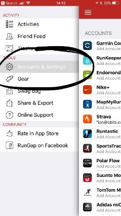
Step 1.
You will need to have installed the app Strava. This health and fitness app will track your GPS data from either your phone or watch and track your speed, elevation and heartrate (watch only). Apart from this, you will also need the app RunGap. This app will allow you to transfer your activity data and export it to a “.fit” file. A .fit file is a special data source that can track heartrate, speed and elevation that is geolocated by x and y coordinates every second (each row).
Step 2.
Once you have the apps downloaded, start a health activity on the Strava app. From there you can transfer your Strava data to RunGap.
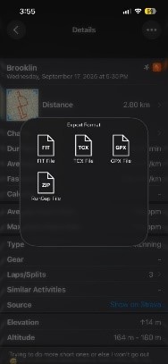
After you sign in and import the Strava data, go to the activity you want to export as a .fit file. Save the .fit file and transfer it to your computer.
Step 3.
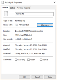
Now that you have the .fit file, you will need to download a tool to convert it to a CSV. This can be found at https://developer.garmin.com/fit/overview/. In Step 1 of this page you will need to download the https://developer.garmin.com/fit/download/ Fit SDK. The file will be in your downloaded folder under FitSDKRelease_21.171.00.zip. You will need to unzip this file and navigate to >java>FitToCSV.bat. This is the tool that you will use on the .fit file. To do this, go to your .fit file properties and change the “Open with:” application to your >java>FitToCSV.bat path.
Now simply run the .fit file and the tool will open and covert it to a CSV in the same folder after pressing any key to continue…
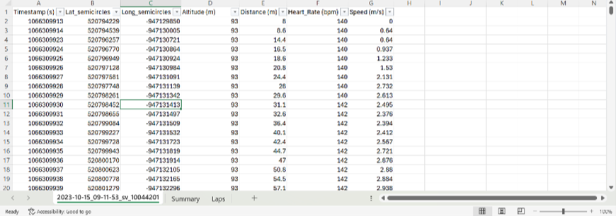
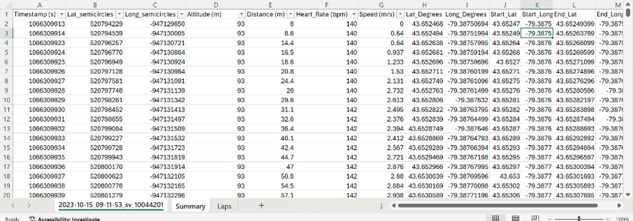
Step 4.
Now, open your CSV. The data is initially messy, and the fields are mixed. To clean it I added a new sheet, and then deleted from the original, continuing to narrow it down using the filter function. In the end, you only want the “data” rows in the Type column and rows with lat and long coordinates to create a point feature class. I also renamed the fields. For example, value 1 became Timestamp(s), which is used as the primary key to differentiate the rows. To get the coordinates in degrees, I used this calculation:
Lat_Degrees: Lat_semicircles / 11930464.71
Long_Degrees: Long_semicircles / 11930464.71
Furthermore, to display the points as lines in the final map, 4 more fields are needed to be added to the excel sheet. This is the start lat, start long, end lat and end long fields. These can simply be calculated by taking the coordinates of the next row for the end lat and end long. You will also need to do this with altitude to make a 3D representation of the elevation.
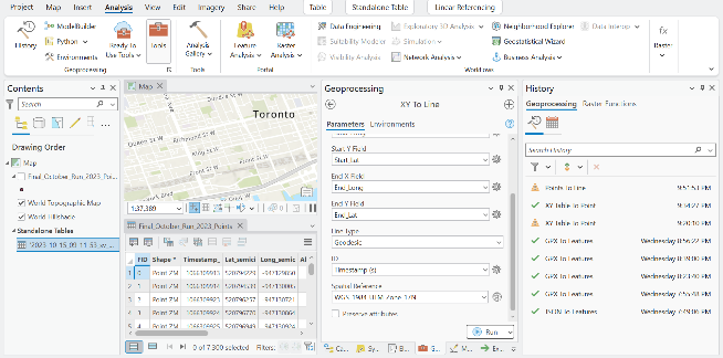
Step 5.
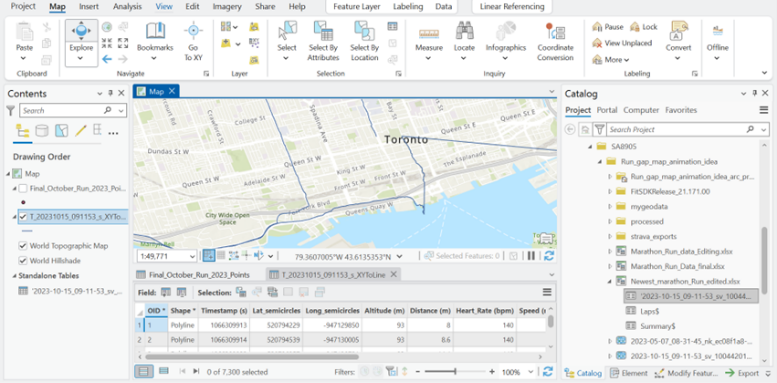
Now that your CSV is cleaned, it is ready to be exported as spatial data. Open ArcGIS Pro and create a new project. From here, load your CSV into a new map. This table will be used in the XY to line geoprocessing tool using the start and end coordinates for the WGS_1984_UTM_Zone_17N projection in Toronto.
Once you run the tool, your data should look something like this, displaying lines connecting each initial point/row.
Step 6.
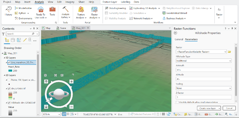
Now it is time to bring your route to life! Start by running the Feature To 3D By Attribute geoprocessing tool on your feature class using the height field as your elevation/altitude.
Your line should now be 3D when opening a 3D Map Scene and importing the 3D layer
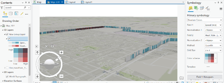
Step 7.
To add more dimensions to the symbology colours, I used “Bivariate Colours”. This provides a unique combination of speed and heart rate at each leg of the race.
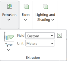
To make the elevation more visually appealing, I used the extrusion function on the line feature class. Then, I used the “Min Height” category with the expression “$feature.Altitude__m_ / 3”. To further add realism, I added the ground elevation surfaces layer called WorldElevation3D/Terrain3D, so that the surrounding topography pops out more.
Step 8.
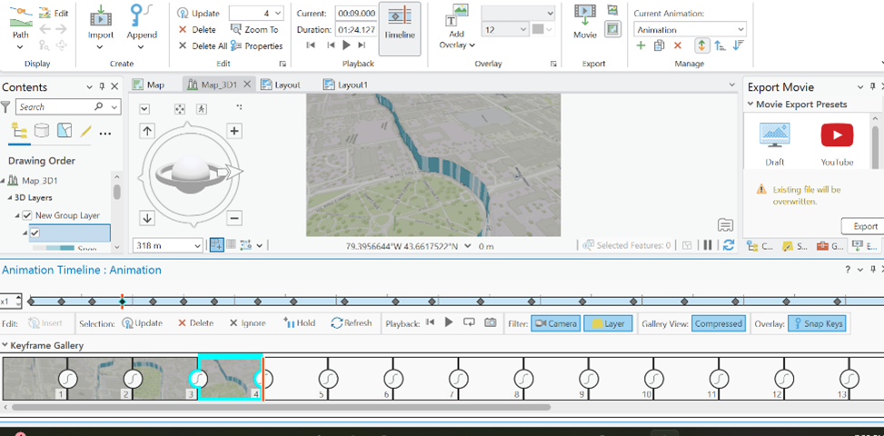
Now that the layer and symbology are refined, the final part of the visualization is creating a Birdseye view of the race trail from start to finish. To do this, I once again used ArcGIS Pro and added an animation in the view tab. From here I continuously added key frames throughout the path until the end. Finally, I directly exported the video to my computer.
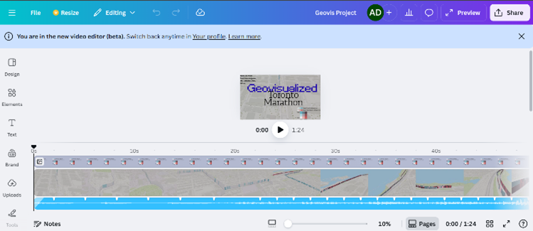
Step 9. Canva
To conclude, I used Canva to add the legend to the map, add music, and a nice-looking title.
And now, you have a 3D running animation…! I hope you have learned something from this blog and give it a try yourself. It was very satisfying taking a real-life achievement and converting it to a in-depth geospatial representation. :)
Geovis Project Assignment, TMU Geography, SA8905, Fall 2025
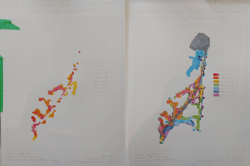
Hi everyone, welcome to my final Geovisualization Project tutorial. With this project, I wanted to combine my love of watercolour painting with cartography. I used Catalyst Professional, ArcGIS Pro, and watercolours to transform Landsat imagery spanning the years 1972 to 2025 into blocks of colour representing periods of landform expansion at Leslie Street Spit. I also made an animated GIF to help illustrate the process.
Study Area
Just to give you a bit of background to the site, Leslie Spit is a manmade peninsula on the Toronto waterfront, made up of brick and concrete rubble from construction sites in Toronto starting in 1959. It was intended to be a port-related facility, but by the early 1970s, this use case was no longer relevant, and natural succession of vegetation had begun. The landform continued to expand through lakefilling, as did the vegetation and wildlife, and by 1995 the Toronto and Region Conservation Authority started enhancing natural habitats, founding Tommy Thompson Park.
Post Classification Change Detection
The Landsat program has been providing remotely sensed imagery since 1972, at which time the Baselands and “Spine Road” had been constructed. Pairs of Landsat images can be compared by classifying the pixels as land or water in Catalyst Professional using an unsupervised classification algorithm, and performing “delta” or post classification change detection in ArcGIS Pro using the Raster Calculator to determine areas that have undergone landform expansion in that time period. The tool literally subtracts the pixel values denoting land or water of a raster at an earlier date from a raster at a later date in order to compare them and detect change. If we perform this process seven times, up until 2025, we can get a near complete picture of the land base formation of the Spit and can visualize these changes.
Let’s begin!
Step 1: Data Collection from USGS EarthExplorer
The first step is to collect 9 images forming 7 image pairs from USGS EarthExplorer. I searched for images that had minimal cloud cover covering the extent of Toronto.
For the year 1985, we need to double up on images in order to transition from the Multispectral Scanner sensor with 60m resolution to the Thematic Mapper sensor with 30m resolution. 1980 MSS and 1985 MSS will form a pair, and 1985 TM and 1990 TM will form a pair.
Step 2: Data Processing in Catalyst Professional
Now we can begin processing our images. All images must be data merged either manually (using the Translate and Transfer Layers Utilities) or using the metadata MTL.txt files (using the Data Merge tool) to join each image band together and subset (using the Clipping/Subsetting tool) to the same extent. The geocoded extent is:
Upper left: 630217.500 P / 4836247.500 L Lower right: 637717.500 P / 4828747.500 L
Using the 2025 image as an example, my window looked like this:
I started a new session of Unsupervised Classification and added two 8 bit channels.
I specified the K-Means algorithm with 20 maximum classes and 20 maximum iterations.
I used Post-Classification Analysis (Aggregation) to assign each of the 20 classes to an information class. These classes are Water and Land. I made sure all classes were assigned and I applied the result to the Output Channel.
I got this result:
I repeated this process for all images. For example, 1972 looked like this:
I saved all of the aggregation results as .pix files using the Clipping/Subsetting tool.
Step 3: Data Processing, Visualization, and GIF-making in ArcGIS Pro
We are ready to move onto our processing and visualization in ArcGIS Pro. Here, we will be performing the post classification or “delta” change detection.
I added the aggregation result .pix files to ArcGIS Pro. I exported the rasters to GRID format. The rasters now had values of 0 (No Data), 21 (Water), and 22 (Land). I used the Raster Calculator (Spatial Analyst) to subtract each earlier dated image from the next image in the sequence. So, 1974 minus 1972, 1976 minus 1974, and so on.
I got this result (with masking polygon included, explanation to follow):
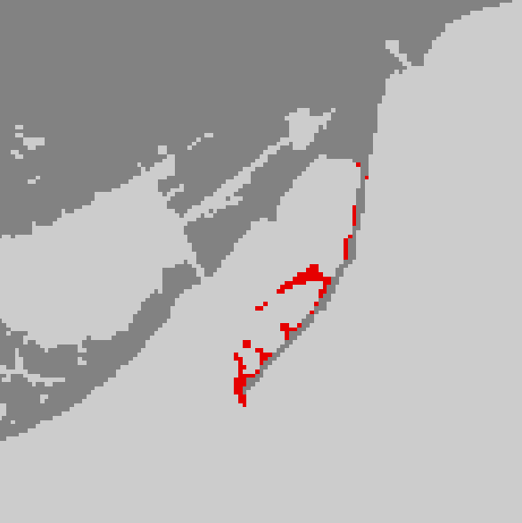
The green (0) represents no change, the red (1) represents change from Water to Land (22 – 21), and the grey (-1) represents change from Land to Water (21 – 22).
I drew a polygon (shown in white) around the Spit so we can perform Extract by Mask (Spatial Analyst). This will clip the raster to a more specific extent.
I symbolized the extracted raster’s values of 0 and -1 with no colour and value 1 as red. We now have the first land area change raster for 1972 to 1974.
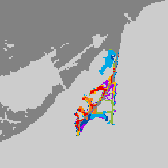
I repeated this for all time periods, symbolizing the portions of the raster with value 1 as orange, yellow, green, blue, indigo, and purple.
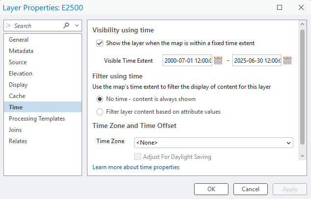
We can now begin our animation. I assigned each change raster its appropriate time period in the Layer Properties. A time slider appeared at the top of my map.
I added a keyframe for each time period to my animation by sliding to the correct time and pressing the green “+” button on the timeline. I used Fixed transitions of 1.5 seconds for each Key Length and extra time (3.0 seconds) at beginning and end to showcase the base raster and the finished product.
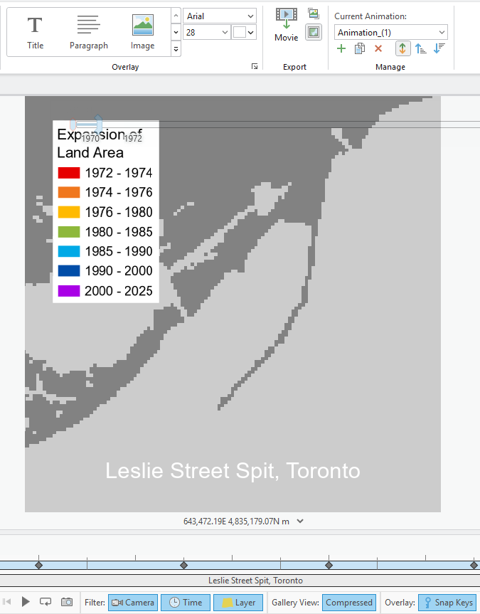
I added overlays (a legend and title) to my map. I ensured the Start Key was 1 (first) and the End Key was 9 (last) so that the overlays were visible throughout the entire 13.5 second animation.
I exported the animation as a GIF – voila!
Step 4: Watercolour Map Painting
To begin my watercolour painting, I used these materials:
Pencil and eraser
Drafting scale (or ruler)
Watercolour paper (Fabriano, cold press, 25% cotton, 12” x 15.75”)
Watercolour brushes (Cotman and Deserres)
Watercolour palettes (plastic and ceramic)
Watercolour drawing pad for test colour swatches
Water container
Lightbox (Artograph LightTracer)
Leslie Spit colour-printed reference image
Black India ink artist pen (Faber-Castell, not pictured)
Masking tape (not pictured)
Lots of natural light
JAZZ FM 91.1 playing on radio (optional)
I first sketched out in pencil some necessary map elements on the watercolour paper: title, subtitle, neatline, legend, etc. I then taped the reference image down onto the lightbox, and then taped the watercolour paper overtop.
I mixed colour and water until I achieved the desired hues and saturations.
From red to purple, I painted colours one by one, using the reference illuminated through the lightbox. When the last colour (purple) was complete, I added the Baselands and Spine Road in grey as well as all colours for the legend.
To achieve the final product, I added light grey paint for the surrounding land and used a black artist pen to go over my pencil lines and add a scale bar and north arrow.
The painting is complete – I hope you enjoyed this tutorial!
Greetings everyone! For my geo-visualization project, I wanted to combine my creative skills of Do It Yourself (DIY) crafting with the technological applications utilized today. This project was an opportunity to be creative using resources I had from home as well as utilizing the awesome applications and features of Microsoft Excel, ArcGIS Online, ArcGIS Pro, and Clipchamp.
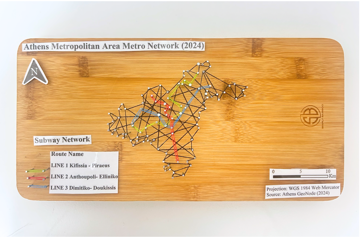
In this blog, I’ll be sharing my process for creating a 3D physical string map model. To mirror my physical model, I’ll be creating a textured animated series of maps. My models display the subway networks of two cities. The first being the City of Toronto, followed by the metropolitan area of Athens, Greece.
Follow along this tutorial to learn how I completed this project!
PROJECT BACKGROUND:
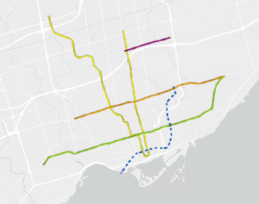
For some background, I am more familiar with Toronto’s subway network. Fortunately enough, I was able to visit Athens and explore the city by relying on their subway network. As of now, both of these cities have three subway lines, and are both undergoing construction of additional lines. My physical model displays the present subway networks to date for both cities, as the anticipated subway lines won’t be opening until 2030. Despite the hands-on creativity of the physical model, it cannot be modified or updated as easily as a virtual map. This is where I was inspired to add to my concept through a video animated map, as it visualizes the anticipated changes to both subway networks!
PHYSICAL MODEL:
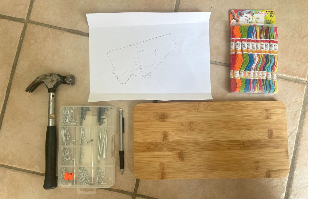
Materials Used:
Paper (used for map tracing)
Pine wood slab
Hellman ½ inch nails
Small hammer
Assorted colour cotton string
Tweezers
Krazy glue
Methods and Process:
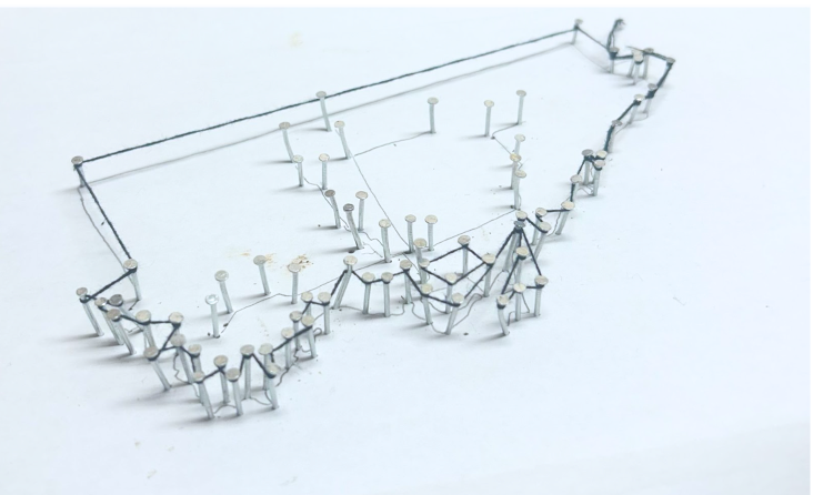
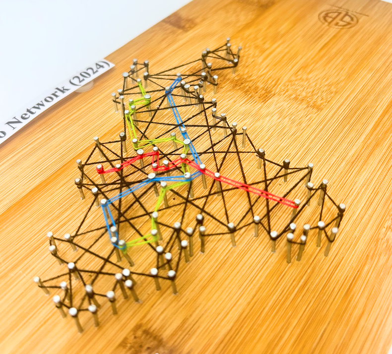
For the physical model, I wanted to rely on materials I had at home. I also required a blank piece of paper for a tracing the boundary and subway network for both cities. This was done by acquiring open data and inputting it into ArcGIS Pro. The precise data sets used are discussed further in my virtual model making. Once the tracings were created, I taped it to a wooden base. Fortunately, I had a perfect base which was pine wood. I opted for hellman 1/2 inch nails as the wood was not too thick and these nails wouldn’t split the wood. Using a hammer, each nail was carefully placed onto the the tracing outline of the cities and subway networks .
I did have to purchase thread so that I could display each subway line to their corresponding colour. The process of placing the thread around the nails did require some patience. I cut the thread into smaller pieces to avoid knots. I then used tweezers to hold the thread to wrap around the nails. When a new thread was added, I knotted it tightly around a nail and applied krazy glue to ensure it was tightly secured. This same method was applied when securing the end of a string.
Images of threading process:
City of Toronto Map Boundary with Tracing
After threading the city boundary and subway network, the paper tracing was removed. I could then begin filling in the space of the boundary. I opted to use black thread for the boundary and fill, to contrast both the base and colours of the subway lines. The City of Toronto thread map was completed prior to the Athens thread map. The same steps were followed. Each city is on opposite sides of the wood base for convenience and to minimize the use of an additional wood base.
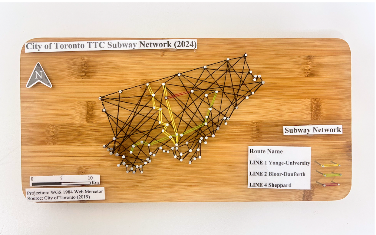
Of course, every map needs a title , legend, north star, projection, and scale. Once both of the 3D string maps were complete, the required titles and text were printed and laminated and added to the wood base for both 3D string maps. I once again used the nails and hammer with the threads to create both legends. Below is an image of the final physical products of my maps!
FINAL PHYSICAL MODELS:
City of Toronto Subway Network Model:
Athens Metropolitan Area Metro Network Model:
VIRTUAL MODEL:
To create the virtual model, I used ArcGIS Pro software to create my two maps and apply picture fill symbology to create a thread like texture. I’ll begin by discussing the open data acquired for the City of Toronto, followed by the Census Metropolitan Area of Athens to achieve these models.
The City of Toronto:
Data Acquisition:
For Toronto, I relied on the City of Toronto open data portal to retrieve the Toronto Municipal Boundary as well as TTC Subway Network dataset. The most recent dataset still includes Line 3, but was kept for the purpose of the time series map. As for the anticipated Eglinton line and Ontario line, I could not find open data for these networks. However, Metrolinx created interactive maps displaying the Ontario Line and Eglinton Crosstown (Line 5) stations and names. To note, the Eglinton Crosstown is identified as a light rail transit line, but is considered as part of the TTC subway network.
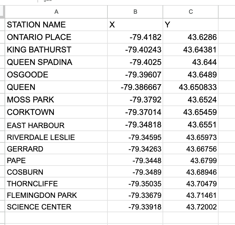
To compile the coordinates for each station for both subway routes, I utilized Microsoft Excel to create 2 sheets, one for the Eglinton line and one for the Ontario line. To determine the location of each subway station, I used google maps to drop a pin in the correct location by referencing the map visual published by Metrolinx.
Ontario Line Excel Table :
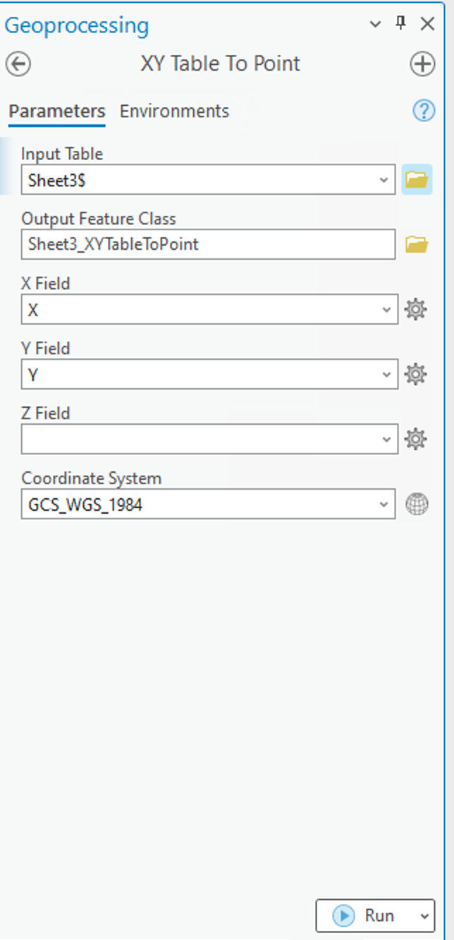
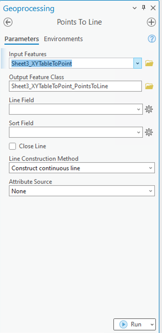
Using ArcGIS Pro, I used the XY Table to Pointtool to insert the coordinates from each separate excel sheet, to establish points on the map. After successfully completing this, I had to connect each point to create a continuous line. For this, I used the Point to Line tool also in ArcGIS Pro.
XY Table to Point tool and Points to Line tool used to add coordinates to map as points and connect points into a continuous line to represent the subway route:
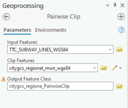
After achieving this, I did have to adjust the subway routes to be clipped within the boundary for The City of Toronto as well as Athens Metropolitan Area. I used the Pairwise Clip in the Geoprocessing pane to achieve this.
Geoprocessing pairwise clip tool parametersused. Note: The input features were the subway lines withe the city boundary as the clip features.
Athens Metropolitan Area:
Data Acquisition:
For retrieving data for Athens, I was able to access open data from Athens GeoNode I imported the following layers to ArcGIS Online; Athens Metropolitan Area, Athens Subway Network, and proposed Athens Line 4 Network which I added as accessible layers to ArcGIS online. I did have to make minor adjustments to the data, as the Athens metropolitan area data displays the neighbourhood boundaries as well. For the purpose of this project, only the outer boundaries were necessary. To overcome this, I used the merge modify feature to merge all the individual polygons within the metropolitan area boundary into one. I also had to use the pairwise clipping tool once again as the line 4 network exceeds the metropolitan boundary, thus being beyond the area of study for this project.
Adding Texture Symbology:
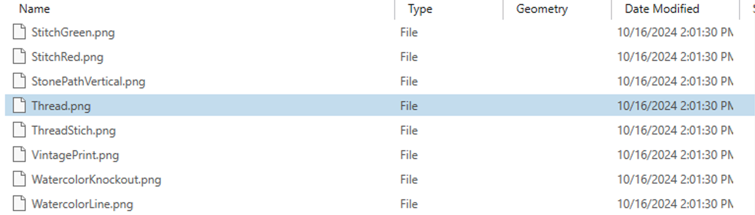
ArcGIS has a variety of tools and features that can enhance a map’s creativity and visualization. For this project , I was inspired by an Esri Yarn Map Tutorial. Given the physical model used thread, I wanted to create a textured map with thread. To achieve this, I utilized the public folder provided with the tutorial. This included portable network graphics (.png) cutouts of several fabrics as well as pen and pencil textures. To best mirror my physical model, I utilized a thread .png.
ESRI yarn map tutorial public folder:
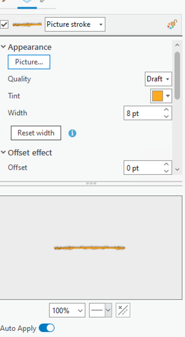
I added the thread .png images by replacing the solid fill of the boundaries and subway networks with a picture fill. This symbology works best with a .png image for lines as it seamlessly blends with the base and surrounding features of the map. The thread .png image uploaded as a white colour, which I was able to modify its colour according to the boundary or particular subway line without distorting the texture it provides.
For both the Toronto and Athens maps, the picture fill for each subway line and boundary was set to a thread .png with its corresponding colour. The boundaries for both maps were set to black as in the physical model, where the subway lines also mirror the physical model which is inspired by the existing/future colours used for subway routes. Below displays the picture symbology with the thread .png selected and tint applied for the subway lines.
City of Toronto subway Networks with picture fill of thread symbology applied:
The base map for the map was also altered, as the physical model is placed on a wood base. To mirror that, I extracted a Global Background layer from ArcGIS online, which I modified using the picture fill to upload a high resolution image of pine wood to be the base map for this model. For the city boundaries for both maps, the thread .png imagery was also applied with a black tint.
PUTTING IT ALL TOGETHER:
After creating both maps for Toronto and Athens, it was time to put it into an animation! The goal of the animation was to display each route, and their opening year(s) to visually display the evolution of the subway system, as my physical model merely captures the current subway networks.
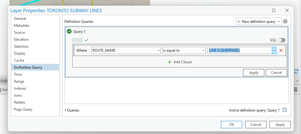
I did have to play around with the layers to individually capture each subway line. The current subway network data for both Toronto and Athens contain all 3 of their routes in one layer, in which I had to isolate each for the purpose of the time lapse in which each route had to be added in accordance to their initial opening date and year of most recent expansion. To achieve this, I set aDefinition Query for each current subway route I was mapping whilst creating the animation.
Definition query tool accessed under layer properties:
Once I added each keyframe in order of the evolution of each subway route, I created a map layout for each map to add in the required text and titles as I did with the physical model. The layouts were then exported into Microsoft Clipchamp to create the video animation. I imported each map layout in .png format. From there, I added transitions between my maps, as well as sound effects !
CITY OF TORONTO SUBWAY NETWORK TIMELNE:
Geovis Project, TMU Geography, SA8905 Sarah Delima
While this project allowed me to be creative both with my physical and virtual models, it did present certain limitations. A notable limitation to this geovisualization for the physical model is that it is meant to be a mere visual representation of the subway networks.
As for the virtual map, although open data was accessible for some of the subway routes, I did have to manually enter XY coordinates for future subway networks. I did reference reputable maps of the anticipated future subway routes to ensure accuracy. Furthermore, given my limited timeline, I was unable to map the proposed extensions of current subway routes. Rather, I focused on routes currently under construction with an anticipated completion date.
CONCLUSION:
Although I grew up applying my creativity through creating homemade crafts, technology and applications such as ArcGIS allow for creativity to be expressed on a virtual level. Overall, the concept behind this project is an ode to the evolution of mapping, from physical carvings to the virtual cartographic and geo-visualization applications utilized today.
Geovis Project Assignment, TMU Geography, SA8905, Fall 2024
Introduction
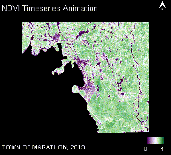
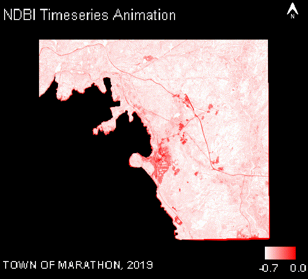
Mapping indices like NDVI and NDBI is an essential approach for visualizing and understanding environmental changes, as these indices help us monitor vegetation health and urban expansion over time. NDVI (Normalized Difference Vegetation Index) is a crucial metric for assessing changes in vegetation health, while NDBI (Normalized Difference Built-Up Index) is used to measure the extent of built-up areas. In this blog post, we will explore data from 2019 to 2024, focusing on the single and lower municipalities of Ontario. By analyzing this five-year time series, we can gain insights into how urban development has influenced greenery in these regions. The web page leverages Google Earth Engine (GEE) to process and visualize NDVI data derived from Sentinel-2 imagery. With 414 municipalities to choose from, users can select specific areas and track NDVI and NDBI trends. The goal was to create an intuitive and informative platform that allows users to easily explore NDVI changes across Ontario’s municipalities, highlighting significant shifts and pinpointing where they are most evident.
In this section, we will walk through the process of creating a dynamic map visualization and exporting time-series data using Google Earth Engine (GEE). The provided code utilizes Sentinel-2 imagery to calculate vegetation and built-up area indices, such as NDVI and NDBI for a defined range of years. The application was developed using the GEE Code Editor and published as a GEE app, ensuring accessibility through an intuitive interface. Keep in mind that the blog post includes only key snippets of the code to walk you through the steps involved in creating the app. To try it out for yourself, simply click the ‘Explore App’ button at the top of the page.
Setting Up the Environment
First, we define global variables that control the years of interest, the area of interest (municipal boundaries), and the months we will focus on for analysis. In this case, we analyze data from 2019 to 2024, but the range can be modified. The code utilizes the municipality Table to filter and display the boundaries of specific municipalities.
var beginningYear = 2019;
var endingYear = 2024;
var NDVILabel = 'NDVI';
var NDBILabel = 'NDBI';
Visualizing Sentinel-2 Imagery
Sentinel-2 imagery is first filtered by the date range (2019-2024 in our case) and bound to a specific municipality. Then we mask clouds in all images using a cloud quality assessment dataset called Cloud Score+. This step helps in generating clean composite images, as well as reducing errors during index calculations. We use a set of specific Sentinel-2 bands to calculate key indices, like NDVI and NDBI which are visualized in true colour or with specific palettes for enhanced contrast. To make this easier, the bands of the Sentinel 2 images (S2_BANDS) are renamed to human-readable names (STD_S2_NAMES).
var S2_BANDS = ['B2', 'B3', 'B4', 'B8', 'B11', 'B12', 'TCI_R', 'TCI_G', 'TCI_B', 'SCL'];
var STD_S2_NAMES = ['blue', 'green', 'red', 'nir', 'swir1', 'swir2', 'redT', 'greenT', 'blueT', 'class'];
var QA_BAND = 'cs_cdf';
var QA_BAND2 = 'cs';
// The threshold for masking; values between 0.50 and 0.65 generally work well.
// Higher values will remove thin clouds, haze & cirrus shadows.
var CLEAR_THRESHOLD = 0.65;

function getCloudMaskedSentinelImages(municipalityGeometry)
{
  // Make a clear median composite.
  var sentinelDataset = sentinel2
      .filterBounds(municipalityGeometry)
      .filter(ee.Filter.date(beginningYear+'-01-01', endingYear+'-12-31'))
      .linkCollection(csPlus, [QA_BAND, QA_BAND2])
      .map(function(img) {
        var x = img.updateMask(img.select(QA_BAND).gte(CLEAR_THRESHOLD));
        x = x.set('year', img.date().get('year'));
        return x;
      })
      .select(S2_BANDS, STD_S2_NAMES);
  return sentinelDataset;
}

function getProcessedSentinelImages(municipalityFeature)
{
  var municipalityGeometry = municipalityFeature.geometry();
  var sentinelDataset = getCloudMaskedSentinelImages(municipalityGeometry);

  var sentinelImages = ee.List([])
  for (var year=beginningYear; year <= endingYear;year++)
  {
    var imageForYear = sentinelDataset.filterDate(year+'-01-01',year+'-12-31').median()
                                        .set('year',year)
                                        .set('product','Sentinel 2');

    imageForYear = imageForYear.clip(municipalityGeometry);
    sentinelImages = sentinelImages.add(imageForYear);
  }
  return ee.ImageCollection(sentinelImages);
}
Index Calculations
The key indices are calculated for each year within the selected municipality boundaries. These indices are calculated using the normalized difference between relevant bands (e.g., NIR and Red bands for NDVI), whereas NDBI is calculated using (SWIR and NIR bands). After calculating the indices, the results are added to the map for visualization. Typically, for NDVI, green represents healthy vegetation, while purple indicates unhealthy vegetation, often corresponding to developed areas such as cities. In the case of NDBI, red pixels signify higher levels of built-up areas, whereas lighter colors, such as white, indicate minimal to no built-up areas, suggesting more vegetation. Together, NDVI and NDBI results provide complementary insights, enabling a better understanding of the relationship between vegetation and built-up areas.
For each year, the calculated index is visualized, and users can see how vegetation and built-up areas have changed over time.
function calculateIndexes(sentinelImages)
{
  var imagesNDVI = ee.List([]);
  var imagesNDBI = ee.List([]);
  for (var year = beginningYear; year <= endingYear; year++)
  {
    var result = calculateIndexesForYear(sentinelImages, year, true);
    imagesNDVI = imagesNDVI.add(result.NDVI);
    imagesNDBI = imagesNDBI.add(result.NDBI);
  }
  return {NDVI: imagesNDVI, NDBI: imagesNDBI};
}

function calculateIndexesForYear(processedImages, year, addToMap)
{
  var sentinelImageForYear = processedImages.filterMetadata('year', 'equals', year).first();
  sentinelImageForYear = addTimePropertiesToImage(sentinelImageForYear, year);
  var NDVISentinel = calculateNormalizedDifference(sentinelImageForYear, year, 'nir', 'red');
  var NDBISentinel = calculateNormalizedDifference(sentinelImageForYear, year, 'swir2', 'nir');

  var result = {NDVI: NDVISentinel, NDBI: NDBISentinel};
  if (addToMap) {
    addImagesToMap(sentinelImageForYear, result, year);
  }

  return result;
}

function calculateNormalizedDifference(image, year, band1, band2)
{
  var diff = image.normalizedDifference([band1, band2]);
  return addTimePropertiesToImage(diff, year);
}

function addTimePropertiesToImage(image, year)
{
  var startDate = ee.Date.fromYMD(year, filterMonthStart, 1);
  var endDate = startDate.advance(filterMonthEnd - filterMonthStart, 'month');
  return image.set('system:time_start',startDate.millis(),'system:time_end', endDate.millis(),'year', year);
}
Generating Time-Series Animations
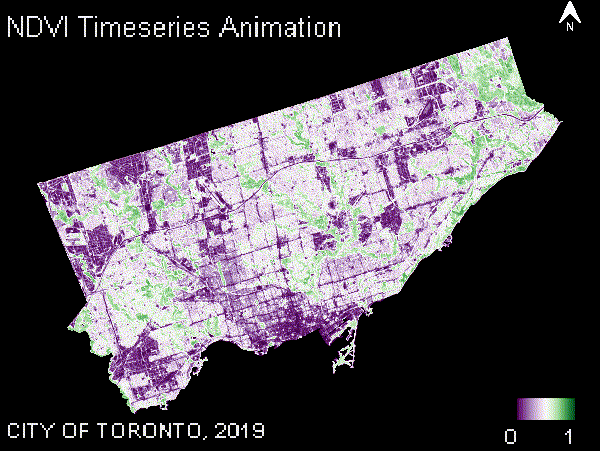
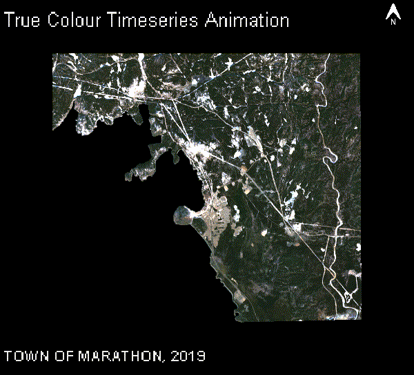
To provide a clearer view of changes over time, the code generates a time-series animation for the selected indices (e.g., NDVI). The animation visualizes the change in land cover over multiple years and is generated as a GIF, which is displayed within the map interface. The animation creation function combines each year’s imagery and overlays relevant text and other symbology, such as the year, municipality name, and legend.
function createAnimationPerYear(collectionImages, collectionName, collectionVisualization,
municipalityName, aoiDimensions, addGradientBar)
{
  var mapTitle = collectionName+' Timeseries Animation';
  var legendLabels = ee.List.sequence(collectionVisualization.min,collectionVisualization.max);
  var gradientBarLabelResize = collectionVisualization.min%1!=0 || collectionVisualization.max%1!=0;
  var northArrow = NorthArrow.draw(aoiDimensions.NorthArrowPoint, aoiDimensions.Scale, aoiDimensions.Width.multiply(.08), .05, 'EPSG:3857');
  var textProperties = {
    fontType: 'Arial',
    fontSize: gradientBarLabelResize? 10 : 14,
    textColor: 'ffffff',
    outlineColor: '000000',
    outlineWidth: 0.5,
    outlineOpacity: 0.6
  };
  var gradientBar;
  if (addGradientBar) {
    gradientBar = GradientBar.draw(aoiDimensions.GradientBarBox,
    {
      min:collectionVisualization.min,
      max:collectionVisualization.max,
      palette: collectionVisualization.palette,
      labels: [collectionVisualization.min,collectionVisualization.max],
      format: gradientBarLabelResize ? '%.1f' : '%.0f',
      round:false,
      text: textProperties,
      scale: aoiDimensions.Scale
    });
  }

  var rgbVis = ee.ImageCollection(collectionImages).map(function(img) {
    var annotations = [
      {property: 'titleLabel', position: 'left', offset: '2%', margin: '1%', scale: aoiDimensions.Scale, fontSize: 16 },
      {property: 'locationLabel', position: 'left', offset: '92%', margin: '1%', scale: aoiDimensions.Scale }
    ];
    var year = img.get('year');
    var labelLocation = ee.String(municipalityName).cat(', ').cat(year);
    img = img.visualize(collectionVisualization).set({titleLabel:mapTitle, locationLabel: labelLocation});
    var annotated = ee.Image(text.annotateImage(img, {}, aoiDimensions.AoiBox, annotations)).blend(northArrow);
    if (addGradientBar) {
      annotated = annotated.blend(gradientBar);
    }
    return annotated;
  });

  var uiGif = ui.Thumbnail(rgbVis, aoiDimensions.GifParams);
  return uiGif;
}

function createTimeSeriesAnimations(sentinelImages, calculatedIndexes, municipalityFeature, municipalityName)
{
  var aoiDimensions = getDimensionsForGifs(municipalityFeature);

  var ndviGif = createAnimationPerYear(calculatedIndexes.NDVI, NDVILabel, visualizationNDVI, municipalityName, aoiDimensions, true);
  var ndbiGif = createAnimationPerYear(calculatedIndexes.NDBI, NDBILabel, visualizationNDBI, municipalityName, aoiDimensions, true);
  var trueColourGif = createAnimationPerYear(sentinelImages, "True Colour", visualizationTrueColor, municipalityName, aoiDimensions, false);

  return {
    TrueColourGif : trueColourGif,
    NdviGif: ndviGif,
    NdbiGif: ndbiGif
  };
}
Map Interaction
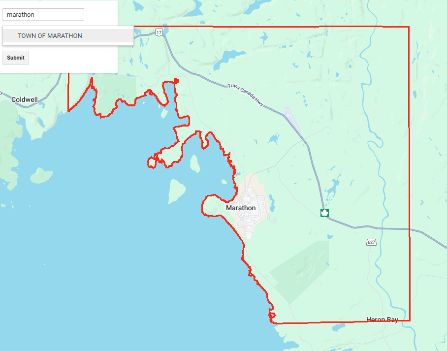
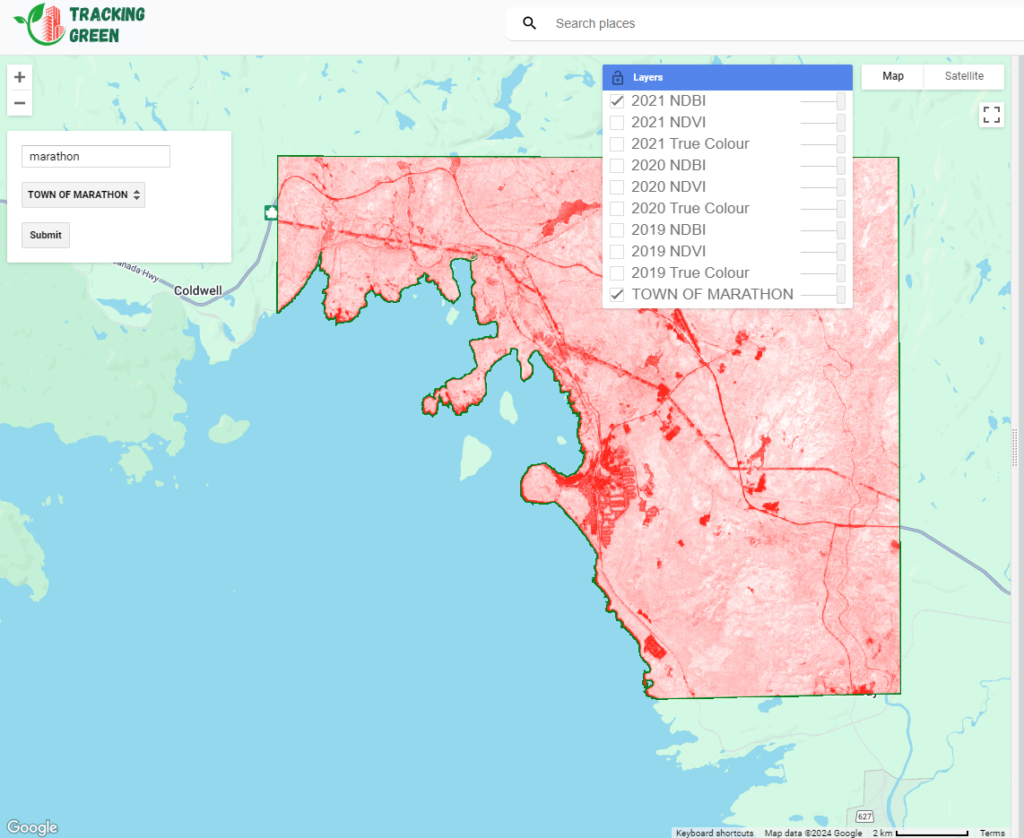
A key feature of this code is the interactive map interface, which allows users to select a municipality from a dropdown menu. Once a municipality is selected, the map zooms into that area and overlays the municipality boundaries. You can then submit that municipality to calculate the indices and render the time series GIF on the panel. You can also explore the various years on the map by selecting the specific layers you want to visualize.
To start with, we will set up the UI components and replace the default UI with our new UI:
// Initialize the map
var map = ui.Map();
// Create a list of items for the dropdown menu
var items = municipalityNames.getInfo();
// Create a search box
var searchBox = ui.Textbox({
  placeholder: 'Search...',
  onChange: function(text) {
    filterMunicipalities(text);
  }
});
// Create a dropdown menu with options
var dropdown = ui.Select({
  items: ['1'],
  placeholder: 'Choose a Municipality',
  onChange: function(municipalityName) {
    displayMunicipalityBoundary(municipalityName);
  }
});
// Create a submit button
var submitButton = ui.Button({
  label: 'Submit',
  onClick: function() {
    var selectedOption = dropdown.getValue();
    print('Submitted option:', selectedOption);
    doThings(selectedOption);
  }
});
// Create a panel to hold the UI elements
var panel = ui.Panel({
  widgets: [searchBox, dropdown, submitButton],
  layout: ui.Panel.Layout.flow('vertical'),
  style: {width: '250px', position: 'top-left'}
});
// Create a panel to hold the GIF
var gifPanel = ui.Panel({
  layout: ui.Panel.Layout.flow('vertical', true),
  style: {width: '897px', backgroundColor: '#d3d3d3'}
});

// Replace placeholder items with municipalityNames
dropdown.items().reset(items);
// Add the panel to the map
map.add(panel);

// Map/chart and image card panel
var splitPanel = ui.SplitPanel(map, gifPanel);
// Replace current UI with the new splitPanel
ui.root.clear();
ui.root.add(splitPanel);
Notice there are functions for the interactive components of the UI, those are shown below:
// Filter the dropdown with the municipalities which match the search box
function filterMunicipalities(searchString)
{
  var filteredItems = items.filter(function(item) { return item.toLowerCase().indexOf(searchString.toLowerCase()) !== -1});
  // Reset the dropdown items with the filtered items
  dropdown.items().reset(filteredItems);
}

// Display boundary of a geometry when selected from the dropdown
function displayMunicipalityBoundary(municipalityName)
{
  map.layers().reset();
  var municipalityFeature = municipalityBoundaries.filter(ee.Filter.eq('MUNICIPA_2', municipalityName)).first();
  map.centerObject(municipalityFeature.geometry());
  addGeometryBoundaryToMap(municipalityFeature.geometry(), 'red', municipalityName);
}

// Add boundary of a geometry to the map
function addGeometryBoundaryToMap(boundaryGeometry, colour, name)
{
  var styledImage = ee.Image()
    .paint({ featureCollection: boundaryGeometry, color: 1, width: 3 })
    .visualize({ palette: [colour], forceRgbOutput: true });
  map.addLayer(styledImage, {},  name, true);
}

// Add generated gifs to the gifPanel
function displayGifs(gifs)
{
  gifPanel.clear();
  gifPanel.add(gifs.TrueColourGif);
  gifPanel.add(gifs.NdviGif);
  gifPanel.add(gifs.NdbiGif);
}

// Add true colour and calculated indexes to the map for a single year
function addImagesToMap(imageForYear, indexes, year)
{
  map.addLayer(imageForYear, visualizationTrueColor, year + " True Colour", false);
  map.addLayer(indexes.NDVI, visualizationNDVI, year + " "+ NDVILabel, false);
  map.addLayer(indexes.NDBI, visualizationNDBI, year + " "+ NDBILabel, false);
}

// Submit button actions, get processed imagery, calculate indices, generate gifs, display gifs
function doThings(municipalityName) {
  var municipalityFeature = municipalityBoundaries.filter(ee.Filter.eq('MUNICIPA_2', municipalityName)).first();
  var sentinelImages = getProcessedSentinelImages(municipalityFeature);

  map.layers().reset();
  addGeometryBoundaryToMap(municipalityFeature.geometry(), 'green', municipalityName);
  map.centerObject(municipalityFeature.geometry());

  //calculate the indexes for years
  var calculatedIndexes = calculateIndexes(sentinelImages);
  var gifs = createTimeSeriesAnimations(sentinelImages, calculatedIndexes, municipalityFeature, municipalityName);

  displayGifs(gifs);
}
Future Additions
Looking ahead, the workflow can be enhanced by calculating the mean NDVI or NDBI for each municipality over longer periods of time and displaying it on a graph. The workflow can also incorporate Sen’s Slope, a statistical method used to assess the rate of change in vegetation or built-up areas. This method is valuable at both pixel and neighbourhood levels, enabling a more detailed assessment of land cover changes. Future additions could also include the application of machine learning models to predict future changes and expanding the workflow to other regions for broader use.
Geovis Project Assignment @RyersonGeo, SA8905, Fall 2022
Background
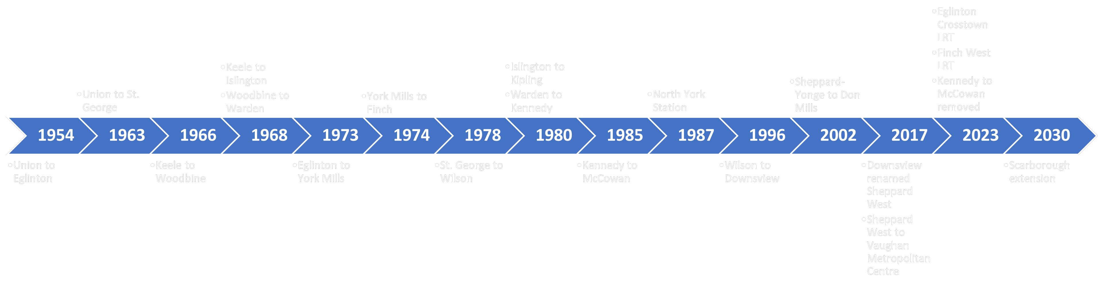
Toronto’s rapid transit system has been constantly growing throughout the decades. This transit system is managed by the Toronto Transit Commission (TTC) which has been operating since the 1920s. Since then, the TTC has reached several milestones in rapid transit development such as the creation of Toronto’s heavy rail subway system. Today, the TTC continues to grow through several new transit projects such as the planned extension of one of their existing subway lines as well as by partnering with Metrolinx for the implementation of two new light rail systems. With this addition, Toronto’s rapid transit system will have a wider network that spans all across the city.
Timeline of the development of Toronto’s rapid transit system
Based on this, a geovisualization product will be created which will animate the history of Toronto’s rapid transit system and its development throughout the years. This post will provide a step-by-step tutorial on how the product was created as well as showing the final result at the end.
Background In 2003, there was a SARS (Severe Acute Respiratory Syndrome) outbreak in Southern China. The first cases were reported in Guangdong, China and quickly spread to other countries via air travel. I experienced all the preventive measures taken and school suspension, yet too young to realize the scale of the outbreak worldwide.
Technology CARTO is used to visualize the spatial distribution of SARS cases by countries and by time. CARTO is a software as a service cloud computing platform that enables analysis and visualization of spatial data. CARTO requires a monthly subscription fee, however, a free account is available for students. With CARTO, a dashboard (incorporating interactive maps, widgets, selective layers) can be created.
Data The data were obtained from World Health Organization under SARS (available here). Two datasets were used. The first dataset was compiled, containing information in the number of cumulative cases and cumulative deaths of each affected country, listed by dates, from March 17 to July 11, 2003. The second dataset was a summary table of SARS cases by countries, containing total SARS cases by sex, age range, number deaths, number of recovery, percentage of affected healthcare worker etc. The data were organized and entered into a spreadsheet in Microsoft Excel. Data cleaning and data processing were performed using text functions in excel. This is primarily done to removing the superscripts after the country names such that the software can recognize, as well as changing the data types from string to numbers. Figure 1. Screenshot of the issues in the country names that have to be processed before uploading it to CARTO.
After trials of connecting the database to CARTO, it was found that CARTO only recognized “Hong Kong”, “Macau” and “Taiwan” as country names, therefore unnecessary characters have to be removed. After cleaning the data, the two datasets were then uploaded and connected to CARTO. If the country names can be recognized, the datasets will then automatically contain spatial information. The two datasets now in CARTO appear as follows: Figure 2. Screenshot of the dataset containing the cumulative number of cases and deaths for each country by date. Figure 3. Screenshot of the dataset containing the summary of SARS cases for each affected country. Figure 4. Screenshot of the page to connect datasets to CARTO. A variety of file formats are accepted.
METHOD After datasets have been connected to CARTO, layers and widgets can be added. First, layers were added simply by clicking “ADD NEW LAYER” and choosing the datasets. After the layer was successfully added, data were ready to be mapped out. To create a choropleth map of the number of SARS cases, choose the layer and under STYLE, specify the polygon colour to “by value” and select the fields and colour scheme to be displayed. Figure 5. Screenshot showing the settings of creating a choropleth map.
Countries are recognized as polygons in CARTO. In order to create a graduated symbol map showing number of SARS cases, centroids of each country has to be computed first. This was done by adding a new analysis of “Create Centroids of Geometries”. After that, under STYLE, specify the point size and point colour to “by value” and select the field and colour scheme. Figure 6. Sets of screenshots showing steps to create centroids of polygons. Click on the layer and under ANALYSIS, add new analysis which brings you to a list of available analysis.
Animation was also created to show SARS-affected countries affected by dates. Under STYLE, “animated” was selected for aggregation. The figure below shows the properties that can be adjusted. Play around with the duration, steps, trails, and resolution, these will affect the appearance and smoothness of the animation. Figure 7. Screenshot showing the settings for animation. Figure 8. Screenshot showing all the layers used.
Widgets were added to enrich the content and information, along with the map itself. Widgets are interactive tools for users where displayed information can be controlled and explored by selecting targeted filters of interest. Widgets were added simply by clicking “ADD NEW WIDGETS” and selecting the fields to be presented in the widget. Most of them were chosen to be displayed in category type. For each category type widget, data has to be configured by selecting the field that the widget will be aggregated by, for most of them, they are aggregated by country, showing the information of widget by countries. Lastly, the animation was accompanied by a time series type widget. Figure 9. Sets of screenshots showing the steps and settings to create new widgets. Figure 10. A screenshot of some of the widgets I incorporated.
FINAL PROJECT The dashboard includes an interactive map and several widgets where users can play around with the different layers, pop-up information, widgets and time-series animation. Widgets information changed along with a change in the map view. Widgets can be expanded and collapsed depending on the user’s preference.
LIMITATION For the dataset of SARS accumulated cases by dates, some dates were not available, which can affect the smoothness of the animation. In fact, the earliest reported SARS cases happened before March 17 (earliest date of statistics available on WHO). Although the statistics still included information before March 17, the timeline of how SARS was spread before March 17 was not available. In addition, there were some inconsistencies in the data. The data provided at earlier dates contain less information, including only accumulated cases and deaths of each affected country. However, data provided at later dates contain new information, such as new cases since last reported date and number of recovery, which was not used in the project in order to maintain consistency but otherwise could be useful in illustrating the topic and in telling a more comprehensive story.
CARTO only allows a maximum of 8 layers, which is adequate for this project, but this may possibly limit the comprehensiveness if used for other larger projects. The title is not available at the first glance of the dashboard and it is not able to show the whole title if it is too long. This could cause confusion since the topic is not specified clearly. Furthermore, the selective layers and legend cannot be minimized. This obscures part of the map, affecting users perception because it is not using all of its available space effectively. Lastly, the animation is only available for points but not polygons, which would otherwise be able to show the change in SARS cases (by colour) for each country by date (time-series animation of choropleth map) and increase functionality and effectiveness of the animation.
Geovis Project Assignment @RyersonGeo, SA8905, Fall 2019
Background:
Over the past 20 years, Asylum Seekers have invented many
travel routes between Africa, Europe and Middle East in order be able to reach
a country of Asylum. Many governmental and non-governmental provided
information about those irregular travel routes used by Asylum Seekers. In this
context, this geovisualization project aims at compiling and presenting two dimensions
of this topic: (1) a comprehensive animated spider map presenting some of the
travel routes between the above mentioned three geographic areas; (2) develop a
dashboard that connects those routes to other statistics about refugees in a user-friendly
interface. In that sense, the best software to fit the project is Tableau.
Data and Technology
Creation of Spider maps at Tableau is perfect for connecting
hubs to surrounding point as it allows paths between many origins and destinations.
Besides, it can comprehend multiple layers. Below is a description of the major
steps for the creation of the animated map and dashboard.
Also, Dashboards are now very useful in combining different themes of data (i.e. pie-charts, graphs, and maps), and accordingly, they are used extensively in non-profit world to present data about a certain cause. The Geovisualiztion Project applied geocoding approach to come up with the animated map and the dashboard.
The Data used to create the project included the following:
-Origins and Destinations of Refugees
-Number of Refugees hosted by each country
-Count of Refugees arriving by Sea (2010-2015)
-Demographics of Refugees arriving by Sea – 2015
Below is a brief description of the steps followed to create the project
Step 1: Data Sources:
The data was collected from the below sources.
United Nations High Commissioner for Refugees, Human Rights
Watch, Vox, InfoMigrants, The Geographical Association of UK, RefWorld, Broder
Free Association for Human Rights, and Frontex Europa.
However, most of the data are not geocoded. Accordingly, Google Sheets was used in Geocoding 21 routes, and thereafter each Route was given a distinguishing ID and a short description of the route.
Step 2: Utilizing the Main Dataset:
Data is imported from an excel sheet. In order to compute a route, Tableau requires data about origins,and destination with latitude and longitude. In that aspect, the data contains different categories:
A-Route I.D. It is a unique path I.D. for each route of the
21 routes;
B-Order of Points: It is the order of stations travelled by
refugees from their country of origin to country of Asylum;
C-Year: the year in which the route was invented;
D-Latitude/Longitude: it is the coordinates of the each
station;
F-Country: It is the country hosting Refugees;
E- Population: Number of refugees hosted in each country.
Step 3: Building the Map View:
The map view was built by putting longitude in columns,
latitude in rows, Route I.D. at details, and selecting the mark type as line.
In order to enhance the layout, Oder of Points was added to Marks’ Path, and
changing it to dimensions instead of SUM.
Finally, to bring stations of travel, another layer was added to by
putting another longitude to columns, and changing it to Dual Axis. To create filtration
by Route, and timeline by year, route was added Filter while year was added to
page.
Step 4: Identifying Routes:
To differentiate routes from each other by distinct colours,
the route column was added to colours, and the default setting was changed to Tableau
20. And Layer format wash changed to dark to have a contrast between the colours
of the routes and the background.
Step 5: Editing the Map:
After finishing up with the map formation. A video was captured
by QuickStart and edited by iMovie to be cropped and merged.
Step 6: Creating the Choropleth map and Symbology:
In another sheet, a set of excel data (obtained from UNHCR) was uploaded to create a Choropoleth map that would display number of refugees hosted by each country by year 2018. Count of refugees was added to columns while Country was added to rows. The Marks’ colour ramp of orange-gold, with 4 classes was added to indicate whether or not the country is hosting a significant number of refugees. Hovering over each country would display the name of the country and number of refugees it hosts.
Step 7: Statistical Graphs:
A pie-chart and a graph were added to display some other
statistics related to count of Refugees arriving by Sea from Africa to Europe,
and the demographics of those refugees arriving by sea. Demographics was added
to label to display them on the charts.
Step 8: Creation of the Dashboard:
All four sheets were added in the dashboard section through
dragging them into the layer view. To comprehend that amount of data explanation,
size was selected as legal landscape. Title was given to the Dashboard as Desperate
Journeys.
Limitations
A- Tableau does not allow the map creator to change the projection of the maps; thus, presentation of maps is limited. Below is a picture showing the final format of the dashboard:
B-Tableau has an online server that can host dashboard; nevertheless, it cannot publish animated maps. Thus, the animated maps is uploaded here a video. The below link can lead the viewer to the dashboard:
C-Due to unavailability of geocoded data, geocoding the routes
of refugees’ migration consumed time to fine out the exact routes taken be refugees.
These locations were based on the reports and maps released by the sources
mentioned at the very beginning of the post.
Geovis Project Assignment @RyersonGeo, SA8905, Fall 2019
Background/Introduction
The City of Toronto Police Services have been keeping track of and stores historical crime information by location and time across the City of Toronto since 2014. This data is now downloadable in Excel and spatial shapefiles by the public and can be used to help forecast future crime locations and time. I have decided to use a set of data from the Police Services Data Portal to create a time series map to show crime density throughout the years 2014 to 2018. The data I have decided to work with are auto-theft, break and enter, robbery, theft and assault. The main idea of the video map I want to display is to show multiple heat density maps across month long intervals between 2014 to 2018 in the City of Toronto and focus on downtown Toronto as most crimes happen within the heart of Toronto.
The end result is an animation time-series map that shows density heat map snapshots during the 4-year period, 3-month interval at a time. Examples of my post are shown at the end of this blog post under Heat Map Videos.
Dataset
All datasets were downloaded through the Toronto Police Services
Data Portal which is accessible to the public.
The data that was used to create my maps are:
Assault
Auto Theft
Robbery
Break and Enter
Theft
Process Required to Generate Time-Series Animation Heat Maps
Step 1: Create an additional field to store the date interval in ArcGis Pro.
Add the shapefile downloaded from the Toronto Police Services Portal intoArcGIS Pro.
First create a new field under View Table and then click on Add.
To get only the date, we use the Calculate Field in the Geoprocessing tools with the formula
date2=!occurrence![:10]
where Occurrence is the existing text field that contains the 10 digit date: YYYY-MM-DD. This removes the time of day which is unnecessary for our analysis.
Step 2: Create a layer using the new date field created.
Go into properties in the edited layer. Under the time tab, place in the new date field created from Step 1 and enter in the time extent of the dataset. In this case, it will be from 2014-01-01 to 2018-12-31 as the data is between 2014 to 2018.
Step 3: Create Symbology as Heat Map
Go into the Symbology properties for the edited layer and select heat map under the drop down menu. Select 80 as its radius which will show the size of the density concentration in a heat map. Choose a color scheme and set the method as Dynamic. The method used will show how each color in the scheme relates to a density value. In a Dynamic setting versus and constant, the density is recalculated each time the map scale or map extent changes to reflect only those features that are currently in view. The Dynamic method is useful to view the distribution of data in a particular area, but is not valid for comparing different areas across a map (ArcGIS Pro Help Online).
Step 4: Convert Map to 3D global scene.
Go to View tab on the top and select convert to global scene.
This will allow the user to create a 3D map feature when showing their animated
heat map.
Step 5: Creating the 3D look.
Once a 3D scene is set, press and hold the middle mouse button and drag it down or up to create a 3D effect.
Step 6: Setting the time-series map.
Under the Time tab, set the start time and end time to create the 3 month interval snapshot. Ensure that “Use Time Span” is checked and the Start and End date is set between 2014 and 2018. See the image below for settings.
Step 7: Create a time Slider Steps for Animation Purposes
Under Animation tab, select the appropriate “Append Time” (the transition time between each frame). Usually 1 second is good enough, anything higher will be too slow. Make sure to check off maintain speed and append front before Importing the time Slider Steps. See below image.
Step 8: Editing additional cosmetics onto the animation.
Once the animation is created, you may add any additional
layers to the frames such as Titles, Time Bar and Paragraphs.
There is a drop down section in the Animation tab that will
allow you to add these cosmetic layers onto the frame.
Animation Timeline by frames will look like this below.
Step 9: Exporting to Video
There are many types of exports the user can choose to create. Such as Youtube, Vimeo, Twitter, Instagram, HD1080 and Gif. See below image for the settings to export the create animation video. You can also choose the number of frames per second, as this is a time-series snapshot no more than 30 frames per second is needed. Choose a place where you would like to export the video and lastly, click on Export.
Conclusion/Recommendation/Limitation
As this was one of my first-time using ArcGIS Pro software, I find it very intuitive to learn as all the functions were easy to find and ready to use. I got lucky in finding a dataset that I didn’t have to format too much as the main fields I required were already there and the only thing required was editing the date format. The number of data in the dataset was sufficient for me to create a time series map that shows enough data across the city of Toronto spanning 3 months at a time. If there was less data, I would have to increase my time span. The 3D scene on ArcGIS Pro is very slow and created a lot of problems for me when trying to load my video onto set time frames. As a result of the high-quality 3D setting, I decided to use, it took couple of hours to render my video through the export tool. As the ArcGIS Pro software wasn’t made to create videos, I felt that there was lack of user video modification tools.
Heat Map Videos Export
Theft in Downtown Toronto between 2014-2018. A Time-Series Heat Map Animation using a 3 month Interval.
Robbery in Downtown Toronto between 2014-2018. A Time-Series Heat Map Animation using a 3 month Interval.
Break and Enter in Downtown Toronto between 2014-2018. A Time-Series Heat Map Animation using a 3 month Interval.
Auto Theft across the City of Toronto between 2014-2018. A Time-Series Heat Map Animation using a 3 month Interval.
Assault across the City of Toronto between 2014-2018. A Time-Series Heat Map Animation using a 3 month Interval.
Laine Gambeta Geovisualization Project, @RyersonGeo, Fall 2019
Tableau is an exceptionally useful tool in visualizing data effectively. It allows many variations of charts in which the software suggests the best type based on data content. The following project uses a data-set obtained from the National Transportation and Safety Board identifying locations and details of plane crashes between 1908-2009. The following screenshot is a final product and a run through of how it was made.
Map Feature:
To create the map identifying accident location, a longitude and latitude is required. Once inputted into the Columns and Rows, Tableau automatically recognizes the location data and creates a map.
The Pages function is populated with the date of occurrence and filtered by month in order to create a time animation based on a monthly scale. When the Pages function is populated with a date the software automatically recognizes a time series animation and creates a time slide.
The size of the map icon indicates the total number of fatalities at a specific location and time. To create this effect, the fatalities measure is inputted into the Size function. This same measure is inserted into the label function to show the total number of occurrences with each icon appearance.
When you scroll over the icons on the map the details of each occurrence appear. To create this tool, the measures you want to appear are inserted into the Details function. In this function, Date, Sum Aboard, Sum Fatalities, Sum Survivors, and Summary of accident appears when you scroll over the icon on the map.
Vertical Bar Chart Feature:
To create the vertical bar chart you must insert the date on the Y axis (columns), and the X axis (rows) with people aboard and fatalities.
Next, we must create a calculation to pull the number of survivors by subtracting the two measures. To do so, right click on a column title cell and click create calculated field. Within this calculation you select the two columns
you want to subtract and it will populate the fields. We will use this to identify the number of survivors.
The next step is creating a dual- axis to show both values on the same chart. Right click one of the measures in the rows field and click dual-axis. This will combine the measures onto the same chart and overlap each other.
Following this we need to filter the data to move along the animation by month. It tallies the monthly numbers and adds it to the chart. In order to combine the monthly tallies to show on an annual bar chart, the following filters are used. First filter by year which tallies the monthly counts into a single column on the bar chart. The Page’s filter identifies the time period increments used in the time slider animation, this value must be consistent across all charts in order to sync. In this case, we are looking at statistics on a monthly basis.
To split the colours between green and red to identify survivors and fatalities, the Measure Names (which is created automatically by Tableau) is inserted into the colour function. This will identify each variable as a different colour.
When you bring your mouse over top the bar chart it selects and identifies the statistics related to the specific year. To create this feature, the measures must be added to the tooltip function and formatted as you please.
Horizontal Bar Chart Feature:
The second bar chart is similar to the previous one. The sum of fatalities is put in Columns and the Date is put in Rows to switch the axis to have the date on the Y axis. The Pages function uses the same time frame as other charts calculating monthly and adding the total to the bar chart as the time progresses.
Total Count Features:
To create the chart you must insert the date on the Y axis (columns), and the X axis (rows) with people aboard and fatalities.
Adding in running counts is a very simple calculation feature and is built into Tableau. You build the table by putting the measure into the text function, this enable’s the value to show as text and not a chart. You will notice below that the Pages function must be populated with a date measure on a monthly basis to be consistent with the other charts.
In order to create the running total values, a calculation must be added to the measure. Clicking the SUM measure opens the options and allows us to select Edit Table Calculation. This opens a menu where you can select Running Total, Sum on a monthly basis. We apply this to 3 separate counters to total occurrences, fatalities, and survivors.
Pie Chart Feature:
Creating a pie chart requires the following measures to be used. Under the marks drop down you must select pie chart. This automatically creates a function for angular measure values. The fatality and survivor measures are used and filtered monthly. The Measure Values which is automatically created by Tableau identifies the values of these measures and is inputted into the Angle function to calculate the pie chart. Again, the Measures Names are inputted into the colour function to separate the values by fatalities and survivors. The Pages function is populated with date of occurrence by month to sync with the other charts.
Lastly, a dashboard is created which allows the placement of the features across a single page. They can be arranged to be aesthetically pleasing and informative. Formatting can be done in the dashboard page to manipulate the colors and fonts.
Limitations:
Tableau does not allow you to select your map projection. Tableau Online has a public server to publish dashboards to, however it does not support timeline animation. Therefore, the following link to my project is limited to selecting the date manually to observe the statistics.
Geovis Project Assignment @RyersonGeo, SA8905, Fall 2018.
Intro:
The topic of this geovisualization project is the TTC. More specifically, the Toronto subway system and its many, many, MANY delays. As someone who frequently has to suffer through them, I decided to turn this misfortune into something productive and informative, as well as something that would give a person not from Toronto an accurate image of what using the TTC on a daily basis is like. A time-series map showing every single delay the TTC went through over a specified time period. The software chosen for this task was Carto, due to its reputation as being good at creating time-series maps.
Obtaining the data:
First, an excel file of TTC subway delays was obtained from Toronto Open Data, where it is organised by month, with this project specifically using August 2018 data. Unfortunately, this data did not include XY coordinates or specific addresses, which made geocoding it difficult. Next, a shapefile of subway lines and stations was obtained from a website called the “Unofficial TTC Geospatial Data”. Unfortunately, this data was incomplete as it had last been updated in 2012 and therefore did not include the recent 2017 expansion to the Yonge-University-Spadina line. A partial shapefile of it was obtained from DMTI, but it was not complete. To get around this, the csv file of the stations shapefile was opened up, the new stations added, the latitude-longitude coordinates for all of the stations manually entered in, and the csv file then geocoded in ArcGIS using its “Display XY Data” function to make sure the points were correctly geocoded. Once the XY data was confirmed to be working, the delay excel file was saved as a csv file, and had the station data joined with it. Now, it had a list of both the delays and XY coordinates to go with those delays. Unfortunately, not all of the delays were usable, as about a quarter of them had not been logged with a specific station name but rather the overall line on which the delay happened. These delays were discarded as there was no way to know where exactly on the line they happened. Once this was done, a time-stamp column was created using the day and timeinday columns in the csv file.
Finally, the CSV file was uploaded to Carto, where its locations were geocoded using Carto’s geocode tool, seen below.
It should be noted that the csv file was uploaded instead of the already geocoded shapefile because exporting the shapefile would cause an issue with the timestamp, specifically it would delete the hours and minutes from the time stamp, leaving only the month and day. No solution to this was found so the csv file was used instead. The subway lines were then added as well, although the part of the recent extension that was still missing had to be manually drawn. Technically speaking the delays were already arranged in chronological order, but creating a time series map just based on the order made it difficult to determine what day of the month or time of day the delay occurred at. This is where the timestamp column came in. While Carto at first did not recognize the created timestamp, due to it being saved as a string, another column was created and the string timestamp data used to create the actual timestamp.
Creating the map:
Now, the data was fully ready to be turned into a time-series map. Carto has greatly simplified the process of map creation since their early days. Simply clicking on the layer that needs to be mapped provides a collection of tabs such as data and analysis. In order to create the map, the style tab was clicked on, and the animation aggregation method was selected.
The color of the points was chosen based on value, with the value being set to the code column, which indicates what the reason for each delay was. The actual column used was the timestamp column, and options like duration (how long the animation runs for, in this case the maximum time limit of 60 seconds) and trails (how long each event remains on the map, in this case set to just 2 to keep the animation fast-paced). In order to properly separate the animation into specific days, the time-series widget was added in the widget tab, located next to to the layer tab.
In the widget, the timestamp column was selected as the data source, the correct time zone was set, and the day bucket was chosen. Everything else was left as default.
The buckets option is there to select what time unit will be used for your time series. In theory, it is supposed to range from minutes to decades, but at the time of this project being completed, for some reason the smallest time unit available is day. This was part of the reason why the timestamp column is useful, as without it the limitations of the bucket in the time-series widget would have resulted in the map being nothing more then a giant pulse of every delay that happened that day once a day. With the time-stamp column, the animation feature in the style tab was able to create a chronological animation of all of the delays which, when paired with the widget was able to say what day a delay occurred, although the lack of an hour bucket meant that figuring out which part of the day a delay occurred requires a degree of guesswork based on where the indicator is, as seen below
Finally, a legend needed to be created so that a viewer can see what each color is supposed to mean. Since the different colors of the points are based on the incident code, this was put into a custom legend, which was created in the legend tab found in the same toolbar as style. Unfortunately this proved impossible as the TTC has close to 200 different codes for various situations, so the legend only included the top 10 most common types and an “other” category encompassing all others.
And that is all it took to create an interesting and informative time-series map. As you can see, there was no coding involved. A few years ago, doing this map would have likely required a degree of coding, but Carto has been making an effort to make its software easy to learn and easy to use. The result of the actions described here can be seen below.