BY: SARAH DELIMA
SA8905 – Geovis Project, MSA Fall 2024
INTRODUCTION:
Greetings everyone! For my geo-visualization project, I wanted to combine my creative skills of Do It Yourself (DIY) crafting with the technological applications utilized today. This project was an opportunity to be creative using resources I had from home as well as utilizing the awesome applications and features of Microsoft Excel, ArcGIS Online, ArcGIS Pro, and Clipchamp.
In this blog, I’ll be sharing my process for creating a 3D physical string map model. To mirror my physical model, I’ll be creating a textured animated series of maps. My models display the subway networks of two cities. The first being the City of Toronto, followed by the metropolitan area of Athens, Greece.
Follow along this tutorial to learn how I completed this project!
PROJECT BACKGROUND:
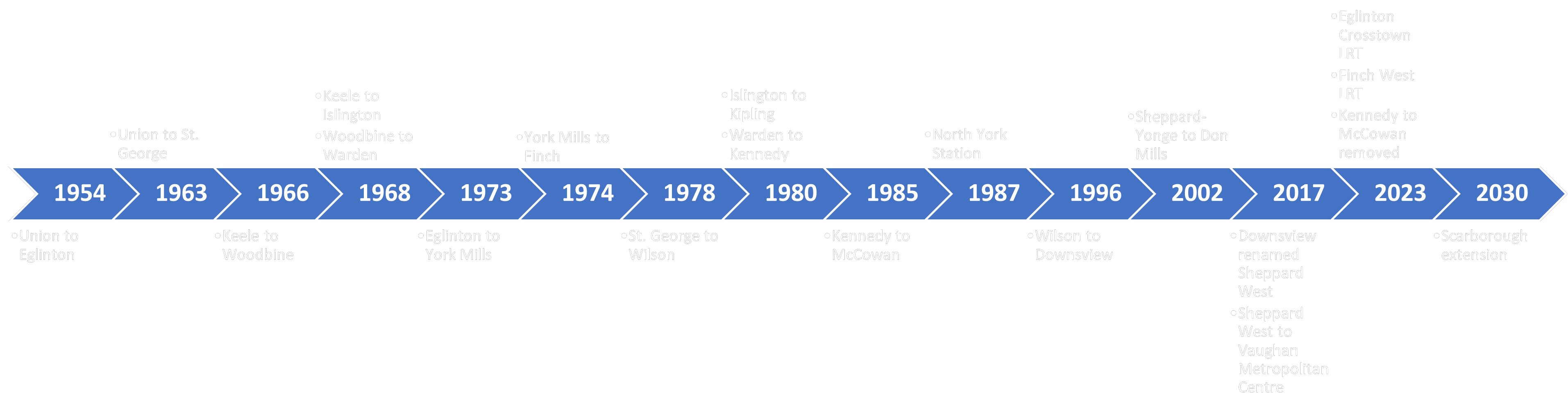
For some background, I am more familiar with Toronto’s subway network. Fortunately enough, I was able to visit Athens and explore the city by relying on their subway network. As of now, both of these cities have three subway lines, and are both undergoing construction of additional lines. My physical model displays the present subway networks to date for both cities, as the anticipated subway lines won’t be opening until 2030. Despite the hands-on creativity of the physical model, it cannot be modified or updated as easily as a virtual map. This is where I was inspired to add to my concept through a video animated map, as it visualizes the anticipated changes to both subway networks!
PHYSICAL MODEL:
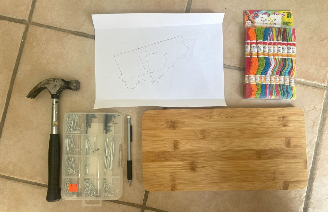
Materials Used:
- Paper (used for map tracing)
- Pine wood slab
- Hellman ½ inch nails
- Small hammer
- Assorted colour cotton string
- Tweezers
- Krazy glue
Methods and Process:
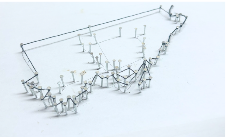
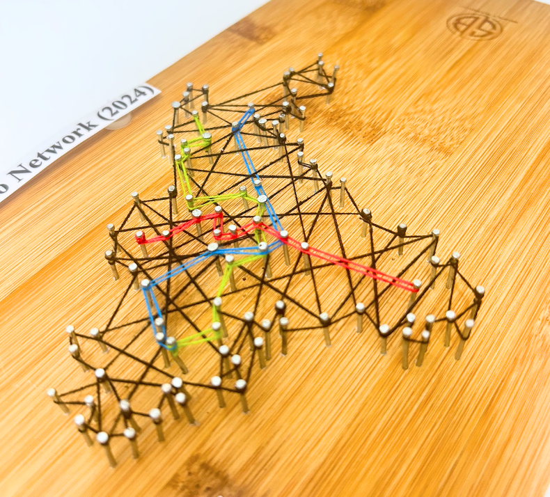
For the physical model, I wanted to rely on materials I had at home. I also required a blank piece of paper for a tracing the boundary and subway network for both cities. This was done by acquiring open data and inputting it into ArcGIS Pro. The precise data sets used are discussed further in my virtual model making. Once the tracings were created, I taped it to a wooden base. Fortunately, I had a perfect base which was pine wood. I opted for hellman 1/2 inch nails as the wood was not too thick and these nails wouldn’t split the wood. Using a hammer, each nail was carefully placed onto the the tracing outline of the cities and subway networks .
I did have to purchase thread so that I could display each subway line to their corresponding colour. The process of placing the thread around the nails did require some patience. I cut the thread into smaller pieces to avoid knots. I then used tweezers to hold the thread to wrap around the nails. When a new thread was added, I knotted it tightly around a nail and applied krazy glue to ensure it was tightly secured. This same method was applied when securing the end of a string.
Images of threading process:
City of Toronto Map Boundary with Tracing
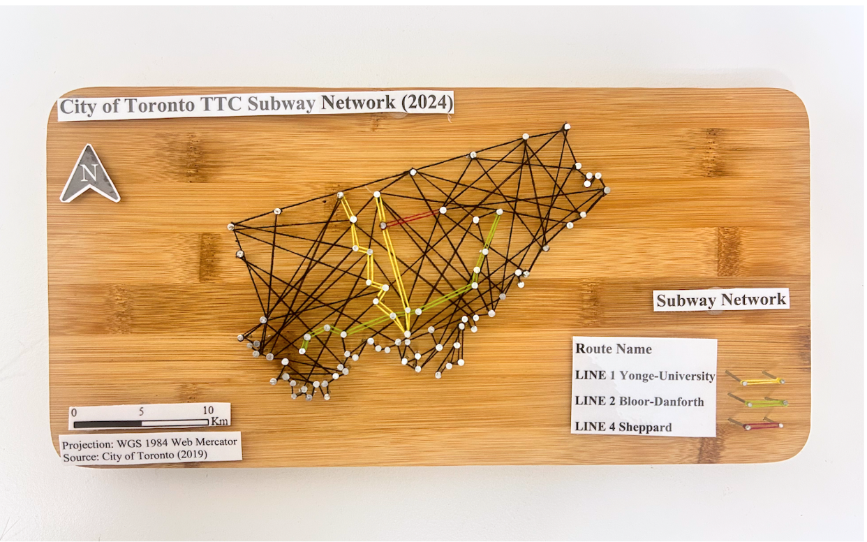
After threading the city boundary and subway network, the paper tracing was removed. I could then begin filling in the space of the boundary. I opted to use black thread for the boundary and fill, to contrast both the base and colours of the subway lines. The City of Toronto thread map was completed prior to the Athens thread map. The same steps were followed. Each city is on opposite sides of the wood base for convenience and to minimize the use of an additional wood base.
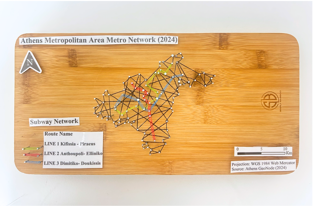
Of course, every map needs a title , legend, north star, projection, and scale. Once both of the 3D string maps were complete, the required titles and text were printed and laminated and added to the wood base for both 3D string maps. I once again used the nails and hammer with the threads to create both legends. Below is an image of the final physical products of my maps!
FINAL PHYSICAL MODELS:
City of Toronto Subway Network Model:

Athens Metropolitan Area Metro Network Model:
VIRTUAL MODEL:
To create the virtual model, I used ArcGIS Pro software to create my two maps and apply picture fill symbology to create a thread like texture. I’ll begin by discussing the open data acquired for the City of Toronto, followed by the Census Metropolitan Area of Athens to achieve these models.
The City of Toronto:
Data Acquisition:
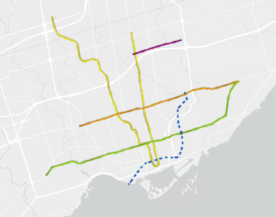
For Toronto, I relied on the City of Toronto open data portal to retrieve the Toronto Municipal Boundary as well as TTC Subway Network dataset. The most recent dataset still includes Line 3, but was kept for the purpose of the time series map. As for the anticipated Eglinton line and Ontario line, I could not find open data for these networks. However, Metrolinx created interactive maps displaying the Ontario Line and Eglinton Crosstown (Line 5) stations and names. To note, the Eglinton Crosstown is identified as a light rail transit line, but is considered as part of the TTC subway network.
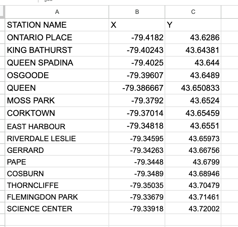
To compile the coordinates for each station for both subway routes, I utilized Microsoft Excel to create 2 sheets, one for the Eglinton line and one for the Ontario line. To determine the location of each subway station, I used google maps to drop a pin in the correct location by referencing the map visual published by Metrolinx.
Ontario Line Excel Table :
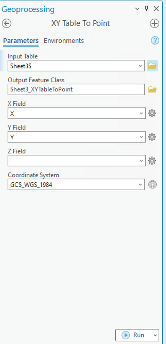
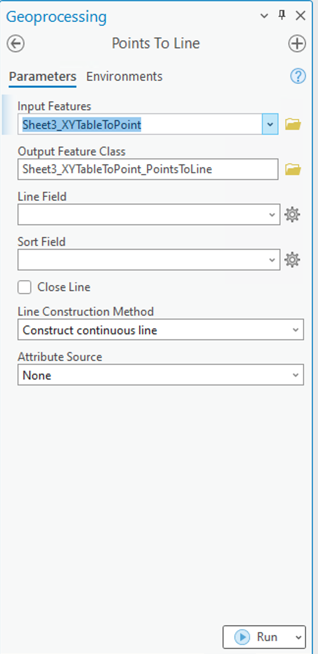
Using ArcGIS Pro, I used the XY Table to Point tool to insert the coordinates from each separate excel sheet, to establish points on the map. After successfully completing this, I had to connect each point to create a continuous line. For this, I used the Point to Line tool also in ArcGIS Pro.
XY Table to Point tool and Points to Line tool used to add coordinates to map as points and connect points into a continuous line to represent the subway route:
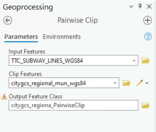
After achieving this, I did have to adjust the subway routes to be clipped within the boundary for The City of Toronto as well as Athens Metropolitan Area. I used the Pairwise Clip in the Geoprocessing pane to achieve this.
Geoprocessing pairwise clip tool parameters used. Note: The input features were the subway lines withe the city boundary as the clip features.
Athens Metropolitan Area:
Data Acquisition:
For retrieving data for Athens, I was able to access open data from Athens GeoNode I imported the following layers to ArcGIS Online; Athens Metropolitan Area, Athens Subway Network, and proposed Athens Line 4 Network which I added as accessible layers to ArcGIS online. I did have to make minor adjustments to the data, as the Athens metropolitan area data displays the neighbourhood boundaries as well. For the purpose of this project, only the outer boundaries were necessary. To overcome this, I used the merge modify feature to merge all the individual polygons within the metropolitan area boundary into one. I also had to use the pairwise clipping tool once again as the line 4 network exceeds the metropolitan boundary, thus being beyond the area of study for this project.
Adding Texture Symbology:
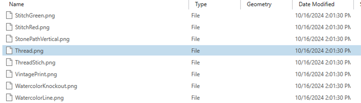
ArcGIS has a variety of tools and features that can enhance a map’s creativity and visualization. For this project , I was inspired by an Esri Yarn Map Tutorial. Given the physical model used thread, I wanted to create a textured map with thread. To achieve this, I utilized the public folder provided with the tutorial. This included portable network graphics (.png) cutouts of several fabrics as well as pen and pencil textures. To best mirror my physical model, I utilized a thread .png.
ESRI yarn map tutorial public folder:
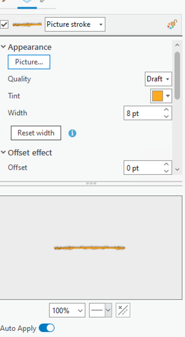
I added the thread .png images by replacing the solid fill of the boundaries and subway networks with a picture fill. This symbology works best with a .png image for lines as it seamlessly blends with the base and surrounding features of the map. The thread .png image uploaded as a white colour, which I was able to modify its colour according to the boundary or particular subway line without distorting the texture it provides.
For both the Toronto and Athens maps, the picture fill for each subway line and boundary was set to a thread .png with its corresponding colour. The boundaries for both maps were set to black as in the physical model, where the subway lines also mirror the physical model which is inspired by the existing/future colours used for subway routes. Below displays the picture symbology with the thread .png selected and tint applied for the subway lines.
City of Toronto subway Networks with picture fill of thread symbology applied:
The base map for the map was also altered, as the physical model is placed on a wood base. To mirror that, I extracted a Global Background layer from ArcGIS online, which I modified using the picture fill to upload a high resolution image of pine wood to be the base map for this model. For the city boundaries for both maps, the thread .png imagery was also applied with a black tint.
PUTTING IT ALL TOGETHER:
After creating both maps for Toronto and Athens, it was time to put it into an animation! The goal of the animation was to display each route, and their opening year(s) to visually display the evolution of the subway system, as my physical model merely captures the current subway networks.
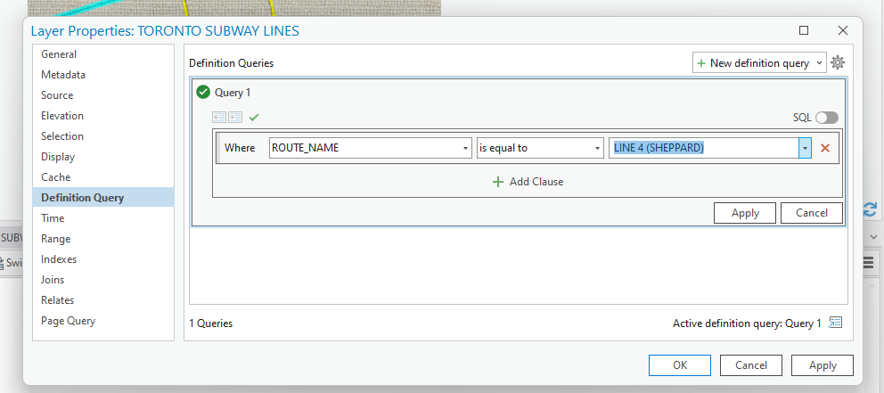
I did have to play around with the layers to individually capture each subway line. The current subway network data for both Toronto and Athens contain all 3 of their routes in one layer, in which I had to isolate each for the purpose of the time lapse in which each route had to be added in accordance to their initial opening date and year of most recent expansion. To achieve this, I set a Definition Query for each current subway route I was mapping whilst creating the animation.
Definition query tool accessed under layer properties:
Once I added each keyframe in order of the evolution of each subway route, I created a map layout for each map to add in the required text and titles as I did with the physical model. The layouts were then exported into Microsoft Clipchamp to create the video animation. I imported each map layout in .png format. From there, I added transitions between my maps, as well as sound effects !
CITY OF TORONTO SUBWAY NETWORK TIMELNE:
ATHENS METROPOLITAN AREA METRO TIMELINE:
LIMITATIONS:
While this project allowed me to be creative both with my physical and virtual models, it did present certain limitations. A notable limitation to this geovisualization for the physical model is that it is meant to be a mere visual representation of the subway networks.
As for the virtual map, although open data was accessible for some of the subway routes, I did have to manually enter XY coordinates for future subway networks. I did reference reputable maps of the anticipated future subway routes to ensure accuracy. Furthermore, given my limited timeline, I was unable to map the proposed extensions of current subway routes. Rather, I focused on routes currently under construction with an anticipated completion date.
CONCLUSION:
Although I grew up applying my creativity through creating homemade crafts, technology and applications such as ArcGIS allow for creativity to be expressed on a virtual level. Overall, the concept behind this project is an ode to the evolution of mapping, from physical carvings to the virtual cartographic and geo-visualization applications utilized today.