Geovisualization Project Assignment, Toronto Metropolitan University, Department of Geography and Environmental Studies, SA8905 – Cartography and Geovisualization, Fall 2025
By Payton Meilleur
Exploring Canada’s Ecozones From Coast to Coast
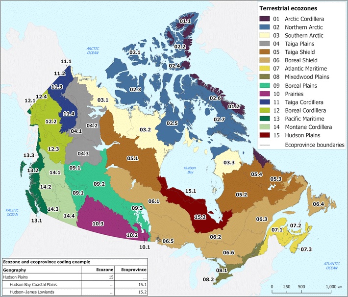
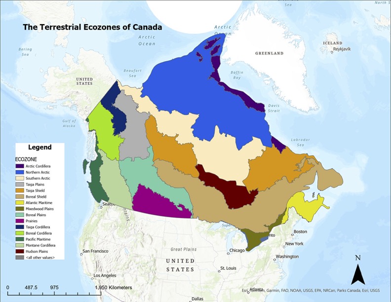
Canada is one of the most ecologically diverse countries in the world, spanning Arctic glaciers, dense boreal forests, sweeping prairie grasslands, temperate rainforests, wetlands, mountain systems, and coastal environments. These contrasting landscapes are organized into 15 terrestrial ecozones, each defined by shared patterns of climate, vegetation, soil, geology, and wildlife. Understanding these long-established ecological regions offers a meaningful way to appreciate Canada’s natural geography, and provides a foundation for environmental planning, conservation, and education.
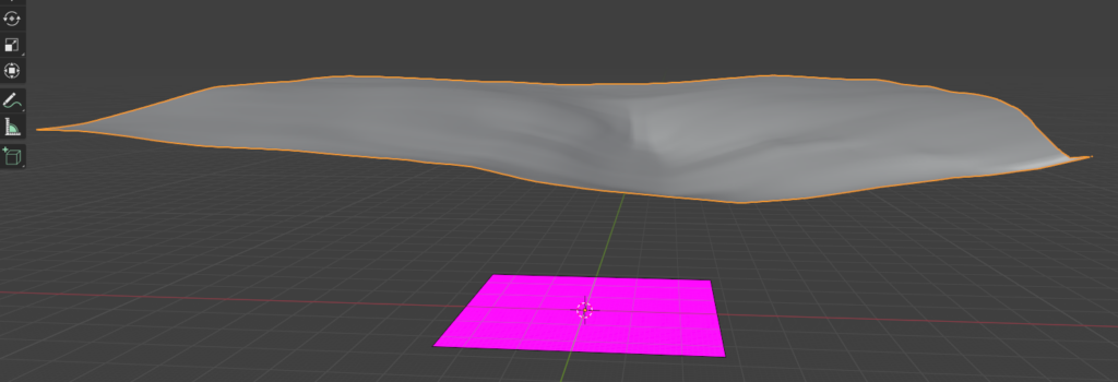
For this project, I set out to create a three-dimensional, tactile model of Canada’s ecozones using layered physical materials. The goal was to translate geographic data into a physical form, showing how soil, bedrock, and land cover differ across the country. This model is accompanied by a digital mapping component completed in ArcGIS Pro, which helped guide the design, structure, and material choices for each ecozone.
This blog post outlines the context behind Canada’s ecozones, the datasets used to build the maps, and the process of turning digital ecological information into a physical, layered 3D model using natural and recycled materials.
Understanding the Terrestrail Ecozones
Ecozones form the broadest unit of the Ecological Framework of Canada, a national classification system used to organize environments with similar ecological processes, evolutionary history, and dominant biophysical conditions. Rather than describing individual landscapes, ecozones function as large-scale spatial units that group Canada’s terrain into major ecological patterns such as the Arctic, Cordillera, Plains, Shield, and Maritime regions. These zones reflect long-term interactions between climate, soils, landforms, vegetation, and geological history, and serve as a foundation for national-level environmental monitoring, conservation planning, and spatial data analysis.
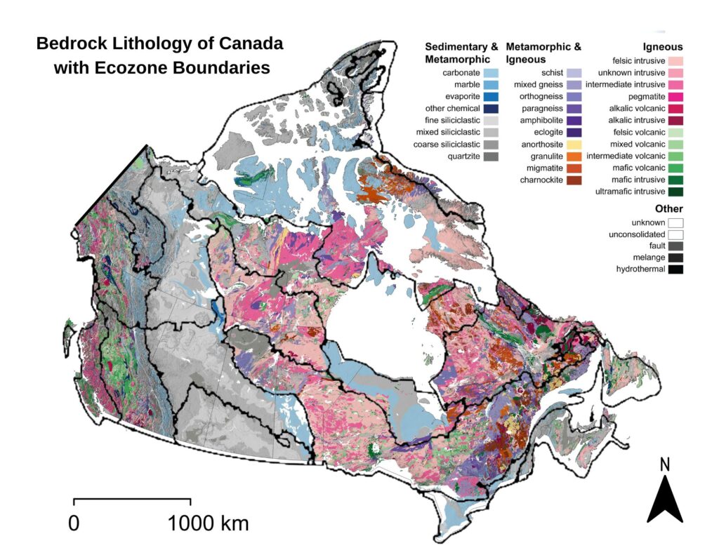
Within this framework, datasets such as bedrock geology, soil order, and land cover provide further ecological detail. Bedrock influences surface form and drainage; soil orders reflect dominant pedogenic processes; and land cover shows the distribution of vegetation and surface characteristics. Together, these national spatial datasets support a deeper understanding of how ecological conditions vary across the country, and they informed both the digital mapping and the material choices used in my 3D physical model.
To interpret Canada’s ecozones more clearly, it is helpful to break down their naming structure. Each ecozone name combines an ecological prefix with a physiographic suffix, and these two components together describe the zone’s overall character.
- The Zone Type describes the ecological/climatic zone
- The Physiographic Region Type describes the physiographic region or geological province
| Zone Type | Meaning | Environmental Traits |
|---|---|---|
| Arctic | High-latitude polar region | Tundra, permafrost, cold/dry climate, sparse vegetation |
| Taiga | Subarctic transitional forest | Sparse trees, stunted conifers, cold winters, thin soils |
| Boreal | Northern coniferous forest | Dense spruce–fir–pine forests, wetlands, glacial terrain |
| Prairies | Grassland lowlands | Temperate climate, fertile soils, agriculture, open plains |
| Mixedwood | Transition between deciduous & coniferous forest | Mixed forest canopy, deeper soils, agriculture + forest |
| Pacific | West Coast ecological region | Maritime climate, temperate rainforest, high precipitation |
| Atlantic | East Coast ecological region | Maritime climate, mixed forest, coastal influence |
| Hudson | Hudson Bay lowlands | Peatlands, poor drainage, cold climate, organic soils |
| Physiographic Region Type | Meaning | Landscape Traits |
|---|---|---|
| Cordillera | Mountain systems and high relief regions | Steep terrain, alpine climate zones, variable soils |
| Shield | Precambrian bedrock of the Canadian Shield | Exposed rock, thin soils, many lakes, glacial features |
| Plains | Lowland interior plains | Sedimentary bedrock, rolling terrain, thicker soils |
| Maritime | Coastal lowlands and mixed forest | Ocean-influenced climate, forested lowlands |
Digital Methods: Building the Ecological Layers in ArcGIS Pro
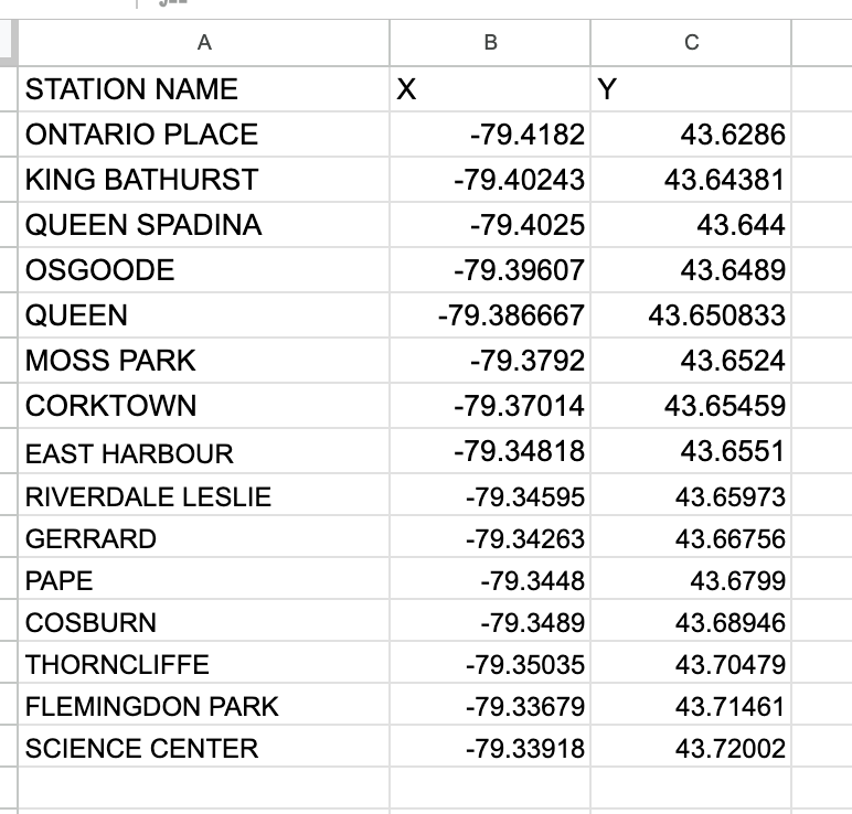
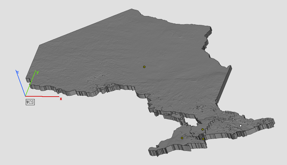
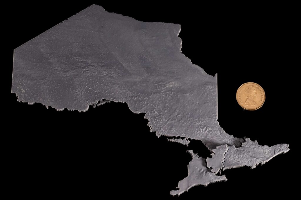
To guide the design of the 3D model, I assembled a set of national-scale spatial datasets representing the major ecological layers of Canada’s terrestrial environment. These included the ecozone boundaries, 2020 land cover, soil order, and bedrock lithology, all accessed through the Government of Canada’s Open Data portal. Each dataset was projected into NAD83 / Canada Albers Equal Area Conic, the recommended projection for ecological and continental analyses.
The ecozone boundaries were used as the spatial framework into which all other layers were integrated. The land cover raster provided information on surface vegetation and terrain characteristics, while the soil order dataset showed how pedogenic processes vary across the country. Bedrock lithology offered a deeper geological layer, distinguishing igneous, metamorphic, and sedimentary provinces across Canada’s major physiographic regions.
In ArcGIS Pro, each raster dataset was clipped to the ecozone boundaries to isolate the surface conditions, soil regimes, and bedrock types present within each zone. This process produced a series of layered maps that showed how ecological characteristics vary across Canada at the ecozone scale. By visualizing these datasets together (land cover on top of soil order and bedrock geology) it became possible to examine the vertical ecological structure of each ecozone and understand the relationships between surface patterns, subsurface materials, and underlying geological formations. These GIS outputs were paired with descriptive information from the Ecological Framework of Canada (ecozones.ca), which provides qualitative detail about the depth of soils, dominant surface features, and the broader geomorphological context of each ecozone. Together, these resources informed the conceptual structure of the 3D model developed in the next stage of the project.


Physical Methods: Constructing the 3D Ecozone Model
The goal of the physical model was to translate Canada’s ecological geography into a tactile, layered form that makes the structure of each ecozone visible and intuitive. While the digital maps reveal patterns across the landscape, the 3D model emphasizes how surface cover, soil, and bedrock stack vertically to shape ecological conditions. Each ecozone was built as an individual “bin” shaped roughly to its boundary, with a transparent side panel exposing the internal layers—bedrock at the base, soil in the middle, and surface materials on top. The thickness, texture, and colour of these layers were informed by the Ecological Framework of Canada, which outlines typical soil profiles, surficial materials, and geological contexts within each ecozone, and by the national spatial datasets processed in ArcGIS Pro. Together, these sources guided the construction of bins that physically represent the vertical ecological structure underlying Canada’s major terrestrial regions.
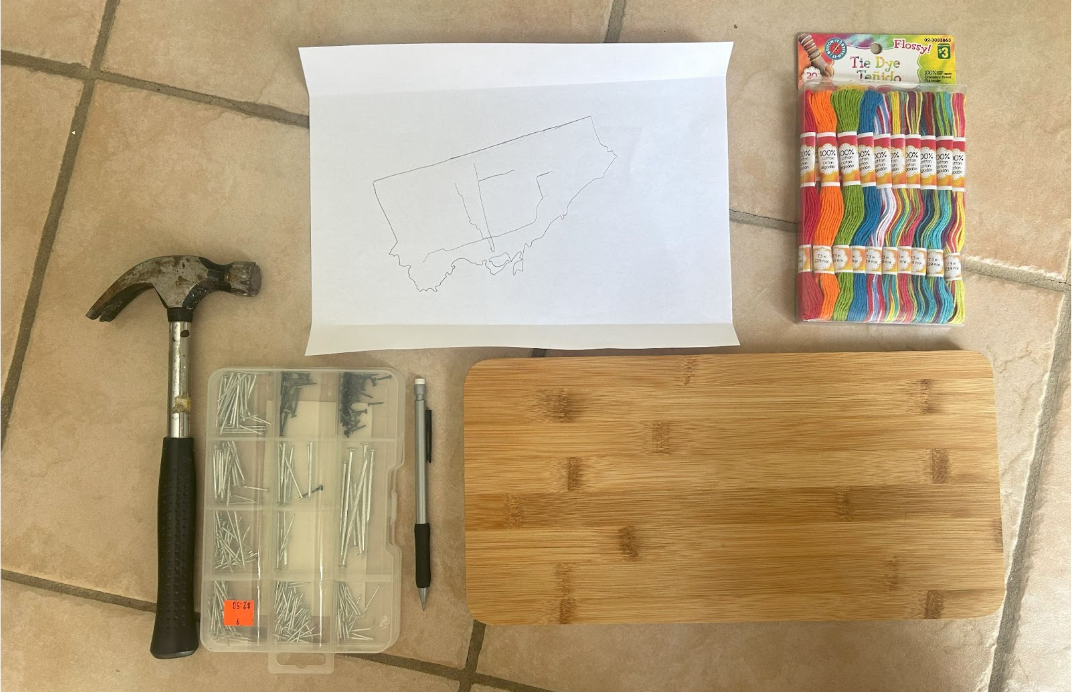
Materials Used
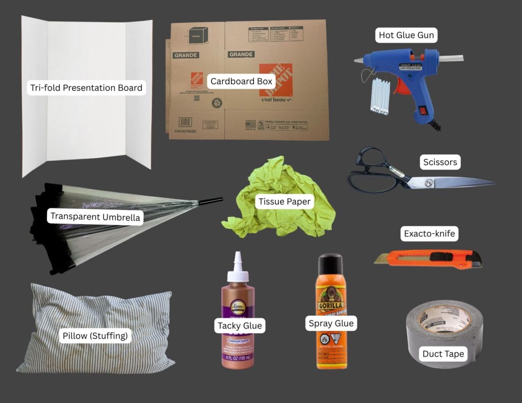
Structural Components (See Figure 6.)
- Base structure: tri-fold presentation board
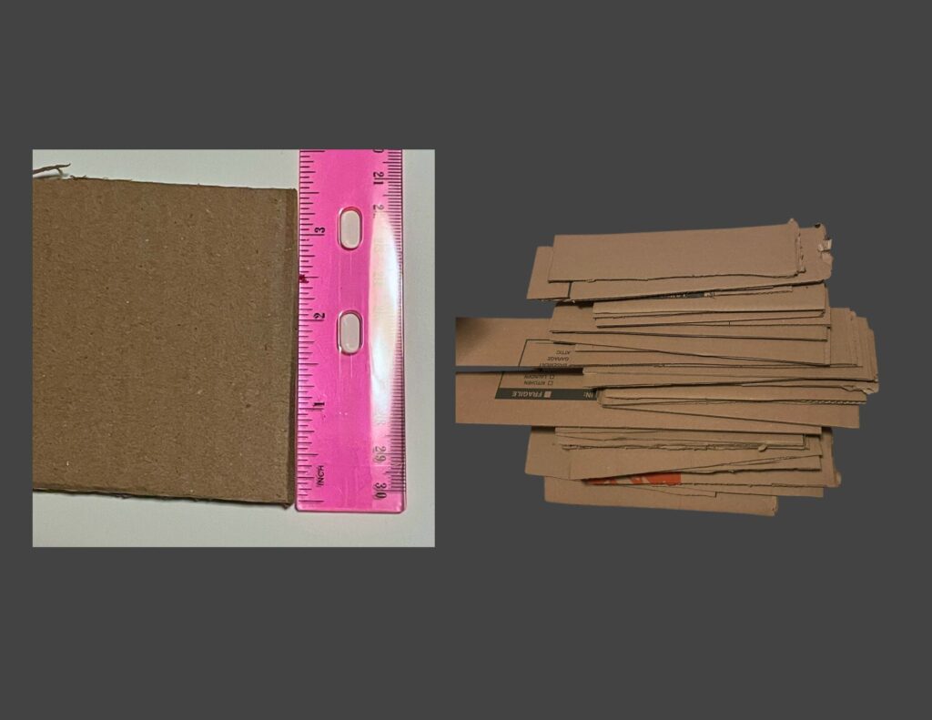
- Bin walls: recycled cardboard boxes
- Viewing window: broken transparent umbrella
- Filling: repurposed pillow stuffing, recycled tissue paper
- Adhesives: hot glue gun, tacky glue, spray glue, duct tape
- Tools: scissors, exacto-knife
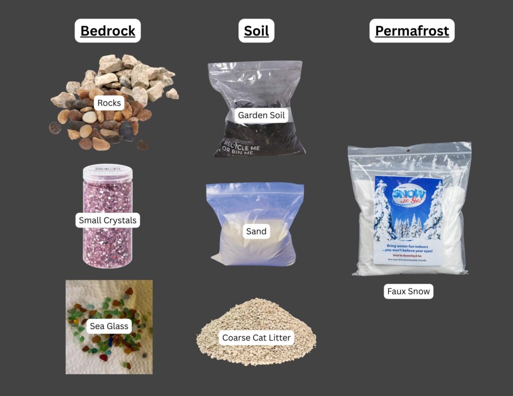
Layered Ecological Materials (See Figure 7.)
- Bedrock: collected rocks of various colours, collected sea glass shards, small crystals
- Soil: collected soil, bagged gardening soil, sand, coarse cat litter
- Permafrost: leftover faux snow from holiday decorations
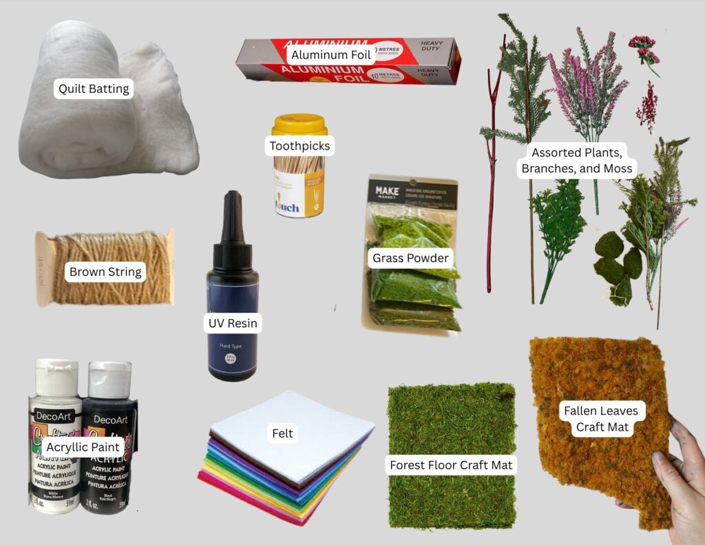
Surface Features and Detailing (See Figure 8.)
- Land cover base: thrifted felt in various colours (to match each surface cover type)
- Surface cover:
– Forested areas: dried moss, forest floor craft mat, artificial grass powder
– Agricultural areas: ‘fallen leaves’ craft mat, shredded brown string
– Snowed areas: thrifted quilt batting
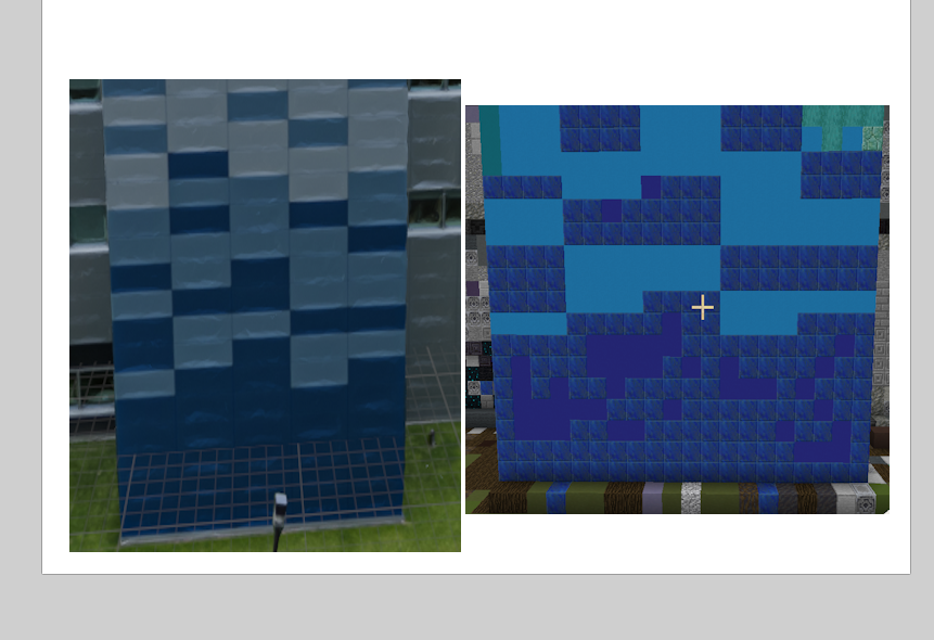
– Wetlands/lakes: coloured UV resin - Mountains: painted tinfoil
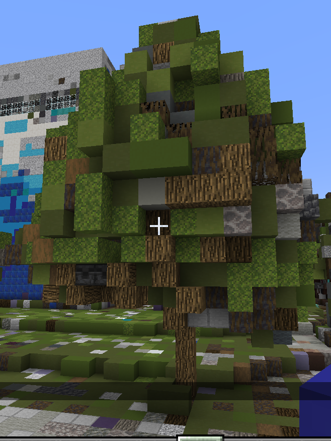
- Trees and shrubs:
– Redwood forest: collected dried Red Twig Dogwood branches and cedar leaves
– Deciduous forest: toothpicks with painted cotton-ball canopies
– Coniferous forest: dried pine needles, repurposed plastic branches
– Berries: collected styrofoam berries - Colouring Materials: thrifted black, white, blue, and red acryllic paint
Constructing the 3-D Ecozone Model
The following steps summarize the process of building the 3D ecozone bins, from shaping the structures to layering bedrock, soil, and surface materials.
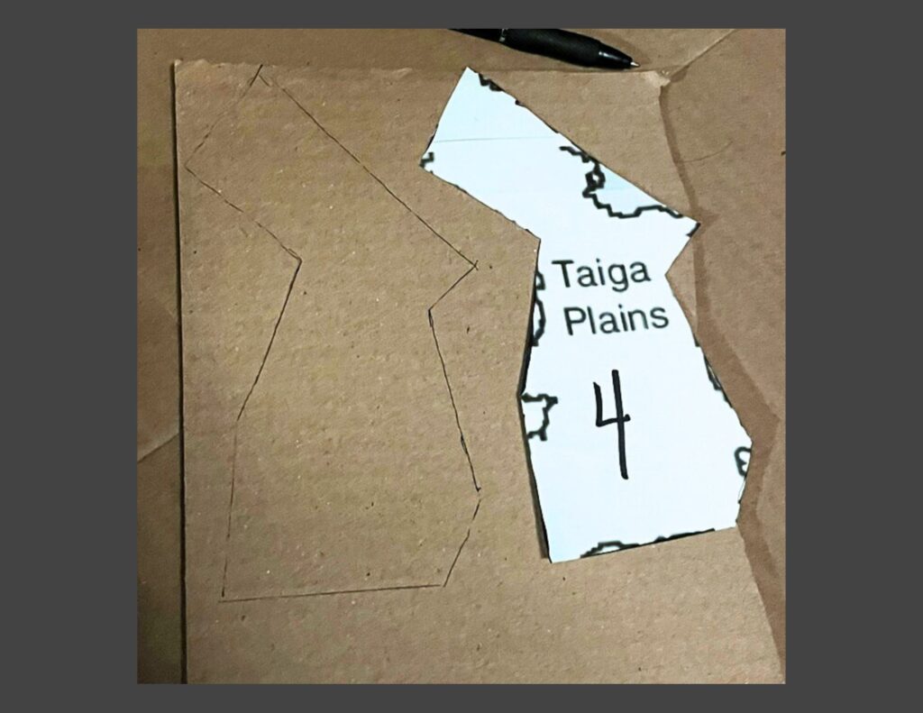
Step 1. Trace and Cut the Ecozone Shapes
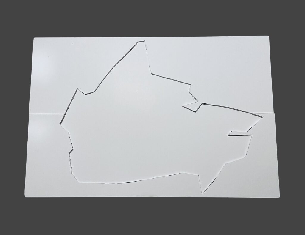
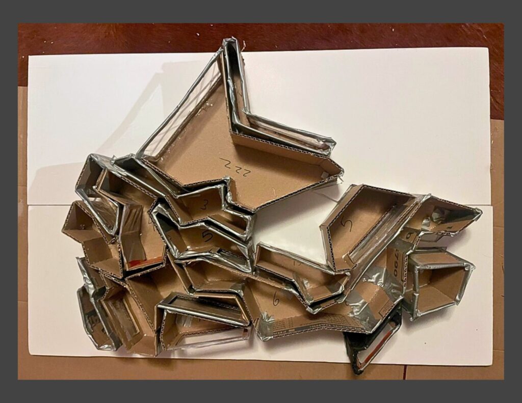
Ecozone boundaries were exported from ArcGIS Pro, printed, and used as templates for the physical model. The outlines were traced onto paper and cut out to establish the footprint of each bin. In addition, the overall outline of Canada was cut into the top layer of the tri-fold presentation board to create a recessed “frame” where the ecozone bins would sit securely during assembly.

Step 2. Cut the Cardboard Bases and Wall Pieces
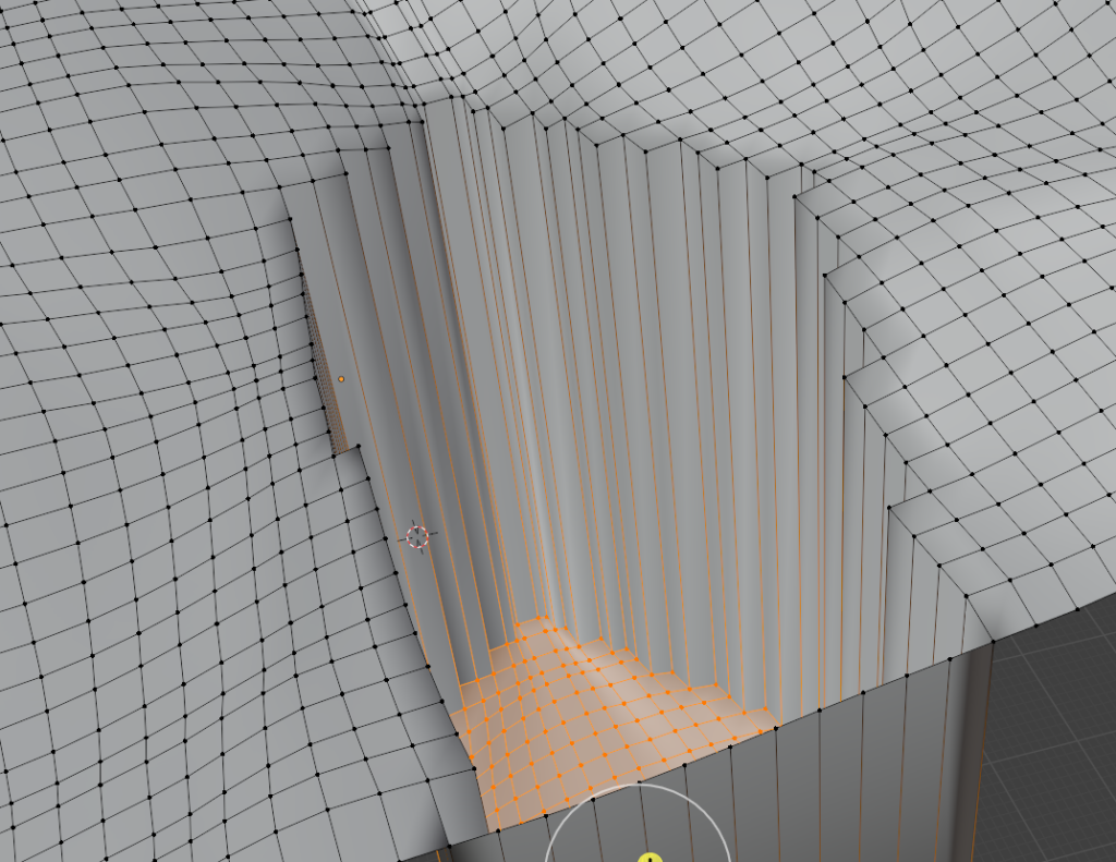
Using the paper templates from Step 1, each ecozone boundary was traced onto recycled cardboard and cut out to form a sturdy base. Additional cardboard strips were measured to a uniform height of 3.5 inches and cut to length so they could later be attached as the vertical walls for each bin.
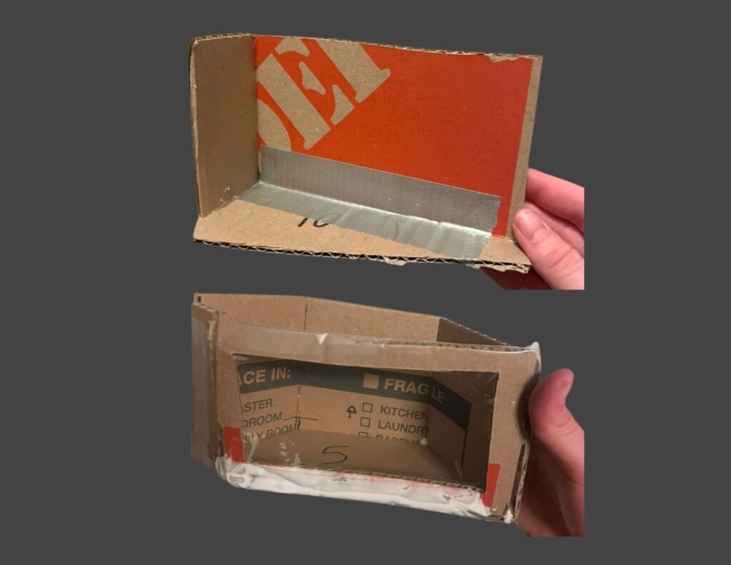
Step 3. Build the Bin Walls and Viewing Windows
The cardboard wall strips were bent and glued along the perimeter of each base using hot glue, then reinforced with duct tape to create durable, open-top bins. A rectangular cut-out was made on one side of each bin, and clear plastic panels cut from a broken transparent umbrella were glued in place to form viewing windows for the internal layers.
Step 4. Test-Fit the Bins in the Presentation Board Frame
Once all bins were constructed, they were placed into the recessed outline cut into the tri-fold presentation board to test the overall fit. This dry run helped ensure the ecozones aligned properly with the national outline. Minor adjustments to edge trimming and bin alignment were made where necessary before moving on to internal layering.
Step 5. Add Internal Support Layers
Before adding the ecological materials, each bin received an internal support base. Pillow stuffing, crumpled tissue paper, and shaped tinfoil were added as lightweight filler to elevate the inner floor where needed and provide structure for the bedrock, soil, and surface layers applied in Step 6.
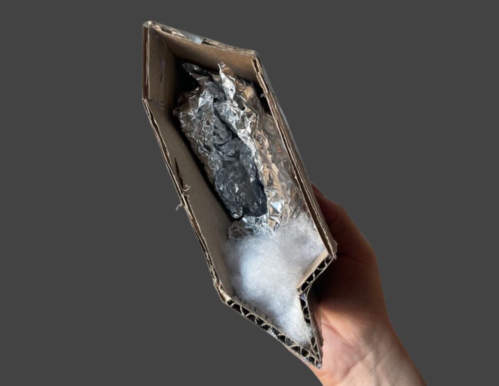

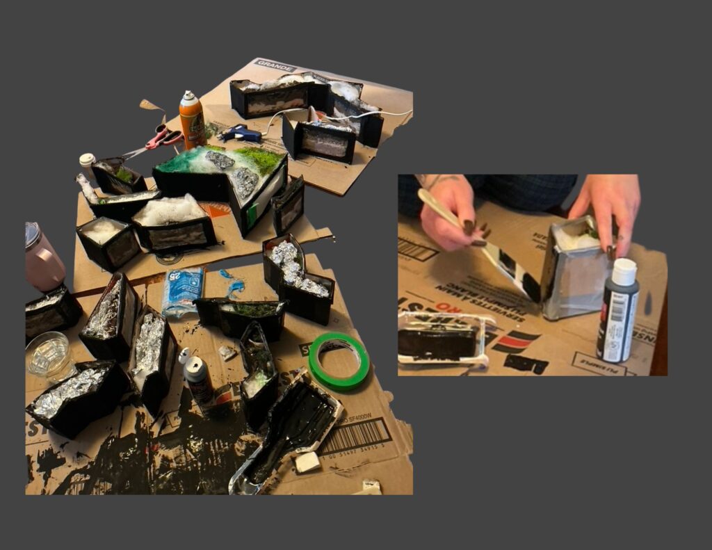
Step 6. Fill the Bins with Bedrock and Soil Layers
Each bin was filled just high enough for the internal layers to be visible through the viewing window. Materials such as rocks, gravel, sand, soil, and artificial snow were added to represent the approximate bedrock and soil conditions characteristic of each ecozone. These layers created the vertical structure that would support the surface land cover added later.

Step 7. Paint the Exterior of the Bins
After all bins were filled, their outer surfaces were painted black to create a cohesive and visually unified appearance. This step helped the ecozones read as a single model while keeping the focus on the internal layers and surface textures.
Step 8. Adding the Land Cover Surface
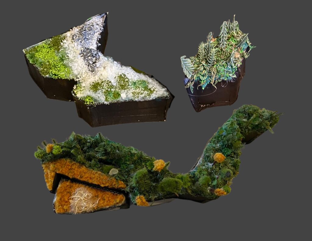
Once the bins were painted, each one was topped with a layer of felt in a colour chosen to match its dominant land cover type. The felt provided a level, uniform base for adding surface materials. On top of this foundation, land-cover textures (such as forest-floor matting, moss, agricultural matting, snow batting, etc.) were added to represent the ecological characteristics of each ecozone

Step 9. Adding Landscape Features
Landscape features were added to give each ecozone its characteristic surface form. Mountains were shaped from tinfoil and painted for texture, while natural and repurposed materials were trimmed into trees, shrubs, and ground vegetation. Lakes and wetlands were created by curing coloured UV resin. Powdered grass, moss, faux snow, and all other surface elements were secured in place using a combination of tacky glue, spray adhesive, and hot glue, ensuring the finished landscapes were stable and cohesive across each bin.

Step 10. Assembling the 3D Model
Once all surface detailing was complete, the ecozone bins were placed back into the presentation-board base. Each piece was adjusted to ensure that the boundaries aligned cleanly, the bins fit together without gaps, and the visible land cover on the surface and sides accurately reflected the geographic and ecological patterns shown in the digital maps. This final assembly brought the full three-dimensional model together as an integrated representation of Canada’s terrestrial ecozones.

Conclusion
This project brought together digital mapping, ecological research, and hands-on model building to translate national-scale environmental data into a tangible format. By combining GIS analysis with layered physical materials, the model highlights how geology, soils, and surface cover interact to shape Canada’s major ecological regions. Although simplified, the final product offers an accessible way to visualize the structure of the Canadian Ecological Framework’s Terrestrial Ecozones and demonstrates how spatial data can be reinterpreted through creative, tactile design.