Geovis Project Assignment, TMU Geography, SA8905, MSA Fall 2025
By Roseline Moseti
Critical decision-making requires access to real-time spatial data, but traditional GIS workflows often lag behind source updates, leading to delayed and sometimes inaccurate visualizations. This project explores an alternative, a Full-Stack Geovisualization Architecture that integrates the database, server and client forming a robust pipeline for low-latency spatial data handling. Unlike conventional systems, this architecture ensures every update in the SQL database is immediately visible through web services on the user’s display, preserving data integrity for time-sensitive decisions. By bridging the gap between static datasets and interactive mapping, the unified platform makes it easier and more intuitive for users to understand complex spatial relationships. Immediate synchronization and a user-friendly interface guarantee that decision-makers rely on the most accurate up to date spatial information when it matters the most.
The Full-Stack Pipeline
The term Full-Stack is key because it means that one has control over integration of every layer of the application ensuring seamless synchronization between the raw data and its interactive visualization.
Part 1: Establish the Database Connection
The foundation for this project is reliable data storage. For this project we use Microsoft SQL Server to host our key datasets; Wastewater plants, Lakes, Rivers as well as the Boundary on Ontario. In this initial step the database connection is established between the local desktop GIS environment (ArcGIS) and the Database through the ArcGIS Database Connection file (.sde).
The foundation for this project is reliable data storage. For this project we use Microsoft SQL Server to host our key datasets; Wastewater plants, Lakes, Rivers as well as the Boundary of Ontario. In this initial step the database connection is established between the local desktop GIS environment (ArcGIS) and the Database through the ArcGIS Database Connection file (.sde).
Once the connection is verified, ArcGIS tools are used to import the shapefile data directly into the SQL Server structure. This transforms the SQL database into an Enterprise Geodatabase, which is a spatial data model capable of storing and managing complex geometry.
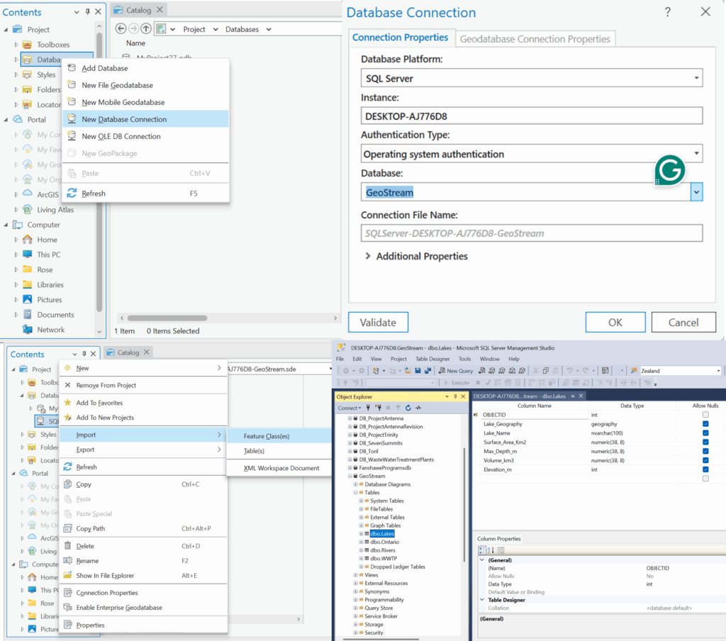
The result is a highly structured repository where all attribute data and spatial features are stored, managed and indexed by the SQL engine.
Part 2: The Backend: Data Access & APIs
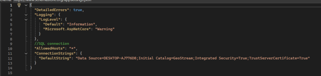
With the spatial data centralized in the SQL Database, the next part is creating the connection to serve this data to the web. The Backend is the intermediary between the database and the end-user display. The crucial first step is establishing the programmatic connection to the database using a secure Connection String. The key aspects here is the server name of the database and the name of the database itself as without the correct details here the data won’t be retrieved from the database.
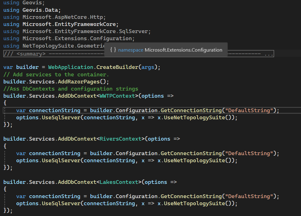
To translate the raw database connection into usable web services, ASP.NET Core and Entity Framework are used for data management. Setting this up, the API endpoints that the front-end application will call are set. This structure ensures that the web application interacts only with the secure, controlled services provided by the backend, maintaining both security and data integrity.
When a user loads the site, the entire system is triggered, and the user’s web browser sends a request to the server and the server using C# accesses the database, pulls the relevant spatial data and transforms it. The server packages the processed data into a web-ready format and sends it back to the browser. The browser instantly reads that package and draws the interactive map on your screen.
Part 3: Data Modelling: Mapping the Shapefiles to the Code
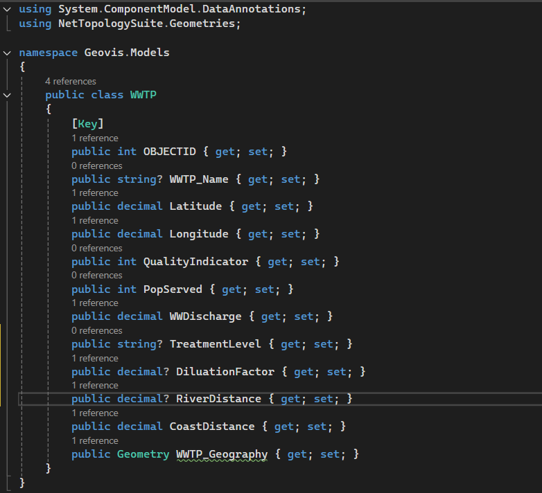
Before spatial data can be accessed by the backend services, the application must understand how the data is structured and how it corresponds to the tables created in the SQL Database. This is handled by the data model for each of the shapefiles, reflecting the individual columns in each of the shapefiles.
The data context is where the C# model is explicitly mapped to the database structure using Entity Framework Core, ensuring data synchronization and proper interpretation.
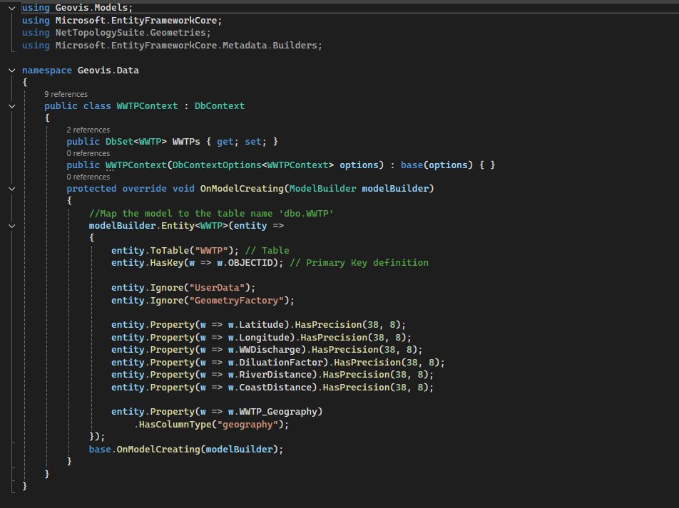
This robust modelling process ensures that the data pulled from the SQL Database is always treated as the original spatial data, ready to be processed by the backend and visualized on the frontend.
Part 4: Data Translation Engine (C# and GeoJSON)
The SQL Database stores location data using accurate, specific data types that are native to the server environment (e.g., geometry or geography). A web browser doesn’t understand these data types and it needs data delivered in a simpler, lighter, and universally readable format. This is where the translation engines come into work and it’s powered by C# back-end logic.
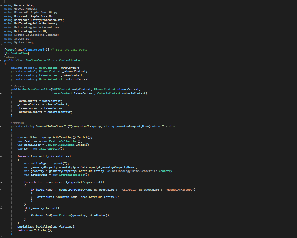
C# acts as the translator and it pulls the coordinate data from the SQL database. The data is then converted into GeoJSON which is a simple standardized, text-based format that all modern web mapping libraries understand. By converting everything to GeoJSON, the C# back-end creates a single, clean package that ensures data consistency and allows the map to load quickly and without errors, regardless of the user’s device or operating system.
Part 5: The Front-end: Interactive Visualization
The most visible piece of the puzzle is the Interactive Presentation. This is the key deliverable which entails embedding a powerful Geographic Information System (GIS) entirely within the user’s browser. The traditional desktop GIS software is bypassed, and users don’t need to install anything, purchase licenses or even use any complex interface but just open a web page.
The real power lies in the integration between the frontend and the backend services established. When a user loads the site, the entire system is triggered and the user’s web browser sends a request to the server and the server using C# API accesses the database, pulls the relevant spatial data and transforms it. The server packages the processed data into a web-ready format and sends it back to the browser. The browser instantly reads that package and draws the interactive map on the screen.
Once the GeoJSON data arrives, a JavaScript mapping library is used to render the interactive map. The presentation is a live tool designed for exploring data. Users can click on any WWTP icon or river line to instantly pull up its database attribute. The map is displayed alongside all supporting elements that provide further details on the browser without a user needing to leave the browser window.
Looking Ahead!
The Full-Stack architecture is not just for current visualization but it’s about establishing a powerful scalable platform for the future. As the server side is already robust and designed to process large geospatial datasets, it is perfectly created for integration of more advanced features. This structure allows for seamless addition of modules for complex analysis like using Python for predictive simulations or proximity modeling. The main benefit is that when these complex server-side analyses are complete, the results can be immediately packaged into GeoJSON and visualized on the existing map interface, turning static data into dynamic, predictive insights.
This Geovis project is designed to be the foundational geospatial data hub for Ontario’s water management, built for both current display needs and future analytical challenges.
See you on the second edition!


.gif)