Emma Hauser
Geovis Project Assignment, TMU Geography, SA8905, Fall 2025
Hi everyone, welcome to my final Geovisualization Project tutorial. With this project, I wanted to combine my love of watercolour painting with cartography. I used Catalyst Professional, ArcGIS Pro, and watercolours to transform Landsat imagery spanning the years 1972 to 2025 into blocks of colour representing periods of landform expansion at Leslie Street Spit. I also made an animated GIF to help illustrate the process.
Study Area
Just to give you a bit of background to the site, Leslie Spit is a manmade peninsula on the Toronto waterfront, made up of brick and concrete rubble from construction sites in Toronto starting in 1959. It was intended to be a port-related facility, but by the early 1970s, this use case was no longer relevant, and natural succession of vegetation had begun. The landform continued to expand through lakefilling, as did the vegetation and wildlife, and by 1995 the Toronto and Region Conservation Authority started enhancing natural habitats, founding Tommy Thompson Park.
Post Classification Change Detection
The Landsat program has been providing remotely sensed imagery since 1972, at which time the Baselands and “Spine Road” had been constructed. Pairs of Landsat images can be compared by classifying the pixels as land or water in Catalyst Professional using an unsupervised classification algorithm, and performing “delta” or post classification change detection in ArcGIS Pro using the Raster Calculator to determine areas that have undergone landform expansion in that time period. The tool literally subtracts the pixel values denoting land or water of a raster at an earlier date from a raster at a later date in order to compare them and detect change. If we perform this process seven times, up until 2025, we can get a near complete picture of the land base formation of the Spit and can visualize these changes.
Let’s begin!
Step 1: Data Collection from USGS EarthExplorer
The first step is to collect 9 images forming 7 image pairs from USGS EarthExplorer. I searched for images that had minimal cloud cover covering the extent of Toronto.

For the year 1985, we need to double up on images in order to transition from the Multispectral Scanner sensor with 60m resolution to the Thematic Mapper sensor with 30m resolution. 1980 MSS and 1985 MSS will form a pair, and 1985 TM and 1990 TM will form a pair.
Step 2: Data Processing in Catalyst Professional
Now we can begin processing our images. All images must be data merged either manually (using the Translate and Transfer Layers Utilities) or using the metadata MTL.txt files (using the Data Merge tool) to join each image band together and subset (using the Clipping/Subsetting tool) to the same extent. The geocoded extent is:
Upper left: 630217.500 P / 4836247.500 L
Lower right: 637717.500 P / 4828747.500 L
Using the 2025 image as an example, my window looked like this:

I started a new session of Unsupervised Classification and added two 8 bit channels.
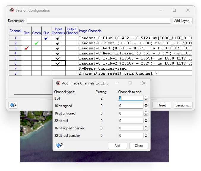
I specified the K-Means algorithm with 20 maximum classes and 20 maximum iterations.
I used Post-Classification Analysis (Aggregation) to assign each of the 20 classes to an information class. These classes are Water and Land. I made sure all classes were assigned and I applied the result to the Output Channel.

I got this result:

I repeated this process for all images. For example, 1972 looked like this:

I saved all of the aggregation results as .pix files using the Clipping/Subsetting tool.
Step 3: Data Processing, Visualization, and GIF-making in ArcGIS Pro
We are ready to move onto our processing and visualization in ArcGIS Pro. Here, we will be performing the post classification or “delta” change detection.
I added the aggregation result .pix files to ArcGIS Pro. I exported the rasters to GRID format. The rasters now had values of 0 (No Data), 21 (Water), and 22 (Land). I used the Raster Calculator (Spatial Analyst) to subtract each earlier dated image from the next image in the sequence. So, 1974 minus 1972, 1976 minus 1974, and so on.
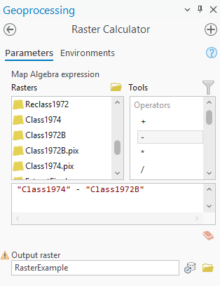
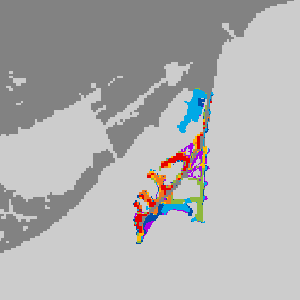
I got this result (with masking polygon included, explanation to follow):

The green (0) represents no change, the red (1) represents change from Water to Land (22 – 21), and the grey (-1) represents change from Land to Water (21 – 22).
I drew a polygon (shown in white) around the Spit so we can perform Extract by Mask (Spatial Analyst). This will clip the raster to a more specific extent.
I symbolized the extracted raster’s values of 0 and -1 with no colour and value 1 as red. We now have the first land area change raster for 1972 to 1974.
I repeated this for all time periods, symbolizing the portions of the raster with value 1 as orange, yellow, green, blue, indigo, and purple.
We can now begin our animation. I assigned each change raster its appropriate time period in the Layer Properties. A time slider appeared at the top of my map.
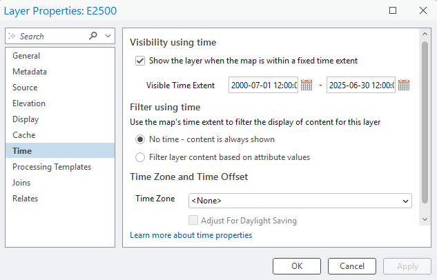
I added a keyframe for each time period to my animation by sliding to the correct time and pressing the green “+” button on the timeline. I used Fixed transitions of 1.5 seconds for each Key Length and extra time (3.0 seconds) at beginning and end to showcase the base raster and the finished product.

I added overlays (a legend and title) to my map. I ensured the Start Key was 1 (first) and the End Key was 9 (last) so that the overlays were visible throughout the entire 13.5 second animation.
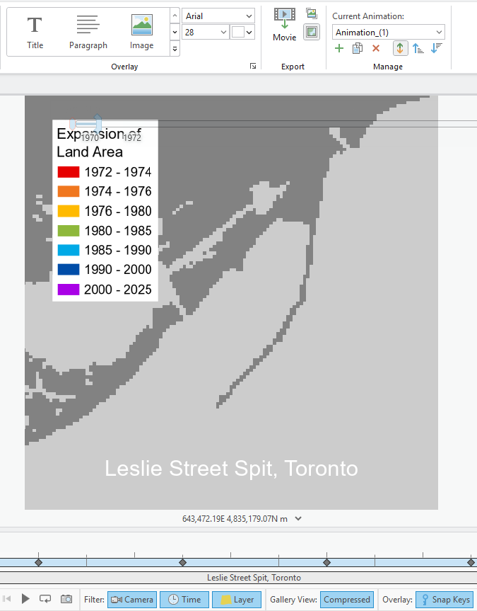
I exported the animation as a GIF – voila!

Step 4: Watercolour Map Painting
To begin my watercolour painting, I used these materials:
- Pencil and eraser
- Drafting scale (or ruler)
- Watercolour paper (Fabriano, cold press, 25% cotton, 12” x 15.75”)
- Watercolour brushes (Cotman and Deserres)
- Watercolour palettes (plastic and ceramic)
- Watercolour drawing pad for test colour swatches
- Water container
- Lightbox (Artograph LightTracer)
- Leslie Spit colour-printed reference image
- Black India ink artist pen (Faber-Castell, not pictured)
- Masking tape (not pictured)
- Lots of natural light
- JAZZ FM 91.1 playing on radio (optional)

I first sketched out in pencil some necessary map elements on the watercolour paper: title, subtitle, neatline, legend, etc. I then taped the reference image down onto the lightbox, and then taped the watercolour paper overtop.

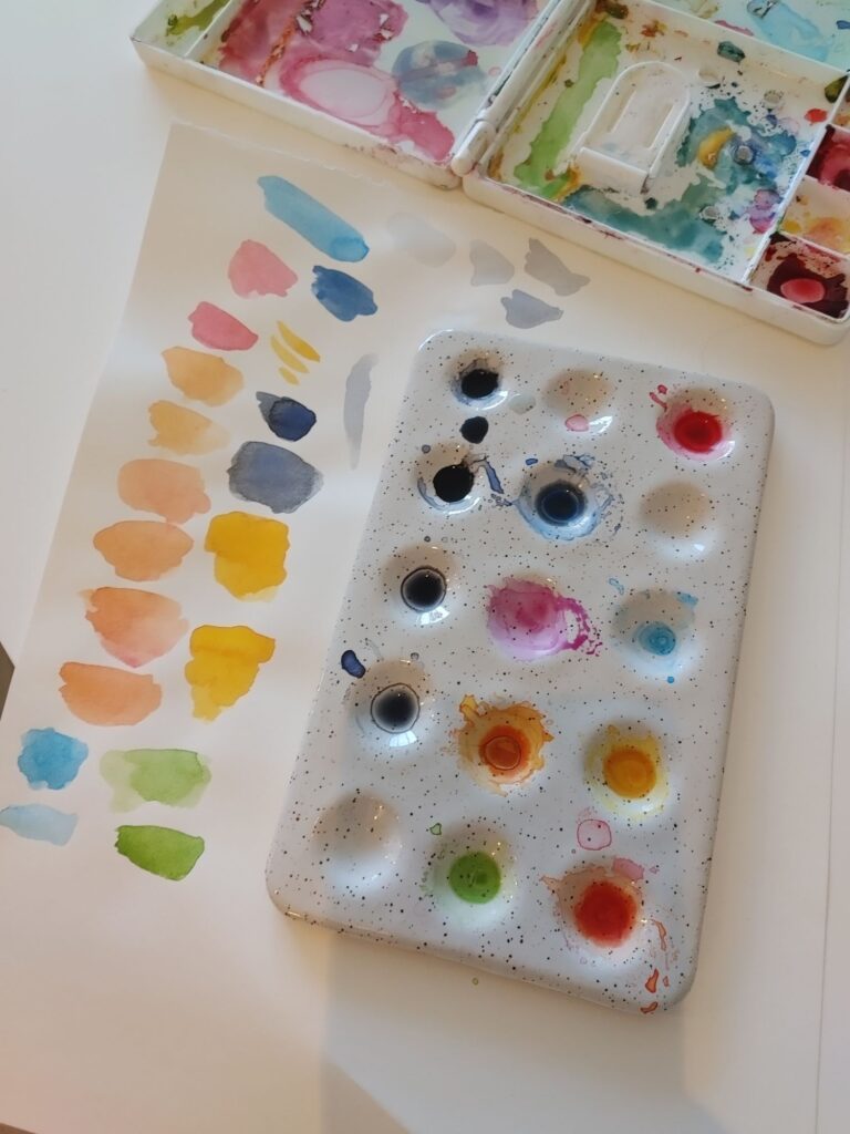
I mixed colour and water until I achieved the desired hues and saturations.
From red to purple, I painted colours one by one, using the reference illuminated through the lightbox. When the last colour (purple) was complete, I added the Baselands and Spine Road in grey as well as all colours for the legend.
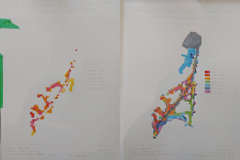
To achieve the final product, I added light grey paint for the surrounding land and used a black artist pen to go over my pencil lines and add a scale bar and north arrow.
The painting is complete – I hope you enjoyed this tutorial!


