Johnson Lumague
Geovis Project Assignment @RyersonGeo, SA8905, Fall 2022
Background
Toronto’s rapid transit system has been constantly growing throughout the decades. This transit system is managed by the Toronto Transit Commission (TTC) which has been operating since the 1920s. Since then, the TTC has reached several milestones in rapid transit development such as the creation of Toronto’s heavy rail subway system. Today, the TTC continues to grow through several new transit projects such as the planned extension of one of their existing subway lines as well as by partnering with Metrolinx for the implementation of two new light rail systems. With this addition, Toronto’s rapid transit system will have a wider network that spans all across the city.
Based on this, a geovisualization product will be created which will animate the history of Toronto’s rapid transit system and its development throughout the years. This post will provide a step-by-step tutorial on how the product was created as well as showing the final result at the end.
Data Processing
The data used consists of Metrolinx’s “Future Regional Transit Network Shapefile” dataset which was retrieved from the Metrolinx Open Data Portal (Metrolinx Open Data). This dataset contains files of the different rapid transit stations and rail networks all over Ontario. For this product, the following two shapefiles from the dataset were used:
- FRTN_POINTS (point data)
- FRTN_TRANSIT_NETWORK (line data)
Methods
Step 1: Importing the data into ArcGIS Pro
Once the files are downloaded, they can be unzipped and imported into ArcGIS Pro using the “Add Data” button.
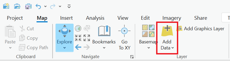
Tip. There are several basemaps available to use on ArcGIS Pro to help visualize the data.
Step 2: Selecting and exporting the data for only the rapid transit systems operated by the TTC
Reducing the data to only show information related to the TTC can be done through several methods. The method used for this product involves using the Selection Tool, “Select By Attributes”. Looking at the attribute table for the data shows that there are data fields named “TECHNOLOGY” and “STATUS” which classifies the data based on rail system type and the state of the system (if it exists, is under construction, or is being planned for the future). Since the TTC operates Toronto’s subway system and the upcoming light rail system, the “Select By Attributes” tool can be used to select these two rail systems as well the systems that already exist and are being currently constructed.
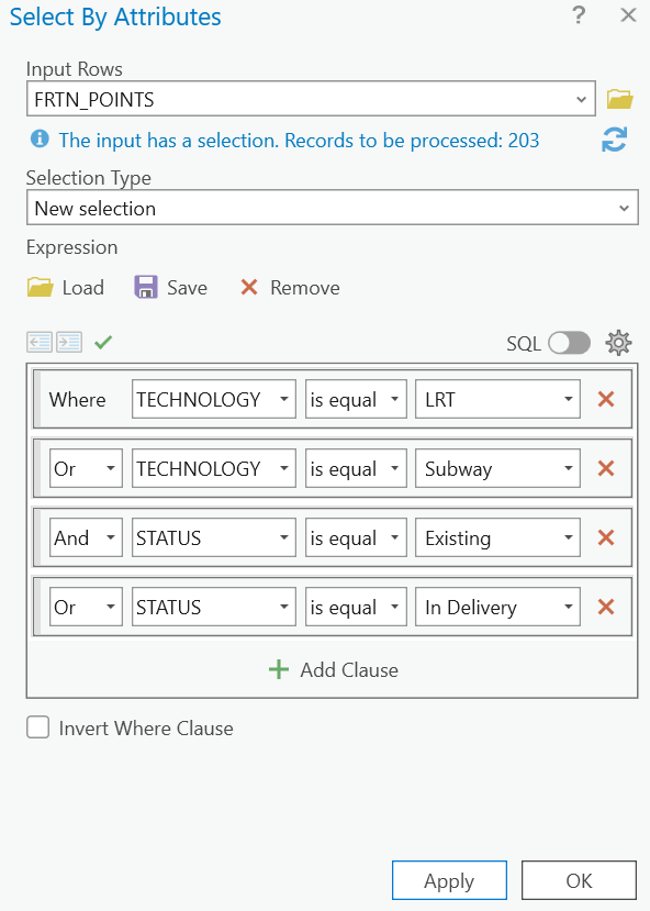
Tip. You can also hold down the SHIFT key to select and deselect data one-by-one. This is useful if the Select Tool selected unneeded data or if more data needs to be selected.
Once the data is selected, they can be exported to create a new shapefile that consists of only the selected data.
Step 3: Preparing the data for temporal elements
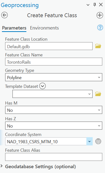
In order to show temporal data, the shapefiles need to be given time attributes. The station shapefile can be easily given time data since each point are separate entities on the attribute table. However, looking at the rail shapefile shows that each line is organized by different names which makes it difficult to add in temporal data for specific segments. To work around this, a new feature class will need to be made in order to create new lines for specific segments of the rail system. This can be done by using the Geoprocessing Tool, “Create Feature Class”.
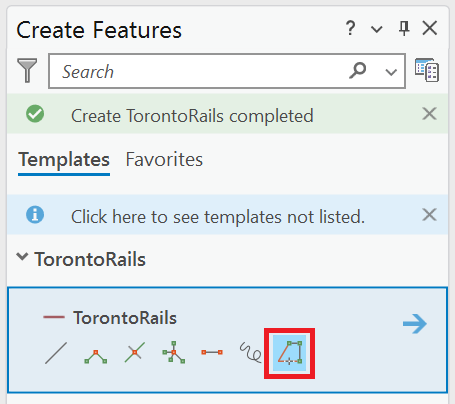
Once the new feature class is created, go to the “Edit” tab and click the “Create” button. Select the new feature class and start creating new line shapefiles of the different segments of the rail system.
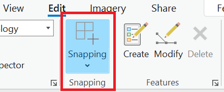
Tip: Make sure to enable “Snapping” and “Trace” to help make it easier to draw over the existing line shapefiles.
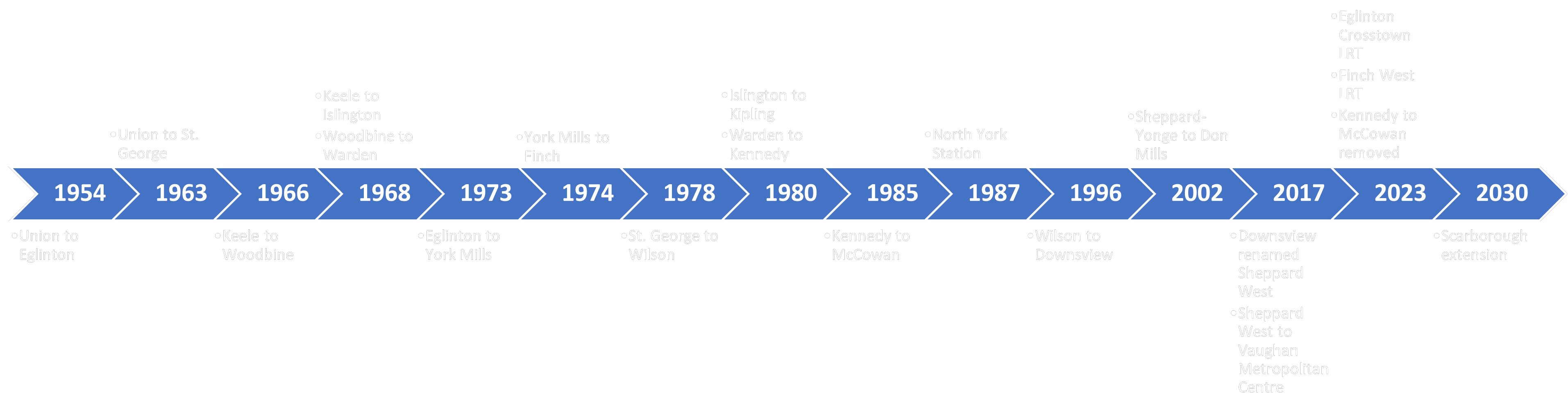
For this product, the new line shapefiles will be created based on the official opening date of each rail portion (TTC Milestones) as well as the future dates for the upcoming new light rail systems and the Line 2 Scarborough extension.
Step 4: Adding in temporal elements into the data
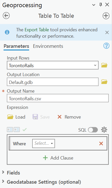
Temporal data can be added in through the manipulation of the data’s attribute table. Similarly to Step 2, manipulating the data can be done through different methods. The method used for this product involves using the “Table To Table” Tool to export the attribute table as a .csv file which can be edited on Microsoft Excel.
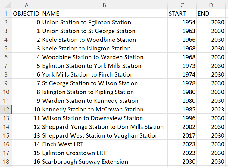
After opening the .csv file, two new columns will be added which will store the temporal data for each rail line. For this product, this will be the official opening year of each segment (START) and the finishing year of any planned projects (END).
Tip. An “OBJECTID” field was automatically created which gives each attribute a unique number which can help with any joining processes.
Step 5: Joining the .csv file to the shapefile
Using the newly updated .csv file, the temporal data can now be added onto the shapefiles in ArcGIS Pro. This can be done by using the “Add Join” function which will join together the data from the shapefiles attribute table and the .csv table using a common field shared between both tables. In this case, it will be the column which holds the unique numbers.
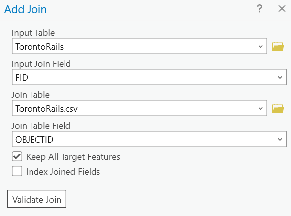
Tip. The ObjectID may have many other names such as FID or UniqueID. The joining process will work as long as the values are common between each table.
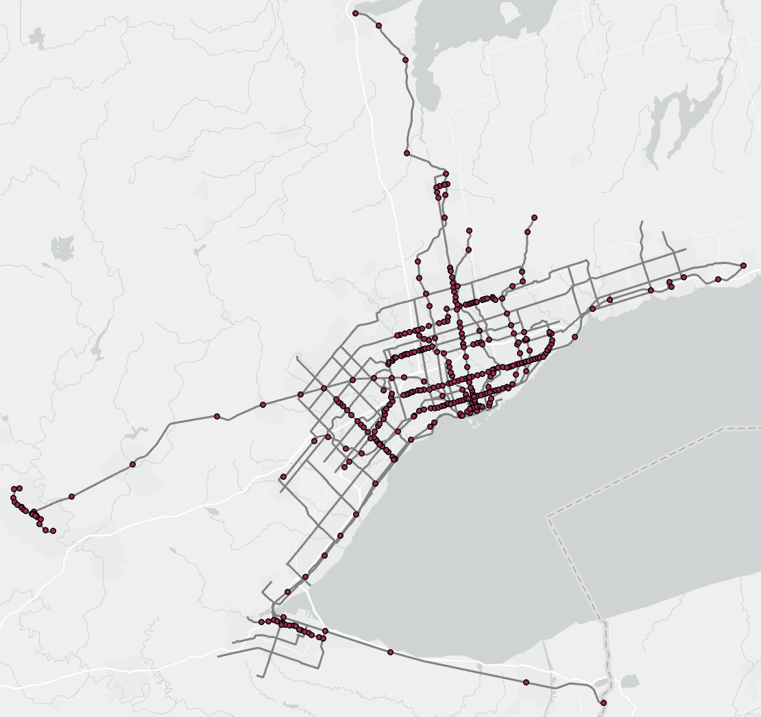
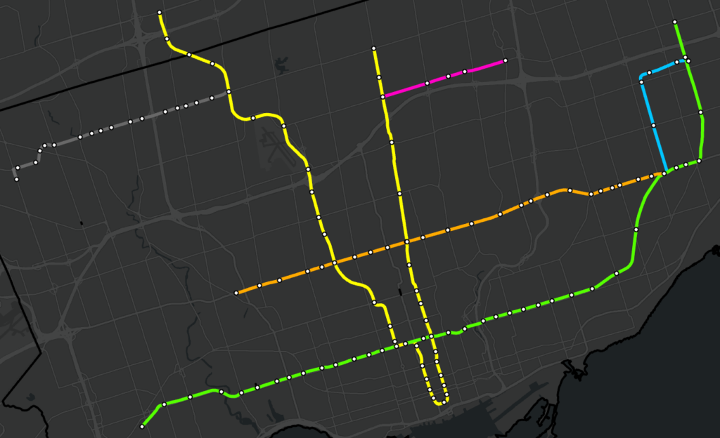
Once the files are joined, the shapefiles can be exported again to create new shapefiles which have the temporal data permanently attached to it. After adjusting the colour scheme, the resulting map will appear as the following:
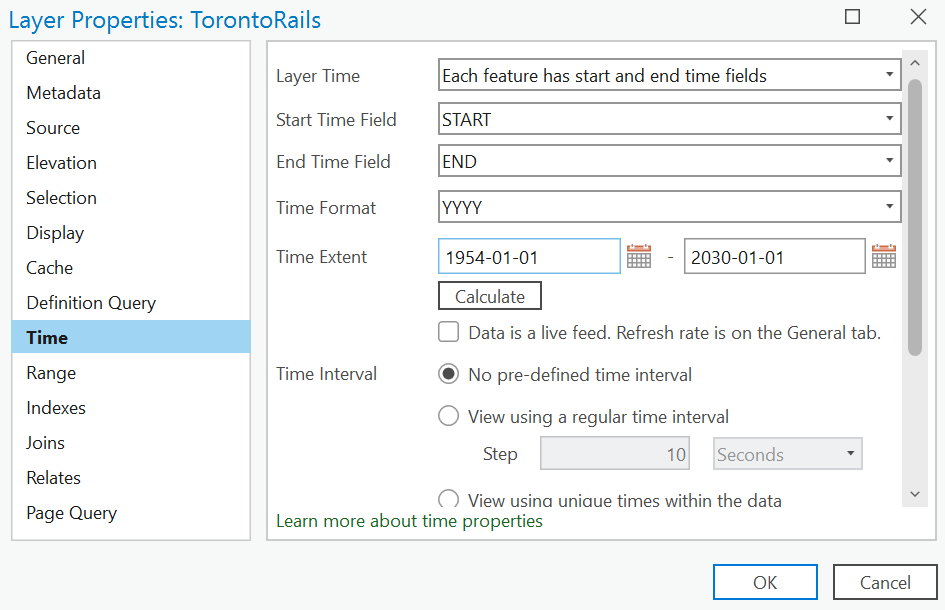
Step 6: Enabling time on the data
Within the shapefiles layer properties, select the “Time” tab and ensure that the “Layer Time” shows that “Each feature has a start and end time fields” with the start time field being “START” and the end time field being “END”. Since the temporal data consists of years, the “Time Format” will be specified as “YYYY”. The time extent will automatically be calculated based on the years entered in the attribute table.
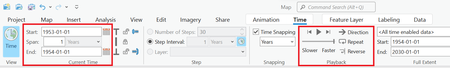
Once time is enabled, a time slider will appear which will allow for the data to become animated. Clicking play on the slider will show the data progressing over the years.

Additionally, there are other options that can be configured in the “Time” tab such as animation speed and adjusting the time period switching interval.
Step 7: Exporting the animation
Under the “View” tab, click “Add” in the animation section to bring up the animation workspace.
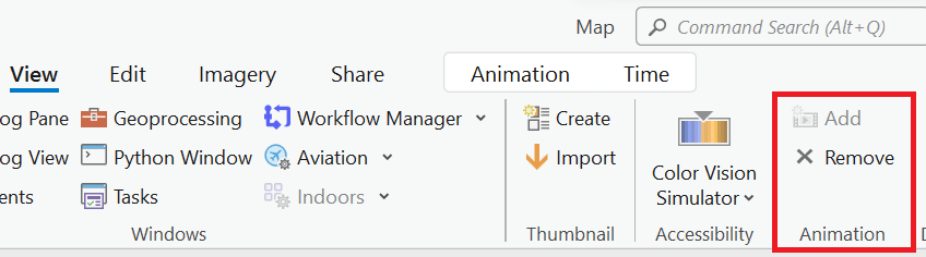
This workspace will allow for the customization of the animation with the addition of different overlays. For this product, a title, timer, different cartographic elements, and other overlays were added on to help visualize the final animated map.
To export the animation, ensure that the time slider is set at the beginning and then click append. Play the animation and click append again once the slider reaches the end. This will create a timeline of the animation from the start to the end.
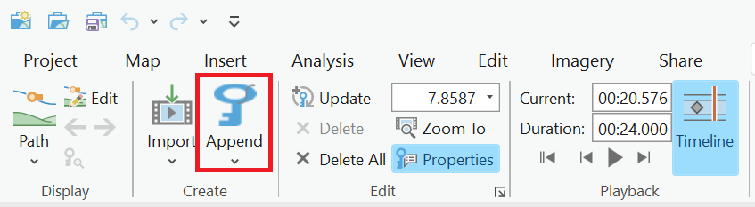
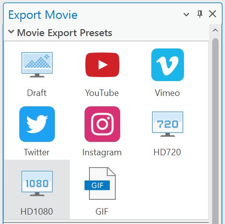
Afterwards, go to the export section and click the “Movie” button. This will bring up the “Export Movie” menu which will show the different formats the animation can be exported as.
Results
To finish up, different animation transitions and labelling were added to help fully visualize the final product.
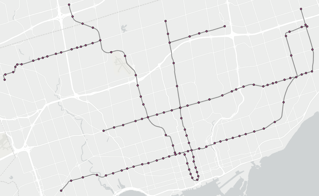
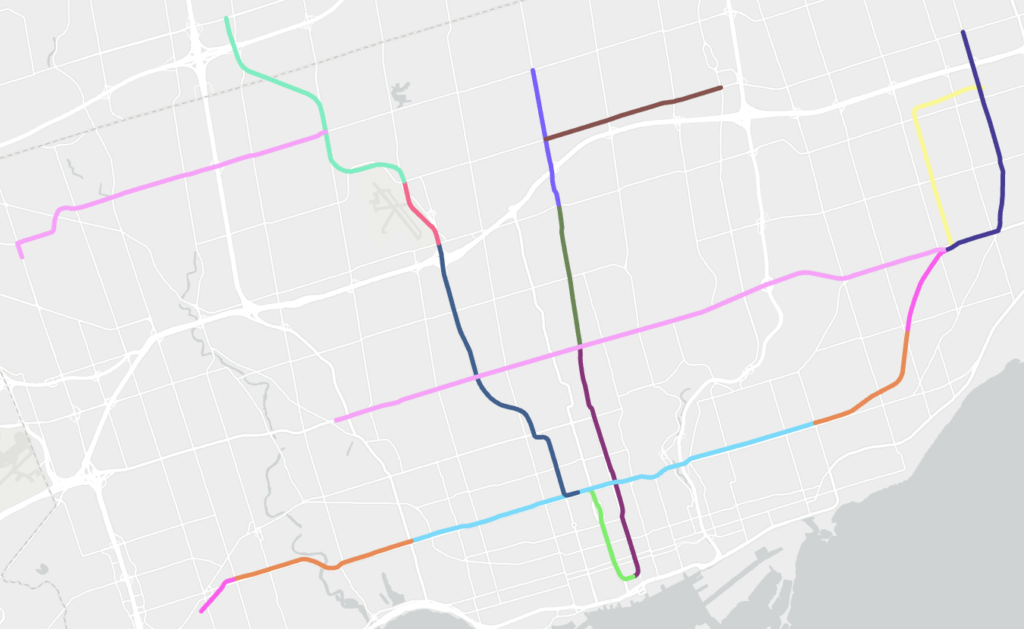
Looking at the product shows an overview of the development of Toronto’s rapid transit system. Over the years, several extensions have been added as well as entire lines and systems being implemented and even removed. From the opening of its first line in 1954 to the opening of the planned Line 2 \extension in 2030, this product provides a geovisualization of how Toronto’s rapid transit has grown across the city over the decades.
Limitations
The animation for this product is very basic and is intended to only provide a quick overview of the capabilities that ArcGIS Pro can provide when creating an animated temporal map. The animation workspace can be intensive to use on weaker hardware which can result in slow performance speeds, long export times, and layer flickering. However, with stronger hardware, this product can be improved to have more complex styles and animations which can help better visualize the temporal aspect of the data.