Geovis Project Assignment @RyersonGeo, SA8905, Fall 2022
Background
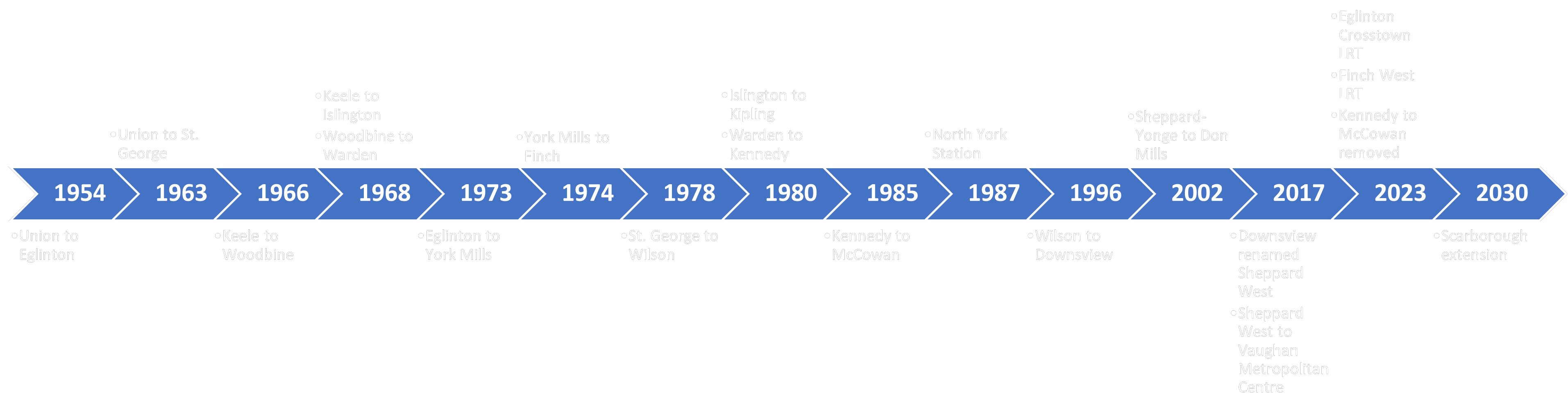
Toronto’s rapid transit system has been constantly growing throughout the decades. This transit system is managed by the Toronto Transit Commission (TTC) which has been operating since the 1920s. Since then, the TTC has reached several milestones in rapid transit development such as the creation of Toronto’s heavy rail subway system. Today, the TTC continues to grow through several new transit projects such as the planned extension of one of their existing subway lines as well as by partnering with Metrolinx for the implementation of two new light rail systems. With this addition, Toronto’s rapid transit system will have a wider network that spans all across the city.
Timeline of the development of Toronto’s rapid transit system
Based on this, a geovisualization product will be created which will animate the history of Toronto’s rapid transit system and its development throughout the years. This post will provide a step-by-step tutorial on how the product was created as well as showing the final result at the end.
Automation’s prevalence in society is becoming normalized as corporations have begun noticing its benefits and are now utilizing artificial intelligence to streamline everyday processes. Previously, this may have included something as basic as organizing customer and product information, however, in the last decade, the automation of delivery and transportation has exponentially grown, and a utopian future of drone deliveries may soon become a reality. The purpose of this visualization project is to convey what automated drone deliveries may resemble in a small city and what types of obstacles they may face as a result of their deployment. A step-by-step process will also be provided so that users can learn how to create a 3D visualization of cities, import 3D objects into ArcGIS Pro, convert point data into 3D visualizations, and finally animate a drone flying through a city. This is extremely useful as 3D visualization provides a different perspective that allows GIS users to perceive study areas from the ground level instead of the conventional birds-eye view.
Area of Study
The focus area for this pilot study is Niagara Falls in Ontario, Canada. The city of Niagara Falls was chosen due to its characteristics of being a smaller city but nonetheless still containing buildings over 120 meters in height. These buildings sizes provide a perfect obstruction for simulating drone flights as Transport Canada has set a maximum altitude limit of 120 meters for safety reasons. Niagara Falls also contains a good distribution of Canada Post locations that will be used as potential drone deployment centres for the package deliveries. Additionally, another hypothetical scenario where all drones deploy from one large building will be visualized. In this instance, London’s gherkin will be utilized as a potential drone-hive (hypothetically owned by Amazon) that drones can deploy from (See https://youtu.be/mzhvR4wm__M). Due to the nature of this project being a pilot study, this method be further expanded in the future to larger dense areas, however, a computer with over 16GB of RAM and a minimum of 8GB of video memory is highly recommended for video rendering purposes. In the video below, we can see the city of Niagara Falls rendered in ArcPro with the gherkin represented in a blue cone shape, similarly, the Canada Post buildings are also represented with a dark blue colour.
City of Niagara Falls (Rendered in ArcPro)
Data
The data for this project was derived from numerous sources as a variety of file types were required. Regarding data directly relating to the city of Niagara Falls – Cellular Towers, Street Lights, Roads, Property parcel lines, Building Footprints and the Niagara Falls Municipal Boundary Shapefiles were all obtained from Niagara Open data and imported into ArcPro. Similarly, the Canada Post Locations Shapefile was derived from Scholar’s Geoportal. In terms of the 3D objects – London’s Gherkin, was obtained from TurboSquid in and the helipad was obtained from CGTrader in the form of DAE files. The Gherkin was chosen because it serves as a hypothetic hive building that can be employed in cities by corporations such as Amazon. Regarding the helipad 3D model, it will be distributed in numerous neighbourhoods around Niagara Falls as a drop-off zones for the drones to deliver packages. In a hypothetical scenario, people would be alerted on their phones as to when their package is securely arriving, and they would visit the loading zone to pick up their package. It should be noted that all files were copyright-free and allowed for personal use.
Process (Step by step)
Importing Files
Figure 1. TurboSquid 3D DAE Download
First, access the Niagara Open Data website and download all the aforementioned files in the search datasets box. Ensure that the files are downloaded in SHP format for recognition in ArcPro (Names are listed at the end of this blog). Next, go on TurboSquid and search for the Gherkin and make sure that the price drop down has a minimum and maximum value of $0 (Figure 1). Additionally, search for ‘Simple helipad free 3D model’ on CGtrader. Ensure that these files are downloaded in DAE format for recognition in ArcPro. Once all files are downloaded open ArcPro and import the Shape files (via Add Data) to first conduct some basic analysis.
Basic GIS Analysis
First, double click on the symbology box for each imported layer, and a symbology dialog should open on the right-hand side of the screen. Click on the symbol box and assign each layer with a distinct yet subtle colour. Once this is finished, select the Canada Post Locations layer, and go to the analysis tab and select the buffer icon to create a buffer around the Canada Post Locations. Input features – The Canada Post Locations. Provide a file location and name in the output feature class and enter a value of 5 kilometres for distance and dissolve the buffers (Figure 2). The reason why 5km was chosen is that regular consumer drones have a battery that can last up to ten kilometres (or 30 min flight time), thus traveling to the parcel destination and back would use up this allotted flight time.
Figure 2. Buffer option on ArcPro
Figure 3. Extent of Drone Deployment
Once this buffer is created the symbology is adjusted to a gradient fill within the layer tab of the symbol. This is to show the groupings of clusters and visualize furthering distance from the Canada Post Locations. In this project we are assuming that the Canada Post Locations are where the drones are deploying from, thus this buffer shows the extent of the drones from the location (Figure 3). As we can see, most residential areas are covered by the drone package service. Next, we are going to give the Canada post buildings a distinct colour from the other buildings. Go to ‘Select by Location’ in the ‘Map’ tab and click ‘Select by Location’. In this dialog box, an intersection relationship is created where the input features are the buildings, and the selecting features is the Canada Post location point data. Hit okay, and now create a new layer from the selection and name it Canada Post buildings. Assign a distinct colour to separate the Canada Post buildings from the rest of the buildings.
3D Visualization – Buildings
Now we are going to extrude our buildings in terms of their height in feet. Click on the View tab in ArcPro and click on the Convert to local scene tab. This process essentially creates a 3D visual of your current map. Next you will notice that all of the layers are under 2D view, once we adjust the settings of the layers, we will drag these layers to the 3D layers section. To extrude the buildings, click on the layer and the appearance tab should come up under the feature layer. Click on the Type diagram drop down and select ‘Max Height’. Thereafter, select the field and choose ‘SHAPE_leng’ as this is the vertical height of the buildings and select feet as the unit. Give ArcPro some time and it should automatically move your building’s layer from the 2D to 3D layers section. Perform this same process with the Canada Post Buildings layer.
Figure 4. Extruded Buildings
Now you should have a 3D view of the city of Niagara Falls. Feel free to move around with the small circle on the bottom left of the display page (Figure 4). You can even click the up arrow to show full control and move around the city. Furthermore, can also add shadows to the buildings by right clicking the map 3D layers tab and selecting ‘Display shadows in 3D’ under Illumination.
Converting Point Data into 3D Objects
In this step, we are going to convert our point data into 3D objects to visualize obstructions such as lamp posts and cell phone towers. First click the Street Lights symbol under 2D layers and the symbology pane should open up on the right side of Arc Pro. Click the current symbol box beside Symbol and under the layer’s icon change the type from ‘Shape Marker’ to 3D model marker (Figure 5).
Figure 5. 3D Shape Marker
Next, click style, search for ‘street-light’, and choose the overhanging streetlight. Drag the Street Light layer from the 2D layer to the 3D layer. Finally, right-click on the layer and navigate to display under properties. Enable ‘Display 3D symbols in real-world units’ and now the streetlamp point data should be replaced by 3D overhanging streetlights. Repeat this same process for the cellphone tower locations but use a different model.
Importing 3D objects & Texturing
Figure 6. Create Features Dialog
Finally, we are going to import the 3D DAE helipad and tower files, place them in our local scene and apply textures from JPG files. First, go on the view tab, click on Catalog Pane and a Catalog should show up on the right side of the viewer. Expand the Databases folder and your saved project should show up as a GDB. Right-click on the GDB and create a new feature class. Name it ‘Amazon Tower’ and change the type from polygon to 3D object and click finish. You should notice that under Drawing Order there should be a new 3D layer with the ‘Amazon Tower’ file name. Select the layer, go on the edit tab and click create to open up the ‘Create Features’ dialog on the right side of the display panel (Figure 6). Click on the Model File tab, click the blue arrow and finally, click the + button. Navigate to your DAE file location, select it and now your model should show up in the view pane and it will allow you to place it on a certain spot. For our purposes, we’ll reduce the height to 30 feet and adjust the Z position to -40 to get rid of the square base under the tower. Click on the location of where you want to place the tower, close the create feature box, apply the multi-patch tool and clear the selection. Finally, to texture the tower, select the tower 3D object, click on the edit tab and this time hit modify. Under the new modify features pane select multi patch features under reshape. Now go on to Google and find a glass building texture JPG file that you like. Click load texture, choose the file, check the ‘Apply to all’ box and click apply. Now the Amazon tower should have the texture applied on it (Figure 7).
Figure 7. Textured Amazon Building
Animation
Finally, now that all of the obstructions are created, we are going to animate a drone flying through the city. Navigate to the animation tab on the top pane and click on timeline. This is where individual keyframes will be combined for the purpose of creating a drone package delivery. Navigate your view so that it is resting on a Canada Post Building and you have your desired view. Click on ‘Create first key frame’ to create your first view, next click up on the ‘full control view’ so that the drone flies up in elevation, and click the + to designate this as a new keyframe. Ensure that the height does not exceed 120 meters as this is the maximum altitude for drones, provided by Transport Canada (Bottom left box). Next, click and drag the hand on the viewer to move forward and back and click + for a new keyframe. Repeat this process and navigate the proposed drone to a helipad (Figure 8). Finally, press the ‘Move down’ button to land the done on the helipad and create a new key frame. Congratulations, you have created your first animation in ArcPro!
Figure 8. Animation in ArcPro
Discussion
Through the process of extruding buildings, maintaining a height less than 120 meters, adding in proposed landing spaces, and turning point data into real-world 3D objects we can visualize many obstructions that drones may face if drone delivery were to be implemented in the city of Niagara Falls. Although this is a basic example, creating an animation of a drone flying through certain neighbourhoods will allow analysts to determine which areas are problematic for autonomous flying and which paths would provide a safer option. Regarding the animation portion, there are two possible scenarios that have been created. First, is a drone deployment from the aforementioned Canada Post Locations. This scenario envisions Niagara Falls as having drone package deployment set out directly from their locations. This option would cover a larger area of Niagara Falls as seen through the buffer, however, having multiple locations may be hard to get funding for. Also, people may not want to live close to a Canada Post due to the noise pollution that comes from drones.
Scenario 1. Canada Post Delivery
The second scenario is to utilize a central building that drones can pickup packages from. This is exemplified as the hive delivery building as seen below. In sharp contrast to option 1, a central location may not be able to reach rural areas of Niagara Falls due to the distance limitations of current drones. However, two major benefits are that all drone deliveries could come from a central location and less noise pollution would occur as a result of this.
Scenario 2. Single HIVE Building
Conclusions & Future Research
Overall, it is evident that drone package deliveries are completely possible within the city of Niagara Falls. Through 3D visualizations in ArcPro, we are able to place simple obstructions such as conventional street lights and cell phone towers within the roads. Through this analysis and animation it is evident that they may not pose an issue to package delivery drones when incorporating communal landing zones. For future studies, this research can be furthered by incorporating more obstructions into the map; such as electricity towers, wiring, and trees. Likewise, future studies can also incorporate the fundamentals of drone weight capacity in relation to how far they can travel and overall speed of deliveries. In doing so, the feasibility of drone package deployment can be better assessed and hopefully implemented in future smart cities.
The geographic visualization of data using programming languages, and specifically R, has seen a substantial upsurge in adoption and popularity among members of the GIS and data analytics community in recent years. While the learning curve in acquainting oneself with scripting techniques might be steeper than using more traditional and out of box GIS applications, it undoubtedly provides some other benefits such as building customizable processes and handling complex spatial analysis operations. The latter point being imperative for projects containing extensive amounts of data as is often the case with transportation and commuting flows which ordinarily contain considerable amount of records comprising of trips’ origins and destinations, mode of transport and travel times information. An added interesting perk is that R offers very creative and visually appealing finalized graphical solutions which were one of the motivators behind the choice of technique for this project. The primary motivator was, however, the program’s capacity in transportation data modelling and mapping as the aim of the project was mapping commuting flows.
Story of R
R is an open source software environment and language for statistical computing and graphics. It is highly extensible which makes it particularly useful to researchers from varied academic and professional fields (they increasingly range from social science, biology and engineering to finance and energy sectors and multifold other fields in between). It is also one of the most rapidly growing software programs in the world, most likely due to the expansion of data science. In the context of Geographic Information Systems (GIS), it can be described as a powerful command-line system comprised of a range of tailored packages, each of them offering different and additional components for handling and analyzing spatial data. The ones utilized in the project were ggplot2, and maptools, and to lesser extent plyr. The former two are some of the most common ones in the R geospatial community while the others encountered in research and worth exploring further were: leaflet and mapview for interactive maps; shiny for web applications; and ggmap, sp and sf for general GIS capabilities. Being an open source software, R community is very helpful in organizing and locating necessary information. One neat option is the readily available cheat sheets for many of the packages (i.e. ggplot cheat sheet) which make finding information genuinely fast.
There are some stunning examples of data visualization in R. One that made a significant media splash a few years ago was done by Paul Butler, a mathematics student at University of Toronto at the time, who plotted social media friendship connections (it created admiration as well as disbelief from many, according to an author, that this was done with less than 150 lines of code in an “old dusty” statistical software such as R). It also inspired further data visualization explorations using R. One of my favorite recent such works came in the form of a compelling book London – The Information Capital by geographer James Cheshire and its co-author designer Oliver Uberti. The majority of the examples in the book were predominantly written not only in R but specifically in its ggplot package, in combination with graphic design applications, and should serve as innovative illustrations on data visualization approaches as well as capabilities on what software could potentially provide. Both of the aforementioned projects inspired mine.
Transportation Mapping and Modelling
I would like to give some background on the type of analysis that was conducted. One of the common types of analysis in transportation geography, transportation planning and transportation engineering is geographic analysis of transport systems for origin-destination data that shows how many people travel (or could potentially travel) between places. This also represents the basic unit of analysis in most transport models which is the trip (single purpose journeys from an origin “A” to origin “B”, and not to be mistaken with Timothy Leary definition). Trips are often grouped by transport mode or number of people travelling, and are represented as desire lines connecting zone centroids (desire lines are straight and closest possible lines between origin – destination points, and can be converted to routes). They do not necessarily need to represent just movement of the people and can show commodity flows and retail trade as well. TransCAD software is often used as the industry standard for this type of modelling. It is, however, quite costly and implemented solely by transportation planning firms and agencies. On the other hand, R is starting to see dedicated transportation planning packages and continuously utilizing relevant GIS ones in transportation field. And most importantly: it’s free.
Data
The dataset implemented for the project was American Community Survey 2009-2013 – 5 Year American Community Survey Commuting Flows located via Inter-University Consortium for Political and Social Research. It is a survey for the entire United States focusing on people’s (over the working age of 16) journeys to work. Data in the original survey was tabulated based on a few categories: means of transportation to work, private vehicle occupancy, time leaving home to go to work, travel and aggregated travel time to work, etc. For the purposes of the project all workers in commuting flows were selected (grouped together for all transportation modes). The trips were based on inner and inter-county commutes.
There are two main components needed when mapping transportation flows in general: coordinates of place of origin, and coordinates of place of destination. Common practice in transportation planning field is to have population weighted centroids for origins and destinations, regardless of the geographic unit of analysis, which in this case was U.S. counties. Therefore population weighted centroid shapefile for U.S. counties was needed so that it can be merged with the original survey data. It was located at the U.S. Census Bureau website and based on 2010 U.S. Census population numbers and distributions per county areas. The study area for the project was the United States and it excluded Canada and Mexico (even though both countries were included for workplace-based geographies), because specific regions of both countries were not mentioned which would make calculations of population weighted centroids not very realistic. Additionally, these records were not numerous to significantly change the model.
Process
In the first step, data was loaded and reformatted in R (R can be downloaded from https://www.r-project.org/ and although analysis can be conducted in R directly it is much preferred and easier to use Rstudio which provides a user-friendly-graphical interface). Rstudio interface and snippet of code is displayed in Figure 1 below (Rstudio can be downloaded from https://www.rstudio.com/ ).
Figure 1: Rstudio interface and snippet of code in the project
Following the two datasets, original commuting survey and population weighted centroids, were joined based on county name and code, and then the unified file was subset to exclude Canada and Mexico, followed by renaming some columns fields for easier readings of origin and destination coordinates. In the next step, ggplot2 was used to position scales for continuous data for x and y axes, succeeded by plotting line segments with alpha command. Number of trips to be plotted were experimented with to show either all trips, or to filter them based on more than 5, 10, 15, 20, 25 and 50 trips. Showing all trips resulted in too dense of a plot as all of the United States was used as a study area. If the study area was of a large scale in nature, showing all trips would be acceptable. The optimal results seemed to be when trips were filtered to show over 10 inner and inter county journeys-to-work trips which resulted in the plot displayed in Figure 2.
The final map was then graphically improved in Adobe Creative Suite resulting in image in Figure 3.
Figure 3: Final mapping project after graphical improvements
Map
The final design showing thousands of commuting trips resembled a NASA image of United States from space at night. It indicated some predictable commuting patterns such as increased journey-to-work lines concentration in large urban centres and in areas with large population densities, such as the North East part of the country. However, some patterns were not so obvious and required some further digging into data accuracy (which passed the test) and then the way in which the original survey was designed. For instance, there are lines from Honolulu, Anchorage and Puerto Rico to the mainland even though the survey was designed to represent daily commuting flows by car, truck, or van; public transport, and other means of commuting. The survey was designed to ask questions for all workers based on primary and secondary jobs by way of commuting for respective reference week when it was conducted and answered. These uncommon results were attributable to people who worked during the reference week at a location that was different from their home (or usual place of work), such as people away from home on business. Therefore place-of-work data showed some interesting geographic patterns of workers who made daily work trips to different parts of the country (e.g., workers who lived in New York and worked in California).
The final mapping product was printed and framed on 24” x 36” canvas as shown in Figure 4. Size was chosen based on aspect ratio of 2 to 3 which seemed best suited to represent the geography of the United States horizontal width and vertical length. Some other options would be to print on acrylic or aluminum which is less cost effective and more time consuming (most of the shops require around 10 days to complete it). However, the printed map on canvas was my preferred choice for this project based on the aesthetic I was aiming for which was to have the appearance of accentuated high commuting areas and dimmed low commuting areas. Another pleasant surprise was that when printing was finalized it manifested more as a painting than data visualization transportation project.