Geovis Project Assignment @RyersonGeo, SA8905, Fall 2021
Introduction/ background
Every city has zoning bylaws that dictate land use. Most cities, including the City of Toronto, have zoning bylaws that set building height limits for different zoning areas. Sometimes, buildings are built above the height limit, either due to development agreements or grandfathering of buildings (when a new zoning by-law doesn’t apply to existing buildings). The aim of this project is to provide a visualization tool for assessing which buildings in Toronto are within the zoning height limits and which are not.
Data and Processing
3D Buildings
The 3D building data was retrieved from Toronto Open Data and derived using the following methods:
LiDAR (2015)
Site Plans – building permit site plan drawings
Oblique Aerials – oblique aerial photos and “street view” photos accessible in Pictometry, Google Earth, and Google Maps.
3DMode – digital 3D model provided by the developer
Zoning Bylaws
Two zoning Bylaw shapefiles were used (retrieved from Toronto Open Data as well):
Building Heights Limits – spatially joined (buildings within zoning area) to the 3D buildings to create the symbology shown on the map. Categories were calculated using the max average building height (3D data) and zoning height limit (zoning bylaws).
Zoning Categories – used to gain additional information and investigate how or why buildings went over the zoning height limit.
Geovisualization
ArcGIS experience builder was used to visualize the data. A local scene with the relevant data was uploaded as a web scene and chosen as the data source for the interactive map in the “Experience”. The map includes the following aspects: Legend showing the zoning and height categories, a layer list allowing users to toggle the zoning category layer on to for further exploration of the data, and a “Filter by Height Category” tool that allows users to view buildings within a selected height category. Pop-ups are enabled for individual buildings and zones for additional information. Some zones include bylaw expectations which may explain why some of the buildings within them are allowed to be above the zoning height limit (only an exception code is provided, a google search is required to gain a better understanding). instructions and details about the map are provided to the user as well.
Limitations
The main limitation of this project is insufficient data – a lack of either building height or zoning height results in a category of “No data” which are displayed as grey buildings. Another limitation is possibly the accuracy of the data, as LiDAR data can sometimes be off and provide wrong estimates of building height. Inaccuracies within 1m were solved by adding an additional category, but there may be some inaccuracies beyond
This index seeks to delineate areas within the Greater Toronto Area that are characterized as being in close proximity to greenery and wellness entities.
From Green Trees With Red Line, by Justin, June 28th 2021. https://www.pexels.com/photo/food-wood-landscape-nature-8771130/
In this model, greenery and wellness entities are considered as those that are wooded, in some cases recreational, and offer potentially efficient transportation opportunities. Here, distance metrics are created and joined to census geography to create a novel planning tool for planners and interested researchers.
ArcGIS Dashboard – Toronto Greenery & Transit Wellness Index
Data Sources
The variables chosen for this model are spatial statistics that are available for an area the size of the Greater Toronto Area. More nuanced spatial databases are available at the city level, though, anecdotally, it can prove difficult to find similar data sets across the municipalities’ open data portals.
Greater Toronto Area (GTA)
created by DMTI Spatial Inc. on August 15th, 2012.
Federal Electoral Districts (FEDs)
created by Statistics Canada on November 16th, 2016.
clipped to the GTA boundary
Land Use Cover
created by DMTI Spatial Inc. on September 15th, 2020.
‘Park’s and Recreation’ vectors selected and exported.
Transit Line
created by DMTI Spatial Inc. on September 15th, 2020.
detailed polylines of all available transit options in the GTA.
Wooded Area
created by the Ontario Ministry of Natural Resources on September 1st, 2006.
a woodland data set.
Trails Line
created by DMTI Spatial Inc. on April 1st, 2015.
polylines of walking, hiking, and biking trails.
Methodology
The methodology for this analysis is quite straightforward. Firstly, Distance Accumulation is used in ArcGIS’s toolbox – an improved version of Euclidean Distance that is now found in ArcGIS Pro.
A Distance Accumulation raster is created for each of the spatial entities.
The resulting Distance Accumulation raster.
After the process, the cells of each raster are converted into points so that they may be normalized to a range of 0 to 1.
Raster to Point Geoprocessing tool.
The resulting Raster to Points layer.
Lastly, the FED cartographic boundary file is clipped to the GTA boundary file, and then the values of these points are spatially joined to the vectors. Ultimately, the mean values of the points contained within each polygon are retained.
Proximity to wooded areas is weighted 50%,
parks and recreational areas – 25%,
trails – 15%,
and public transit lines – 10%.
The variables are weighted and combined linearly in the final Greenery and Transit Wellness Index. The dashboard allows the user to select and view the Greenery and Transit wellness statistics of any FED within the GTA. On the left side of the window one can see a graph of each factor grouped by FED.
Zooming into, or selecting any FED on the map, or list on the right side of the screen changes the features of the graph. Finally, on the bottom right of the dashboard, a legend with the choropleth’s colour classification scheme can be found in the first tab . The second tab details the statistics of user selected FED’s, while the third lists this project’s data sources.
Literature
The methodology of this assignment is based off the following literature where links between access to green space and health outcomes are explored.
Markevych, I., Schoierer, J., Hartig, T., Chudnovsky, A., Hystad, P., Dzhambov, A. M., de Vries, S., Triguero-Mas, M., Brauer, M., Nieuwenhuijsen, M. J., Lupp, G., Richardson, E. A., Astell-Burt, T., Dimitrova, D., Feng, X., Sadeh, M., Standl, M., Heinrich, J., & Fuertes, E. (2017). Exploring pathways linking greenspace to health: Theoretical and methodological guidance. Environmental Research, 158, 301-317. https://doi.org/10.1016/j.envres.2017.06.028
Twohig-Bennett, C., & Jones, A. (2018). The health benefits of the great outdoors: A systematic review and meta-analysis of greenspace exposure and health outcomes. Environmental Research, 166, 628-637. https://doi.org/10.1016/j.envres.2018.06.030
O’Regan, A. C., Hunter, R. F., & Nyhan, M. M. (2021). “Biophilic cities”: Quantifying the impact of google street view-derived greenspace exposures on socioeconomic factors and self-reported health. Environmental Science & Technology, 55(13), 9063-9073. https://doi.org/10.1021/acs.est.1c01326
Roberts, M., Irvine, K. N., & McVittie, A. (2021). Associations between greenspace and mental health prescription rates in urban areas. Urban Forestry & Urban Greening, 64, 127301. https://doi.org/10.1016/j.ufug.2021.127301
Data Bibliography
Greater Toronto Area (GTA) Boundary
DMTI Spatial Inc. (2012, Aug 15). Greater Toronto Area (GTA) Boundary. Scholar’s Geoportal. http://geo.scholarsportal.info.ezproxy.lib.ryerson.ca/#r/details/_uri@=41643035
Geovis Project Assignment @RyersonGeo, SA8905, Fall 2021
Data referenced contains information licensed under the Open Government Licence – City of Ottawa.
Initial Concept
Early on, when thinking about the project, I decided I wanted to choose a technology I had little to no exposure to and really dive deep into how it worked and what it was capable of. I looked through several different technologies and eventually decided on Mapbox as a result of William Davis’ site and the vast array of cool interactive projects using it as their platform. Mapbox is a platform specifically for web or application maps that gives the user an incredible degree of control over the appearance of all aspects of a map. It does this by providing a studio interface (GUI) where a user can customise a basemap by importing shape files, geojson files, image files, etc. Once you’ve edited this basemap to your satisfaction you can export the map as a url and link it directly into an html document.
My initial idea was to use time series data with a slider to visualize bike accidents in my home city (Ottawa) over a number of years. However, because of how Mapbox methods and functions work (more on this later) I chose to use a slider to run through the numbers of accidents by intersection from a particular year. With this in mind I began the construction of my website (and more tutorials on Mapbox methods than I care to remember)…
Webmap Construction
I will admit quite frankly that I know absolutely nothing about html and CSS, both essential components in website design. However, I do have some javascript experience and since mapbox methods are built on node.js this proved invaluable. The first step in the map construction thankfully involved only graphical tweaking of the openstreetmap basemap that Mapbox provides as an editable style. Keeping in mind those important cartographic principles, I chose to change all the major components on this map into shades of navy blue. I also gave the labels a larger white halo to allow them to stand out and hid those I didn’t think would be very useful.
The finished basemap in Mapbox Studio
The next step was to upload a shapefile of the accident points from 2013, obtained from the City of Ottawa open data portal, to Mapbox. Mapbox acts as a host for shape files, geojson, etc. that you upload to it, and converts all these formats into tilesets that you can call in your map by referencing a url. You can also add these tilesets directly into your basemap, however this makes them harder to work with when you eventually switch over to code. For this map, I chose to add a shapefile of the City of Ottawa neighbourhoods directly to my basemap since I had no interest in making this layer interactive. I also uploaded a shapefile containing the cycling network for the City to my basemap just out of personal interest. The file containing the accident points and information was left as a tileset and not added to the basemap so we could easily call it when developing our interactive elements.
The tileset and all of its fields referenced in the final map
Now that I had my data uploaded and my basemap complete it was time to move into a code editor and put together my webmap.
A Daunting Amount of Code
Now, when you first look at the code for this webmap it can appear quite daunting, I certainly felt that way when I first tried to figure it out. You’ll need a few things to actually start editing your html page: 1. You need to go download the node.js repository, this is what Mapbox methods and fuctions run on. 2. You’ll need a good editor/compiler and a live server of some sort so you can see your changes in real time. I used Atom as my editor and then a free live server called “atom-live-server” which is available through atoms tools library. I also played around with creating a python local server – hosted from my PC, but this is quite complicated and it’s much easier to use the available tools.
Once you’ve got all this together it’s time to start putting together your webpage. You can either code it entirely from scratch or base it on a pre-existing project. Since I had little to no experience with html and CSS I chose to take one of Mapbox’s example projects and edit it using my own maps and functions. What this means is that the basics of the page itself were already set up, however none of the information was present. So, for example, the slider element was in the webpage, but none of the information you could scroll through was present, nor was there a method linking the slider to a filter for that information.
Some of the basic HTML and CSS that I edited
So, on to Mapbox and it’s various methods and functions. First off was to add the basemap as the “map element” on our webpage. This was done by plugging the url into the “style” field of the map element. This essentially imports the full style that you’ve created in the GUI. When doing this it’s also important to set your starting zoom and centre point. If you don’t do this, Mapbox will default to a full world zoomout and place you at the projection centre. Here I chose a starting zoom of 9.1, which gives a good overview of the City of Ottawa and a centre sitting smack in the middle of the City.
Next, we call the tileset containing the collision points. I have to admit it took me a full week of work to get this part right. Mapbox has a ton of different ways of styling these layers that you can play with directly in the code. However, ashamed as I am to admit it, my major issue here was not adding the “mapbox://” before my tileset id. This is very important, without this your map will just appear blank, as you are adding a layer that for all intents and purposes does not exist to Mapbox. Once I had eventually figured this out I went ahead and added the layer with a few style options worked out. The three major things I chose to style with the layer were: 1. I set the circle radius to grow with the number of cyclist collisions per point. This was done using a “get” function on the “2013_CYCLI” field that was part of the collisions shapefile. 2. Next, I interpolated the colour of the points, again on the number per intersection, just to give a little more distinction. 3. Finally, and this is a very important step, I set a filter on the “2013_CYCLI” field that would ensure only points with cyclist collisions would be added to the map.
The basic building blocks of my webmap, including the layer calls and styling options
Let’s Add Some Interactivity
Our next step was to link the slider element of our html page to a function that would allow it to filter data. I used a very simple setup for this that would run through the “2013_CYCLI” field and filter the intersections by position on the slider. To do this, I created a variable that stored the slider position as an integer. I then used a “filter” function to go through the layer and pull all accidents with that value or higher. So now the slider would let you go through all the accidents in 2013 and look at all collisions involving cyclists, locations with 2 or more cyclist collisions, and locations with 3 or more cyclist collisions. Essentially, you can see which intersections in Ottawa are the most dangerous for cyclists.
The slider function with the final layer call to re-add the streets to the map
The final touch was to call another layer from openstreetmap and overlay it so you were able to see the road network. With this done, the webmap was complete and ready to be shared.
Oh Github
To share the map I chose to use Github pages. The process is relatively simple once you get going. The first thing to do is to ensure that your html file is called “index” – this is the root file for a github pages site as you are able to add several different pages to any site you create. As we were just sharing the single page, calling it index ensures that it’s always displayed when you load the site. Next you upload the html file to Github, or you link the folder on your machine to github through the github desktop app, I found this super useful as Atom (the code editor I was using) has github desktop integration. And voila, once you’ve enable the pages option in your github repository settings, you can share the link with whomever you’d like!
I do think it would be remiss not to mention a few of the issues I had: 1. The major one was the lack of tutorials for Mapbox. While there is a lot of examples and their API and style reference is exhaustive, a lot of the issues I ran into could have been solved very easily if a solid online tutorial library focused on the basics (they do have one but it’s not that helpful for beginners) existed. The second major issue was my complete lack of knowledge when it came to html and CSS. I was able to learn a fair bit as I went but in the end there are a few portions that I wish I could polish up. Specifically, adding tickmarks and a legend to the slider would have been a very useful feature and I spent hours trying to figure that one out. Unluckily not every browser supports tickmarks and/or legends so I ended up just giving the range by the title. Finally, I do wish that the data I was dealing with had been limited to cycling incidents, as the inclusion of all collisions forced me to filter by cyclist collision rather than year.
Geovis Project Assignment @RyersonGeo, SA8905, Fall 2021
Introduction
The crime rate for the city of Chicago is significantly higher than the US average. In 2016, Chicago was responsible for nearly half of the homicides increase in the US.
A time series interactive dashboard will be used to visualize and analyze the distribution of homicides across Chicago for the last two decades. We will create this dashboard using Tableau Desktop, which is an interactive data visualization and analytical tool. In addition to the dashboard, we will create two visualizations: treemap and line chart. Treemap will be used to visualize aggregated homicides across police districts. The line chart will visualize the number of homicides per month.
Data
The data used to produce the Interactive Dashboard was obtained from the Chicago Data Portal. The dataset consists of 7,424,694 crimes between 2001 to 2021. However, since our crime is focused on homicides, the data was filtered by setting the field Prime Type to be equal to HOMICIDE and then the data was downloaded as a CSV file.
I will go through the step-by-step process of creating the time-series interactive dashboard, the dashboard can be viewed here for reference.
Creating the Interactive Dashboard
To get started on creating the interactive dashboard and the visualizations. We will first import the data, since our dataset is in a CSV format we will select the Text File under the To a File Option. After opening the data, you will see a screen showing all the fields in the CSV file and on the bottom left beside Data Source, you will see a tab called Sheet 1 (highlighted in orange), we will click on it to begin the process of creating the dashboard. The Worksheet tabs will be used to create the map and visualizations and the Dashboard tab will be used to create the dashboard.
In order to create a dot density map showing homicides across Chicago, we need to plot the latitude and longitude coordinates for each homicide. We do this by dragging the Longitude field into the Columns tab and the Latitude field into the Rows tab. We then set both fields to Dimension, by right-clicking on the fields. A map will automatically be created however, there are two minor issues with the map, shown below.
Our map shows 1 null point (displayed on the bottom right of the map) and there is a random point in Missouri.
In order to fix these issues, we will first remove the null point by clicking on 1 null and selecting the Filter Data. To remove the random point located in Missouri, we will right-click on the point and select Exclude. This will remove the point from the map, and our map extent will automatically zoom to the Chicago area.
Creating Time-series Map
To create the time-series map, we will drag the Year field into the Pages card. This will create a time slider that will allow you to view the dot density map for any chosen year. The time slider also allows the user to animate the map, by clicking on the loop button and the animation can be paused at any time.
For our dot density map, we will show specific attributes for each homicide location on the map. This can be accomplished by dragging the fields into the Marks card. For our map, we will show the following fields: Block, Description, District, Location Description, and Date.
To make our map look aesthetic, we will change the theme of our map to Dark. This can be done by going to the header Map, hovering over to Background Map, and selecting Dark. To better visualize the locations of the data points, we will add zip code boundaries to the map. To do this, we will go to the header Map and from there we will choose Map Layers and then select the Zip Code Boundaries under the Map Layers pane (this will appear on the left side of the sheet). Lastly, we are going to change the colour and size of the data points. This can be done by going to the Marks card and selecting the Color and Size option.
Visualizations
Treemap
We will now create the visualizations to better understand the distribution of homicides in Chicago. To begin the process, we will create a new Worksheet and we will name it Treemap. To create a treemap, we will first drag the Year field into the Page card, as we are creating a time-series interactive map. Since we want to see how homicides vary across police districts, we will drag the District field into the Marks card. To show the homicides, we will drag the Primary Type field onto both the Color and Size options in the Marks card. We will then set the Primary Type field to Measure and choose Count, as we want to show aggregated homicides. The final step is to make our worksheet transparent, so we could add it to our interactive map. This is done by going to the header Format and selecting Shading. In the Formatting pane, we will set the Worksheet and Pane background colour to None.
Line Chart
We will create a new Worksheet and name it chart. Our data does not contain the month the incident occurred, but we have the Date when the incident occurred. So, in order to extract just the month, we will need to create a new field. This can be done by going to the Analysis header and choosing Create Calculated Field. We will give the field an appropriate name, change the name Calculation1 to MonthOfIncident. To extract the month we first need to truncate the Date field, as it contains both the date and time. We will use the LEFT function which allows us to truncate a string type specified by the length. The date consists of 10 characters (dd/mm/yyyy), so our query would be LEFT([Date], 10). Next, we need to extract the month from the truncated string, so we will use the built-in function, called MONTH, which returns a number representing the month. However, the MONTH function requires its parameter data type to be a date. So we need to convert our truncated string date to date, we can do this by applying the DATE function on the LEFT function and finally applying the MONTH function on the entire expression. Thus our expression for finding the month is:
Now, we can finally begin the process of creating the line chart. As we are making a time-series interactive map, we will also need to make a time-series line chart. So, we will drag the Year field into the Pages card, as this will be part of our time-series interactive map. Next, we will drag the MonthOfIncident field into the Columns tab and Primary Type into the Rows tab. Since we want to show the total number of homicides, we will set the Primary Type field to Measure and select Count. We will make this worksheet transparent as well, so we will go to the header Format and select Shading. In the Formatting pane, we will set the Worksheet and Pane background colour to None.
Creating the Dashboard
To create our dashboard, we will click on the Dashboard tab, right beside the Worksheet tab. In the dashboard, we can add all the worksheets we have created. We will first add the interactive map followed by the visualizations. To display the visualizations on top of the map, we need to make them float. So, we will select one of the visualizations and hover over to More Options (shown as a downward arrow) and click on Floating, repeat this process for the other visualization. You can also change the size of the dashboard by going to the Size pane, the default size is Desktop Browser (1000 x 800), we will change it to Generic Desktop (1366 x 788). Last but not least, we will publish this dashboard, by going to the Server -> Tableau Public -> Save to Tableau Public As. Tableau Public allows anyone to view the dashboard and allow anyone to download it and specific permissions for the dashboard can be applied.
Limitations and Future Goals
One of the main limitations that occurred during the process of creating the dashboard was gathering the data. First, I had downloaded the entire CSV file containing all different types of crimes. However, when I filtered the Primary Type to HOMICIDE in the Filters card, a huge amount of data for homicides was missing. So, I then decided to directly connect the dataset to Tableau using ODATA Server. It took me a couple hours to connect to the server, just to run into the same issue. I then tried exporting the data through SODA API from the portal, I was able to find raw data for homicides however, it contained partial data. After a while, I figured out I had to directly filter the table in the Chicago Data Portal in order to download the entire data for Chicago homicides.
Another limitation I faced with the data was creating the visualizations. Originally I intended on creating a highlight table to show how homicides varied across police districts and community areas. However, due to the data having null values for community areas, the visualization couldn’t be created. Furthermore, I was only able to create basic visualizations, as the data did not have any interesting variables to help analyze the homicide distribution. For instance, if each homicide incident included a Zip Code, it could have been used to explain the spatial pattern much better rather than using police districts to show how homicides vary across it.
If I was to expand on this project, I would try to incorporate all different crime incidents from 2001-2021 to see Chicago’s overall crime history. In addition to this, I would find demographic data for Chicago such as population, education, and average family income to help understand the spatial pattern for the distribution of crimes.
Natural disasters are major events that result from natural processes of the planet. With global warming and the changing of our climate, it’s rare to go through a week without mention of a flood, earthquake, or a bad storm happening somewhere in the world. I chose to make my web map on natural disasters, because it is at the front of lot of people’s minds lately, as well as there is reliable and historical public data available on disasters around the world. My main goal is to make an informational and easy to use web page, that is accessible to anyone from any educational level or background. The web page will display all of the recorded natural disasters around the world over the past 68 years, and will allow you to see what parts of the world are more prone to certain types of disasters in a clear and understandable format.
Figure 1. Map displaying natural disaster data points, zoomed into Africa.
In order to make my web map I used:
Javascript – programming language
HTML/CSS – front-end programming language and stylesheets
Leaflet – a javascript library or interactive maps
JQuery – a javascript framework
JSCharting – a javascript charting library that creates charts using SVG (Scalable Vector Graphics)
Data & Map Creation
The data for this web map was taken from: Geocoded Disasters (GDIS) Dataset, v1 (1960-2018) from NASA’s Socioeconomic Data and Applications Centre (SEDAC). The data was originally downloaded as a Comma-separated values (CSV) file. CSV files are simple text files that allow for you to easily share data, and generally take up less space.
A major hurdle in preparing this map was adding the data file onto the map. Because the CSV file was so large (30, 000+). I originally added the csv file onto mapbox studio as a dataset, and then as tiles, but I ended up switching to Leaflet, and locally accessing the csv file instead. Because the file was so large, I decided to use QGIS to sort the data by disaster type, and then uploaded them in my javascript file, using JQuery.
Data can come in different data types and formats, so it is important to convert data into format that is useful for whatever it is you hope to extract or use it for. In order to display this data, first the markers data is read from the csv file, and then I used Papa Parse to convert the string file, to an array of objects. Papa Parse is a csv library for javascript, that allows you to parse through large files on the local system or download them from the internet. Data in an array and/or object, allows you to loop through the data, making it easier to access particular information. For example, when including text in the popup for the markers (Figure 2), I had to access to particular information from the disaster data, which was very easy to do as it was an object.
Code snippet for extracting csv and creating marker and popup (I bolded the comments. Comments are just notes, they are not actually part of the code):
// Read markers data from extreme_temp.csv
$.get('./extreme_temp.csv', function (csvString) {

  // Use PapaParse to convert string to array of objects
  var data = Papa.parse(csvString, { header: true, dynamicTyping: true }).data;

  // For each row in data, create a marker and add it to the map
  for (var i in data) {
    var row = data[i];

        // create popup contents
        var customPopup = "<h1>" + row.year + " " + row.location + "<b> Extreme Temperature Event<b></h1><h2><br>Disaster Level: " + row.level + "<br>Country: " + row.country + ".</h2>"

        // specify popup options
        var customOptions =
        {
          'maxWidth': '500',
          'className': 'custom'
        }

    var marker = L.circleMarker([row.latitude, row.longitude], {
      opacity: 50
    }).bindPopup(customPopup, customOptions);

// show popup on hover
    marker.on('mouseover', function (e) {
      this.openPopup();
    });
    marker.on('mouseout', function (e) {
      this.closePopup();
    });

// style marker and add to map
    marker.setStyle({ fillColor: 'transparent', color: 'red' }).addTo(map);
  }

});
Figure 2. Marker Popup
I used L.Circlemarker ( a leaflet vector layer) to assign a standard circular marker to each point. As you can see in Figure 1 and 3, the markers appear all over the map, and are very clustered in certain areas. However, when you zoom in as seen in Figure 3, the size of the markers adjusts, and they become easier to see, as you zoom into the more clustered areas. The top left corner of the map contains a zoom component, as well these 4 empty square buttons vertically aligned, which are each assigned a continent (just 4 continents for now), and will navigate over to that continent when clicked.
Figure 3. Map zoomed in to display, marker size
The bottom left corner of the map contains the legend and toggle buttons to change between the theme of the map, from light to dark. Changing the theme of the map doesn’t alter any of the data on the map, it just changes the style of the basemap. Nowadays almost every browser and web page seems to have a dark mode option, so I thought it would be neat include. The title, legend and the theme toggles, are all static and their positions on the web page remain the same.
Another component on the web page is the ‘Disaster Fact’ box on the bottom right corner of the page. This textbook is meant display random facts about natural disaster over a specified time interval. Ideally, i have variable that contains an array of facts in a list, in string form. Then use the setInterval(); function, and a function that generates a random number, that is the length of the array – 1, and use that as an index to select one of the list items from the array. However, for the moment the map will display the first fact after the specific time interval, when the page loads, but then it remains on the page. But refreshing the page, will cause for the function to generate another random fact.
Figure 4. Pie Chart displaying Distribution of Natural Disasters
One of the component of my web map page, that I will expand on, is the chart. For now I added a simple pie chart using JSCharts to display the total number of disasters per disaster type, for the last 68 years. Using JSCharts as fairly simple, as you can see if you take a look at the code for it in my GitHub. I calculated the total number of disasters for each disaster type by looking at the number of lines in each of my already divided csv files, and manually entered them as the y values. However, normally in order to calculate this data, especially if it was in one large csv file, I would use RStudio.
Something to keep in mind:
People view websites on different platform nowadays, from laptops, to tables and iPhones. A problem with creating web pages is to keep in mind that different platform for viewing web pages, have different screen sizes. So webpages need to be optimized to look good in differ screen sizes, and this is largely done using CSS.
Looking Ahead
Overall my web map is still in progress, and there are many components I need to improve upon, and would like to add to. I would also like to add a bar chart that shows the total number of disasters for each year, for each disaster type , along the bottom of the map, with options to toggle between each disaster type. Also I would like to add a swipe bar that allows you to see the markers on the map based on the year. A component of the map I had trouble adding was an option to hide/view marker layers on the map. I was able to get it to work for just one marker for each disaster type, but it wouldn’t work for the entire layer, so looking ahead I will figure out how to fix that as well.
There was no major research question in making this web page, my goal was to simply make a web map that was appealing, interesting, and easy to use. I hope to expand on this map and add the components that I’ve mentioned, and fix the issues I wasn’t able to figure out. Overall, making a web page can be frustrating, and there is a lot of googling and watching youtube videos involved, but making a dynamic web app is a useful skill to learn as it can allow you to convey information as specifically and creatively as you want.
Geovis Project Assignment @RyersonGeo, SA8905, Fall 2021
By: Katrina Chandler
For my GeoVisualization Project, I chose to map locations of music videos by the Reggaeton artist, Daddy Yankee, using ArcGIS Story Map. Daddy Yankee has been producing music and making music videos for more than 20 years. I got the idea for this project when watching his music video ‘Limbo’.
Data Aggregation
Official music videos were selected from Daddy Yankee’s YouTube channel. Behind the scenes videos on Daddy Yankee’s YouTube channel and articles from various sources were used to locate cities where these videos were filmed. Out of the 56 official videos, excluding remixes and extended versions, I was able find the locations for 27 of the Daddy Yankee’s music videos. It should be noted that this project has minimal information about Daddy Yankee as the focus of it was the locations where the music videos were filmed.
Making the Story Map
To display my project, I decided to use story map tour as it allows multimedia content and text to be displayed side by side with a map. I started by logging into ArcGIS story map, selected new story then selected guided map tour.
I entered a title for my project then looked into changing the base map. I also wanted to change the zoom to a level appropriate for the music video locations. To do this I selected map options (in the top right corner), changed my base map into imagery hybrid and changed my initial zoom level to city. I chose imagery hybrid as it will help me locate the cities better and I prefer the look of it.
I added my multimedia content, i.e. YouTube links, by selecting ‘add image or video’. I selected ‘link’ and pasted the video link in to the appropriate box. I added text stating where the video was filmed, when it was released (uploaded) on Daddy Yankee’s YouTube channel and any additional information I found.
After entering the multimedia content and text, I added the location on the map that corresponds with the slide. To do this, I selected add location, zoomed into the city and then clicked to drop the location point. Another way to add a location point to the map is to ‘search by location’.
While dropping location points on the map, I did not get all as precise as I would have liked the points to be so I edited them. I selected ‘edit location’ then either clicked and dragged the point or deleted it completely and dropped a new point. In the figure below, there are red edges around the 22nd point. This signifies that the point has been selected and can be dragged to its new location. It can also be deleted by clicking on garbage bin icon (at the bottom centre of the picture). If deleted a new point was reselected.
Dependent on what the user wants, the level of zoom can be different on each slide. To change the zoom level, simply zoom in or out of the current map then select ‘use current zoom level’. This worked well for me when I wanted to show exact locations of where a video was filmed. Slides 6, 11, 14, 18, 19, 22 and 26 in the story map show pin point locations of the following respectively: the Faena Hotel, Hôtel de Glace, Comprehensive Cancer Centre of Puerto Rico, Escuela Dr. Antonio S. Pedrerira, Puerto Rico Memorial Cemetery, Centro, Ceremonial Otomi and La Bombonera Stadium. Pinpoint locations were compared to google maps to ensure the correct placement of the location point. These pinpoint locations are where the music videos were partially or fully filmed.
To change the design of my story map, I clicked ‘design’ at the top of the page and selected the Obsidian theme. To change the colour of my text, I highlighted it, clicked the colour palette and selected the colour I wanted.
There is an option to add multiple media to one slide. To do this, click the ‘+’ icon at the top of slide and upload a file or add a link. To play the music video, select play (like how it is on YouTube) and select full screen if you like. To open the YouTube link in a new window, click the title of the music video. If the user wants to reorder the multimedia content, they have to click the icon with three horizontal lines and a new window will open. There the user can reorder the content by dragging it to the where they like it to be seen. In order to see the multimedia content in one slide, the user clicks the right (and left) arrow as seen below. To see the credited information, hover over the information icon (i) at the top left of the page.
To add a slide, select ‘+’ at the bottom right of the story map. To change the layout, select the ‘…’ at the bottom left of the story map and customize. The first option is Guided where you can select if you want the story to be map focused or media focused. The second option is Explorer where you can select if you want the slides to be listed or in a grid format. To rearrange a slide, select it and drag to the new position.
Although this project is based on media content, I decided to use guided map focus as it is best suited for this GeoVisualization project. The order of this project was based on the dates the music videos were released on Daddy Yankee’s YouTube channel. It is in chronological order starting with the newest upload to the oldest upload. Below is a picture to visualize the locations of the music videos from this project.
Issues
A few of the music videos were filmed in multiple locations. I was only able to add one location point per slide so I select the point based on interest or where the majority of the video was filmed. The song Con Calma had 2 filming locations, however Daddy Yankee filmed his part in Los Angeles so Los Angeles was selected for the location point. Another issue was that eight of the music videos were filmed in Miami, Florida and no precise locations were found for these videos. To allow the viewer to read the name of the city clearly, at the selected zoom level, point locations were placed around the name of the city instead of directly on top of it. This was taken into consideration for all locations. Unfortunately, one of the precise locations (Puerto Rico Memorial Cemetery – slide 19) had a fair amount of cloud cover so the full location could not be seen clearly. I also had an issue changing the story map title and slide titles text colour. Data collection was the most difficult part of this project. The sources of this data (articles) are not scholarly peer reviewed and can be considered a limitation as the accuracy of their data is unknown.
Automation’s prevalence in society is becoming normalized as corporations have begun noticing its benefits and are now utilizing artificial intelligence to streamline everyday processes. Previously, this may have included something as basic as organizing customer and product information, however, in the last decade, the automation of delivery and transportation has exponentially grown, and a utopian future of drone deliveries may soon become a reality. The purpose of this visualization project is to convey what automated drone deliveries may resemble in a small city and what types of obstacles they may face as a result of their deployment. A step-by-step process will also be provided so that users can learn how to create a 3D visualization of cities, import 3D objects into ArcGIS Pro, convert point data into 3D visualizations, and finally animate a drone flying through a city. This is extremely useful as 3D visualization provides a different perspective that allows GIS users to perceive study areas from the ground level instead of the conventional birds-eye view.
Area of Study
The focus area for this pilot study is Niagara Falls in Ontario, Canada. The city of Niagara Falls was chosen due to its characteristics of being a smaller city but nonetheless still containing buildings over 120 meters in height. These buildings sizes provide a perfect obstruction for simulating drone flights as Transport Canada has set a maximum altitude limit of 120 meters for safety reasons. Niagara Falls also contains a good distribution of Canada Post locations that will be used as potential drone deployment centres for the package deliveries. Additionally, another hypothetical scenario where all drones deploy from one large building will be visualized. In this instance, London’s gherkin will be utilized as a potential drone-hive (hypothetically owned by Amazon) that drones can deploy from (See https://youtu.be/mzhvR4wm__M). Due to the nature of this project being a pilot study, this method be further expanded in the future to larger dense areas, however, a computer with over 16GB of RAM and a minimum of 8GB of video memory is highly recommended for video rendering purposes. In the video below, we can see the city of Niagara Falls rendered in ArcPro with the gherkin represented in a blue cone shape, similarly, the Canada Post buildings are also represented with a dark blue colour.
City of Niagara Falls (Rendered in ArcPro)
Data
The data for this project was derived from numerous sources as a variety of file types were required. Regarding data directly relating to the city of Niagara Falls – Cellular Towers, Street Lights, Roads, Property parcel lines, Building Footprints and the Niagara Falls Municipal Boundary Shapefiles were all obtained from Niagara Open data and imported into ArcPro. Similarly, the Canada Post Locations Shapefile was derived from Scholar’s Geoportal. In terms of the 3D objects – London’s Gherkin, was obtained from TurboSquid in and the helipad was obtained from CGTrader in the form of DAE files. The Gherkin was chosen because it serves as a hypothetic hive building that can be employed in cities by corporations such as Amazon. Regarding the helipad 3D model, it will be distributed in numerous neighbourhoods around Niagara Falls as a drop-off zones for the drones to deliver packages. In a hypothetical scenario, people would be alerted on their phones as to when their package is securely arriving, and they would visit the loading zone to pick up their package. It should be noted that all files were copyright-free and allowed for personal use.
Process (Step by step)
Importing Files
Figure 1. TurboSquid 3D DAE Download
First, access the Niagara Open Data website and download all the aforementioned files in the search datasets box. Ensure that the files are downloaded in SHP format for recognition in ArcPro (Names are listed at the end of this blog). Next, go on TurboSquid and search for the Gherkin and make sure that the price drop down has a minimum and maximum value of $0 (Figure 1). Additionally, search for ‘Simple helipad free 3D model’ on CGtrader. Ensure that these files are downloaded in DAE format for recognition in ArcPro. Once all files are downloaded open ArcPro and import the Shape files (via Add Data) to first conduct some basic analysis.
Basic GIS Analysis
First, double click on the symbology box for each imported layer, and a symbology dialog should open on the right-hand side of the screen. Click on the symbol box and assign each layer with a distinct yet subtle colour. Once this is finished, select the Canada Post Locations layer, and go to the analysis tab and select the buffer icon to create a buffer around the Canada Post Locations. Input features – The Canada Post Locations. Provide a file location and name in the output feature class and enter a value of 5 kilometres for distance and dissolve the buffers (Figure 2). The reason why 5km was chosen is that regular consumer drones have a battery that can last up to ten kilometres (or 30 min flight time), thus traveling to the parcel destination and back would use up this allotted flight time.
Figure 2. Buffer option on ArcPro
Figure 3. Extent of Drone Deployment
Once this buffer is created the symbology is adjusted to a gradient fill within the layer tab of the symbol. This is to show the groupings of clusters and visualize furthering distance from the Canada Post Locations. In this project we are assuming that the Canada Post Locations are where the drones are deploying from, thus this buffer shows the extent of the drones from the location (Figure 3). As we can see, most residential areas are covered by the drone package service. Next, we are going to give the Canada post buildings a distinct colour from the other buildings. Go to ‘Select by Location’ in the ‘Map’ tab and click ‘Select by Location’. In this dialog box, an intersection relationship is created where the input features are the buildings, and the selecting features is the Canada Post location point data. Hit okay, and now create a new layer from the selection and name it Canada Post buildings. Assign a distinct colour to separate the Canada Post buildings from the rest of the buildings.
3D Visualization – Buildings
Now we are going to extrude our buildings in terms of their height in feet. Click on the View tab in ArcPro and click on the Convert to local scene tab. This process essentially creates a 3D visual of your current map. Next you will notice that all of the layers are under 2D view, once we adjust the settings of the layers, we will drag these layers to the 3D layers section. To extrude the buildings, click on the layer and the appearance tab should come up under the feature layer. Click on the Type diagram drop down and select ‘Max Height’. Thereafter, select the field and choose ‘SHAPE_leng’ as this is the vertical height of the buildings and select feet as the unit. Give ArcPro some time and it should automatically move your building’s layer from the 2D to 3D layers section. Perform this same process with the Canada Post Buildings layer.
Figure 4. Extruded Buildings
Now you should have a 3D view of the city of Niagara Falls. Feel free to move around with the small circle on the bottom left of the display page (Figure 4). You can even click the up arrow to show full control and move around the city. Furthermore, can also add shadows to the buildings by right clicking the map 3D layers tab and selecting ‘Display shadows in 3D’ under Illumination.
Converting Point Data into 3D Objects
In this step, we are going to convert our point data into 3D objects to visualize obstructions such as lamp posts and cell phone towers. First click the Street Lights symbol under 2D layers and the symbology pane should open up on the right side of Arc Pro. Click the current symbol box beside Symbol and under the layer’s icon change the type from ‘Shape Marker’ to 3D model marker (Figure 5).
Figure 5. 3D Shape Marker
Next, click style, search for ‘street-light’, and choose the overhanging streetlight. Drag the Street Light layer from the 2D layer to the 3D layer. Finally, right-click on the layer and navigate to display under properties. Enable ‘Display 3D symbols in real-world units’ and now the streetlamp point data should be replaced by 3D overhanging streetlights. Repeat this same process for the cellphone tower locations but use a different model.
Importing 3D objects & Texturing
Figure 6. Create Features Dialog
Finally, we are going to import the 3D DAE helipad and tower files, place them in our local scene and apply textures from JPG files. First, go on the view tab, click on Catalog Pane and a Catalog should show up on the right side of the viewer. Expand the Databases folder and your saved project should show up as a GDB. Right-click on the GDB and create a new feature class. Name it ‘Amazon Tower’ and change the type from polygon to 3D object and click finish. You should notice that under Drawing Order there should be a new 3D layer with the ‘Amazon Tower’ file name. Select the layer, go on the edit tab and click create to open up the ‘Create Features’ dialog on the right side of the display panel (Figure 6). Click on the Model File tab, click the blue arrow and finally, click the + button. Navigate to your DAE file location, select it and now your model should show up in the view pane and it will allow you to place it on a certain spot. For our purposes, we’ll reduce the height to 30 feet and adjust the Z position to -40 to get rid of the square base under the tower. Click on the location of where you want to place the tower, close the create feature box, apply the multi-patch tool and clear the selection. Finally, to texture the tower, select the tower 3D object, click on the edit tab and this time hit modify. Under the new modify features pane select multi patch features under reshape. Now go on to Google and find a glass building texture JPG file that you like. Click load texture, choose the file, check the ‘Apply to all’ box and click apply. Now the Amazon tower should have the texture applied on it (Figure 7).
Figure 7. Textured Amazon Building
Animation
Finally, now that all of the obstructions are created, we are going to animate a drone flying through the city. Navigate to the animation tab on the top pane and click on timeline. This is where individual keyframes will be combined for the purpose of creating a drone package delivery. Navigate your view so that it is resting on a Canada Post Building and you have your desired view. Click on ‘Create first key frame’ to create your first view, next click up on the ‘full control view’ so that the drone flies up in elevation, and click the + to designate this as a new keyframe. Ensure that the height does not exceed 120 meters as this is the maximum altitude for drones, provided by Transport Canada (Bottom left box). Next, click and drag the hand on the viewer to move forward and back and click + for a new keyframe. Repeat this process and navigate the proposed drone to a helipad (Figure 8). Finally, press the ‘Move down’ button to land the done on the helipad and create a new key frame. Congratulations, you have created your first animation in ArcPro!
Figure 8. Animation in ArcPro
Discussion
Through the process of extruding buildings, maintaining a height less than 120 meters, adding in proposed landing spaces, and turning point data into real-world 3D objects we can visualize many obstructions that drones may face if drone delivery were to be implemented in the city of Niagara Falls. Although this is a basic example, creating an animation of a drone flying through certain neighbourhoods will allow analysts to determine which areas are problematic for autonomous flying and which paths would provide a safer option. Regarding the animation portion, there are two possible scenarios that have been created. First, is a drone deployment from the aforementioned Canada Post Locations. This scenario envisions Niagara Falls as having drone package deployment set out directly from their locations. This option would cover a larger area of Niagara Falls as seen through the buffer, however, having multiple locations may be hard to get funding for. Also, people may not want to live close to a Canada Post due to the noise pollution that comes from drones.
Scenario 1. Canada Post Delivery
The second scenario is to utilize a central building that drones can pickup packages from. This is exemplified as the hive delivery building as seen below. In sharp contrast to option 1, a central location may not be able to reach rural areas of Niagara Falls due to the distance limitations of current drones. However, two major benefits are that all drone deliveries could come from a central location and less noise pollution would occur as a result of this.
Scenario 2. Single HIVE Building
Conclusions & Future Research
Overall, it is evident that drone package deliveries are completely possible within the city of Niagara Falls. Through 3D visualizations in ArcPro, we are able to place simple obstructions such as conventional street lights and cell phone towers within the roads. Through this analysis and animation it is evident that they may not pose an issue to package delivery drones when incorporating communal landing zones. For future studies, this research can be furthered by incorporating more obstructions into the map; such as electricity towers, wiring, and trees. Likewise, future studies can also incorporate the fundamentals of drone weight capacity in relation to how far they can travel and overall speed of deliveries. In doing so, the feasibility of drone package deployment can be better assessed and hopefully implemented in future smart cities.
In 2017, 50 Automatic Speed Enforcement (ASE) cameras were installed throughout Toronto. These cameras work by taking pictures of vehicles which are speeding, and then issuing a fine to the owner of the vehicle. 2 Cameras are allocated to each ward located mainly near school zones for a total of 50, which will eventually be rotated out for a different set of 50 in different locations. This strategy is meant to reduce collisions by having people slow down in areas where the ASE cameras are present.
Figure 1: ASE camera in Toronto
To visualize whether the installation of these cameras has made a difference on collisions in Toronto, I decided to use ArcGIS Dashboards. ArcGIS Dashboards is a tool that presents spatial data and associated statistics in an interactive format, allowing the user to get the answers to questions that they want.
In order to put this together, I collected collision data from the Toronto Police Public Safety Data Portal which includes data on collisions throughout Toronto from 2006 until 2021. I also collected data on the ASE locations from the Ontario Open Data Portal, and opened both datasets in ArcGIS Online to edit their symbology before adding it to a dashboard.
FIgure 2: Preparing the data for use in the dashboard
Now that the map was ready, I started to configure the actual dashboard. The main elements that I considered essential to include were: • A filter system, to allow users to filter collisions under certain conditions • A pie chart, to allow users to visualize the percentage of each type of collision depending on their filters • A line or bar graph to allow users to see the distribution of collisions temporally. These can all be easily added to a blank dashboard and configured using the “+” button on the ArcGIS Dashboards top header. The final dashboard with all the previously mentioned elements and the map frame can be seen below:
Figure 3: Complete dashboard
Dashboard Elements and Functions
The first element we will be looking at is the side panel on the left, which contains the date selector as well as multiple category selectors for different attributes. Each one opens an accordion-style menu when clicked, displaying all available filters for that particular category. These filters can be toggled on or off, and the map frame in the centre will reflect any filters made.
Figure 4: Visibility selector with rain toggled
The next element is the serial chart at the bottom of the dashboard, which contains two graphs stacked on top of each other. The first one is a line graph of the collisions by date all the way from 2006 until now, and the second one is a histogram of the collisions per hour based on a 24-hour clock. Both graphs contain a time slider at the top which can be used to zoom in and look at a particular time period in detail. However, the time slider is purely for viewing purposes and will not affect the map.
Specific time periods can also be selected by clicking on the graph and dragging your mouse over them, or by holding CTRL and clicking the time periods as well. For example, if you only wanted to see collisions from 2017 and onwards, you could click and drag your mouse over the part of the line graph where 2017 starts all the way until the far right side. Unlike the time slider, selecting time periods this way will reflect on the map frame.
Figure 5: Serial graphs
The final elements are the legend and the pie chart to the right of the map frame. The legend displays the categorization for each data point, like which ASE camera is currently active vs. planned, or which collisions resulted in fatalities vs. injuries. The pie chart is stacked on top of the legend and displays the distribution of collision type. Similar to the serial charts, the pie chart will adjust to fit the map extent and the filters chosen. However, the legend is static and will not change regardless of filters or map extent.
Figure 6: Legend and Pie Graph Stack
Limitations& Conclusion
While a dashboard like this can be convenient in many ways, there are some limitations. For example, for the serial graphs there is no indication in the UI that time periods can be selected at all. I only found out about the function when I accidentally clicked on it; before, I had assumed that the time slider would provide that function and was confused why the data points on the map did not change when I adjusted the time slider. Additionally, it is much more difficult to see when time periods have been selected on light mode than on dark mode, which is why I set this dashboard to dark mode.
Another limitation is that there is no real way to conduct spatial analysis beyond the functions outlined earlier. Common tools like creating buffers or finding intersections that would be present in ArcMap/ArcGIS Pro/QGIS are nowhere to be found. You could do these analyses in those programs, create a layer from said analyses, and then import it into a webmap as a layer before adding it to a dashboard, but that would require you to rework the entire dashboard.
Overall, dashboards are a convenient way of allowing users who aren’t familiar with GIS to manipulate and visualize spatial data. It can be a great way to simplify data and create a neat tool that can identify trends or statistics at a glance. However, it is important to note that due to its limitations, its utility will depend greatly on your use case.
GeoVis Project @RyersonGeo, SA8905, Fall 2021, Mirza Ammar Shahid
Introduction
Commercial real estate is crucial part of the economy and is a key indicator of a region’s economic health. In the project different types of Under constriction projects within the Toronto market will be assessed. Projects that are under construction or are proposed to be completed within the next few years will be visualized. Some property types that will be looked at are, hospitality, office, industrial, retail, sports and entertainment etc. The distribution of each property type within the regions will be displayed. To determine the proportional distribution within each region by property type. Software that will be used is Tableau to create a visualization of the data which will be interactive to explore different data filters.
Data
The data for the project was obtained from the Costar group’s database. The data used was exported using all properties within the submarket of Toronto (York region, Durham region, Peel Region, Halton region). Under construction or proposed properties above the size of 7000 sqft were exported to be used for the analysis. Property name, address, submarket, size, longitude, latitude and the year built were some of the attributes exported for each property project.
Method
Once data was filtered and exported from the source, the data was inserted into Tableau as an excel file.
The latitude and longitude were placed in rows and columns in order to create a map in tableau for visualization.
Density of mark was used to show the density and a filter was applied for property type.
Second sheet was created with same parameters but instead of density circle marks were used to identify locations of each individual project (Under Construction Projects).
Third sheet was created with property type on x axis and proportion of each in each region in y axis. To show the proportions of each property type by region.
The three worksheets were used to compile an interactive dashboard for optimal visualization of the data.
Figure 1: rows, columns and marks
Results
Density Map Showing Industrial Property type All Under construction project locations Regional Distribution by Property type
The results are quite intriguing as to where certain property type constriction dominant over the rest. Flex is greatest in Peel region, Health care in Toronto, Hospitality in Halton, Industrial in Peel, Multifamily in Toronto, Office in downtown Toronto, retail in York region, specialty in York region and sports and entertainment in Durham with new casino opening in Ajax.
The final dashboard can be seen below, however due to sharing restrictions, the dashboard can only be accessed if you have a Tableau account.
In conclusion, using under construction commercial real estate dashboard can have positive impact on multiple entities within the sector. Developers can use such geo visualizations to monitor ongoing projects and find new projects within opportunity zones. Brokerages can use this to find new leads, potential listings and manage exiting listings. Governments of all three levels, municipal, provincial and federal can use these dashboard to monitor health conditions of their constituency and make insightful policy changes based on facts.
Geovis Project Assignment @RyersonGeo, SA8905, Fall 2021
INTRODUCTION
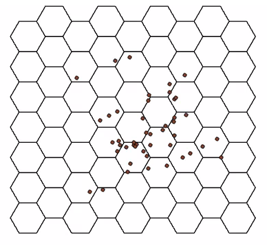
Crime on campus has long been at the forefront of discussion regarding safety of community members occupying the space. Despite efforts to mitigate the issue—vis-à-vis increased surveillance cameras, increased hiring of security personnel, etc.—, it continues to persist on X University’s campus. In an effort to quantify this phenomenon, the university’s website collates each security incident that takes place on campus and details its location, time (reported and occurrence), and crime type, and makes it readily available for the public to view through web browser or email notifications. This effort to collate security incidents can be seen as a way for the university to first and foremost, quickly notify students of potential harm, but also as a means to understanding where incidents may be clustering. The latter is to be explored in the subsequent geo-visualization project which attempts to visualize three years worth of security incidents data, through the creation of a 3D laser-cut acrylic hexbin model. Hexbinning refers to the process of aggregating point data into a predefined hexagon that represents a given area, in this case, the vertex-to-vertex measurement is 200 metres. By proxy of creating a 3D model, it is hoped that the tangibility, interchangeability, and gamified aspects of the project will effectively re-conceptualize the phenomena to the user, and in-turn, stress the importance of the issue at hand.
DATA AND METHODS
The data collection and methodology can be divided into two main parts: 2D mapping and 3D modelling. For the 2D version, security incidents from July 2nd, 2018 to October 15th, 2021 were manually scraped from the university’s website (https://www.ryerson.ca/community-safety-security/security-incidents/list-of-security-incidents/) and parsed into columns necessary for geocoding purposes (see Figure 1). Once all the data was placed into the excel file, they would be converted into a .csv file and imported into the ArcGIS Pro environment. Once there, one simply right clicks on the .csv and clicks “Geocode Table”, and follows the prompts for inputting the data necessary for the process (see inputs in Figure 2). Once ran, the geocoding process showed a 100% match, meaning there was no need for any alterations, and now shows a layer displaying the spatial distribution of every security incident (n = 455) (see Figure 3). To contextualize these points, a base map of the streets in-and-around the campus was extracted from the “Road Network File 2016 Census” from Scholars GeoPortal using the “Split Line Features” tool (see output in Figure 3).
Figure 1. Snippet of spreadsheet containing location, postal code, city, incident date, time of incident, and crime type, for each of the security incidents.
Figure 2. Inputs for the Geocoding table, which corresponds directly to the values seen in Figure 1.
Figure 3. Base map of streets in-and-around X University’s campus. Note that the geo-coded security incidents were not exported to .SVG – only visible here for demonstration purposes.
To aggregate these points into hexbins, a certain series of steps had to be followed. First, a hexagonal tessellation layer was produced using the “Generate Tessellation” tool, with the security incidents .shp serving as the extent (see snippet of inputs in Figure 4 and output in Figure 5). Second, the “Summarize Within” tool was used to count the number of security incidents that fell within a particular polygon (see snippet of inputs in Figure 6 and output in Figure 7). Lastly, the classification method applied to the symbology (i.e. hexbins) was “Natural Breaks”, with a total of 5 classes (see Figure 7). Now that the two necessary layers have been created, namely, the campus base map (see Figure 3 – base map along with scale bar and north arrow) and tessellation layer (see Figure 5 – hexagons only), they would both be exported as separate images to .SVG format – a format compatible with the laser cutter. The hexbin layer that was classified will simply serve as a reference point for the 3D model, and was not exported to .SVG (see Figure 7).
Figure 4. Snippet of input when using the “Generate Tessellation” geoprocessing tool. Note that these were not the exact inputs, spatial reference left blank merely to allow the viewer to see what options were available.
Figure 5. Snippet of output when using the “Generate Tessellation” geoprocessing tool. Note that the geo-coded security incidents were not exported to .SVG – only visible here for demonstration purposes.
Figure 6. Snippet of input when using the “Summarize Within” geoprocessing tool.
Figure 7. Snippet of output when using the “Summarize Within” geoprocessing tool. Note that this image was not exported to .SVG but merely serves as a guide for the physical model.
When the project idea was first conceived, it was paramount that I familiarized myself with the resources available and necessary for this project. To do so, I applied for membership to the Library’s Collaboratory research space for graduate students and faculty members (https://library.ryerson.ca/collab/ – many thanks to them for making this such a pleasurable experience). Once accepted, I was invited to an orientation, followed by two virtual consultations with the Research Technology Officer, Dr. Jimmy Tran. Once we fleshed out the idea through discussion, I was invited to the Collaboratory to partake in mediated appointments. Once in the space, the aforementioned .SVG files were opened in an image editing program where various aspects of the .SVG were segmented into either Red, Green, or Blue, in order for the laser cutter to distinguish different features. Furthermore, the tessellation layer was altered to now include a 5mm (diameter) circle in the centre of each hexagon to allow for the eventual insertion of magnets. The base map would be etched onto an 11×8.5 sheet of clear acrylic (3mm thick), whereas the hexagons would be cut-out into individual pieces at a size of 1.83in vertex-to-vertex. Atop of this, a black 11×8.5 sheet of black acrylic would be cut-out to serve as the background for the clear base map (allowing for increased contrast to accentuate finer details). Once in hand, the hexagons would be fixed with 5x3mm magnets (into the aforementioned circles) to allow for seamless stacking between pieces. Stacks of hexagons (1 to 5) would represent the five classes in the 2D map, but with height now replacing the graduated colour schema (see Figure 7 and Figure 9 – although the varying translucency of the clear hexagons is also quite evident and communicates the classes as well). The completed 3D model is captured in Figure 8, along with the legend in Figure 9 that was printed out and is to always be presented in tandem with the model. The legend was not etched into the base map so as to allow it to be used for other projects that do not use the same classification schema, and in-case I had changed my mind about a detail at some point.
Figure 8. 3D Laser-Cut Acrylic Hexbin Model depicting three-years worth of security incidents on campus. Multiple angles provided.
Figure 9. Legend which corresponds the physical model displayed in Figure 8. Physical version has been created as well and will be shown in presentation.
FUTURE RESEARCH DIRECTIONS AND LIMITATIONS
The geo-visualization project at-hand serves as a foundation for a multitude of future research avenues, such as: exploring other 3D modalities to represent human geography phenomenon; as a learning tool for those not privy to cartography; and as a tool to collect further data regarding perceived and experienced areas of crime. All of which expand on the aspects tangibility, interchangeability, and gamification harped on in the project at-hand. With the latter point, imagine a situation where a booth is set up on campus and one were to simply ask “using these hexagon pieces, tell us where you feel the most security incidents on campus would occur.” The answers provided would be invaluable, as they would yield great insight into what areas of campus community members feel are most unsafe, and what factors may be contributing to it (e.g. built environment features such as poor lighting, lack of cameras, narrowness, etc.), resulting in a synthesis between the qualitative and quantitative. Or on the point of interchangeability, if someone wanted to explore the distribution of trees on campus for instance, they could very well laser-cut their own hexbins out of green acrylic at their own desired size (e.g. 100m), and simply use the same base map.
Despite the fairly robust nature of the project, some limitations became apparent, more specifically: issues with the way a few security incident’s data were collected and displayed on the university’s website (e.g. non-existent street names, non-existent intersections, missing street suffixes, etc.); an issue where the exportation of a layer to .SVG resulted in the creation of repeated overlapping of the same images that had to be deleted before laser cutting; and lastly, future iterations may consider exaggerating finer features (e.g. street names) to make the physical model even more legible.