Mapping Toronto Flood Events by using Esri Operations Dashboard

Dashboard Web application: Toronto Flood Events 2013-2017

By: Mohamad Fawaz Al-Hajjar

Geovisualization Project, @RyersonGeo, SA8905, Fall 2019

Introduction:

Toronto has been affected by many flood events, but the biggest modern event happened in July, 8th, 2013, when a thunderstorm passed over the city and broke the record when Toronto received huge amount of rain reached to 126mm, that caused major transit delays, power outages, flight cancellations and many areas flooded throughout the city; in order to visualize such phenomena and monitor the number of events per Toronto ward, web application dashboard has been implemented to inactively visualize the historical data, which also could be used to map the real time data as an optimal way to utilize the web dashboards.

Geovisualization Methodology

The technology that has been used to interactively visualize flood events data in Toronto is Esri Operations Dashboard, which was released in December, 2017 and has become an effective tool for the Esri users, which allow them to publish their Web Maps via dashboard by applying simple configuration without writing a single line of code. The project has followed the below methodology.

  1. Data Review and Manipulation

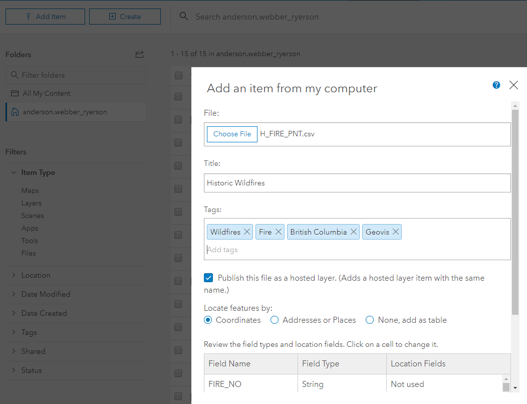
After obtaining the open data from two main sources, TRCA Open Data Portal and Toronto Open Data Portal, with other different data sources which have been reviewed and visualized in ArcMap application 10.7.1 release. Some of the data had to be cleansed, such as Flood Plain Mapping Index and property boundary shapefiles, other data were derived from polygon shapefile “flood-reporting-wgs84” for Toronto wards, where the total number of flood events stored by year from 2013-2017. A derived data-set produced as a point shapefile events points by using generating random point tool from polygon in ArcGIS ArcToolbox.

In addition, another data set have been created, the Property boundaries which have been intersected and clipped with the flood plain feature to generate the flooded properties per ward, which is also spatially joined with the wards to inherit its attributes. that could be configured in the dashboard to show the number of flooded properties per ward.

List of Data-Set Used:

Stormevents (derived from Flood reporting polygon) (Toronto open data)

Property per ward (derived from Property boundary and Flood reporting polygons) (Toronto open data)

Flood Events renamed to (Flood reporting polygons) (Toronto open data)

Toronto Shelters (Toronto open data)

GTA Watercourses (TRCA open data)

GTA Flood Plain (TRCA open data)

GTA Waterbodies (TRCA open data)

2. Data Publishing:

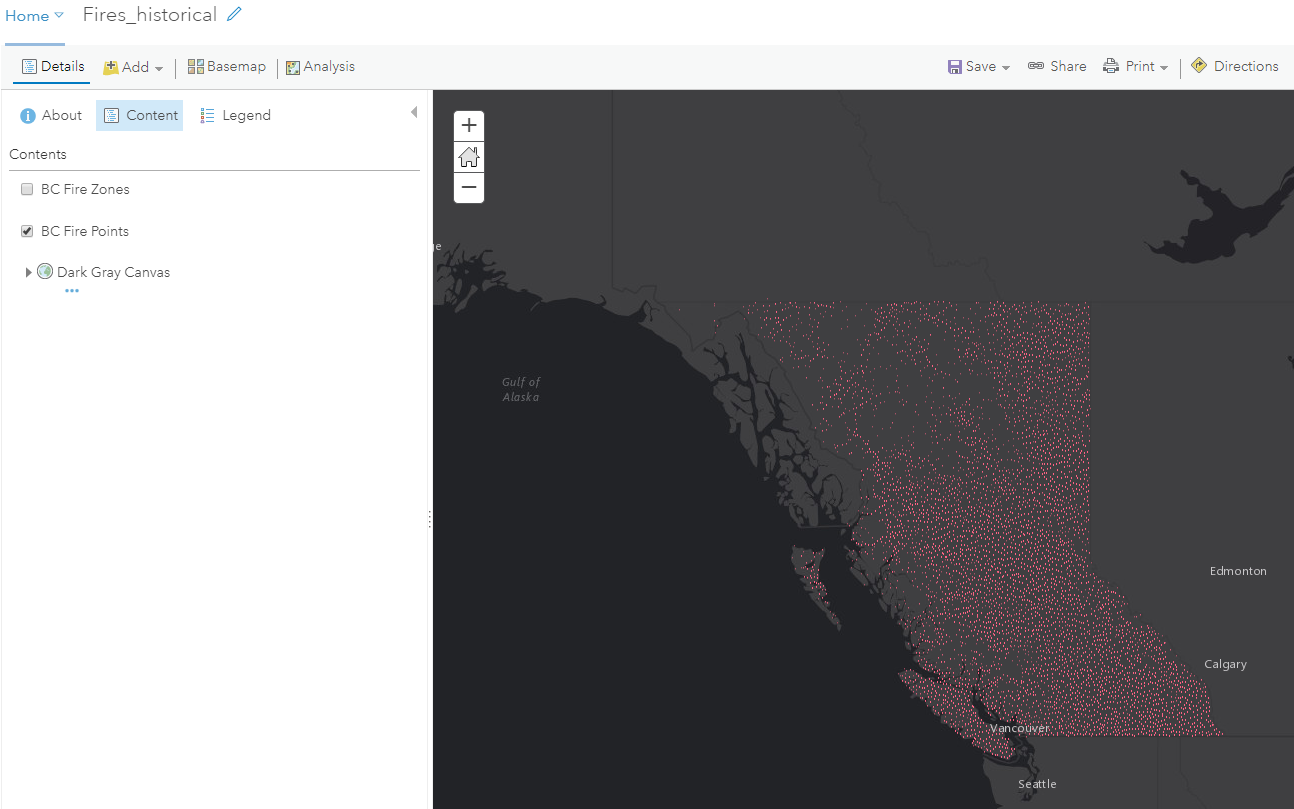
After getting the data ready, map produced in ArcMap where data symbolized then published to web map In ArcGIS Online, which will be the core map for the operation dashboard.

3. Creating the Dashboard:

In order to generate an Esri operation dashboard you need to be a member of ArcGIS Online organization, then have a published Web Map or hosted Feature Layer as an input to the dashboard.

Creating the dashboard went through many steps as described below:

  • Login to your ArcGIS Online organization using your username and password.
  • From the main interface click the App Launcher button as below snapshot
Application Launcher button

or you could also click on your Web Map application under Content in ArcGIS Online then click on Create Web App dropdown list to choose Using Operations Dashboard

Create Web App
  • Create Web App box will be opened to fill Title, Tag and Summary
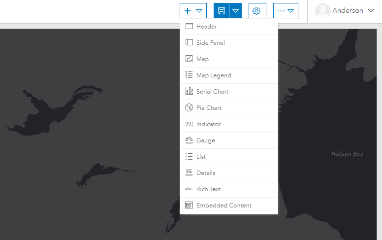
  • The map will be opened into the dashboard, where you will start to add the widgets you need to your application from the drop-down menu as below snapshot.
  • Widgets will be added and configured as needed.

Toronto Flood Events Dashboard has included the most important widgets (Map, Header, Serial Chart, Pie Chart, Indicator, and List)

Once widget selected, the configuration box will be opened which is easy to be configured then will be dragged to be docked as needed

After adding multiple widgets, an important setting needs to be configured in the Map widget to set what is called an Action Framework, that happens when we change the map extent of the geographic area, then the other dashboard elements such as (Serial Chart, Pie Chart, Indicator, and List) will interactively be changed.

  • From the Map Widget go to Configure button, then select Map Actions tab, hit Add Action drop-down list then filter to choose other dashboard elements from the configuration box. the option When Map Extent Changes appears to let you filter and make action to other elements as well. Indeed, this is the most powerful tool in the dashboard.
  • Another configuration could be made in the Header element where you can insert a drop-down menu to map a certain feature by date, type, area or time, which is easily be configured in the dashboard web application.
  • After configuring all required elements, hit save then you can share or publish your dashboard web application with other users out of your organization.
To access the Dashboard click on the link below
Toronto Flood Events 2013-2017

Geovisualization Project Limitations:

The project was encountered two main limitations:

The data limitation:

Data limitations were taken most of the time to be defined, then after defining the available open data, many data cleansing and manipulation has been taking in terms of changing spatial reference to fit with online maps or changing the data format, which are still limited with the variables used, the derived events point generated randomly from the polygon shapefile “flood-reporting-wgs84” for Toronto wards to show the number of events per Toronto ward, which are not available as points from the main source; even though, the points still not accurate in location, but it give an idea about the number of event per ward boundary in different years.

Technology Accessibility:

It is clearly represented when we use Esri operations dashboard, which is only available to the member of ArcGIS Online organization and whom how have that access, still be able to get the benefits out of it by hitting the published location.

Visualizing Spatial Distribution of SARS in Carto

by Cheuk Ying Lee (Damita)
Geovis Project Assignment @RyersonGeo, SA8905, Fall 2019

Project Link: https://c14lee.carto.com/builder/5ebe8c01-fb32-40bf-9cae-3b5f7326d02b/embed

Background
In 2003, there was a SARS (Severe Acute Respiratory Syndrome) outbreak in Southern China. The first cases were reported in Guangdong, China and quickly spread to other countries via air travel. I experienced all the preventive measures taken and school suspension, yet too young to realize the scale of the outbreak worldwide.

Technology
CARTO is used to visualize the spatial distribution of SARS cases by countries and by time. CARTO is a software as a service cloud computing platform that enables analysis and visualization of spatial data. CARTO requires a monthly subscription fee, however, a free account is available for students. With CARTO, a dashboard (incorporating interactive maps, widgets, selective layers) can be created.

Data
The data were obtained from World Health Organization under SARS (available here). Two datasets were used. The first dataset was compiled, containing information in the number of cumulative cases and cumulative deaths of each affected country, listed by dates, from March 17 to July 11, 2003. The second dataset was a summary table of SARS cases by countries, containing total SARS cases by sex, age range, number deaths, number of recovery, percentage of affected healthcare worker etc. The data were organized and entered into a spreadsheet in Microsoft Excel. Data cleaning and data processing were performed using text functions in excel. This is primarily done to removing the superscripts after the country names such that the software can recognize, as well as changing the data types from string to numbers.

Figure 1. Screenshot of the issues in the country names that have to be processed before uploading it to CARTO.

After trials of connecting the database to CARTO, it was found that CARTO only recognized “Hong Kong”, “Macau” and “Taiwan” as country names, therefore unnecessary characters have to be removed. After cleaning the data, the two datasets were then uploaded and connected to CARTO. If the country names can be recognized, the datasets will then automatically contain spatial information. The two datasets now in CARTO appear as follows:

Figure 2. Screenshot of the dataset containing the cumulative number of cases and deaths for each country by date.

Figure 3. Screenshot of the dataset containing the summary of SARS cases for each affected country.

Figure 4. Screenshot of the page to connect datasets to CARTO. A variety of file formats are accepted.

METHOD
After datasets have been connected to CARTO, layers and widgets can be added. First, layers were added simply by clicking “ADD NEW LAYER” and choosing the datasets. After the layer was successfully added, data were ready to be mapped out. To create a choropleth map of the number of SARS cases, choose the layer and under STYLE, specify the polygon colour to “by value” and select the fields and colour scheme to be displayed.

Figure 5. Screenshot showing the settings of creating a choropleth map.

Countries are recognized as polygons in CARTO. In order to create a graduated symbol map showing number of SARS cases, centroids of each country has to be computed first. This was done by adding a new analysis of “Create Centroids of Geometries”. After that, under STYLE, specify the point size and point colour to “by value” and select the field and colour scheme.

Figure 6. Sets of screenshots showing steps to create centroids of polygons. Click on the layer and under ANALYSIS, add new analysis which brings you to a list of available analysis.


Animation was also created to show SARS-affected countries affected by dates. Under STYLE, “animated” was selected for aggregation. The figure below shows the properties that can be adjusted. Play around with the duration, steps, trails, and resolution, these will affect the appearance and smoothness of the animation.


Figure 7. Screenshot showing the settings for animation.

Figure 8. Screenshot showing all the layers used.

Widgets were added to enrich the content and information, along with the map itself. Widgets are interactive tools for users where displayed information can be controlled and explored by selecting targeted filters of interest. Widgets were added simply by clicking “ADD NEW WIDGETS” and selecting the fields to be presented in the widget. Most of them were chosen to be displayed in category type. For each category type widget, data has to be configured by selecting the field that the widget will be aggregated by, for most of them, they are aggregated by country, showing the information of widget by countries. Lastly, the animation was accompanied by a time series type widget.

Figure 9. Sets of screenshots showing the steps and settings to create new widgets.

Figure 10. A screenshot of some of the widgets I incorporated.

FINAL PROJECT

The dashboard includes an interactive map and several widgets where users can play around with the different layers, pop-up information, widgets and time-series animation. Widgets information changed along with a change in the map view. Widgets can be expanded and collapsed depending on the user’s preference.

LIMITATION
For the dataset of SARS accumulated cases by dates, some dates were not available, which can affect the smoothness of the animation. In fact, the earliest reported SARS cases happened before March 17 (earliest date of statistics available on WHO). Although the statistics still included information before March 17, the timeline of how SARS was spread before March 17 was not available. In addition, there were some inconsistencies in the data. The data provided at earlier dates contain less information, including only accumulated cases and deaths of each affected country. However, data provided at later dates contain new information, such as new cases since last reported date and number of recovery, which was not used in the project in order to maintain consistency but otherwise could be useful in illustrating the topic and in telling a more comprehensive story.

CARTO only allows a maximum of 8 layers, which is adequate for this project, but this may possibly limit the comprehensiveness if used for other larger projects. The title is not available at the first glance of the dashboard and it is not able to show the whole title if it is too long. This could cause confusion since the topic is not specified clearly. Furthermore, the selective layers and legend cannot be minimized. This obscures part of the map, affecting users perception because it is not using all of its available space effectively. Lastly, the animation is only available for points but not polygons, which would otherwise be able to show the change in SARS cases (by colour) for each country by date (time-series animation of choropleth map) and increase functionality and effectiveness of the animation.

Turbo Vs Snail

by Jazba Munir

The highways in Canada including the Trans Canada Highway (TCH) and the National Highways System (NHS), fall within provincial or territorial jurisdiction (Downs, 2004). The Greater Toronto Area (GTA) is surrounded by many of the 400 series highways. Some of the segments or between interchanges experience higher traffic volume than others (Downs, 2004). The traffic volume during certain hours such as morning rush hours (6:30 – 9:30) and evening rush hours (4:30- 6:30) results in traffic congestion. This traffic congestion is experienced on highway (Hwy) 401 that is the most “busiest” highway of North America. In 2016, City of Toronto Council approved the road tolls for Gardiner Express and Don Valley Parkway (DVP) to decrease the traffic volume and congestion on these two highways (Fraser, 2016). This proposal was not implemented; nonetheless, it can be visualized using Tableau that whether the speed improves by using the dataset to compare the toll route with non-toll route. The steps on the Tableau: The dataset used for visualization can be organized and clean using Microsoft Excel or Tableau. The speed data is retrieved in points form. For instance, each point has a x and y coordinates. The first step is to create field ID in order to connect each point (x, y) to next point (x, y); in order, to create the line of Hwy 401.The street , highways, routes layer provided by Tableau was used as a guideline to make sure that all the points are connected in a correct order (See Figure 1) .

Figure 1: The layer added into the map sheet

The x and y are converted from measures to dimensions since, the x and y default setting is measures. This change can be made by dragging and dropping x and y from measures to dimensions. Another way is putting longitude into columns and latitude in to rows (See Figure 2).

Figure 2: Columns and Rows for Longitude and Latitude.

The difference between the two is that dimensions are tools that are used to slice and describe data record whereas measures are values of those records that are aggregated. For further assistance please refer to: https://www.tableau.com/learn/training Once all the points appear on the map in tableau use the mark first selection to select line to connect the points (See Figure 3).

Figure 3: The option to connect the dots.

The speed data for any of the selected hwy can be placed in the colors and graduated color scheme from red to green is selected. In this color scheme red indicates minimum speed of 80km whereas green indicates maximum speed 120 km. These speeds were selected as standard to compare toll route with non-toll routes. These are some of the basics steps that are required for any spatial tableau project. The color, size, label and detail options can be selected to create the visualization much clearer (See Figure 4).

Figure 4: The option to add color, size and labels of the variables.

This shows the options for creating the comparison between the turbo vs snail. For further assistance please refer to: https://www.tableau.com/learn/training Once this is set up another sheet was added to include a graph component. The speeds can be organized by hour, minute, year, road (toll vs non-toll). The speed can be represented by using the color option. The speed on the map is represented with the red to green color gradient. The underneath map is layer map available through tableau (See Figure 5).

Figure 5: Showing the speed in color red to green.

This will indicate the difference between the speed at the different part of the hwy. All the other hwy’s appear in yellow to show insects of each hwy. The sheet 1 for map and sheet 2 with a graph are combined to create a dashboard. This dash board helps to visualize the graph and map at once. The filter for each sheet is combined to make space organized more space for the sheets (See Figure 6 and 7).

Figure 6: Showing the filters added into the dashboard.

For further assistance please refer to: https://www.tableau.com/learn/training The dashboard helps to know the speed and compare it based on the time and location. Based on the visualization, it can be concluded that toll routes have no congestion as the line is green. This indication is drawn based on the visualization. In contrast, the non-toll route appears red and light green for some sections. The color helps to know where the congestion occurs. Image 1:

Dashboard combining the two sheets In conclusion, the tableau visualization helps to compare between toll route vs non-toll route. Based on the dashboard, the toll route is turbo speed whereas the non-toll route are snails.

References https://www.brookings.edu/research/traffic-why-its-getting-worse-what-government-can-do/ https://www.cbc.ca/news/canada/toronto/city-council-meeting-road-tolls-1.3893884

Desperate Journeys

By Ibrahim T. Ghanem

Geovis Project Assignment @RyersonGeo, SA8905, Fall 2019

Background:

Over the past 20 years, Asylum Seekers have invented many travel routes between Africa, Europe and Middle East in order be able to reach a country of Asylum. Many governmental and non-governmental provided information about those irregular travel routes used by Asylum Seekers. In this context, this geovisualization project aims at compiling and presenting two dimensions of this topic: (1) a comprehensive animated spider map presenting some of the travel routes between the above mentioned three geographic areas; (2) develop a dashboard that connects those routes to other statistics about refugees in a user-friendly interface. In that sense, the best software to fit the project is Tableau.

Data and Technology

Creation of Spider maps at Tableau is perfect for connecting hubs to surrounding point as it allows paths between many origins and destinations. Besides, it can comprehend multiple layers. Below is a description of the major steps for the creation of the animated map and dashboard.

Also, Dashboards are now very useful in combining different themes of data (i.e. pie-charts, graphs, and maps), and accordingly, they are used extensively in non-profit world to present data about a certain cause. The Geovisualiztion Project applied geocoding approach to come up with the animated map and the dashboard.

The Data used to create the project included the following:

-Origins and Destinations of Refugees

-Number of Refugees hosted by each country

-Count of Refugees arriving by Sea (2010-2015)

-Demographics of Refugees arriving by Sea – 2015

Below is a brief description of the steps followed to create the project

Step 1: Data Sources:

The data was collected from the below sources.

United Nations High Commissioner for Refugees, Human Rights Watch, Vox, InfoMigrants, The Geographical Association of UK, RefWorld, Broder Free Association for Human Rights, and Frontex Europa.

However, most of the data are not geocoded. Accordingly, Google Sheets was used in Geocoding 21 routes, and thereafter each Route was given a distinguishing ID and a short description of the route.

Step 2: Utilizing the Main Dataset:

Data is imported from an excel sheet. In order to compute a route, Tableau requires data about origins,and destination with latitude and longitude. In that aspect, the data contains different categories:

A-Route I.D. It is a unique path I.D. for each route of the 21 routes;

B-Order of Points: It is the order of stations travelled by refugees from their country of origin to country of Asylum;

C-Year: the year in which the route was invented;

D-Latitude/Longitude: it is the coordinates of the each station;

F-Country: It is the country hosting Refugees;

E- Population: Number of refugees hosted in each country.

Step 3: Building the Map View:

The map view was built by putting longitude in columns, latitude in rows, Route I.D. at details, and selecting the mark type as line. In order to enhance the layout, Oder of Points was added to Marks’ Path, and changing it to dimensions instead of SUM.  Finally, to bring stations of travel, another layer was added to by putting another longitude to columns, and changing it to Dual Axis. To create filtration by Route, and timeline by year, route was added Filter while year was added to page.

Step 4: Identifying Routes:

To differentiate routes from each other by distinct colours, the route column was added to colours, and the default setting was changed to Tableau 20. And Layer format wash changed to dark to have a contrast between the colours of the routes and the background.

Step 5: Editing the Map:

After finishing up with the map formation. A video was captured by QuickStart and edited by iMovie to be cropped and merged.

Step 6: Creating the Choropleth map and Symbology:

In another sheet, a set of excel data (obtained from UNHCR) was uploaded to create a Choropoleth map that would display number of refugees hosted by each country by year 2018. Count of refugees was added to columns while Country was added to rows. The Marks’ colour ramp of orange-gold, with 4 classes was added to indicate whether or not the country is hosting a significant number of refugees. Hovering over each country would display the name of the country and number of refugees it hosts.

Step 7: Statistical Graphs:

A pie-chart and a graph were added to display some other statistics related to count of Refugees arriving by Sea from Africa to Europe, and the demographics of those refugees arriving by sea. Demographics was added to label to display them on the charts.

Step 8: Creation of the Dashboard:

All four sheets were added in the dashboard section through dragging them into the layer view. To comprehend that amount of data explanation, size was selected as legal landscape. Title was given to the Dashboard as Desperate Journeys.

Limitations

A- Tableau does not allow the map creator to change the projection of the maps; thus, presentation of maps is limited. Below is a picture showing the final format of the dashboard:

B-Tableau has an online server that can host dashboard; nevertheless, it cannot publish animated maps. Thus, the animated maps is uploaded here a video. The below link can lead the viewer to the dashboard:

https://prod-useast-a.online.tableau.com/t/desperatejourneysgeovis/views/DesperateJourneys_IbrahimGhanem_Geoviz/DesperateJourneys/ibrahim.ghanem@ryerson.ca/23c4337a-dd99-4a1b-af2e-c9f683eab62a?:display_count=n&:showVizHome=n&:origin=viz_share_link

C-Due to unavailability of geocoded data, geocoding the routes of refugees’ migration consumed time to fine out the exact routes taken be refugees. These locations were based on the reports and maps released by the sources mentioned at the very beginning of the post.

The Toronto Financial Institution Market: Bridging the gap between Cartography and Analytics using Tableau

Nav Salooja

“Geovis Project Assignment @RyersonGeo, SA8905, Fall 2019”

<script type='text/javascript' src='https://prod-useast-a.online.tableau.com/javascripts/api/viz_v1.js'></script><div class='tableauPlaceholder' style='width: 1920px; height: 915px;'><object class='tableauViz' width='1920' height='915' style='display:none;'><param name='host_url' value='https%3A%2F%2Fprod-useast-a.online.tableau.com%2F' /> <param name='embed_code_version' value='3' /> <param name='site_root' value='/t/torontofimarketgeovisprojectsa8905fall2019' /><param name='name' value='TheTorontoFIMarketDashboard/TorontoFIMarket' /><param name='tabs' value='yes' /><param name='toolbar' value='yes' /><param name='showAppBanner' value='false' /></object></div>

Introduction & Background

Banking in the 21st century has evolved significantly especially in the hyper competitive Canadian Market. Big banks nationally have a limited population and wealth share to capture given Canada’s small population and have been active in innovating their retail footprint. In this case study, TD Bank is the point of interest given its large branch network footprint in the Toronto CMA. Within the City of Toronto the bank has 144 branches and is used as the study area for the dashboard created.  The dashboard analyzes the market potential, branch network distribution, banking product recommendations and client insights to help derive analytics through a centralized and interactive data visualization tool.

Technology

The technology selected for the geovisualization component is Tableau given its friendly user interface, mapping capabilities, data manipulation and an overall excellent visualization experience. However, Alteryx was widely used for the build out of the datasets that run in Tableau. As the data was extracted from various different sources, spatial element and combining datasets was all done in Alteryx. The data extracted for Expenditure, Income and Dwelling Composition was merged and indexed in Alteryx. The TD Branches was web scrapped live from the Branch Locator and the trading areas (1.5KM Buffers) are also created in Alteryx. The software is also used for all the statistical functions such as the indexed data points in the workbook were all created in Alteryx. The geovisualization component is all created within the Tableau workbooks as multiple sheets are leverged to create an interactive dashboard for full end user development and results.

Figure 1 represents the Alteryx Workflow used to build the Market, Branch and Trade Area datasets
Figure 2 provides the build out of the final data sets to fully manipulate the data to be Tableau prepared

Data Overview

There are several data sets used to build the multiple sheets in the tableau workbook which range from Environics Expenditure Data, Census Data and webscrapped TD branch locations. In addition to these data sets, a client and trade area geography file was also created. The clients dataset was generated by leveraging a random name and Toronto address generator and those clients were then profiled to their corresponding market. The data collected ranges from a wide variety of sources and geographic extents to provide a fully functional view of the banking industry. This begins by extracting and analyzing the TD Branches and their respective trade areas. The trading areas are created based on a limited buffer representing the immediate market opportunity for the respective branches. Average Income and Dwelling composition variables are then used at the Dissemination Area (DA) geography from the 2016 Census. Although income is represented as an actual dollar value, all market demographics are analyzed and indexed against Toronto CMA averages. As such these datasets combined with Market, Client and TD level data provide the full conceptual framework for this dashboard.

Tables & Visualization Overview

Given the structure of the datasets, six total tables are utilized to combine and work with the data to provide the appropriate visualization. The first two tables are the branch level datasets which begin with the geographic location of the branches in the City of Toronto. This is a point file taken from the TD store locator with fundamental information about the branch name and location attributes. There is a second table created which analyzes the performance of these branches in respect to their client acquisition over a pre-determined timeframe.

Figure three is a visualization of the first table used and the distribution of the Branch Network within the market

The third table used consists of client level information selected from ‘frequent’ clients (clients transacting at branches 20+ times in a year. Their information builds on the respective geography and identifies who and where the client resides along with critical information that is usable for the bank to run some level of statistical analytics. The client table shows the exact location of those frequent clients, their names, unique identifiers, their preferred branch, current location, average incomes, property/dwelling value and mortgage payments the bank collects. This table is then combined to understand the client demographic and wealth opportunity from these frequent clients at the respective branches.

Figure four is the visualization of the client level data and its respective dashboard component

Table four and five are extremely comprehensive as they visualize the geography of the market (City of Toronto at a DA level). This provides a trade area market level full breakdown of the demographics and trading areas as DAs are attributed to their closest branch and allows users to trigger on for where the bank has market coverage and where the gaps reside. However, outside of the allocation of the branches, the geography has a robust set of demographics such as growth (population, income), Dwelling composition and structure, average expenditure and the product recommendations the bank can target driven through the average expenditure datasets. Although the file has a significant amount of data and can be seen as overwhelming, selected data is fully visualized. This also has the full breakdown of how many frequent clients reside in the respective markets and what kind of products are being recomened on the basis of the market demographics analyzed through dwelling composition, growth metrics and expenditure.

Figure five is the visualization of the market level data and its respective dashboard component

The final table provides visualization and breakdown of the five primary product lines of business the bank offers which are combined with the market level data and cross validated against the average expenditure dataset. This is done to identify what products can be recommended throughout the market based on current and anticipate expenditure and growth metrics. For example, markets with high population, income and dwelling growth with limited spend would be targeted with mortgage products given the anticipated growth and the limited spend indicating a demographic saving to buy their home in a growth market. These assumptions are made across the market based on the actual indexed values and as such every market (DA) is given a product recommendation.

Figure six is the visualization of the product recommendation and analysis data and its respective dashboard component

Dashboard

Based on the full breakdown of the data extracted, the build out and the tables leveraged as seen above, the dashboard is fully interactive and driven by one prime parameters which controls all elements of the dashboard. Additional visualizations such as the products visualization, the client distribution treemap and the branch trends bar graph are combined here. The products visualization provides a full breakdown of the products that can be recommended based on their value and categorization to the bank. The value is driven based on the revenue the product can bring as investment products drive higher returns than liabilities. This is then broken down into three graphs consisting of the amount of times the product is recommended, the market coverage the recommendation provides between Stocks, Mortgages, Broker Fees, Insurance and Personal Banking products. The client distribution tree map provides an overview by branch as to how many frequent clients reside in the branch’s respective trading area. This provides a holistic approach to anticipating branch traffic trends and capacity constraints as branches with a high degree of frequent clients would require larger square footage and staffing models to adequately service the dependent markets. The final component is the representation of the client trends in a five year run rate to identify the growth the bank experienced in the market and at a branch level through new client acquisition. This provides a full run down of the number of new clients acquired and how the performance varies year over year to identify areas of high and low growth.

This combined with the primary three mapping visualizations, creates a fully robust and interactive dashboard for the user. Parameters are heavily used and are built on a select by branch basis to dynamically change all 6 live elements to represent what the user input requires. This is one of the most significant capabilities of Tableau, the flexibility of using a parameter to analyze the entire market, one branch at a time or to analyze markets without a branch is extremely powerful in deriving insights and analytics. The overall dashboard then zooms in/out as required when a specific branch is selected highlighting its location, its respective frequent clients, the trade area breakdown, what kind of products to recommend, the branch client acquisition trends and the actual number of frequent clients in the market. This can also be expanded to analyze multiple branches or larger markets overall if the functionality is required. Overall, the capacity of the dashboard consists of the following elements:

1. Market DA Level Map
2. Branch Level Map
3. Client Level Map
4. Client Distribution (Tree-Map)
5. Branch Trending Graph
6. Product Recommendation Coverage, Value and Effectiveness

This combined with the capacity to manipulate/store a live feed of data and the current parameters used for this level of analysis bring a new capacity to visualizing large datasets and providing a robust interactive playground to derive insights and analytics.

The link for this full Tableau Workbook is hosted here (please note an online account is required):https://prod-useast-a.online.tableau.com/t/torontofimarketgeovisprojectsa8905fall2019/views/TheTorontoFIMarketDashboard/TorontoFIMarket?:showAppBanner=false&:display_count=n&:showVizHome=n&:origin=viz_share_link

Geovisualization of Crime in the City of Toronto Using Time-Series Animation Heat Map in ARCGIS PRO

Hetty Fu

Geovis Project Assignment @RyersonGeo, SA8905, Fall 2019

Background/Introduction

The City of Toronto Police Services have been keeping track of and stores historical crime information by location and time across the City of Toronto since 2014. This data is now downloadable in Excel and spatial shapefiles by the public and can be used to help forecast future crime locations and time. I have decided to use a set of data from the Police Services Data Portal to create a time series map to show crime density throughout the years 2014 to 2018. The data I have decided to work with are auto-theft, break and enter, robbery, theft and assault. The main idea of the video map I want to display is to show multiple heat density maps across month long intervals between 2014 to 2018 in the City of Toronto and focus on downtown Toronto as most crimes happen within the heart of Toronto.

The end result is an animation time-series map that shows density heat map snapshots during the 4-year period, 3-month interval at a time. Examples of my post are shown at the end of this blog post under Heat Map Videos.

Dataset

All datasets were downloaded through the Toronto Police Services Data Portal which is accessible to the public.

The data that was used to create my maps are:

  1. Assault
  2. Auto Theft
  3. Robbery
  4. Break and Enter
  5. Theft

Process Required to Generate Time-Series Animation Heat Maps

Step 1:  Create an additional field to store the date interval in ArcGis Pro.

Add the shapefile downloaded from the Toronto Police Services Portal intoArcGIS Pro.

First create a new field under View Table and then click on Add.             

To get only the date, we use the Calculate Field in the Geoprocessing tools with the formula

date2=!occurrence![:10]  

where Occurrence is the existing text field that contains the 10 digit date: YYYY-MM-DD. This removes the time of day which is unnecessary for our analysis.

Step 2: Create a layer using the new date field created.

Go into properties in the edited layer. Under the time tab, place in the new date field created from Step 1 and enter in the time extent of the dataset. In this case, it will be from 2014-01-01 to 2018-12-31 as the data is between 2014 to 2018.

Step 3: Create Symbology as Heat Map

Go into the Symbology properties for the edited layer and select heat map under the drop down menu. Select 80 as its radius which will show the size of the density concentration in a heat map. Choose a color scheme and set the method as Dynamic. The method used will show how each color in the scheme relates to a density value. In a Dynamic setting versus and constant, the density is recalculated each time the map scale or map extent changes to reflect only those features that are currently in view. The Dynamic method is useful to view the distribution of data in a particular area, but is not valid for comparing different areas across a map (ArcGIS Pro Help Online).

Step 4: Convert Map to 3D global scene.

Go to View tab on the top and select convert to global scene. This will allow the user to create a 3D map feature when showing their animated heat map.

Step 5: Creating the 3D look.

Once a 3D scene is set, press and hold the middle mouse button and drag it down or up to create a 3D effect.

Step 6: Setting the time-series map.

Under the Time tab, set the start time and end time to create the 3 month interval snapshot. Ensure that “Use Time Span” is checked and the Start and End date is set between 2014 and 2018. See the image below for settings.

Step 7: Create a time Slider Steps for Animation Purposes

Under Animation tab, select the appropriate “Append Time” (the transition time between each frame). Usually 1 second is good enough, anything higher will be too slow. Make sure to check off maintain speed and append front before Importing the time Slider Steps. See below image.

Step 8: Editing additional cosmetics onto the animation.

Once the animation is created, you may add any additional layers to the frames such as Titles, Time Bar and Paragraphs.

There is a drop down section in the Animation tab that will allow you to add these cosmetic layers onto the frame.

Animation Timeline by frames will look like this below.

Step 9: Exporting to Video

There are many types of exports the user can choose to create. Such as Youtube, Vimeo, Twitter, Instagram, HD1080 and Gif. See below image for the settings to export the create animation video. You can also choose the number of frames per second, as this is a time-series snapshot no more than 30 frames per second is needed. Choose a place where you would like to export the video and lastly, click on Export.

Conclusion/Recommendation/Limitation

As this was one of my first-time using ArcGIS Pro software, I find it very intuitive to learn as all the functions were easy to find and ready to use. I got lucky in finding a dataset that I didn’t have to format too much as the main fields I required were already there and the only thing required was editing the date format. The number of data in the dataset was sufficient for me to create a time series map that shows enough data across the city of Toronto spanning 3 months at a time. If there was less data, I would have to increase my time span. The 3D scene on ArcGIS Pro is very slow and created a lot of problems for me when trying to load my video onto set time frames. As a result of the high-quality 3D setting, I decided to use, it took couple of hours to render my video through the export tool. As the ArcGIS Pro software wasn’t made to create videos, I felt that there was lack of user video modification tools.

Heat Map Videos Export

  1. Theft in Downtown Toronto between 2014-2018. A Time-Series Heat Map Animation using a 3 month Interval.
  2. Robbery in Downtown Toronto between 2014-2018. A Time-Series Heat Map Animation using a 3 month Interval.
  3. Break and Enter in Downtown Toronto between 2014-2018. A Time-Series Heat Map Animation using a 3 month Interval.
  4. Auto Theft across the City of Toronto between 2014-2018. A Time-Series Heat Map Animation using a 3 month Interval.
  5. Assault across the City of Toronto between 2014-2018. A Time-Series Heat Map Animation using a 3 month Interval.

Visualizing Toronto Fire Service Response

By: Remmy Zelaya

Geovis Project Assignment @RyersonGeo, SA8905, Fall 2019

CARTO is an online tool to create online maps, dashboards, and perform spatial analysis. Basic membership is free and no coding experience is required to get your maps online. I creating my project on visualizing Toronto Fire Service data entirely in CARTO. The embedded map is below or you can click here to see it in a new tab.

I’ll briefly explain how I created my map and how you can too. 

Before we get to CARTO, we’ll need our data. The City of Toronto’s Open Data portal contains lots of free data on city services and life. From the portal I downloaded shapefiles of TFS stations and run areas (catchment areas for fire stations), and a CSV file of fire incidents.

Next create a CARTO account if you don’t already have one. Once logged in, the CARTO home page will have links to “Getting Started”, “New Map”, and “New dataset.” The Getting Started page is an excellent tutorial on CARTO for first time users. 

Before we start making a map, we will need to upload our data. Click “new dataset” and follow the prompts. Note, CARTO requires shapefiles to be archived in a ZIP file. 

Once that is done, click on “new map” and add your uploaded datasets. CARTO will add your datasets as layers to the map, zoom to layer extent, and automatically create a point layer out of the CSV file. 

The map is on the right side of the screen and a control panel with a list of the uploaded layers is on the right. From here we can do a couple of things;

  • Re-title our map by double clicking on the default title
  • Rearrange our layers by dragging and dropping. Layer order determines drawing order. Rearrange the layers so that the stations and incidents points are on top of the run area polygon.
  • Change the base map. I’ve used Positon Lite for a simple and clean look. Note, CARTO has options to import base maps and styles from other site, or to create your own.
  • Click on the layer card to bring up that layer’s options menu.

Let’s click on the fire stations layer. As with the map we can rename the layer by double clicking on the name. The layer menu has five panes, Data, Analysis, Style, Pop-Up, Legend. The Style pane will be selected by default. The first section of the Style pane is aggregation, which is useful for visualizing dense point layers. We’ll keep the default aggregation of By Point. Section 2 Style controls the appearance of the layer. I’ve changed my point colour to black and increased the size to 12. I need the stations to stand out from the incident points. 

Now with the incidents layer, I decided to use the Animation aggregation option. If the point layer has a column representing time, we can use this to create an animation of the points appearing on the map over time. This option creates a time slider widget at the bottom of the map with a histogram representing the amount of fires over time.

With the run areas, I decided to create a choropleth map where run areas with higher amount of incidents would appear darker on the map. To do this, I first need to determine how many incidents points fall into each run area. Go to the run area menu, click on Analysis, then “+Add New Analysis.” CARTO will navigate to a new page with a grid of its spatial analysis options. Click on “Intersect and Aggregate” which finds “overlapping geometries from a second layer and aggregate its values in the current layer.”

CARTO will navigate back to the Analysis pane of the run area menu and display options for the analysis. Run area should already be selected under Base Layer. Choose incidents as the target layer, and under Measure By select count. CARTO will display a message stating new columns have been added to the data, count_vals and count_vals_density. 

There will be an option to style the analysis. Click on it. Choose “by value” for Polygon Colour, and choose the new count_vals_density for Column, then select an appropriate colour scheme.

CARTO’s widget feature creates small boxes on the right of the map with useful charts and stats on our data. You click on the Widgets pane to start add new widgets from a grid (as with Analysis) or can add new widgets based on a specific layer from that layer’s Data pane. CARTO has four types of widgets;

  • Category creates a horizontal bar chart measuring how many features fit into a category. This widget also allows users to filter data on the map by category. 
  • Histogram creates a histogram measuring a selected variable
  • Formula displays a statistic on the data based on a selected formula
  • Time Series animates a layers according to its time information.

As with layers, clicking on a widget brings up its option menu. From here you can change the source data layer, the widget type, and configure data values. For my Fires by Run Area widget, I used the incidents layer as the source, aggregated by id_station (fire station ID numbers) using the count operation. This widget counts how many incidents each station responded to and displays a bar chart of the top 5 stations. Clicking on a station in the bar chart will filter the incidents by the associated station. After this, I added four formula based widgets.

We’re nearly done. Click on the “publish” button on the bottom left to publish the map to the web. CARTO will provide a link for other users to see the map and an HTML embed code to add it to a web page. I used the embed code to added the embedded map to the beginning of the post.

Thanks for reading. I hope you’ll use CARTO to create some nice maps of your own. You may be interested in checking out the CARTO blog to see other projects built on the platform or the Help section for my information on building your own maps and applications.

Visualizing the Story of Forest Fires in BC with Operational Dashboards

By: Anderson Webber

Background

2017 and 2018 were the two worst fire years in the BC’s known history, diminishing provincial air quality and destroying healthy ecosystems beyond natural levels. These consecutive record-breaking years have led to many discussions regarding the causes of such fires, with the hope to better understand why these events occurred and hopefully prevent such events from reoccurring. The purpose of this project is to help aid in the understanding of BC wildfires through an interactive summary of the 179,000 wildfires occurring within the province over the last 68 years via an Operations Dashboard.

This image has an empty alt attribute; its file name is UEvIDLI36LdfJ3DBJcZZI1UVB6dJopmn-_2ZbtI7bAB67OThU9KmieQf5J5_ZHrI_8ar62-rI2dNWdogy94w7yWQ99vqxKKxX8BLaQ1mw2VxCVySZelO-5UylqDFJOpKSWpxlK77

Data and Technology

Dashboards have become a very trendy tool for geovisualizations, designed to display location aware visualizations and analytics packaged in an easy to use web or mobile app. ESRI largely markets Operational Dashboards for real-time analytics which aid in such tasks as emergency response, but in this example I will be looking at the dashboard’s utility in understanding a large historical data set; past BC wildfires. BC wildfire data was sourced from the BC open data catalogue containing point locations and attribute data of any fire incident updated on April 1st 2019 with all previous years data since 1950. The following tutorial will allow anybody with an ArcGIS license to replicate this project.

Step 1. Getting the data

Data was downloaded from here:

https://catalogue.data.gov.bc.ca/dataset/fire-incident-locations-historical

Step 2. Data Cleaning

Beyond the date of report and location, the wildfire CSV contained information for each fire including its size, cause and which zone it occurred in… In order to create the widgets I wanted, the data had to be cleaned a bit. To determine which months the fires were worst for example, the date field in the format YYYYMMDD had to be split into three separate fields; Year, Month and Day. This could be done in any data manipulation software such as SQL server, alterex or excel. The simple query needed to select included:

=LEFT(D2,4) to select year

=MID(D2,5,2) to select month 

=RIGHT(D2,2) to select days

Step 3. Hosting layer file online

Once data was split it had to be uploaded into ArcGIS online as a hosted layer file in order to be brought into the dashboard webapp. Hosted layers allow for the uploading of large files which can be used in web, desktop or mobile apps. In order to post hosted features you must be part of an ArcGIS organization, and have privileges to post hosted layers. When you add a layer through ArcGIS Online, this is what your options should look like to host a layer:

Step 4. Making a web map

Before creating the dashboard itself, the user must create a web map first. This is done by clicking the “Create” tab then clicking the “Map” button. Once the map is open simply click the “Add +” button and bring in the hosted feature classes we just created. Now you have made a web map with the fire data. Edit symbology and add any other layers you would like in this step. I chose a dark basemap and red ‘firefly’ symbology. 

Step 5. Adding fields

Depending on what you want your dashboard to display, more data cleaning and manipulating could be done at this step. As I wanted to see what the different sizes of fires were within BC, I created an ESRI Arcade expression which would calculate a field with ranges. To do this I created a new field with data type ‘Text’ in the Fires table called ‘Sizes’ and calculated the field with: 

iif($feature[“SIZE_HA”] <=0.25 , “<0.25”,

iif($feature[“SIZE_HA”] <=10, “0.25-10”,

iif($feature[“SIZE_HA”] <=100, “10-100”,

iif($feature[“SIZE_HA”] <=1000, “100-1,000”,

iif($feature[“SIZE_HA”] <=10000, “1,000-10,000”,

iif($feature[“SIZE_HA”] <=50000, “10,000-50,000”,

iif($feature[“SIZE_HA”] >50000, “>50,000”, 0)))))))

Step 6. Creating the dashboard

Now we are ready to make the dashboard! On the same webmap which was just made, click the Share button -> Create new Webapp -> Operations Dashboard. You can call it whatever you like. Now you have a dashboard shell.

Step 7. Add widgets

Now comes the fun part. Click the “+” dropdown on the top left of the dashboard and add whatever widgets you want. Widgets can be dragged, resized and stacked allowing for a high level of customization.

Step 8. Making charts interactive

To make charts interactive, within the widget configured in the ‘actions’ toolbar and add whatever action you like. This means that selecting a bar on the chart below will change the points, indicators and all accompanying data visualizations to the months chosen. The same methods can be applied to any other aspect, including the map itself.

Keep playing around with the widgets. You can also add images. The final product http://arcg.is/1WDSyy. A screenshot can be seen below:

Limitations

Limitations for this project regarded both the data and software itself. For starters, in order to create an Operations Dashboard, you need an authorized ArcGIS account which is not free and therefore accessible to everyone. Another major limitation has to do with the size of the data set. With almost 180,000 fire points, the rending of these points online can encounter problems such as lag and may even may crash if you have limited ram. The third limitation regards the projection. ArcGIS Online defaults to a global WGS 1983 projection, which is not optimal for looking presenting data at the provincial level. Finally, the user’s screen size also has a major impact on the experience of the user. Although it can be opened on mobile devices and tablets, the dashboard becomes more limited, as graphics and titles are cut off or crushed together, taking away from the visual appeal and usability of the dashboards.

A Shot in the Dark: Analyzing Mass Shootings in the United States, 2014-2019

By: Miranda Ramnarayan

Geovis Project Assignment @RyersonGeo, SA8905, Fall 2019

The data gathered for this project was downloaded from the Gun Violence Archive (https://www.gunviolencearchive.org/), which is a non-for Profit Corporation. The other dataset is the political affiliation per state, gathered by scrapping this information from (https://www.usa.gov/election-results). Since both of these datasets contain a “State Name” column, an inner join will be conducted to allow the two datasets to “talk” to each other.

The first step is importing your excel files, and setting up that inner join.

There are four main components this dashboard is made of: States with Mass Shootings, States with Highest Death Count, Total Individuals Injured from Mass Shootings and a scattergram displaying the amount of individuals injured and killed. All of these components were created in Tableau Worksheets and then combined on a Dashboard upon completion. The following are steps on how to re-create each Worksheet. 

1. States with Mass Shootings

In order to create a map in Tableau, very basic geographic information is needed. In this case, drag and drop the “State” attribute under the “Dimensions” column into the empty frame. This will be the result:

In order to change the symbology from dots to polygons, select “Map” under the Marks section.

To assign the states with their correct political affiliation, simply drag and drop the associated year you want into the “Colour” box under Marks.

This map is displaying the states that have had mass shootings within them, from 2014 to 2019. In order to automatic this, simply drag and drop the “Incident Date” attribute under Pages. The custom date page has been selected as “Month / Year” since the data set is so large.

This map is now complete and when you press the play button displayed in the right side of this window, the map will change as it only displays states that have mass shootings within them for that month and year.

2. States with Highest Death Count

This is an automated chart that shows the Democratic and Republican state that has the highest amount of individuals killed from mass shootings, as the map with mass shootings above it runs through its time series. Dragging and dropping “State” into the Text box under Marks will display all the states within the data set. Dragging and dropping the desired year into Colour under Marks will assign each state with its political party.

 In order for this worksheet to display the state with the highest kill count, the following calculations have to be made once you drag and drop the “# Killed” from Measures into Marks.

To link this count to each state, filter “State” to only display the one that has the maximum count for those killed.

This will automatically place “State” under Filters.

Drag and drop “Incident Date” into Pages and set the filter to Month / Year, matching the format from section 1.

Format your title and font size. The result will look like:

3. Total Individuals Injured from Mass Shootings

In terms of behind the scenes editing, this graph is the easiest to replicate.

Making sure that “State Name” is above “2016” in this frame is very important, since this is telling Tableau to display each state individually in the bar graph, per year.

4. Scattergram

This graph displays the amount of individuals killed and injured per month / year. This graph is linked to section 1 and section 2, since the “Incident Date” under Pages is set to the same format. Dragging and dropping “SUM (#Killed)” into Rows and SUM (#Injured) into Columns will set the structure for the graph.

In order for the dot to display the sum of individuals killed and injured, drag and drop “# Killed” into Filter and the following prompt will appear. Select “Sum” and repeat this process for “# Injured”.

Drag and drop “Incident Date” and format the date to match Section 1 and 2. This will be your output.

Dashboard Assembly

This is where Tableau allows you to be as customizable as you want. Launching a new Dashboard frame will allow you to drag and drop your worksheets into the frame. Borders, images and text boxes can be added at this point. From here, you can re-arrange/resize and adjust your inserted workbooks to make sure formatting is to your desire.  

Right clicking on the map on the dashboard and selecting “Highlight” will enable an interactive feature on the dashboard. In this case, users will be able to select a state of interest, and it will highlight that state across all workbooks on your dashboard. This will also highlight the selected state on the map, “muting” other states and only displaying that state when it fits the requirements based on the calculations set up prior.

Since all the Pages were all set to “Month/Year”, once you press “play” on the States with Mass Shootings map, the rest of the dashboard will adjust to display the filtered information.

It should be noted that Tableau does not allow the user to change the projection of any maps produced, resulting in a lack of projection customization. The final dashboard looks like this:

Visualizing New York City yellow cabs and their origin-destination over time

Fana Gidey
SA8905 – Cartography and Geovisualization
Fall 2019
@Ryersongeo

Background

Taxi networks can uncover how people move within neighbourhoods and detect distinct communities, cost of housing and other socio-economic features.  New York City is famous for its yellow cabs and diverse neighbourhoods providing a good study area. This project will look at trip records for Yellow Cab taxi’s in order to visualize New York residents travel patterns over-time.

On New Year’s Eve, New York taxi riders are expected to make their way to see the ball drop, watch the fireworks from the east of Hudson River, Battery Park, and Coney Island. Lastly movement from the outer boroughs into Manhattan and Brooklyn for entertainment is expected. 

Marketers, policy makers, urban planners and real estate industry can leverage this spatial data to predict activity and features of human society.

Technology

The technology used for visualization is Kepler.gl. Kepler.gl is an open-source geospatial data analysis tool. I picked the tool because it can visualize paths over time with time-series and animations that can communicate a very powerful data narrative. Previous examples were flight and refugee movement data. Kepler has drag and drop options to highly skilled scripting.

Step 1: Gathering the Data

The data was obtained NYC Open Data Portal – Transportation – City of New York. Here you can obtain Yellow, Green Cab and For-Hire Vehicle trip records. Initially I wanted to compare trip records between two years (i.e. 2009 and 2016) however this data set is so robust (131,165,043 records). I decided to narrow down and focused on yellow cabs and only a single date that may have lots of taxi activity (January 1st 2016). The columns in the data set include: VendorID, Pickup and Drop-off Date Timestamp, pickup and drop off latitude and longitudes, trip distance, payment type, payment amount, tax, toll amount, and total amount.

Step 2: Cleaning the Data

It is imperative to know how data needs to be structured when drawing paths over time using origin-destination data. In order to create a path over time map, the data source should include the following types of information:

  • The Latitude and Longitude coordinates for each trip data point in a path
  • A column that defines the order to connect the points (in my case I used the date timestamp information, or you can manually applied surrogate key is also acceptable (i.e. 1, 2, 3, 4, 5)
  • The source data has a sufficient amount of data points to create lines from points

Before

The data was then cleaned and prepped for use in excel. The fields were formatted to currency (2 decimal spaces $) date (m/d/yyyy h:mm:ss) and null values were removed. A trip duration field was calculated and obsolete data is removed. The csv now has 345,038 records.

After

Step 3: Create Visualization

Now that that the data is cleaned and prepped for use it can be implemented to an interactive visualization software. As soon as you navigate to kepler.gl and select ‘Get Started’. You will be prompted to add your data (i.e. csv, json, and geojson).

Once your data is loaded, you can start with the “Layer” options. The software was able to pick up the pick-up and drop-off latitude and longitude. The pick-up and drop-off are represented as point features, you can use the drop-down menu to select lines, arcs, etc.

The origin-destination points are now represented by arcs. In order to animate the feature, a field must be selected to sort by.

In the filters tab, you can choose a field to sort by (i.e. “pick_up datetime”).

You can edit the map style by select the “Base Map” tab.

Other customization features are highlighted below.

Final Results

https://fanagidey.github.io/