
Asvini Patel
Geovis Project Assignment, TMU Geography, SA8905, Fall 2024
Introduction
Mapping indices like NDVI and NDBI is an essential approach for visualizing and understanding environmental changes, as these indices help us monitor vegetation health and urban expansion over time. NDVI (Normalized Difference Vegetation Index) is a crucial metric for assessing changes in vegetation health, while NDBI (Normalized Difference Built-Up Index) is used to measure the extent of built-up areas. In this blog post, we will explore data from 2019 to 2024, focusing on the single and lower municipalities of Ontario. By analyzing this five-year time series, we can gain insights into how urban development has influenced greenery in these regions. The web page leverages Google Earth Engine (GEE) to process and visualize NDVI data derived from Sentinel-2 imagery. With 414 municipalities to choose from, users can select specific areas and track NDVI and NDBI trends. The goal was to create an intuitive and informative platform that allows users to easily explore NDVI changes across Ontario’s municipalities, highlighting significant shifts and pinpointing where they are most evident.
Data and Map Creation
In this section, we will walk through the process of creating a dynamic map visualization and exporting time-series data using Google Earth Engine (GEE). The provided code utilizes Sentinel-2 imagery to calculate vegetation and built-up area indices, such as NDVI and NDBI for a defined range of years. The application was developed using the GEE Code Editor and published as a GEE app, ensuring accessibility through an intuitive interface. Keep in mind that the blog post includes only key snippets of the code to walk you through the steps involved in creating the app. To try it out for yourself, simply click the ‘Explore App’ button at the top of the page.
Setting Up the Environment
First, we define global variables that control the years of interest, the area of interest (municipal boundaries), and the months we will focus on for analysis. In this case, we analyze data from 2019 to 2024, but the range can be modified. The code utilizes the municipality Table to filter and display the boundaries of specific municipalities.
var beginningYear = 2019;
var endingYear = 2024;
var NDVILabel = 'NDVI';
var NDBILabel = 'NDBI';
Visualizing Sentinel-2 Imagery
Sentinel-2 imagery is first filtered by the date range (2019-2024 in our case) and bound to a specific municipality. Then we mask clouds in all images using a cloud quality assessment dataset called Cloud Score+. This step helps in generating clean composite images, as well as reducing errors during index calculations. We use a set of specific Sentinel-2 bands to calculate key indices, like NDVI and NDBI which are visualized in true colour or with specific palettes for enhanced contrast. To make this easier, the bands of the Sentinel 2 images (S2_BANDS) are renamed to human-readable names (STD_S2_NAMES).
var S2_BANDS = ['B2', 'B3', 'B4', 'B8', 'B11', 'B12', 'TCI_R', 'TCI_G', 'TCI_B', 'SCL'];
var STD_S2_NAMES = ['blue', 'green', 'red', 'nir', 'swir1', 'swir2', 'redT', 'greenT', 'blueT', 'class'];
var QA_BAND = 'cs_cdf';
var QA_BAND2 = 'cs';
// The threshold for masking; values between 0.50 and 0.65 generally work well.
// Higher values will remove thin clouds, haze & cirrus shadows.
var CLEAR_THRESHOLD = 0.65;

function getCloudMaskedSentinelImages(municipalityGeometry)
{
  // Make a clear median composite.
  var sentinelDataset = sentinel2
      .filterBounds(municipalityGeometry)
      .filter(ee.Filter.date(beginningYear+'-01-01', endingYear+'-12-31'))
      .linkCollection(csPlus, [QA_BAND, QA_BAND2])
      .map(function(img) {
        var x = img.updateMask(img.select(QA_BAND).gte(CLEAR_THRESHOLD));
        x = x.set('year', img.date().get('year'));
        return x;
      })
      .select(S2_BANDS, STD_S2_NAMES);
  return sentinelDataset;
}

function getProcessedSentinelImages(municipalityFeature)
{
  var municipalityGeometry = municipalityFeature.geometry();
  var sentinelDataset = getCloudMaskedSentinelImages(municipalityGeometry);

  var sentinelImages = ee.List([])
  for (var year=beginningYear; year <= endingYear;year++)
  {
    var imageForYear = sentinelDataset.filterDate(year+'-01-01',year+'-12-31').median()
                                        .set('year',year)
                                        .set('product','Sentinel 2');

    imageForYear = imageForYear.clip(municipalityGeometry);
    sentinelImages = sentinelImages.add(imageForYear);
  }
  return ee.ImageCollection(sentinelImages);
}
Index Calculations
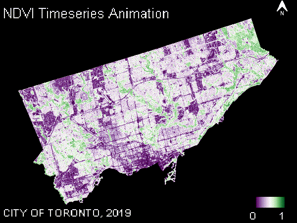
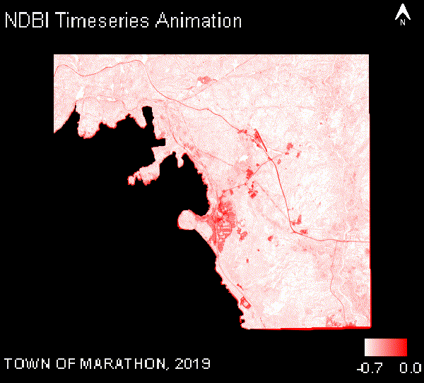
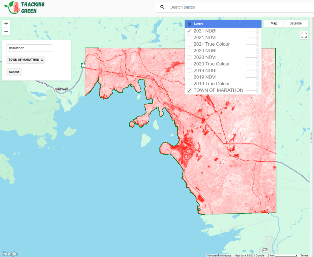
The key indices are calculated for each year within the selected municipality boundaries. These indices are calculated using the normalized difference between relevant bands (e.g., NIR and Red bands for NDVI), whereas NDBI is calculated using (SWIR and NIR bands). After calculating the indices, the results are added to the map for visualization. Typically, for NDVI, green represents healthy vegetation, while purple indicates unhealthy vegetation, often corresponding to developed areas such as cities. In the case of NDBI, red pixels signify higher levels of built-up areas, whereas lighter colors, such as white, indicate minimal to no built-up areas, suggesting more vegetation. Together, NDVI and NDBI results provide complementary insights, enabling a better understanding of the relationship between vegetation and built-up areas.
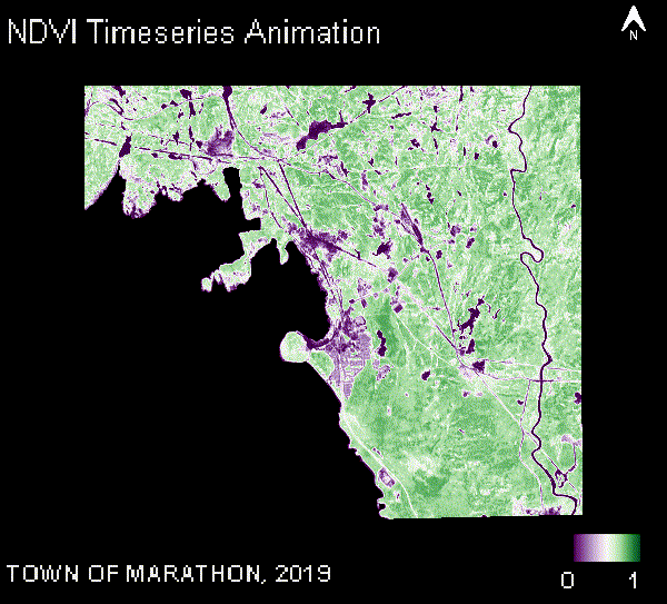
For each year, the calculated index is visualized, and users can see how vegetation and built-up areas have changed over time.
function calculateIndexes(sentinelImages)
{
  var imagesNDVI = ee.List([]);
  var imagesNDBI = ee.List([]);
  for (var year = beginningYear; year <= endingYear; year++)
  {
    var result = calculateIndexesForYear(sentinelImages, year, true);
    imagesNDVI = imagesNDVI.add(result.NDVI);
    imagesNDBI = imagesNDBI.add(result.NDBI);
  }
  return {NDVI: imagesNDVI, NDBI: imagesNDBI};
}

function calculateIndexesForYear(processedImages, year, addToMap)
{
  var sentinelImageForYear = processedImages.filterMetadata('year', 'equals', year).first();
  sentinelImageForYear = addTimePropertiesToImage(sentinelImageForYear, year);
  var NDVISentinel = calculateNormalizedDifference(sentinelImageForYear, year, 'nir', 'red');
  var NDBISentinel = calculateNormalizedDifference(sentinelImageForYear, year, 'swir2', 'nir');

  var result = {NDVI: NDVISentinel, NDBI: NDBISentinel};
  if (addToMap) {
    addImagesToMap(sentinelImageForYear, result, year);
  }

  return result;
}

function calculateNormalizedDifference(image, year, band1, band2)
{
  var diff = image.normalizedDifference([band1, band2]);
  return addTimePropertiesToImage(diff, year);
}

function addTimePropertiesToImage(image, year)
{
  var startDate = ee.Date.fromYMD(year, filterMonthStart, 1);
  var endDate = startDate.advance(filterMonthEnd - filterMonthStart, 'month');
  return image.set('system:time_start',startDate.millis(),'system:time_end', endDate.millis(),'year', year);
}
Generating Time-Series Animations
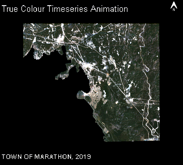
To provide a clearer view of changes over time, the code generates a time-series animation for the selected indices (e.g., NDVI). The animation visualizes the change in land cover over multiple years and is generated as a GIF, which is displayed within the map interface. The animation creation function combines each year’s imagery and overlays relevant text and other symbology, such as the year, municipality name, and legend.
function createAnimationPerYear(collectionImages, collectionName, collectionVisualization,
municipalityName, aoiDimensions, addGradientBar)
{
  var mapTitle = collectionName+' Timeseries Animation';
  var legendLabels = ee.List.sequence(collectionVisualization.min,collectionVisualization.max);
  var gradientBarLabelResize = collectionVisualization.min%1!=0 || collectionVisualization.max%1!=0;
  var northArrow = NorthArrow.draw(aoiDimensions.NorthArrowPoint, aoiDimensions.Scale, aoiDimensions.Width.multiply(.08), .05, 'EPSG:3857');
  var textProperties = {
    fontType: 'Arial',
    fontSize: gradientBarLabelResize? 10 : 14,
    textColor: 'ffffff',
    outlineColor: '000000',
    outlineWidth: 0.5,
    outlineOpacity: 0.6
  };
  var gradientBar;
  if (addGradientBar) {
    gradientBar = GradientBar.draw(aoiDimensions.GradientBarBox,
    {
      min:collectionVisualization.min,
      max:collectionVisualization.max,
      palette: collectionVisualization.palette,
      labels: [collectionVisualization.min,collectionVisualization.max],
      format: gradientBarLabelResize ? '%.1f' : '%.0f',
      round:false,
      text: textProperties,
      scale: aoiDimensions.Scale
    });
  }

  var rgbVis = ee.ImageCollection(collectionImages).map(function(img) {
    var annotations = [
      {property: 'titleLabel', position: 'left', offset: '2%', margin: '1%', scale: aoiDimensions.Scale, fontSize: 16 },
      {property: 'locationLabel', position: 'left', offset: '92%', margin: '1%', scale: aoiDimensions.Scale }
    ];
    var year = img.get('year');
    var labelLocation = ee.String(municipalityName).cat(', ').cat(year);
    img = img.visualize(collectionVisualization).set({titleLabel:mapTitle, locationLabel: labelLocation});
    var annotated = ee.Image(text.annotateImage(img, {}, aoiDimensions.AoiBox, annotations)).blend(northArrow);
    if (addGradientBar) {
      annotated = annotated.blend(gradientBar);
    }
    return annotated;
  });

  var uiGif = ui.Thumbnail(rgbVis, aoiDimensions.GifParams);
  return uiGif;
}

function createTimeSeriesAnimations(sentinelImages, calculatedIndexes, municipalityFeature, municipalityName)
{
  var aoiDimensions = getDimensionsForGifs(municipalityFeature);

  var ndviGif = createAnimationPerYear(calculatedIndexes.NDVI, NDVILabel, visualizationNDVI, municipalityName, aoiDimensions, true);
  var ndbiGif = createAnimationPerYear(calculatedIndexes.NDBI, NDBILabel, visualizationNDBI, municipalityName, aoiDimensions, true);
  var trueColourGif = createAnimationPerYear(sentinelImages, "True Colour", visualizationTrueColor, municipalityName, aoiDimensions, false);

  return {
    TrueColourGif : trueColourGif,
    NdviGif: ndviGif,
    NdbiGif: ndbiGif
  };
}
Map Interaction
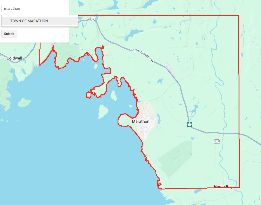
A key feature of this code is the interactive map interface, which allows users to select a municipality from a dropdown menu. Once a municipality is selected, the map zooms into that area and overlays the municipality boundaries. You can then submit that municipality to calculate the indices and render the time series GIF on the panel. You can also explore the various years on the map by selecting the specific layers you want to visualize.
To start with, we will set up the UI components and replace the default UI with our new UI:
// Initialize the map
var map = ui.Map();
// Create a list of items for the dropdown menu
var items = municipalityNames.getInfo();
// Create a search box
var searchBox = ui.Textbox({
  placeholder: 'Search...',
  onChange: function(text) {
    filterMunicipalities(text);
  }
});
// Create a dropdown menu with options
var dropdown = ui.Select({
  items: ['1'],
  placeholder: 'Choose a Municipality',
  onChange: function(municipalityName) {
    displayMunicipalityBoundary(municipalityName);
  }
});
// Create a submit button
var submitButton = ui.Button({
  label: 'Submit',
  onClick: function() {
    var selectedOption = dropdown.getValue();
    print('Submitted option:', selectedOption);
    doThings(selectedOption);
  }
});
// Create a panel to hold the UI elements
var panel = ui.Panel({
  widgets: [searchBox, dropdown, submitButton],
  layout: ui.Panel.Layout.flow('vertical'),
  style: {width: '250px', position: 'top-left'}
});
// Create a panel to hold the GIF
var gifPanel = ui.Panel({
  layout: ui.Panel.Layout.flow('vertical', true),
  style: {width: '897px', backgroundColor: '#d3d3d3'}
});

// Replace placeholder items with municipalityNames
dropdown.items().reset(items);
// Add the panel to the map
map.add(panel);

// Map/chart and image card panel
var splitPanel = ui.SplitPanel(map, gifPanel);
// Replace current UI with the new splitPanel
ui.root.clear();
ui.root.add(splitPanel);
Notice there are functions for the interactive components of the UI, those are shown below:
// Filter the dropdown with the municipalities which match the search box
function filterMunicipalities(searchString)
{
  var filteredItems = items.filter(function(item) { return item.toLowerCase().indexOf(searchString.toLowerCase()) !== -1});
  // Reset the dropdown items with the filtered items
  dropdown.items().reset(filteredItems);
}

// Display boundary of a geometry when selected from the dropdown
function displayMunicipalityBoundary(municipalityName)
{
  map.layers().reset();
  var municipalityFeature = municipalityBoundaries.filter(ee.Filter.eq('MUNICIPA_2', municipalityName)).first();
  map.centerObject(municipalityFeature.geometry());
  addGeometryBoundaryToMap(municipalityFeature.geometry(), 'red', municipalityName);
}

// Add boundary of a geometry to the map
function addGeometryBoundaryToMap(boundaryGeometry, colour, name)
{
  var styledImage = ee.Image()
    .paint({ featureCollection: boundaryGeometry, color: 1, width: 3 })
    .visualize({ palette: [colour], forceRgbOutput: true });
  map.addLayer(styledImage, {},  name, true);
}

// Add generated gifs to the gifPanel
function displayGifs(gifs)
{
  gifPanel.clear();
  gifPanel.add(gifs.TrueColourGif);
  gifPanel.add(gifs.NdviGif);
  gifPanel.add(gifs.NdbiGif);
}

// Add true colour and calculated indexes to the map for a single year
function addImagesToMap(imageForYear, indexes, year)
{
  map.addLayer(imageForYear, visualizationTrueColor, year + " True Colour", false);
  map.addLayer(indexes.NDVI, visualizationNDVI, year + " "+ NDVILabel, false);
  map.addLayer(indexes.NDBI, visualizationNDBI, year + " "+ NDBILabel, false);
}

// Submit button actions, get processed imagery, calculate indices, generate gifs, display gifs
function doThings(municipalityName) {
  var municipalityFeature = municipalityBoundaries.filter(ee.Filter.eq('MUNICIPA_2', municipalityName)).first();
  var sentinelImages = getProcessedSentinelImages(municipalityFeature);

  map.layers().reset();
  addGeometryBoundaryToMap(municipalityFeature.geometry(), 'green', municipalityName);
  map.centerObject(municipalityFeature.geometry());

  //calculate the indexes for years
  var calculatedIndexes = calculateIndexes(sentinelImages);
  var gifs = createTimeSeriesAnimations(sentinelImages, calculatedIndexes, municipalityFeature, municipalityName);

  displayGifs(gifs);
}
Future Additions
Looking ahead, the workflow can be enhanced by calculating the mean NDVI or NDBI for each municipality over longer periods of time and displaying it on a graph. The workflow can also incorporate Sen’s Slope, a statistical method used to assess the rate of change in vegetation or built-up areas. This method is valuable at both pixel and neighbourhood levels, enabling a more detailed assessment of land cover changes. Future additions could also include the application of machine learning models to predict future changes and expanding the workflow to other regions for broader use.


 Fig. 2 Field Calculator Tool in QGIS
 Fig. 3 Attribute table showing the Damge_Yr in YYYY-MM-DD format after update.
 Fig. 4 Time manager settings window
 Fig. 6 Time Manager dock showing settings for the animation in QGIS
 Fig. 7 Combining the png files in VirtualDub software