Shashank Prabhu, Geovis Project Assignment, TMU Geography, SA8905, Fall 2024
Introduction
Toronto’s residential real estate market has experienced one of the most rapid price increases among major global cities. This surge has led to a significant affordability crisis, impacting the quality of life for residents. My goal with this project was to explore the key factors behind this rapid increase, while also analyzing the monetary and fiscal policies implemented to address housing affordability.
The Approach: Mapping Median House Prices
To ensure a more accurate depiction of the market, I used the median house price rather than the average. The median better accounts for outliers and provides a clearer view of housing trends. This analysis focused on all home types (detached, semi-detached, townhouses, and condos) between 2014 and 2022.
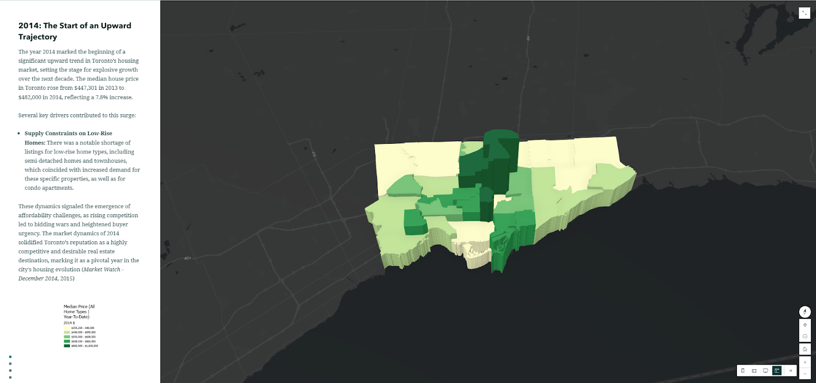
Although data for all years were analyzed, only pivotal years (2014, 2017, 2020, and 2022) were mapped to emphasize the factors driving significant changes during the period.
Data Source
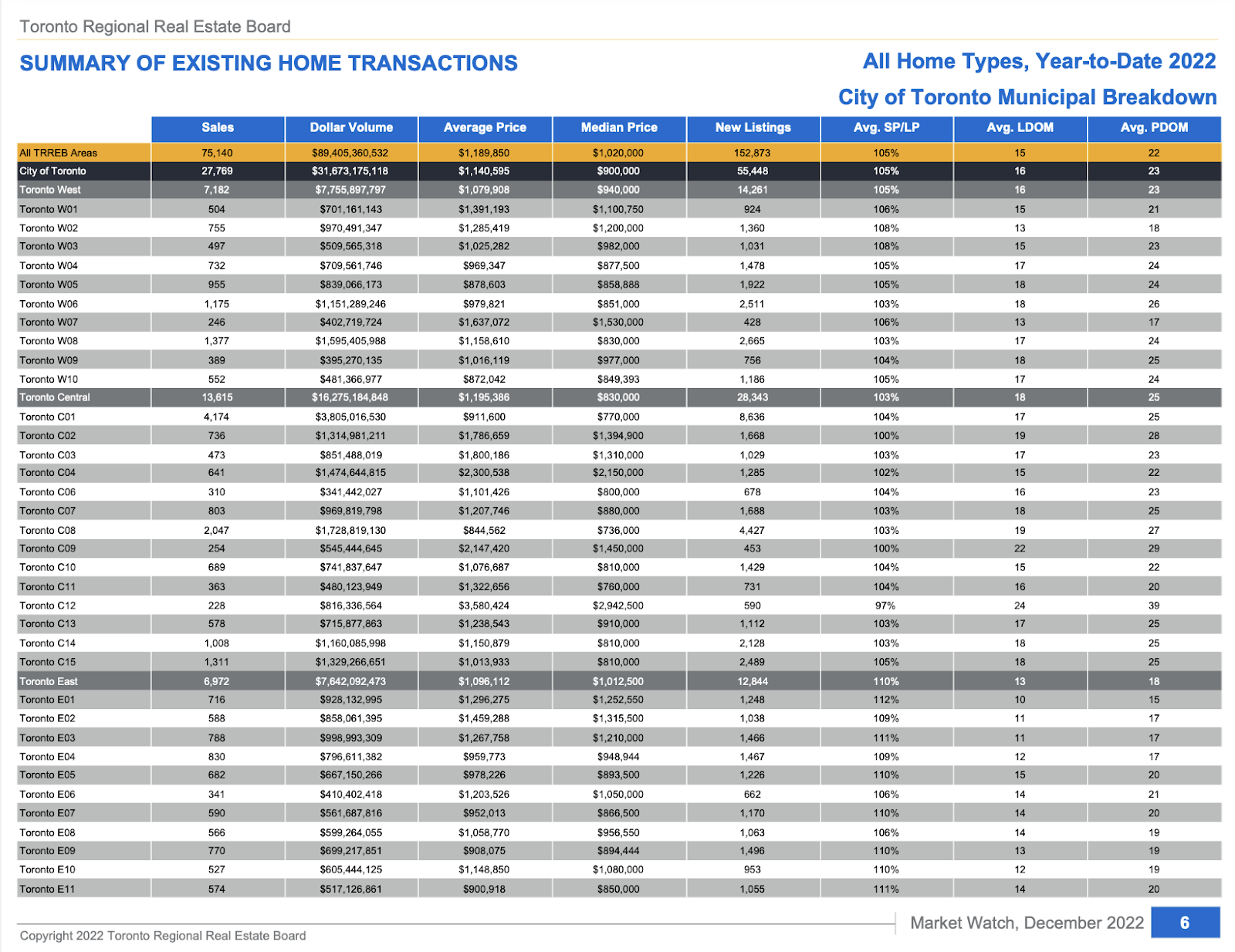
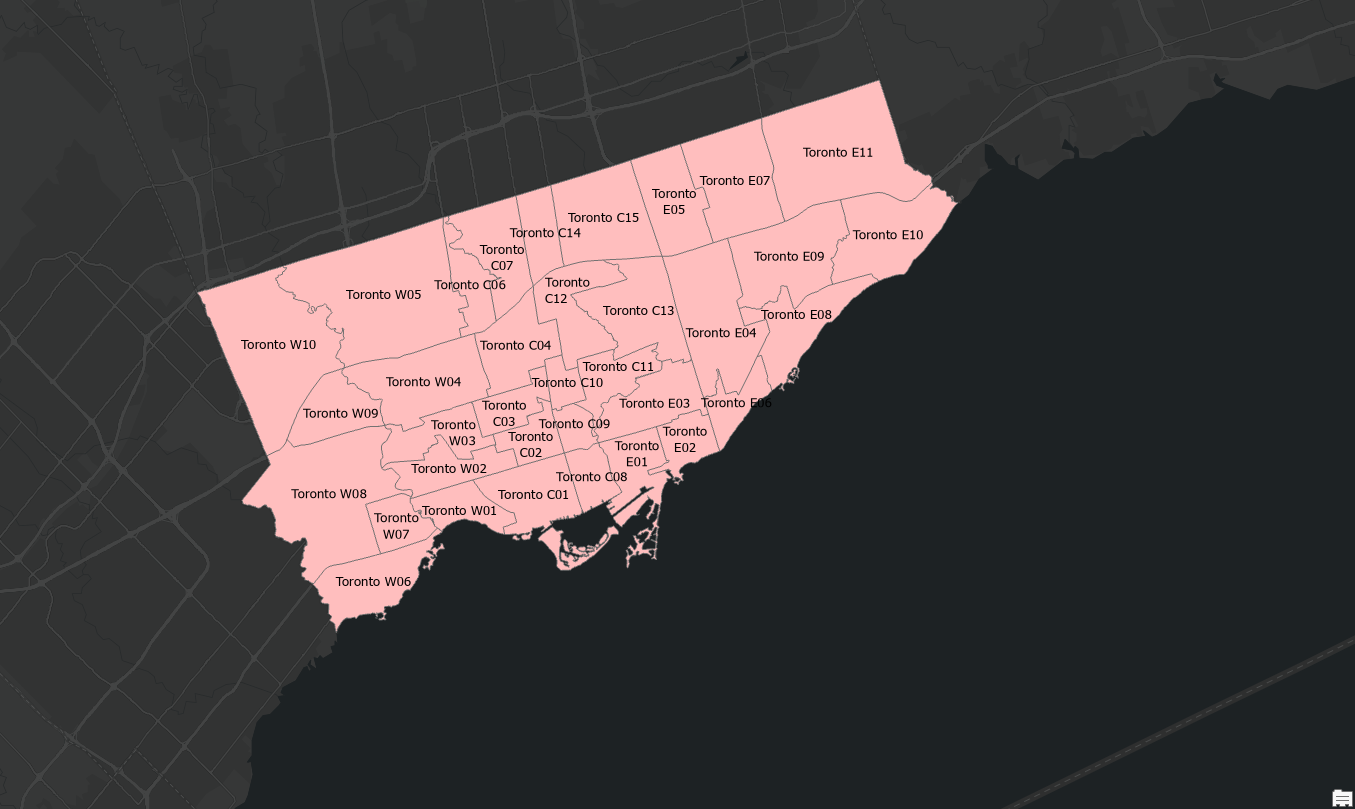
The Toronto Regional Real Estate Board (TRREB) was the primary data source, offering comprehensive market watch reports. These reports provided median price data for Central Toronto, East Toronto, and West Toronto—TRREB’s three primary regions. These regions are distinct from the municipal wards used by the city.
Creating the Maps
Step 1: Data Preparation
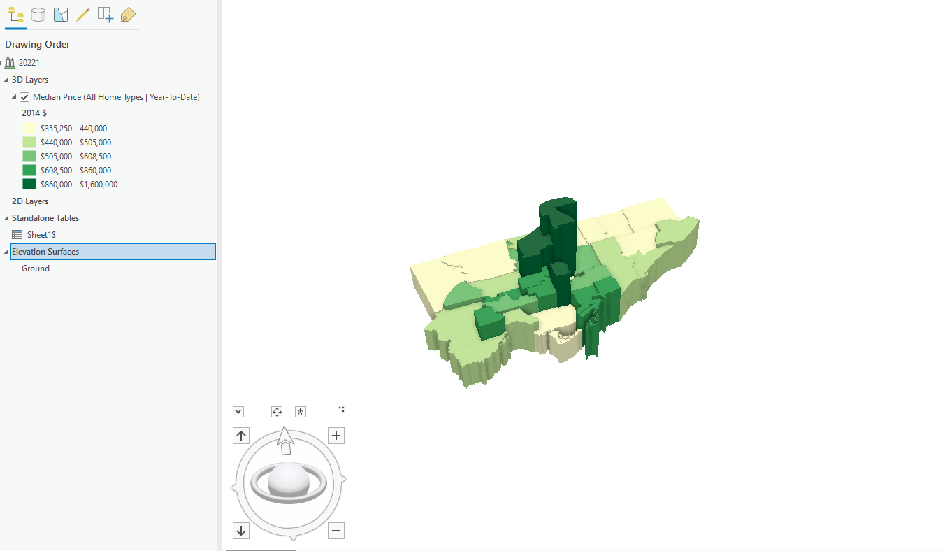
The Year-to-Date (YTD) December figures were used to capture an accurate snapshot of annual performance. The median price data for each of the years across the different regions was organized in an Excel sheet, joined with TRREB’s boundary file (obtained through consultation with the Library’s GIS department), and imported into ArcGIS Pro. WGS 1984 Web Mercator projection was used for the maps.
Step 2: Visualization with 3D Extrusions
3D extrusions were used to represent price increases, with the height of each bar corresponding to the median price. A green gradient was selected for visual clarity, symbolizing growth and price.
Step 3: Overcoming Challenges
After creating the 3D extrusion maps for the respective years (2014, 2017, 2020, 2022), the next step was to export those maps to ArcOnline and then to Story Maps, the easiest way of doing so was to export it as a Web Scene, from which it would show up under the Content section on ArcOnline.
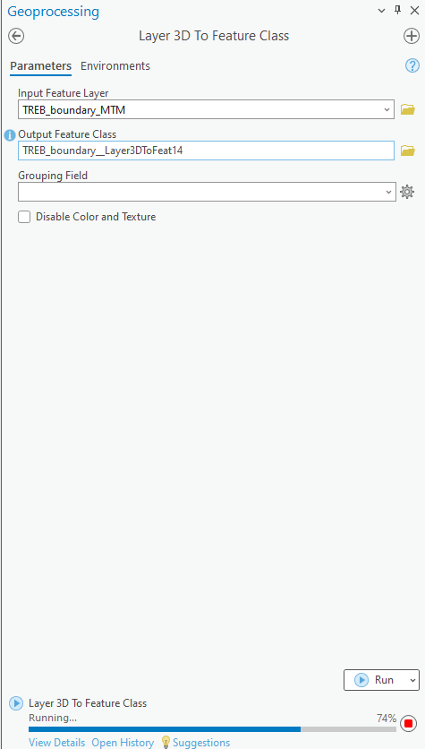
- Flattened 3D Shapes: Exporting directly as a Web Scene to add onto Story Maps caused extrusions to lose their 3D properties. This was resolved using the “Layer 3D to Feature Class” tool.
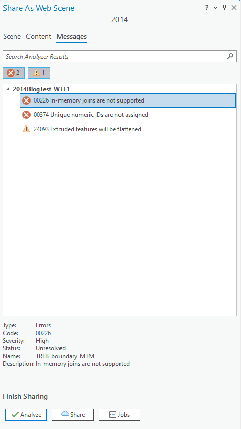
- Lost Legends: However, after using the aforementioned tool, the Legends were erased during export. To address this, static images of the legends were added below each map in Story Maps.
Step 4: Finalizing the Story Map
After resolving these issues, the maps were successfully exported using the Export Web Scene option. They were then embedded into Story Maps alongside text to provide context and analysis for each year.
Key Insights
The project explored housing market dynamics primarily through an economic lens.
- Interest Rates: The Bank of Canada’s overnight lending rate played a pivotal role, with historic lows (0.25%) during the COVID-19 pandemic fueling a housing boom, and sharp increases (up to 5% by 2023) leading to market cooling.
- Immigration: Record-breaking immigration inflows also contributed to increased demand, exacerbating the affordability crisis.
While earlier periods like 2008 were critical in shaping the market, boundary changes in TRREB’s data made them difficult to include.
Conclusion
Analyzing real estate trends over nearly a decade and visualizing them through 3D extrusions offers a profound insight into the rapid rise of residential real estate prices in Toronto. This approach underscores the magnitude of the housing surge and highlights how policy measures, while impactful, have not fully addressed the affordability crisis.
The persistent rise in prices, even amidst various interventions, emphasizes the critical need for increased housing supply. Initiatives aimed at boosting the number of housing units in the city remain essential to alleviate the pressures of affordability and meet the demands of a growing population.
Link to Story Map (You will need to sign in through your TMU account to view it): https://arcg.is/WCSXG