Menusan Anantharajah, Geovis Project Assignment, TMU Geography, SA8905, Fall 2025
Hello, this is my blog post!
My Geovis project will explore the realms of 3D mapping and printing through a multi-stage process that utilizes various tools. I have always had a small interest in 3D modelling and printing, so I selected this medium for the project. Although this is my first attempt, I was quite pleased with the process and the results.
I decided to map out a simplified Socioeconomic Status (SES) Index of Toronto’s neighbourhoods in 2021 using the following three variables:
- Median household income
- Percentage of population with a university degree
- Employment rate
It should be noted that since these variables exist on different scales, they were standardized using z-scores and then scaled to a 0-100 range. The neighbourhoods will be extruded by the SES index value, meaning that neighbourhoods scoring high will be taller in height. I chose SES as my variable of choice since it would be interesting to physically visualize the disparities and differences between the neighbourhoods by height.
Data Sources
- Boundary Shapefile of Toronto’s neighbourhoods, obtained from City of Toronto, 2025
- Data table of Neighbourhood Profiles, obtained from City of Toronto, 2021 (Table updated in 2023)
Software
A variety of tools were used for this project, including:
- Excel (calculating the SES index and formatting the table for spatial analysis)
- ArcGIS Pro (spatially joining the neighbourhood shapefile with the SES table)
- shp2stl* (takes the spatially joined shapefile and converts it to a 3D model)
- Blender (used to add other elements such as title, north arrow, legend, etc.)
- Microsoft 3D Builder** (cleaning and fixing the 3D model)
- Ultimaker Cura (preparing the model for printing)
* shp2stl would require an older node.js installation
** Microsoft 3D Builder is discontinued, though you can sideload it
Process
Step 1: Calculate the SES index values from the Neighbourhood Profiles
The three SES variables (median household income, percentage of population with a university degree, employment rate) were extracted from the Neighbourhood Profiles table. Using Microsoft Excel, these variables were standardized using z-scores, then combined into a single average score, and finally rescaled to a 0-100 range. I then prepared the final table for use in ArcGIS Pro, which included the identifiers (neighbourhood names) with their corresponding SES values. After this was done, the table was exported as a .csv file and brought over to ArcGIS Pro.
Step 2: Create the Spatially Joined Shapefile using ArcGIS Pro
The neighbourhood boundary file and the newly created SES table were imported into ArcGIS Pro. Using the Add Join feature, the two data sets were combined into one unified shapefile, which was then exported as a .shp file.
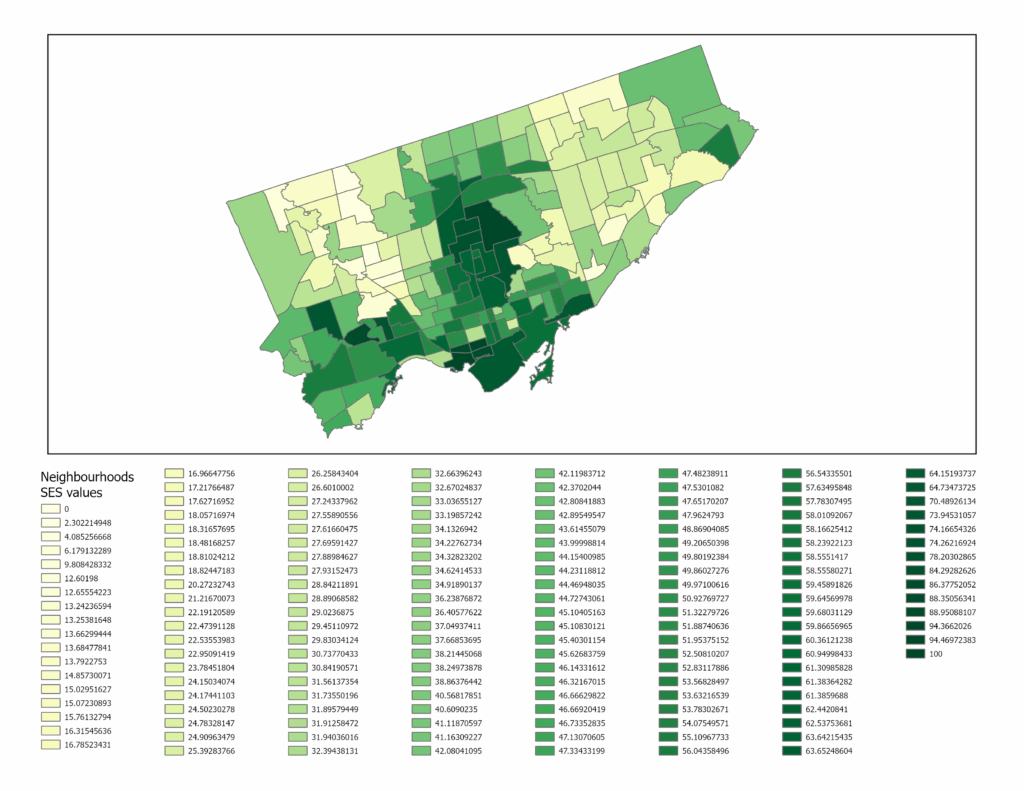
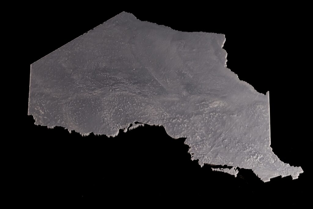
The figure above shows what the SES map looks like in a two-dimensional view. The areas with lighter hues represent neighbourhoods with low SES values, while the ones in dark green represent neighbourhoods with high SES values.
Step 3: Convert the shapefile into a 3D model file using shp2stl
Before using shp2stl, make sure that you have an older version of node.js (v11.15.0) and npm (6.7.0) installed. I would also recommend placing your shapefile in a new directory, as it can later be utilized as a Node project folder. Once the shapefile is placed in a new folder, you can open the folder in Windows Terminal (or Command Prompt) and run the following:
npm install shp2stlThis will bring in all the necessary modules into the project folder. After that, the script can be written. I created the following script:
const fs = require('fs');
const shp2stl = require('shp2stl');

shp2stl.shp2stl('TO_SES.shp', {
  width: 150,
  height: 25,
  extraBaseHeight: 3,
  extrudeBy: "SES_z",
  binary: true,
  verbose: true
}, function(err, stl) {
  if (err) throw err;
  fs.writeFileSync('TO_NH_SES.stl', stl);
});
This script was ‘compiled’ using Visual Studio Code; however, you can use any compiler or processor (even Notepad works). This script was then saved to a .js file in the project folder. The script was then executed in Terminal using this:
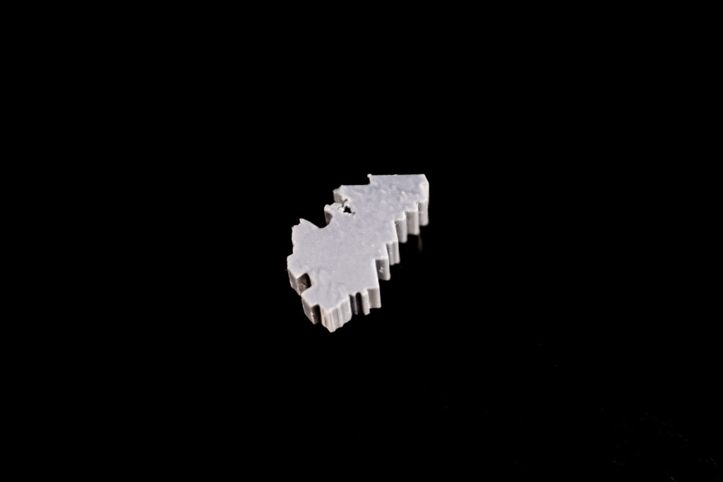
node shapefile_convert.jsThe result is a 3D model that looks like this:
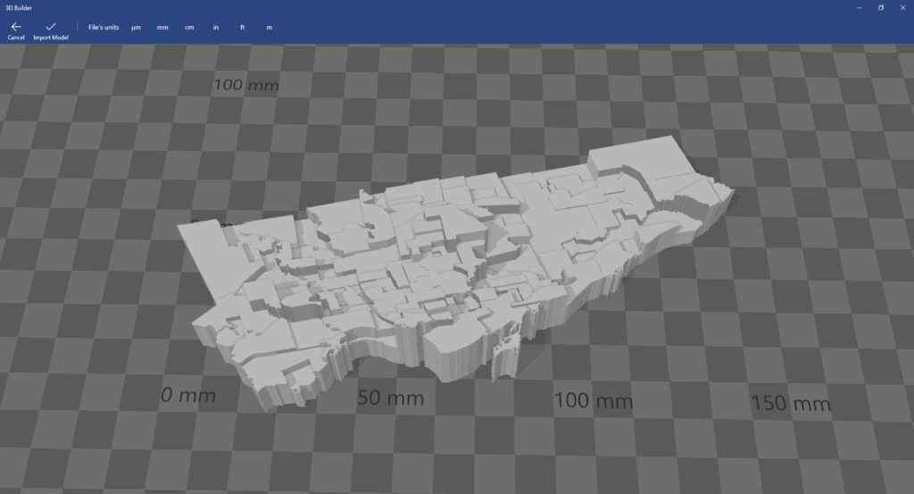
Since we only have Toronto’s neighbourhoods, we have to import this into Blender and create the other elements.
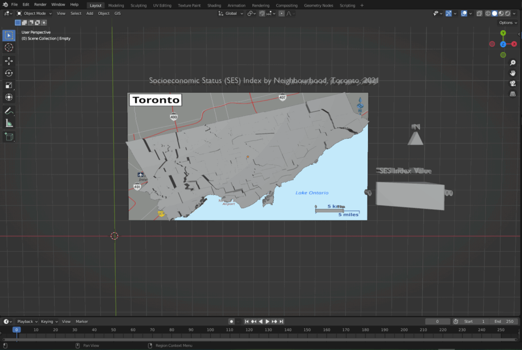
Step 4: Add the Title, Legend, North Arrow and Scale Bar in Blender
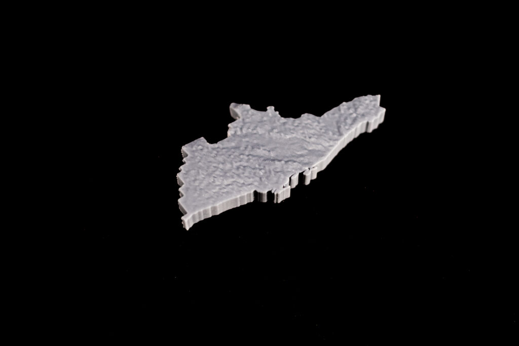
The 3D model was brought into Blender, where the other map elements were created and added alongside the core model. To create the scale bar for the map, the 3D model was overlaid onto a 2D map that already contained a scale bar, as shown in the following image.
After creating the necessary elements, the model needs to be cleaned for printing.
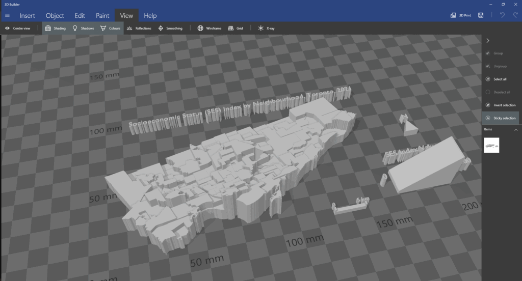
Step 5: Cleaning the model using Microsoft 3D Builder
When importing the model into 3D Builder, you may encounter this:
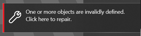
Once you click to repair, the program should be able to fix various mesh errors like non-manifold edges, inverted faces or holes.
After running the repair tool, the model can be brought into Ultimaker Cura.
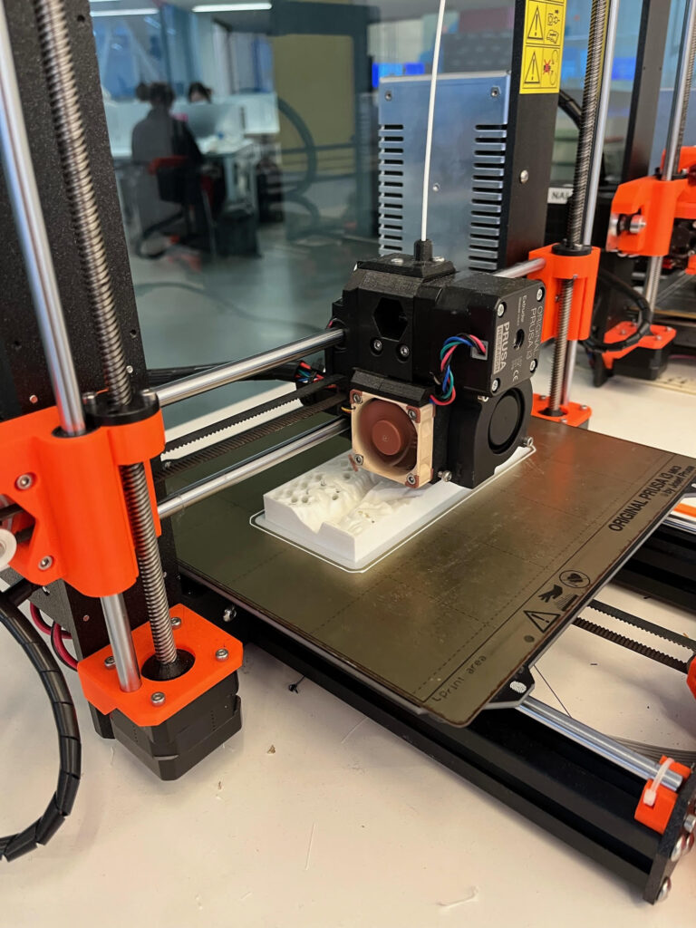
Step 6: Preparing the model for printing
The model was imported into Ultimaker Cura to determine the optimal printing settings. As I had to send this model to my local library to print, this step was crucial to see how the changes in the print settings (layer height, infill density, support structures) could impact the print time and quality. As the library had an 8-hour print limit, I had to ensure that the model was able to be printed out within that time limit.
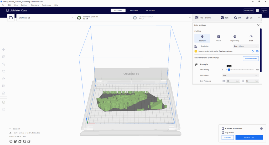
With this tool, I was able to determine the best print settings (0.1 mm fine resolution, 10% infill density).
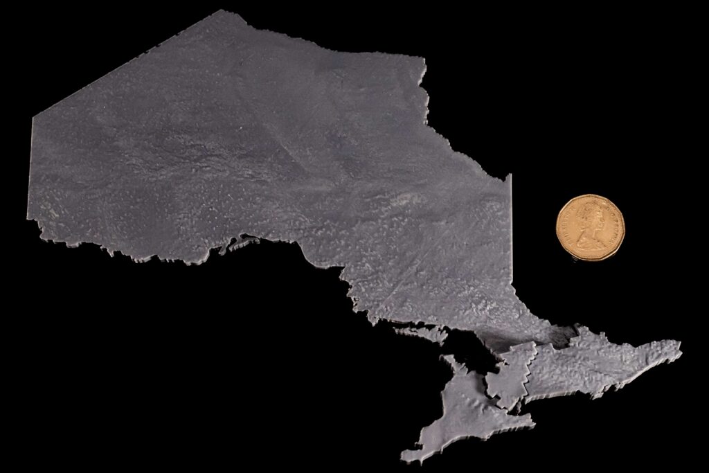
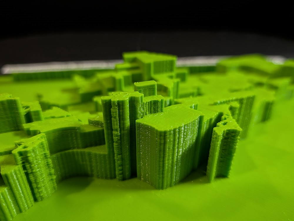
With everything finalized from my side, I sent the model over to be printed at the library; this was the result:
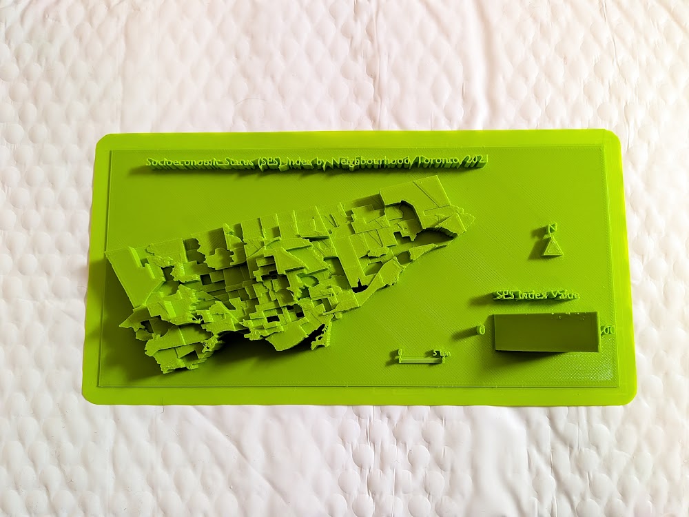
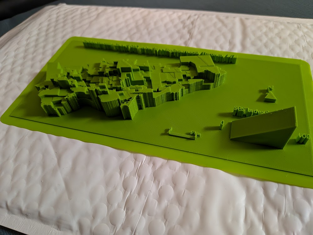
Overall, the print of the model was mostly successful. Most of the elements were printed out cleanly and as intended. However, the 3D text could not be printed with the same clarity, so I decided to print out the textual elements on paper and layer them on top of the 3D forms.
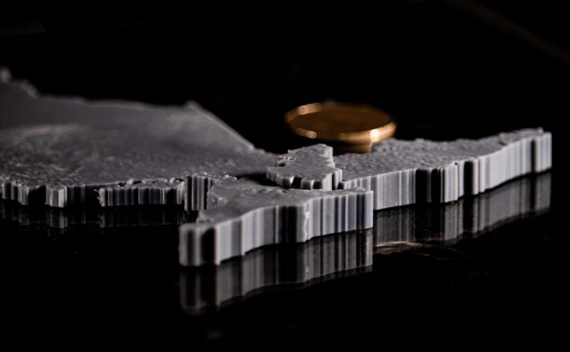
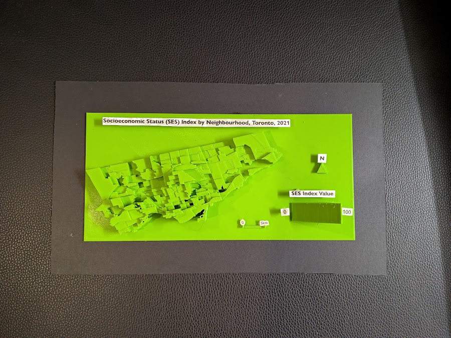
The following is the final resulting product:
Limitations
While I am still satisfied with the end result, there were some limitations to the model. The model still required further modifications and cleaning before printing; this was handled by the library staff at Burnhamthorpe and Central Library in Mississauga (huge shoutout to them). The text elements were also messy, which was expected given the size and width of the typeface used. One improvement to the model would be to print the elements separately and at a larger scale; this would ensure that each part is printed more clearly.
Closing Thoughts
This project was a great learning experience, especially for someone who had never tried 3D modelling and printing before. It was also interesting to see the 3D map highlighting the disparities between neighbourhoods; some neighbourhoods with high SES index values were literally towering over the disadvantaged bordering neighbourhoods. Although this project began as an experimental and exploratory endeavour, the process of 3D mapping revealed another dimension of data visualization.
References
City of Toronto. (2025). Neighbourhoods [Data set]. City of Toronto Open Data Portal. https://open.toronto.ca/dataset/neighbourhoods/
City of Toronto. (2023). Neighbourhood profiles [Data set]. City of Toronto Open Data Portal. https://open.toronto.ca/dataset/neighbourhood-profiles/