3D Printing Canadian Topographies

by Scott Mackey, Geovis Project Assignment @RyersonGeo, SA8905, Fall 2016

Since its first iteration in 1984 with Charles Hull’s Stereo Lithography, the process of additive manufacturing has made substantial technological bounds (Ishengoma, 2014). With advances in both capability and cost effectiveness, 3D printing has recently grown immensely in popularity and practicality. Sites like Thingiverse and Tinkercad allow anyone with access to a 3D printer (which are becoming more and more affordable) to create tangible models of anything and everything.

When I discovered the 3D printers at Ryerson’s Digital Media Experience (DME) lab, I decided to 3D print models of interesting Canadian topographies, selecting study areas from the east coast (Nova Scotia), west coast (Alberta), and central Canada (southern Ontario). These locations show the range of topographies and land types strewn across Canada, and the models can provide practical use alongside their aesthetic allure by identifying key features throughout the different elevations of the scene.

The first step in this process was to learn how to 3D print. The DME has three different 3D printers, all of which use an additive layering process. An additive process melts materials and applies them thin layer by thin layer to create a final physical product. A variety of materials can be used in additive layers, including plastic filaments such as polylactic acid (PLA) (plastic filament) and Acrylonitrile Butadiene Styrene (ABS), or nylon filaments. After a brief tutorial at the DME on the 3D printing process, I chose to use their Lulzbot TAZ, the 3D printer offering the largest surface area. The TAZ is compatible with ABS or PLA filament of a 1.75 mm diameter. I decided on white PLA filament as it offers a smooth finish and melts at a lower temperature, with the white colour being easy to paint over.

img_1740
Lulzbot TAZ

The next step was to acquire the data in the necessary format. The TAZ requires the digital 3D model to be in an STL (STereoLithography) format. Two websites were paramount in the creation of my STL files. The first was GeoGratis Geospatial Data Extraction. This National Resources Canada site provides free geospatial data extraction, allowing the user to select elevation (DSM or DEM) and land use attribute data in an area of Canada. The process of downloading the data was quick and painless, and soon I had detailed geospatial information on the sites I was modelling.

geogratis
GeoGratis Geospatial Data Extraction

One challenge still remained despite having elevation and land use data – creating an STL file. While researching how to do this, I came across the open source web tool called Terrain2STL on a visualization website called jthatch.com. This tool allows the user to select an area on a Google basemap, and then extracts the elevation data of that area from the Consortium for Spatial Information’s SRTM 90m Digital Elevation Database, originally produced by NASA. Terrain2STL allows the users to increase the vertical scaling (up to four times) in order to exaggerate elevation, lower the height of sea level for emphasis, and raise the base height of the produced model in a selected area ranging in size from a few city blocks to an entire national park.

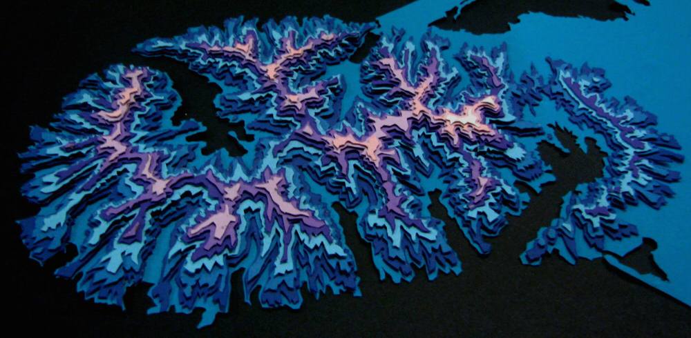
The first area I selected was Charleston Lake in southern Ontario. Being a southern part of the Canadian Shield, this lake was created by glaciers scarring the Earth’s surface. The vertical scaling was set to four, as the scene does not have much elevation change.

Once I downloaded the STL, I brought the file into Windows 10’s 3D Builder application to slim down the base of the model. The 3D modelling program Cura was then used to further exaggerated the vertical scaling to 6 times, and to upload the model to the TAZ. Once the filament was loaded and the printer heated, it was ready to print. This first model took around 5 hours, and fortunately went flawlessly.

Cape Breton, Nova Scotia was selected for the east coast model. While this site has a bit more elevation change than Charleston Lake, it still needed to have 4 times vertical exaggeration to show the site’s elevations. This print took roughly 4 and a half hours.

Finally, I selected Banff, Alberta as my final scene. This area shows the entrance to Banff National Park from Calgary. No vertical scaling was needed for this area. This print took roughly 5 and half hours.

Once all the models were successfully printed, it was time to add some visual emphasis. This was done by painting each model with acrylic paint, using lighter green shades for high areas to darker green shades for areas of low elevation, and blue for water. The data extracted from GeoGratis was used as a reference in is process. Although I explored the idea of including delineations of trails, trail heads, roads, railways, and other features, I decided they would make the models too busy. However, future iterations of such 3D models could be designed to show specific land uses and features for more practical purposes.

img_1778
Charleston Lake, Ontario
img_1779
Cape Breton, Nova Scotia
img_1775
Banff, Alberta

3D models are a fun and appealing way to visual topographies. There is something inexplicably satisfying about holding a tangible representation of the Earth, and the applicability of 3D geographic models for analysis should not be overlooked.

Sources:

GeoGratis Geospatial Data Extraction. (n.d.). Retrieved November 28, 2016, from http://www.geogratis.gc.ca/site/eng/extraction

Ishengoma, F. R., & Mtaho, A. B. (2014). 3D Printing: Developing Countries Perspectives. International Journal of Computer Applications, 104(11), 30-34. doi:10.5120/18249-9329

Terrain2STL Create STL models of the surface of Earth. (n.d.). Retrieved November 28, 2016, from http://jthatch.com/Terrain2STL/


3D Paper Topography Map of Evergreen Brick Works and Its Surroundings

By Nicole Serrafero

Geovis Project Assignment @RyersonGeo, SA8905, Fall 2016

When learning about geography in the early years of school we had to trace and label contours based off topographic maps. For the purpose of the course work I decided to take inspiration from my younger school days and use modern technologies to attempt to reproduce a topographic map with cartographic elements included. My main inspiration came from an artist by the name of Sam Cadwell who creates beautiful works of arts using layers of paper to represent contours. An example of his work can be seen below and through the link to his website.

Example of Sam Cadwell's Work

The project involved cutting out each contour layer and features using a Cricut machine which is computer guided paper cutter (seen below).

 photo IMG_20161107_123320_zps33mlcyg6.jpg

The maximum paper size that the cutter program can handle is 11” in x 11” so I ensured that the study area would fit within the paper size limitations. The paper used for the project was 12”x12” cardstock paper in a variety of colours to represent each feature. For the layers of contours, a pink to red colour scheme was used as it provided me with up to 15 layers of sequential colours.

 photo 0aa4f3c0-b318-4696-9a89-09c959f8483f_zpsdazdxid7.jpg

The water features were blue, the rail features yellow, the buildings a light purple, and the roads black.


Data Used

Four (4) datasets were used to produce the topographic model:

  • Contour Lines (Obtained from TRCA)
  • Building Footprints (Obtained from DMTI spatial)
  • Waterways (Obtained from TRCA)
  • Road and Rail Lines (Obtained from Statistics Canada)

Study Area Extraction

All of the files were loaded into ArcMap then all projected to WGS84 to ensure all files were in the same projection. The Evergreen Brick Works was chosen as the study area as its surrounding area contains interesting contours, roads, a major highway, railways, a river. To ensure that the study area was contained within the paper limitations the page size within ArcMap was set to 11” x 11” and the map view was adjusted until I was satisfied with the area. Once the final study area was chosen the features within the view were clipped out and saved as separate files. Below is a screen shot of what the final study area covers.

studyarea_ns

With the data now clipped the further data processing could be done easily as the amount of data was significantly reduced. The contour lines came as 1m intervals with a range of 22 individual contours levels which is too many levels for the amount of paper that I have available for the contours. The number of contours was reduced by selecting every 4 m contour then extracting the selected lines to a separate file. With the new file the number of layers was reduced to 12 layers which fits within my 15-layer limit. The remaining files did not need further processing within ArcMap.

The next major step to get the files ready for the paper cutter. To do this all layers were saved as scalable vector files (SVG) for each data set. To accomplish this all layers were turned off except for one dataset. Then the Export Map option was used to save the map area as an SVG file. The SVG files were then imported into a program called Inskscape to be edited further. Within the Inskscape program the contours were divided up into their individual 4m interval layers (seen below).

layers_ns

Some of the smaller contour lines were deleted as the cutter would not be able to cut the shape out. The other features were given a layer of their own as well. Each individual layer was then exported and saved as an 11”x11” page in JPEG format.  The program used to work the paper cutter did not work as well with files that came from ArcMap directly which was why Inkscape was used. It is also easier to edit/select the lines and change the thickness within Inkscape.


Printing and Assembling the Model

To cut our each layer the JPEG layers were imported into the paper cutter program. Each layer was placed on the canvas then the corresponding colour was placed on the cutting map and loaded into the machine. Once loaded the paper cutter proceeded with cutting the paper. An example of what a cut layer from the machine can be seen below.

 photo 21275b2f-1f16-4cae-8a18-7f725417c1b5_zpsdoaqnf9s.jpg

The contours were cut first followed by the river, then the roads and railway and last was the Evergreeen Brick Works buildings. Each contour layer was stuck together using foam spacers that had tape on each size. These spacers were used to create the illusion of height in the model. The remaining paper features were stuck on using double sided tape. The following images show the assembling process.

 photo d084f076-6a2f-4cde-a51d-73927be5435c_zpsth4idvyg.jpg

 photo c4d9c449-5152-4ef2-9c45-3d56c5f90dfb_zps4ebxn1v7.jpg

 photo db8a056f-1a67-4486-896f-87fdb407c8fe_zps5xwbnwea.jpg

 photo 5ebc99e9-6bf6-4f0b-8a88-a63f1bf7bee3_zpsrupmc76i.jpg

Once all of the paper layer were assembled the legend, scale, north arrow, and labels were added by hand. The final product can be seen below.

 photo IMG_20161113_221812_zpszfiofto3.jpg


West Don Lands Development: 2011 – 2015


CHRISTINA BOROWIEC
CHRISTINA BOROWIEC | West Don Lands Development: 2011 – 2015 | 3D Printing Tech.

Author: CHRISTINA BOROWIEC
Geovis Project Assignment @RyersonGeo, SA8905, Fall 2016


PROJECT DESCRIPTION:
The model displayed above is of the West Don Lands of the City of Toronto, bounded by Queen St. E to the north, the rail corridor to the south, Berkeley St. to the west, and Bayview Ave. to the east. In utilizing Ryerson University’s Digital Media Experience Lab’s three-dimensional printing technology, an interactive model providing a tangible means to explore the physical impact of urbanization and the resultant change in the city’s skyline has been produced. The model interactively demonstrates how the West Don Lands, a former brownfield, have intensified from 2011 to 2015 as a result of waterfront revitalization projects and by serving as the Athletes’ Village for the Toronto Pan Am/Parapan American Games.

Buildings constructed during or prior to 2011 are printed in black, while those built in 2012 or later are green. In total, 11 development projects have been undertaken within the study area between 2011 and 2015. Each of these development projects have been individually printed, and correspond to a single property on the base layer, which is identifiable by the unique building footprint. The new developments can be easily attached and removed from the base of the model (the 2011 building and elevation layer) via magnetic bases and footprints, thereby providing an engaging way to discover how the West Don Lands of Toronto have developed in a four year period. By interacting with the model, the greater implications of the developments on the city’s built form and skyline can be realized and experienced at a tangible scale.

Areas with the lowest elevation (approximately 74 m) are solidly filled in on the landscape grid, while areas with higher elevations (80 m to 84 m) have stacked grids and foam risers added to better exaggerate and communicate the natural landscape. These additions can be viewed in the video below.

Street names and a north arrow are included on the model, as well as both an absolute and traditional scale bar. The absolute scale of the model is 1:5,000.


PROJECT EXECUTION:
To complete the project, a mixture of geographic information system (GIS) and modeling software were used. First, the 3D Massing shapefile was downloaded from the City of Toronto’s OpenData website, and the digital elevation model (DEM) for Toronto was retrieved from Natural Resources Canada. Using ArcMap, the 3D Massing shapefile, which includes information such as the name, location, height, elevation, and age of buildings in the city, was clipped to the study area. Next, buildings constructed prior to or during 2011 were selected and exported as a new layer file. The same was done for new developments, or the buildings constructed from 2012 to 2015, with both layers using a NAD83 UTM Zone 17N projection. Once these new layers were successfully created, they were imported into ArcScene.

In ArcScene, the digital elevation model for Toronto was opened and projected in NAD83. The raster layer was clipped to the extent of the 2011 building layer, and ensured to have the same spatial reference as the building layer. Next, the DEM layer properties were adjusted so base heights were obtained from the surface, and a vertical exaggeration was calculated from the extent of the DEM in the scene properties. Once complete, the “EleZ” variable data provided in the building layers’ shapefiles were used to calculate and display building heights. The new developments 3D file was then exported, as the 2011 buildings and DEM files were merged. Since the “EleZ” (building height) variable was used rather than “Z” (ground elevation) or “Elevation” (building height from mean sea level), the two layers successfully merged without buildings extending below the DEM layer. The merged file was then exported as a 3D file. Although many technical issues were encountered at this point in the project (i.e. the files failed to merge, ArcScene crashed unexpectedly repeatedly, exported file quality was low…), the challenges were overcome by viewing online tutorials of users who had encountered similar issues.

Once the two 3D files were successfully exported (the new developments building file and the 2011 building file merged with the DEM), they were converted to .STL file types and opened in AutoDesk Inventor. Here, the files were edited, cleaned, smoothed, and processed to ensure the model was complete and would be accepted in Cura (3D printing software).


At Ryerson University’s Digital Media Experience Lab, the models were printed using the TAZ three-dimensional printer (pictured below). Black filament was used for the 2011 buildings and DEM layer, and green was used for the new developments. These colours were selected from what was currently available at the lab because they provided the greatest level of contrast. In total, printing took approximately 7 hours to complete, with the base layer taking about 5.5 hours and the new developments requiring 1.5 hours. The video above reveals the printing process. No issues were encountered in the utilization of the 3D printer, as staff were on-hand to answer any questions and provide assistance. Regarding printing settings, the temperature of the bed was set at 60°C, and the print temperature was set to 210°C. A 0.4 mm nozzle was used with a 20% fill density. The filament density was 1.75 mm, and a brim was added for support to the platform during printing. Although the brim is typically removed at the completion of a print, the brim was intentionally kept on the model for aesthetic purposes and to serve as a border to the study area.


TAZ 3D Printer


Once printing was completed, the model was attached to a raised base and street names, a north arrow, legend, absolute scale and scale bar, and title were added. Magnets were then cut to fit the new development building pieces, and attached both to the base layer of the model and the new developments. As a final step in the process, the model’s durability and stability were tested by encouraging family and friends to interact with the model prior to its display at the Environics User Conference in Toronto, Ontario in November 2016.


West Don Lands Development: 2011 - 2015 Project


RECOMMENDED ENHANCEMENTS:
To improve the project, three enhancements are recommended. First, stronger magnets could be utilized both on the new development pieces and on the base layer of the model. In doing so, the model would become more durable, sturdy, and easier to lift up to examine at eye level – without the worry of buildings falling over due to low magnetic attractiveness resulting from the thicker cardboard base on which the model rests. In relation to this, stronger glue could be used to better bind the street names to the grid as well.

Additionally, the model may be improved if a solid base layer was used instead of a grid. Although the grid was intended to be experimental and remains an interesting feature which draws attention, it would likely be easier for a viewer to interpret the natural features of the area (including the hills and valleys) if the model base was solid.

The last enhancement entails using a greater variety of filaments in the model’s production to create a more visually impactful product with more distinguishable features. For instance, the base elevation layer could be printed in a different colour than the buildings constructed in 2011. Although this would complicate the printing and assembly of the model, the final product would be more eye-catching.


DATA SOURCES:
City of Toronto. (2016, May). 3D Massing. Buildings [Shapefile]. Toronto, Ontario. Accessed from <http://www1.toronto.ca/wps/portal/contentonly?vgnextoid=d431d477f9a3a410VgnVCM10000071d60f89RCRD>.

Natural Resources Canada. (1999). Canadian Digital Elevation Data (CDED). Digital Elevation Model [Shapefile]. Toronto, Ontario. Accessed from <http://maps.library.utoronto.ca/cgi-bin/datainventory.pl?idnum=20&display=full&title=Canadian+Digital+Elevation+Model+(DEM)+&edition=>.


CHRISTINA BOROWIEC
Geovisualization Project
Professor: Dr. Claus Rinner
SA 8905: Cartography and Geovisualization
Ryerson University
Department of Geography and Environmental Studies
Date: November 29, 2016

Map Animation of Toronto’s Watermain Breaks (2015)

Audrey Weidenfelder
Geovis Project Assignment @RyersonGeo, SA8905, Fall 2016
mymap

For my geo-viz project, I wanted to create a map animation.  I decided to use CARTO, a web mapping application.

CARTO

CARTO is an open source web application software built on PostGIS and PostgreSQL open source spatial databases.  Users can manage data, run spatial analysis and design custom maps.  Within CARTO, there is an interface where SQL can be used to manipulate data, and a CartoCSS editor (a cartography language) to symbolize data.

CARTO has a tool called Torque that allows you to ‘bring your data to life’.  It’s good for mapping large data sets that have a time and/or date reference.  CARTO is well documented, and they offer guides and tutorials to assist users in their web mapping projects.  You can sign up for a free account here.  The free account is limited to 250Mb of storage after which charges apply.

The Process:  Connect to data, create new data set, add new column, symbolize

To create a map animation, simply connect to your data set either by dragging and dropping or browsing to your file.  If you don’t have data, you can search CARTO’s data library.  I had a file that I downloaded from the Toronto Open Data Catalogue.  I wanted to test CARTO’s claim that it can ‘bring large data sets to life’.  The file contained over 35,000 records of the city’s watermain breaks from 1990 to 2015.  I brought it into CARTO through the file browser, and in about 40 seconds all 35,000 point locations appeared in the map viewer.  From here, I explored the data, experimented with all the different visualization tools, and practised with CartoCSS to symbolize the data.

I decided to animate the 1,353 watermain breaks for 2015.  I had to filter the data set using a SQL statement to create a new data set containing only the 2015 breaks.  It’s easy to do using SQL.  You select from your table and column:

Select * from Breaks where Break_Year = 2015

CARTO asks if you wish to create a new data set from your selection – select ‘Yes’.  A new data set is created.  It will transfer your selected data into a new table along with the attributes associated with the selection.  You can keep the default table name or change the name of your table.  I re-named the table to ‘Watermain Breaks 2015’

From here, I wanted to organize the data by the seasons:  Spring, Summer, Winter and Fall.  This required creating a new column, selecting data according to the months and days of the season, entering the selected data into the column, and reassigning it a new name.

In data view, select ‘Add Column’ from the table designer, give it a name and a data type.  In this case I called it ‘Season’ and selected ‘String’ as the data type for text.  The next step was to update the column ‘Season’ based on values from the ‘Break_Date’ column that contained the dates of all breaks.  This was accomplished through the SQL Query editor, as so:

Update Watermain_Breaks _2015 set Season = ‘Spring’
where Break_Date >= ‘2015-03-21’ and Break_Date <= ‘2015-06-20’

The value of ‘Spring’ replaced the selected date range in the new column.  This was repeated for summer, fall and winter, substituting the appropriate date range for each season.

I then switched to the Category Wizard to symbolize this map layer.  Here you select the column you wish to symbolize.  I wasn’t pleased with the CARTO default symbolization, and there are were few options to choose from, so I used the CartoCSS editor to modify:

/** category visualization */
#breaks {
Marker-fill-opacity: 0.9;
Marker-placement: point;
Marker-type: ellipse;
Marker-width: 8;
Marker-allow-overlap: true;
}

#breaks[season=”Fall”] {
Marker-fill: #FF9900;
Marker-line-color: #FF9900
}

#breaks[season=”Spring”] {
Marker-fill: #229A00;
Marker-line-color: #229A00;
}

And so on …

To make the map layer interactive, I used the Infowindow designer in map view.  Here you can create pop-up windows based on a column in the table.  Options are available for a hover window or a clickable window.

Adding Layers

To add more interest to the map, I added the City of Toronto Neighbourhood boundaries so that the number of breaks per neighbourhood could be viewed.  I downloaded the shapefile from Toronto Open Data, connected the data set to my map and added it as a second layer.  I added info pop-ups, and changed the default symbolization with CartoCSS editor:

/** simple visualization */  #neighbourhoods_wgs84{
Polygon-fill: #FF6600;
Polygon-opacity: 0;
Line-color: #000000;
Line-width: 0.5;
Line-opacity: 1;
}

Animation

CARTO only allows animation on one map layer, and it does not permit info windows.  You also cannot copy a layer.  As such, I added a new layer by connecting to the watermain breaks data table, and then used the Torque Cat Wizard to animate the layer.

Animation is based on the column that contains either a date or time.  I selected the Break_Date column, and used CartoCSS editor to set the number of frames, duration of the animation, data aggregation to cumulative so that the points remained on the map, and then symbolized the data points to match the original watermain breaks layer.  A legend was then added to this layer.

CARTO has the option to add elements such as title, text boxes and images.  I added a title and a text box containing some facts about the city’s watermain breaks and pipe distribution.

The map animation can be viewed here .  Zoom in, pan around, find your neighbourhood, move the date slider, and select from the visible layers.

Note:  CARTO does not function well in Microsoft Edge


CloudCities 3D Model of the Ryerson Campus

Justin Miron

Submission for GeoVis Project Assignment @RyersonGeo, SA8905, Fall 2016

Interactive City Models

One of the most useful visualization and planning tools used in urban planning and design is the 3D model: a to-scale representation of the built form of a city, its existing (and as-built) conditions and its proposed (or possible) conditions.  A 3D model effectively communicates information about the proportion, size, and distribution of structures and other urban elements, that when well made and presented is intuitively grasped by the people that are viewing it.

A principal drawback to most 3D models is that they are physical models, and they take a lot of time to create, to modify, and can only be shared with an audience who is physically present. One way to solve the this problem is to replace the physical with a 3D digital model (using 3D modelling software such as Rhino, ArchiCAD, Blender, Solidworks, etc.) and to share the models with other users.  Yet, there are drawbacks to this approach, too. For one, these models can only be shared with users that have the same (or similar) software of the kind that was used to create the model. For users who do not have the correct software, static or animated representations of the model are made which, while they can still convey information, do not allow the user make choices on what aspects of the model they want to view or explore.

Beyond this technical problem, the models are not geographic and they are not data-driven. Though they are spatial, they are not referenced to a location on the earth and they don’t contain attributes. There is no way to know what building or open space you are looking at without asking someone who is familiar with the model. Informal exploration is just too limited. One way to solve these problems is to store and view 3D model information in CloudCities.

CloudCities and the Ryerson Campus

CloudCities is a geographically-enriched 3D model viewing and storage platform. The graphical rendering is done through ThreeJS, a javascript library used to build and render 3D objects in a browser. It is one of several platforms that blend geographic information within a 3D environment (see here and here for further examples).

CloudCities allows users to upload 3D model information, such as a building, tree, vehicle, or terrain, as well as their attributes. Not all 3D information can be uploaded (for instance, stylized 3D lines or other non-geographic 3D visualizations are not generally possible). In addition to upload, CloudCities has several customization features that allow the model scene to be modified: sun/shadow settings; pre-set camera views and 3D slides; a search function; location comparison to OpenStreetMap; and dynamic attribute and 3D editing, which allows the user to dynamically modify/add to object attributes and to use basic 3D editing functions.

CloudCities is built to store and view 3D models (as opposed to general 3D visualizations), and specifically 3D models of cities (multiple buildings, blocks, terrain, etc.) so for this project I have built a model of the bulk of Ryerson University’s Campus in downtown Toronto.

Area used for the CloudCities model
A view of the entire model

Data

The input data for the model’s 3D buildings is from two sources: myself, who modelled several buildings on the Ryerson campus, including Kerr Hall, in Rhinoceros (Rhino), a 3D modelling program, and the City of Toronto’s Open Data portal, which maintains a 3D massing and building model dataset that is frequently updated and that is available in several formats.

The 3D information from the City of Toronto is of high quality, but it is released in several formats, and not all of these formats contain equivalent data. Out of all of the data available, the 3D CAD information is the most detailed and accurate but it is harder to work with.

Ultimately, all of the 3D information that fits within the sample area were converted, by individual building, into multipatch features using the ArcGIS 3D Analyst extension. These multipatches were loaded into ArcScene, exported to an ESRI 3D webscene format, and then uploaded into a CloudCities scene. While there are other ways to create a functional CloudCities scene, uploading from ArcScene is the most straightforward, though it is certainly not an option for everyone (see the Asset import tutorial), especially when they do not have ArcScene or 3D Analyst available to use!

original-rhino-models
Rhinoceros model of Kerr Hall (above) and a multipatch of the Ryerson Student Center (below)

I manually modelled Kerr Hall because I wanted it to be more detailed than that stored within the City of Toronto dataset. The modelling was done in Rhino. The model was then exported from Rhino into .3DS format, then to multipatch to be included into the webscene uploaded into CloudCities. Deletion of original building massing data from the City of Toronto dataset was required where another model instance – in this case, custom-models like that of Kerr Hall – takes its place. 

Zoning information is also provided by the City’s Open Data portal and this was used to code each building instance with its associated zone category (e.g. R or ‘Residential’).

I have customized and manually refined City blocks (which define the road surfaces) and green open space areas because these are not accurately captured within the City’s data.

Complex Data

Terrain surfaces and trees (which can be very complex objects) were not added to this model because of the eventual data size requirements, but in order for these elements to look good and not awkward, they must be of sufficient detail. Terrain published by the City of Toronto, even when simplified, is a complex geometry that would weigh on the model’s performance. In addition, terrain requires that buildings sit on top of the surface, but the buildings modelled by the City do not account for an uneven grade around the base (what is known as Finished Floor Elevation). While this detail can be made within the models, the eventual time required would have been onerous. The more detail in a building and the more the model approximates reality, the longer the model will take to create.

User Experience (UX) highlights

In the CloudCities model, buildings contain a name, whether they are Ryerson University buildings, the planning zone they fall within (e.g. commercial or residential), and the size of the building footprint area in sq.m. Some of this information is added within the pre-upload ArcGIS environment, but much of it is added from within CloudCities’ editing environment.

These attributes serve as the basis for dashboards and a search bar. The dashboard displays these vital statistics whenever a building object is clicked.


dashboard-for-statistics
Dashboard reveals attributes when a building is clicked.

Additionally, a search bar and search constraints can be set, and the user can search through the scene’s attributes to highlight objects that are returned. For instance, every building that has the zone ‘Commercial Residential’ is highlighted whenever that term is entered into the search. The search functions are limited, however – there are no advanced queries supported by CloudCities. Instead, various constraints on searches must be set on the back end to make sure that a particular search does not return any object that fulfills any small dimension of the attribute data.

Search results when "Commercial Residential" is entered
Search results when “Commercial Residential” is entered

Specific locations can be saved as bookmarks, and these aid in presentation purposes. These locations can be combined into a slideshow “tour” of the model. This is a particularly relevant feature when sending the model to others, as the locations are stored with the scene, and literally move the user point of view around the model in order to tell a story.

bookmarks
Camera bookmarks can help guide a user through the model

A sun/shade rendering tool can be implemented, which allows the user to set the time of year and time of day to create a realistic view of how shadows would be cast by model elements based on the model’s location on the earth, although this is not a sun shadow calculator and is meant simply to enhance the experience of the model.

sun-shade-comparison
Sun and shadow controls

Limitations of CloudCities

One of the main limitations of CloudCities is that it is not customizable from a development point of view. A user is limited to pre-set dashboard, search, and styling options. In addition, the platform costs money and is billed at a hefty $60 USD+/per month in order to create a city model to the detail that was made for this post.

The range of 3D visualizations possible is limited. It would be nice to have a platform that incorporates more options for presenting thematic data that goes beyond dashboards and search bars. There is a lot of 3D data that does not manifest itself in a 3D structure. ThreeJS’s gallery of 3D visualizations provides interesting examples of how 3D city modelling could be developed in the future.

Despite these limitations, CloudCities provides an easy-to-use platform for making and viewing 3D city models. I do not believe that CloudCities will always be the only platform that offers the same functionality, but it is currently a really good example of how urban planners and designers can take advantage of geo-technology to create a more interactive and data-rich experience of their 3D information.

The final model can be viewed on CloudCities hereAfter mid-December 2016, the model’s geographic extents will be greatly reduced so that the model can be stored on a free account.