Author: Shantelle Miller
Geovisualization Project Assignment @TMUGeography, SA8905, Fall 2024
Introduction: Why Flood Resilience Matters
Urban flooding is a growing concern, especially in cities like Toronto, where increasing urbanization has disrupted the natural water cycle. Greenspaces, impervious surfaces, and stormwater infrastructure all play vital roles in reducing flood risks, but understanding how these factors interact can be challenging.
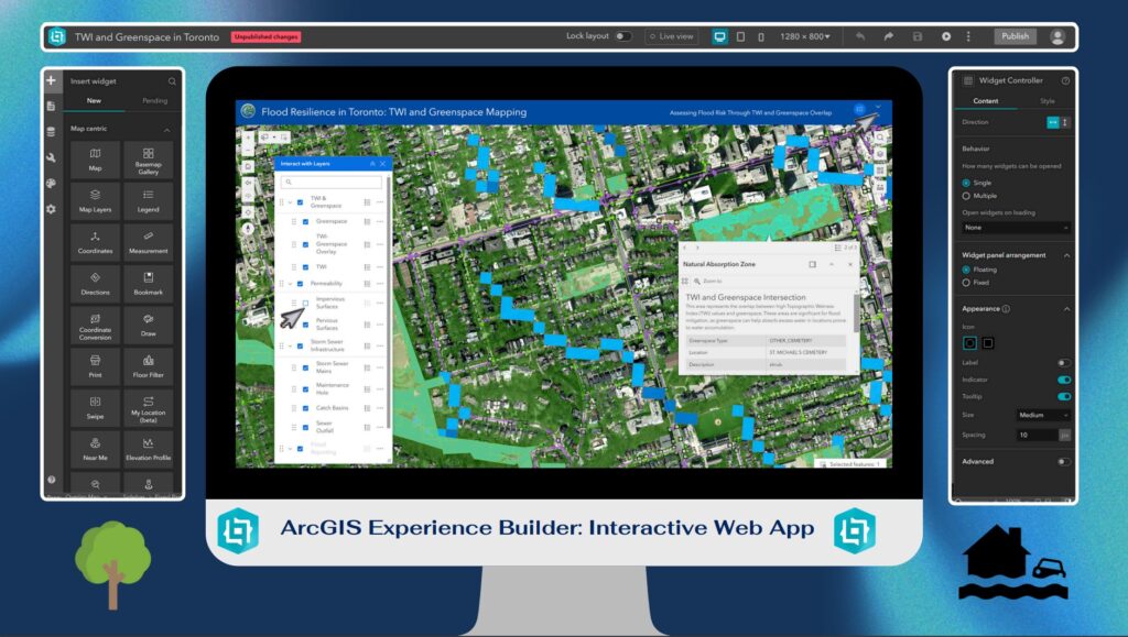
To address this, I created an interactive mapping tool using ArcGIS Experience Builder that visualizes flood resilience in Toronto. By combining multiple datasets, including Topographic Wetness Index (TWI), greenspaces, and stormwater infrastructure, this map highlights areas prone to flooding and identifies zones where natural mitigation occurs.
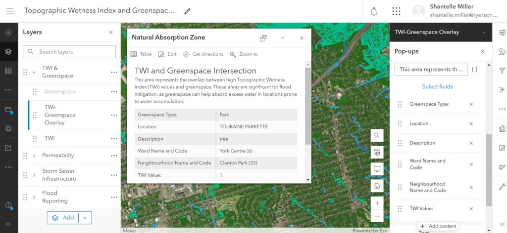
One of the tool’s standout features is the TWI-Greenspace Overlay, which pinpoints “Natural Absorption Zones.” These are areas where greenspaces overlap with high TWI values, demonstrating how natural environments help absorb runoff and reduce flooding.
Why Experience Builder?
I chose ArcGIS Experience Builder for this project because it offers a user-friendly, highly customizable platform for creating dynamic, interactive web maps. Unlike static maps, Experience Builder allows users to explore data in real-time with widgets like toggleable layers, dynamic legends, and interactive pop-ups.
- Multi-Dataset Integration: It supports the combination of multiple datasets like TWI, greenspaces, and stormwater infrastructure.
- Widgets and Tools: Users can filter data, view attributes, and toggle layers seamlessly.
- No Code Required: Although customizable, the platform doesn’t require coding, making it accessible for users of all technical backgrounds.
The Importance of Data Normalization and Standardization
Before diving into the data, it’s essential to understand the critical role that data normalization and standardization played in this project:
- Ensuring Comparability: Different datasets often come in various formats and scales. Standardizing these allows for meaningful comparisons across layers, such as correlating TWI values with greenspace coverage.
- Improving Accuracy: Normalization adjusts values measured on different scales to a common scale, reducing potential biases and errors in data interpretation.
- Facilitating Integration: Harmonized data enables seamless integration within the mapping tool, enhancing user experience and interaction.
Data: The Foundation of the Project
The project uses data from the Toronto Open Data Portal and Ontario Data Catalogue, processed in ArcGIS Pro, and published to ArcGIS Online.
Layers
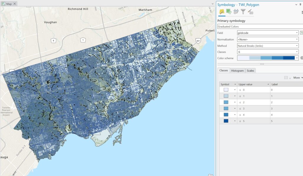
Topographic Wetness Index (TWI):
- Derived from DEM
- TWI identifies areas prone to water accumulation.
- It was categorized into four levels (low, medium, high, and very high flood risk), with only the highest-risk areas displayed for focus.
Greenspaces:
- Includes parks, forests, and other natural areas that act as natural buffers against flooding.
Impervious Surfaces and Pervious Surfaces:
- Pervious Surfaces: Represent natural areas like soil, grass, and forests that allow water to infiltrate.
- Impervious Surfaces: Represent roads, buildings, and other hard surfaces that contribute to runoff.
Stormwater Infrastructure:
- Displays critical infrastructure like catch basins and sewer drainage points, which manage water flow.
TWI-Greenspace Overlay:
- Combines high-risk TWI zones with greenspaces to identify “Natural Absorption Zones”, where natural mitigation occurs.
Creating the Map: From Data to Visualization
Step 1: Data Preparation in ArcGIS Pro
- Imported raw data and clipped layers to Toronto’s boundaries.
- Processed TWI using terrain analysis and classified it into intuitive flood risk levels.
- Combined pervious and impervious surface data into a single dataset for easy comparison.
- Created the TWI-Greenspace Overlay, merging greenspaces and TWI data to show natural flood mitigation zones.
- Normalized and standardized all layers.
Step 2: Publishing to ArcGIS Online
- Uploaded processed layers as hosted feature layers with customized symbology.
- Configured pop-ups to include detailed attributes, such as TWI levels, land cover types, and drainage capacities as well as google map direct link for each point feature.
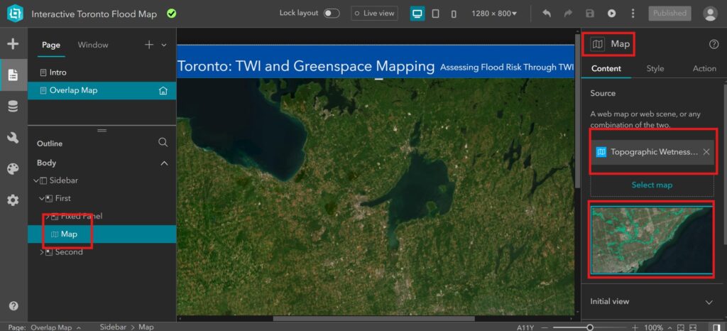
Step 3: Building the Experience in ArcGIS Experience Builder
- Imported the web map into Experience Builder to design the user interface.
- Added widgets like the Map, Interactive Layer List, Filters, Legend, Search etc., for user interaction.
- Customized layouts and legends to emphasize the relationship between TWI, greenspaces, and surface types.
Interactive Features
The map offers several interactive features to make flood resilience data accessible:
Layer List:
- Users can toggle between TWI, pervious surfaces, impervious surfaces, greenspaces, and infrastructure layers.
Dynamic Legend:
- Updates automatically to reflect visible layers, helping users interpret the map.
Pop-Ups:
- Provide detailed information for each feature, such as:
- TWI levels and their implications for flood risk.
- Land cover types, distinguishing between pervious and impervious surfaces.
- Greenspace types and their flood mitigation potential.
TWI-Greenspace Overlay Layer:
- Highlights areas where greenspaces naturally mitigate flooding, called “Natural Absorption Zones.”
Filters:
Enable users to focus on specific attributes, such as high-risk TWI areas or zones dominated by impervious surfaces.
Applications and Insights
- The interactive map provides actionable insights for multiple audiences:
Urban Planners:
- Identify areas lacking greenspace or dominated by impervious surfaces where flooding risks are highest.
- Plan infrastructure improvements to mitigate runoff, such as adding bioswales or permeable pavement.
Planners:
- Assess development sites to ensure they align with flood mitigation goals and avoid high-risk areas.
Homeowners:
- Evaluate flood risks and identify natural mitigation features in their neighborhoods.
- For example, the map can reveal neighborhoods with high TWI and limited greenspace, showing where additional stormwater infrastructure might be necessary.
Limitations and Future Work
Limitations
- Incomplete Data: Some areas lack detailed data on stormwater infrastructure or land cover, leading to gaps in analysis.
- Dynamic Changes: The static nature of the datasets means the map doesn’t reflect recent urban development or climate events.
Future Work
- Add real-time data on precipitation and runoff to make the tool more dynamic.
- Expand the analysis to include socioeconomic factors, highlighting vulnerable populations.
- Enhance accessibility features to ensure compliance with AODA standards for users with disabilities.
Conclusion: A Tool for Flood Resilience
Flood resilience is a complex issue requiring a nuanced understanding of natural and built environments. This interactive mapping tool simplifies these relationships by visualizing critical datasets like TWI, greenspaces, and pervious versus impervious surfaces.
By highlighting areas of natural flood mitigation and zones at risk, the map provides actionable insights for planners, developers, and homeowners. The TWI-Greenspace Overlay layer, in particular, underscores the importance of greenspaces in managing stormwater and reducing flood risks in Toronto.
I hope this project inspires further exploration of flood resilience strategies and serves as a resource for building a more sustainable and resilient city.
Thank you for reading, and feel free to explore the map experience using the link below!
Project Link: Explore Flood Resilience in Toronto
Data Source: Toronto Open Data Portal, Ontario Open Data Catalogue
Built Using: ArcGIS Pro, ArcGIS Online, and ArcGIS Experience Builder