By Sharon Seilman, Ryerson University
Geovis Project Assignment @RyersonGeo, SA8905, Fall 2018
Background
Topic:
An evaluation of annual Greenhouse Gas (GHG) Emissions changes in Canada and an in-depth analysis of which provinces/ territories contribute to most of the GHG emissions within National and Regional geographies, as well as by economic sectors.
- The timeline for this analysis was from 1990-2015
- Main data sources: Government of Canada Greenhouse Gas Emissions Inventory and Statistics Canada
Why?
Greenhouse gas emissions are compounds in the atmosphere that absorbs infrared radiation, thus trapping and holding heat in the atmosphere. By increasing the heat in the atmosphere, greenhouse gases are responsible for the greenhouse effect, which ultimately leads to global climate change. GHG emissions are monitored in three elements -its abundance in the atmosphere, how long it stays in the atmosphere and its global warming potential.
Audience:
Government organizations, Environmental NGOs, Members of the public
Technology
An informative website with the use of Webflow was created, to visually show the story of the annual emissions changes in Canada, understand the spread of it and the expected trajectory. Webflow is a software as a service (SaaS) application that allows designers/users to build receptive websites without significant coding requirements. While the designer is creating the page in the front end, Webflow automatically generates HTML, CSS and JavaScript on the back end. Figure 1 below shows the user interaction interface of Webflow in the editing process. All of the content that is to be used in the website would be created externally, prior to integrating it into the website.

The website:
The website it self was designed in a user friendly manner that enables users to follow the story quite easily. As seen in figure 2, the information it self starts at a high level and gradually narrows down (national level, national trajectory, regional level and economic sector breakdown), thus guiding the audience towards the final findings and discussions. The maps and graphs used in the website were created from raw data with the use of various software that would be further elaborated in the next section.

Check out Canada’s GHG emissions story HERE!
Method
Below are the steps that were undertaken for the creation of this website. Figure 3 shows a break down of these steps, which is further elaborated below.

- Understanding the Topic:
- Prior to beginning the process of creating a website, it is essential to evaluate and understand the topic overall to undertake the best approach to visualizing the data and content.
- Evaluate the audience that the website would be geared towards and visualize the most suitable process to represent the chosen topic.
- For this particular topic of understanding GHG emissions in Canada, Webflow was chosen because it allows the audience to interact with the website in a manner that is similar to a story; providing them with the content in a visually appealing and user friendly manner.
- Data Collection:
- For the undertaking of this analysis, the main data source used was the Greenhouse Gas Inventory from the Government of Canada (Environment and Climate Change). The inventory provided raw values that could be mapped and analyzed in various geographies and sectors. Figure 4 shows an example of what the data looks like at a national scale, prior to being extracted. Similarly, data is also provided at a regional scale and by economic sector.

Figure 4: Raw GHG Values Table from the Inventory - The second source for this visualization was the geographic boundaries. The geographic boundaries shapefiles for Canada at both a national scale and regional scale was obtained from Statistics Canada. Additionally, the rivers (lines) shapefile from Statistics Canada too was used to include water bodies in the maps that were created.
- When downloading the files from Statistics Canada, the ArcGIS (.shp) format was chosen.
- For the undertaking of this analysis, the main data source used was the Greenhouse Gas Inventory from the Government of Canada (Environment and Climate Change). The inventory provided raw values that could be mapped and analyzed in various geographies and sectors. Figure 4 shows an example of what the data looks like at a national scale, prior to being extracted. Similarly, data is also provided at a regional scale and by economic sector.
- Analysis:
- Prior to undertaking any of the analysis, the data from the inventory report needed to be extracted to excel. For the purpose of this analysis, national, regional and economic sector data were extracted from the report to excel sheets
- National -from 1990 to 2015, annually,
- Regional -by province/territory from 1990 to 2015, annually
- Economic Sector -by sector from 1990 to 2015, annually
- Graphs:
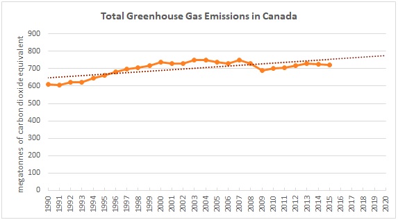
- Trend -after extracting the national level data from the inventory, a line graph was created in excel with an added trendline. This graph shows the total emissions in Canada from 1990 to 2015 and the expected trajectory of emissions for the upcoming five years. In this particular graph, it is evident that the emissions show an increasing trajectory. Check out the trend graph here!
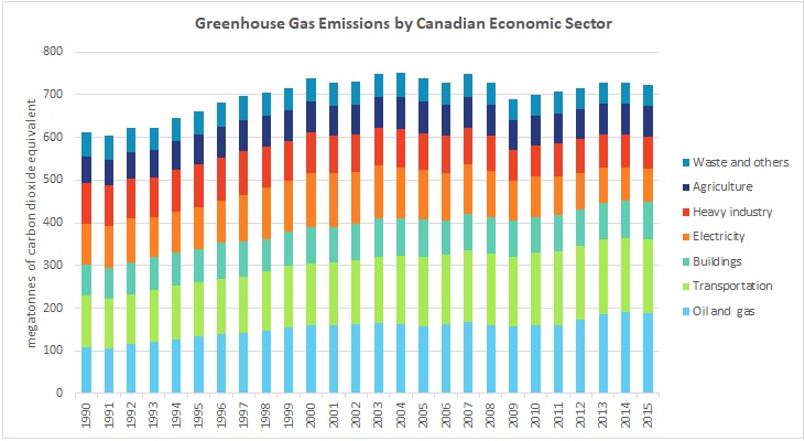
- Economic Sector -similar to the trend graph, the economic sector annual data was extracted from the inventory to excel. With the use of the available data, a stacked bar graph was created from 1990 to 2015. This graph shows the breakdown of emissions by sector in Canada as well as the variation/fluctuations of emissions in the sectors. It helps understand which sectors contribute the most and which years these sectors may have seen a significant increase or decrease. With the use of this graph, further analysis could be undertaken to understand what changes may have occurred in certain years to create such a variation. Check out the economic sector graph here!
- Maps:
- National map -the national map animation was created with the use of ArcMap and an online GIF maker. After the data was extracted to excel, it was saved as a .csv files and uploaded to ArcMap. With the use of ArcMap, sixteen individual maps were made to visualize the varied emissions from 1990 to 2015. The provincial and territorial shapefile was dissolved using the ArcMap dissolve feature (from the Arc Tool box) to obtain a boundary file at a national scale (that was aligned with the regional boundary for the next map). Then, the uploaded table was joined to the boundary file (with the use of the Table join feature). Both the dissolved national boundary shapefile and the river shapefile were used for this process, with the data that was initially exported from the inventory for national emissions. Each map was then exported a .jpeg image and uploaded to the GIF maker, to create the animation that is shown in the website. With the use of this visualization, the viewer can see the variation of emissions throughout the years in Canada. Check out the national animation map here!
- Regional map -similar to the national one, the regional map animation was created in same process. However, for the regional emissions, data was only available for three years (1990, 2005 and 2015). The extracted data .csv file was uploaded and table joined to the provinces and territories shapefile (undissolved), to create three choropleth maps. The three maps were them exported as .jpeg images and uploaded to the GIF maker to create the regional animation. By understanding this animation, the viewer can distinctly see which regions in Canada have increase, decreased or remained the same with its emissions. Check out the regional animation map here!
- Prior to undertaking any of the analysis, the data from the inventory report needed to be extracted to excel. For the purpose of this analysis, national, regional and economic sector data were extracted from the report to excel sheets
- Final output/maps:
- The graphs and maps that were discussed above were exported as images and GIFs to integrate in the website. By evaluating the varied visualizations, various conclusions and outputs were drawn in order to understand the current status of Canada as a nation, with regards to its GHG emissions. Additional research was done in order to assess the targets and policies that are currently in place about GHG emissions reductions.
- Design and Context:
- Once the final output and maps were created, and the content was drafted, Webflow enables the user to easily upload external content via the upload media tool. The content was then organized with the graphs and maps that show a sequential evaluation of the content.
- For the purpose of this website, an introductory statement introduces the content discussed and Canada’s place in the realm of Global emissions. Then the emissions are first evaluated at a national scale with the visual animation, then the national trend, regional animation and finally, the economic sector breakdown. Each of the sections have its associated content and description that provides an explanation of what is shown by the visual.
- The Learn More and Data Source buttons in the website include direct links to Government of Canada website about Canada’s emissions and the GHG inventory itself.
- The concluding statement provides the viewer with an overall understanding of Canada’s status in GHG emissions from 1990 to 2015.
- All of the font formatting and organizing of the content was done within the Webflow interface with the end user in mind.
- Webflow:
- The particular format that was chosen in for this website because of story telling element of it. Giving the viewer the option to scrolls through the page and read the contents of it, works similarly as story because this website was created for informative purposes.
Lessons Learned:
- While the this website provides informative information, it could be further advanced through the integration of an interactive map, with the use of additional coding. This however would require creating the website outside of the Webflow interface.
- Also, the analysis could be further advanced with the additional of municipal emissions values and policies (which was not available in the inventory it self)
Overall, the use of Webflow for the creation of this website, provides users with the flexibility to integrate various components and visualizations. The user friendly interface enables uses with minimal coding knowledge to create a website that could be used for various purposes.
Thank you for reading. Hope you enjoyed this post!


.gif)