Mapping the Elevation of different Mount Kilimanjaro Climbing Routes in a 3D Scene-based Story Map

By Gabriel Dunk-Gifford

November 27th, 2024

SA 8905

Background

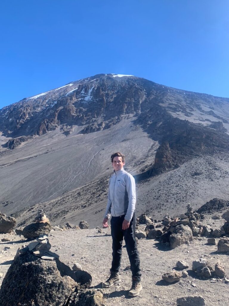
In 2023, I climbed Mount Kilimanjaro. Mount Kilimanjaro, is located in the northern region of Tanzania, straddling the border with Kenya, and at 5,895 metres, is the tallest mountain in Africa. My sister was doing a work term in Tanzania, so I thought it was a great opportunity to complete a physical and mental challenge that has been a bucket list item for me. The other major driver for me to climb this mountain, is that it is one of the tallest mountains in the world that does not require a large amount of technical climbing and can be done mostly by walking. Despite this however, the freezing temperatures, the altitude and the long distances being covered meant that it was still an immensely difficult challenge for me to complete. We chose to climb the 7 day Machame Route, which was recommended for people that wanted a long enough route to have a relatively high chance of reaching the summit, but did not want to spend an excessive amount for the longest routes. This was just one of many routes that climbing companies use when leading trips to the summit, which have a lot of variation in terms of length of time. The shortest route, Marangu, which takes place over 5 days is the least expensive, due to not having to pay the 10-20 people required to lead a group of climbers (Guides, Assistant Guides, Porters, and Cooks). However, the flip side of this is that 5 days does not provide very much time to acclimatize to the altitude, which means that over 50% of climbers on this route do not reach the summit due to prevalent altitude sickness. The 7 day Machame Route is much more manageable with the extra days, giving the climbers more time to make sorties into the higher elevation zones and back down to acclimatize more comfortably. The third route, which is called the Northern Circuit as it traverses all the way around the north side of the mountain, takes place over 10 days. It is the most scenic, giving time for climbers to see all the different types of vegetation zones that the mountain has to offer, and also causes the least amount of altitude-related stress, as it ascends into the high elevation much more slowly, and gives more time to acclimatize once the climbers have reached that zone.  Altitude sickness has a large amount of variation between people, in terms of the level of severity and symptoms. For instance, one person in my group, who was an experienced triathlete, began experiencing symptoms of altitude sickness on the 2nd day of the climb, and was ultimately unable to reach the summit, whereas my symptoms were less severe. Despite this, by the time we reached the summit in the early hours of the morning on Day 6, I had begun to feel the effects of the altitude, with persistent headaches, exhaustion and vertigo. These symptoms are all consequences of the reduced amount of oxygen that is available at such a high elevation, and were also compounded by the extremely low temperatures at night (between -15 and -25 degrees), which made it very difficult to sleep. Despite these setbacks however, reaching the summit was a very interesting and rewarding experience that I wanted to share with this project. 

Scope of the project

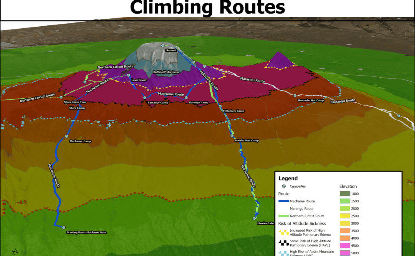
For the purposes of this geovisualization project, I chose to create a 3d scene in ArcGIS Pro, which displayed the elevation of the different parts of the mountain, and how 3 different route lengths (5 days, 7 days and 10 days) differ in terms of how they traverse through the different elevation zones. I also drew dashed lines on my 3d model which mark the elevation at which different levels of altitude sickness typically occur. Because of my own personal experience and that of other people, I thought that it was important to analyze altitude sickness and how it can be prevalent in a climb as common as Mount Kilimanjaro

Generally there are two levels of altitude sickness that can occur on a climb such as this one. The first one, Acute Mountain Sickness or AMS, is extremely common. The symptoms are not particularly severe, usually showing in most people as fatigue, shortness of breath, headaches, and sometimes nausea. The risk of this illness occurs usually in the 2000 to 2,500 metre range, becoming extremely common by the time a person ascends to around 4000 metres. The second, much more severe form of altitude sickness, comes in two forms, High Altitude Pulmonary Edema and High Altitude Cerebral Edema. As is probably evident from the names of these illnesses, HAPE primarily affects the lungs, while HACE mostly affects the brain, though most people that contract this, experience symptoms of both. HAPE/HACE begins to occur in people at the 4500m range (with a 2-6% risk at that elevation), but becomes much more prevalent at elevations above 5000m. The risk of this illness continues to increase as the elevation increases, which is why it is so difficult to reach the summit of the 8000m + mountains like Everest or K2. To counteract the effects of these illnesses, acclimatization to the elevation is extremely important. This is why mountain guides are constantly stressing the need to keep a very slow pace of climbing, and longer routes have a much higher success rate, as it allows for more time for the body to acclimatize to the altitude. 

Format of the Project

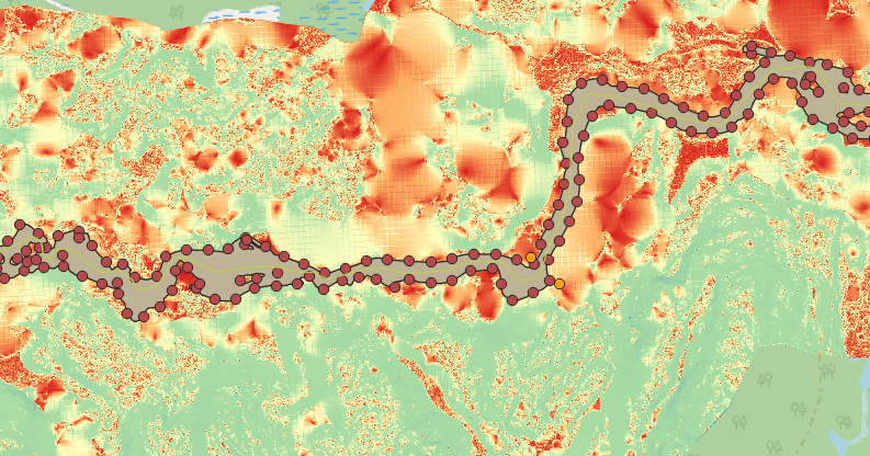
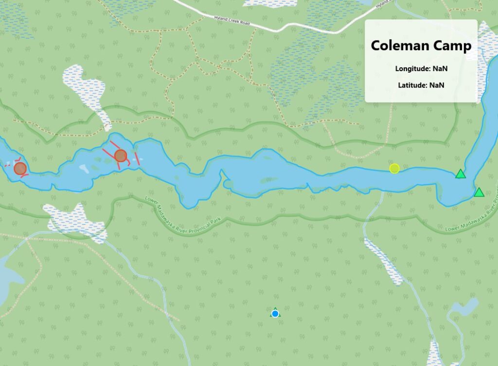
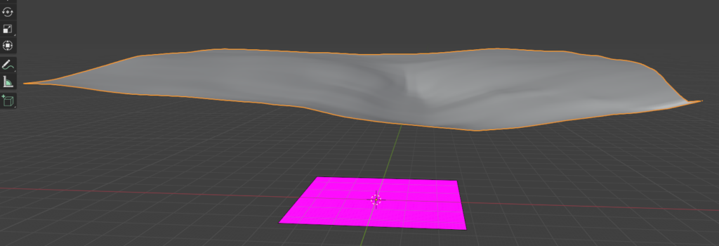
To complete this project, I began by downloading an elevation raster dataset from NASA Earthdata to display the elevation on the mountain. I then added that to an ArcGIS project and drew a boundary around the mountain to use as my study area. From there, I clipped the raster to only show the elevation in that area, and also limit the size of the file. The dataset was classified at 1 metre intervals, which meant that the differences in elevation between classes was extremely difficult to see, so I used the Reclassify Analysis tool to classify the raster at 500 metre intervals. I then assigned colours to each class with green representing the lowest elevations, then yellow, orange, red and finally blue and white for the very high elevations around the summit. I then started a project in Google Earth to draw out the different climbing routes. While Google Earth has limited functionality in terms of mapping, I find that its 3d terrain is detailed and easy to see, so it provided a more accurate depiction of the routes than if I used ArcGIS Pro. I used point placemarks to mark the different campsites on each of the routes and connected them with line features. For knowledge of the routes and campsites, I used the itineraries on popular Kilimanjaro guide companies’ websites, for each of the different routes. Once I had finished drawing out the routes and campsites in Google Earth, I exported the map as a KML file and converted it to ArcGIS layer files using an analysis tool. Finally, I drew polygons around the elevation borders that corresponded with the risks of altitude sickness that I outlined above. I used dashed lines as my symbology for that layer in order to differentiate it from the solid line routes layer. 

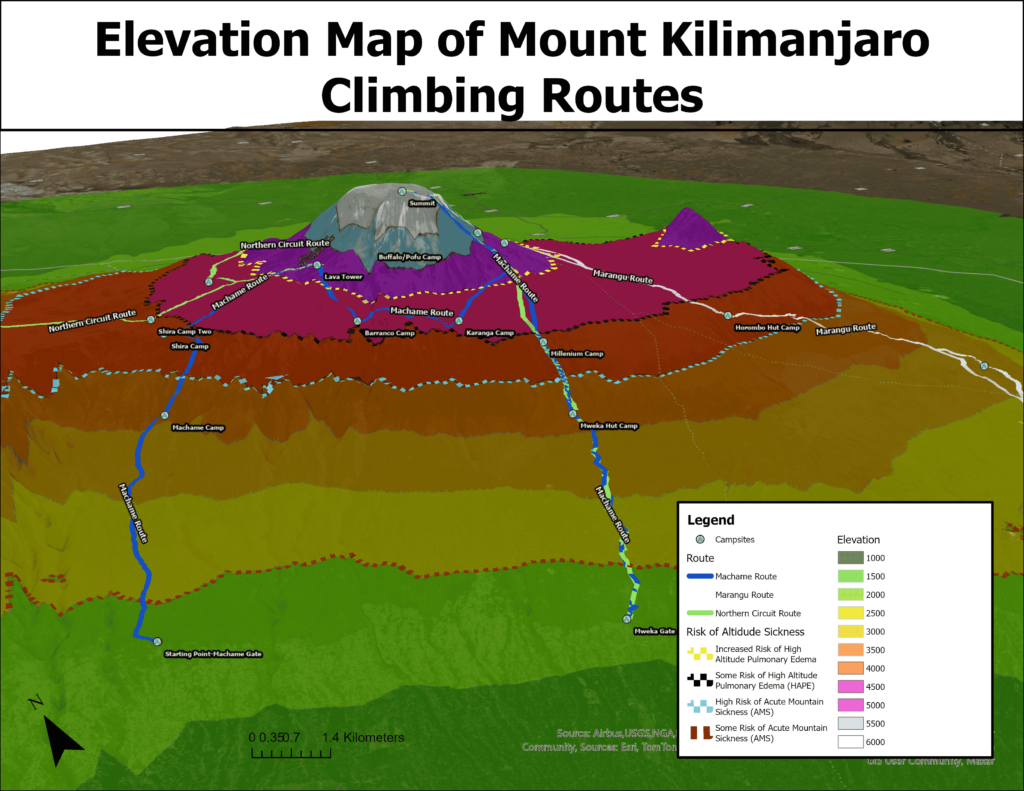
The next step for the project was converting the map to a 3d scene, in order to display the elevation more accurately. I increased the vertical exaggeration of my ground terrain base layer, in order to differentiate the elevation zones more. From there, I explored the scene and added labels to make sure that all the different map elements could be seen. I created an animation that flew around the mountain to display all angles at the beginning of my Story Maps Project. I then created still maps that covered the different areas of the mountain that are traversed by the different routes. Since the 5 day route basically ascends and descends on the same path, it only needed one map to show its elevation changes, and different campsites. However, the 7 day map needed two different maps to capture all the different parts of the route, and the 10 day one needed 4 as it travels all the way around the less commonly climbed, north side of the mountain. Finally, I created an ArcGIS Story Maps project to display the different maps that I created. I think that Story Maps is an excellent tool for displaying the results of projects such as this one. Its interactive and engaging interface allows the user to understand what can be a complicated project, in a simple and intriguing manner. I added pictures of my own climb to the project to add context to the topic, along with text explaining the different maps. The project can be viewed here: https://arcg.is/1Sinnf0

Conclusions

This project is very beneficial, as it both provides people who have climbed the mountain the opportunity to see the different elevation zones that they traversed and thus maybe connect that with some of their own experiences, but also the chance for prospective climbers to see the progression through the levels of elevation that each route takes, and be informed their choice of route based on that.

Using ReactJS and OpenLayers to make a Madawaska River web map

By: Garrett Holmes  | SA8903 – Fall 2024

The Madawaska is a river and provincial park located in the Central Ottawa watershed in Southern Ontario.

The section of river inside the Madawaska Provincial Park is a popular camping and water-sport location for paddlers across the province. The river includes numerous sets of rapids that present a fun and exciting challenge for paddlers. However, as the water level and discharge rates fluctuate throughout the year from rainfall, snowmelt, and other factors, the conditions of the white water rapids change, so it’s important for paddlers to understand what state the river is in in order to prepare for a trip. My web app will visually symbolize what these different water levels mean for paddlers at different times of the year, while providing other information about rapids, campsite, and access points.

The final web app repository can be viewed here

Requirements

Creating a React App

Install React

Follow this tutorial to create a basic ReactJS app, call it ‘map-app’ and navigate to it in a text editor like VSCode. You will notice a few important files and folders in here. ‘README.md’ includes some information and important commands for your app. The ‘public’ folder includes any files that you’ll want to access in your app, like images or metadata. This is where you will put your GIS data once we have the react app assembled.

Basic React App file structure

React is designed to be modular and organized, and essentially lets us manipulate HTML components using javascript. A react app is made up of components, which are sections of code that are modular and re-usable. Components also have props and states. Props are passed into a component and can represent things like text, style options, files, and more to change the look and behaviour of components. Hooks are functions that allow us to change the state of a component on the fly, and are what makes react interactive and mutable.

Setting up OpenLayers

Before we start our react app, install OpenLayers, a library that allows us to easily display and work with geographic vector data with javascript and html, which can therefore be used with react. Run the command “npm install ol" to install OpenLayers.

Now that we have a react app set up and OpenLayers, we can start our react app with npm start. This will open a page in your default browser that links to the local server on your machine that’s running your application.

Making a base map

Now lets make a component for our map. Right click on the ‘src’ folder in the left pane and click ‘New Folder’, we will call it ‘Components’. Now right click on that folder and click ‘New File’, call it ‘BaseMap.js’. If you have the extension ‘ES7+ React/Redux/React-Native snippets’ installed – in the extensions tab on the left – you can go to your new file and type ‘rfce’ then press enter to create the basic shell of a component with the same name as the filename. Otherwise you can copy the code below into your ‘MapLayer.js’ file:

Now lets populate the component with everything we need from OpenLayers. We will create a map that displays open street map, an open source basemap. I won’t explain everything about how react works since it would take too long, but see the [OpenLayers guide])(https://openlayers.org/doc/tutorials/concepts.html) for details on what each of the components are doing. This should be your component once you have added everything:

This will fill the entire page with the Open Street Map basemap. To render our component on the page, navigate to ‘App.js’ and delete all the default items inside the <div> in the return statement. At the top of the page import our BaseMap component: import BaseMap from './Components/BaseMap';. Then, add the component inside the <div> in the return statement.

Hit ctrl+s to save, and you should see your map on the webpage! You will be able to zoon and navigate the same as if it were google maps.

Adding vector data to the map

Now, let’s create a generalized component that we can use to add vector data to the web app. OpenLayers is capable of supporting a variety of filetypes for displaying vector data, but for now we’ll use GeoJSON because of it’s widespread compatibility.

Inside the ‘Components’ folder, create a new file called ‘MapLayers.js’, then use rfce to populate the component, or copy the following code:

In React, components communicate with eachother using ‘props’. We’ll use these to add our layers.

Add a ‘layers’ prop and a ‘map’ prop to the component definition:

Now we can access the data that’s passed into the component. Layers will represent a list of objects containing the filenames for our data as well as symbology information. Map will be the same map we created in the ‘BaseMap’ component.

For react to run code, we need to use a function called a useEffect, that will run automatically when the props that we specify are changed. Inside this function is where we will load the vector data into the ‘map’ prop.

Since the ‘layers’ prop is a list of object, we can iterate through it with the ‘forEach’ command. For every layer in the list, we’ll make a new VectorSource, which is an OpenLayers object that keeps track of geometry information. We’ll then add each VectorSource to a VectorLayer, which keeps track of how we display the geometry. Finally, the loop adds each new layer to the map. The list at the very bottom of the ‘useEffect()’ tells the program to run the contained code every time the ‘map’ or ‘layers’ props change.

For now, our component will return ‘null’, because everything is going to be rendered on the map in the BaseMap component.

Here’s what your final ‘MapLayers’ component should look like:

Adding Data

A map with nothing on it is no use to anyone. For this project, the goal was to build a web tool for looking at how the water level affects the rivers edge in the Madawaska River Provincial Park in Ontario.

In order to represent the elevation of the river and calculate metrics at different locations along the river, I used the Ontario Imagery-Derived DEM which is offered at a 2m resolution. The Madawaska river is located in two sections; DRAPE B, and DRAPE C. Since these are very large files image files, I needed to convert each file to tif format and generate pyramids for display in Arc or QGIS.

Then, I downloadd the Ontario Hydrographic Line dataset to get the locations of rapids and other features like dams.

I also needed shape data to represent the river itself from the Ontario Open Data portal.

Then, I loaded the ‘.vrt’ file I made from the DEM images into QGIS, and clipped it by the extent of the river polygon. I chose to clip the raster to a buffer of 1km to leave room to represent the surrounding area as well.

Preparing the data

Then, I had to format the data properly to be used in the web app.

When the water level of a river rises, the width of the river expands, and the bank recedes up the shore. I represented the change in water level by adding a dynamic buffer to the river polygon as an approximation of water level rise. It should be noted that this approximation assumes that the water has risen uniformly across the course of the river, which could not be true, however for the purpose of simplifying the app I used that assumption. The actual distance on land that the river expands to at any given section will depend on the slope of the embankment. This is where the DEM comes into play. I calculated the buffer distance to be applied to the river based on sampled points representing the slope along the river’s edge. Then I used the average slope to come up with the buffer distance per water level rise.

To keep things simple, and since the slope of the river bank does not vary much over its course, we will use the average slope along the edge of the river as our Slope value.

To do this, I used the following QGIS tools:

  • Polygon to Lines (Madawaska River)
  • Points Along Geometry (Madawaska River Lines, for every 50m)
  • Sample Raster Values (Slope)
  • Field Calculator: mean(“SAMPLE_1”) = 9.6%
Points generated every 100m along the water line, overlaid with the slope raster

Here’s the equation for calculating buffer distance:

Buffer Distance = water level change / tan(Slope)

(Where slope is represented as a percentage)

The tangent of the slope here represents the ratio of the water level rise to the distance it will travel over land. Therefore the constant we’ll divide the water level change with will be tan(slope) = 0.17

Before adding my shape data to the map, I had to do a fair amount of cleaning in QGIS. First, every layer is clipped to be within 1km of the river. All the rapids were named manually based on topographic maps, then Aggregated by their name. I also generated a file containing the centroids for each set of rapids for easier interpretation on the map.

Campsite and Access Point data was taken from the Recreation Point dataset by the Ministry of Natural Resources. Campsites and Access points were split into separate layers for easier symbolization.

Each file was then exported from QGIS as a GeoJSON file, then saved in the ‘public’ folder of my react app under ‘layers’. This will make it possible to access the layers from the code.

Adding the data to the web app

Now that all the data is ready, we can put all the pieces together. Inside ‘BaseMap.js’, create a new list at the top of the page called ‘jsonLayers’. Each item in the list will have the following format:

Where the filename is the path to your GeoJSON layer, the style is an OpenLayers Style instance (which I won’t explain here, but you can learn more from the OpenLayers documentation), and zIndex represents which layers will appear on top of others (For example, zIndex = 1 is below zIndex = 10).

Next, at the bottom of the component where we ‘return’ what to display, we will add an instance of our ‘MapLayers’ component, and pass in the required props.

Now in your web app, you should see your layers on screen! You may need to zoom in to find them.

I added a few other features and tools that make it so that the map automatically zooms to the extent of the largest layer, and so that the user can select features to see their name.

Geo-visualization

Once the basic structure of the app was set up, I could start to add extra features to represent the water level change. I created a new component called ‘BufferLayer’, which takes in a single GeoJSON file as well as a map to display the vector on. This component makes use of a library called turf.js that allows you to perform geospatial operations in javascript. I used turf.js to apply the buffer described above using a function that takes the geometry from the VectorSource for the layer, and directly applies a turf.js buffer operation to it. The buffer is always applied to the ‘original’ river polygon, meaning that a 10m buffer won’t ‘stack’ on top of another 10m buffer. This also prevents issues with broken geometry caused by the buffer operation when applying a negative buffer.

To control my buffer, I created one more component called ‘LevelSlider’, which adds a simple slider and a button that when pressed, runs the ‘handleBufferChange` function. The math for calculating the buffer distance based on the slope is done in the LevelSlider component with the static values I calculated earlier. The minimum and maximum values are also customizable. Here’s a snippet of that component:

The LevelSlider component is added in the ‘return’ section of ‘BufferLayer’, with CSS styling to make sure it appears neatly in the bottom left corner of the map.

The example minimum and maximum values are based on the minimum and maximum water level changes (from average) in the river based on real hydro-metric data from Environment Canada.

Conclusion

With a bit of extra styling, and by making use of other OpenLayers features like ‘Select’, and ‘Overlay’, I was able to build this functional, portable web app that can be added to any react website with ease.

However, lots more can be done to improve it! A chart that tracks hydro-metric data over time could help give context to the water levels on the river. With a little more math, you could even make use of discharge information to estimate the speed of the river at different times of year.

Using the campsite data and a centreline of the river course, you could calculate the distance between campsite, rapids, access points, etc. Making the tool a functional for planning trips. Also, given more information about individual whitewater sets, such as classes (C2, C3, etc.), descriptions, or images you could better represent the river in all it’s detail.

The final layout of the web app

Visualizing Earthquakes with Pydeck: A Geospatial Exploration

Mapping data in an interactive and visually compelling way is a powerful approach to uncovering spatial patterns and trends. Pydeck, a Python library for large-scale geospatial visualization, is an exceptional tool that makes this possible. Leveraging the robust capabilities of Uber’s Deck.gl, Pydeck enables users to create layered, interactive maps with ease. In this tutorial, we delve into Pydeck’s potential by visualizing earthquake data, exploring how it allows us to reveal patterns and relationships in raw datasets.

This project focuses on mapping earthquakes, analyzing their spatial distribution, and gaining insights into seismic activity. By layering visual elements like scatterplots and heatmaps, Pydeck provides an intuitive, user-friendly platform for understanding complex datasets. Throughout this tutorial, we explore how Pydeck brings earthquake data to life, offering a clear picture of patterns that emerge when we consider time, location, magnitude, and depth.


Why Pydeck?

Pydeck stands out as a tool designed to simplify geospatial data visualization. Unlike traditional map-plotting libraries, Pydeck goes beyond static visualizations, enabling interactive maps with 3D features. Users can pan, zoom, and rotate the maps while interacting with individual data points. Whether you’re working in Jupyter Notebooks, Python scripts, or web applications, Pydeck makes integration seamless and accessible.

One of Pydeck’s strengths lies in its support for multiple visualization layers. Each layer represents a distinct aspect of the dataset, which can be customized with parameters like color, size, and height to highlight key attributes. For instance, in our earthquake visualization project, scatterplot layers are used to display individual earthquake locations, while heatmaps emphasize regions of frequent seismic activity. The ability to combine such layers allows for a nuanced exploration of spatial phenomena.

What makes Pydeck ideal for projects like this one is its balance of simplicity and power. With just a few lines of code, users can create maps that would otherwise require advanced software or extensive programming expertise. Its ability to handle large datasets ensures that even global-scale visualizations, like mapping thousands of earthquakes, remain efficient and responsive.

Furthermore, Pydeck’s layered architecture allows users to experiment with different ways of presenting data. By combining scatterplots, heatmaps, and other visual layers, users can craft a visualization that is both aesthetically pleasing and scientifically robust. This flexibility makes Pydeck a go-to tool for not only earthquake mapping but any project requiring geospatial analysis.


Creating Interactive Earthquake Maps: A Pydeck Tutorial

Before diving into the visualization process, the notebook begins by setting up the necessary environment. It imports essential libraries such as pandas for data handling, pydeck for geospatial visualization, and other utilities for data manipulation and visualization control. To ensure the libraries are available for usage they must be installed using pip.

! pip install pydeck pandas ipywidgets h3
import pydeck as pdk
import pandas as pd
import h3
import ipywidgets as widgets
from IPython.display import display, clear_output

Step 1: Data Preparation and Loading

Earthquake datasets typically include information such as the location (latitude and longitude), magnitude, and depth of each event. The notebook begins by loading the earthquake data from a CSV file using the Pandas library.

The data is then cleaned and filtered, ensuring that only relevant columns—such as latitude, longitude, magnitude, and depth—are retained. This preparation step is critical as it allows the user to focus on the most important attributes needed for visualization.

Once the dataset is ready, a preview of the data is displayed to confirm its structure. This typically involves displaying a few rows of the dataset to check the format and ensure that values such as the coordinates, magnitude, and depth are correctly loaded.

# Read in dataset
earthquakes = pd.read_csv("Earthquakes-1990-2023.csv")

# Drop rows with missing data
earthquakes = earthquakes.dropna(subset=["latitude", "longitude", "magnitude", "depth"])

# Convert time column to datetime
earthquakes["time"] = pd.to_datetime(earthquakes["time"], unit="ms")

Step 2: Initializing the Pydeck Visualization

With the dataset cleaned and ready, the next step is to initialize the Pydeck visualization. Pydeck provides a high-level interface to create interactive maps by defining various layers that represent different aspects of the data.

The notebook sets up the base map using Pydeck’s Deck class. This involves defining an initial view state that centers the map on the geographical region of interest. The center of the map is determined by calculating the average latitude and longitude of the earthquakes in the dataset, and the zoom level is adjusted to provide an appropriate level of detail.

# Render map
pdk.Deck(
    layers=[heatmap_layer],
    initial_view_state=view_state,
    tooltip={"text": "Magnitude: {magnitude}\nDepth: {depth} km"},
).show()

Step 3: Creating the Heatmap Layer

The primary visualization in the notebook is a heatmap layer to display the density of earthquake events. This layer aggregates the data into a continuous color gradient, with warmer colors indicating areas with higher concentrations of seismic activity.

The heatmap layer helps to identify regions where earthquakes are clustered, providing a broader view of global or regional seismic activity. For instance, high-density areas—such as the Pacific Ring of Fire—become more prominent, making it easier to identify active seismic zones.

# Define HeatmapLayer
heatmap_layer = pdk.Layer(
    "HeatmapLayer",
    data=filtered_earthquakes,
    get_position=["longitude", "latitude"],
    get_weight="magnitude",  # Higher magnitude contributes more to heatmap
    radius_pixels=50,  # Radius of influence for each point
    opacity=0.7,
)

Step 4: Adding the 3D Layer

To enhance the visualization, the notebook adds a columnar layer, which maps individual earthquake events and there depths as extruded columns on the map. Each earthquake is represented by a column, where:

  • Height: The height of each column corresponds to the depth of the earthquake. Tall columns represent deeper earthquakes, making it easy to identify significant seismic events at a glance.
  • Color: The color of the column also emphasizes the depth of the earthquake, with a color gradient yellow-red used to represent varying depths. Typically, deeper earthquakes are shown in redder colors, while shallower earthquakes are displayed in yellow.

This 3D column layer provides an effective way to visualize the distribution of earthquakes across geographic space while also conveying important information about their depth.

# Define a ColumnLayer to visualize earthquake depth
column_layer = pdk.Layer(
    "ColumnLayer",
    data=sampled_earthquakes,
    get_position=["longitude", "latitude"],
    get_elevation="depth",  # Column height represents depth
    elevation_scale=100,
    get_fill_color="[255,  255 - depth * 2, 0]",  # yellow to red
    radius=15000,
    pickable=True,
    auto_highlight=True,
)

Step 5: Refining the Visualization

Once the base map and layers are in place, the notebook provides additional customization options to refine the visualization. Pydeck’s interactive capabilities allow the user to:

  • Zoom in and out: Users can zoom in to explore smaller regions in greater detail or zoom out to get a global view of seismic activity.
  • Hover for details: When hovering over an earthquake event on the map, a tooltip appears, providing additional information such as the exact magnitude, depth, and location. This interaction enhances the user experience, making it easier to explore the data in a hands-on way.

The notebook also ensures that the map’s appearance and behavior are tailored to the dataset, adjusting parameters like zoom level and pitch to create a visually compelling and informative display.

Step 6: Analyzing the Results

After rendering the map with all layers and interactive features, the notebook transitions into an analysis phase. With the interactive map in front of them, users can explore the patterns revealed by the visualization:

  • Clusters of seismic activity: By zooming into regions with high earthquake density, users can visually identify clusters of activity along tectonic plate boundaries, such as the Pacific Ring of Fire. These clusters highlight regions prone to more frequent and intense earthquakes.
  • Magnitude distribution: The varying sizes of the circles (representing different earthquake magnitudes) reveal patterns of high-magnitude events. Users can quickly spot large earthquakes in specific regions, offering insight into areas that may need heightened attention for preparedness or mitigation efforts.
  • Depth-related trends: The color gradient used to represent depth provides insights into the relationship between earthquake depth and location. Deeper earthquakes often correspond to subduction zones, where one tectonic plate is forced beneath another. This spatial relationship is critical for understanding the dynamics of earthquake behavior and associated risks.

By interacting with the map, users gain a deeper understanding of the data and can draw meaningful conclusions about seismic trends.


Limitations of Pydeck

While Pydeck is a powerful tool for geospatial visualization, it does have some limitations that users should be aware of. One notable constraint is its dependency on web-based technologies, as it relies heavily on Deck.gl and the underlying JavaScript frameworks for rendering visualizations. This means that while Pydeck excels in creating interactive, browser-based visualizations, it may not be the best choice for large-scale offline applications or those requiring complex, non-map-based visualizations. Additionally, Pydeck’s documentation and community support, although growing, may not be as extensive as some more established libraries like Matplotlib or Folium, which can make troubleshooting more challenging for beginners. Another limitation is the performance handling of extremely large datasets; while Pydeck is designed to handle large-scale data, rendering thousands of points or complex layers may lead to slower performance depending on the user’s hardware or the complexity of the visualization. Finally, while Pydeck offers significant customization options, certain advanced features or highly specialized geospatial visualizations (such as full-featured GIS analysis) may require supplementary tools or libraries beyond what Pydeck offers. Despite these limitations, Pydeck remains a valuable tool for interactive and engaging geospatial visualization, especially for tasks like real-time data visualization and web-based interactive maps.


Conclusion

Pydeck transforms geospatial data into an interactive experience, empowering users to explore and analyze spatial phenomena with ease. Through this earthquake mapping project, we’ve seen how Pydeck highlights patterns in seismic activity, offering valuable insights into the magnitude, depth, and distribution of earthquakes. Its intuitive interface and powerful visualization capabilities make it a vital tool for geospatial analysis in academia, research, and beyond. Whether you’re studying earthquakes, urban development, or environmental changes, Pydeck provides a platform to bring your data to life. By leveraging its features, you can turn complex datasets into accessible stories, enabling better decision-making and deeper understanding of the world around us. While it is a powerful tool for creating visually compelling maps, it is important to consider its limitations, such as performance issues with very large datasets and the need for web-based technology for rendering. For users seeking similar features in a less code-based environment Kepler.gl—an open-source geospatial analysis tool—offer even greater flexibility and performance. To explore the notebook and try out the visualization yourself, you can access it here. Pydeck opens up new possibilities for anyone looking to dive into geospatial analysis and create interactive maps that bring data to life.

Tracking Green: A Time Series Animation App in GEE

Asvini Patel

Geovis Project Assignment, TMU Geography, SA8905, Fall 2024

Introduction

Mapping indices like NDVI and NDBI is an essential approach for visualizing and understanding environmental changes, as these indices help us monitor vegetation health and urban expansion over time. NDVI (Normalized Difference Vegetation Index) is a crucial metric for assessing changes in vegetation health, while NDBI (Normalized Difference Built-Up Index) is used to measure the extent of built-up areas. In this blog post, we will explore data from 2019 to 2024, focusing on the single and lower municipalities of Ontario. By analyzing this five-year time series, we can gain insights into how urban development has influenced greenery in these regions. The web page leverages Google Earth Engine (GEE) to process and visualize NDVI data derived from Sentinel-2 imagery. With 414 municipalities to choose from, users can select specific areas and track NDVI and NDBI trends. The goal was to create an intuitive and informative platform that allows users to easily explore NDVI changes across Ontario’s municipalities, highlighting significant shifts and pinpointing where they are most evident.

Data and Map Creation

In this section, we will walk through the process of creating a dynamic map visualization and exporting time-series data using Google Earth Engine (GEE). The provided code utilizes Sentinel-2 imagery to calculate vegetation and built-up area indices, such as NDVI and NDBI for a defined range of years. The application was developed using the GEE Code Editor and published as a GEE app, ensuring accessibility through an intuitive interface. Keep in mind that the blog post includes only key snippets of the code to walk you through the steps involved in creating the app. To try it out for yourself, simply click the ‘Explore App’ button at the top of the page.

Setting Up the Environment

First, we define global variables that control the years of interest, the area of interest (municipal boundaries), and the months we will focus on for analysis. In this case, we analyze data from 2019 to 2024, but the range can be modified. The code utilizes the municipality Table to filter and display the boundaries of specific municipalities.

Visualizing Sentinel-2 Imagery

Sentinel-2 imagery is first filtered by the date range (2019-2024 in our case) and bound to a specific municipality. Then we mask clouds in all images using a cloud quality assessment dataset called Cloud Score+. This step helps in generating clean composite images, as well as reducing errors during index calculations. We use a set of specific Sentinel-2 bands to calculate key indices, like NDVI and NDBI which are visualized in true colour or with specific palettes for enhanced contrast. To make this easier, the bands of the Sentinel 2 images (S2_BANDS) are renamed to human-readable names (STD_S2_NAMES).

Index Calculations

The key indices are calculated for each year within the selected municipality boundaries. These indices are calculated using the normalized difference between relevant bands (e.g., NIR and Red bands for NDVI), whereas NDBI is calculated using (SWIR and NIR bands). After calculating the indices, the results are added to the map for visualization. Typically, for NDVI, green represents healthy vegetation, while purple indicates unhealthy vegetation, often corresponding to developed areas such as cities. In the case of NDBI, red pixels signify higher levels of built-up areas, whereas lighter colors, such as white, indicate minimal to no built-up areas, suggesting more vegetation. Together, NDVI and NDBI results provide complementary insights, enabling a better understanding of the relationship between vegetation and built-up areas.

For each year, the calculated index is visualized, and users can see how vegetation and built-up areas have changed over time.

Generating Time-Series Animations

To provide a clearer view of changes over time, the code generates a time-series animation for the selected indices (e.g., NDVI). The animation visualizes the change in land cover over multiple years and is generated as a GIF, which is displayed within the map interface. The animation creation function combines each year’s imagery and overlays relevant text and other symbology, such as the year, municipality name, and legend.

Map Interaction

A key feature of this code is the interactive map interface, which allows users to select a municipality from a dropdown menu. Once a municipality is selected, the map zooms into that area and overlays the municipality boundaries. You can then submit that municipality to calculate the indices and render the time series GIF on the panel. You can also explore the various years on the map by selecting the specific layers you want to visualize.

To start with, we will set up the UI components and replace the default UI with our new UI:

Notice there are functions for the interactive components of the UI, those are shown below:

Future Additions

Looking ahead, the workflow can be enhanced by calculating the mean NDVI or NDBI for each municipality over longer periods of time and displaying it on a graph. The workflow can also incorporate Sen’s Slope, a statistical method used to assess the rate of change in vegetation or built-up areas. This method is valuable at both pixel and neighbourhood levels, enabling a more detailed assessment of land cover changes. Future additions could also include the application of machine learning models to predict future changes and expanding the workflow to other regions for broader use.

Visualizing select waterfalls of Hamilton, Ontario through 3D modelling using Blender and BlenderGIS

By: Darith Tran|Geovisualization Project Assignment|TMU Geography|SA8905|Fall 2024

Introduction/Background

The city of Hamilton, Ontario is home to many trails and waterfalls and offers many scenic and nature-focused areas. The city is situated along the Niagara Escarpment, which allows for unique topography and is the main reason for the high frequency of waterfalls that exist across the city. Hamilton is dubbed as the waterfall capital of the world, being home to over 100 waterfalls within the city’s boundaries. Despite this, Hamilton is still under the radar for tourists as it sits between 2 other major cities that see higher tourist traffic such as Niagara Falls (which is home to one of the world’s most known waterfall) and Toronto (popular for the CN Tower and hustle bustle city atmosphere).

The main purpose of this project was to increase awareness for the beauty of the Southern Ontario wonder and to provide prospective visitors, or even citizens of Hamilton, with an interactive story map to provide some general information on the trails connected to the waterfalls and the details of the waterfalls themselves. The 3D modelling aspect of the project aims to provide a unique visualization of how the waterfalls look in order to provide a quick, yet creative visual for those looking into visiting the city to see the waterfalls in person.

Data, Processing and Workflow (Blender + OpenTopography DEMs)

The first step of this project was to obtain DEMs for the regions of interest (Hamilton, Ontario) to be used as the foundation of the 3D model. The primary software used for this project was Blender (a 3D modeling software) leveraged by a GIS oriented plugin called “BlenderGIS” which is direct plugin available created by GitHub user domlysz allowing users to directly import GIS related files and elements such as shapefiles and base maps into the Blender editing and modelling pane. The plugin also allows users to load and access DEMs straight into Blender to be extracted and edited sourced through OpenTopography.

The first step is to open Blender and navigate towards the GIS tab in the object mode in the application :

Under the GIS tab, there are many options and hovering over “web geodata” prompts the following options:

In this case, we want to start off with a base map and the plugin has many sources available including the default Google Maps, ESRI Base maps as well as OpenStreetMap (Google Satellite was used for this project)

Once the base map is loaded into the Blender plane, I zoomed into the area of interest #1, being the Dundas Peak region, which is home to both Tew’s Falls and Webster’s Falls. The screenshot below shows the 2D image of Tew’s Falls in the object plane:

Once an area of interest is defined and all information is loaded, the elevation model is requested to generate the 3D plane of the land region:

The screenshot above shows the general 3D plane being created from a 30m DEM extracted from OpenTopography through the BlenderGIS plugin. The screenshot below showcases the modification of the 3D plane through the extrusion tool which adds depth and edges to create the waterfall look. Below is the foundation used specifically for Tew’s Falls.

Following this, imagery from the basemap was merged with the 3D extrusted plane to produce a the 3D render of the waterfall plane. To add the waterfall animation, the physics module was activated, allowing for various types of motion to be added to the 3D plane. Fluid was selected with the outflow behavior to simulate the movement of water coming down from a waterfall. This was then overlayed onto the 3D plane of the waterfall to simulate water flowing down from the waterfall.

These steps were then essentially repeated for Webster’s Falls and Devil’s Punchbowl waterfalls to produce 3D models with waterflow animations!

Link to ArcGIS Story Map: https://arcg.is/05Lr8T

Conclusion and Limitations

Overall, I found this to be a cool and fun way to visualize the waterfalls of Hamilton, Ontario and adding the rendered product directly onto ArcGIS Story Maps makes for an immersive experience. The biggest learning curve for this project was the use of the application Blender as I have never used the software before and have only briefly explored 3D modelling in the past. Originally, I planned to create 10 renders and animations of 10 waterfalls in Hamilton however, this became a daunting task after realizing the rendering and export times after completing the 3 models shown in the Story Map. Additionally, the render quality was rather low since 2D imagery was interpolated into a 3D plane which caused some distortions and warped shapes which would require further processing.

Explore Flood Resilience in Toronto: An Interactive Mapping Tool

Author: Shantelle Miller
Geovisualization Project Assignment @TMUGeography, SA8905, Fall 2024

Introduction: Why Flood Resilience Matters

Urban flooding is a growing concern, especially in cities like Toronto, where increasing urbanization has disrupted the natural water cycle. Greenspaces, impervious surfaces, and stormwater infrastructure all play vital roles in reducing flood risks, but understanding how these factors interact can be challenging.

To address this, I created an interactive mapping tool using ArcGIS Experience Builder that visualizes flood resilience in Toronto. By combining multiple datasets, including Topographic Wetness Index (TWI), greenspaces, and stormwater infrastructure, this map highlights areas prone to flooding and identifies zones where natural mitigation occurs.

One of the tool’s standout features is the TWI-Greenspace Overlay, which pinpoints “Natural Absorption Zones.” These are areas where greenspaces overlap with high TWI values, demonstrating how natural environments help absorb runoff and reduce flooding.

Why Experience Builder?

I chose ArcGIS Experience Builder for this project because it offers a user-friendly, highly customizable platform for creating dynamic, interactive web maps. Unlike static maps, Experience Builder allows users to explore data in real-time with widgets like toggleable layers, dynamic legends, and interactive pop-ups.

  • Multi-Dataset Integration: It supports the combination of multiple datasets like TWI, greenspaces, and stormwater infrastructure.
  • Widgets and Tools: Users can filter data, view attributes, and toggle layers seamlessly.
  • No Code Required: Although customizable, the platform doesn’t require coding, making it accessible for users of all technical backgrounds.

The Importance of Data Normalization and Standardization

Before diving into the data, it’s essential to understand the critical role that data normalization and standardization played in this project:

  • Ensuring Comparability: Different datasets often come in various formats and scales. Standardizing these allows for meaningful comparisons across layers, such as correlating TWI values with greenspace coverage.
  • Improving Accuracy: Normalization adjusts values measured on different scales to a common scale, reducing potential biases and errors in data interpretation.
  • Facilitating Integration: Harmonized data enables seamless integration within the mapping tool, enhancing user experience and interaction.

Data: The Foundation of the Project

The project uses data from the Toronto Open Data Portal and Ontario Data Catalogue, processed in ArcGIS Pro, and published to ArcGIS Online.

Layers

Topographic Wetness Index (TWI):

  • Derived from DEM
  • TWI identifies areas prone to water accumulation.
  • It was categorized into four levels (low, medium, high, and very high flood risk), with only the highest-risk areas displayed for focus.

Greenspaces:

  • Includes parks, forests, and other natural areas that act as natural buffers against flooding.

Impervious Surfaces and Pervious Surfaces:

  • Pervious Surfaces: Represent natural areas like soil, grass, and forests that allow water to infiltrate.
  • Impervious Surfaces: Represent roads, buildings, and other hard surfaces that contribute to runoff.

Stormwater Infrastructure:

  • Displays critical infrastructure like catch basins and sewer drainage points, which manage water flow.

TWI-Greenspace Overlay:

  • Combines high-risk TWI zones with greenspaces to identify “Natural Absorption Zones”, where natural mitigation occurs.

Creating the Map: From Data to Visualization

Step 1: Data Preparation in ArcGIS Pro

  1. Imported raw data and clipped layers to Toronto’s boundaries.
  2. Processed TWI using terrain analysis and classified it into intuitive flood risk levels.
  3. Combined pervious and impervious surface data into a single dataset for easy comparison.
  4. Created the TWI-Greenspace Overlay, merging greenspaces and TWI data to show natural flood mitigation zones.
  5. Normalized and standardized all layers.

Step 2: Publishing to ArcGIS Online

  1. Uploaded processed layers as hosted feature layers with customized symbology.
  2. Configured pop-ups to include detailed attributes, such as TWI levels, land cover types, and drainage capacities as well as google map direct link for each point feature.

Step 3: Building the Experience in ArcGIS Experience Builder

  1. Imported the web map into Experience Builder to design the user interface.
  2. Added widgets like the Map, Interactive Layer List, Filters, Legend, Search etc., for user interaction.
  3. Customized layouts and legends to emphasize the relationship between TWI, greenspaces, and surface types.

Interactive Features

The map offers several interactive features to make flood resilience data accessible:

Layer List:

  • Users can toggle between TWI, pervious surfaces, impervious surfaces, greenspaces, and infrastructure layers.

Dynamic Legend:

  • Updates automatically to reflect visible layers, helping users interpret the map.

Pop-Ups:

  • Provide detailed information for each feature, such as:
  • TWI levels and their implications for flood risk.
  • Land cover types, distinguishing between pervious and impervious surfaces.
  • Greenspace types and their flood mitigation potential.

TWI-Greenspace Overlay Layer:

  • Highlights areas where greenspaces naturally mitigate flooding, called “Natural Absorption Zones.”

Filters:

Enable users to focus on specific attributes, such as high-risk TWI areas or zones dominated by impervious surfaces.

Applications and Insights

  • The interactive map provides actionable insights for multiple audiences:

Urban Planners:

  • Identify areas lacking greenspace or dominated by impervious surfaces where flooding risks are highest.
  • Plan infrastructure improvements to mitigate runoff, such as adding bioswales or permeable pavement.

Planners:

  • Assess development sites to ensure they align with flood mitigation goals and avoid high-risk areas.

Homeowners:

  • Evaluate flood risks and identify natural mitigation features in their neighborhoods.
  • For example, the map can reveal neighborhoods with high TWI and limited greenspace, showing where additional stormwater infrastructure might be necessary.

Limitations and Future Work

Limitations

  1. Incomplete Data: Some areas lack detailed data on stormwater infrastructure or land cover, leading to gaps in analysis.
  2. Dynamic Changes: The static nature of the datasets means the map doesn’t reflect recent urban development or climate events.

Future Work

  1. Add real-time data on precipitation and runoff to make the tool more dynamic.
  2. Expand the analysis to include socioeconomic factors, highlighting vulnerable populations.
  3. Enhance accessibility features to ensure compliance with AODA standards for users with disabilities.

Conclusion: A Tool for Flood Resilience

Flood resilience is a complex issue requiring a nuanced understanding of natural and built environments. This interactive mapping tool simplifies these relationships by visualizing critical datasets like TWI, greenspaces, and pervious versus impervious surfaces.

By highlighting areas of natural flood mitigation and zones at risk, the map provides actionable insights for planners, developers, and homeowners. The TWI-Greenspace Overlay layer, in particular, underscores the importance of greenspaces in managing stormwater and reducing flood risks in Toronto.

I hope this project inspires further exploration of flood resilience strategies and serves as a resource for building a more sustainable and resilient city.

Thank you for reading, and feel free to explore the map experience using the link below!

Project Link: Explore Flood Resilience in Toronto
Data Source: Toronto Open Data Portal, Ontario Open Data Catalogue
Built Using: ArcGIS Pro, ArcGIS Online, and ArcGIS Experience Builder

Family Travel Survey

Marzieh Darabi, Geovis Project Assignment, TMU Geography, SA8905, Fall 2024

https://experience.arcgis.com/experience/638bb61c62b3450ab3133ff21f3826f2

This project is designed to help transportation planners understand how families travel to school and identify the most commonly used walking routes. The insights gained enable the City of Mississauga to make targeted improvements, such as adding new signage where it will have the greatest impact.

Project Workflow

Each school has its own dedicated page within the app, displaying both a map and a survey. The maps were prepared in ArcGIS Pro and then shared to ArcGIS Online. In the Map Viewer, I defined the symbology and set the desired zoom level for the final map. To identify key routes for the study, I used the Buffer tool in ArcGIS Pro to analyze routes in close proximity to schools. Next, I applied the Select by Location tool to identify routes located within a 400-meter radius of each school. These selected routes were then exported as a new street dataset. I further refined this dataset by customizing the streets to include only the most relevant options, reducing the number of choices presented in the survey.

Each route segment was labeled to correspond directly with the survey questions, making it easy for families to understand which options in the survey matched the map. To make these labels, new field was added to street dataset that would correspond to options in the survey. These maps were then integrated into ArcGIS Experience Builder using the Map Widget, which allows further customization of map content and styling via the application’s settings panel.

ArcGIS Experience Builder interface showing the process of adding a Map Widget and customizing the app layout

Why Experience Builder?

When designing the application, I chose ArcGIS Experience Builder because of its flexibility, modern interface, and wide range of features tailored to building interactive applications. Here are some of the specifications and advantages of using Experience Builder for this project:

  1. Widget-Based Design:
    Experience Builder operates on a widget-based framework, allowing users to drag and drop functional components onto the canvas. This flexibility made it easy to integrate maps, surveys, buttons, and text boxes into a cohesive application.
  2. Customizable Layouts:
    The platform offers tools for designing responsive layouts that adapt to different screen sizes. For this project, I configured desktop layout to ensure that the application is accessible to families.
  3. Map Integration:
    The Map Widget provided options to display the walking routes and key streets interactively. I set specific map extents to align with the study’s goals. End-users could zoom in or out and interact with the map to see routes more clearly.
  4. Survey Integration:
    By embedding the survey using the Survey Widget, I was able to link survey questions directly to map visuals. The widget also allowed real-time updates, meaning survey responses are automatically stored and can be accessed or analyzed in ArcGIS Online.
  5. Dynamic User Navigation:
    The Button Widget enabled intuitive navigation between pages. Each button is configured to link directly to a school’s map and survey page, while a Back Button on each page ensures users can easily return to the introduction screen.
  6. Styling Options:
    Experience Builder offers extensive styling options to customize the look and feel of the application. I used the Style Panel to select fonts, colors, and layouts that are visually appealing and accessible.

App Design Features

The app is designed to accommodate surveys for seven schools. To ensure ease of navigation, I created an introductory page listing all the schools alongside a brief overview of the survey. From this page, users can navigate to individual school maps using a Button Widget, which links directly to the corresponding school pages. A Back Button on each map page allows users to return to the school list easily.

The survey is embedded within each page using the Survey Widget, allowing users to submit their responses directly. The submitted data is stored as survey records and can be accessed via ArcGIS Online.

Setting links between buttons and pages in ArcGIS Experience Builder

Customizing Surveys

The survey was created using the Survey123 app, which offers various question types to suit different needs. For my survey, I utilized multiple-choice and single-line text question types. Since some questions are specific to individual schools, I customized their visibility using visibility rules based on the school selected in Question 1. For example, Question 4, which asks families about the routes they use to reach school, only becomes visible once a school is selected in Question 1.

If the survey data varies significantly across different maps, separate surveys can be created for each school to ensure accuracy and relevance.

setting visibility rules for survey questions based on user responses

Final Thoughts

Using ArcGIS Experience Builder provided the ideal platform for this project by combining powerful map visualizations with an intuitive interface for survey integration. Its customization options allowed me to create a user-centric app that meets the needs of both families and transportation planners.

Visualizing Population on a 3D-Printed Terrain of Ontario

Xingyu Zeng

Geovisual Project Assignment @RyersonGeo, SA8905, Fall 2022

Introduction

3D visualization is an essential and popular category in geovisualization. After a period of development, 3D printing technology has become readily available in people’s daily lives. As a result, 3D printable geovisualization project was relatively easy to implement at the individual level. Also, compared to electronic 3D models, the advantages of explaining physical 3D printed models are obvious when targeting non-professional users.

Data and Softwares

3D model in Materialise Magics
  • Data Source: Open Topography – Global Multi-Resolution Topography (GMRT) Data Synthesis
  • DEM Data to a 3D Surface: AccuTrans 3D – which provides translation of 3D geometry between the formats used by many 3D modeling programs.
  • Converting a 3D Surface to a Solid: Materialise Magics – Converting surface to a solid with thickness and the model is cut according to the boundaries of the 5 Transitional Regions of Ontario. Using different thicknesses representing the differences in total population between Transitional Regions. (e.g. The central region has a population of 5 million, and the thickness is 10 mm; the west region has a population of 4 million the thickness is 8 mm)
  • Slicing & Printing: This step is an indispensable step for 3D printing, but because of the wide variety of printer brands on the market, most of them have their own slicing software developed by the manufacturers, so the specific operation process varies. But there is one thing in common, after this step, the file will be transferred to the 3D printer, and what follows is a long wait.

Visualization

The 5 Transitional Regions is reorganized by the 14 Local Health Integration Network (LHIN), and the corresponding population and model heights (thicknesses) for each of the five regions of Ontario are:

  • West, clustering of: Erie-St. Clair, South West, Hamilton Niagara Haldimand Brant, Waterloo Wellington, has a total population of about 4 million, the thickness is 8mm.
  • Central, clustering of: Mississauga Halton, Central West, Central, North Simcoe Muskoka, has a total population of about 5 million, the thickness is 10mm.
  • Toronto, clustering of: Toronto Central, has a total population of about 1.4 million, the thickness is 2.8mm.
  • East, clustering of: Central East, South East, Champlain, has a total population of about 3.7 million, the thickness is 7.4mm.
  • North, clustering of: North West, North East, has a total population of about 1.6 million, the thickness is 3.2mm.
Different thicknesses
Dimension Comparison
West region
Central region
Toronto
East region
North region

Limitations

The most unavoidable limitation of 3D printing is the accuracy of the printer itself. It is not only about the mechanical performance of the printer, but also about the materials used, the operating environment (temperature, UV intensity) and other external factors. The result of these factors is that the printed models do not match exactly, even though they are accurate on the computer. On the other hand, the 3D printed terrain can only represent variables that can be presented by unique values, such as the total population of my choice.

Toronto’s Rapid Transit System Throughout the Years, 1954 to 2030: Creating an Animated Map on ArcGIS Pro

Johnson Lumague

Geovis Project Assignment @RyersonGeo, SA8905, Fall 2022

Background

Toronto’s rapid transit system has been constantly growing throughout the decades. This transit system is managed by the Toronto Transit Commission (TTC) which has been operating since the 1920s. Since then, the TTC has reached several milestones in rapid transit development such as the creation of Toronto’s heavy rail subway system. Today, the TTC continues to grow through several new transit projects such as the planned extension of one of their existing subway lines as well as by partnering with Metrolinx for the implementation of two new light rail systems. With this addition, Toronto’s rapid transit system will have a wider network that spans all across the city.

Timeline of the development of Toronto’s rapid transit system

Based on this, a geovisualization product will be created which will animate the history of Toronto’s rapid transit system and its development throughout the years. This post will provide a step-by-step tutorial on how the product was created as well as showing the final result at the end.

Continue reading Toronto’s Rapid Transit System Throughout the Years, 1954 to 2030: Creating an Animated Map on ArcGIS Pro

Visualizing Flow Regulation at the Shand Dam

Hannah Gordon

GeovisProject Assignment @RyersonGeo, SA8905, Fall 2022

Concept

When presented with this geovisualization opportunity I knew I wanted my final deliverable to be interactive and novel. The idea I decided on was a 3D printed topographic map with interactive elements that would allow the visualization of flow regulation from the Shand Dam by placing wooden dowels in holes of the 3D model above and below the dam to see how the dam regulated flow. This concept visualizes flow (cubic meters of water a second) in a way similar to a hydrograph, but brings in 3D elements and is novel and fun as opposed to a traditional chart.   Shand Dam on the Grand River was chosen as the site to visualize flow regulation as the Grand River is the largest river system in Southern Ontario, Shand Dam is a Dam of Significance, and  there are hydrometric stations that record river discharge above and below the dam for the same time periods (~1970-2022). 

About Shand Dam

Dams and reservoirs like the Shand Dam are designed to provide maximum flood storage following peak flows. During high flows (often associated with spring snow melt) water is held in the reservoir to reduce the amount of flow downstream, lowering flood peak flows (Grand River Conservation Authority, 2014). Shand Dam (constructed in 1942 as Grand Valley Dam) is located just south of Belwood Lake (an artificial reservoir) in Southern Ontario, and provides significant flow regulation and low flow augmentation that prevents flooding south of the dam (Baine, 2009). Shand Dam proved a valuable investment in 1954 after Hurricane Hazel when no lives were lost in the Grand River Watershed from the hurricane.

Shand Dam (at the time Grand Valley Dam) in 1942. Photographer: Walker, A., 1942

Today, the dam continues to prevent  and lessen the devastation from flooding (especially spring high-flows) through the use of four large gates and three ‘low-flow discharge tubes’ (Baine, 2009).   Dam discharge from dams on the Grand River may continue for some time after the storm is over to regain reservoir storage space and prepare for the next storm  (Grand River Conservation Authority, 2014). This is illustrated in the below hydrographs where the flow above and below the dam is plotted over a time series of one week prior to the peak flow and one week post the peak flow, and the dam delays and ‘flattens’ the peak discharge flow.

Data & Process

This project required two data sources – the hydrometric data for river discharge and a DEM (digital elevation model) from which a 3D printed model will be created. Hydrometric data for the two stations (02GA014 and 02GA016) was downloaded from the Government of Canada, Environment and Natural resources in the format of a .csv (comma separated value) table. Two datasets for hydrometric data were downloaded – the annual extreme peak data for both stations and the daily discharge data for both stations  in date-data format.  The hydrometric data provided river discharge as daily averages in cubic meters a second.   The DEM was downloaded from the Government of Canada’s Geospatial Data Extraction Tool. This website makes it simple and easy to download a DEM for a specific region of canada at a variety of spatial resolutions. I chose to extract my data for the area around Shand Dam that included the hydrometric stations, at a 20 meter resolution (finest resolution available).

3D Printing the DEM

The first step in creating the interactive 3D model was becoming 3D printer certified at Toronto Metropolitan University’s  Digital Media Experience Lab (DME). While I already knew how to 3D print this step was crucial as it allowed me to have access to the 3D printers in the DME for free. Becoming certified with the DME was a simple process of watching some videos, taking an online test, then booking an in person test. Once I had passed I was able to book my prints. The DME has two PRUSA brand printers. These 3D printers require a .gcode file to print models. Initially my data was in a .tiff file, and creating a .gcode file would first involve creating an STL (standard triangle language), then creating a gcode file from the STL. The gcode file acts as a set of ‘instructions’ for the 3D printer.

Exporting the STL with QGIS

First the plugin ‘DEM to 3D print’ had to be installed for QGIS. This plugin creates an STL file from the DEM (tiff). When exporting the digital elevation model to an STL (standard triangle language) file a few constraints had to be enforced.

  • The final size of the STL had to be under 25 mb so it could be uploaded and edited in tinkercad to add holes for the dowels.
  • The final size of the STL file had to be less than ~20cm by ~20cm to fit on the 3D printers bed. 
  • The final .gcode file created from the STL would have to print in under 6 hours to be printed at  the DME. This created a size constraint on the model I would be able to 3D print.

It took multiple experimentations of the QGIS DEM to 3D plugin to create the two STL files that would each print in under 6 hours, and be smaller than 25mb. The DEM was exported as an STL using the plugin and the following settings;

  • The spacing was 0.6mm. Spacing reflects the amount of detail in the STL, and while a spacing of 0.2 mm would have been more suitable for the project it would have created too large of a file to be imported to tinkercad. 
  • The final model size is 6 cm by 25cm and divided into two parts of 6 by 12.5cm. 
  • The model height of the STL was set to 400m, as the lowest elevation to be printed was 401m. This ensured an unnecessarily thick model would not be created. A thick model was to be avoided as it would waste precious 3D printing time.
  • The base height of the model was 2mm. This means that below the lowest elevation an additional 2 mm of model will be created.
  • The final scale of the model is approximately 1:90,000 (1:89,575), with a vertical exaggeration of 15 times. 

Printing with the DME

These STL that were exported from QGIS were opened in PRUSA slicer to create gcode files. The 3D printer configuration of the DME printers were imported and the infill density was set to 10%. This is the lowest infill density the DME will permit, and helps lower the print time by printing a lattice on the interior of the print as opposed to solid fill. Both the gcode files would print in just under 6 hours. 

Part one of the 3D elevation model printing in the DME, the ‘holes’ seen in the top are the infill grid.

3D printing the files at the DME proved more challenging than initially expected. When the slots were booked on the website I made it clear that the two files were components of a larger project, however when I arrived to print my two files the 3D printers had two different colors of filament (one of which was a blue-yellow blend). As the two 3D prints would be assembled together I was not willing to create a model that was half white, half blue/yellow. Therefore the second print had to be unfortunately pushed to the following week. At this point I was glad I had been proactive and booked the slots early otherwise I would have been forced to assemble an unattractive model.  The DME staff were very understanding and found humor in the situation,  immediately moving  my second print to the following week so the two files could use the same filament color. 

Modeling Hydrometric Data with Dowels

To choose the days used to display discharge in the interactive model the csv file of annual extreme peak data was opened in excel and maximum annual discharge was sorted in descending order. The top three discharge events at station 02GA014 (above the dam), that would have had data on the same days below the dam  were:

  • 1975-04-19 (average daily discharge of 306 cubic meters a second)
  • 1976-03-21 (average daily discharge of 289 cubic meters a second)
  • 2008-12-28 (average daily discharge of 283 cubic meters a second)

I also chose 2018’s peak discharge event (average daily discharge of 244 cubic meters a second on February 21st) to be included as it was a significant more recent flow event (top 6)

Once the four peak flow events had been decided on, their corresponding data in the daily discharge data were found, and  a scaling factor of 0.05 was applied in excel so I would know the proportional length to cut the dowels. This meant that every 0.5cm of dowel would indicate 10 cubic meters a second of discharge.

As the dowels sit within the 3D print, prior to cutting the dowels I had to find out the depth of the holes in the model. The hole for station 02GA014 (above the dam) was 15mm deep and the holes for station 02GA016 (below the dam) were 75mm deep. This meant that I would have to add 15mm or 75mm to the dowel length to ensure the dowels would accurately reflect discharge when viewed above the model. The dowels were then cut to size, painted to reflect the peak discharge event they correspond to and labeled with the date the data was from. Three dowels for the legend were also cut that reflected discharge of 100, 200, and 300 cubic meters a second. Three pilot holes then three 3/16” holes were drilled into the base for the project (two finished 1 x4’s) for these dowels to sit.

Assembling the Model

Once all the parts were ready the model could be assembled. The necessary information about the project and legend was then printed and carefully transferred to the wood with acetone. Then the base of the 3D print was aggressively sanded to provide better adhesion and glued onto the wood and clamped in place. I had to be careful with this as too tight of clamps would crack the print, but too loose of clamps and the print wouldn’t stay in place as it dried.

Final model showing 2018 peak flow
Final model showing 1976 peak flow
Final model showing 1975 peak flow
Final model showing 2008 peak flow

Applications

The finished interactive model allows the visualization of flow regulation from the Shand Dam, for different peak flow events, and highlights the value of this particular dam. Broadly, this project idea was a way to visualize hydrographs, and showed the differences in discharge over a spatial and temporal scale that resulted from the dam. The top dowel shows the flow above the dam for the peak flow event, and the three dowels below the dam show the flow below the dam for the day of the peak discharge, one day after, and two days after, to show the flow regulation over a period of days and illustrate the delayed and moderated hydrograph peak. The legend dowels are easily removable to line them up with the dowels in the 3D print to get a better idea of ow much flow there was on a given day at a given place. The project idea I used in  creating this model can easily be modified for other dams (provided there is suitable hydrometric data). Beyond visualizing flow regulation the same idea and process could be used to create models that show discharge at different stations over a watershed, or over a continuous period of time – such as monthly averages over a year. These models could have a variety of uses such as showing how river discharge changed in response to urbanization, or how climate change is causing more significant spring peak flows from snowmelt. 

References

Baine, J. (2009). Shand Dam a First For Canada. Grand Actions: The Grand Strategy Newsletter. Vol. 14, Issue 2. https://www.grandriver.ca/en/learn-get-involved/resources/Documents/Grand_Actions/Publications_GA_2009_2_MarApr.pdf

Grand River Conservation Authority (2014). Grand River Watershed Water Management Plan. Prepared by the Project Team, Water Management Plan., Cambridge, ON. 137p. + appendices. Retrieved from https://www.grandriver.ca/en/our-watershed/resources/Documents/WMP/Water_WMP_Plan_Complete.pdf

Walker, A. (April 18th, 1942). The dam is 72 feet high, 300 feet wide at the base, and more than a third of a mile long [photograph]. Toronto Star Photograph Archive, Toronto Public Library Digital Archives. Retrieved from https://digitalarchive.tpl.ca/objects/228722/the-dam-is-72-feet-high-300-feet-wide-at-the-base-and-more