Hannah Gordon
GeovisProject Assignment @RyersonGeo, SA8905, Fall 2022
Concept
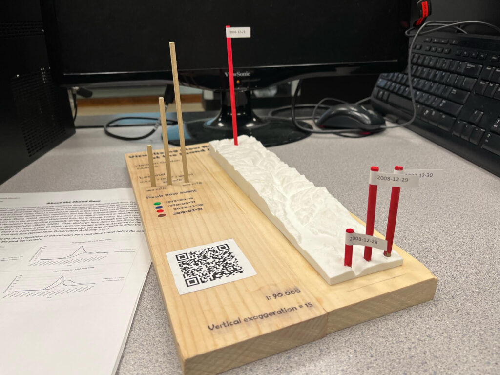
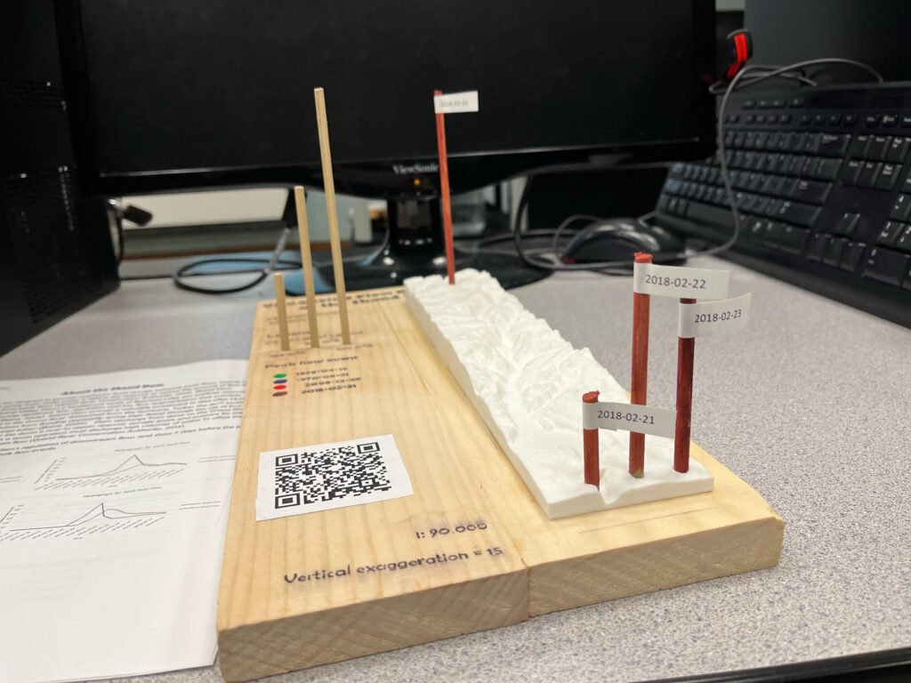
When presented with this geovisualization opportunity I knew I wanted my final deliverable to be interactive and novel. The idea I decided on was a 3D printed topographic map with interactive elements that would allow the visualization of flow regulation from the Shand Dam by placing wooden dowels in holes of the 3D model above and below the dam to see how the dam regulated flow. This concept visualizes flow (cubic meters of water a second) in a way similar to a hydrograph, but brings in 3D elements and is novel and fun as opposed to a traditional chart. Shand Dam on the Grand River was chosen as the site to visualize flow regulation as the Grand River is the largest river system in Southern Ontario, Shand Dam is a Dam of Significance, and there are hydrometric stations that record river discharge above and below the dam for the same time periods (~1970-2022).


About Shand Dam
Dams and reservoirs like the Shand Dam are designed to provide maximum flood storage following peak flows. During high flows (often associated with spring snow melt) water is held in the reservoir to reduce the amount of flow downstream, lowering flood peak flows (Grand River Conservation Authority, 2014). Shand Dam (constructed in 1942 as Grand Valley Dam) is located just south of Belwood Lake (an artificial reservoir) in Southern Ontario, and provides significant flow regulation and low flow augmentation that prevents flooding south of the dam (Baine, 2009). Shand Dam proved a valuable investment in 1954 after Hurricane Hazel when no lives were lost in the Grand River Watershed from the hurricane.
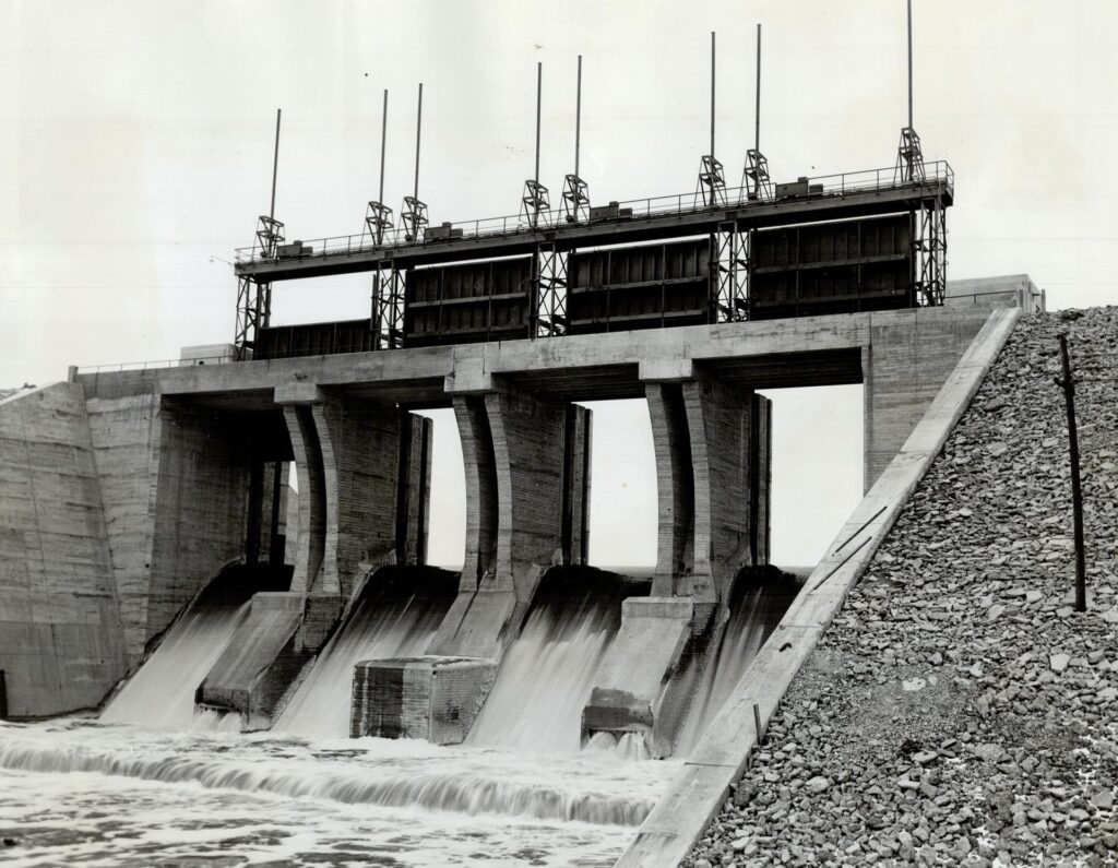
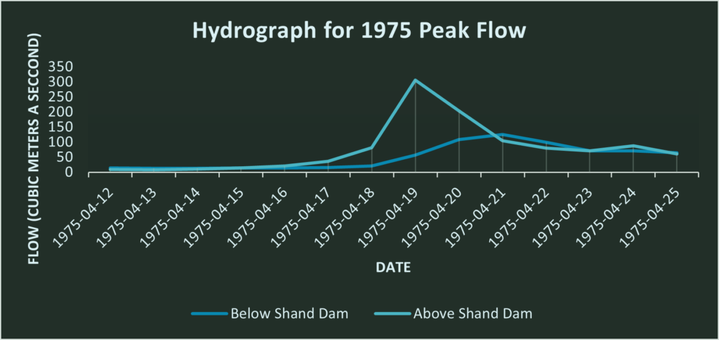
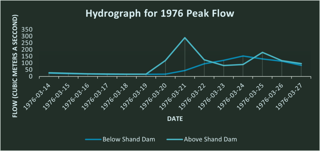
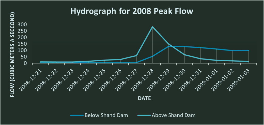
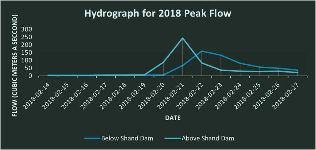
Today, the dam continues to prevent and lessen the devastation from flooding (especially spring high-flows) through the use of four large gates and three ‘low-flow discharge tubes’ (Baine, 2009). Dam discharge from dams on the Grand River may continue for some time after the storm is over to regain reservoir storage space and prepare for the next storm (Grand River Conservation Authority, 2014). This is illustrated in the below hydrographs where the flow above and below the dam is plotted over a time series of one week prior to the peak flow and one week post the peak flow, and the dam delays and ‘flattens’ the peak discharge flow.
Data & Process
This project required two data sources – the hydrometric data for river discharge and a DEM (digital elevation model) from which a 3D printed model will be created. Hydrometric data for the two stations (02GA014 and 02GA016) was downloaded from the Government of Canada, Environment and Natural resources in the format of a .csv (comma separated value) table. Two datasets for hydrometric data were downloaded – the annual extreme peak data for both stations and the daily discharge data for both stations in date-data format. The hydrometric data provided river discharge as daily averages in cubic meters a second. The DEM was downloaded from the Government of Canada’s Geospatial Data Extraction Tool. This website makes it simple and easy to download a DEM for a specific region of canada at a variety of spatial resolutions. I chose to extract my data for the area around Shand Dam that included the hydrometric stations, at a 20 meter resolution (finest resolution available).
3D Printing the DEM
The first step in creating the interactive 3D model was becoming 3D printer certified at Toronto Metropolitan University’s Digital Media Experience Lab (DME). While I already knew how to 3D print this step was crucial as it allowed me to have access to the 3D printers in the DME for free. Becoming certified with the DME was a simple process of watching some videos, taking an online test, then booking an in person test. Once I had passed I was able to book my prints. The DME has two PRUSA brand printers. These 3D printers require a .gcode file to print models. Initially my data was in a .tiff file, and creating a .gcode file would first involve creating an STL (standard triangle language), then creating a gcode file from the STL. The gcode file acts as a set of ‘instructions’ for the 3D printer.
Exporting the STL with QGIS
First the plugin ‘DEM to 3D print’ had to be installed for QGIS. This plugin creates an STL file from the DEM (tiff). When exporting the digital elevation model to an STL (standard triangle language) file a few constraints had to be enforced.
- The final size of the STL had to be under 25 mb so it could be uploaded and edited in tinkercad to add holes for the dowels.
- The final size of the STL file had to be less than ~20cm by ~20cm to fit on the 3D printers bed.
- The final .gcode file created from the STL would have to print in under 6 hours to be printed at the DME. This created a size constraint on the model I would be able to 3D print.
It took multiple experimentations of the QGIS DEM to 3D plugin to create the two STL files that would each print in under 6 hours, and be smaller than 25mb. The DEM was exported as an STL using the plugin and the following settings;
- The spacing was 0.6mm. Spacing reflects the amount of detail in the STL, and while a spacing of 0.2 mm would have been more suitable for the project it would have created too large of a file to be imported to tinkercad.
- The final model size is 6 cm by 25cm and divided into two parts of 6 by 12.5cm.
- The model height of the STL was set to 400m, as the lowest elevation to be printed was 401m. This ensured an unnecessarily thick model would not be created. A thick model was to be avoided as it would waste precious 3D printing time.
- The base height of the model was 2mm. This means that below the lowest elevation an additional 2 mm of model will be created.
- The final scale of the model is approximately 1:90,000 (1:89,575), with a vertical exaggeration of 15 times.
Printing with the DME
These STL that were exported from QGIS were opened in PRUSA slicer to create gcode files. The 3D printer configuration of the DME printers were imported and the infill density was set to 10%. This is the lowest infill density the DME will permit, and helps lower the print time by printing a lattice on the interior of the print as opposed to solid fill. Both the gcode files would print in just under 6 hours.
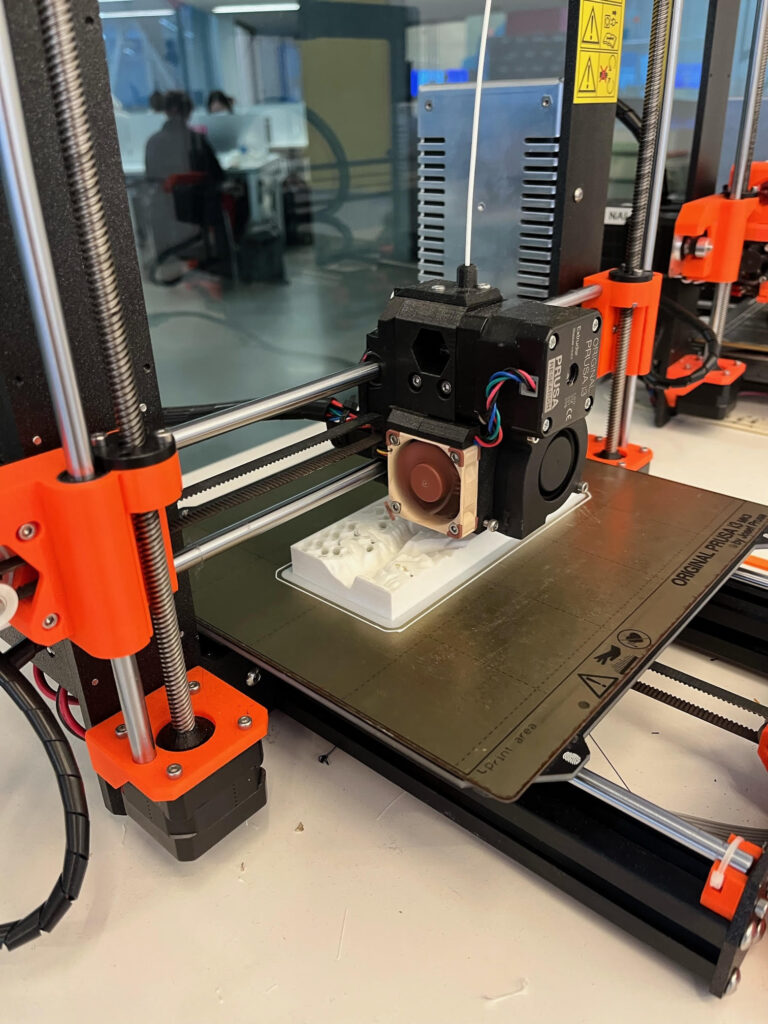
3D printing the files at the DME proved more challenging than initially expected. When the slots were booked on the website I made it clear that the two files were components of a larger project, however when I arrived to print my two files the 3D printers had two different colors of filament (one of which was a blue-yellow blend). As the two 3D prints would be assembled together I was not willing to create a model that was half white, half blue/yellow. Therefore the second print had to be unfortunately pushed to the following week. At this point I was glad I had been proactive and booked the slots early otherwise I would have been forced to assemble an unattractive model. The DME staff were very understanding and found humor in the situation, immediately moving my second print to the following week so the two files could use the same filament color.
Modeling Hydrometric Data with Dowels
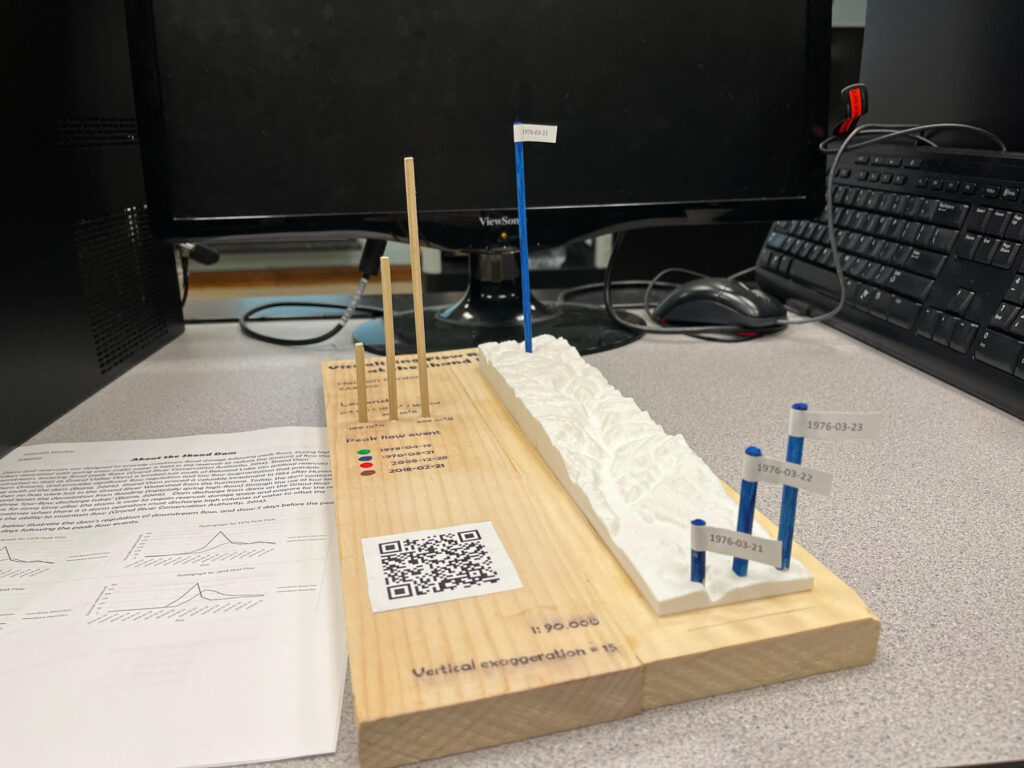
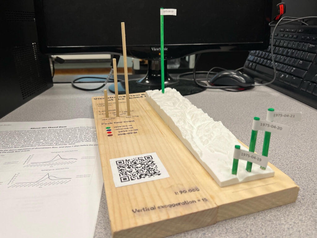
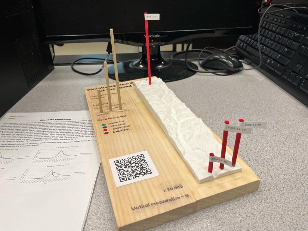
To choose the days used to display discharge in the interactive model the csv file of annual extreme peak data was opened in excel and maximum annual discharge was sorted in descending order. The top three discharge events at station 02GA014 (above the dam), that would have had data on the same days below the dam were:
- 1975-04-19 (average daily discharge of 306 cubic meters a second)
- 1976-03-21 (average daily discharge of 289 cubic meters a second)
- 2008-12-28 (average daily discharge of 283 cubic meters a second)
I also chose 2018’s peak discharge event (average daily discharge of 244 cubic meters a second on February 21st) to be included as it was a significant more recent flow event (top 6)
Once the four peak flow events had been decided on, their corresponding data in the daily discharge data were found, and a scaling factor of 0.05 was applied in excel so I would know the proportional length to cut the dowels. This meant that every 0.5cm of dowel would indicate 10 cubic meters a second of discharge.
As the dowels sit within the 3D print, prior to cutting the dowels I had to find out the depth of the holes in the model. The hole for station 02GA014 (above the dam) was 15mm deep and the holes for station 02GA016 (below the dam) were 75mm deep. This meant that I would have to add 15mm or 75mm to the dowel length to ensure the dowels would accurately reflect discharge when viewed above the model. The dowels were then cut to size, painted to reflect the peak discharge event they correspond to and labeled with the date the data was from. Three dowels for the legend were also cut that reflected discharge of 100, 200, and 300 cubic meters a second. Three pilot holes then three 3/16” holes were drilled into the base for the project (two finished 1 x4’s) for these dowels to sit.
Assembling the Model
Once all the parts were ready the model could be assembled. The necessary information about the project and legend was then printed and carefully transferred to the wood with acetone. Then the base of the 3D print was aggressively sanded to provide better adhesion and glued onto the wood and clamped in place. I had to be careful with this as too tight of clamps would crack the print, but too loose of clamps and the print wouldn’t stay in place as it dried.
Applications
The finished interactive model allows the visualization of flow regulation from the Shand Dam, for different peak flow events, and highlights the value of this particular dam. Broadly, this project idea was a way to visualize hydrographs, and showed the differences in discharge over a spatial and temporal scale that resulted from the dam. The top dowel shows the flow above the dam for the peak flow event, and the three dowels below the dam show the flow below the dam for the day of the peak discharge, one day after, and two days after, to show the flow regulation over a period of days and illustrate the delayed and moderated hydrograph peak. The legend dowels are easily removable to line them up with the dowels in the 3D print to get a better idea of ow much flow there was on a given day at a given place. The project idea I used in creating this model can easily be modified for other dams (provided there is suitable hydrometric data). Beyond visualizing flow regulation the same idea and process could be used to create models that show discharge at different stations over a watershed, or over a continuous period of time – such as monthly averages over a year. These models could have a variety of uses such as showing how river discharge changed in response to urbanization, or how climate change is causing more significant spring peak flows from snowmelt.
References
Baine, J. (2009). Shand Dam a First For Canada. Grand Actions: The Grand Strategy Newsletter. Vol. 14, Issue 2. https://www.grandriver.ca/en/learn-get-involved/resources/Documents/Grand_Actions/Publications_GA_2009_2_MarApr.pdf
Grand River Conservation Authority (2014). Grand River Watershed Water Management Plan. Prepared by the Project Team, Water Management Plan., Cambridge, ON. 137p. + appendices. Retrieved from https://www.grandriver.ca/en/our-watershed/resources/Documents/WMP/Water_WMP_Plan_Complete.pdf
Walker, A. (April 18th, 1942). The dam is 72 feet high, 300 feet wide at the base, and more than a third of a mile long [photograph]. Toronto Star Photograph Archive, Toronto Public Library Digital Archives. Retrieved from https://digitalarchive.tpl.ca/objects/228722/the-dam-is-72-feet-high-300-feet-wide-at-the-base-and-more