Studying Toronto’s Peak Crime Month of 2025
Geo-Vis Project Assignment, TMU Geography, SA8905, Fall 2025
Hello everyone, and welcome to my blog!
Today’s topic addresses the distribution of crime in Toronto. I am seeking to provide the public, and implicated stakeholders with a greater knowledge and understanding of how, where, and why different types of crime are distributed in relation to urban features like commercial buildings, public transit, restaurants, parks, open spaces, and more. We will also be looking at some of the socio-economic indicators of crime, and from there identify ways to implement relevant and context specific crime mitigation and reduction strategies.
This project investigates how crime data analysis can better inform urban planning and the distribution of social services in Toronto, Ontario. Research across diverse global contexts highlights that crime is shaped by a mix of socioeconomic, environmental, and spatial factors, and that evidence-based planning can reduce harm while improving community well-being. The following review synthesizes findings from six key studies, alongside observed crime patterns within Toronto.
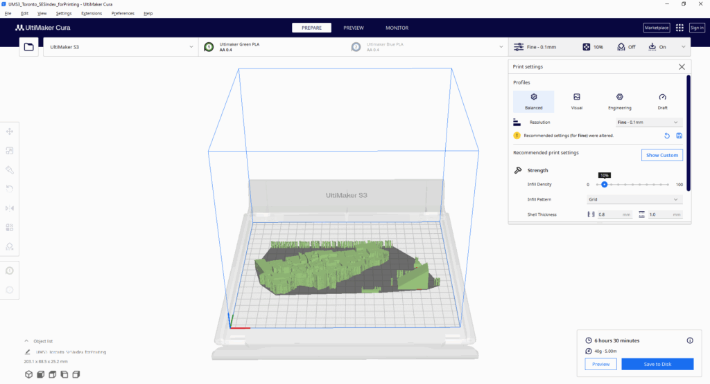
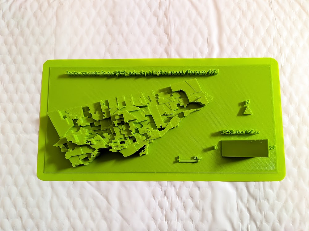
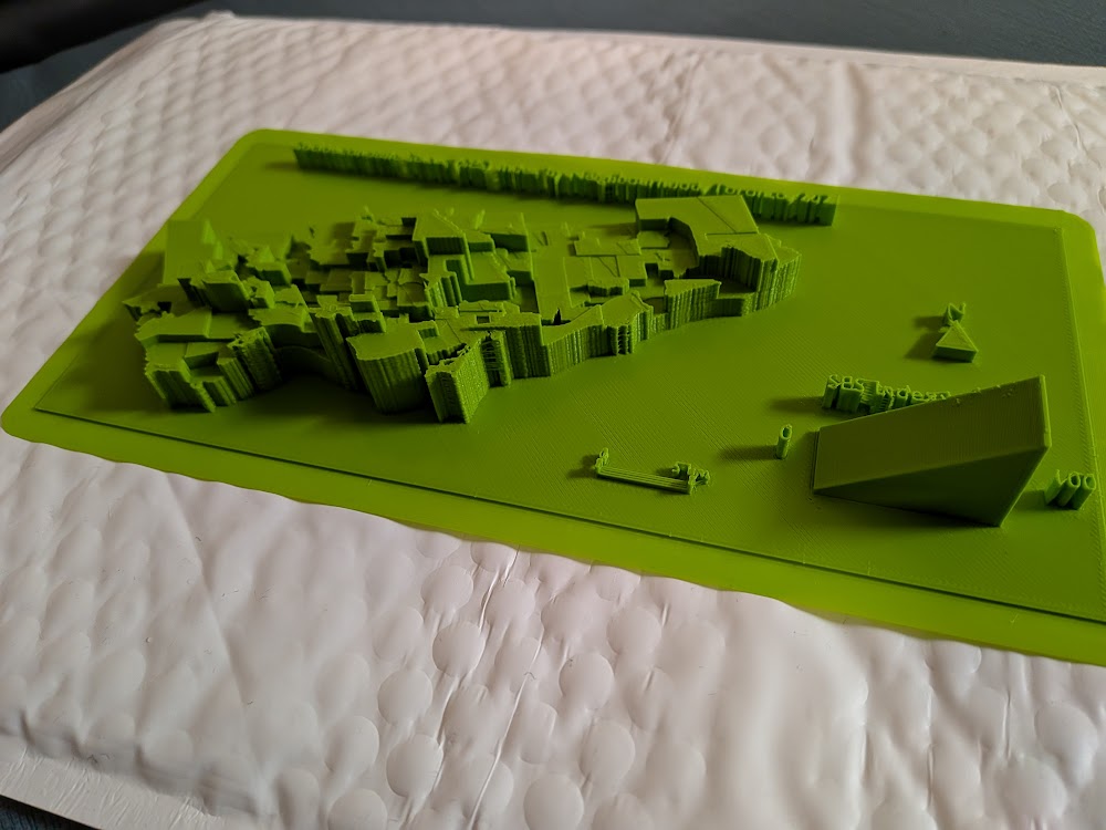
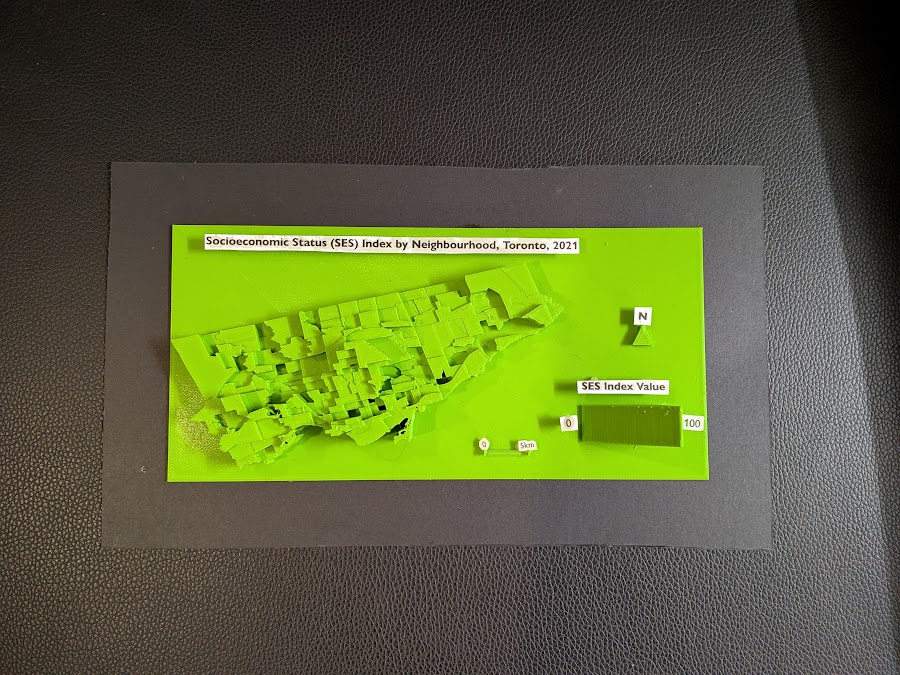
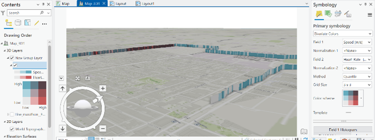
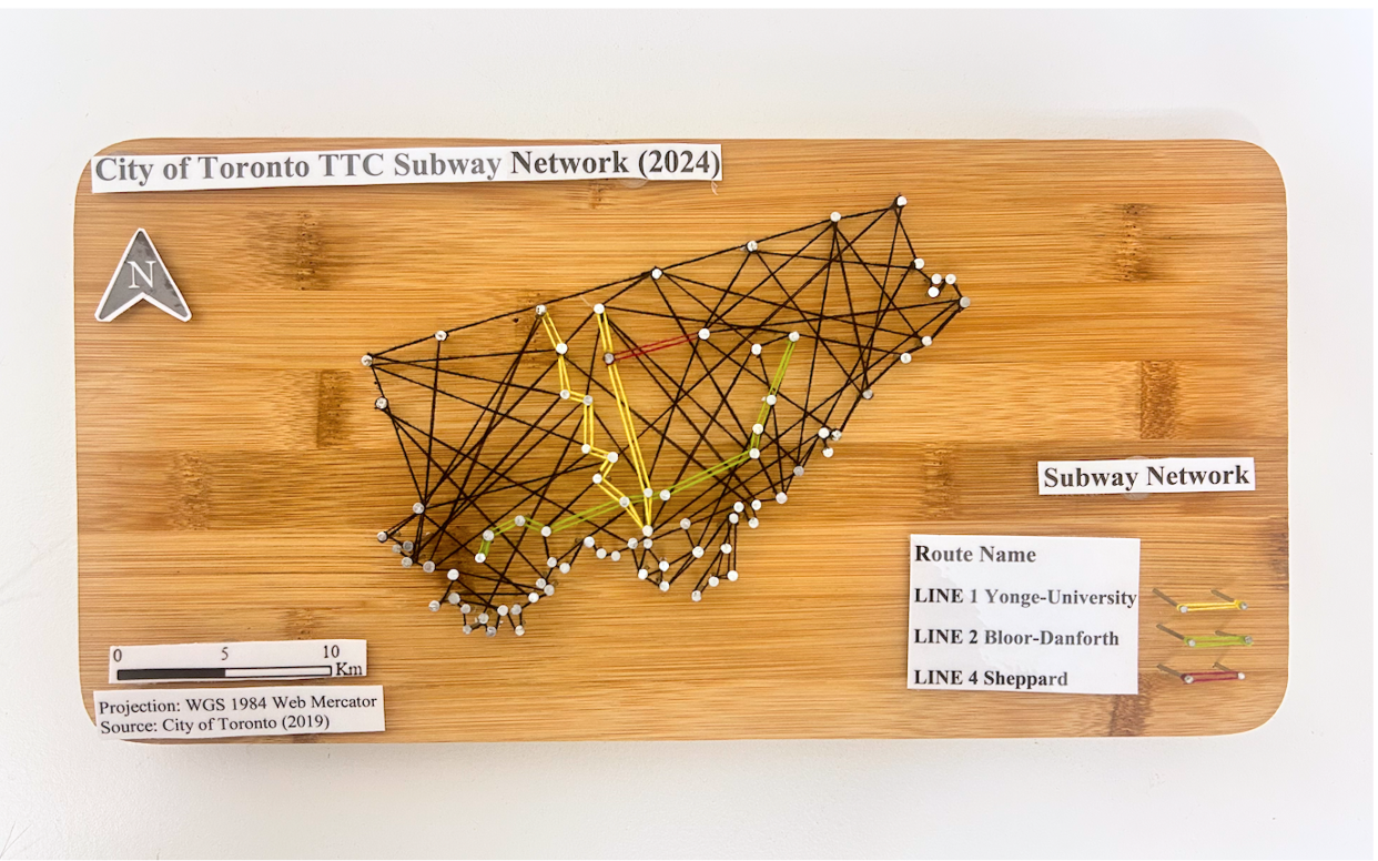
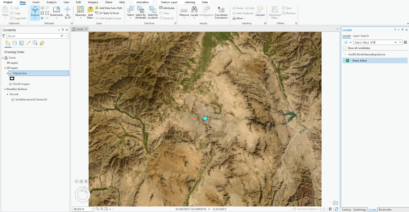
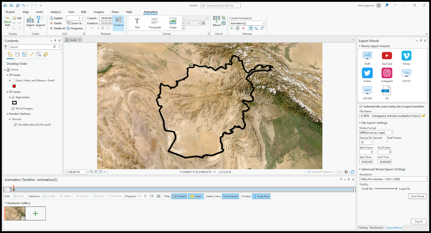
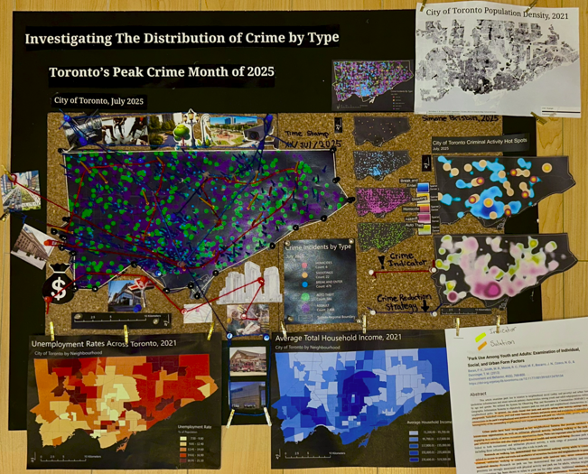
Accompanying a literature review, I created a 3D model that displays a range of information including maps made in ArcGIS Pro. The data used was sourced from the Toronto Police Service Public Safety Data Portal, and Toronto’s Neighbourhood Profiles from the 2021 Census. The objective here is to draw insightful conclusions as to what types of crime are clustering where in Toronto, what socio-economic and/or urban infrastructural indicators are contributing to this? and what solutions could be implemented in order to reduce overall crime rates across all of Toronto’s neighbourhoods – keeping equitability in mind ?
The distribution of crime across Toronto’s neighbourhoods reflects a complex interplay of socioeconomic conditions, built environment characteristics, mobility patterns, and levels of community cohesion. Understanding these geographic and social patterns is essential to informing more effective city planning, targeted service delivery, and preventive interventions. Existing research emphasizes the need for long-term, multi-approach strategies that address both immediate safety concerns and the deeper structural inequities that shape crime outcomes. Mansourihanis et al. (2024) highlight that crime is closely linked to urban deprivation, noting that inequitable access to resources and persistent neighbourhood disadvantages influence where and how crime occurs. Their work stresses the importance of integrating crime prevention with broader social and economic development initiatives to create safer, and more resilient urban environments (Mansourihanis et al., 2024).
Mansourihanis, O., Mohammad Javad, M. T., Sheikhfarshi, S., Mohseni, F., & Seyedebrahimi, E. (2024). Addressing Urban Management Challenges for Sustainable Development: Analyzing the Impact of Neighborhood Deprivation on Crime Distribution in Chicago. Societies, 14(8), 139. https://doi.org/10.3390/soc14080139
Click here to view the literature review I conducted on this topic.
How can we use crime data analysis to better inform city planning and the distribution of social services?
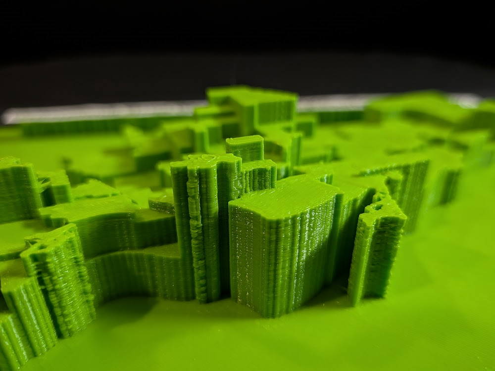
Methods – Creating a 3D Interactive Crime Investigation Board
Part 1, Preliminary Research and Mapping
The purpose of this 3D map is to provide an interactive tool that can be regularly updated over time; allowing users to build upon research using various sources of information in varying formats (e.g. literature, images, news reports, raw data, various map types presenting comparable socio-economic data, etc; thread can be used to connect images and other information to associated areas on the map). The model has been designed for easy means of addition, removal and connection of media items by using materials like tacks, clips, and cork board. Crime incidents can be tracked and recorded in real time. This allows for quick identification of where crime is clustering based on geography, socio-economic context, and proximity to different land use types and urban features like transportation networks. We can continue to record and analyze what urban features or amenities could be deterring or attracting/ promoting criminal activity. This will allow for fast, context specific, crime management solutions that will ultimately help reduce overall crime rates in the city.

1. Conduct a detailed literature review.
Here is the literature review I conducted to address this topic.
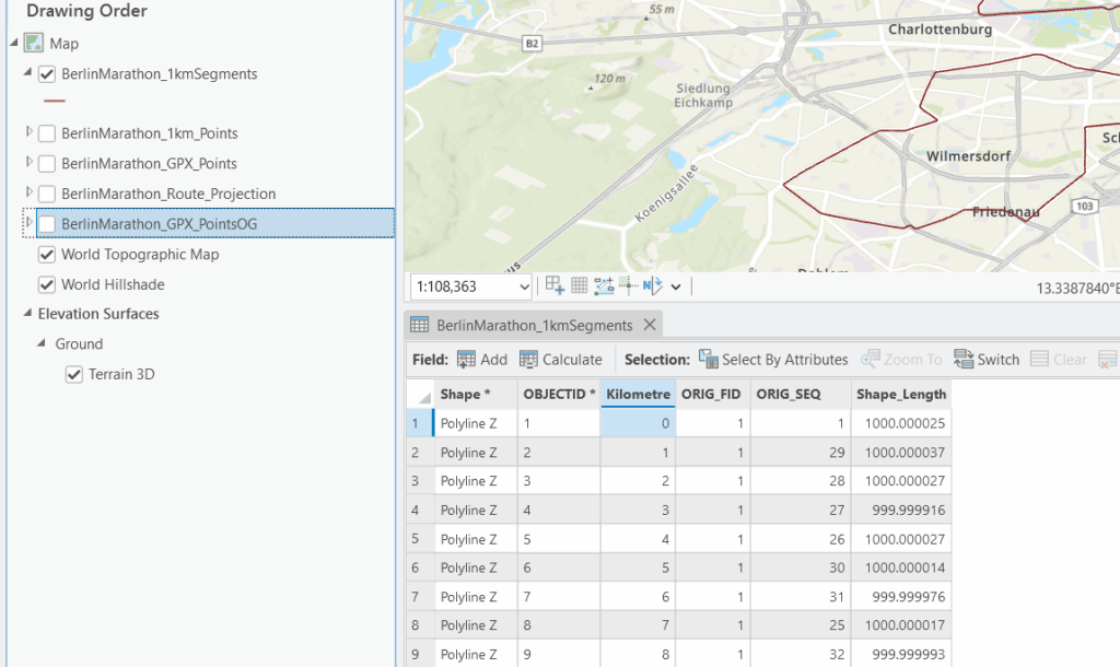
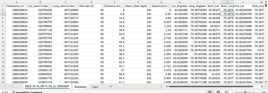
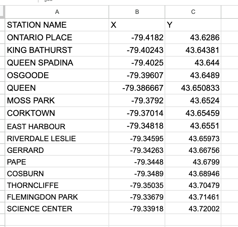
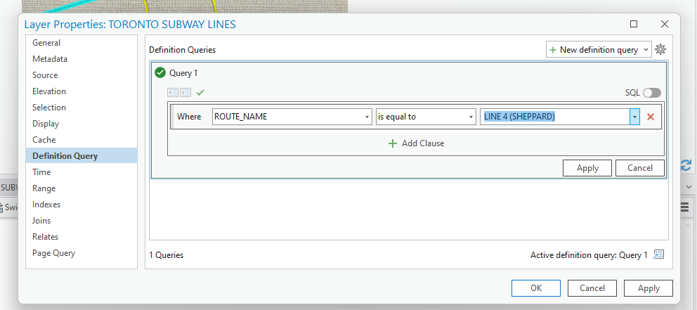
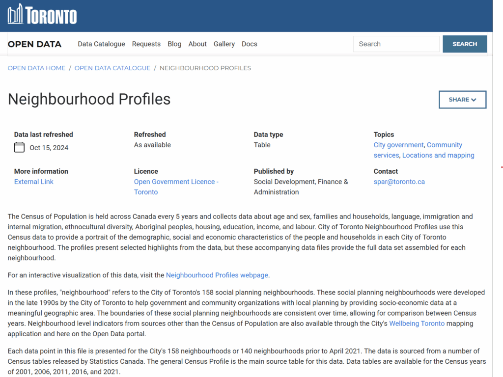
2. Downloaded the following data from: Open Data | Toronto Police Service Public Safety Data Portal. Each dataset was filtered to show points only from 2025.
- Dataset: Shooting and Firearm Discharges
- Dataset: Homicides
- Dataset: Assault
- Dataset: Auto Theft
- Dataset: Break and Enter
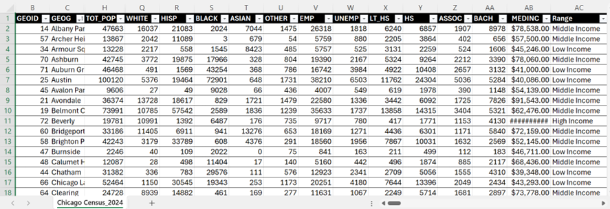
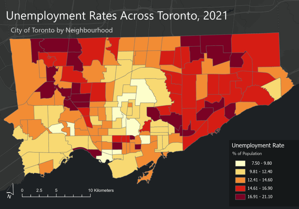
Toronto Neighbourhood Profiles, 2021 Census from: Neighbourhood Profiles - City of Toronto Open Data Portal
- Average Total Household Income by Neighbourhood
- Unemployment Rates by Neighbourhood
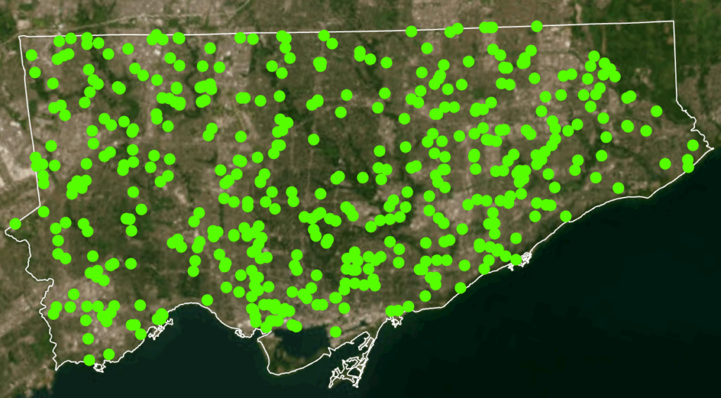
3. After examining the full data sets by year, select a time period to map. In this case, July 2025 which was the month that had the greatest number of crimes to occur this year.
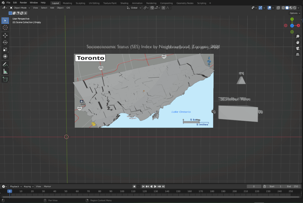
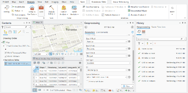
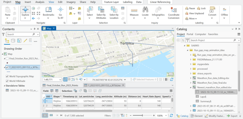
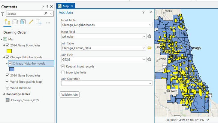
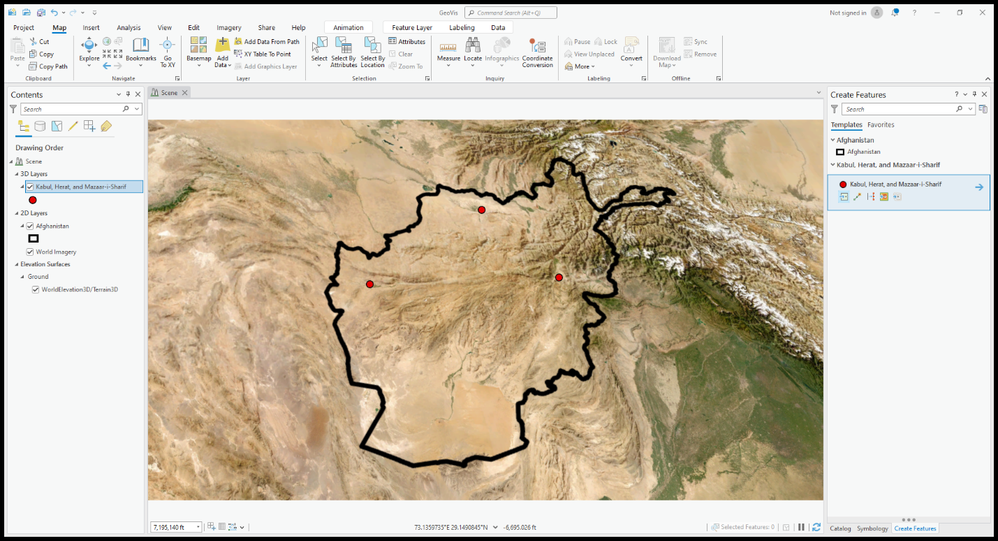
4. Map Setup
- Coordinate system: NAD 1983 UTM Zone 17N
- Rotation: -17
- Geography:
- City of Toronto, ON, Canada
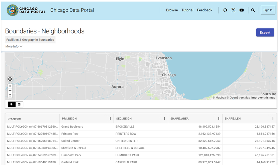
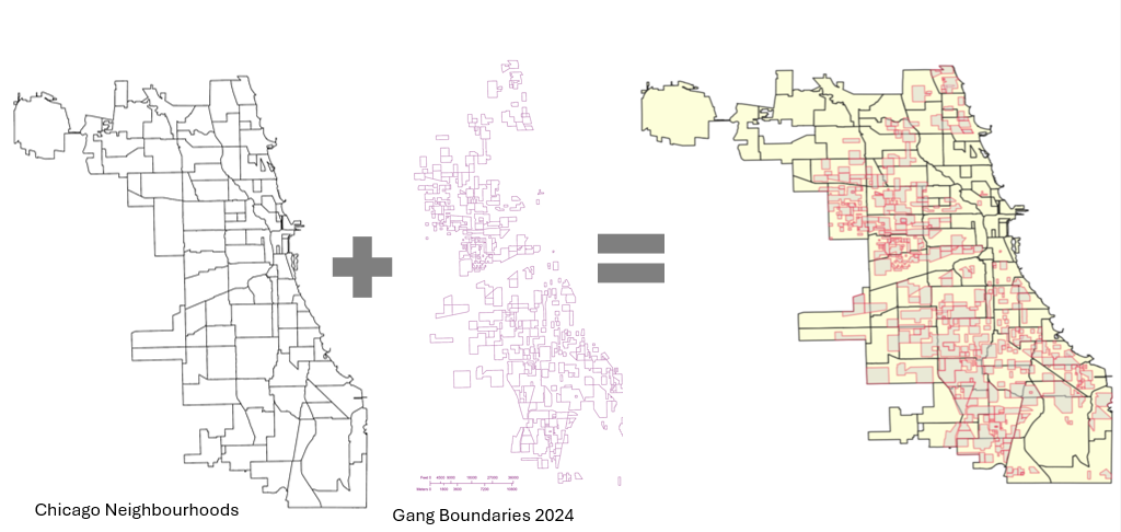
- Neighbourhood boundaries from Toronto Open Data Portal
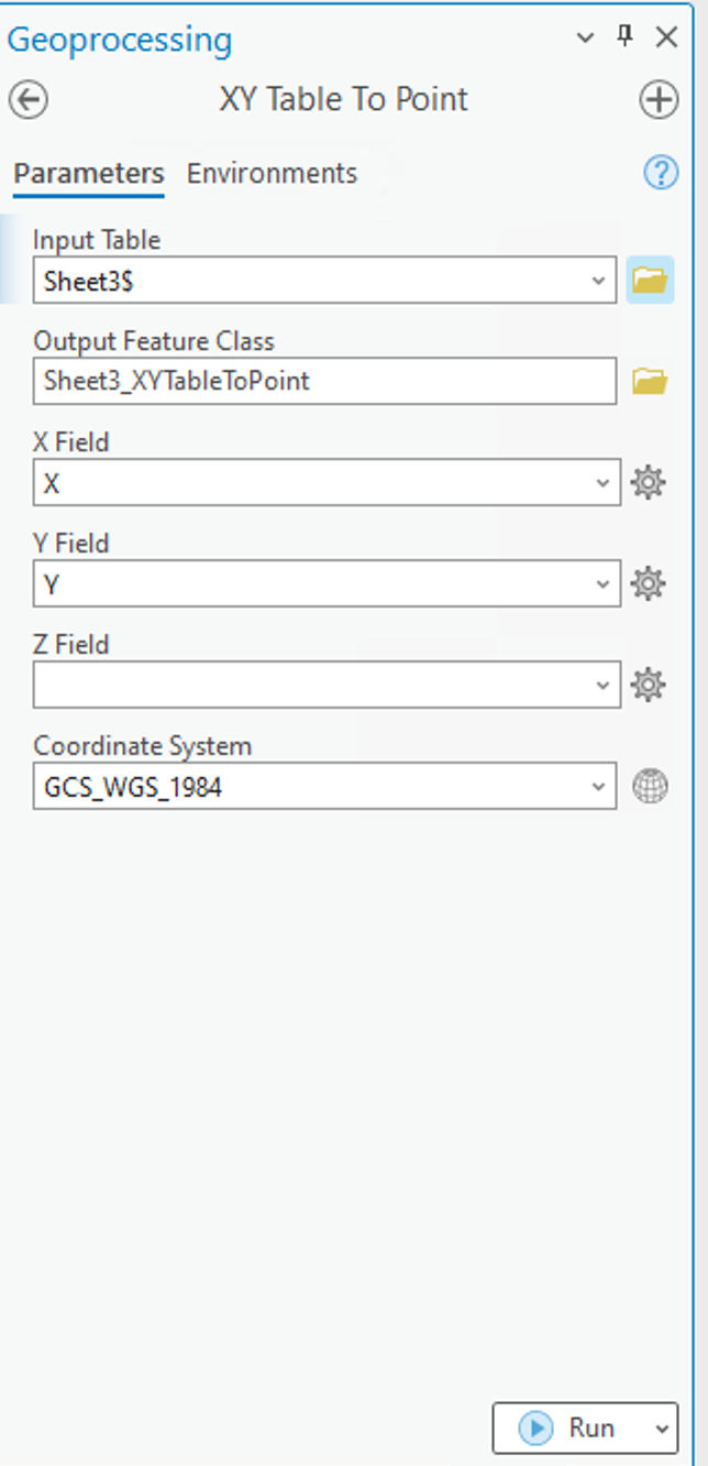
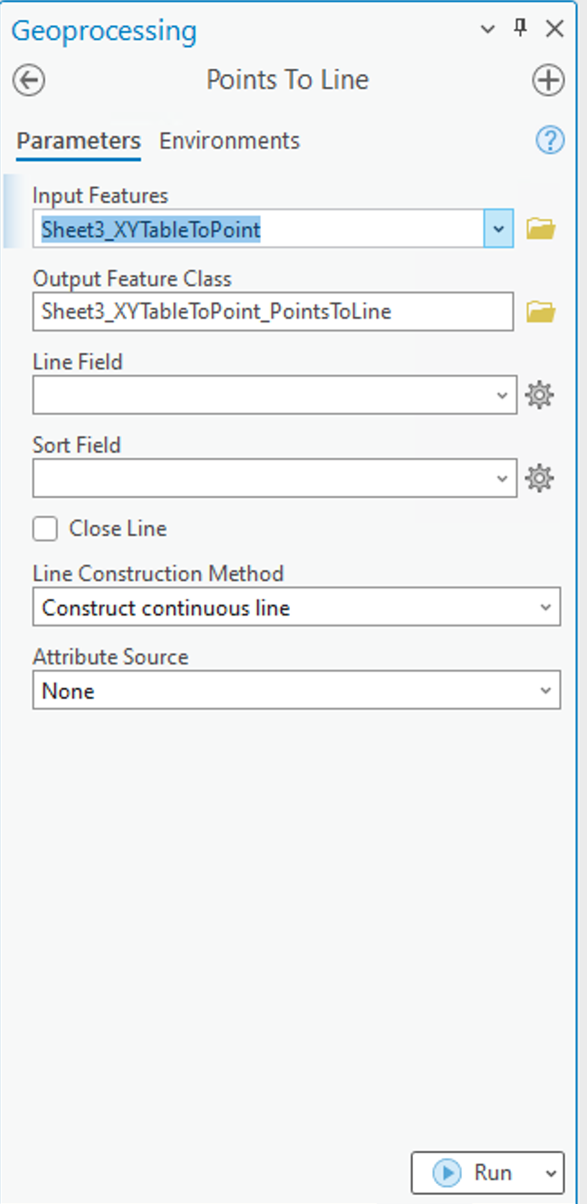
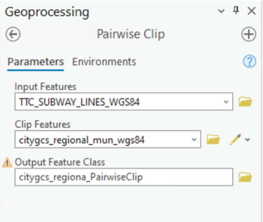
5. Add the crime incident data reports and Toronto’s Neighbourhood Boundary file.
Geospatial Analysis Tools Used
Tool - Select by attribute and delete the data that we are not mapping. In this case;
From the Attribute Table,
Select by Attribute [OCC_YEAR] [is less than] [2025]
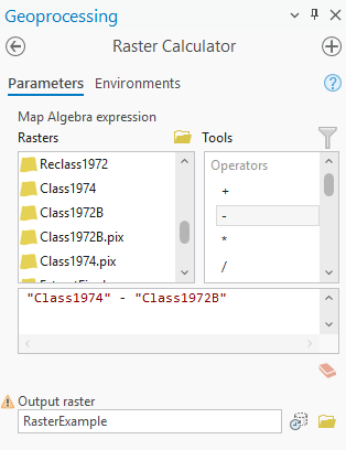
Tool - Summarize within
Count the number of crime incidents within each of the neighbourhood's boundary polygons for the 5 selected crime types for preliminary analysis and mapping.
Design Tools and Map Types Used
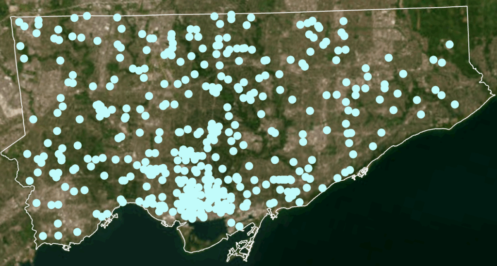
- Dot Density
- 2025 Crime rates, by type, annual and for July of 2025
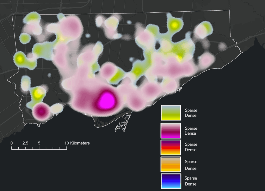
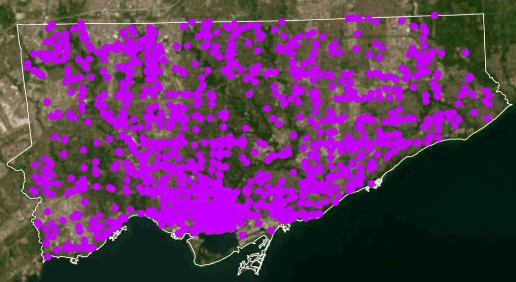
- Heat Map
- 2025 Crime rates, by type, annual and for July of 2025
- Choropleth
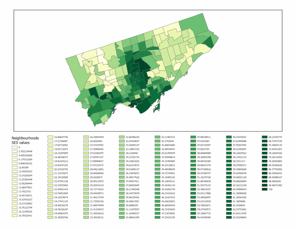
- Average Total Household Income, City of Toronto by Neighbourhood
- Unemployment Rates Across Toronto, 2021
- Design Tools e.g. convert to graphics
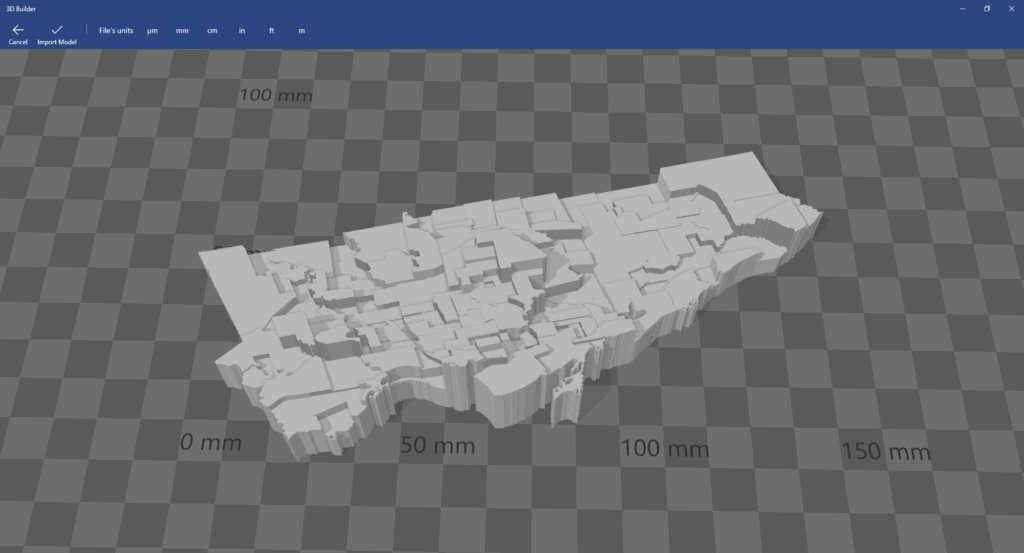
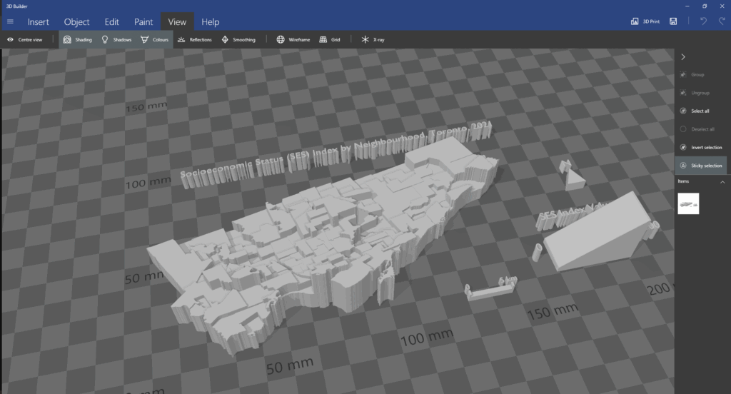
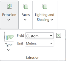
Part 2, Creating the 3D Model
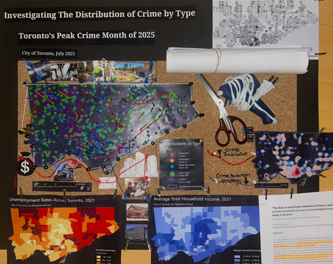
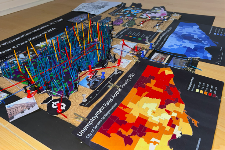
Based on literature review and analysis of the presented maps, this model allows for us to further analyze, visually display and record the data and findings. This model will allow for users to see where points are clustering, and examine urban features, land use and the socio-economic context of cluster areas in order to address potential solutions, with equity in mind.
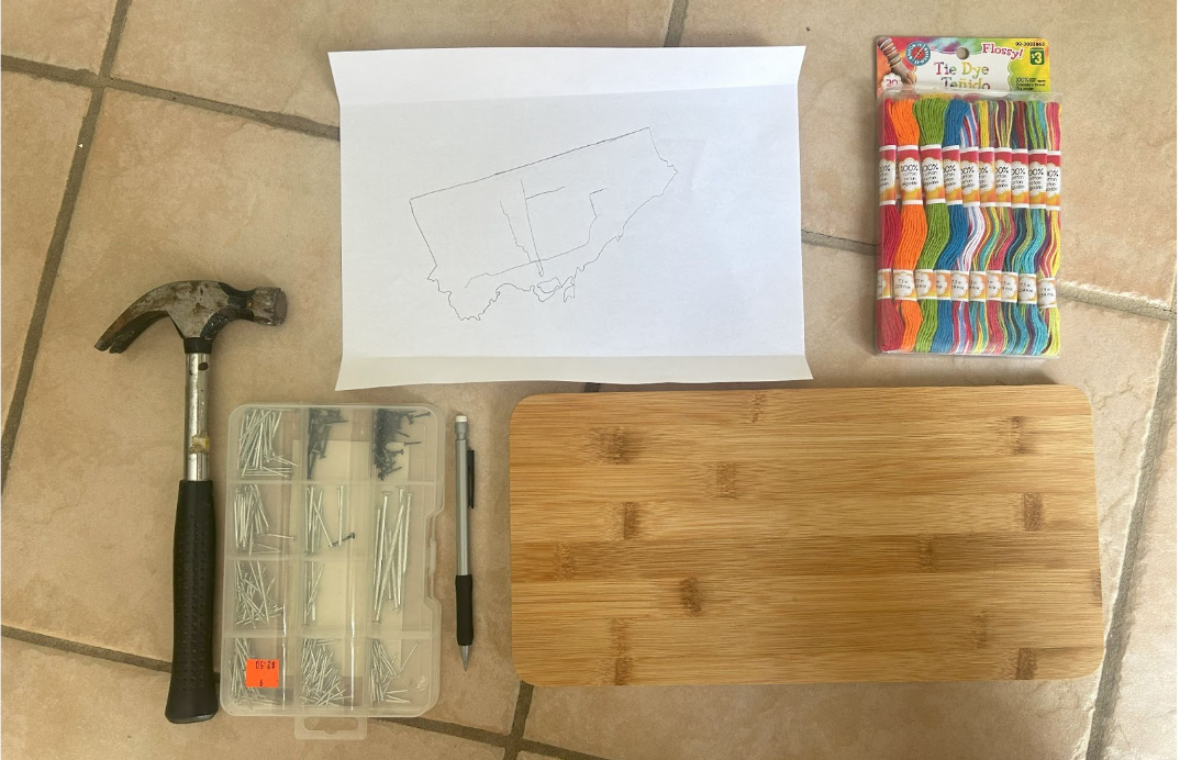
Supplies
- Thread,
- Painted tooth picks,
- Mini clothes pins,
- Highlighters, markers etc.
- Scissors,
- Hot glue
- Images of indicators
- Relevant/insightful literature research
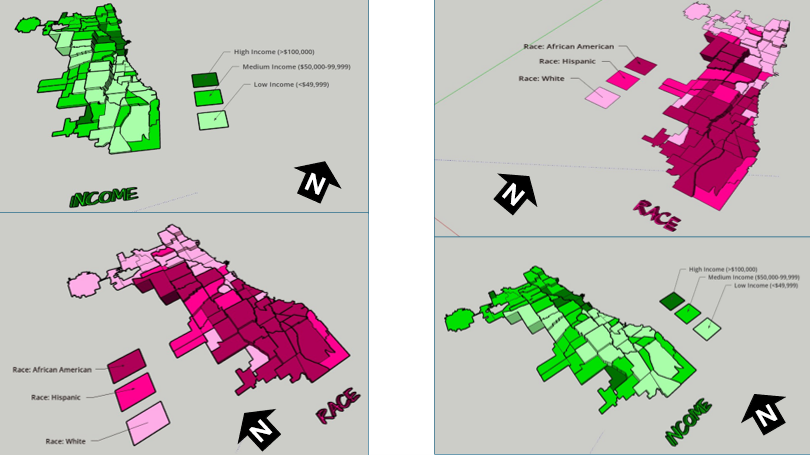
- Socio-Economic Maps: Population Income, unemployment, and density
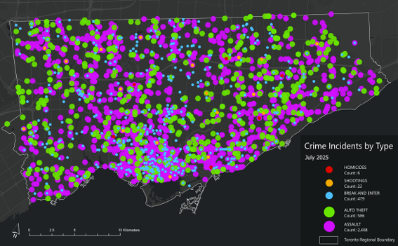
- Crime Maps: Dot density crime by type, heat map of crime distribution by type, from the select 5 crime types, all incidents to occur during the month of July, 2025
Process
1. Attach cork board to poster board;
2. Cut out and place down main maps that have been printed (maps created in ArcGIS Pro, some additional design edits made in Canva);
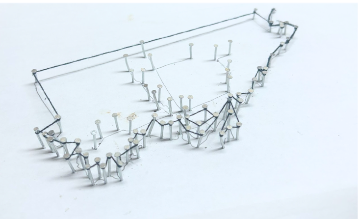
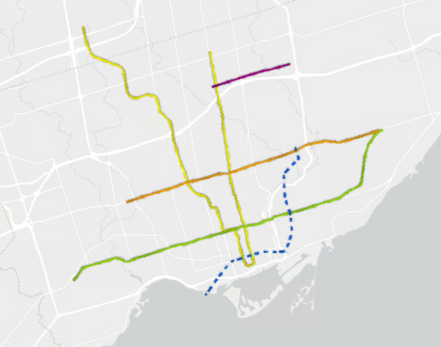
3. Outline the large or central base map with tacks; use string to connect the tacks outlining the City of Toronto's regional boundary line.
4. Using colour painted tooth picks (alternatively, tacks may be used depending on size limitations), crime incidents can be recorded in real time, using different colours to represent different crime types.
5. Additional data can be added on and joined to other map elements over time. This data could be: images and locations of crime indicators; new literature findings; news reports’ raw data; different map types presenting comparable socio-economic data; community input via email, from consultation meetings, 911 calls, or surveys; graphs; tables; land use type and features and more.
6. Thread is used to connect images and other information to associated areas on the map. In this case, blue string and tacks were used to highlight preventative crime measures and red to represent an indicator of crime.
7. Sticky notes can be used to update the day and month (using a new poster/cork board for each year), under “Time Stamp”
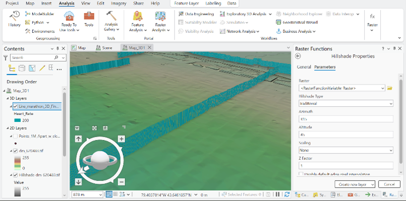
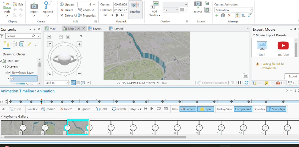
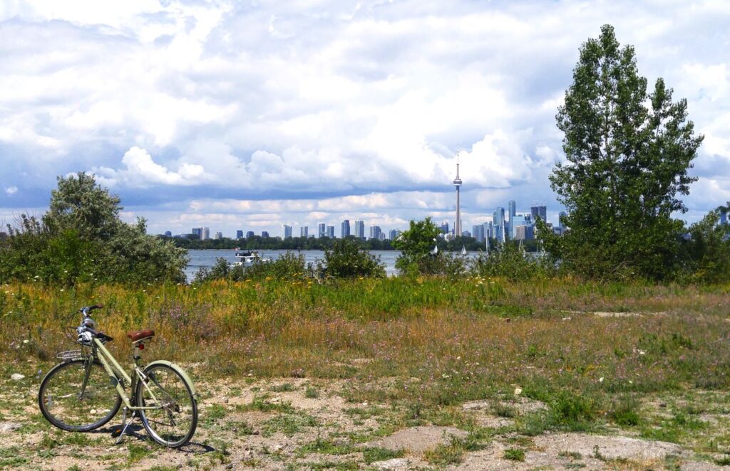
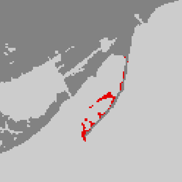
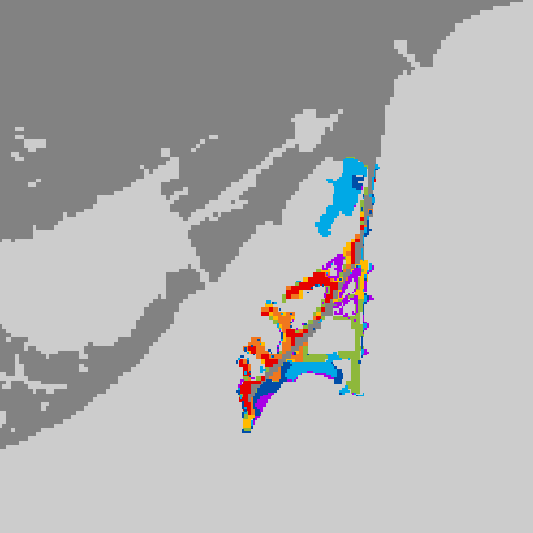
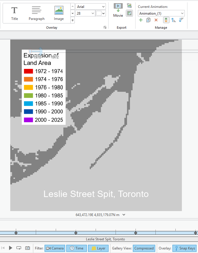
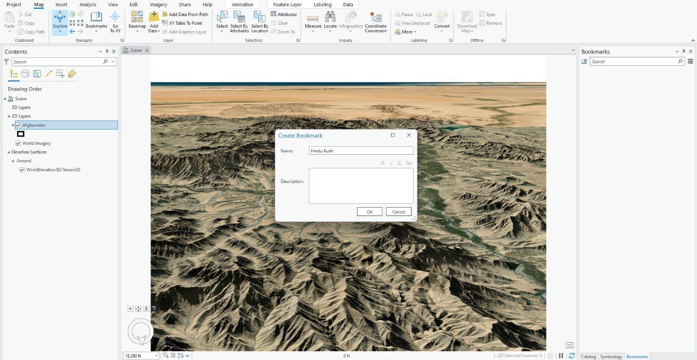
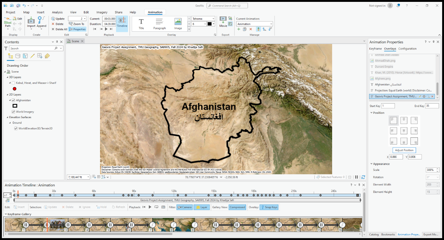
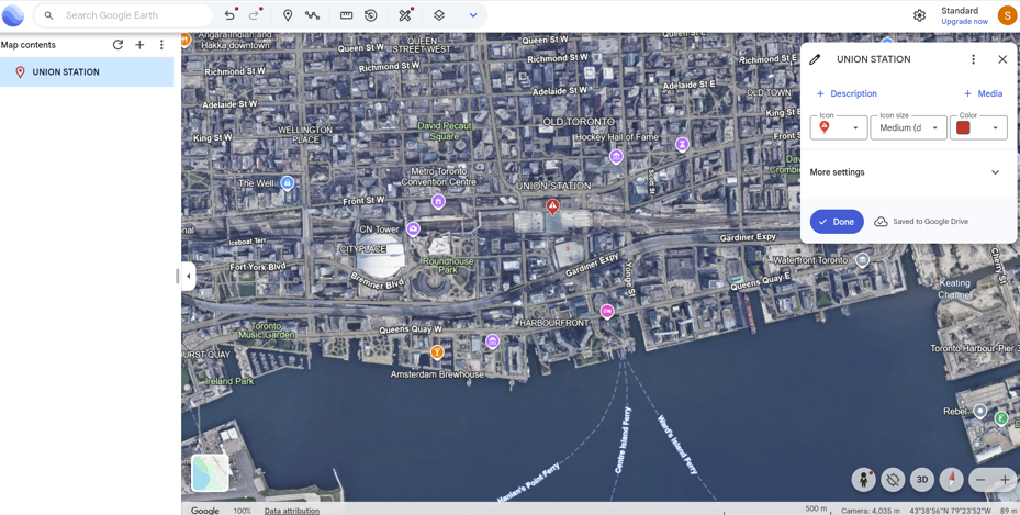
8. Use of Google Earth was applied to further analyze using satellite imagery, a terrestrial layer, and an urban features layer in order to further analyze land use, type, function, and significant features like Union Station - a major public transit connection point, and located within Toronto’s most dense and overall largest crime hot spot.
9. A satellite imagery base map in ArcGIS was used to compare large green spaces (parks, ravines, golf courses etc.) with the distribution of each incidence point on the dot map created. Select each point field individually for optimal view and map analysis.
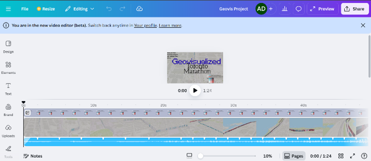
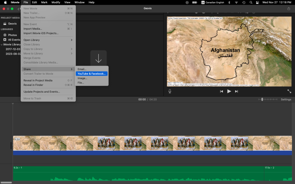
10. Video and Photo content used to display the final results were created using an IPhone Camera and the "iMovie" video editing app.
See photos and videos for reference!
Findings
Socioeconomic and Environmental Indicators of Crime
A consistent theme across the literature and my own findings is the strong connection between neighborhood deprivation and crime. Mansourihanis et al. (2024) emphasize that understanding the “relationship between urban deprivation and crime patterns” supports targeted, long-term strategies for urban safety. Concentrated poverty, population density, and low social cohesion are significant predictors of violence (Mejia & Romero, 2025; M. C. Kondo et al., 2018). Similarly, poverty and weak rule of law correlate more strongly with homicide rates than gun laws alone (Menezes & Kavita, 2025).
Environmental characteristics also influence crime distribution. Multiple studies link greater green space to reduced crime, higher social cohesion, and stronger perceptions of safety (Mejia & Romero, 2025). Exposure to green infrastructure can foster community pride and engagement, further reinforcing crime-preventive effects (Mejia & Romero, 2025). Relatedly, Stalker et al. (2020) show that community violence contributes to poor mental and physical health, with feelings of unsafety directly associated with decreased physical activity and weaker social connectedness.
Other urban form indicators—including land-use mix, connectivity, and residential density—shape mobility patterns that, in turn, affect where crime occurs. Liu, Zhao, and Wang (2025) find that property crimes concentrate in dense commercial districts and transit hubs, while violent crimes occur more often in crowded tourist areas. These patterns reflect the role of population mobility, economic activity, and social network complexity in structuring urban crime.
Crime Prevention and Community-Based Solutions
Several authors highlight the value of integrating built-environment design, green spaces, and community-driven interventions. Baran et al. (2014) show that larger parks, active recreation features, sidewalks, and intersection density all promote park use, while crime, poverty, and disorder decrease utilization. Parks and walkable environments also support psychological health and encourage social interactions that strengthen community safety. In addition, green micro-initiatives—such as community gardens or small landscaped interventions—have been found to enhance residents’ emotional connection to their neighborhoods while reducing local crime (Mejia & Romero, 2025).
At the policy level, optimizing the distribution of public facilities and tailoring safety interventions to local conditions are essential for sustainable crime prevention (Liu, Zhao, & Wang, 2025). For gun violence specifically, trauma-informed mental health care, early childhood interventions, and focused deterrence are recommended as multidimensional responses (Menezes & Kavita, 2025).
Spatial Crime Patterns in Toronto
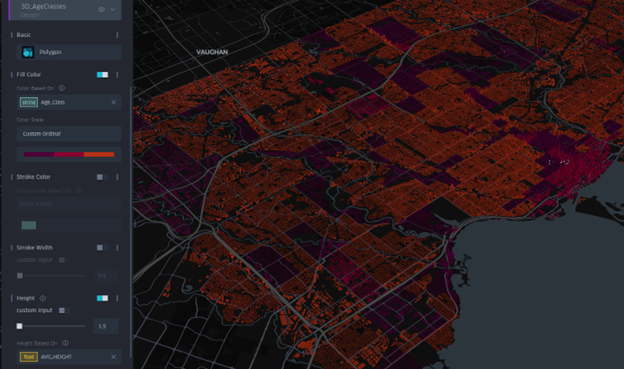
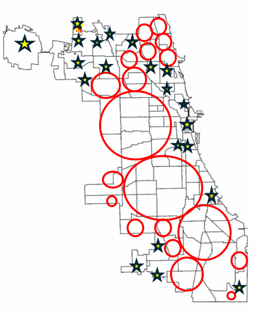
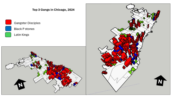
When mapped across Toronto’s geography, the crime data revealed distinct clustering patterns that mirror many of the relationships described in the literature. Assault, shootings, and homicides form a broad U- or O-shaped distribution that aligns with neighborhoods exhibiting lower average incomes and higher unemployment rates. These patterns echo global findings on deprivation and violence.
Downtown Toronto—particularly the area surrounding Union Station—emerges as the city’s highest-density crime hotspot. This zone features extremely high connectivity, car-centric infrastructure, dense commercial and mixed land use, and limited green space. These conditions resemble those identified by Liu, Zhao, and Wang (2025), where transit hubs and high-traffic commercial districts generate elevated rates of property and violent crime. Google Earth imagery further highlights the concentration of major built-form features that attract large daily populations and mobility flows, reinforcing the clustering of assaults and break-and-enter incidents in the downtown core.
Auto theft is relatively evenly distributed across the city and shows weaker clustering around transit or commercial nodes. However, areas with lower incomes and higher unemployment still show modestly higher auto-theft levels. Break and enter incidents, by contrast, concentrate more strongly in high-income neighborhoods with lower unemployment—suggesting that offenders selectively target areas with greater material assets.
Across all crime categories, one consistent pattern is the notable absence of incidents within large green spaces such as High Park and Rouge National Urban Park. This supports the broader literature connecting green space with lower crime and improved perceptions of safety (Mejia & Romero, 2025; Baran et al., 2014). Furthermore, as described, different kinds of crime occur in low versus high income neighbourhoods emphasizing a need for context specific resolutions that take into consideration crime type and socio-economics.
Synthesis and Relevance for Toronto
Collectively, these findings indicate that crime in Toronto is shaped by intersecting socioeconomic factors, environmental features, and mobility patterns. Downtown crime clustering reflects high density, transit connectivity, and land-use complexity; outer-neighborhood violence aligns with deprivation; and green spaces consistently correspond with lower crime. These patterns mirror global research emphasizing the role of social cohesion, urban form, and economic inequality in shaping crime distribution.
Understanding these relationships is essential for planning decisions around green infrastructure investments, targeted social services, transit-area safety strategies, and neighborhood-specific interventions. Ultimately, integrating environmental design, socioeconomic supports, and community-based programs that support safer, healthier, and more equitable outcomes for Toronto residents.