Geovis Project Assignment @RyersonGeo, SA8905, Fall 2022
Background
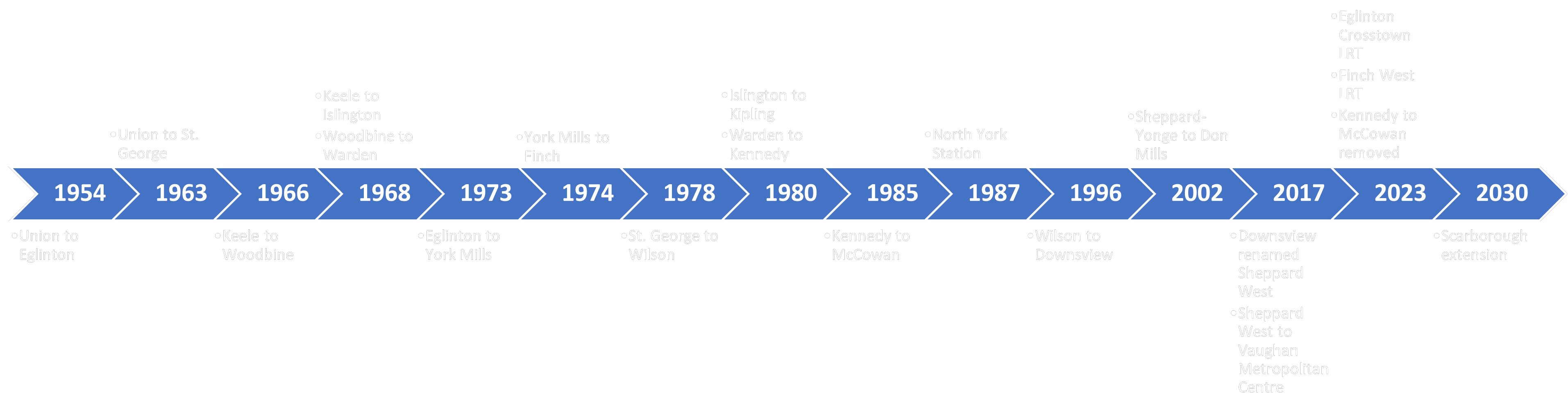
Toronto’s rapid transit system has been constantly growing throughout the decades. This transit system is managed by the Toronto Transit Commission (TTC) which has been operating since the 1920s. Since then, the TTC has reached several milestones in rapid transit development such as the creation of Toronto’s heavy rail subway system. Today, the TTC continues to grow through several new transit projects such as the planned extension of one of their existing subway lines as well as by partnering with Metrolinx for the implementation of two new light rail systems. With this addition, Toronto’s rapid transit system will have a wider network that spans all across the city.
Timeline of the development of Toronto’s rapid transit system
Based on this, a geovisualization product will be created which will animate the history of Toronto’s rapid transit system and its development throughout the years. This post will provide a step-by-step tutorial on how the product was created as well as showing the final result at the end.
Anastasiia Smirnova SA8905 Geovis project, Fall 2022
Introduction
Through this project I wanted to gain and advance my skills in both storytelling and visualizing spatial data. Here you can learn more about my attempt of using ArcGIS StoryMaps to highlight the importance of including children in the urban planning agenda and to show the World- and Canada-wide spatial patterns of urban areas’ commitment to creating inclusive urban environments with children in mind.
I used ESRI’s ArcGIS Pro, Online Map Viewer and StoryMaps for my project. First, I used the desktop app (ArcGIS Pro) to import my data and create my initial maps. After that I uploaded the layers that I wanted to use as web layers to my ArcGIS account, and then I finalized them using ArcGIS online applications. I used the online map viewer to adjust symbology as necessary as was trying to figure out what worked better for each part of my story. It was easy to go back and forth between the Map Viewer and StoryMaps – to make the necessary changes, then to see how the updated maps work with the story, and then repeat these steps as needed. The Map viewer generally had the functionality I needed to change my map symbology and I did not have to go back to ArcGIS Pro too often to make modifications after I uploaded my layers online.
I liked the functionality of StoryMaps. I used the sidecar option to introduce my story, and for showing most of my maps. I find that this block type provides some of the most immersive experience while scrolling, so I used it for the parts of the story that I wanted to keep the reader’s attention on.
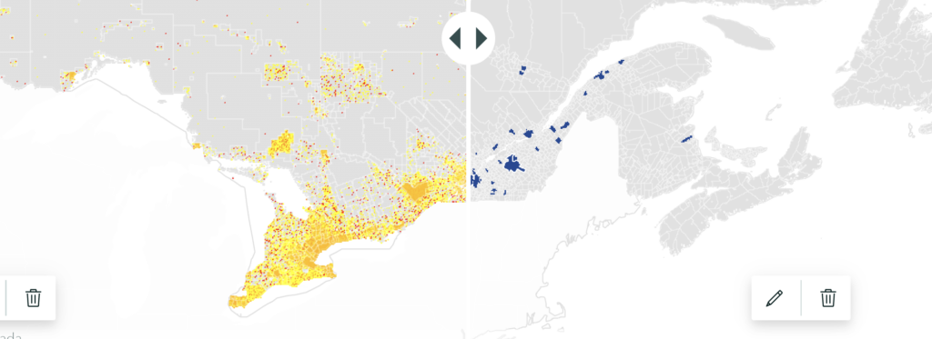
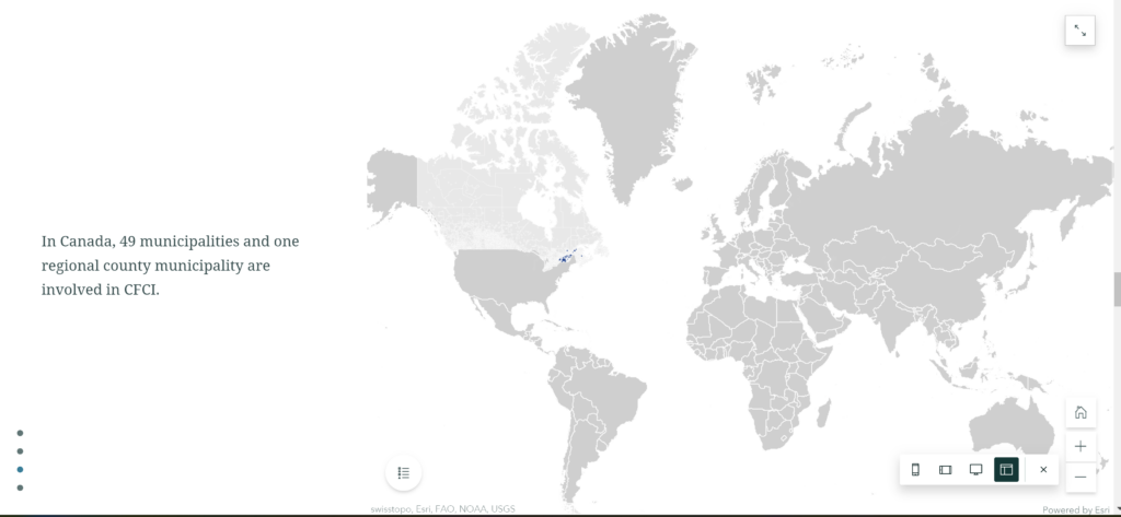
I found that the swipe option worked well for showing comparisons. In a regular map, it is often difficult to show all information you want without cluttering the map with too many layers and making the map unreadable. The swipe option can help solve this problem. As such, I used this function to show how many children did (not) live within the municipalities that were part of CFCI and therefore could (not) benefit from the initiative.
the map shows distribution of children and youth residences (on the left, yellow and red) and municipalities involved in CFCI (on the right, blue)
For inserting your maps to any blocks of StoryMaps, you can choose to either use your maps uploaded as images or insert the actual interactive online maps. While the image option has some benefits, such as more flexibility in styling the map and faster loading, the main benefit of inserting the actual online maps is interactivity. You can zoom in and out, search for a specific location, show/hide legend, learn more about each unit on the map and so on (as the creator of the story, you can edit and set restrictions of what readers can and cannot do with your online maps).
Since I wanted to keep my maps as simple visually as possible, I went with the second option. This way, if the reader wanted to learn more about my maps and the information they displayed, they could do so by using the interactive map functions.
Interesting findings
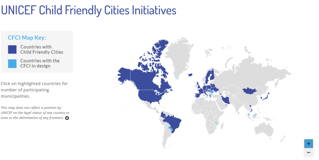
In addition to the main message of the project (the need to promote child friendly cities), the maps showed how the choice of data, scale and mapping methodology can influence the results and representation. On the CFCI website, the main map was showing all countries that were involved in the CFCI. The map did not consider how many municipalities in each country were actually involved in the initiatives.
The main map from the UNICEF CFCI website – CFCI countries
This way of displaying data may be misleading, since the level involvement of each country varied greatly. In some countries, most of the territory was part of CFCI, but some other countries only had a couple municipalities each with UNICEF’s child friendly initiatives.
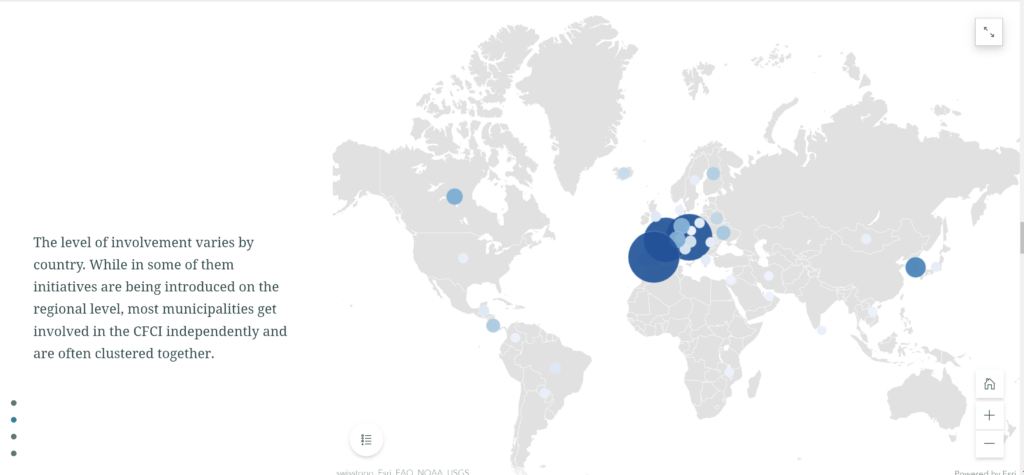
For this story, in addition to the world CFCI country map similar to the one from the website, a proportional symbol map was created to show how many municipalities from each country were actually involved in the CFCI and I put these two maps in one sidecar block so that the reader could swipe back and forth to see how the distribution of CFCI changed with the change of the variable, and what the actual level of involvement if each country was.
A map from my StoryMap – Municipalities involved in CFCI
When zoomed in, even more information about the unevenness and clustering in the spatial distribution of the CFCI municipalities can be discovered.
The sidecar block (I used the float side by side option for my maps), and the smooth transitions it provided, worked well for showing the differences between the maps, as well as for zooming in into a smaller scale map.
Challenges
Some of the main challenges for me were associated with updating the maps if I wanted to change something. It took some time for me to figure out what could be done at which step of the process (with different apps) and how far back I had to go to modify something. As such I had trouble updating and modifying the legends for the maps.
Unfortunately, the options for adjusting the legends using the ArcStory editor or the online map viewer were limited. For instance, it was impossible to hide or edit the name of the column which contained data used in the map while using the online apps. Since I was creating my original layers in ArcGIS Pro, then uploading them as web layers, and then adjusting my maps further in the online map viewer, it was difficult to go back to change the original data in the end, just to modify one little line on the map legend. Only some parts of the legend could be modified using the online apps. So, one of the lessons I took from this experience is that you need to make sure all the column names are appropriate before making all the edits online if you are using a similar process as I did. It is also helpful to think about the legends right from the start.
Conclusion and results
In general, I am satisfied with the ArcGIS StoryMap platform. It was easy to use, and it did a good job of assisting me in creating a map-based story that looks clean and flows smoothly. I am planning on further exploring the StoryMap functionality in the future.
If you are interested in learning more about child friendly cities and seeing my StoryMap result, you can follow this link:
Automation’s prevalence in society is becoming normalized as corporations have begun noticing its benefits and are now utilizing artificial intelligence to streamline everyday processes. Previously, this may have included something as basic as organizing customer and product information, however, in the last decade, the automation of delivery and transportation has exponentially grown, and a utopian future of drone deliveries may soon become a reality. The purpose of this visualization project is to convey what automated drone deliveries may resemble in a small city and what types of obstacles they may face as a result of their deployment. A step-by-step process will also be provided so that users can learn how to create a 3D visualization of cities, import 3D objects into ArcGIS Pro, convert point data into 3D visualizations, and finally animate a drone flying through a city. This is extremely useful as 3D visualization provides a different perspective that allows GIS users to perceive study areas from the ground level instead of the conventional birds-eye view.
Area of Study
The focus area for this pilot study is Niagara Falls in Ontario, Canada. The city of Niagara Falls was chosen due to its characteristics of being a smaller city but nonetheless still containing buildings over 120 meters in height. These buildings sizes provide a perfect obstruction for simulating drone flights as Transport Canada has set a maximum altitude limit of 120 meters for safety reasons. Niagara Falls also contains a good distribution of Canada Post locations that will be used as potential drone deployment centres for the package deliveries. Additionally, another hypothetical scenario where all drones deploy from one large building will be visualized. In this instance, London’s gherkin will be utilized as a potential drone-hive (hypothetically owned by Amazon) that drones can deploy from (See https://youtu.be/mzhvR4wm__M). Due to the nature of this project being a pilot study, this method be further expanded in the future to larger dense areas, however, a computer with over 16GB of RAM and a minimum of 8GB of video memory is highly recommended for video rendering purposes. In the video below, we can see the city of Niagara Falls rendered in ArcPro with the gherkin represented in a blue cone shape, similarly, the Canada Post buildings are also represented with a dark blue colour.
City of Niagara Falls (Rendered in ArcPro)
Data
The data for this project was derived from numerous sources as a variety of file types were required. Regarding data directly relating to the city of Niagara Falls – Cellular Towers, Street Lights, Roads, Property parcel lines, Building Footprints and the Niagara Falls Municipal Boundary Shapefiles were all obtained from Niagara Open data and imported into ArcPro. Similarly, the Canada Post Locations Shapefile was derived from Scholar’s Geoportal. In terms of the 3D objects – London’s Gherkin, was obtained from TurboSquid in and the helipad was obtained from CGTrader in the form of DAE files. The Gherkin was chosen because it serves as a hypothetic hive building that can be employed in cities by corporations such as Amazon. Regarding the helipad 3D model, it will be distributed in numerous neighbourhoods around Niagara Falls as a drop-off zones for the drones to deliver packages. In a hypothetical scenario, people would be alerted on their phones as to when their package is securely arriving, and they would visit the loading zone to pick up their package. It should be noted that all files were copyright-free and allowed for personal use.
Process (Step by step)
Importing Files
Figure 1. TurboSquid 3D DAE Download
First, access the Niagara Open Data website and download all the aforementioned files in the search datasets box. Ensure that the files are downloaded in SHP format for recognition in ArcPro (Names are listed at the end of this blog). Next, go on TurboSquid and search for the Gherkin and make sure that the price drop down has a minimum and maximum value of $0 (Figure 1). Additionally, search for ‘Simple helipad free 3D model’ on CGtrader. Ensure that these files are downloaded in DAE format for recognition in ArcPro. Once all files are downloaded open ArcPro and import the Shape files (via Add Data) to first conduct some basic analysis.
Basic GIS Analysis
First, double click on the symbology box for each imported layer, and a symbology dialog should open on the right-hand side of the screen. Click on the symbol box and assign each layer with a distinct yet subtle colour. Once this is finished, select the Canada Post Locations layer, and go to the analysis tab and select the buffer icon to create a buffer around the Canada Post Locations. Input features – The Canada Post Locations. Provide a file location and name in the output feature class and enter a value of 5 kilometres for distance and dissolve the buffers (Figure 2). The reason why 5km was chosen is that regular consumer drones have a battery that can last up to ten kilometres (or 30 min flight time), thus traveling to the parcel destination and back would use up this allotted flight time.
Figure 2. Buffer option on ArcPro
Figure 3. Extent of Drone Deployment
Once this buffer is created the symbology is adjusted to a gradient fill within the layer tab of the symbol. This is to show the groupings of clusters and visualize furthering distance from the Canada Post Locations. In this project we are assuming that the Canada Post Locations are where the drones are deploying from, thus this buffer shows the extent of the drones from the location (Figure 3). As we can see, most residential areas are covered by the drone package service. Next, we are going to give the Canada post buildings a distinct colour from the other buildings. Go to ‘Select by Location’ in the ‘Map’ tab and click ‘Select by Location’. In this dialog box, an intersection relationship is created where the input features are the buildings, and the selecting features is the Canada Post location point data. Hit okay, and now create a new layer from the selection and name it Canada Post buildings. Assign a distinct colour to separate the Canada Post buildings from the rest of the buildings.
3D Visualization – Buildings
Now we are going to extrude our buildings in terms of their height in feet. Click on the View tab in ArcPro and click on the Convert to local scene tab. This process essentially creates a 3D visual of your current map. Next you will notice that all of the layers are under 2D view, once we adjust the settings of the layers, we will drag these layers to the 3D layers section. To extrude the buildings, click on the layer and the appearance tab should come up under the feature layer. Click on the Type diagram drop down and select ‘Max Height’. Thereafter, select the field and choose ‘SHAPE_leng’ as this is the vertical height of the buildings and select feet as the unit. Give ArcPro some time and it should automatically move your building’s layer from the 2D to 3D layers section. Perform this same process with the Canada Post Buildings layer.
Figure 4. Extruded Buildings
Now you should have a 3D view of the city of Niagara Falls. Feel free to move around with the small circle on the bottom left of the display page (Figure 4). You can even click the up arrow to show full control and move around the city. Furthermore, can also add shadows to the buildings by right clicking the map 3D layers tab and selecting ‘Display shadows in 3D’ under Illumination.
Converting Point Data into 3D Objects
In this step, we are going to convert our point data into 3D objects to visualize obstructions such as lamp posts and cell phone towers. First click the Street Lights symbol under 2D layers and the symbology pane should open up on the right side of Arc Pro. Click the current symbol box beside Symbol and under the layer’s icon change the type from ‘Shape Marker’ to 3D model marker (Figure 5).
Figure 5. 3D Shape Marker
Next, click style, search for ‘street-light’, and choose the overhanging streetlight. Drag the Street Light layer from the 2D layer to the 3D layer. Finally, right-click on the layer and navigate to display under properties. Enable ‘Display 3D symbols in real-world units’ and now the streetlamp point data should be replaced by 3D overhanging streetlights. Repeat this same process for the cellphone tower locations but use a different model.
Importing 3D objects & Texturing
Figure 6. Create Features Dialog
Finally, we are going to import the 3D DAE helipad and tower files, place them in our local scene and apply textures from JPG files. First, go on the view tab, click on Catalog Pane and a Catalog should show up on the right side of the viewer. Expand the Databases folder and your saved project should show up as a GDB. Right-click on the GDB and create a new feature class. Name it ‘Amazon Tower’ and change the type from polygon to 3D object and click finish. You should notice that under Drawing Order there should be a new 3D layer with the ‘Amazon Tower’ file name. Select the layer, go on the edit tab and click create to open up the ‘Create Features’ dialog on the right side of the display panel (Figure 6). Click on the Model File tab, click the blue arrow and finally, click the + button. Navigate to your DAE file location, select it and now your model should show up in the view pane and it will allow you to place it on a certain spot. For our purposes, we’ll reduce the height to 30 feet and adjust the Z position to -40 to get rid of the square base under the tower. Click on the location of where you want to place the tower, close the create feature box, apply the multi-patch tool and clear the selection. Finally, to texture the tower, select the tower 3D object, click on the edit tab and this time hit modify. Under the new modify features pane select multi patch features under reshape. Now go on to Google and find a glass building texture JPG file that you like. Click load texture, choose the file, check the ‘Apply to all’ box and click apply. Now the Amazon tower should have the texture applied on it (Figure 7).
Figure 7. Textured Amazon Building
Animation
Finally, now that all of the obstructions are created, we are going to animate a drone flying through the city. Navigate to the animation tab on the top pane and click on timeline. This is where individual keyframes will be combined for the purpose of creating a drone package delivery. Navigate your view so that it is resting on a Canada Post Building and you have your desired view. Click on ‘Create first key frame’ to create your first view, next click up on the ‘full control view’ so that the drone flies up in elevation, and click the + to designate this as a new keyframe. Ensure that the height does not exceed 120 meters as this is the maximum altitude for drones, provided by Transport Canada (Bottom left box). Next, click and drag the hand on the viewer to move forward and back and click + for a new keyframe. Repeat this process and navigate the proposed drone to a helipad (Figure 8). Finally, press the ‘Move down’ button to land the done on the helipad and create a new key frame. Congratulations, you have created your first animation in ArcPro!
Figure 8. Animation in ArcPro
Discussion
Through the process of extruding buildings, maintaining a height less than 120 meters, adding in proposed landing spaces, and turning point data into real-world 3D objects we can visualize many obstructions that drones may face if drone delivery were to be implemented in the city of Niagara Falls. Although this is a basic example, creating an animation of a drone flying through certain neighbourhoods will allow analysts to determine which areas are problematic for autonomous flying and which paths would provide a safer option. Regarding the animation portion, there are two possible scenarios that have been created. First, is a drone deployment from the aforementioned Canada Post Locations. This scenario envisions Niagara Falls as having drone package deployment set out directly from their locations. This option would cover a larger area of Niagara Falls as seen through the buffer, however, having multiple locations may be hard to get funding for. Also, people may not want to live close to a Canada Post due to the noise pollution that comes from drones.
Scenario 1. Canada Post Delivery
The second scenario is to utilize a central building that drones can pickup packages from. This is exemplified as the hive delivery building as seen below. In sharp contrast to option 1, a central location may not be able to reach rural areas of Niagara Falls due to the distance limitations of current drones. However, two major benefits are that all drone deliveries could come from a central location and less noise pollution would occur as a result of this.
Scenario 2. Single HIVE Building
Conclusions & Future Research
Overall, it is evident that drone package deliveries are completely possible within the city of Niagara Falls. Through 3D visualizations in ArcPro, we are able to place simple obstructions such as conventional street lights and cell phone towers within the roads. Through this analysis and animation it is evident that they may not pose an issue to package delivery drones when incorporating communal landing zones. For future studies, this research can be furthered by incorporating more obstructions into the map; such as electricity towers, wiring, and trees. Likewise, future studies can also incorporate the fundamentals of drone weight capacity in relation to how far they can travel and overall speed of deliveries. In doing so, the feasibility of drone package deployment can be better assessed and hopefully implemented in future smart cities.
The COVID-19 pandemic has affected every age group in Toronto, but not equally (breakdown here). As of November 2020, the 20-29 age group accounts for nearly 20% of cases, which is the highest proportion compared to the other groups. The 70+ age group accounts for 15.4% of all cases. During the first wave, seniors were affected the most, as there were outbreaks in long-term care homes across the city. By the end of summer and early fall, the probability of a second wave was certain, and it was clear that an increasing number of cases were attributed to younger people, specifically those 20-29 years old. Data from after October 6th was not available at the time this project began, but since then Toronto has seen another outbreak in long-term care homes and an increasing number of cases each week. This story map will investigate the spatial distribution and patterns of COVID-19 cases in the city’s neighbourhoods using ArcGIS Pro and Tableau. Based on the findings, specific neighbourhoods with high rates can be analyzed further.
Why these age groups?
Although other age groups have seen spikes during the pandemic, the trends of those cases have been more even. Both the 20-29 and 70+ groups have seen significant increases and decreases between February and November. Seniors are more likely to develop extreme symptoms from COVID-19, which is why it is important to focus on identifying neighbourhoods with higher rates of seniors. 20-29 is an important age group to track because increases within that group are more unique to the second wave and there is a clear cluster of neighbourhoods with high rates.
Data and Methods
The COVID-19 data for Toronto was provided by the Geo-Health Research Group. Each sheet within the Excel file contained a different age group and the number of cases each neighbourhood had per week from January to early October. The format of the data had to be arranged differently for Tableau and ArcGIS Pro. I was able to table join the original excel sheet with the columns I needed (rates during the week of April 14th and October 6th for the specific age groups) to a Toronto neighbourhood shapefile in Pro and map the rates. The maps were then exported as individual web layers to ArcGIS Online, where the pop-ups were formatted. After this was done, the maps were added to the Story Map. This was a simple process because I was still working within the ArcGIS suite so the maps could be transported from Pro to Online seamlessly.
For animations with a time and date component, Tableau requires the data to be vertical (i.e. had to be transposed). This is an example of what the transformation looks like (not the actual values):
A time placeholder was added beside the date (T00:00:00Z) and the excel file was imported into Tableau. The TotalRated variable was numeric, and put in the “Columns” section. Neighbourhoods was a string column and dragged to the “Colour” and “Label” boxes so the names of each neighbourhood would show while playing the animation. The row column was more complicated because it required the calculated field as follows:
TotalRatedRanking is the new calculation name. This produced a new numeric variable which was placed in the “Rows” box.
If TotalRatedRanking is right clicked, various options will pop-up. To ensure the animation was formatted correctly, the “Discrete” option had to be chosen as well as “Compute Using —> Neighbourhoods.” The data looked like the screenshot below, with an option to play the animation in the bottom right corner. This process was repeated for the other two animations.
Unfortunately, this workbook could not be imported directly into Tableau Public (where there would be a link to embed in the Story Map) because I was using the full version of Tableau. To work around this issue, I had to re-create the visualization in Tableau Public (does not support animation), and then I could add the animation separately when the workbook was uploaded to my Tableau Public account. These animations had to be embedded into the Story Map, which does have an “Embed” option for external links. To do this, the “Share” button on Tableau Public had to be clicked and a link appeared. But when embedded in the Story Map, the animation is not shown because the link is not formatted correctly. To fix this, the link had to be altered manually (a quick Google search helped me solve it):
Limitations and Future Work
Creating an animation showing the rate of cases over time in each neighbourhood (for whichever age group or other category in the excel spreadsheet) may have been beneficial. An animation in ArcGIS Pro would have been cool (just not enough time to learn about how ArcGIS animation works), and this is an avenue that could be explored further. The compromise was to focus on certain age groups, although patterns between the start (April) and end (October) points are less obvious. It would also be interesting to explore other variables in the spreadsheet, such as community spread and hospitalizations per neighbourhood. I tried using kepler.gl, which is a powerful data visualization tool developed by Uber, to create an animation from January to October for all cases, and this worked for the most part (video at the end of the Story Map). The neighbourhoods were represented as dots (not polygons), which is not very intuitive for the viewer because the shape of the neighbourhood cannot be seen. Polygons can be imported into kepler.gl but only as a geojson and I am unfamiliar with that file format.
Tropical storms are a category of weather events that create wind and rainfall conditions of varying intensity. These conditions can have high destructive potential depending on intensity, with these storms being classified from tropical depression at the weakest, to hurricane at the most intense. They occur between 5- and 20-degrees latitude when low atmospheric pressure systems cross warm ocean surface temperatures. Depending on conditions, winds can develop from as low as 23 mph to over 157 mph. When these storms meet land, they will often cause property damage and threaten lives due to flooding and wind force before dissipating.
The most dangerous of these storms are classified as hurricanes, which are characterized by exceedingly high wind speeds. Hurricanes are famed across the south-eastern United States for the devastating effects they can have when they reach land such as 2005’s Hurricane Katrina with over $125 billion in damage and over 1800 deaths or 2012’s Hurricane Sandy with $70 Billion in damage and 233 deaths. Due to this, the study and prediction of tropical storm development has remained continually relevant.
Why track tropical storms?
Many of the processes surrounding hurricane development are poorly understood, such as ocean and atmospheric circulation. To better understand these events, efforts have been made to form detailed histories of past tropical storm conditions. The National Oceanic and Atmospheric Administration (NOAA) has created detailed records of tropical storms as far back as the mid 1800’s.
The atmosphere and ocean are 2 of the largest carbon and thermal sinks on Earth. With anthropogenic climate change changing the conditions of these two bodies, there is concern that tropical storm development will change with it, potentially with intensification of these destructive events. A search for periods analogous to forecasted future conditions has emerged in an attempt to predict how tropical storm conditions may change. Paleotempestology is a scientific field that has sought to extend tropical storm records past modern monitoring technology using geological proxies and historical documentary records.
This visualization will represent the frequency of tropical storm activity in the Atlantic as a heat map. Kernel Density values are assigned based on proximity to tropical storm path activity. The higher the value, the more tropical storm activity seen in proximity to the location. Kernel density will be visualized on a 10-year basis, helping to visualize how storm activity over time and the frequency at which these storms may impact coastal communities.
Visualization
Fig. 2 Visualization of tropical storm activity density in the west Atlantic.
Data and Platform
For this project, tropical storm data is visualized using the International Best Track Archive for Climate Stewardship (IBTrACS), a tropical cyclone best track data collection published by NOAA.
ARCGis was selected as the platform that would be used for the visualization. The software was familiar and effective for doing the project’s geoprocessing, and looked promising for the visualization product. ARCGis features robust geoprocessing tools for creating the visualization, and has an animation feature that can produce the video format and implement overlay features such as a timeline and text. As the project developed, the animation tool would be abandoned however in favor of Windows Video Editor for the video as discussed later.
Methods
With data available in shapefile form, importing NOAA’s data into ARCGis was simple. The data on display upon importation is overwhelming with over 120 thousand records displayed as travel paths. Performance is low and there is little to no context to what is being viewed.
Fig. 3 – A map of all tropical storm tracks recorded
Using density geoprocessing and the filtering of data range through time, this will be transformed into something interpretable.
Time
Time was the first filter implemented. In the properties of the layer, time was enabled. Each row has corresponding time fields. In this case, year was used. Implementing this introduced an adjustable filter to the map area in the top right. This slider could be adjusted to narrow down the range.
Fig. 4 – Layer Time properties and the resulting time range filter
While handy on the fly, more precise results for filtering time is found within the Map Time tab, with precision controls available there.
Creating the density view
For creating heatmaps typically the heatmap symbology option is used to create effective density views with time enabled filtering. For this visualization, this approach was not available as the approach was incompatible with the line datatype used. To create a density map, geoprocessing would need to be done using the density toolset. The kernel density toolset was selected. This tool uses a bivariate kernel function for form a weight range surrounding each point. These ranges are then summed to form cell density values for each raster grid point, resulting in a heatmap.
This approach carried some issues for implementation however. In the process of geoprocessing, the tool doesn’t take into account or assign any time data to the output. This meant that the processed layer couldn’t be effectively filtered for the visualization. To work around this, the data was broken into layers by desired year range, then processed, creating a layer for each time window. These layers could still be used to make keyframes and scenes for the animation, though this solution would have some added housekeeping in displaying certain details such as time and legend within the video
Format
As mentioned earlier, the ARCGis animation tools were planned for use as the delivery format. Working with the results generated so far would prove problematic however. The animation tool is focused on applications involving changes of view and time. Given the needs and constraints of the solutions taken for this project, neither of these would be active components of this visualization, and would complicate the creation of the animation. Issues with preview playback, overlays and exports further complicated this. Given the relatively simple needs, a different approach using other software was selected.
In researching this topic, much forum discussion was found surrounding similar projects. Consensus seemed to be that for a visualization using static views such as this, exporting to an external main-stream video-processing platform would be most effective. To do this, each time view would need to be honed and exported as images through a layout. These layouts would then be arranged into a video with windows video editor.
Elements such as legend, title and attribution that had been causing issues under the animation tool were added to a layout. They automatically updated relevant information as layers were swapped within the layout view. Each layer in turn were exported as layouts representing each year range. Once these images were created, they were imported into windows video editor where they were composed into a timeline. Each layout was given period of 3 seconds before it would transition to the next layout. The video was then exported in 1080p and published to Youtube. Once hosted on Youtube, it can be easily embedded into a site like above or shared via link.
Fig. 5 – Video editing in Windows Video Editor
Future Work
There are different factors and semi-regular phenomenon that have impacts on tropical storm development. Events such as El Nino and the Pacific Decadal Oscillation are recurring events that could enhance. Relating the timeline of these events as well as ocean surface temperature could help interpret trends within this visualization. Creating a methodology behind time ranges displayed also could have enhanced this visualization. For example, breaking this visualization into phases of El Nino-Southern Oscillation rather than even time windows may have presented a lot of value to this sort of visualization.
During one of my study breaks, I was looking at aerial photographs of Toronto’s Waterfront. One thing in particular caught my attention; the parking lots. I did not grow up in Toronto and had no idea how drastically different the waterfront area looked like. I kept on opening up images from various years and comparing the changes. The Waterfront area was different; at first the roundhouses disappeared and followed by parking lots and industrial warehouses. This is the short answer to what inspired this StoryMap. I wanted to see how the surface of our city changed over time, specifically the role of parking lots.
Key Findings
There has been a 32 % reduction in surfaces dedicated to parking lots between 2003 and 2019.
Even though there are fewer parking lots, there is a similar proportion of parking lot size surfaced between 2003-2019.
Many of the parking lots in the entertainment district turned into condos.
About the StoryMap
Data
For this project, I used areal photographs from the City of Toronto, works and Emergency Services. I chose 2003 and 2019 as my years to compare.
Platformand Method
The digitization process was done through Esri’s software, ArcMap. I then exported the layers into gis online and made a map. this map was embedded into the StoryMap with adjustment to the layers. Additionally, I cross-referenced information with google maps, to identify what has replaced the parking lots (broke into 4 categories: residential, commercial, public, and other).
Limitations
Note: The data showcased in this story and maps is based on manual aerial photograph digitization. Some features might have been inadvertently missed or incorrectly categorized.
Future Work
This can be done for a wider range of years. Also, a more comprehensive classification of what is no longer a parking lot could be described in greater detail.
Geovis Project Assignment @RyersonGeo, SA8905, Fall 2019
Background/Introduction
The City of Toronto Police Services have been keeping track of and stores historical crime information by location and time across the City of Toronto since 2014. This data is now downloadable in Excel and spatial shapefiles by the public and can be used to help forecast future crime locations and time. I have decided to use a set of data from the Police Services Data Portal to create a time series map to show crime density throughout the years 2014 to 2018. The data I have decided to work with are auto-theft, break and enter, robbery, theft and assault. The main idea of the video map I want to display is to show multiple heat density maps across month long intervals between 2014 to 2018 in the City of Toronto and focus on downtown Toronto as most crimes happen within the heart of Toronto.
The end result is an animation time-series map that shows density heat map snapshots during the 4-year period, 3-month interval at a time. Examples of my post are shown at the end of this blog post under Heat Map Videos.
Dataset
All datasets were downloaded through the Toronto Police Services
Data Portal which is accessible to the public.
The data that was used to create my maps are:
Assault
Auto Theft
Robbery
Break and Enter
Theft
Process Required to Generate Time-Series Animation Heat Maps
Step 1: Create an additional field to store the date interval in ArcGis Pro.
Add the shapefile downloaded from the Toronto Police Services Portal intoArcGIS Pro.
First create a new field under View Table and then click on Add.
To get only the date, we use the Calculate Field in the Geoprocessing tools with the formula
date2=!occurrence![:10]
where Occurrence is the existing text field that contains the 10 digit date: YYYY-MM-DD. This removes the time of day which is unnecessary for our analysis.
Step 2: Create a layer using the new date field created.
Go into properties in the edited layer. Under the time tab, place in the new date field created from Step 1 and enter in the time extent of the dataset. In this case, it will be from 2014-01-01 to 2018-12-31 as the data is between 2014 to 2018.
Step 3: Create Symbology as Heat Map
Go into the Symbology properties for the edited layer and select heat map under the drop down menu. Select 80 as its radius which will show the size of the density concentration in a heat map. Choose a color scheme and set the method as Dynamic. The method used will show how each color in the scheme relates to a density value. In a Dynamic setting versus and constant, the density is recalculated each time the map scale or map extent changes to reflect only those features that are currently in view. The Dynamic method is useful to view the distribution of data in a particular area, but is not valid for comparing different areas across a map (ArcGIS Pro Help Online).
Step 4: Convert Map to 3D global scene.
Go to View tab on the top and select convert to global scene.
This will allow the user to create a 3D map feature when showing their animated
heat map.
Step 5: Creating the 3D look.
Once a 3D scene is set, press and hold the middle mouse button and drag it down or up to create a 3D effect.
Step 6: Setting the time-series map.
Under the Time tab, set the start time and end time to create the 3 month interval snapshot. Ensure that “Use Time Span” is checked and the Start and End date is set between 2014 and 2018. See the image below for settings.
Step 7: Create a time Slider Steps for Animation Purposes
Under Animation tab, select the appropriate “Append Time” (the transition time between each frame). Usually 1 second is good enough, anything higher will be too slow. Make sure to check off maintain speed and append front before Importing the time Slider Steps. See below image.
Step 8: Editing additional cosmetics onto the animation.
Once the animation is created, you may add any additional
layers to the frames such as Titles, Time Bar and Paragraphs.
There is a drop down section in the Animation tab that will
allow you to add these cosmetic layers onto the frame.
Animation Timeline by frames will look like this below.
Step 9: Exporting to Video
There are many types of exports the user can choose to create. Such as Youtube, Vimeo, Twitter, Instagram, HD1080 and Gif. See below image for the settings to export the create animation video. You can also choose the number of frames per second, as this is a time-series snapshot no more than 30 frames per second is needed. Choose a place where you would like to export the video and lastly, click on Export.
Conclusion/Recommendation/Limitation
As this was one of my first-time using ArcGIS Pro software, I find it very intuitive to learn as all the functions were easy to find and ready to use. I got lucky in finding a dataset that I didn’t have to format too much as the main fields I required were already there and the only thing required was editing the date format. The number of data in the dataset was sufficient for me to create a time series map that shows enough data across the city of Toronto spanning 3 months at a time. If there was less data, I would have to increase my time span. The 3D scene on ArcGIS Pro is very slow and created a lot of problems for me when trying to load my video onto set time frames. As a result of the high-quality 3D setting, I decided to use, it took couple of hours to render my video through the export tool. As the ArcGIS Pro software wasn’t made to create videos, I felt that there was lack of user video modification tools.
Heat Map Videos Export
Theft in Downtown Toronto between 2014-2018. A Time-Series Heat Map Animation using a 3 month Interval.
Robbery in Downtown Toronto between 2014-2018. A Time-Series Heat Map Animation using a 3 month Interval.
Break and Enter in Downtown Toronto between 2014-2018. A Time-Series Heat Map Animation using a 3 month Interval.
Auto Theft across the City of Toronto between 2014-2018. A Time-Series Heat Map Animation using a 3 month Interval.
Assault across the City of Toronto between 2014-2018. A Time-Series Heat Map Animation using a 3 month Interval.
Geovis Project Assignment @RyersonGeo, SA8905, Fall 2019
Introduction
The disappearing of the once world’s fourth largest lake, Aral Sea, was a shocking tragedy to the world, not only just the shrinkage of lake volume from 1,093.0 km3 in 1960 to 98.1 km3 in 2010 ( Gaybullaev et al., 2012), but also, the rate of shrinkage. Impacts on environment, local climate, citizen’s health, and agriculture are irreversible. This human made disaster could have been prevented in some degree if close monitoring of the lake was made and people are more educated about the importance of ecosystem. One efficient approach to monitor lake water level changes is the utilizing of satellite imagery .The spreading of free high spatial and high temporal resolution satellite imagery provides excellent opportunity to study water level changes through time. In this study, spatial resolution in 3 and 5 meters and temporal resolution as high as 3 days per visit PlanetScope Scene Satellite Imagery are obtained from Planet website. Iso-Cluster Unsupervised Classification in ArcGIS Desktop and Animation Timeline in ArcGIS Pro are used. Study area is set to Claireville Reservoir and 10 dates of imagery starting from April to late June are used to study water level changes.
Data Acquisition
To download the satellite imagery, a statement of research interest needed to be submitted to Planet Sales personal on their website (https://www.planet.com/). After getting access, go on typing in the study area and select a drawing tool to determine an area of interest. All available imagery will load up after setting a time range, cloud cover percentage, area coverage, and imagery source. To download a imagery, go select a imagery and click “ORDER ITEM” and items will be ready to download on the “Orders” tab when you click on your account profile. When downloading a item, noticing that there is a option to select between “Analytic”, “Visual”, and “Basic”. Always select “Analytic” if analysis will be made on the data. “Analytic” indicating geometric and radiometric calibration are already been made to imagery.
Methodology
ArcGIS desktop is used to implement classification and data conversion. Following after, ArcGIS Pro is used to create a animated time slide. Steps are list below:
After creating a file geodatabase and opening a map, drag imagery labeled letter ending with “SR” (surface reflectance) into the map .
Find or search “Mosaic To New Raster” and use it to merge multiple raster into one to get a full study area (if needed).
Create a new polygon feature class and use it to cut the imagery into much smaller dataset by using “Clip”. This will speed up processing of the software.
Grab “Image Classification” tool from Customize tab on top after selecting “Toolbars”.
On “Image Classification” toolbar, select desired raster layer and click on “Classification”. Choose Iso Cluster Unsupervised classification. Please see Figure 1. for classified result.
Identify classes that belong to water body. Search and use “Reclassify” tool to set a new value (for example: 1) for classes belong to water body, leave new value fields empty for all the rest of classes. Check “ Change missing values to NoData” and run the tool. You will get a new raster layer contain only 1 class: water body as result (Figure 2. and Figure 3.).
Use “Raster to Polygon” tool to convert resulted raster layer to polygons and clean up misclassified data by utilizing editor tool bar. After select “Start editing” from Editor drop down menu, select and delete unwanted polygons (noises).
Use resulted polygons to cut imagery in order to get a imagery contain water bodies only.
Do the above process for all the dates.
Open ArcGIS Pro and connect to the geodatabase that has been using in ArcGIS Desktop.
Search and use “Create Mosaic Dataset” tool to combine all water body raster into one dataset. Notes: Select “Build Raster Pyramids” and “Calculate Statistics” in Advanced Options.
After creating a mosaic dataset, find “Footprint” under the created layer and right click to open attribute table.
Add a new field, set data type as “text” and type in dates for these water body entries. Save edited table.
Right click on the layer and go to properties. Under time tab, select “each feature has a single time field” for “Layer Time”, select the time field that just has been created for “Time Field”, and specify the time format same as the time field format.
A new tab named “Time” will show up on first line of tabs in the software interface.
Click on the “Time” tab and specify “Span”. In my case, the highest temporal resolution for my dataset is 3 days, so I used 3 days as my “Span”.
Click the Run symbol in the “Play Back” section of tabs and one should see animated maps.
If editing each frame is needed, go to “Animation” tab on the top and select “Import” from tabs choose “Time Slider Step”. A series will be added to the bottom and waiting to be edited.
To export animated maps as videos, go to “Movie” in “Export” section of Animation tabs. Choose desired output format and resolution.
A set of high temporal and high spatial resolution imagery can effectively capture the water level changes for Claireville Reservoir. The time range is 10 dates from April to June, and as expected, water level changes as time pass by. This is possibly due to heavy rains and flood event which normally happens during summer time. Please see below for animated map .
Reference
Gaybullaev, B., Chen, S., & Gaybullaev, D. (2012). Changes in water volume of the Aral Sea after 1960. Applied Water Science, 2(4), 285–291. doi: 10.1007/s13201-012-0048-z
In this online development blog for my created map animation, I intend to discuss the steps involved in producing my final geovisualization product, which can be viewed above in the embedded youtube link. It is my hope that you, the reader, learn something new about GIS technologies and can apply any of the knowledge contained within this blog towards your own projects. Prior to discussing the technical aspects of the map animations development, I would like to provide some context behind the creation of my map animation.
Cities within developing nations are experiencing urban growth at a rapid rate. Both population and sprawl are increasing at unpredictable rates, with consequences for environmental health and sustainability. In order to explore this topic, I have chosen to create a time series map animation visualizing the growth of urban land use in a developing city within the Global South. The City which I have chosen is Sào Paulo, Brazil. Sào Paulo has been undergoing rapid urban growth over the last 20 years. This increase in population and urban sprawl has significant consequences to climate change, and such it is important to understand the spatial trend of growth in developing cities that do not yet have the same level of control and policies in regards to environmental sustainability and urban planning. A map animation visualizing not only the extent of urban growth, but when and where sprawl occurs, can help the general public get an idea of how developing cities grow.
Data Collection
In-depth searches of online open data catalogues for vector based land use data cultivated little results. In the absence of detailed, well collected and precise land use data for Sào Paulo, I chose to analyze urban growth through the use of remote sensing. Imagery from Landsat satellites were collected, and further processed in PCI Geomatica and ArcGIS Pro for land use classification.
Data collection involved the use of open data repositories. In particular, free remotely sensed imagery from Landsat 4, 5, 7 and 8 can be publicly accessed through the United States Geological Survey Earth Explorer web page. This open data portal allows the public to collect imagery from a variety of satellite platforms, at varying data levels. As this project aims to view land use change over time, imagery was selected at data type level-1 for Landsat 4-5 Thematic Mapper and Landsat 8 OLI/TIRS. Imagery selected had to have at least less than 10% cloud cover, and had to be images taken during the daytime so that spectral values would remain consistent across each unsupervised image classification.
Landsat 4-5 imagery at 30m spectral resolution was used for the years between 2004 and 2010. Landsat-7 Imagery at 15m panchromatic resolution was excluded from search criteria, as in 2003 the scan-line corrector of Landsat-7 failed, making many of its images obsolete for precise land use analysis. Landsat 8 imagery was collected for the year 2014 and 2017. All images downloaded were done so at the Level-1 GeoTIFF Data Product level. In total, six images were collected for years 2004, 2006, 2007, 2008, 2010, 2014, 2017.
Data Processing
Imagery at the Level-1 GeoTIFF Data Product Level contains a .tif file for each image band produced by Landsat 4-5 and Landsat-8. In order to analyze land use, the image data must be processed as a single .tiff. PCI Geomatica remote sensing software was employed for this process. By using the File->Utility->Translate command within the software, the user can create a new image based on one of the image bands from the Landsat imagery.
For this project, I selected the first spectral band from Landsat 4-5 Thematic Mapper images, and then sequentially added bands 2,3,4,5, and band 7 to complete the final .tiff image for that year. Band 6 is skipped as it is the thermal band at 120m spatial resolution, and is not necessary for land use classification. This process was repeated for each landsat4-5 image.Similarly for the 2014 and 2017 Landsat-8 images, bands 2-7 were included in the same manner, and a combined image was produced for years 2014 and 2017.
Each combined raster image contained a lot of data, more than required to analyze the urban extent of Sào Paulo and as a result the full extent of each image was clipped. When doing your own map animation project, you may also wish to clip data to your study area as it is very common for raw imagery to contain sections of no data or clouds that you do not wish to analyze. Using the clipping/subsetting option found under tools in the main panel of PCI Geomatica Focus, you can clip any image to a subset of your choosing. For this project, I selected the coordinate type ‘lat/long’ extents and input data for my selected 3000×3000 pixel subset. The input coordinates for my project were: Upper left: 46d59’38.30″ W, Upper right: 23d02’44.98″ S, Lower right: 46d07’21.44″ W, Lower Left: 23d52’02.18″ S.
Land Use Classification
The 7 processed images were then imported into a new project in ArcPro. During importation, raster pyramids were created for each image in order to increase processing speeds. Within ArcPro, the Spatial Analyst extension was activated. The spatial analyst extension allows the user to perform analytical techniques such as unsupervised land use classification using iso-clusters. The unsupervised iso-clusters tool was used on each image layer as a raster input.
The tool generates a new raster that assigns all pixels with the same or similar spectral reluctance value a class. The number of classes is selected by the user. 20 classes were selected as the unsupervised output classes for each raster. It is important to note that the more classes selected, the more precise your classification results will be. After this output was generated for each image, the 20 spectral classes were narrowed down further into three simple land use classes. These classes were: vegetated land, urban land cover, and water. As the project primarily seeks to visualize urban growth, and not all types of varying land use, only three classes were necessary. Furthermore, it is often difficult to discern between agricultural land use and regular vegetated land cover, or industrial land use from residential land use, and so forth. Such precision is out of scope for this exercise.
The 20 classes were manually assigned, using the true colour .tiff image created from the image processing step as a reference. In cases where the spectral resolution was too low to precisely determine what land use class a spectral class belong to, google maps was earth imagery referenced. This process was repeated for each of the 7 images.
After the 20 classes were assigned, the reclassify tool under raster processing in ArcPro was used to aggregate all of the similar classes together. This outputs a final, reclassified raster with a gridcode attribute that assigns respective pixel values to a land use class. This step was repeated for each of the 7 images. With the reclassify tool, you can assign each of the output spectral classes to new classes that you define. For this project, the three classes were urban land use, vegetated land, and water.
Cartographic Element Choices:
It was at this point within ArcPro that I had decided to implement my cartographic design choices prior to creating my final map animation.
For each layer, urban land use given a different shade of red. The later the year, the darker and more opaque the colour of red. Saturation and light used in this manner helps assist the viewer to indicate where urban growth is occurring. The darker the shade of red, the more recent the growth of urban land use in the greater Sào Paulo region. In the final map animation, this will be visualized through the progression of colour as time moves on in the video.
ArcPro Map Animation:
Creating an animation in ArcPro is very simple. First, locate the animation tab through the ‘View’ panel in ArcPro, then select ‘Add animation’. Doing so will open a new window below your work space that will allow the user to insert keyframes. The animation tab contains plenty of options for creating your animation, such as the time frame between key frames, and effects such as transitions, text, and image overlays.
For the creation of my map animation, I started with zoomed-out view of South America in order to provide the viewer with some context for the study area, as the audience may not be very familiar with the geography of Sào Paulo. Then, using the pan tool, I zoomed into select areas of choice within my study area, ensuring to create new keyframes every so often such that the animation tool creates a fly-by effect. The end result explores the very same mapping extents as I viewed while navigating through my data.
While making your own map animation, ensure to play through your animation frequently in order to determine that the fly-by camera is navigating in the direction you want it to. The time between each keyframe can be adjusted in the animation panel, and effects such as text overlays can be added. Each time I activated another layer for display to show the growth of urban land use from year to year, I created a new keyframe and added a text overlay indicating to the user the date of the processed image.
Once you are satisfied with your results, you can export your final animation in a variety of formats, such as .avi, .mov, .gif and more. You can even select the type of resolution, or use a preset that automatically configures your video format for particular purposes. I chose the youtube export format for a final .mpeg4 file at 720p resolution.
I hope this blog was useful in creating your very own map animation on remotely sensed and classified raster data. Good luck!
SA8905 Geovisualization Project, Ryerson University
The Development of San Francisco
San Francisco is located in the center of Northern California. It started as a base for the gold rush of 1849, the city quickly became one of the most populated cities in the United States. Shortly thereafter, San Francisco was devastated by the 1906 earthquake. Development peaked in the 1900’s as San Francisco rebuilt areas demolished by the earthquake and fires to compensate the growing population. During the 1930’s the San Francisco-Oakland Bay Bridge and the Golden Gate Bridge were opened. Additionally, during World War II, San Francisco was a major mainland supply point and port of embarkation for the war in the Pacific. Both factors led to another peak in construction. After World War II, many American military personnel who had fallen in love with the city while leaving for or returning from the Pacific settled in the city. This led to promoting the development of the Sunset District, Visitacion Valley, and the total build-out of San Francisco. Starting in the latter half of the 1960’s, San Francisco became most recognized for the hippie movement. Currently, San Francisco has become known for finance and technology industries. There is a high demand for housing, driven by its close proximity to Silicon Valley, and a low supply of available housing has led to the city being one of America’s most expensive places to live.
Data
The data used for the time series animation was imported from data.gov. Data.gov is a repository for the US Governments open source data. The imported data included a Land use Shapefile for San Francisco. The shapefile included information such as land use, shape area, street address, street number, etc. The land use shapefile also included the year the building was built. The building years range from 1848 to 2016 displaying 153 years of urbanization. The buildings were represented as polygons throughout San Francisco. Additionally, a grey scale base map from ArcGIS Pro was displayed to create a more cohesive map design.
Time Series Animation
To develop the reconstruction of San Francisco throughout the years, both QGIS and ArcGIS Pro were utilized. Both platforms were used so to provide a comparison between time series animation tools from an open source application and a non-open source application.
QGIS is an open source geographic information systems application that provides data visualization, editing, and analysis through functions and plugins. To create the time series animation the Time Manager plugin was utilized. The Time Manager plugin animates vector features based on a time attribute. For this study the time attribute was the years built.
ArcGIS Pro is the latest professional desktop GIS from Esri. ArcGIS Pro enables users to view, explore, analyze, edit and share maps and data. Unlike QGIS, no additional plugins are required to create the animated time series.
QGIS Methodology
To generate the time series in QGIS, the land use shapefile was downloaded and opened in QGIS. The attribute table from the land use shapefile was then exported and opened in Excel so that the yrbuilt column could be reformatted to meet QGIS Time Manager requirements. The yrbuilt column had the data presented as YYYY format for building dates. QGIS Time Manager requires timestamps to be in YYYY-MM-DD. To correct the format, -01-01 was added to the end of each building year. The modified values were then saved into a new column called yrbuilt1. The Excel sheet was then imported into QGIS and joined to the land use shapefile.
In QGIS, each of the buildings was presented as polygons. The shapefile symbology was changed from single symbology to quantified symbology. In other words, the symbology for each of the polygons was broken down to seven classes defined by years. Each class was then distinguished by color, so that one may differentiate the oldest building from the newest buildings. Furthermore, a grey scale basemap was added to create a more cohesive map.
Furthermore, in the Time Manager settings, “Add Layer” was selected. The land use shapefile was chosen as the Layer of interest. The start time was set to the yrbuilt1 attribute, whereas the end time was set to “No end time – accumulate features”. This allows newer buildings to be added without older buildings being removed from the map. For the animation, each time frame will be shown for 100 milliseconds. The Time Manager plugin was then turned on so that the time series may run.
In order to export the time series animation, Time Manager offers an “Export Video” option. However, this exports the animation as an image series, not as an actual video. To correct this, the image series was uploaded to Mapbox where additional Mapbox styles were used to render the map. It was then exported as a Gif from Mapbox.
ArcGIS Pro Methodology
In ArcGIS Pro, the land use shapefile was imported. The symbology for each of the polygons was then broken down to seven classes defined by years. The same colours utilized in QGIS were applied to the classes in ArcGIS Pro to differentiate between the building years. Within the layer’s properties, the Layers Time was selected as “each feature has a single time field”. Furthermore, the start and end times were set to the newest and oldest building years. The number of steps were assigned a value of sixteen. In View, the animation was added, and the Time Slider Steps were imported. The time frames were set to match the QGIS animation so that both time series animations would run at the same speed. The time series animation was then exported as a Gif.
Final Animated Map
Finally, to create a cohesive animated map the exported Gif’s were complied together in PowerPoint. Additional map features, such as a legend, were designed within PowerPoint. A bar graph was added along the bottom of the map to show years of peak building construction. The final time series map was then exported as a .mp4 and upload to YouTube.