Lexical Distance and Linguistic Diversity in the Balkans: A Network Map

By Zeljko Bavcevic

Geovis Class Project @RyersonGeo, SA8905, 2018

  1. Introduction

The purpose of this series of posts is to serve as a record of my work on the SA8905 Geovisualization project. The broad aim of this project is to explore the complex relationship between language and geography, and each serves as a mediating factor on the other. I have long been fascinated by how geography has an impact on language and on populations, borders and culture by proxy. Specifically, I was hoping to understand how changes in the traversability of landscapes would impact migrations of people and thus impact language.

Over the course of research phase of this project, I realized that conducting the project on all of the languages of the world would require a large amount of data collection and cleaning, such that was considerably beyond the temporal scope of a single class. As such, I narrowed my goal to examining only the geography of language in the Balkan Peninsula, and how they related to one another in terms of linguistic diversity, lexical distance and speaker population.

  1. Research

The first stage in this process required finding data to operationalize my target variables. This proved more difficult than I had first expected for a number of reasons. Firstly, there is no single, global set of agreed upon variables for understanding language. Instead there are a number of competing variable sets each maintained by different organizations (with very different incentives).

Eventually I narrowed my focus on three primary linguistic variables for visualization, these are:

  1. Speaker Population: The number of individuals in the world estimated to speak a certain language. The value is largely based on a projection.


  1. Lexical Distance: A linguistic variable measuring the conceptual distance between languages by comparing each along a number of criteria such as common words, verb formations and other comparative measures.


  1. Linguistic Diversity: An index score that measures the different types of languages, dialects or variations spoken within the regions of the primary language.


  1. Data:

The data for these variables are generated and maintained by two primary organizations, SIL International and Unesco. SIL Interational compiles data on a number of relevant linguistic variables for sale to organizations. Unesco on the other hand is an international non-profit organization. The two data sets are very different in their methodologies and as such cannot be combined or used in conjunction. For this purpose, I elected to only use one of the data sets. Although the Unesco data was free, the format it was kept in would have required a laborious process of cleaning and transformation before it could easily be used in my model. As such, I reached out to SIL international for a quote and acquired the data I needed. It must be noted, for the purposes of transparency, that SIL is a Christian organization and there have been several concerns about its methodology and incentive structure. To assess the impact of thee on my outcome, I did a brief comparison between a sub-sample of the UNESCO and SIL data sets and was satisfied that it was within acceptable parameters.

During my research, I had found a number of illustrations of lexical distance. Most often these would take the form of node or network charts depicting the different languages (Figure 1).

Lexical Distance
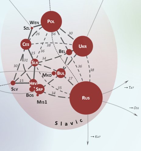
Figure 1: Lexical Distance Network

However, these were all static, non-spatial and often did not take into account other relevant linguistic variables such as linguistic diversity within a language class. As such, I wanted my own visualization to be dynamic, interactive, spatial and containing other relevant linguistic variables. To this end I needed to find a technology or platform that would allow me sufficient customizability and interactions. Inspired by the network or node maps I had consistently seen throughout my research phase, I knew that I wanted to build on this concept, adding a spatial and interactive component.

  1. Technology

I considered a number of options, the first and most obvious was using Python to code a network map using the Gephi platform. While pure coding would offer the most freedom and customizability, hosting the various tools I needed would prove very tedious and costly. As such, I set out in search of a hosted node or network analysis platform. After considerable research into a number of possible candidates, I opted for kumu.io.

Kumu was selected because it allowed me the freedom of coding most of my map to my specifications (On top of having a very user friendly UI), while also hosting all of my data and tools natively. This reduced the technical “surface area” of the project, which reduces opportunities for code breaking bugs and cross platform communications errors. Paying the modest membership fee, I began adding my data to Kumu.

  1. Execution

The first stage of development was loading my SIL data into Kumu. This was made easy using Kumu’s data cleaning tool. This allows the user to make sure all the input data meets kumu’s formatting requirements and even allows the user to dynamically change spreadsheet documents before upload.


Kumu’s Upload Wizard

After this was complete I created a bi-directional connection between each language (or element in network analysis parlance). This resulted in an ugly and incomprehensible visual bundle of connections. The next stage of the process would be coding the various variable symbolizes, interface options (adding a search, zoom and selection toolbar).


Kumu’s Advanced Code Based Editor

This was done using Kumu’s advance coding editor and I encountered no issues during this stage. However, when I attempted to add the polygon of the various countries of the Balkan Peninsula, the map visualization would simply vanish and I was not able to trouble shoot this with any success. As such, I had to ultimately abandon the spatial component of the project due to the constraints of time. I was still very satisfied with the resulting output.


    The Final Output

  1. Challenges

A number of challenges were encountered during the course of this project. The primary issue was that the geographic overlay failed to load. My every attempt to fix this was unsuccessful and ultimately this radically undermined completing the project as I had conceived it at the design stage. Nonetheless, I still believe that the other elements of the project still satisfied the project requirements of producing a novel and interesting geovisualization.

3D Printing Canadian Topographies

by Scott Mackey, Geovis Project Assignment @RyersonGeo, SA8905, Fall 2016

Since its first iteration in 1984 with Charles Hull’s Stereo Lithography, the process of additive manufacturing has made substantial technological bounds (Ishengoma, 2014). With advances in both capability and cost effectiveness, 3D printing has recently grown immensely in popularity and practicality. Sites like Thingiverse and Tinkercad allow anyone with access to a 3D printer (which are becoming more and more affordable) to create tangible models of anything and everything.

When I discovered the 3D printers at Ryerson’s Digital Media Experience (DME) lab, I decided to 3D print models of interesting Canadian topographies, selecting study areas from the east coast (Nova Scotia), west coast (Alberta), and central Canada (southern Ontario). These locations show the range of topographies and land types strewn across Canada, and the models can provide practical use alongside their aesthetic allure by identifying key features throughout the different elevations of the scene.

The first step in this process was to learn how to 3D print. The DME has three different 3D printers, all of which use an additive layering process. An additive process melts materials and applies them thin layer by thin layer to create a final physical product. A variety of materials can be used in additive layers, including plastic filaments such as polylactic acid (PLA) (plastic filament) and Acrylonitrile Butadiene Styrene (ABS), or nylon filaments. After a brief tutorial at the DME on the 3D printing process, I chose to use their Lulzbot TAZ, the 3D printer offering the largest surface area. The TAZ is compatible with ABS or PLA filament of a 1.75 mm diameter. I decided on white PLA filament as it offers a smooth finish and melts at a lower temperature, with the white colour being easy to paint over.

img_1740
Lulzbot TAZ

The next step was to acquire the data in the necessary format. The TAZ requires the digital 3D model to be in an STL (STereoLithography) format. Two websites were paramount in the creation of my STL files. The first was GeoGratis Geospatial Data Extraction. This National Resources Canada site provides free geospatial data extraction, allowing the user to select elevation (DSM or DEM) and land use attribute data in an area of Canada. The process of downloading the data was quick and painless, and soon I had detailed geospatial information on the sites I was modelling.

geogratis
GeoGratis Geospatial Data Extraction

One challenge still remained despite having elevation and land use data – creating an STL file. While researching how to do this, I came across the open source web tool called Terrain2STL on a visualization website called jthatch.com. This tool allows the user to select an area on a Google basemap, and then extracts the elevation data of that area from the Consortium for Spatial Information’s SRTM 90m Digital Elevation Database, originally produced by NASA. Terrain2STL allows the users to increase the vertical scaling (up to four times) in order to exaggerate elevation, lower the height of sea level for emphasis, and raise the base height of the produced model in a selected area ranging in size from a few city blocks to an entire national park.

The first area I selected was Charleston Lake in southern Ontario. Being a southern part of the Canadian Shield, this lake was created by glaciers scarring the Earth’s surface. The vertical scaling was set to four, as the scene does not have much elevation change.

Once I downloaded the STL, I brought the file into Windows 10’s 3D Builder application to slim down the base of the model. The 3D modelling program Cura was then used to further exaggerated the vertical scaling to 6 times, and to upload the model to the TAZ. Once the filament was loaded and the printer heated, it was ready to print. This first model took around 5 hours, and fortunately went flawlessly.

Cape Breton, Nova Scotia was selected for the east coast model. While this site has a bit more elevation change than Charleston Lake, it still needed to have 4 times vertical exaggeration to show the site’s elevations. This print took roughly 4 and a half hours.

Finally, I selected Banff, Alberta as my final scene. This area shows the entrance to Banff National Park from Calgary. No vertical scaling was needed for this area. This print took roughly 5 and half hours.

Once all the models were successfully printed, it was time to add some visual emphasis. This was done by painting each model with acrylic paint, using lighter green shades for high areas to darker green shades for areas of low elevation, and blue for water. The data extracted from GeoGratis was used as a reference in is process. Although I explored the idea of including delineations of trails, trail heads, roads, railways, and other features, I decided they would make the models too busy. However, future iterations of such 3D models could be designed to show specific land uses and features for more practical purposes.

img_1778
Charleston Lake, Ontario
img_1779
Cape Breton, Nova Scotia
img_1775
Banff, Alberta

3D models are a fun and appealing way to visual topographies. There is something inexplicably satisfying about holding a tangible representation of the Earth, and the applicability of 3D geographic models for analysis should not be overlooked.

Sources:

GeoGratis Geospatial Data Extraction. (n.d.). Retrieved November 28, 2016, from http://www.geogratis.gc.ca/site/eng/extraction

Ishengoma, F. R., & Mtaho, A. B. (2014). 3D Printing: Developing Countries Perspectives. International Journal of Computer Applications, 104(11), 30-34. doi:10.5120/18249-9329

Terrain2STL Create STL models of the surface of Earth. (n.d.). Retrieved November 28, 2016, from http://jthatch.com/Terrain2STL/


Story Swipe Map – 2011 / 2015 Election Results

Geovis Course Assignment, SA8905, Fall 2015 (Rinner)
Author: Austin Pagotto
Link to Web app: http://arcg.is/1Yf8Yqn
(Note: project may have trouble loading using Chrome – try Internet Explorer)

Project Idea:

The idea of my project was to comprehensively map the past two Canadian federal election results. When looking for visualization methods to compare this data I came across the Swipe feature on the ArcGIS Online story maps. Along with all the interaction features of any ArcGIS online web map, this feature lets the user swipe left and right to reveal either different layers or in my case different maps. As you can see in the screenshot below the right side of the map is showing the provincial winners of the 2015 election while the left side of the map is showing the provincial winners of the 2011 election. The middle line in the middle can be swiped back and forth to show how the provincial winners differed in each election.

Pic1

Project Execution:

The biggest problem in executing my project was that the default ArcGIS online projection is web Mercator, which greatly distorts Canada. I was able to find documentation from Natural Resources Canada explaining how Lambert Conformal Conic basemaps can be uploaded to an ArcGIS online map and replace the default basemaps.

Another problem with my visualization of the project was that when zoomed to a national scale level, a lot of the individual polling divisions became impossible to see. This creates an issue because each polling division is designed to have a somewhat equal population count in them. So the small ones aren’t less important or less meaningful than the big ones. To solve this, when zoomed out, I changed the symbology to show the party that had won the most seats in each province, so it would show the provincial winner as seen in the previous screenshot. When zoomed in however the individual polling divisions become visible, showing the official name at increased zoom levels. The years of each election were added to the labels to help remind the user what map was on what side.
pic2

The methodology I used to create this project was to create two different online maps, one for each election year. Then I created the swipe web app which would allow both of these maps to be loaded and swipeable between the two. It was important here to make sure that all the settings for each map were the exact same (colors, transparency and attribute names).

The data that is shown on my maps were all downloaded from ArcGIS online to Arcmap Desktop and then zipped and reuploaded back to my project.  It was important to change my data’s projection to Lambert Conformal Conic before uploading it so that it wouldn’t have to be reprojected again using ArcGIS online.

This project demonstrated how web mapping applications can make visualizing and comparing data much easier than creating two standalone maps.

Data Sources: Projection/Basemap information from Natural Resources Canada
Election Data from ESRI Canada (downloaded from ArcGIS Online)

Link to Web app: http://arcg.is/1Yf8Yqn