By: Lindi Jahiu
Geovis Project Assignment @RyersonGeo, SA8905, Fall 2021
INTRODUCTION
Crime on campus has long been at the forefront of discussion regarding safety of community members occupying the space. Despite efforts to mitigate the issue—vis-à-vis increased surveillance cameras, increased hiring of security personnel, etc.—, it continues to persist on X University’s campus. In an effort to quantify this phenomenon, the university’s website collates each security incident that takes place on campus and details its location, time (reported and occurrence), and crime type, and makes it readily available for the public to view through web browser or email notifications. This effort to collate security incidents can be seen as a way for the university to first and foremost, quickly notify students of potential harm, but also as a means to understanding where incidents may be clustering. The latter is to be explored in the subsequent geo-visualization project which attempts to visualize three years worth of security incidents data, through the creation of a 3D laser-cut acrylic hexbin model. Hexbinning refers to the process of aggregating point data into a predefined hexagon that represents a given area, in this case, the vertex-to-vertex measurement is 200 metres. By proxy of creating a 3D model, it is hoped that the tangibility, interchangeability, and gamified aspects of the project will effectively re-conceptualize the phenomena to the user, and in-turn, stress the importance of the issue at hand.
DATA AND METHODS
The data collection and methodology can be divided into two main parts: 2D mapping and 3D modelling. For the 2D version, security incidents from July 2nd, 2018 to October 15th, 2021 were manually scraped from the university’s website (https://www.ryerson.ca/community-safety-security/security-incidents/list-of-security-incidents/) and parsed into columns necessary for geocoding purposes (see Figure 1). Once all the data was placed into the excel file, they would be converted into a .csv file and imported into the ArcGIS Pro environment. Once there, one simply right clicks on the .csv and clicks “Geocode Table”, and follows the prompts for inputting the data necessary for the process (see inputs in Figure 2). Once ran, the geocoding process showed a 100% match, meaning there was no need for any alterations, and now shows a layer displaying the spatial distribution of every security incident (n = 455) (see Figure 3). To contextualize these points, a base map of the streets in-and-around the campus was extracted from the “Road Network File 2016 Census” from Scholars GeoPortal using the “Split Line Features” tool (see output in Figure 3).

Figure 1. Snippet of spreadsheet containing location, postal code, city, incident date, time of incident, and crime type, for each of the security incidents.

Figure 2. Inputs for the Geocoding table, which corresponds directly to the values seen in Figure 1.

Figure 3. Base map of streets in-and-around X University’s campus. Note that the geo-coded security incidents were not exported to .SVG – only visible here for demonstration purposes.
To aggregate these points into hexbins, a certain series of steps had to be followed. First, a hexagonal tessellation layer was produced using the “Generate Tessellation” tool, with the security incidents .shp serving as the extent (see snippet of inputs in Figure 4 and output in Figure 5). Second, the “Summarize Within” tool was used to count the number of security incidents that fell within a particular polygon (see snippet of inputs in Figure 6 and output in Figure 7). Lastly, the classification method applied to the symbology (i.e. hexbins) was “Natural Breaks”, with a total of 5 classes (see Figure 7). Now that the two necessary layers have been created, namely, the campus base map (see Figure 3 – base map along with scale bar and north arrow) and tessellation layer (see Figure 5 – hexagons only), they would both be exported as separate images to .SVG format – a format compatible with the laser cutter. The hexbin layer that was classified will simply serve as a reference point for the 3D model, and was not exported to .SVG (see Figure 7).

Figure 4. Snippet of input when using the “Generate Tessellation” geoprocessing tool. Note that these were not the exact inputs, spatial reference left blank merely to allow the viewer to see what options were available.
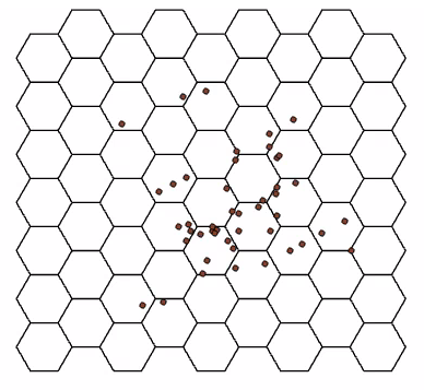
Figure 5. Snippet of output when using the “Generate Tessellation” geoprocessing tool. Note that the geo-coded security incidents were not exported to .SVG – only visible here for demonstration purposes.

Figure 6. Snippet of input when using the “Summarize Within” geoprocessing tool.

Figure 7. Snippet of output when using the “Summarize Within” geoprocessing tool. Note that this image was not exported to .SVG but merely serves as a guide for the physical model.
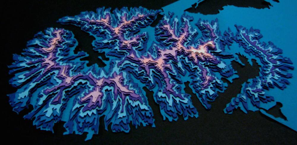
When the project idea was first conceived, it was paramount that I familiarized myself with the resources available and necessary for this project. To do so, I applied for membership to the Library’s Collaboratory research space for graduate students and faculty members (https://library.ryerson.ca/collab/ – many thanks to them for making this such a pleasurable experience). Once accepted, I was invited to an orientation, followed by two virtual consultations with the Research Technology Officer, Dr. Jimmy Tran. Once we fleshed out the idea through discussion, I was invited to the Collaboratory to partake in mediated appointments. Once in the space, the aforementioned .SVG files were opened in an image editing program where various aspects of the .SVG were segmented into either Red, Green, or Blue, in order for the laser cutter to distinguish different features. Furthermore, the tessellation layer was altered to now include a 5mm (diameter) circle in the centre of each hexagon to allow for the eventual insertion of magnets. The base map would be etched onto an 11×8.5 sheet of clear acrylic (3mm thick), whereas the hexagons would be cut-out into individual pieces at a size of 1.83in vertex-to-vertex. Atop of this, a black 11×8.5 sheet of black acrylic would be cut-out to serve as the background for the clear base map (allowing for increased contrast to accentuate finer details). Once in hand, the hexagons would be fixed with 5x3mm magnets (into the aforementioned circles) to allow for seamless stacking between pieces. Stacks of hexagons (1 to 5) would represent the five classes in the 2D map, but with height now replacing the graduated colour schema (see Figure 7 and Figure 9 – although the varying translucency of the clear hexagons is also quite evident and communicates the classes as well). The completed 3D model is captured in Figure 8, along with the legend in Figure 9 that was printed out and is to always be presented in tandem with the model. The legend was not etched into the base map so as to allow it to be used for other projects that do not use the same classification schema, and in-case I had changed my mind about a detail at some point.


Figure 8. 3D Laser-Cut Acrylic Hexbin Model depicting three-years worth of security incidents on campus. Multiple angles provided.

Figure 9. Legend which corresponds the physical model displayed in Figure 8. Physical version has been created as well and will be shown in presentation.
FUTURE RESEARCH DIRECTIONS AND LIMITATIONS
The geo-visualization project at-hand serves as a foundation for a multitude of future research avenues, such as: exploring other 3D modalities to represent human geography phenomenon; as a learning tool for those not privy to cartography; and as a tool to collect further data regarding perceived and experienced areas of crime. All of which expand on the aspects tangibility, interchangeability, and gamification harped on in the project at-hand. With the latter point, imagine a situation where a booth is set up on campus and one were to simply ask “using these hexagon pieces, tell us where you feel the most security incidents on campus would occur.” The answers provided would be invaluable, as they would yield great insight into what areas of campus community members feel are most unsafe, and what factors may be contributing to it (e.g. built environment features such as poor lighting, lack of cameras, narrowness, etc.), resulting in a synthesis between the qualitative and quantitative. Or on the point of interchangeability, if someone wanted to explore the distribution of trees on campus for instance, they could very well laser-cut their own hexbins out of green acrylic at their own desired size (e.g. 100m), and simply use the same base map.
Despite the fairly robust nature of the project, some limitations became apparent, more specifically: issues with the way a few security incident’s data were collected and displayed on the university’s website (e.g. non-existent street names, non-existent intersections, missing street suffixes, etc.); an issue where the exportation of a layer to .SVG resulted in the creation of repeated overlapping of the same images that had to be deleted before laser cutting; and lastly, future iterations may consider exaggerating finer features (e.g. street names) to make the physical model even more legible.