Teresa Kao
Geovis Project Assignment, TMU Geography, SA8905, Fall 2025
Hi everyone, in this project, I explore how cycling infrastructure influences Bike Share ridership across Toronto. Specifically, I examine whether stations located within 50 meters of protected cycling lanes exhibit higher ridership than those near unprotected lanes, and to see which areas protected cycling lanes could be improved.
This tutorial walks through the full workflow using QGIS for spatial analysis and Kepler.gl for interactive mapping, filtering, and data exploration. By the end, you’ll be able to visualize ridership patterns, measure proximity to cycling lanes, and identify where additional stations or infrastructure could improve accessibility.
Preparing the Data in QGIS
Importing Cycling Network and Station Data
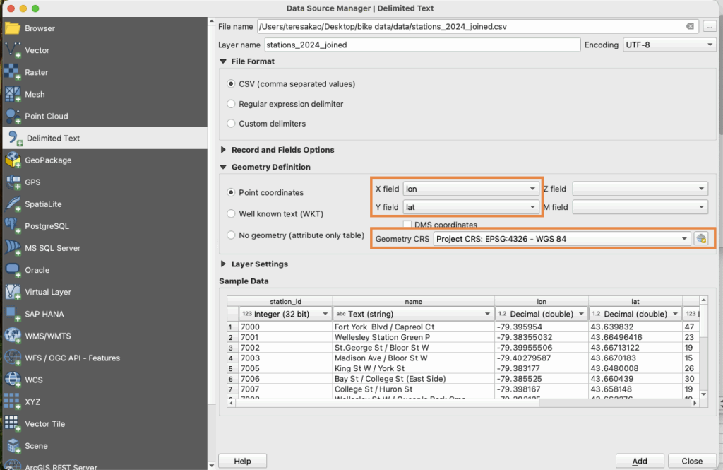
Import the cycling network shapefiles using Layer -> Add Layer -> Add Vector Layer, and load the Bike Share station CSV by assigning X = longitude, Y = latitude, and setting the CRS to EPSG:4326 (WGS84).
Reproject to UTM 17N for Distance Calculations
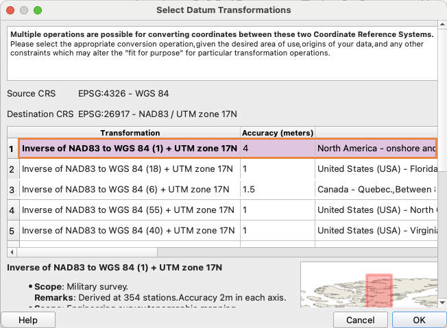
Because Kepler.gl only supports GeoJSON in EPSG:4326, all layers are first reprojected in QGIS to EPSG:26917 (Right click -> Export -> Save Features As…), distance calculations are performed there, and the processed results are then exported back to GeoJSON (EPSG:4326) for use in Kepler.gl.
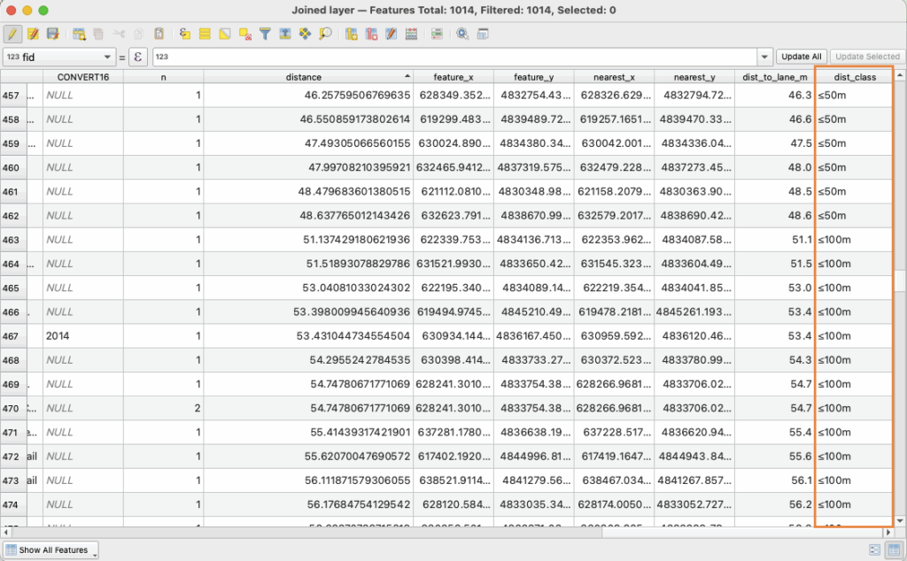
Calculating Distance to the Nearest Cycling Lane
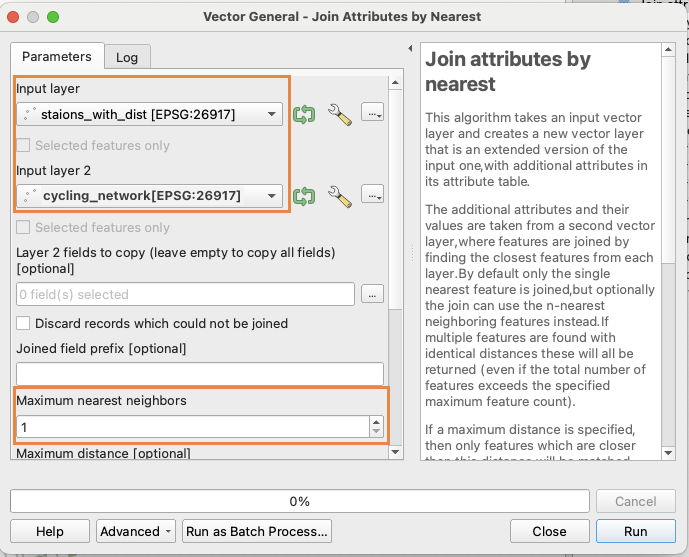
Use the Join Attributes by Nearest tool ( Processing Toolbox-> Join Attributes by Nearest), setting the Input Layer to stations dataset, the Join Layer to the cycling lane dataset, and Maximum neighbours to 1. This will generate an output layer with a new field (distance_to_lane_m) representing the distance in meters from each station to its nearest cycling lane.

Creating Distance Categories
Use the Field Calculator (∑) to create distance classifications using the following expression :
<CASE
WHEN "dist_to_lane_m" <= 50 THEN '≤50m'
WHEN "dist_to_lane_m" <= 100 THEN '≤100m'
WHEN "dist_to_lane_m" <= 250 THEN '≤250m'
ELSE '>250m'
END>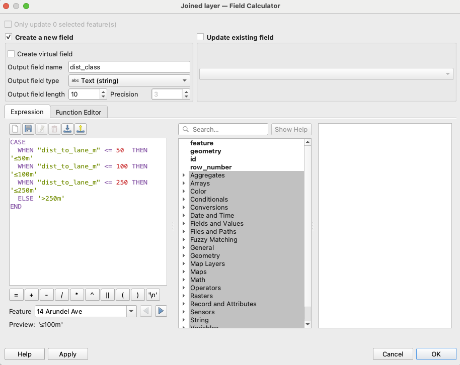
Exporting to GeoJSON for Kepler.gl
Since Kepler.gl does not support shapefiles, export each layer as a GeoJSON (Right Click -> Export -> Save Features As -> Format: GeoJSON -> CRS: EPSG:4326). The distance values will remain correct because they were already calculated in UTM projection.
Building Interactive Visualizations in Kepler.gl
Import Data
Go to Layer -> Add Layer -> choose data
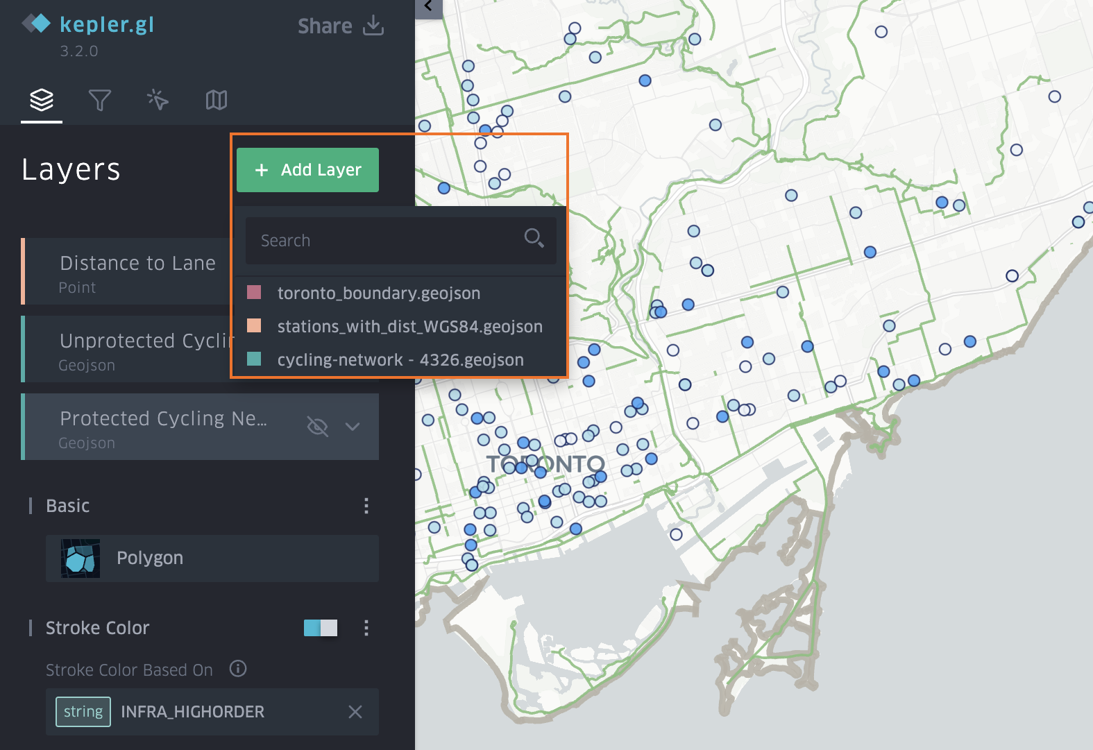
- For Bike Share Stations, use the point layer and symbolize it by the distance_to_lane_m field, selecting a colour scale and applying custom breaks to represent different distance ranges.
- For Protected Cycling Network, use the polygon layer and symbolize it by all the protected lane columns, applying a custom ordinal stroke colour scale such as light green.
- For Unprotected Cycling Network, use the polygon layer and symbolize it by all the unprotected columns, applying a custom ordinal stroke colour scale such as dark green.
- For Toronto Boundary, use the polygon layer and assign a simple stroke colour to outline the study area.

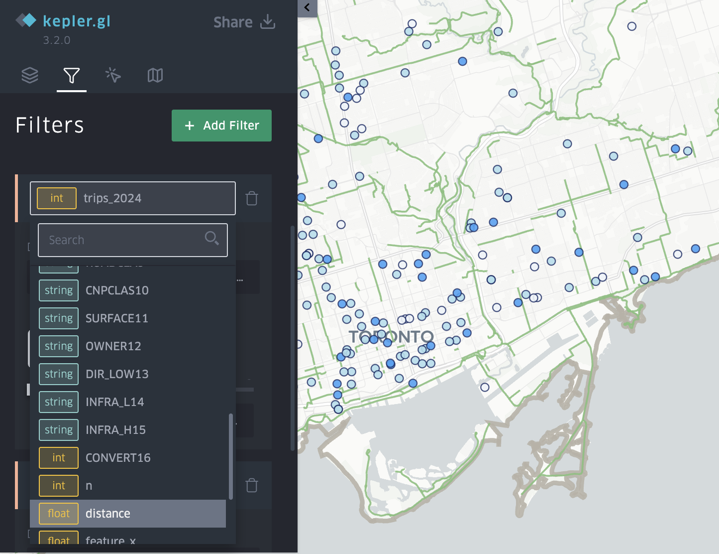
Add Filters
The filter slider is what makes this visualization powerful. Go to Add Filter -> Select a Dataset -> Choose the Field (for example ridership, distance_to_lane)
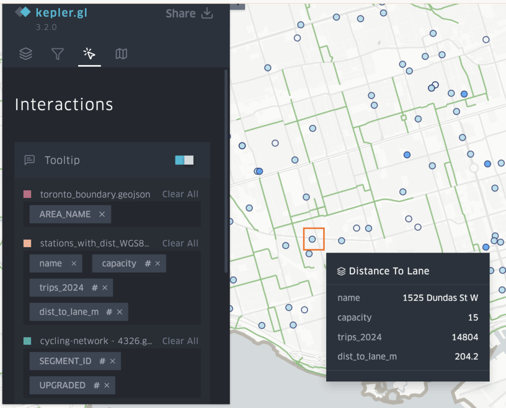
Add Tooltips
Go to Tooltip -> Toggle ON -> Select fields to display. Enable tooltips so users can hover a station to see details, such as station name, ridership, distance to lane, capacity.
Exporting Your Interactive Map
Export image, table(csv), and map (shareable link) -> uses Mapbox Api to create an interactive online map that other people can interact with your map.


How this interactive map help answer the research question
This interactive map helps answer the research question in two ways.
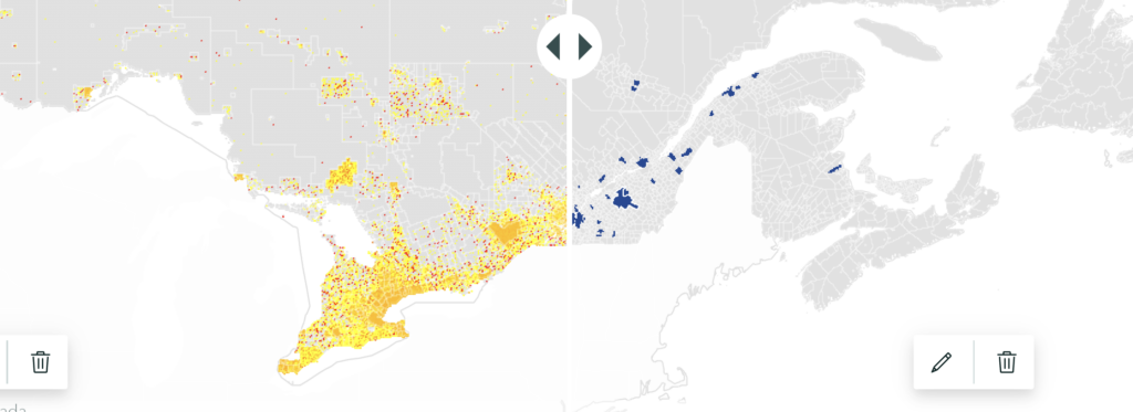
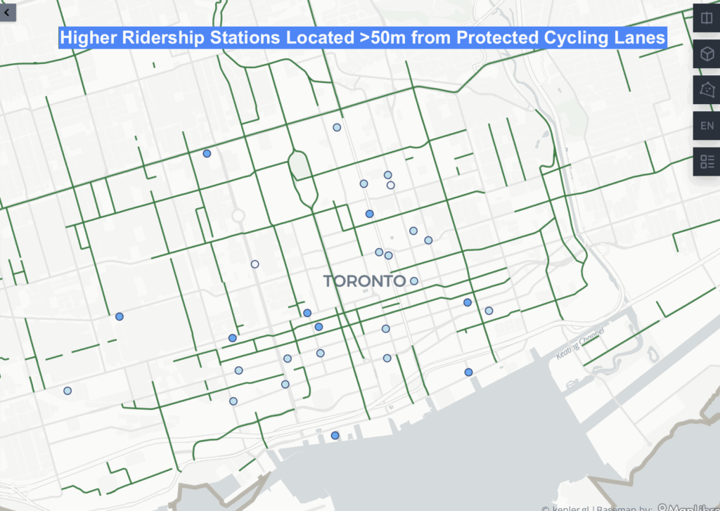
First, by applying a filter on distance_to_lane_m, users can isolate stations located within 50 meters of a cycling lane and visually compare their ridership to stations farther away. Toggling between layers for protected and unprotected cycling lanes allows users to see whether higher ridership stations tend to cluster near protected infrastructure.


Based on the map, the majority of higher ridership stations are concentrated near protected cycling lanes, suggesting a positive relationship between ridership and proximity to safer cycling infrastructure.
Second, by applying a ridership filter (>30,000 trips), the map highlights high demand stations that lack nearby protected cycling lanes. These appear as busy stations located next to unprotected lanes or more than 50 meters away from any cycling facility.

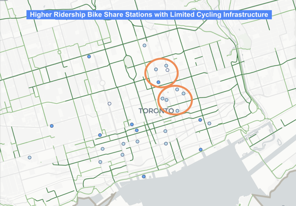
Together, these filters highlight where cycling infrastructure is lacking, especially in the Yonge Church area and the Downtown East / Yonge Dundas area, making it clear where protected lanes may be needed.
Thank you for taking the time to explore my blog. I hope it was informative and that you were able to learn something from it!