Explore Flood Resilience in Toronto: An Interactive Mapping Tool

Author: Shantelle Miller
Geovisualization Project Assignment @TMUGeography, SA8905, Fall 2024

Introduction: Why Flood Resilience Matters

Urban flooding is a growing concern, especially in cities like Toronto, where increasing urbanization has disrupted the natural water cycle. Greenspaces, impervious surfaces, and stormwater infrastructure all play vital roles in reducing flood risks, but understanding how these factors interact can be challenging.

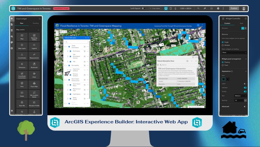
To address this, I created an interactive mapping tool using ArcGIS Experience Builder that visualizes flood resilience in Toronto. By combining multiple datasets, including Topographic Wetness Index (TWI), greenspaces, and stormwater infrastructure, this map highlights areas prone to flooding and identifies zones where natural mitigation occurs.

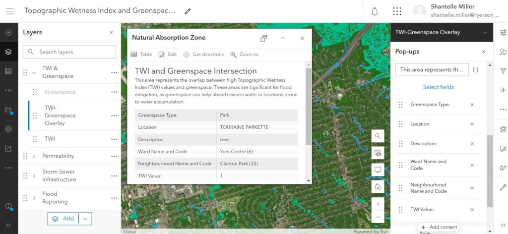
One of the tool’s standout features is the TWI-Greenspace Overlay, which pinpoints “Natural Absorption Zones.” These are areas where greenspaces overlap with high TWI values, demonstrating how natural environments help absorb runoff and reduce flooding.

Why Experience Builder?

I chose ArcGIS Experience Builder for this project because it offers a user-friendly, highly customizable platform for creating dynamic, interactive web maps. Unlike static maps, Experience Builder allows users to explore data in real-time with widgets like toggleable layers, dynamic legends, and interactive pop-ups.

  • Multi-Dataset Integration: It supports the combination of multiple datasets like TWI, greenspaces, and stormwater infrastructure.
  • Widgets and Tools: Users can filter data, view attributes, and toggle layers seamlessly.
  • No Code Required: Although customizable, the platform doesn’t require coding, making it accessible for users of all technical backgrounds.

The Importance of Data Normalization and Standardization

Before diving into the data, it’s essential to understand the critical role that data normalization and standardization played in this project:

  • Ensuring Comparability: Different datasets often come in various formats and scales. Standardizing these allows for meaningful comparisons across layers, such as correlating TWI values with greenspace coverage.
  • Improving Accuracy: Normalization adjusts values measured on different scales to a common scale, reducing potential biases and errors in data interpretation.
  • Facilitating Integration: Harmonized data enables seamless integration within the mapping tool, enhancing user experience and interaction.

Data: The Foundation of the Project

The project uses data from the Toronto Open Data Portal and Ontario Data Catalogue, processed in ArcGIS Pro, and published to ArcGIS Online.

Layers

Topographic Wetness Index (TWI):

  • Derived from DEM
  • TWI identifies areas prone to water accumulation.
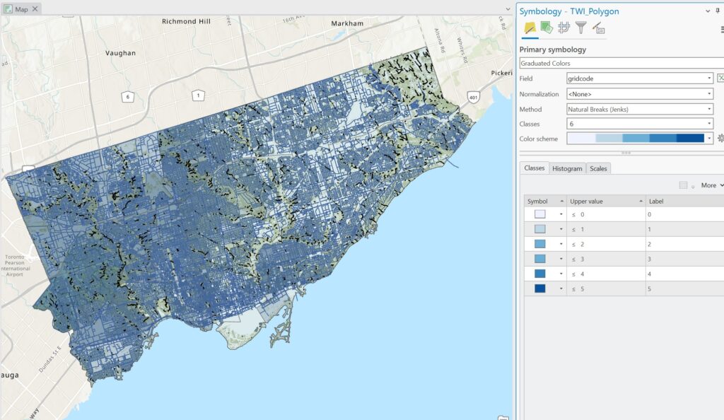
  • It was categorized into four levels (low, medium, high, and very high flood risk), with only the highest-risk areas displayed for focus.

Greenspaces:

  • Includes parks, forests, and other natural areas that act as natural buffers against flooding.

Impervious Surfaces and Pervious Surfaces:

  • Pervious Surfaces: Represent natural areas like soil, grass, and forests that allow water to infiltrate.
  • Impervious Surfaces: Represent roads, buildings, and other hard surfaces that contribute to runoff.

Stormwater Infrastructure:

  • Displays critical infrastructure like catch basins and sewer drainage points, which manage water flow.

TWI-Greenspace Overlay:

  • Combines high-risk TWI zones with greenspaces to identify “Natural Absorption Zones”, where natural mitigation occurs.

Creating the Map: From Data to Visualization

Step 1: Data Preparation in ArcGIS Pro

  1. Imported raw data and clipped layers to Toronto’s boundaries.
  2. Processed TWI using terrain analysis and classified it into intuitive flood risk levels.
  3. Combined pervious and impervious surface data into a single dataset for easy comparison.
  4. Created the TWI-Greenspace Overlay, merging greenspaces and TWI data to show natural flood mitigation zones.
  5. Normalized and standardized all layers.

Step 2: Publishing to ArcGIS Online

  1. Uploaded processed layers as hosted feature layers with customized symbology.
  2. Configured pop-ups to include detailed attributes, such as TWI levels, land cover types, and drainage capacities as well as google map direct link for each point feature.

Step 3: Building the Experience in ArcGIS Experience Builder

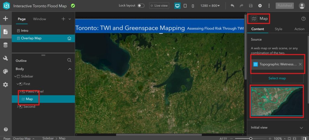
  1. Imported the web map into Experience Builder to design the user interface.
  2. Added widgets like the Map, Interactive Layer List, Filters, Legend, Search etc., for user interaction.
  3. Customized layouts and legends to emphasize the relationship between TWI, greenspaces, and surface types.

Interactive Features

The map offers several interactive features to make flood resilience data accessible:

Layer List:

  • Users can toggle between TWI, pervious surfaces, impervious surfaces, greenspaces, and infrastructure layers.

Dynamic Legend:

  • Updates automatically to reflect visible layers, helping users interpret the map.

Pop-Ups:

  • Provide detailed information for each feature, such as:
  • TWI levels and their implications for flood risk.
  • Land cover types, distinguishing between pervious and impervious surfaces.
  • Greenspace types and their flood mitigation potential.

TWI-Greenspace Overlay Layer:

  • Highlights areas where greenspaces naturally mitigate flooding, called “Natural Absorption Zones.”

Filters:

Enable users to focus on specific attributes, such as high-risk TWI areas or zones dominated by impervious surfaces.

Applications and Insights

  • The interactive map provides actionable insights for multiple audiences:

Urban Planners:

  • Identify areas lacking greenspace or dominated by impervious surfaces where flooding risks are highest.
  • Plan infrastructure improvements to mitigate runoff, such as adding bioswales or permeable pavement.

Planners:

  • Assess development sites to ensure they align with flood mitigation goals and avoid high-risk areas.

Homeowners:

  • Evaluate flood risks and identify natural mitigation features in their neighborhoods.
  • For example, the map can reveal neighborhoods with high TWI and limited greenspace, showing where additional stormwater infrastructure might be necessary.

Limitations and Future Work

Limitations

  1. Incomplete Data: Some areas lack detailed data on stormwater infrastructure or land cover, leading to gaps in analysis.
  2. Dynamic Changes: The static nature of the datasets means the map doesn’t reflect recent urban development or climate events.

Future Work

  1. Add real-time data on precipitation and runoff to make the tool more dynamic.
  2. Expand the analysis to include socioeconomic factors, highlighting vulnerable populations.
  3. Enhance accessibility features to ensure compliance with AODA standards for users with disabilities.

Conclusion: A Tool for Flood Resilience

Flood resilience is a complex issue requiring a nuanced understanding of natural and built environments. This interactive mapping tool simplifies these relationships by visualizing critical datasets like TWI, greenspaces, and pervious versus impervious surfaces.

By highlighting areas of natural flood mitigation and zones at risk, the map provides actionable insights for planners, developers, and homeowners. The TWI-Greenspace Overlay layer, in particular, underscores the importance of greenspaces in managing stormwater and reducing flood risks in Toronto.

I hope this project inspires further exploration of flood resilience strategies and serves as a resource for building a more sustainable and resilient city.

Thank you for reading, and feel free to explore the map experience using the link below!

Project Link: Explore Flood Resilience in Toronto
Data Source: Toronto Open Data Portal, Ontario Open Data Catalogue
Built Using: ArcGIS Pro, ArcGIS Online, and ArcGIS Experience Builder

Mapping Child Friendly City Initiatives in Canada and in the World using ArcGIS StoryMaps

Anastasiia Smirnova
SA8905 Geovis project, Fall 2022

Introduction

Through this project I wanted to gain and advance my skills in both storytelling and visualizing spatial data. Here you can learn more about my attempt of using ArcGIS StoryMaps to highlight the importance of including children in the urban planning agenda and to show the World- and Canada-wide spatial patterns of urban areas’ commitment to creating inclusive urban environments with children in mind.

I did it by mapping municipalities that are participating in UNICEF’s Child Friendly Cities Initiatives (CFCI), which aim to promote cities where the “ voices, needs, priorities and rights of children are an integral part of public policies, programs and decisions.”

Technology

I used ESRI’s ArcGIS Pro, Online Map Viewer and StoryMaps for my project. First, I used the desktop app (ArcGIS Pro) to import my data and create my initial maps. After that I uploaded the layers that I wanted to use as web layers to my ArcGIS account, and then I finalized them using ArcGIS online applications. I used the online map viewer to adjust symbology as necessary as was trying to figure out what worked better for each part of my story. It was easy to go back and forth between the Map Viewer and StoryMaps – to make the necessary changes, then to see how the updated maps work with the story, and then repeat these steps as needed. The Map viewer generally had the functionality I needed to change my map symbology and I did not have to go back to ArcGIS Pro too often to make modifications after I uploaded my layers online.

I liked the functionality of StoryMaps. I used the sidecar option to introduce my story, and for showing most of my maps. I find that this block type provides some of the most immersive experience while scrolling, so I used it for the parts of the story that I wanted to keep the reader’s attention on.

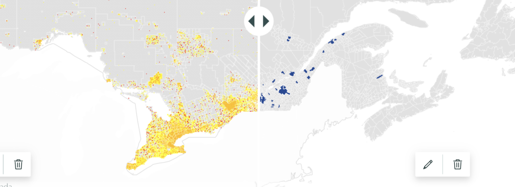
I found that the swipe option worked well for showing comparisons. In a regular map, it is often difficult to show all information you want without cluttering the map with too many layers and making the map unreadable. The swipe option can help solve this problem. As such, I used this function to show how many children did (not) live within the municipalities that were part of CFCI and therefore could (not) benefit from the initiative.

the map shows distribution of children and youth residences (on the left, yellow and red) and municipalities involved in CFCI (on the right, blue)

For inserting your maps to any blocks of StoryMaps, you can choose to either use your maps uploaded as images or insert the actual interactive online maps. While the image option has some benefits, such as more flexibility in styling the map and faster loading, the main benefit of inserting the actual online maps is interactivity. You can zoom in and out, search for a specific location, show/hide legend, learn more about each unit on the map and so on (as the creator of the story, you can edit and set restrictions of what readers can and cannot do with your online maps).

Since I wanted to keep my maps as simple visually as possible, I went with the second option. This way, if the reader wanted to learn more about my maps and the information they displayed, they could do so by using the interactive map functions.

Interesting findings

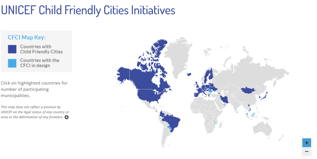
In addition to the main message of the project (the need to promote child friendly cities), the maps showed how the choice of data, scale and mapping methodology can influence the results and representation. On the CFCI website, the main map was showing all countries that were involved in the CFCI. The map did not consider how many municipalities in each country were actually involved in the initiatives.

The main map from the UNICEF CFCI website – CFCI countries

This way of displaying data may be misleading, since the level involvement of each country varied greatly. In some countries, most of the territory was part of CFCI, but some other countries only had a couple municipalities each with UNICEF’s child friendly initiatives.

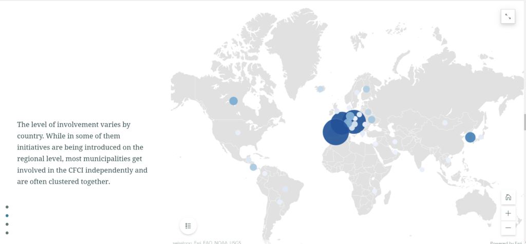
For this story, in addition to the world CFCI country map similar to the one from the website, a proportional symbol map was created to show how many municipalities from each country were actually involved in the CFCI and I put these two maps in one sidecar block so that the reader could swipe back and forth to see how the distribution of CFCI changed with the change of the variable, and what the actual level of involvement if each country was.

A map from my StoryMap – Municipalities involved in CFCI

When zoomed in, even more information about the unevenness and clustering in the spatial distribution of the CFCI municipalities can be discovered.

The sidecar block (I used the float side by side option for my maps), and the smooth transitions it provided, worked well for showing the differences between the maps, as well as for zooming in into a smaller scale map.

Challenges

Some of the main challenges for me were associated with updating the maps if I wanted to change something. It took some time for me to figure out what could be done at which step of the process (with different apps) and how far back I had to go to modify something. As such I had trouble updating and modifying the legends for the maps.

Unfortunately, the options for adjusting the legends using the ArcStory editor or the online map viewer were limited. For instance, it was impossible to hide or edit the name of the column which contained data used in the map while using the online apps. Since I was creating my original layers in ArcGIS Pro, then uploading them as web layers, and then adjusting my maps further in the online map viewer, it was difficult to go back to change the original data in the end, just to modify one little line on the map legend. Only some parts of the legend could be modified using the online apps. So, one of the lessons I took from this experience is that you need to make sure all the column names are appropriate before making all the edits online if you are using a similar process as I did. It is also helpful to think about the legends right from the start.

Conclusion and results

In general, I am satisfied with the ArcGIS StoryMap platform. It was easy to use, and it did a good job of assisting me in creating a map-based story that looks clean and flows smoothly. I am planning on further exploring the StoryMap functionality in the future.

If you are interested in learning more about child friendly cities and seeing my StoryMap result, you can follow this link:

Canadian cities and towns for happy children (arcgis.com): Mapping Child Friendly City Initiatives in Canada and in the World using ArcGIS StoryMaps

A Glimpse of Short Term Rentals in Calgary Using Tableau

by Bryan Willis
Geovis Project Assignment @RyersonGeo, SA8905, Fall 2020

Project linkhttps://thebryanwillis.github.io/CalgaryShortTermRentals.html

Background

Over the years, many homeowners have decided to turn their place of residence into short term rentals, allowing their place of residence to be rented out for short periods of time. Short term rentals have also seen an increase in popularity due to their better pricing when compared with hotels and the unique neighbourhood characteristics it provides. Although Calgary has not seen the increase of short term rentals as dramatics as that of Toronto and Vancouver, Calgary has continued to see growth in the short term rental supply. The City of Calgary defines a short term rental as a place of residence that provides temporary accommodation and lodging for up to 30 days and all short term rentals in Calgary must legally obtain a business license to run.

This interactive dashboard will aim to highlight some key components related to short term rentals in Calgary such as the locations, the license status, the composition of the housing type and licenses per month

Data

The data used in this dashboard is based off of the Short Term Rentals data set which was acquired through the City of Calgary’s Open Data Portal.

Methods

  1. Data Cleaning – After downloading the data from the open data portal, the data needed to be cleaned for it to properly display the attributes we want. All rows containing NULL values were removed from the data set via MS Excel.
  2. Map Production – After importing the cleaned data into Tableau, we should quickly be able to create our map that shows where the locations of the short term rentals are. To do this, drag both the auto generated into the middle of the sheet which should automatically generate a map with the location points. To differentiate LICENSED and CANCELLED points, drag the License Status column into the ‘Color’ box.
  1. Monthly Line Graph – To produce the line graph that shows the number of licenses produced by month, drag into the COLUMN section at the top and right click on it and select MONTH. For the ROWS section, again use but right click on it after dragging and select MEASURE and COUNT. Lastly, drag License Status into the ‘Color’ box.
Finalized monthly line graph
  1. City Quadrant Table – To create this table, we first need to create a new column value for the city quadrant. Right click the white space under ‘Tables’ and click on ‘Create Calculated Field’ which will bring up a new window. In the new window input RIGHT([Address],2) into the blank space. This code will create a new field with the last two letters in the Address field which is the quadrant. Once this field is created, drag it into the ROW section and drag it again into the ROW but this time right clicking it and clicking on Measure and then Count. Finish off by dragging License Status to the ‘Color’ box.
Finalized City Quadrant Table
  1. Dwelling Type Pie Chart – For the pie chart, first right click on the ROW section and click ‘New Calculation’. In the box, type in avg(0) to create a new ‘Mark’. There should now be an AGG(avg(0)) section under “Marks’, make sure the dropdown is selected at ‘Pie’. Then drag the Type of Residence column into the ‘Angle’ and ‘Color’ boxes. To further compute the percentage for each dwelling type, right click on the angle tab with the Type of Residence column in it then go the ‘Quick Table calculation’ and finally ‘Percent of Total’ .
Finalized pie chart
  1. Dashboard Creation – Once the above steps are complete, a dashboard can be made with the pieces by combining all 4 sheets in the Dashboard tab.
Finalized dashboard with the 4 created components

Limitations

The main limitations in this project comes from the data. Older licensing data is removed from the data set when the data set is updated daily by city staff. This presents the problem of not being able to compare full year to date data. As seen in the data set used in the dashboard, majority of the January data has already been removed from the data set with the except of January 26, 2020. Additionally, there were also quite a few entries in the data set that had null addresses which made it impossible to pinpoint where those addresses were. Lastly, as this data set is for 2020, the COVID-19 pandemic might have disrupted the amount of short term rentals being licensed due to both the city shifting priorities as well as more people staying home resulting in less vacant homes available for short term rentals.

Visualizing Urban Land Use Growth in Greater Sào Paulo

By: Kevin Miudo

Geovis Project Assignment @RyersonGeo, SA8905, Fall 2018

https://www.youtube.com/watch?v=Il6nINBqNYw&feature=youtu.be

Introduction

In this online development blog for my created map animation, I intend to discuss the steps involved in producing my final geovisualization product, which can be viewed above in the embedded youtube link. It is my hope that you, the reader, learn something new about GIS technologies and can apply any of the knowledge contained within this blog towards your own projects. Prior to discussing the technical aspects of the map animations development, I would like to provide some context behind the creation of my map animation.

Cities within developing nations are experiencing urban growth at a rapid rate. Both population and sprawl are increasing at unpredictable rates, with consequences for environmental health and sustainability. In order to explore this topic, I have chosen to create a time series map animation visualizing the growth of urban land use in a developing city within the Global South. The City which I have chosen is Sào Paulo, Brazil. Sào Paulo has been undergoing rapid urban growth over the last 20 years. This increase in population and urban sprawl has significant consequences to climate change, and such it is important to understand the spatial trend of growth in developing cities that do not yet have the same level of control and policies in regards to environmental sustainability and urban planning. A map animation visualizing not only the extent of urban growth, but when and where sprawl occurs, can help the general public get an idea of how developing cities grow.

Data Collection

In-depth searches of online open data catalogues for vector based land use data cultivated little results. In the absence of detailed, well collected and precise land use data for Sào Paulo, I chose to analyze urban growth through the use of remote sensing. Imagery from Landsat satellites were collected, and further processed in PCI Geomatica and ArcGIS Pro for land use classification.

Data collection involved the use of open data repositories. In particular, free remotely sensed imagery from Landsat 4, 5, 7 and 8 can be publicly accessed through the United States Geological Survey Earth Explorer web page. This open data portal allows the public to collect imagery from a variety of satellite platforms, at varying data levels. As this project aims to view land use change over time, imagery was selected at data type level-1 for Landsat 4-5 Thematic Mapper and Landsat 8 OLI/TIRS. Imagery selected had to have at least less than 10% cloud cover, and had to be images taken during the daytime so that spectral values would remain consistent across each unsupervised image classification.

Landsat 4-5 imagery at 30m spectral resolution was used for the years between 2004 and 2010. Landsat-7 Imagery at 15m panchromatic resolution was excluded from search criteria, as in 2003 the scan-line corrector of Landsat-7 failed, making many of its images obsolete for precise land use analysis. Landsat 8 imagery was collected for the year 2014 and 2017. All images downloaded were done so at the Level-1 GeoTIFF Data Product level. In total, six images were collected for years 2004, 2006, 2007, 2008, 2010, 2014, 2017.

Data Processing

Imagery at the Level-1 GeoTIFF Data Product Level contains a .tif file for each image band produced by Landsat 4-5 and Landsat-8. In order to analyze land use, the image data must be processed as a single .tiff. PCI Geomatica remote sensing software was employed for this process. By using the File->Utility->Translate command within the software, the user can create a new image based on one of the image bands from the Landsat imagery.

For this project, I selected the first spectral band from Landsat 4-5 Thematic Mapper images, and then sequentially added bands 2,3,4,5, and band 7 to complete the final .tiff image for that year. Band 6 is skipped as it is the thermal band at 120m spatial resolution, and is not necessary for land use classification. This process was repeated for each landsat4-5 image.Similarly for the 2014 and 2017 Landsat-8 images, bands 2-7 were included in the same manner, and a combined image was produced for years 2014 and 2017.

Each combined raster image contained a lot of data, more than required to analyze the urban extent of Sào Paulo and as a result the full extent of each image was clipped. When doing your own map animation project, you may also wish to clip data to your study area as it is very common for raw imagery to contain sections of no data or clouds that you do not wish to analyze. Using the clipping/subsetting option found under tools in the main panel of PCI Geomatica Focus, you can clip any image to a subset of your choosing. For this project, I selected the coordinate type ‘lat/long’ extents and input data for my selected 3000×3000 pixel subset. The input coordinates for my project were: Upper left: 46d59’38.30″ W, Upper right: 23d02’44.98″ S, Lower right: 46d07’21.44″ W, Lower Left: 23d52’02.18″ S.

Land Use Classification

The 7 processed images were then imported into a new project in ArcPro. During importation, raster pyramids were created for each image in order to increase processing speeds.  Within ArcPro, the Spatial Analyst extension was activated. The spatial analyst extension allows the user to perform analytical techniques such as unsupervised land use classification using iso-clusters. The unsupervised iso-clusters tool was used on each image layer as a raster input.

The tool generates a new raster that assigns all pixels with the same or similar spectral reluctance value a class. The number of classes is selected by the user. 20 classes were selected as the unsupervised output classes for each raster. It is important to note that the more classes selected, the more precise your classification results will be. After this output was generated for each image, the 20 spectral classes were narrowed down further into three simple land use classes. These classes were: vegetated land, urban land cover, and water. As the project primarily seeks to visualize urban growth, and not all types of varying land use, only three classes were necessary. Furthermore, it is often difficult to discern between agricultural land use and regular vegetated land cover, or industrial land use from residential land use, and so forth. Such precision is out of scope for this exercise.

The 20 classes were manually assigned, using the true colour .tiff image created from the image processing step as a reference. In cases where the spectral resolution was too low to precisely determine what land use class a spectral class belong to, google maps was earth imagery referenced. This process was repeated for each of the 7 images.

After the 20 classes were assigned, the reclassify tool under raster processing in ArcPro was used to aggregate all of the similar classes together. This outputs a final, reclassified raster with a gridcode attribute that assigns respective pixel values to a land use class. This step was repeated for each of the 7 images. With the reclassify tool, you can assign each of the output spectral classes to new classes that you define. For this project, the three classes were urban land use, vegetated land, and water.

Cartographic Element Choices:

 It was at this point within ArcPro that I had decided to implement my cartographic design choices prior to creating my final map animation.

For each layer, urban land use given a different shade of red. The later the year, the darker and more opaque the colour of red. Saturation and light used in this manner helps assist the viewer to indicate where urban growth is occurring. The darker the shade of red, the more recent the growth of urban land use in the greater Sào Paulo region. In the final map animation, this will be visualized through the progression of colour as time moves on in the video.

ArcPro Map Animation:

Creating an animation in ArcPro is very simple. First, locate the animation tab through the ‘View’ panel in ArcPro, then select ‘Add animation’. Doing so will open a new window below your work space that will allow the user to insert keyframes. The animation tab contains plenty of options for creating your animation, such as the time frame between key frames, and effects such as transitions, text, and image overlays.

For the creation of my map animation, I started with zoomed-out view of South America in order to provide the viewer with some context for the study area, as the audience may not be very familiar with the geography of Sào Paulo. Then, using the pan tool, I zoomed into select areas of choice within my study area, ensuring to create new keyframes every so often such that the animation tool creates a fly-by effect. The end result explores the very same mapping extents as I viewed while navigating through my data.

While making your own map animation, ensure to play through your animation frequently in order to determine that the fly-by camera is navigating in the direction you want it to. The time between each keyframe can be adjusted in the animation panel, and effects such as text overlays can be added. Each time I activated another layer for display to show the growth of urban land use from year to year, I created a new keyframe and added a text overlay indicating to the user the date of the processed image.

Once you are satisfied with your results, you can export your final animation in a variety of formats, such as .avi, .mov, .gif and more. You can even select the type of resolution, or use a preset that automatically configures your video format for particular purposes. I chose the youtube export format for a final .mpeg4 file at 720p resolution.

I hope this blog was useful in creating your very own map animation on remotely sensed and classified raster data. Good luck!

West Don Lands Development: 2011 – 2015


CHRISTINA BOROWIEC
CHRISTINA BOROWIEC | West Don Lands Development: 2011 – 2015 | 3D Printing Tech.

Author: CHRISTINA BOROWIEC
Geovis Project Assignment @RyersonGeo, SA8905, Fall 2016


PROJECT DESCRIPTION:
The model displayed above is of the West Don Lands of the City of Toronto, bounded by Queen St. E to the north, the rail corridor to the south, Berkeley St. to the west, and Bayview Ave. to the east. In utilizing Ryerson University’s Digital Media Experience Lab’s three-dimensional printing technology, an interactive model providing a tangible means to explore the physical impact of urbanization and the resultant change in the city’s skyline has been produced. The model interactively demonstrates how the West Don Lands, a former brownfield, have intensified from 2011 to 2015 as a result of waterfront revitalization projects and by serving as the Athletes’ Village for the Toronto Pan Am/Parapan American Games.

Buildings constructed during or prior to 2011 are printed in black, while those built in 2012 or later are green. In total, 11 development projects have been undertaken within the study area between 2011 and 2015. Each of these development projects have been individually printed, and correspond to a single property on the base layer, which is identifiable by the unique building footprint. The new developments can be easily attached and removed from the base of the model (the 2011 building and elevation layer) via magnetic bases and footprints, thereby providing an engaging way to discover how the West Don Lands of Toronto have developed in a four year period. By interacting with the model, the greater implications of the developments on the city’s built form and skyline can be realized and experienced at a tangible scale.

Areas with the lowest elevation (approximately 74 m) are solidly filled in on the landscape grid, while areas with higher elevations (80 m to 84 m) have stacked grids and foam risers added to better exaggerate and communicate the natural landscape. These additions can be viewed in the video below.

Street names and a north arrow are included on the model, as well as both an absolute and traditional scale bar. The absolute scale of the model is 1:5,000.


PROJECT EXECUTION:
To complete the project, a mixture of geographic information system (GIS) and modeling software were used. First, the 3D Massing shapefile was downloaded from the City of Toronto’s OpenData website, and the digital elevation model (DEM) for Toronto was retrieved from Natural Resources Canada. Using ArcMap, the 3D Massing shapefile, which includes information such as the name, location, height, elevation, and age of buildings in the city, was clipped to the study area. Next, buildings constructed prior to or during 2011 were selected and exported as a new layer file. The same was done for new developments, or the buildings constructed from 2012 to 2015, with both layers using a NAD83 UTM Zone 17N projection. Once these new layers were successfully created, they were imported into ArcScene.

In ArcScene, the digital elevation model for Toronto was opened and projected in NAD83. The raster layer was clipped to the extent of the 2011 building layer, and ensured to have the same spatial reference as the building layer. Next, the DEM layer properties were adjusted so base heights were obtained from the surface, and a vertical exaggeration was calculated from the extent of the DEM in the scene properties. Once complete, the “EleZ” variable data provided in the building layers’ shapefiles were used to calculate and display building heights. The new developments 3D file was then exported, as the 2011 buildings and DEM files were merged. Since the “EleZ” (building height) variable was used rather than “Z” (ground elevation) or “Elevation” (building height from mean sea level), the two layers successfully merged without buildings extending below the DEM layer. The merged file was then exported as a 3D file. Although many technical issues were encountered at this point in the project (i.e. the files failed to merge, ArcScene crashed unexpectedly repeatedly, exported file quality was low…), the challenges were overcome by viewing online tutorials of users who had encountered similar issues.

Once the two 3D files were successfully exported (the new developments building file and the 2011 building file merged with the DEM), they were converted to .STL file types and opened in AutoDesk Inventor. Here, the files were edited, cleaned, smoothed, and processed to ensure the model was complete and would be accepted in Cura (3D printing software).


At Ryerson University’s Digital Media Experience Lab, the models were printed using the TAZ three-dimensional printer (pictured below). Black filament was used for the 2011 buildings and DEM layer, and green was used for the new developments. These colours were selected from what was currently available at the lab because they provided the greatest level of contrast. In total, printing took approximately 7 hours to complete, with the base layer taking about 5.5 hours and the new developments requiring 1.5 hours. The video above reveals the printing process. No issues were encountered in the utilization of the 3D printer, as staff were on-hand to answer any questions and provide assistance. Regarding printing settings, the temperature of the bed was set at 60°C, and the print temperature was set to 210°C. A 0.4 mm nozzle was used with a 20% fill density. The filament density was 1.75 mm, and a brim was added for support to the platform during printing. Although the brim is typically removed at the completion of a print, the brim was intentionally kept on the model for aesthetic purposes and to serve as a border to the study area.


TAZ 3D Printer


Once printing was completed, the model was attached to a raised base and street names, a north arrow, legend, absolute scale and scale bar, and title were added. Magnets were then cut to fit the new development building pieces, and attached both to the base layer of the model and the new developments. As a final step in the process, the model’s durability and stability were tested by encouraging family and friends to interact with the model prior to its display at the Environics User Conference in Toronto, Ontario in November 2016.


West Don Lands Development: 2011 - 2015 Project


RECOMMENDED ENHANCEMENTS:
To improve the project, three enhancements are recommended. First, stronger magnets could be utilized both on the new development pieces and on the base layer of the model. In doing so, the model would become more durable, sturdy, and easier to lift up to examine at eye level – without the worry of buildings falling over due to low magnetic attractiveness resulting from the thicker cardboard base on which the model rests. In relation to this, stronger glue could be used to better bind the street names to the grid as well.

Additionally, the model may be improved if a solid base layer was used instead of a grid. Although the grid was intended to be experimental and remains an interesting feature which draws attention, it would likely be easier for a viewer to interpret the natural features of the area (including the hills and valleys) if the model base was solid.

The last enhancement entails using a greater variety of filaments in the model’s production to create a more visually impactful product with more distinguishable features. For instance, the base elevation layer could be printed in a different colour than the buildings constructed in 2011. Although this would complicate the printing and assembly of the model, the final product would be more eye-catching.


DATA SOURCES:
City of Toronto. (2016, May). 3D Massing. Buildings [Shapefile]. Toronto, Ontario. Accessed from <http://www1.toronto.ca/wps/portal/contentonly?vgnextoid=d431d477f9a3a410VgnVCM10000071d60f89RCRD>.

Natural Resources Canada. (1999). Canadian Digital Elevation Data (CDED). Digital Elevation Model [Shapefile]. Toronto, Ontario. Accessed from <http://maps.library.utoronto.ca/cgi-bin/datainventory.pl?idnum=20&display=full&title=Canadian+Digital+Elevation+Model+(DEM)+&edition=>.


CHRISTINA BOROWIEC
Geovisualization Project
Professor: Dr. Claus Rinner
SA 8905: Cartography and Geovisualization
Ryerson University
Department of Geography and Environmental Studies
Date: November 29, 2016

Displaying Brooklyn’s Urban Layers by Mapping Over 200 Years of Buildings

Renad Kerdasi
Geovis Course Assignment
SA8905, Fall 2015 (Rinner)

Growth in Brooklyn
Located at the far western end of Long Island, Brooklyn is the most populous of New York City’s five boroughs. The borough began to expand between the 1830s and 1860s in downtown Brooklyn. The borough continued to expand outwards as a result of a massive European immigration, the completion of the Brooklyn Bridge connecting to Manhattan, and the expansion of industry. By mid 1900s, most of Brooklyn was already built up as population increased rapidly.

Data
The data in the time series map are from PLUTO, which is a NYC open data site created by NYC Department of City Planning and released in 2015. The data contain information about each building located in the boroughs, including the year the construction of the building was completed (in numeric 4 digits format) and the building footprints. The building years range from 1800 to 2015, there are some missing dates in the dataset as well as some inaccuracy in the recorded dates. The data are available in Shapefile and Windows Comma Separated format, found on NYC Planning website: http://www.nyc.gov/html/dcp/html/bytes/dwn_pluto_mappluto.shtml

The Making of the Time Series
To present the structural episodes of Brooklyn’s built environment, QGIS 2.10 was utilized with the Time Manager plugin. QGIS is an open source GIS application that provides data visualization, editing, and analysis through functions and plugins (https://www.qgis.org/en/site/about/). The Time Manager plugin animates vector features based on a time attribute (https://plugins.qgis.org/plugins/timemanager/). This tool was effective in presenting a time series of Brooklyn’s building construction dates.

To create the time series, the PLUTO SHP was downloaded and prepared by removing any unnecessary fields. The columns of interest are: FID, Shape, and YearBuilt. Because we are interested in the time column, the formatting must fit with QGIS Time Manager. QGIS Time Manager requires timestamps to be in YYYY-MM-DD format whereas the building dates in the PLUTO SHP are in a four-digit format. Therefore, the date in the dataset must be modified to fit the Time Manager format before it can be brought into QGIS.

Table 1_BrooklynData

In QGIS, Time Manager plugin must be installed first. The SHP can then be added into QGIS as well as other Shapefiles needed: roads, highways, state boundaries, etc. Note: to use Time Manager, the data must be in SHP format.

Layer_BrooklynData

Once the data are added, the polygons (i.e. buildings) are styled based on age. This will be effective in distinguishing the oldest buildings from the newest. In QGIS, there are a large number of options available to apply different types of symbology to the data. The layer is styled based on the attribute Year Built, since the time series will show urban layers using building dates. Also, Graduated is chosen because features in the layer should not be styled the same way. The other data file, such as roads, highways, and state boundaries, are styled as well.

Once all the data are added and styled, it can be oriented and applied to the Time Manager plugin. To truly see the urban layers, the map is zoomed on the upper portion of Brooklyn. In Time Manager settings, the layer with building dates is added and the Start Time is the Year Built field, which includes the timestamp data. To get features to be configured permanently on the map, in the End Time option “No End Time” is selected. For animation options, each time frame will be shown for 100 milliseconds, and timestamp (i.e. built year) will be displayed on the map.

Layer_BrooklynData

In the Time Manager dock, the time frame is changed to years since the animation will be showing the year the construction of the building was completed. The size of the time frame will be 5 years. With these settings, each frame will display 5 years of data every 100 millisecond. Playing the video will display the animation inside QGIS, and one can see the time scrolling from 1800-2015 in the dock.

Dock_BrooklynData

Time Manager also enables you to export the animation to an image series using the “Export Video” button. Actual video export is not implemented in Time Manager. To play the animation outside of QGIS, various software applications can be used on the resulting image series to create a video file.

In addition, QGIS only allows users to insert a legend and title in the Composer Manager window. Currently, it is not possible to get the legend rendered in the main map window. One approach to generate a video with a legend is to create a dummy legend and add the image containing the legend into the PNGs that Time Manager produces. A dummy legend and a title for Brooklyn’s urban layers was created outside of QGIS, and added to each PNG.

Finally, to create a time-lapse and compile the images together, Microsoft Movie Maker was utilized. Other software applications can be used, including mancoder and avidemux.

Results

Link: https://youtu.be/52TnYAVxN3s

T.Orientation: Colouring the Grids of Toronto

By Boris Gusev, Geovis Course Assignment, SA8905, Fall 2015 (Rinner)


The way in which we settle the land around us can paint a rich picture of how our cities have developed over years.  By the turn of the 19th century, urban planners generally agreed that grid-like patterns were the optimal solution and held the most promise for the future of transit. Physical planning led to the development of automotive cities like Los Angeles, Chicago and Detroit. Toronto’s history of growth can also be traced through its sprawling grid of roads.

In this visualization, a MapZen extract of OpenStreetMap road network was used to represent the compass-heading-based orientation of  Toronto roads. Streets that are orthogonal, meaning that they intersect at a right angle, are assigned the same colours. At a 90 degree angle, the streets are coloured with the darkest shades of orange or blue, decreasing in intensity as the intersection angle becomes more obtuse.

Follow the link to take a look at: Toronto Streets by Orientation

Vis_overview

More exciting details and a DIY guide under the cut. Kudos to Stephen Von Worley at Data Pointed for the inspiration and Mathieu Rajerison at Data & GIS Tips for the script and a great how-to.

Continue reading T.Orientation: Colouring the Grids of Toronto