by Melanie C. MacDonald
Geovis Project Assignment @RyersonGeo, SA8905, Fall 2017

From November 8th to 16th, 2017, I ran a small mapping campaign to generate building data in Kibera (Nairobi, Kenya) using OpenStreetMap (OSM). OSM is a collaborative online project whose aim is to create a free, editable ‘world map’ for anyone to use. The foundation(s) of OSM are rooted in both participation and partnership (i.e. the open-source movement) and restriction (i.e. the growing complexity of data and copyright constraints in many fields of work); collaboration was OSMs direct response to these notable growing restrictions and, as a results, I felt the best – and most interesting – technology suited for my geovisualization project. Overall, my personal campaign resulted in the contribution of 6770 buildings generated from known sources – mostly myself – and 1101 from ‘unknown’ sources (to me).
Importance:
Building data in informal settlements (or “slums”) is difficult to generate and/or find. While my research efforts, which included an informal interview/discussion with colleagues in Kenya, uncovered that building data for Kibera does in fact exist, it is prohibitively expensive and inaccessible to most people, including myself. (Note: Despite being a student and a former researcher in Nairobi, this was the case.) To further this, copyright law protects any data extracted in the private sector, making it more complicated to use this data to create a map for the public. Because I wanted to use this geovisualization project to create such a map – accessible to anyone (using the technology available through Esri’s Story Maps) and educational, the case for OSM became even stronger.
Steps taken: how and where to start?
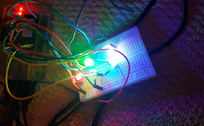
The first step of my project was to learn how OpenStreetMap (OSM) works. Because OSM is intuitive, the steps I took were simple: (1) visit the website, www.openstreetmap.org; (2) create an account (“Sign Up”); (3) Log In; (4) type in “Kibera, Nairobi, Kenya” into the search field; (3) click “edit”; (4) follow the tutorial that OSM offers before you make your first edit; (5) select “Area” and zoom all the way into the rooftops of the buildings to create polygons that mark the geolocation of each structure (double-click to close the polygon); (6) select “Building” from the options in the left-bar (Note: if this process was done with people who live in these neighbourhoods, the names of what each building could be included in the data extraction, which would create more possibility for analysis in the future); (7) click the “check-mark” (perhaps the most important step to saving the data, and then “Save” on the top banner.


These steps were repeated until a chosen portion of Kibera was completed. The above instructions were emailed to a few willing participants and a “call” for participation via Twitter, too, was done periodically over the course of 6 days. My building extraction started from the beginning of an “access road” at the furthest South-Eastern point of Kibera in a village called Soweto-East, where I had conducted research about a contentious “slum-upgrading” programme 4 years ago.
Over the course of 6 days, I made 31,691 edits to OSM over all, which included all actions (deleting incorrect buildings, creating nodes, moving things, etc.). In total, I created 5471 buildings and 1299 were created by friends and family, resulting in 6770 buildings in total. However, when I extracted this building data, first loading it into QGIS and then exporting that shapefile into ArcGIS, 7871 buildings were counted (extracted/cleaned) in this area South of the railway (which runs along the northern part of the outside boundary). I cannot account for who created 1101 buildings (perhaps success attributed to social media efforts?), but 86% of the area was ‘mapped’ over a 6-day period.
It’s often said, for perspective purposes, that Kibera is “two-thirds the size of Central Park in New York”, but the precise calculation of area it covered is less-often (if ever) expressed. I wasn’t able to contribute to an absolutely calculation, either, but: not accounting for elevation or other things, at its longest and widest, the area of Kibera covered in this 6-day period was approximately 2000m x 1500m. It’s imprecise, but: imagine someone running around a 400m track 5 times and you have the length of the area in focus – thousands of buildings that are homes, businesses, schools, medical clinics, and so on the equivalent of maybe 10 football fields (12 or 13 acres).

Accuracy, Precision & Impact
It was often difficult to determine where the lines began and ended. Because of the corrugated metal material that’s used to build homes, schools, businesses (and more), the light flares from the sun, captured from the satellite imagery, made for guesswork in some instances. The question then became: why bother? Is there a point, or purpose, to capturing these structures at all if it’s impossible to be precise?
Much of the work to date with open-source data in this particular community in this particular part of the world is deeply rooted in protecting people; keeping people safe. Reading about the origins of mapping efforts by an organization called Map Kibera can reveal a lot about the impact(s) and challenges of creating geodata in informal settlements (or “slums”). The process of drawing thousands of polygons to represent buildings that are most often considered to be precarious or impermanent housing was enlightening. One of the main take-away ‘lessons’ was that data production and availability is critical – without data, we don’t have much to work with as spatial analysts.

Practical Implications: the “Story Map”
While new data production was one of the goals of this geovisualization project, the second challenge goal was to find a way of communicating the results. As a technology, Esri’s Story Maps technology was the most useful because it allowed me to link the OSM map as a basemap, which helped maintain the open-source ‘look’ to the map. Without much effort, the 7871 new buildings, covering 7 of the 13 villages in Kibera, were automatically available using this basemap. Because I took stop-motion videos of the OSM building extraction process, I was able to create point data on my Story Map to link to these videos. With “education” as one of the goals of the project – both of the infrastructure in Kibera itself, and of how to use OSM, in general – people unfamiliar with OSM tools and how they can be used/useful in the context of missing data in informal settlements (or “slums”) could familiarize themselves with both. In addition, I included interesting, personal photos from prior-research/work in this area, further adding to the “story” of infrastructure in the community. The Story Map is available here.

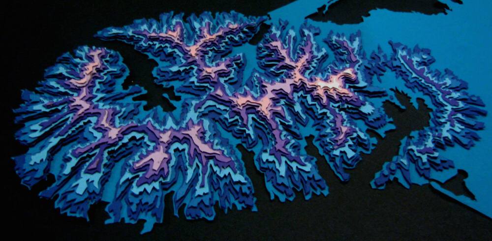
Print: Formalizing the Informal
The initial goal of this geovisualization project was to demonstrate that there is beauty and art in the creation of data, particularly when it is collaborative and made to be openly-accessible, unrestricted, and for anyone to use. After I proposed to create and extract building data from Kibera, I wanted to use a special printing technology to have the building data etched into an aluminum composite material called dibond. The idea was to have this piece of collaborative work (about a place commonly labeled a “slum”) gallery-ready and ultimately “legitimized” simply by being etched into something permanent (this idea of “legitimate” is tongue-in-cheek, to be clear). The technology available to etch into dibond is limited in the city, however, and when time-limitations made the etching-goal prohibitive, I decided to have the final product printed and mounted onto dibond as a compromise. In the end, the result of having the mounting material hidden was conceptually true to the goal of the project – to draw attention to the reality that real people with rich lives maintain these homes, businesses, schools, community centres, etc., regardless of the assumptions what that corrugated metal material may indicate. Paired with the Esri Story Map, this print was useful at drawing the attention of people into the digital story, which was loaded onto a computer for the day of the formal project presentation. Now, however, the 24×36 print hands on my wall, generating conversation about the entire process of this project and the potential impacts of open-source data. Having spent 3 years of my life examining the impacts of public participation when designing infrastructure changes (which hopefully lead to improvements in quality of life), this print – and process – could not have a better ‘home’.