Please read on below or use the search function, categories list, or tag cloud to find posts of interest. Keep in mind that most posts reflect student work summarizing one of two projects that had to be completed within a 12-week term. Happy reading!
Geovisualization Project Assignment, Toronto Metropolitan University, Department of Geography and Environmental Studies, SA8905 – Cartography and Geovisualization, Fall 2025
By Payton Meilleur
Exploring Canada’s Ecozones From Coast to Coast
Canada is one of the most ecologically diverse countries in the world, spanning Arctic glaciers, dense boreal forests, sweeping prairie grasslands, temperate rainforests, wetlands, mountain systems, and coastal environments. These contrasting landscapes are organized into 15 terrestrial ecozones, each defined by shared patterns of climate, vegetation, soil, geology, and wildlife. Understanding these long-established ecological regions offers a meaningful way to appreciate Canada’s natural geography, and provides a foundation for environmental planning, conservation, and education.
For this project, I set out to create a three-dimensional, tactile model of Canada’s ecozones using layered physical materials. The goal was to translate geographic data into a physical form, showing how soil, bedrock, and land cover differ across the country. This model is accompanied by a digital mapping component completed in ArcGIS Pro, which helped guide the design, structure, and material choices for each ecozone.
This blog post outlines the context behind Canada’s ecozones, the datasets used to build the maps, and the process of turning digital ecological information into a physical, layered 3D model using natural and recycled materials.
Understanding the Terrestrail Ecozones
Ecozones form the broadest unit of the Ecological Framework of Canada, a national classification system used to organize environments with similar ecological processes, evolutionary history, and dominant biophysical conditions. Rather than describing individual landscapes, ecozones function as large-scale spatial units that group Canada’s terrain into major ecological patterns such as the Arctic, Cordillera, Plains, Shield, and Maritime regions. These zones reflect long-term interactions between climate, soils, landforms, vegetation, and geological history, and serve as a foundation for national-level environmental monitoring, conservation planning, and spatial data analysis.
Within this framework, datasets such as bedrock geology, soil order, and land cover provide further ecological detail. Bedrock influences surface form and drainage; soil orders reflect dominant pedogenic processes; and land cover shows the distribution of vegetation and surface characteristics. Together, these national spatial datasets support a deeper understanding of how ecological conditions vary across the country, and they informed both the digital mapping and the material choices used in my 3D physical model.
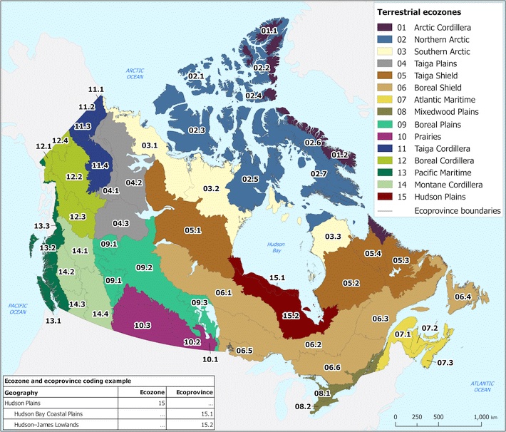
To interpret Canada’s ecozones more clearly, it is helpful to break down their naming structure. Each ecozone name combines an ecological prefix with a physiographic suffix, and these two components together describe the zone’s overall character.
The Zone Type describes the ecological/climatic zone
The Physiographic Region Type describes the physiographic region or geological province
Exposed rock, thin soils, many lakes, glacial features
Plains
Lowland interior plains
Sedimentary bedrock, rolling terrain, thicker soils
Maritime
Coastal lowlands and mixed forest
Ocean-influenced climate, forested lowlands
Figure 1. The Terrestrial Ecozones of Canada. Retrived from Statistics Canada (2021).
Digital Methods: Building the Ecological Layers in ArcGIS Pro
To guide the design of the 3D model, I assembled a set of national-scale spatial datasets representing the major ecological layers of Canada’s terrestrial environment. These included the ecozone boundaries, 2020 land cover, soil order, and bedrock lithology, all accessed through the Government of Canada’s Open Data portal. Each dataset was projected into NAD83 / Canada Albers Equal Area Conic, the recommended projection for ecological and continental analyses.
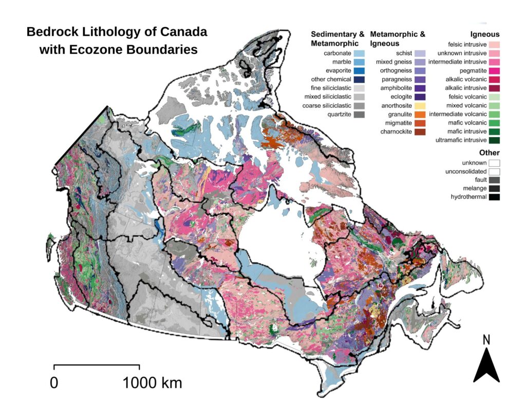
The ecozone boundaries were used as the spatial framework into which all other layers were integrated. The land cover raster provided information on surface vegetation and terrain characteristics, while the soil order dataset showed how pedogenic processes vary across the country. Bedrock lithology offered a deeper geological layer, distinguishing igneous, metamorphic, and sedimentary provinces across Canada’s major physiographic regions.
In ArcGIS Pro, each raster dataset was clipped to the ecozone boundaries to isolate the surface conditions, soil regimes, and bedrock types present within each zone. This process produced a series of layered maps that showed how ecological characteristics vary across Canada at the ecozone scale. By visualizing these datasets together (land cover on top of soil order and bedrock geology) it became possible to examine the vertical ecological structure of each ecozone and understand the relationships between surface patterns, subsurface materials, and underlying geological formations. These GIS outputs were paired with descriptive information from the Ecological Framework of Canada (ecozones.ca), which provides qualitative detail about the depth of soils, dominant surface features, and the broader geomorphological context of each ecozone. Together, these resources informed the conceptual structure of the 3D model developed in the next stage of the project.
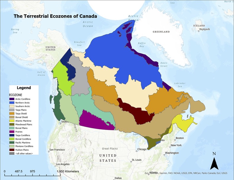
Figure 2. Reference map of Canada’s 15 terrestrial ecozones.
Figure 3. Map showing 2020 land cover classifications across Canada’s ecozones.
Figure 4. Map showing the distribution of soil orders within Canada’s ecozones.
Figure 5. Map showing the distribution of Canada’s major bedrock types, overlaid with ecozone boundaries.
Physical Methods: Constructing the 3D Ecozone Model
The goal of the physical model was to translate Canada’s ecological geography into a tactile, layered form that makes the structure of each ecozone visible and intuitive. While the digital maps reveal patterns across the landscape, the 3D model emphasizes how surface cover, soil, and bedrock stack vertically to shape ecological conditions. Each ecozone was built as an individual “bin” shaped roughly to its boundary, with a transparent side panel exposing the internal layers—bedrock at the base, soil in the middle, and surface materials on top. The thickness, texture, and colour of these layers were informed by the Ecological Framework of Canada, which outlines typical soil profiles, surficial materials, and geological contexts within each ecozone, and by the national spatial datasets processed in ArcGIS Pro. Together, these sources guided the construction of bins that physically represent the vertical ecological structure underlying Canada’s major terrestrial regions.
Materials Used
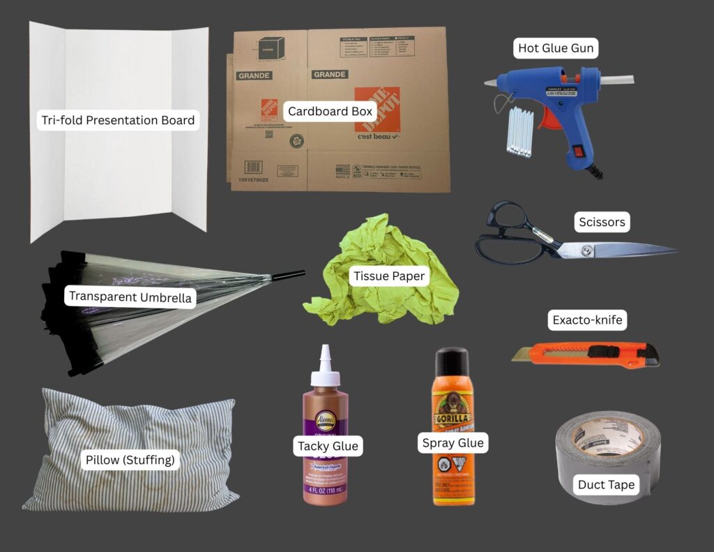
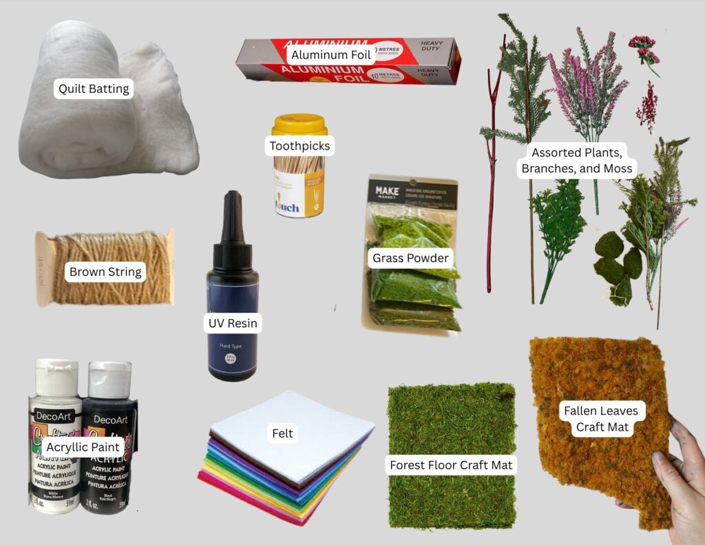
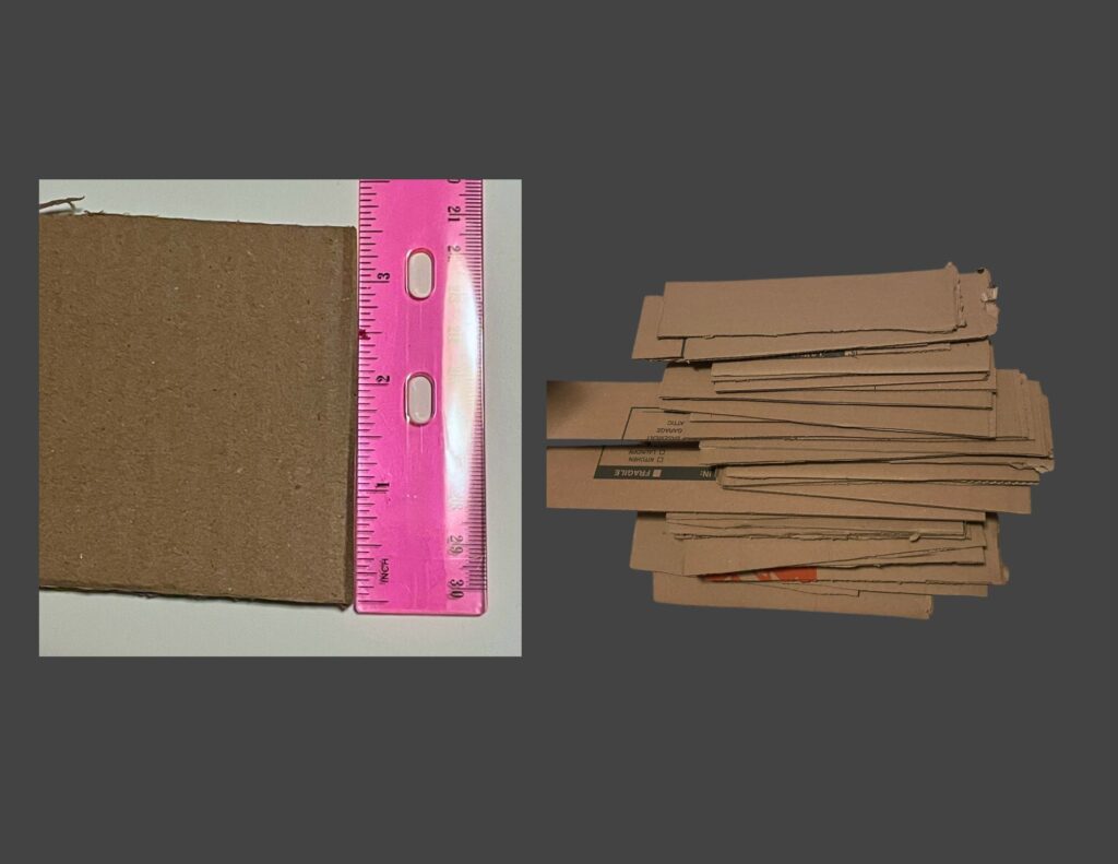
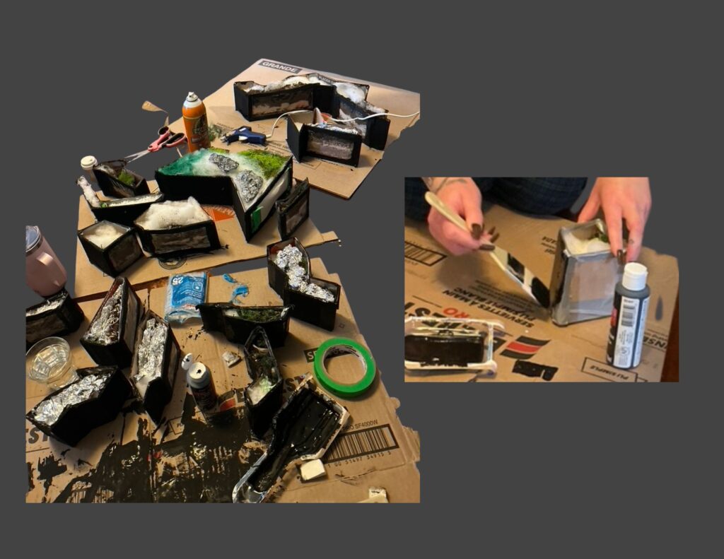
Structural Components (See Figure 6.)
Base structure: tri-fold presentation board
Bin walls: recycled cardboard boxes
Viewing window: broken transparent umbrella
Filling: repurposed pillow stuffing, recycled tissue paper
Adhesives: hot glue gun, tacky glue, spray glue, duct tape
Tools: scissors, exacto-knife
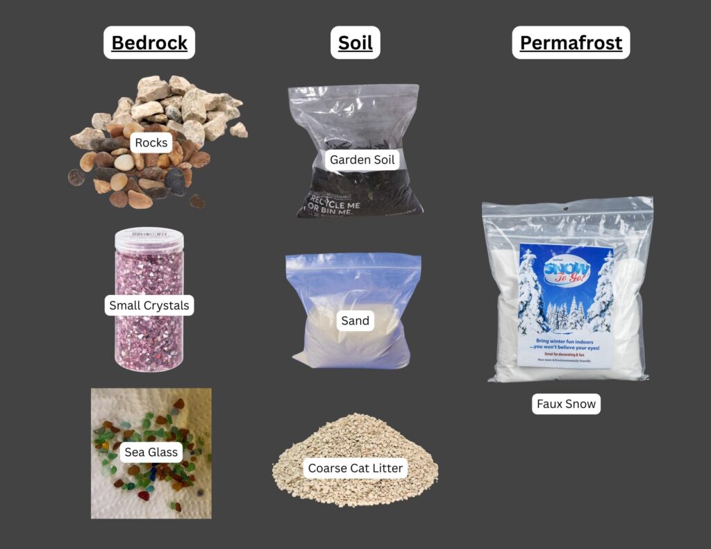
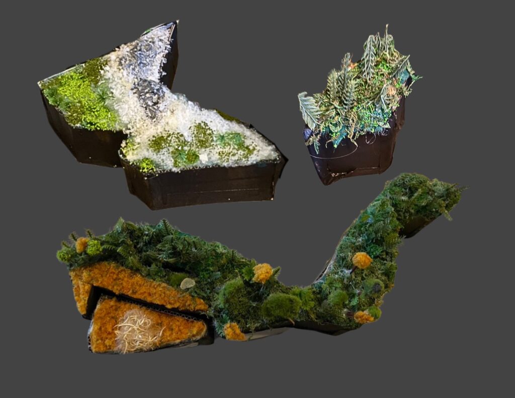
Layered Ecological Materials (See Figure 7.)
Bedrock: collected rocks of various colours, collected sea glass shards, small crystals
Trees and shrubs: – Redwood forest: collected dried Red Twig Dogwood branches and cedar leaves – Deciduous forest: toothpicks with painted cotton-ball canopies – Coniferous forest: dried pine needles, repurposed plastic branches – Berries: collected styrofoam berries
Colouring Materials: thrifted black, white, blue, and red acryllic paint
Figure 6. Structural materials used to build the ecozone bins and base.
Figure 7. Subsurface materials representing bedrock, soil, and permafrost layers.
Figure 8. Surface cover and vegetation materials used to detail each ecozone.
Constructing the 3-D Ecozone Model
The following steps summarize the process of building the 3D ecozone bins, from shaping the structures to layering bedrock, soil, and surface materials.
Step 1. Trace and Cut the Ecozone Shapes
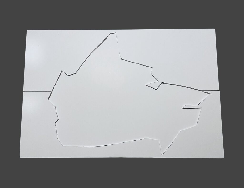
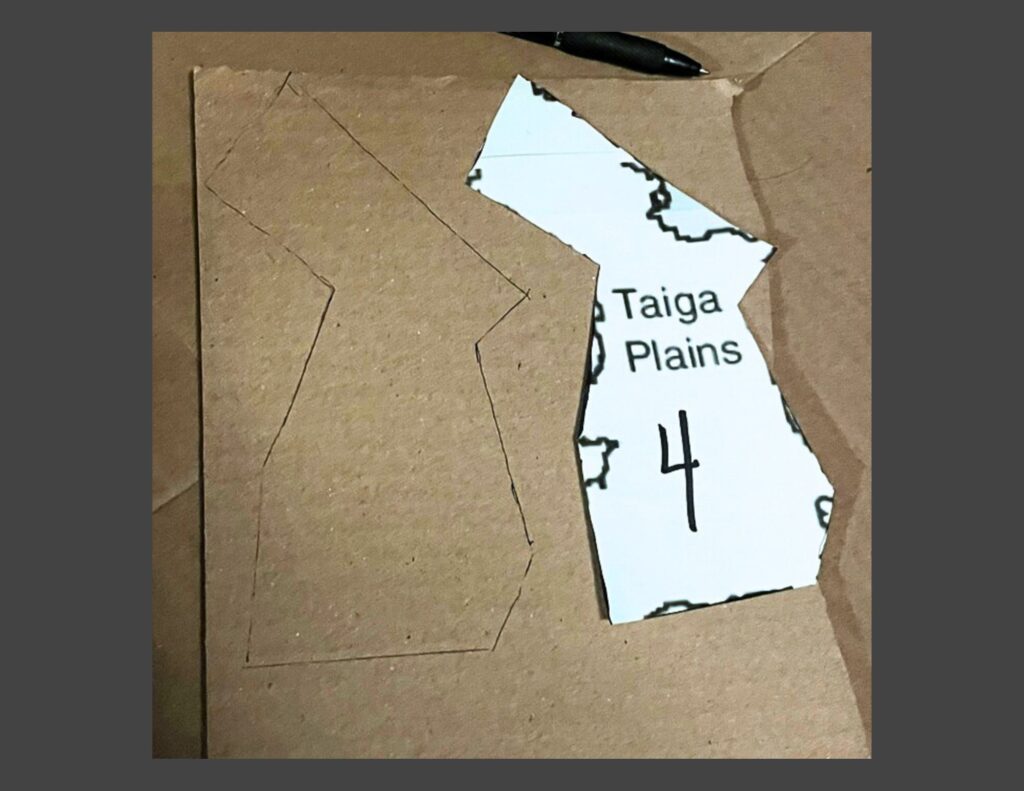
Ecozone boundaries were exported from ArcGIS Pro, printed, and used as templates for the physical model. The outlines were traced onto paper and cut out to establish the footprint of each bin. In addition, the overall outline of Canada was cut into the top layer of the tri-fold presentation board to create a recessed “frame” where the ecozone bins would sit securely during assembly.
Step 2. Cut the Cardboard Bases and Wall Pieces
Using the paper templates from Step 1, each ecozone boundary was traced onto recycled cardboard and cut out to form a sturdy base. Additional cardboard strips were measured to a uniform height of 3.5 inches and cut to length so they could later be attached as the vertical walls for each bin.
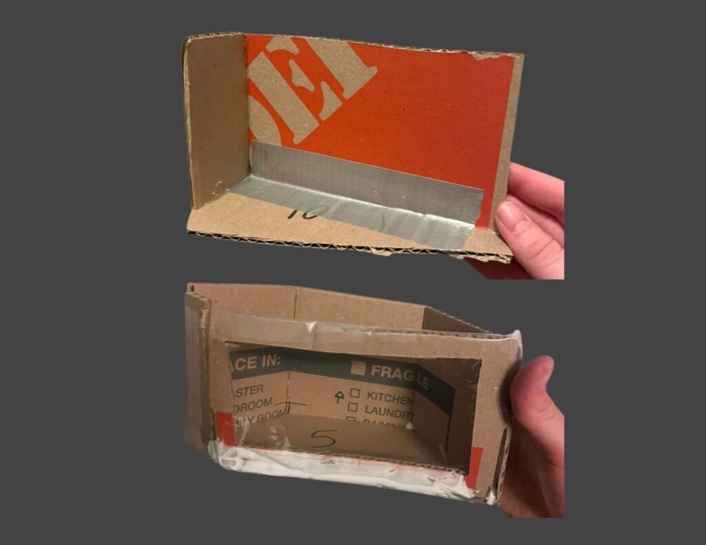
Step 3. Build the Bin Walls and Viewing Windows
The cardboard wall strips were bent and glued along the perimeter of each base using hot glue, then reinforced with duct tape to create durable, open-top bins. A rectangular cut-out was made on one side of each bin, and clear plastic panels cut from a broken transparent umbrella were glued in place to form viewing windows for the internal layers.
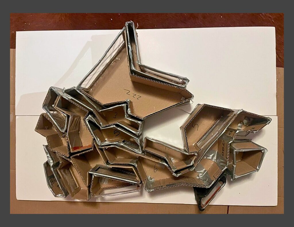
Step 4. Test-Fit the Bins in the Presentation Board Frame
Once all bins were constructed, they were placed into the recessed outline cut into the tri-fold presentation board to test the overall fit. This dry run helped ensure the ecozones aligned properly with the national outline. Minor adjustments to edge trimming and bin alignment were made where necessary before moving on to internal layering.
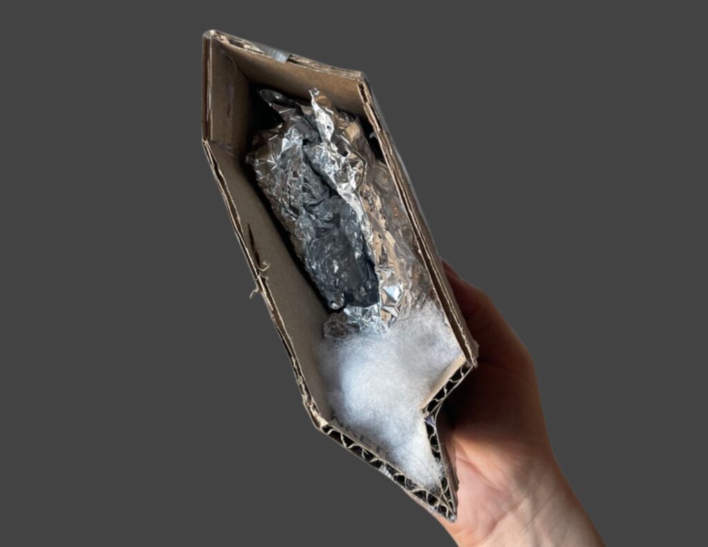
Step 5. Add Internal Support Layers
Before adding the ecological materials, each bin received an internal support base. Pillow stuffing, crumpled tissue paper, and shaped tinfoil were added as lightweight filler to elevate the inner floor where needed and provide structure for the bedrock, soil, and surface layers applied in Step 6.
Step 6. Fill the Bins with Bedrock and Soil Layers
Each bin was filled just high enough for the internal layers to be visible through the viewing window. Materials such as rocks, gravel, sand, soil, and artificial snow were added to represent the approximate bedrock and soil conditions characteristic of each ecozone. These layers created the vertical structure that would support the surface land cover added later.
Step 7. Paint the Exterior of the Bins
After all bins were filled, their outer surfaces were painted black to create a cohesive and visually unified appearance. This step helped the ecozones read as a single model while keeping the focus on the internal layers and surface textures.
Step 8. Adding the Land Cover Surface
Once the bins were painted, each one was topped with a layer of felt in a colour chosen to match its dominant land cover type. The felt provided a level, uniform base for adding surface materials. On top of this foundation, land-cover textures (such as forest-floor matting, moss, agricultural matting, snow batting, etc.) were added to represent the ecological characteristics of each ecozone
Step 9. Adding Landscape Features
Landscape features were added to give each ecozone its characteristic surface form. Mountains were shaped from tinfoil and painted for texture, while natural and repurposed materials were trimmed into trees, shrubs, and ground vegetation. Lakes and wetlands were created by curing coloured UV resin. Powdered grass, moss, faux snow, and all other surface elements were secured in place using a combination of tacky glue, spray adhesive, and hot glue, ensuring the finished landscapes were stable and cohesive across each bin.
Step 10. Assembling the 3D Model
Once all surface detailing was complete, the ecozone bins were placed back into the presentation-board base. Each piece was adjusted to ensure that the boundaries aligned cleanly, the bins fit together without gaps, and the visible land cover on the surface and sides accurately reflected the geographic and ecological patterns shown in the digital maps. This final assembly brought the full three-dimensional model together as an integrated representation of Canada’s terrestrial ecozones.
Conclusion
This project brought together digital mapping, ecological research, and hands-on model building to translate national-scale environmental data into a tangible format. By combining GIS analysis with layered physical materials, the model highlights how geology, soils, and surface cover interact to shape Canada’s major ecological regions. Although simplified, the final product offers an accessible way to visualize the structure of the Canadian Ecological Framework’s Terrestrial Ecozones and demonstrates how spatial data can be reinterpreted through creative, tactile design.
Pixels, rasters, GIFs, and beads — because who said remote sensing can’t be fun?
Oh, and I built a Google Earth Engine web app too.
Geovis Project Assignment, TMU Geography, SA8905, Fall 2025
Author: Amina Derlic
Introduction
I’ve always been fascinated with things above the Earth. As a kid, I wanted to be an astronaut — drifting through space, staring back at the planet from far, far away. Life didn’t take me to the International Space Station, but it did bring me somewhere surprisingly close: remote sensing. Becoming a forest scientist turned out to be its own kind of space adventure — one where satellites become your eyes, algorithms become your instruments, and forests become your landscape.
For this project, I wanted to explore something that has always caught my curiosity: how forests and vegetation heal after fire. What actually happens in the years after a burn? How quickly does vegetation come back? Are there patterns of resilience, or scars that linger? And what changes become visible only when you zoom out and look across a whole decade of satellite data?
While digging through disturbance datasets, I came across the Kenora018 fire, a May 2016 wildfire right on the Ontario–Manitoba border near Kenora and Ingolf. It was perfect: great Landsat coverage, and a well-documented footprint. I even downloaded the official fire polygon from the Forest Disturbance Area dataset on Ontario’s GeoHub.
But instead of sticking strictly to that boundary, I decided to take a more playful cartographic approach. The broader border region burns often — almost rhythmically — so I expanded my area of interest. Looking at a larger extent allowed the landscape to tell a much bigger story than the official fire perimeter could.
From there, the project grew into a full workflow. My goals in Google Earth Engine (GEE) were to:
build NDVI layers for 2015–2025 using Landsat composite imagery
compute dNBR for key fire years (2016 and 2025) to quantify burn severity
mask water and overlay Hansen tree loss for added ecological context
create an interactive GEE web app with a smooth year slider
animate everything into a GIF, visualizing a decade of change
and finally, turn one raster into a piece of physical bead art — transforming pixels into something tactile and handmade
This was also my first substantial project using JavaScript — the language that Earth Engine speaks — which meant a learning curve full of trial, error, debugging, breakthroughs, and a surprising amount of satisfaction. Somewhere between the code editor, the map layers, the exports, and the bead tray, the project turned into a multi-stage creative and technical journey.
And from here, everything unfolded into the full workflow you’ll see below.
How I Built It: Data, Tools, and Workflow
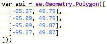
The study area for this project was chosen along the Kenora–Ingolf border, where the Kenora018 wildfire burned in May 2016. Instead of limiting the analysis strictly to the official fire boundary downloaded from the Ontario GeoHub, I expanded the area slightly to include surrounding forest stands, repeated burn patches, road networks, and nearby lakes. This broader geometry allowed the visualization to reflect not only the 2016 fire but also the recurring disturbance patterns that characterize this region.
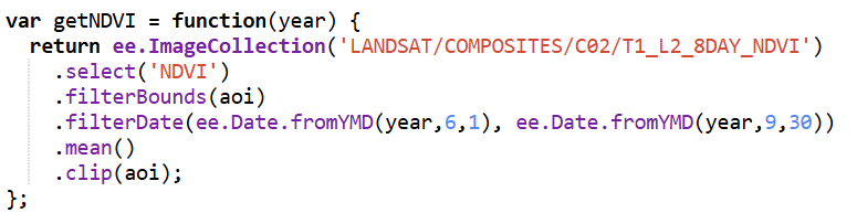
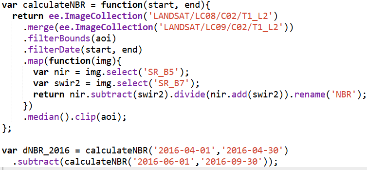
All data processing was carried out in Google Earth Engine, using a combination of Landsat imagery, global forest change data, and surface-water products. To track vegetation condition through time, I relied on the Landsat 8/9 NDVI 8-day composites from the LANDSAT/COMPOSITES/C02/T1_L2_8DAY_NDVI collection. I extracted summer-season imagery (June through September) for every year from 2015 to 2025, producing a decade-long series of clean, cloud-reduced NDVI layers. These composites provided a consistent view of vegetation health and were ideal for comparing regrowth before and after disturbance.
For burn-severity analysis, I used the Landsat 8 and 9 Level-2 Surface Reflectance collections (LANDSAT/LC08/C02/T1_L2 and LANDSAT/LC09/C02/T1_L2). These datasets include atmospherically corrected spectral bands, which are necessary for accurately computing the Normalized Burn Ratio (NBR). Using the NIR (SR_B5) and SWIR2 (SR_B7) bands, I calculated NBR for two time windows: a pre-fire period in April and a post-fire growing-season period from June through September. The difference between these two, dNBR, is a widely used indicator of burn severity. I produced dNBR images for 2016, the year of the Kenora018 fire, and for 2025, which showed another disturbance signal in the same region.
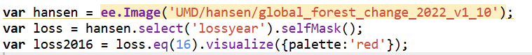
To contextualize the burn information, I incorporated the Hansen Global Forest Change dataset (UMD/hansen/global_forest_change_2022_v1_10). The lossyear layer identifies the precise year of canopy loss, and I used it to highlight where fire corresponded with actual forest removal. Importantly, dataset I used is only published up to 2022, so canopy loss could only be displayed through that year. The red pixels were blended into the 2016 dNBR map to show where burn severity aligned with structural forest change.
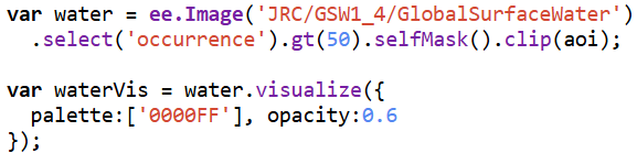
Because the region contains extensive lakes and small water bodies, I also used the JRC Global Surface Water dataset (JRC/GSW1_4/GlobalSurfaceWater) to create a water mask. However, in several places the JRC water polygons didn’t fully cover the lake edges, allowing some of the underlying Landsat pixels to show through — which made the water appear patchy and inconsistent on the map. To fix this, I converted the JRC water layer to vectors and applied a 3-metre buffer around each polygon. This small buffer filled in those gaps and produced smooth, continuous lake boundaries. After rasterizing the buffered shapes, I applied the mask across all imagery, which made the lakes look much cleaner in both the GIF animation and the interactive map.
Together, these datasets formed the backbone of the project, enabling a multi-layered visualization of fire, recovery, water, and forest change across eleven years of Landsat imagery.
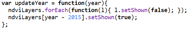
Once all annual NDVI and dNBR layers were created, I assembled them into an interactive web app using GEE’s UI toolkit. I built a year slider, layer toggles, and a map panel that automatically revealed the correct layers as the user scrolled through time. This allowed viewers to explore forest disturbance and regrowth dynamically rather than through static maps.
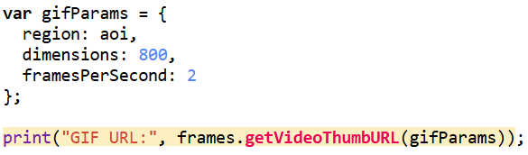
For the animation component, I generated visualized frames for each year, blended in the water mask and Hansen tree loss where needed, and assembled everything into a single ImageCollection for export as a GIF. While the interactive web app uses the full study area, I decided to crop the GIF to a smaller subregion that showed the most dramatic change. Much of the surrounding forest remained relatively stable over the decade, so focusing on the high-disturbance zone made the animation cleaner, more expressive, and easier to interpret. After exporting the GIF from Google Earth Engine, I added a simple title overlay in Canva to keep the aesthetic cohesive.
Results & What the Data Revealed
Once everything was assembled in the Google Earth Engine web app, the decade-long story of the Kenora–Ingolf forest began to unfold frame by frame. The 2015 NDVI layer offers a clean, healthy baseline — a landscape of mostly intact canopy, rich in mid-summer vegetation.
Before diving into the year-to-year patterns, it’s worth noting how the two key indicators behaved in this landscape. NDVI ranged roughly between 0.0 and 0.8, with the higher values representing dense, healthy canopy. This made it very effective for tracking vegetation recovery: strong greens in 2015, a sharp drop in 2016, and then a clear, steady resurgence in the years that followed. dNBR, on the other hand, showed burn severity in a way NDVI alone could not. In 2016, most values fell between –0.1 and 0.7, signalling low to moderate burn severity — not as intense as some fire reports suggested, but consistent with Landsat’s 30-metre pixel averaging. This also aligned with USGS MTBS. By 2025, dNBR peaks were higher on the eastern edge of the AOI, revealing a more severe burn pattern associated with the Kenora 20 and Kenora 14 fires. Together, NDVI and dNBR provided a complementary narrative: one charting the health of the vegetation, the other capturing the intensity and extent of disturbances shaping it.
The shift happens abruptly in 2016 with the Kenora018 wildfire. The dNBR layer reveals a clear patch of moderate burn severity. Interestingly, this contrasts with some local fire reports that described the event as severely burned. Landsat’s 30-metre pixel size helps explain the difference: each pixel blends many trees, softening the appearance of smaller, high-intensity burn pockets. The NDVI for 2016 fully supports this reading — vegetation drops sharply in the burn scar, transitioning toward yellows. The Hansen forest-loss data for 2016 reinforces this interpretation. The red loss pixels align closely with the drop in NDVI and the moderate dNBR signature, confirming that actual tree mortality followed the same spatial pattern seen in the spectral indices. Even though dNBR suggested mostly low–moderate severity, the Hansen layer shows that canopy loss still occurred in the core of the burn scar, creating a consistent picture when all three datasets are viewed together.
By 2017, recovery is already visible. Small patches of green begin resurfacing across the scar. In 2018, the regrowth strengthens further, and the forest steadily rebuilds. That pattern breaks briefly in 2019, where NDVI shows a dip in vegetation unrelated to the 2016 burn. This aligns with fire reports describing several minor grass fires in the Kenora and Thunder Bay districts that year — small on the ground, but detectable at Landsat’s scale.
From 2020 to 2024, the forest rebounds spectacularly. NDVI values rise and stabilize, indicating a canopy that not only recovers but in many places reaches even higher productivity than the pre-2016 baseline. This decade-long greening makes the region appear surprisingly resilient.
Then 2025 changes the story again. Two separate fires — Kenora 20 and Kenora 14 — burned portions of the eastern side of my AOI. These events show up clearly in both NDVI and dNBR: sharp declines in vegetation, strong burn-severity signals, and fresh scar boundaries distinctly different from the 2016 burn. The contrast between long-term recovery and sudden new disturbance makes 2025 an especially dramatic year in the final visualization.
To showcase the temporal changes more clearly, I exported the processed frames as a GIF. Since the file was too large for standard embedding, I converted it into a short video and uploaded it to YouTube. This made the animation smoother, easier to share, and more accessible across devices. The video captures the most dynamic portion of the study area — including the 2016 Kenora018 burn and the later Kenora 20 and Kenora 14 fires in 2025 — and shows the forest shifting through cycles of disturbance and recovery.
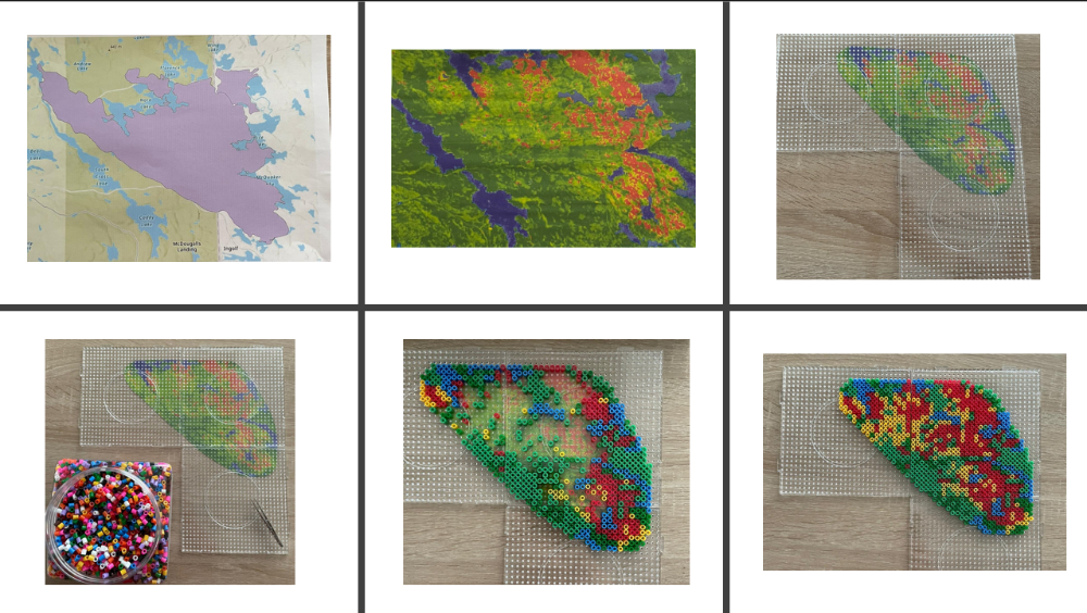
Finally, I wanted to take the project beyond the screen and turn part of the data into something tactile. I started by downloading the official Kenora 018 fire perimeter shapefile from the Ontario Ministry’s GeoHub, printed it, and used it as a physical template. Then I exported and printed my 2016 NDVI layer outlined with Hansen tree loss, trimmed it precisely to fit the perimeter, and used this as the base map for my physical build.
From there, I began assembling the bead map pixel by pixel using tweezers. Each bead colour corresponded to a class in the combined NDVI + tree loss dataset: blue for water, dark/healthy green for intact vegetation, yellow for stressed or low NDVI vegetation, and red for Hansen-confirmed 2016 tree loss. Because each printed pixel still contained sub-pixel variation, I used a simple decision rule: whichever class covered more than 50% of the pixel determined the bead placed on top.
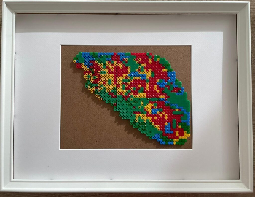
The process was surprisingly challenging. Some beads were from different brands and sets, meaning they melted at different temperatures — a complication I didn’t anticipate. As a result, the final fused piece is a little uneven and imperfect. But that imperfection also feels true to the project. Converting satellite indices into something handcrafted forced me to slow down and engage with the landscape differently. It’s one thing to analyze disturbance with code; it’s another to physically place hundreds of tiny beads representing real burned trees. The end result may be a bit chaotic, but it’s meaningful, tactile, and oddly beautiful — a small, imperfect echo of a real forest recovering after fire.
Process of creating bead board:
And final product on the table:
Limitations
As with any remote-sensing project, several limitations shape how the results should be interpreted. Landsat’s 30-metre resolution smooths out fine-scale fire effects, often making burns appear more moderate than ground reports suggest. Cloud masking varies year by year and can affect NDVI clarity. The Hansen dataset, used in this project, only extends to 2022, which means it cannot capture the 2025 tree loss associated with Kenora 20 and Kenora 14. And NDVI, while powerful, saturates in dense forest, making some structural changes invisible.
Even with these constraints, the decade-long patterns remain strong and revealing: the 2016 burn, the gradual regrowth, the 2019 dip, the robust recovery into the early 2020s, and finally the sharp return of fire in 2025.
Wrapping Up
What began as a small idea — “let’s check out what happened after that 2016 fire” — spiraled into a full time-travel adventure across a decade of Landsat data. I built sliders, animated rasters, chased burn scars across the Ontario–Manitoba border, and ended up turning satellite pixels into actual beads. Not bad for one project.
The forest’s story was both familiar and surprising: a big fire in 2016, recovery that starts immediately, a weird dip in 2019, years of strong regrowth… and then boom — the 2025 Kenora 20 and Kenora 14 fires lighting up the right side of my study area. You can almost feel the landscape breathing: exhale during fire, inhale during regrowth.
This was my first time writing JavaScript for real, my first time making a GIF in GEE, my first time turning data into a physical object — and definitely not my last. I’m leaving this project both tired and energized, full of new ideas and very aware of how fragile and resilient forests can be at the same time.
If you had told kid-me — the wannabe astronaut — that I’d one day be stitching together satellite imagery and making bead art out of forest fires… I think she would have approved.
Geovis Project Assignment, TMU Geography, SA8905, Fall 2025
Author: Pravar Joshi
Introduction
This tutorial walks through how I created Follow Your Flush, an educational web app that shows where wastewater travels in Toronto after someone flushes a toilet or drains a sink. The goal of the project is to help the public understand a complex urban system in a simple, visual way. Toronto has nearly 3,800 km of sanitary sewers and more than 523,000 property connections. Most of this infrastructure is underground and difficult to picture. This project uses interactive mapping, routing, and animation to turn a hidden system into an intuitive experience.
It invites the user to click anywhere in the city. The app then:
Identifies which wastewater treatment plant serves that location.
Computes a walking route (as a stand-in for sewer pipes) from the chosen point to the plant.
Animates a smooth camera flythrough along the path.
Extends the journey along an outfall pipe to Lake Ontario or the Don River.
Presents a treatment stages summary with a simple looping wastewater animation.
Shows the total travel distance.
The app brings together Mapbox GL JS, ArcGIS Online (AGOL) feature services, Mapbox Directions, and Turf.js for spatial calculations. It also uses the Mapbox Free Camera API, along with terrain and sky layers, to turn a simple map click into a fully animated 3D experience. In this tutorial, I will walk through how to combine these tools to build your own interactive story maps that draw on AGOL data, incorporate animations, use 3D map views, and perform open source geospatial analysis.
Why create an interactive story map?
This project shows how web mapping can turn a hidden system into something easy to understand. Most people never think about how wastewater makes its way to a treatment plant. A story-driven, animated map helps people understand distance, direction, and the treatment process.
The same approach can be used for other topics:
Drinking water treatment story
Fish migration patterns (eg salmon)
A bike or transit route animation
A delivery vehicle or garbage collection story
A heatwave moving across a city
A “walk the proposed development site” planning tool for developers
The storytelling approach stays the same. Only the datasets change.
Integrating Mapbox with ArcGIS Online (AGOL) Data
One of the most important pieces of this project is the ability to bring AGOL data directly into a Mapbox application. AGOL hosts feature services that can be queried through a simple REST API. These services can return data as GeoJSON, which Mapbox can load immediately as a source. This creates a flexible workflow where authoritative data is stored in AGOL (eg municipalities often post data on AGOL and it can be accessed for free) and rendered interactively through Mapbox in a custom web application.
This integration enables you to access the plentiful feature services in AGOL while leveraging Mapbox’s industry-leading graphics layers and APIs that allow for interactive web apps to be created with ease.
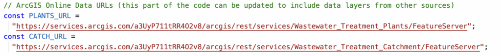
In this project, two AGOL layers were used:
Wastewater Treatment Plants (points)
Wastewater Catchments (polygons)
These were loaded through REST queries. First, I stored the URL for each of them separately:
Then, I fetched the URL for each of them independently; for example:
Once the request is sent to AGOL to retrieve the feature service, then it needs to be converted into a JavaScript object that contains the GeoJSON features:
The next step is to register the data inside Mapbox as a source, so it can draw this data, filter it, transform, and animate:
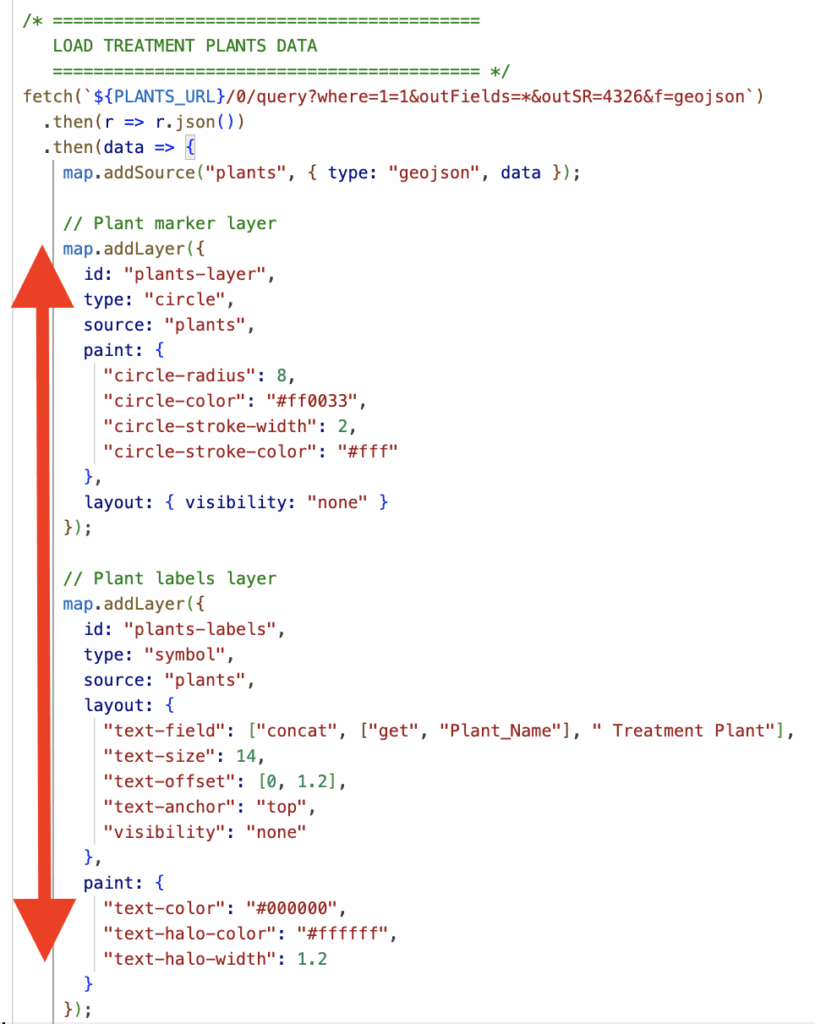
Lastly, I created a circle layer for the plant locations since this is point data and added labels above the plant. I kept the visibility as ‘none’ or hidden as this data is only shown on the map once the user triggers the entire workflow:
To summarize, this part of the tutorial walks through how to download an AGOL feature layer as GeoJSON such that it can be used in Mapbox. In this example, a point layer from AGOL was transformed in a circle layer for wastewater treatment plant locations and a symbol layer was also created in Mapbox for readable labels. Please refer to more detailed documentation here: https://developers.arcgis.com/rest/services-reference/enterprise/query-feature-service-layer/
Using Turf.js for Open-Source Spatial Analysis
Turf.js is a lightweight, open-source geospatial analysis library for JavaScript. It fills an important gap if you want to do geospatial operations, without depending on commercial APIs or paying credits for repeated calls via ESRI’s APIs.
In this project, Turf.js is used to support:
Finding the nearest address to a click
Creating line geometries
Point-to-Point distance calculations
Computing final journey lengths
Handling geometry operations that Mapbox does not perform
Finding the nearest address to a click
When the user clicks the map, the app looks for the closest address point. This gives the user context: “You clicked near 123 Sample Street.”
This pattern can also be used for a variety of use-cases. Instead of the closest address point, you can program the app to find the nearest park, nearest fire station, nearest trailhead, nearest bus stop, etc..
While the reverse-geocoding itself is done through the Mapbox Geocoding API, Turf provides the geographic structure needed to represent the clicked location correctly. The codeblock below is converting the raw coordinate pair into a proper GeoJSON Point. Then, the location can be passed cleanly into downstream spatial logic, distance functions, and API calls. Turf ensures the click is formatted as a true spatial feature rather than just a number pair.
Creating Line Geometries
A major part of the app involves drawing routes and pipe paths on the map. Turf.js makes this possible by converting plain arrays of coordinates into valid GeoJSON LineStrings. These LineStrings are then used for routing, animation, and distance calculations.
Walking Route (user click → treatment plant)
When the Mapbox Directions API returns a walking route, it provides the geometry as a raw array of coordinate pairs. Turf turns that list into a real spatial feature:
This gives the route a formal geometric structure. That structure is what allowed me to smooth the route, fit the map to the route’s bounding box, computre the route’s geodesic length, and animate the camera along the path. Without converting the coordinates to a LineString, none of those operations would work reliably.
Point-to-Distance Calculations
Turf allows the app to treat the walking route and the outfall pipe as real geographic lines instead of screen-based pixels. Using turf.length(), the distance between route coordinates is computed with proper geographic units. This converts hundreds of small coordinate segments into a single cumulative distance.
Conclusion
Mapbox is good at rendering beautiful map outputs for web apps, but it does not run geospatial operations. Turf fills this gap and can be leveraged for your interactive story-based web app!
Handling User Input and Spatial Logic
User interaction drives the entire application. The workflow always begins with a map click that triggers the logic for selecting the correct spatial boundary, calculating a route, and starting the animation.
This process applies can apply for many different use-cases:
Identify which watershed a user clicked
Identify or assign a bike route or transit line based on where a user clicked
Detect which fire station or service zone covers an area
In my example, the code performs two essential operations:
Detect which AGOL polygon contains the user clicked point.
Use that polygon’s attributes to guide the rest of the story
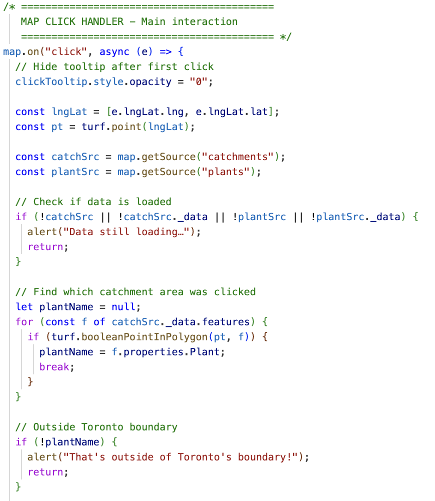
This codeblock below is the main map click handler for my application. Some of the key features:
Listening for a Click The handler begins with map.on("click", …), which waits for the user to click the map. This is the trigger for all interaction.
Cleaning Up the Interface The tooltip that guides first-time users is hidden as soon as they click. This keeps the interface clean for the rest of the workflow.
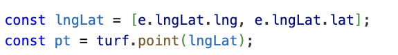
Capturing the Click Location The clicked longitude and latitude are extracted from the event (e.lngLat). These coordinates are wrapped into a Turf.js point object (turf.point(lngLat)), which allows the point to be used in spatial operations.
Checking That the Data Is Loaded Before running any spatial queries, the code checks whether the catchment polygons and plant data have actually finished loading. If either dataset is missing, the user sees an alert and the function stops.
Executing Point-in-Polygon Logic Before running any spatial queries, the code checks whether the catchment polygons and plant data have actually finished loading. If either dataset is missing, the user sees an alert and the function stops.
Handling Clicks Outside the Study Area If the loop finishes without finding a catchment, the system alerts the user that the click was outside the valid boundary and ends the function.
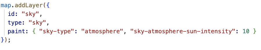
Enhancing the Map with Terrain and Sky Layers
To make the map feel more immersive, the project uses Mapbox’s terrain and sky layers. These layers add visual depth by emphasizing elevation and atmospheric light, giving users the sense that they are traveling through a landscape rather than sliding across a flat 2D map.
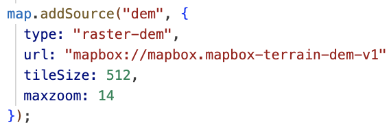
Adding a Digital Elevation Model (DEM)
Mapbox provides a global DEM that can be used to give the map a 3D effect. The DEM can be added as a raster source:
Once the DEM is loaded, you can apply it as the map’s terrain:
The exaggeration value controls how “vertical” the terrain appears. A little exaggeration helps users see the landscape without making the scenery look unnatural.
Adding a Sky Layer
The sky layer gives the map a realistic horizon when the camera tilts which is especially important in a project with dramatic camera movements such as this one as there is a camera that follows the path.
This sky layer the camera animation feel more cinematic. When the camera swoops down behind the walking path or flies across Lake Ontario during the outfall animation, the sky contributes to a sense of motion and depth.
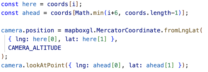
Using the Mapbox Free Camera API for Animation
The free camera API allows the map’s viewpoint to move smoothly along a path. This is similar to mimicking a drone or guided flythrough and transforms the map from a static reference into a narrated journey.
Setting up the camera
You start by grabbing the current free camera options from the map:
This camera can be repositioned and rotated independently.
placing the camera at a coordinate
For each coordinate in the route, you update the camera’s position and orientation:
The .position function controls where the camera is located. The .lookAtPoint function controls what the camera is pointed at and CAMERA_ALTITUDE adjusts how high above the path the animation flies. In my application, I enable the user to adjust the altitude via a slider.
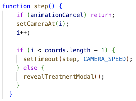
Animating the flight
You can create a recursive step() function that updates the camera a little at a time to create an animation:
The result is a smooth glide along the walking route and the outfall pipe, in my application. This creates the core storytelling moment of the application, letting users “follow their flush” as if traveling along the sewer network themselves.
Educational Modals and Storytelling Structure
The Follow Your Flush web app uses a sequence of modals to turn geographic data into a guided, educational story. This approach ensures users learn something at every step rather than just looking at moving lines on a map.
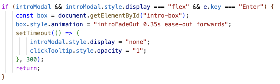
Intro Modal (Setting the Stage)
This modal set the introductory concept and disappears when the user is ready to begin:
This helps new users understand what the app represents and what they should do next (press enter!).
Click Info Modal (SHOWING KEY DATA ATTRIBUTES BACK TO THE USER)
Once the app determines which treatment plant services the area the user clicked, it displays an informational modal. This modal is the bridge between the spatial logic and the educational experience. To build it, the app uses DOM manipulation methods that let JavaScript read and update HTML elements on the page:
The key DOM methods used here are:
getElementById() finds the exact element to update
.innerHTML writes dynamic HTML content into the modal
.style.display controls when modals appear
state flags like awaitingEnter help manage user flow
Overall, the use of modals throughout an interactive web app help create a narrative for the user.
Conclusion
This project brings together ArcGIS Online Data Integration, Mapbox graphics, Turf.js, camera animations, and interactive modals to create a guided, educational experience on top of real spatial data. While there is no need to re-create these exact steps, the techniques demonstrated here can be leveraged for any interactive web app. Thank you for reading this post!
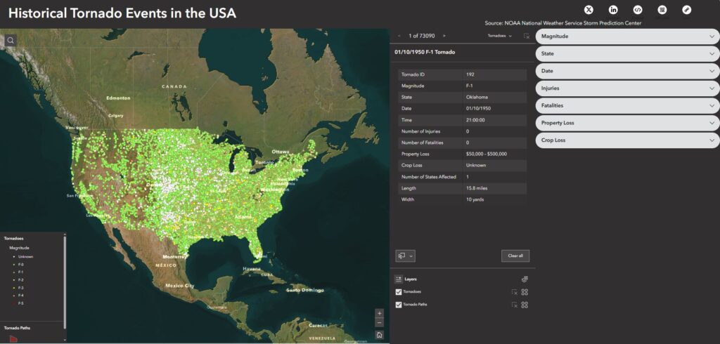
Tornado Alley has no definitive boundary. The NOAA National Severe Storms Laboratory explains that Tornado Alley is a term invented by the media to refer to a broad area of relatively high tornado occurrence in the central United States, and that the boundary of Tornado Alley changes based on the data and variables mapped (NOAA National Severe Storms Laboratory, 2024). This inspired my geovisualization project, in which I wanted to visualize all tornado occurrences in the United States and see how the spatial distribution of tornadoes, or what could be deemed as tornado alley, would change based on different spatial queries.
Data
The data used for this project are all publicly available for download at the links provided below.
The NOAA’s National Weather Service Storm Prediction Center publishes tornado occurrence data dating back to 1950. This file can be found on their website and is named ‘1950-2024_all_tornadoes.csv’. Additionally, a data description file can be viewed here.
Two important tasks must be completed using ArcGIS Pro.
Creating point data for all tornado occurrences.
Creating tornado paths for all applicable tornado occurrences.
Here is how these tasks were completed.
Creating the tornado occurrence point data layer
Add data to the map.
Open a new ArcGIS Pro Project and add the ‘1950-2024_all_tornadoes.csv’ and the ‘2024 1 : 500,000 (national) States’ shapefile to the current map.
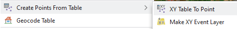
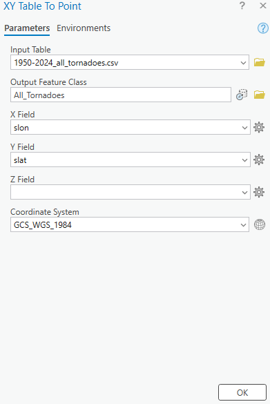
2. Create point data.
Right click on the ‘1950-2024_all_tornadoes.csv’ in the contents pane and navigate to “XY Table to Point”. Fill out the parameters as pictured below and run. This creates point data for all tornado occurrences using the start longitude and start latitude.
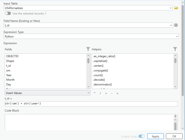
3. Creating a unique Tornado ID Field
Currently, there is no unique tornado ID field as tornado numbers are reused annually. We will now create a unique tornado ID field. Right click on the new All_Tornadoes layer and navigate to Data Design > Fields. Here, add a new field as pictured below.
Open the All_Tornadoes attribute table and navigate to the new t_id field. Right click and choose Field Calculate. Here, we will create a unique tornado ID by concatenating the om field and the year field as pictured below.
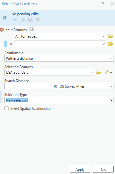
4. Using Select by Location to clip point occurrences apppearing outside the United States.
With the All_Tornadoes layer selected, navigate to Select by Location and fill the parameters out as pictured below.
Right-click on the All_Tornadoes layer and navigate to Data > Export Features. Ensure that you are exporting the selected records. Name this new feature layer “USA_Tornadoes”.
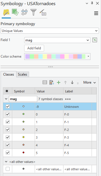
5. Symbolizing Point Occurrences
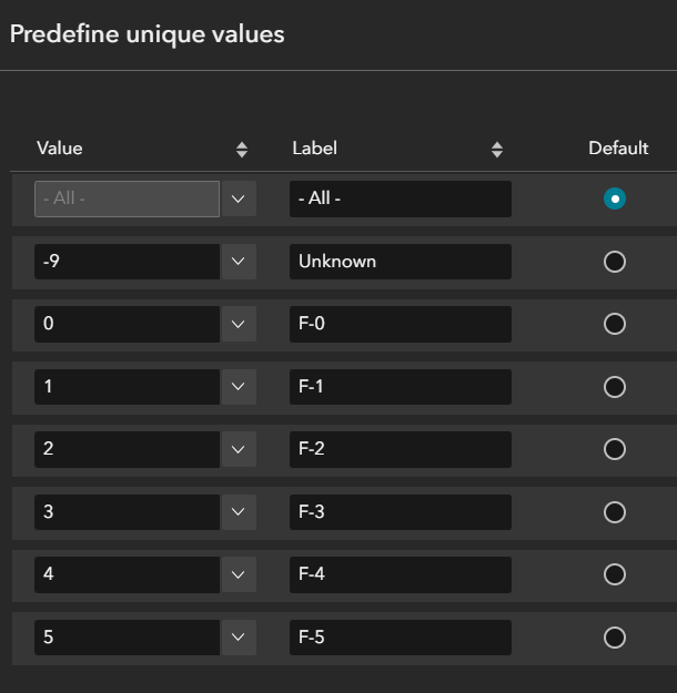
Navigate to the USA_Tornadoes layer symbology. Here, we will choose unique values and symbolize the Magnitude field (mag) as pictured below.
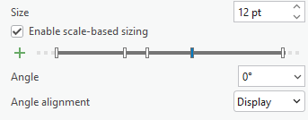
Enable scale-based sizing of points at appropriate ranges so that they do not crowd the map at its full extent. To begin, I used 3 pt, then 8 pt, and then 12 pt progressive sizing.
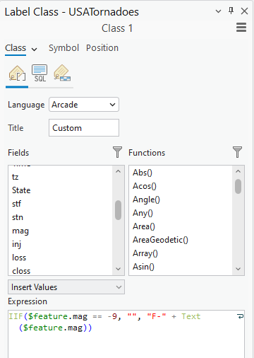
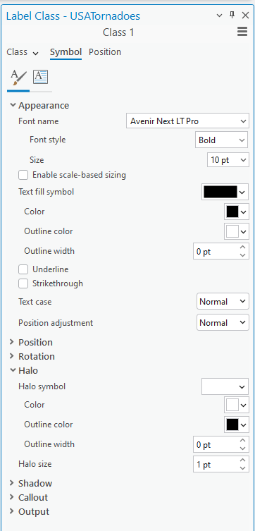
6. Labelling Point Occurrences
Right-click on USA_Tornadoes and navigate to labeling properties. We would like to label each occurrence with its magnitude. This Arcade expression leaves any points with a -9 value unlabelled, as they have unknown magnitudes.
Under the new Label Class, navigate to symbol and fill out the settings as pictured below.
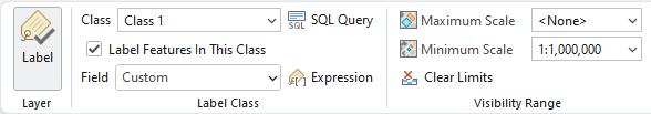
Under Visibility Range, fill out the minimum scale as pictured below. This will stop the labels from crowding the map when zoomed out. Save your project!
Creating tornado paths
Use the XY to Line Tool to create paths
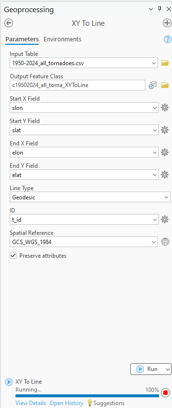
Launch the XY to Line tool. Use the ‘1950-2024_all_tornadoes.csv’, as the input feature. Fill out the parameters as pictured below. This will create a line from each tornado’s start lat/long to end lat/long. Running this will take a few minutes, be patient. Name this new layer “Tornado Paths”
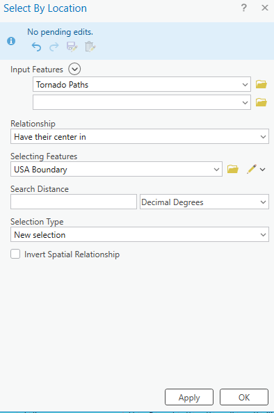
2. Select by Location all tornado paths in USA
Some tornadoes may only have a start lat/long, and no end lat/long recorded. In this case, the end of their path will appear at a 0,0 lat/long. To remove all of these inaccurate paths, we will peform a select by location. Fill out the parameters as pictured below.
Open the tornado paths attribute table and switch the selection. Visually confirm that the only highlighted paths are now outside of the USA. Delete these records.
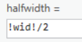
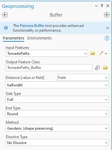
3. Creating a Buffer
To appropriately visualize the width of the tornado’s path, we will create a buffer of the Tornado Paths layer. Start by adding a new field to the Tornado Paths layer as pictured below.
Open the attribute table and field calculate the new halfwidth field as pictured below.
Now we can create a buffer. Open the buffer tool and fill in the parameters like below.
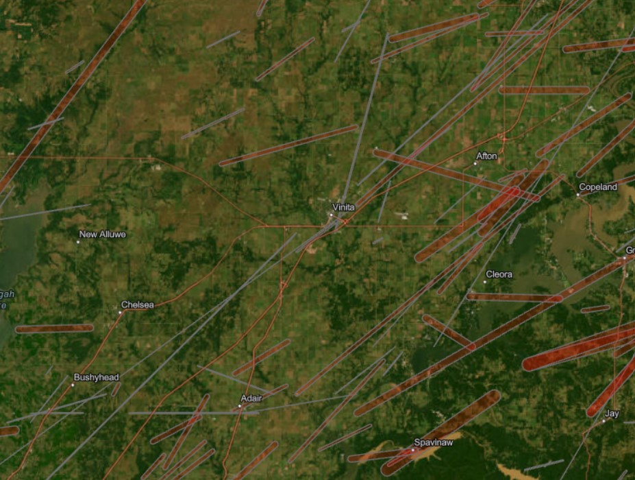
Symbolize this buffer in red and change the transparency to 60%. Add a 1 pt outline of grey. We have now created a layer showing the path of each tornado visualizing accurate length and width.
Save the project. Navigate to the share toolbar and share as a web map. We can now open our web map in ArcGIS Online.
Part Two: Preparing the Web Map for Experience Builder
Open the web map.
Open up the new web map in ArcGIS Online. The web map should have two layers: USA Tornadoes and Tornado Paths. Any other layers can be removed. Our map appears the same way in which we saved it in ArcGIS Pro.
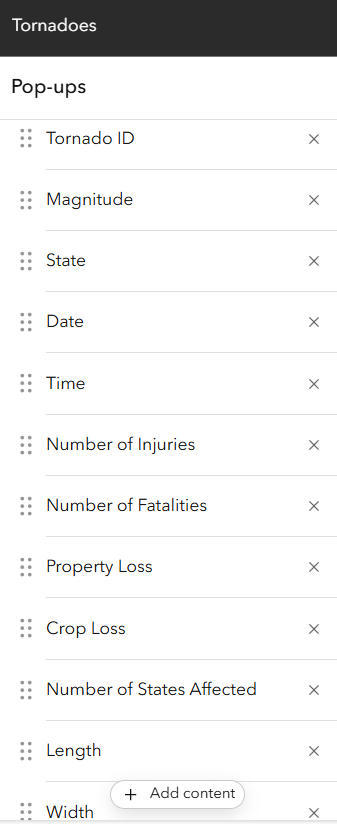
2. Format Popups.
Click on the USA Tornadoes layer. On the right hand pane, navigate to popups. Here, we will create some attribute expressions using Arcade to create nicely formatted fields for our popups. Add the following attribute expressions:
In the popups options, choose the fields pictured below to appear in the popups. Ensure you are using the attribute expressions you have made so that the popups have the data formatted as desired.
Repeat these steps on the Tornado Paths layer. Save the web map.
Part Three: Creating the Experience
Choose a template.
In ArcGIS Online, select create a new app > Experience Builder. This experience was generated using the template. However, I published the template with all of the edits made to create the Historical Tornado Events in the United States Experience.
2. Connect your web map.
Connect your Tornadoes web map to the map widget. Modify a custom extent for the map to appear at.
3. Configure filter widgets.
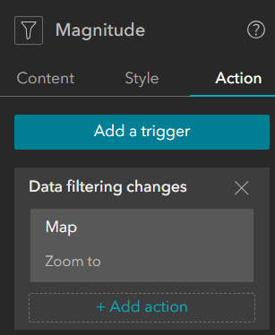
For each filter widget, configure a SQL expression using predefined unique values. For example, configure the Magnitude filter as pictured below.
This allows the user to select a value from a dropdown rather than typing in a value.
Additionally, configure a trigger action that will action the map to zoom to the filtered records, as pictured below.
4. Configure Feature Info widget.
Connect the feature info widget to the map widget. This widget will show the same information that we formatted in the web map popups.
5. Configure the Select Features widget.
Connect the Select Features widget to the map widget. Enable select by rectangle and select by point.
6. Save and publish! All widgets have now been configured.
Result
The Experience Builder output is an interactive web app that allows users to explore historical tornado occurrences dating back to 1950, their paths of destruction overlaying aerial imagery to see the exact structures and cities they passed through, and compares the statistics of human and financial loss caused by each. Users can see where the most severe tornadoes tend to occur, or visualize severity temporally.
Geo-Vis Project Assignment, TMU Geography, SA8905, Fall 2025
Hello everyone, and welcome to my blog!
Today’s topic addresses the distribution of crime in Toronto. I am seeking to provide the public, and implicated stakeholders with a greater knowledge and understanding of how, where, and why different types of crime are distributed in relation to urban features like commercial buildings, public transit, restaurants, parks, open spaces, and more. We will also be looking at some of the socio-economic indicators of crime, and from there identify ways to implement relevant and context specific crime mitigation and reduction strategies.
This project investigates how crime data analysis can better inform urban planning and the distribution of social services in Toronto, Ontario. Research across diverse global contexts highlights that crime is shaped by a mix of socioeconomic, environmental, and spatial factors, and that evidence-based planning can reduce harm while improving community well-being. The following review synthesizes findings from six key studies, alongside observed crime patterns within Toronto.
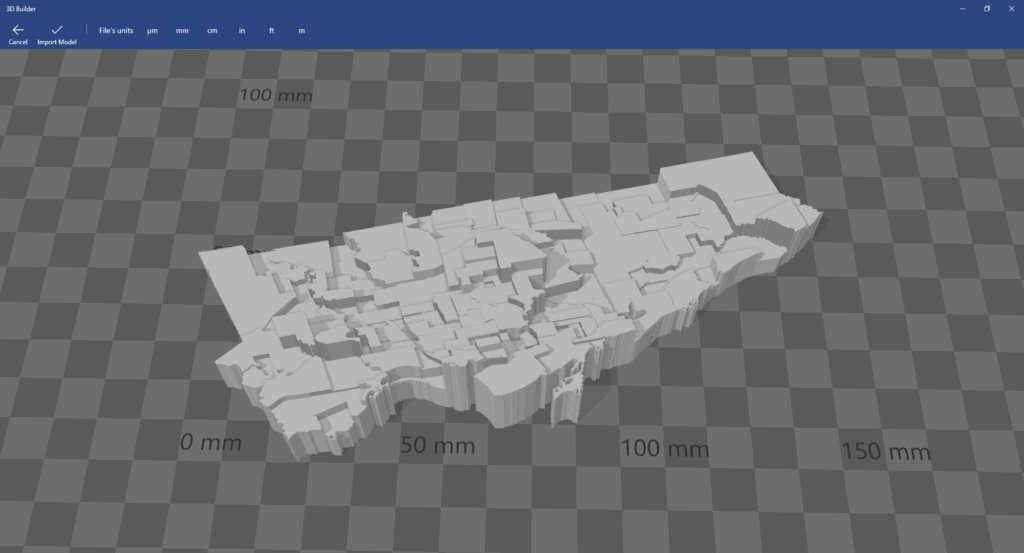
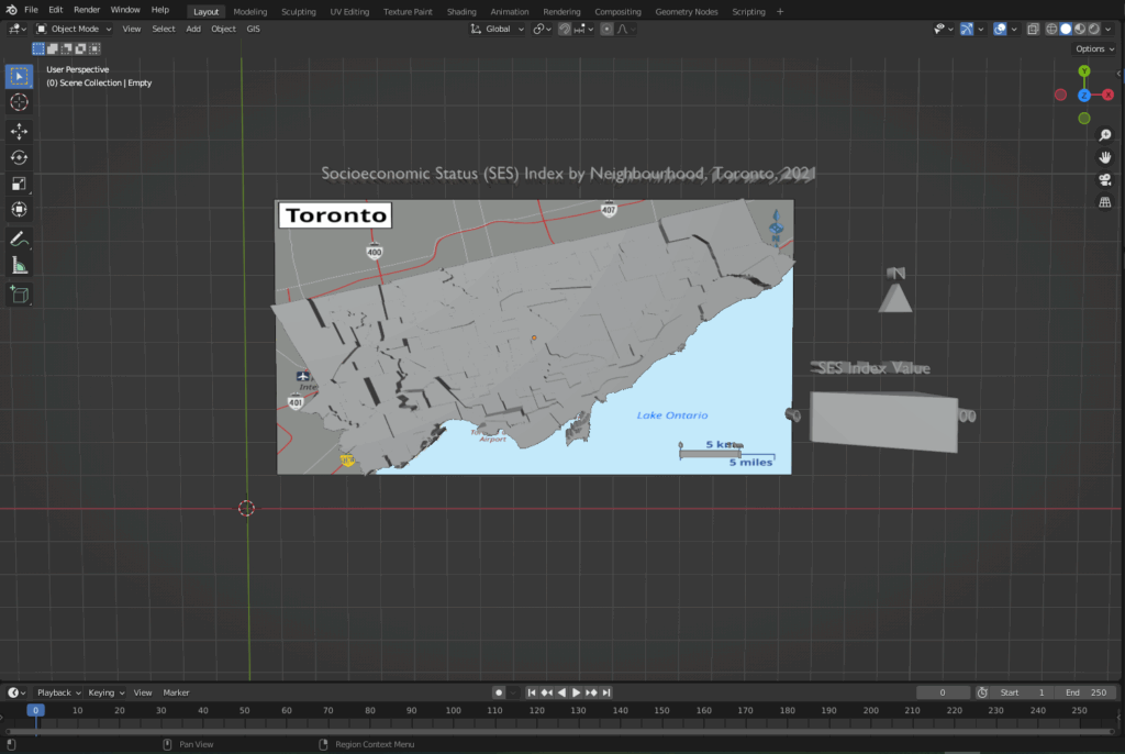
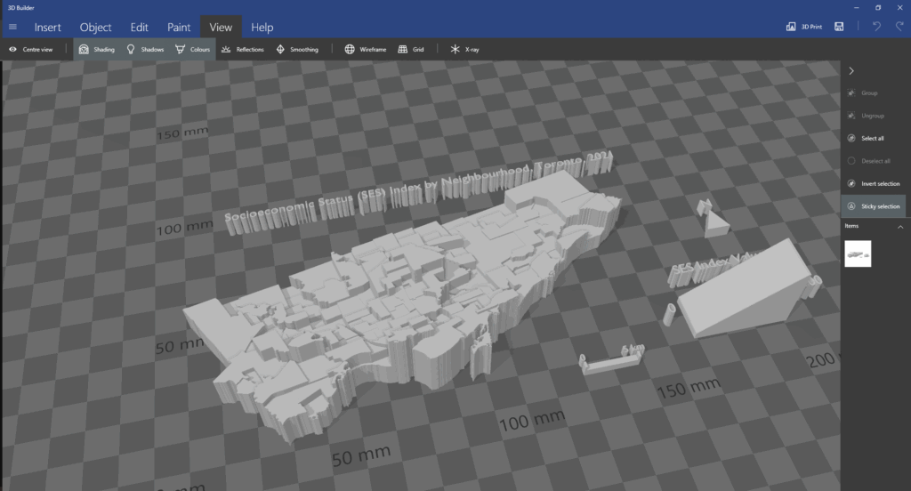
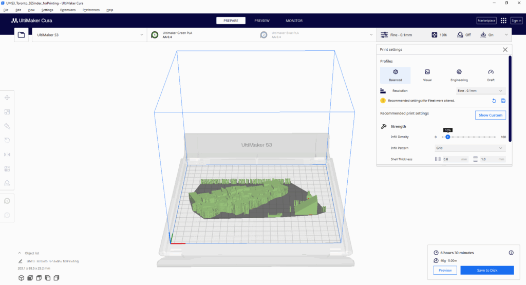
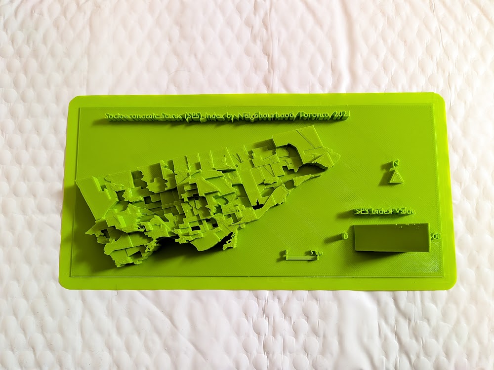
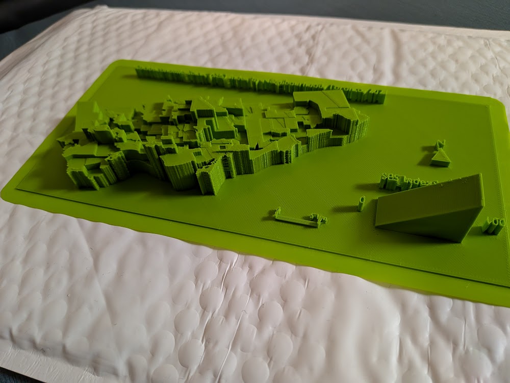
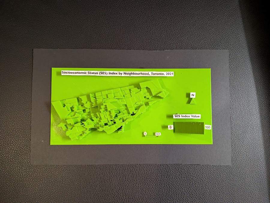
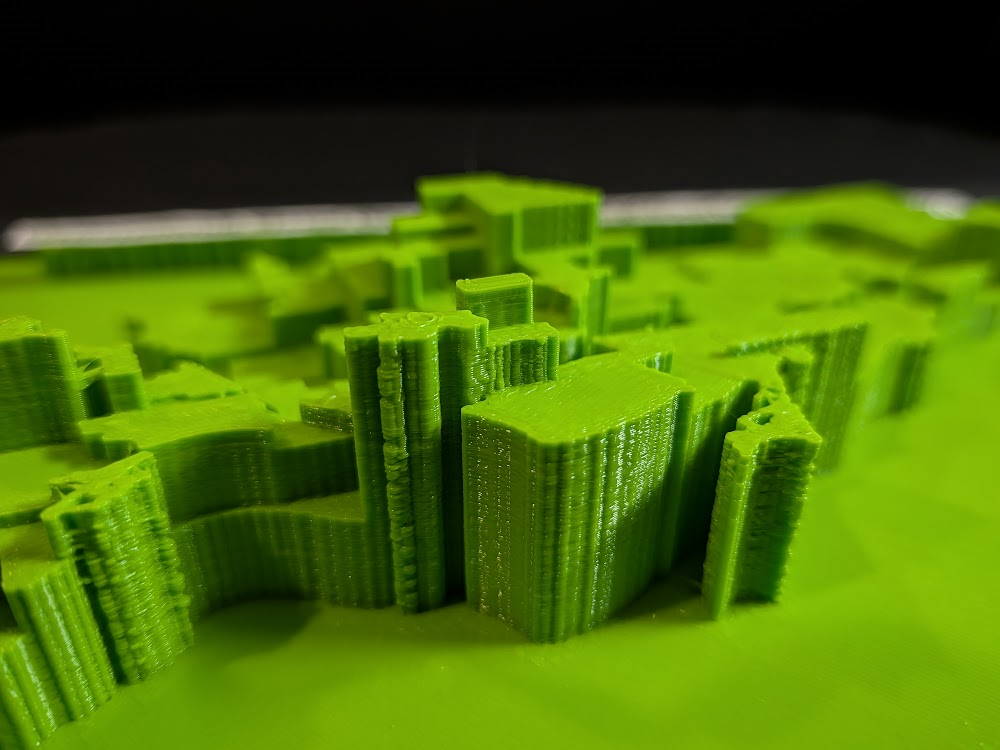
Accompanying a literature review, I created a 3D model that displays a range of information including maps made in ArcGIS Pro. The data used was sourced from the Toronto Police Service Public Safety Data Portal, and Toronto’s Neighbourhood Profiles from the 2021 Census. The objective here is to draw insightful conclusions as to what types of crime are clustering where in Toronto, what socio-economic and/or urban infrastructural indicators are contributing to this? and what solutions could be implemented in order to reduce overall crime rates across all of Toronto’s neighbourhoods – keeping equitability in mind ?
The distribution of crime across Toronto’s neighbourhoods reflects a complex interplay of socioeconomic conditions, built environment characteristics, mobility patterns, and levels of community cohesion. Understanding these geographic and social patterns is essential to informing more effective city planning, targeted service delivery, and preventive interventions. Existing research emphasizes the need for long-term, multi-approach strategies that address both immediate safety concerns and the deeper structural inequities that shape crime outcomes. Mansourihanis et al. (2024) highlight that crime is closely linked to urban deprivation, noting that inequitable access to resources and persistent neighbourhood disadvantages influence where and how crime occurs. Their work stresses the importance of integrating crime prevention with broader social and economic development initiatives to create safer, and more resilient urban environments (Mansourihanis et al., 2024).
Mansourihanis, O., Mohammad Javad, M. T., Sheikhfarshi, S., Mohseni, F., & Seyedebrahimi, E. (2024). Addressing Urban Management Challenges for Sustainable Development: Analyzing the Impact of Neighborhood Deprivation on Crime Distribution in Chicago. Societies, 14(8), 139. https://doi.org/10.3390/soc14080139
Click here to view the literature review I conducted on this topic.
How can we use crime data analysis to better inform city planning and the distribution of social services?
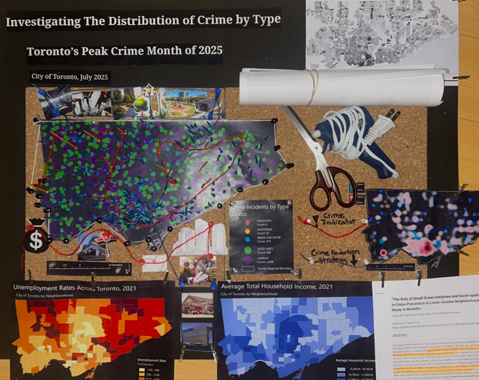
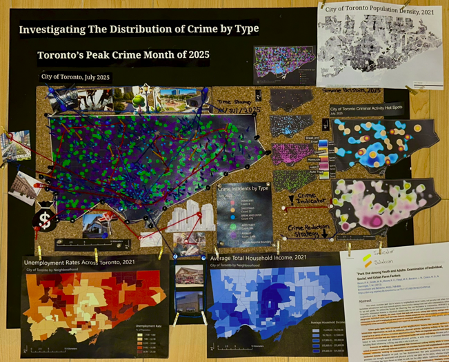
Methods – Creating a 3D Interactive Crime Investigation Board
Part 1, Preliminary Research and Mapping
The purpose of this 3D map is to provide an interactive tool that can be regularly updated over time; allowing users to build upon research using various sources of information in varying formats (e.g. literature, images, news reports, raw data, various map types presenting comparable socio-economic data, etc; thread can be used to connect images and other information to associated areas on the map). The model has been designed for easy means of addition, removal and connection of media items by using materials like tacks, clips, and cork board. Crime incidents can be tracked and recorded in real time. This allows for quick identification of where crime is clustering based on geography, socio-economic context, and proximity to different land use types and urban features like transportation networks. We can continue to record and analyze what urban features or amenities could be deterring or attracting/ promoting criminal activity. This will allow for fast, context specific, crime management solutions that will ultimately help reduce overall crime rates in the city.
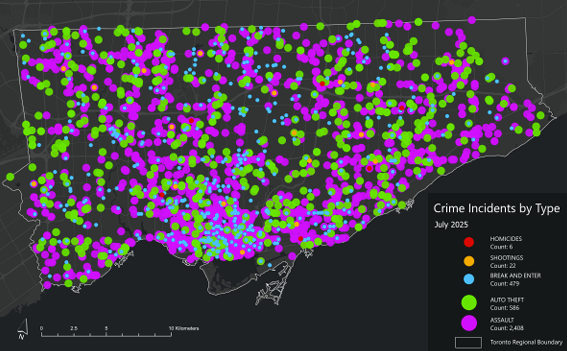
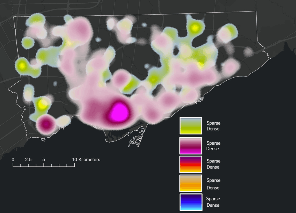
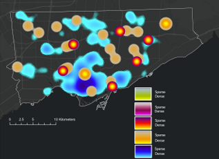
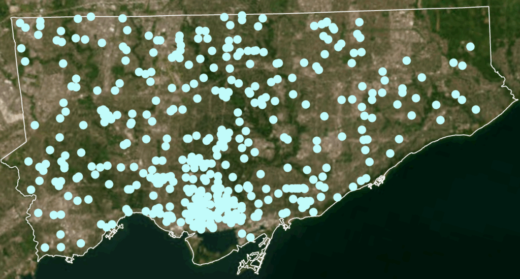
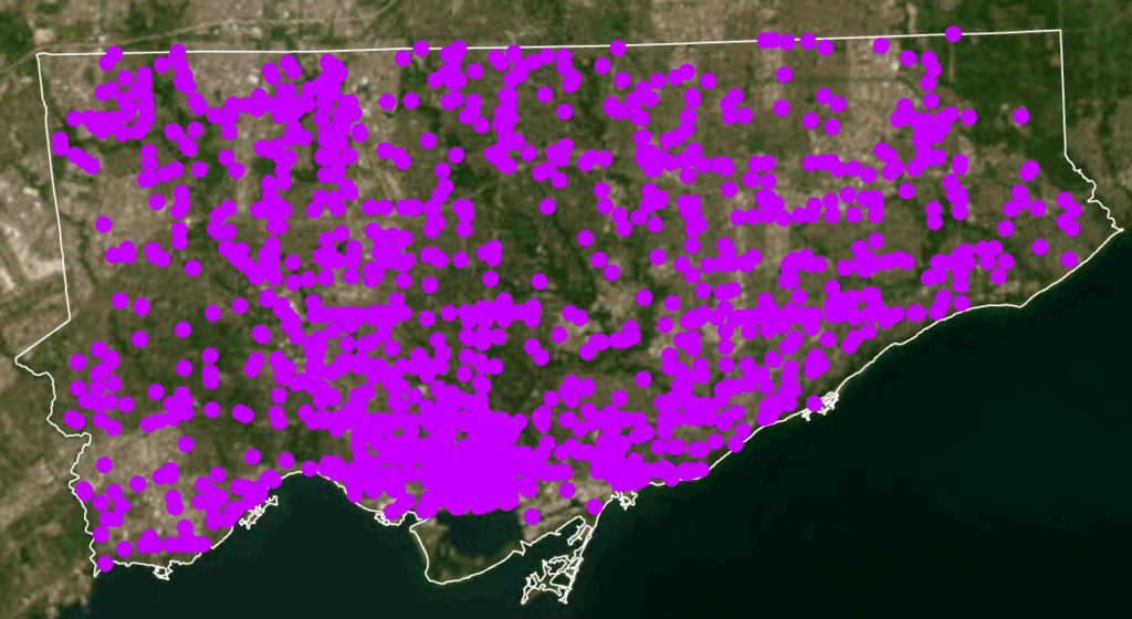
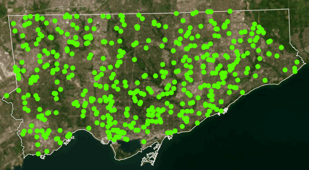
Heat Map: Assault (pink/purple), Auto Theft (green)Homicide (red/yellow), Shooting (Orange), Break and Enter (blue)Toronto Police Open Data Portal, used for crime dataCity of Toronto Open Data Portal, Neighbourhood Profiles, for 2021 Census data
1. Conduct a detailed literature review. Here is the literature review I conducted to address this topic.
2. Downloaded the following data from: Open Data | Toronto Police Service Public Safety Data Portal. Each dataset was filtered to show points only from 2025.
- Dataset: Shooting and Firearm Discharges - Dataset: Homicides - Dataset: Assault - Dataset: Auto Theft - Dataset: Break and Enter
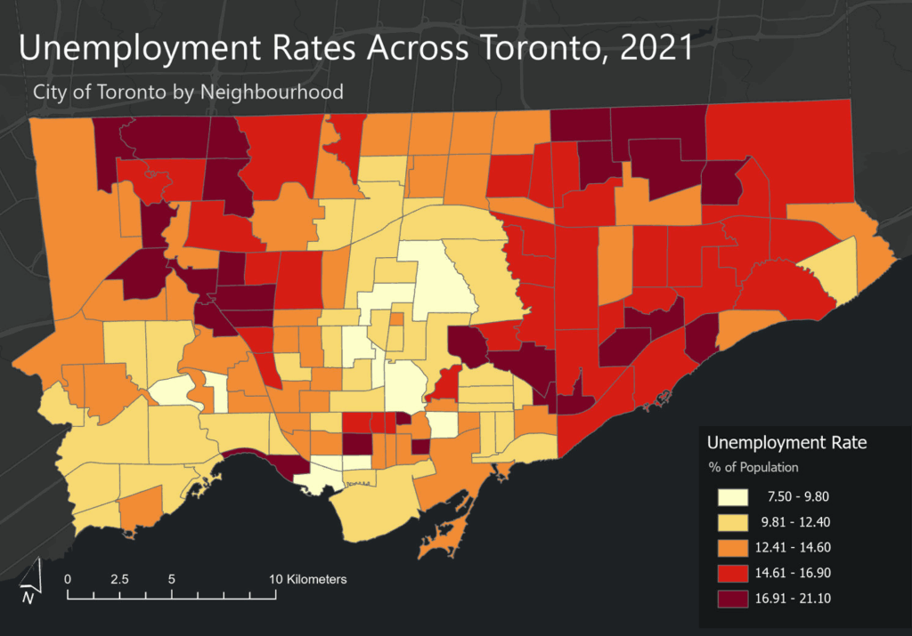
Toronto Neighbourhood Profiles, 2021 Census from: Neighbourhood Profiles - City of Toronto Open Data Portal - Average Total Household Income by Neighbourhood - Unemployment Rates by Neighbourhood
3. After examining the full data sets by year, select a time period to map. In this case, July 2025 which was the month that had the greatest number of crimes to occur this year.
4. Map Setup - Coordinate system: NAD 1983 UTM Zone 17N - Rotation: -17 - Geography: - City of Toronto, ON, Canada - Neighbourhood boundaries from Toronto Open Data Portal
5. Add the crime incident data reports and Toronto’s Neighbourhood Boundary file.
Geospatial Analysis Tools Used Tool - Select by attribute and delete the data that we are not mapping. In this case; From the Attribute Table, Select by Attribute [OCC_YEAR] [is less than] [2025]
Tool - Summarize within Count the number of crime incidents within each of the neighbourhood's boundary polygons for the 5 selected crime types for preliminary analysis and mapping.
Design Tools and Map Types Used - Dot Density - 2025 Crime rates, by type, annual and for July of 2025 - Heat Map - 2025 Crime rates, by type, annual and for July of 2025 - Choropleth - Average Total Household Income, City of Toronto by Neighbourhood - Unemployment Rates Across Toronto, 2021 - Design Tools e.g. convert to graphics
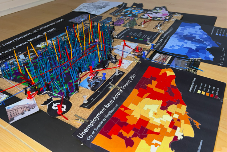
Part 2, Creating the 3D Model
Draft 3D ModelFinal 3D Model
Break and EnterAssaultAuto Theft
Based on literature review and analysis of the presented maps, this model allows for us to further analyze, visually display and record the data and findings. This model will allow for users to see where points are clustering, and examine urban features, land use and the socio-economic context of cluster areas in order to address potential solutions, with equity in mind.
Supplies - Thread, - Painted tooth picks, - Mini clothes pins, - Highlighters, markers etc. - Scissors, - Hot glue - Images of indicators - Relevant/insightful literature research - Socio-Economic Maps: Population Income, unemployment, and density - Crime Maps: Dot density crime by type, heat map of crime distribution by type, from the select 5 crime types, all incidents to occur during the month of July, 2025
Process 1. Attach cork board to poster board;
2. Cut out and place down main maps that have been printed (maps created in ArcGIS Pro, some additional design edits made in Canva);
3. Outline the large or central base map with tacks; use string to connect the tacks outlining the City of Toronto's regional boundary line.
4. Using colour painted tooth picks (alternatively, tacks may be used depending on size limitations), crime incidents can be recorded in real time, using different colours to represent different crime types.
5. Additional data can be added on and joined to other map elements over time. This data could be: images and locations of crime indicators; new literature findings; news reports’ raw data; different map types presenting comparable socio-economic data; community input via email, from consultation meetings, 911 calls, or surveys; graphs; tables; land use type and features and more.
6. Thread is used to connect images and other information to associated areas on the map. In this case, blue string and tacks were used to highlight preventative crime measures and red to represent an indicator of crime.
7. Sticky notes can be used to update the day and month (using a new poster/cork board for each year), under “Time Stamp”
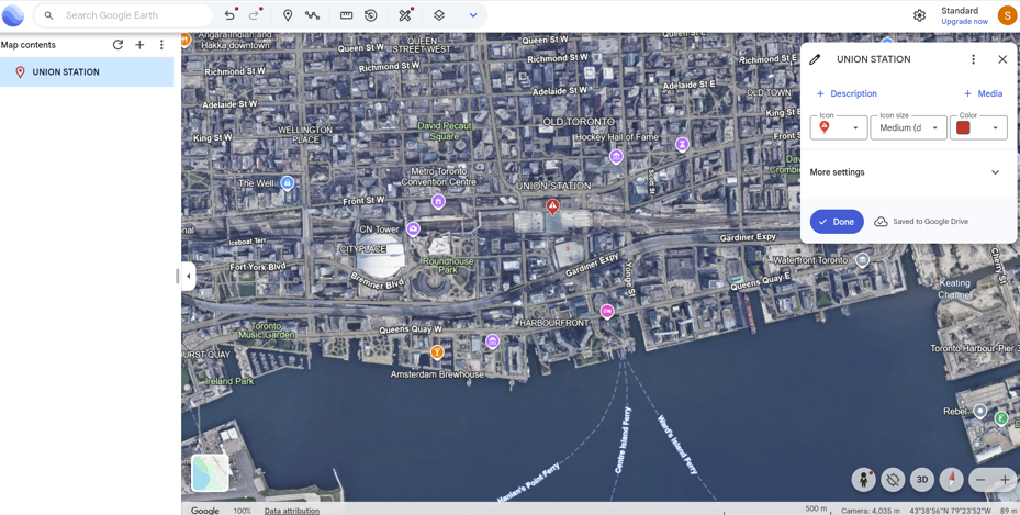
8. Use of Google Earth was applied to further analyze using satellite imagery, a terrestrial layer, and an urban features layer in order to further analyze land use, type, function, and significant features like Union Station - a major public transit connection point, and located within Toronto’s most dense and overall largest crime hot spot.
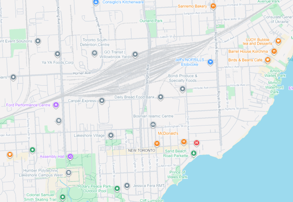
9. A satellite imagery base map in ArcGIS was used to compare large green spaces (parks, ravines, golf courses etc.) with the distribution of each incidence point on the dot map created. Select each point field individually for optimal view and map analysis.
10. Video and Photo content used to display the final results were created using an IPhone Camera and the "iMovie" video editing app.
See photos and videos for reference!
Findings
Socioeconomic and Environmental Indicators of Crime
A consistent theme across the literature and my own findings is the strong connection between neighborhood deprivation and crime. Mansourihanis et al. (2024) emphasize that understanding the “relationship between urban deprivation and crime patterns” supports targeted, long-term strategies for urban safety. Concentrated poverty, population density, and low social cohesion are significant predictors of violence (Mejia & Romero, 2025; M. C. Kondo et al., 2018). Similarly, poverty and weak rule of law correlate more strongly with homicide rates than gun laws alone (Menezes & Kavita, 2025).
Environmental characteristics also influence crime distribution. Multiple studies link greater green space to reduced crime, higher social cohesion, and stronger perceptions of safety (Mejia & Romero, 2025). Exposure to green infrastructure can foster community pride and engagement, further reinforcing crime-preventive effects (Mejia & Romero, 2025). Relatedly, Stalker et al. (2020) show that community violence contributes to poor mental and physical health, with feelings of unsafety directly associated with decreased physical activity and weaker social connectedness.
Other urban form indicators—including land-use mix, connectivity, and residential density—shape mobility patterns that, in turn, affect where crime occurs. Liu, Zhao, and Wang (2025) find that property crimes concentrate in dense commercial districts and transit hubs, while violent crimes occur more often in crowded tourist areas. These patterns reflect the role of population mobility, economic activity, and social network complexity in structuring urban crime.
Crime Prevention and Community-Based Solutions
Several authors highlight the value of integrating built-environment design, green spaces, and community-driven interventions. Baran et al. (2014) show that larger parks, active recreation features, sidewalks, and intersection density all promote park use, while crime, poverty, and disorder decrease utilization. Parks and walkable environments also support psychological health and encourage social interactions that strengthen community safety. In addition, green micro-initiatives—such as community gardens or small landscaped interventions—have been found to enhance residents’ emotional connection to their neighborhoods while reducing local crime (Mejia & Romero, 2025).
At the policy level, optimizing the distribution of public facilities and tailoring safety interventions to local conditions are essential for sustainable crime prevention (Liu, Zhao, & Wang, 2025). For gun violence specifically, trauma-informed mental health care, early childhood interventions, and focused deterrence are recommended as multidimensional responses (Menezes & Kavita, 2025).
Spatial Crime Patterns in Toronto
When mapped across Toronto’s geography, the crime data revealed distinct clustering patterns that mirror many of the relationships described in the literature. Assault, shootings, and homicides form a broad U- or O-shaped distribution that aligns with neighborhoods exhibiting lower average incomes and higher unemployment rates. These patterns echo global findings on deprivation and violence.
Downtown Toronto—particularly the area surrounding Union Station—emerges as the city’s highest-density crime hotspot. This zone features extremely high connectivity, car-centric infrastructure, dense commercial and mixed land use, and limited green space. These conditions resemble those identified by Liu, Zhao, and Wang (2025), where transit hubs and high-traffic commercial districts generate elevated rates of property and violent crime. Google Earth imagery further highlights the concentration of major built-form features that attract large daily populations and mobility flows, reinforcing the clustering of assaults and break-and-enter incidents in the downtown core.
Auto theft is relatively evenly distributed across the city and shows weaker clustering around transit or commercial nodes. However, areas with lower incomes and higher unemployment still show modestly higher auto-theft levels. Break and enter incidents, by contrast, concentrate more strongly in high-income neighborhoods with lower unemployment—suggesting that offenders selectively target areas with greater material assets.
Across all crime categories, one consistent pattern is the notable absence of incidents within large green spaces such as High Park and Rouge National Urban Park. This supports the broader literature connecting green space with lower crime and improved perceptions of safety (Mejia & Romero, 2025; Baran et al., 2014). Furthermore, as described, different kinds of crime occur in low versus high income neighbourhoods emphasizing a need for context specific resolutions that take into consideration crime type and socio-economics.
Synthesis and Relevance for Toronto
Collectively, these findings indicate that crime in Toronto is shaped by intersecting socioeconomic factors, environmental features, and mobility patterns. Downtown crime clustering reflects high density, transit connectivity, and land-use complexity; outer-neighborhood violence aligns with deprivation; and green spaces consistently correspond with lower crime. These patterns mirror global research emphasizing the role of social cohesion, urban form, and economic inequality in shaping crime distribution.
Understanding these relationships is essential for planning decisions around green infrastructure investments, targeted social services, transit-area safety strategies, and neighborhood-specific interventions. Ultimately, integrating environmental design, socioeconomic supports, and community-based programs that support safer, healthier, and more equitable outcomes for Toronto residents.
Geovis Project Assignment, TMU Geography, SA8905, MSA Fall 2025
By Roseline Moseti
Critical decision-making requires access to real-time spatial data, but traditional GIS workflows often lag behind source updates, leading to delayed and sometimes inaccurate visualizations. This project explores an alternative, a Full-Stack Geovisualization Architecture that integrates the database, server and client forming a robust pipeline for low-latency spatial data handling. Unlike conventional systems, this architecture ensures every update in the SQL database is immediately visible through web services on the user’s display, preserving data integrity for time-sensitive decisions. By bridging the gap between static datasets and interactive mapping, the unified platform makes it easier and more intuitive for users to understand complex spatial relationships. Immediate synchronization and a user-friendly interface guarantee that decision-makers rely on the most accurate up to date spatial information when it matters the most.
The Full-Stack Pipeline
The term Full-Stack is key because it means that one has control over integration of every layer of the application ensuring seamless synchronization between the raw data and its interactive visualization.
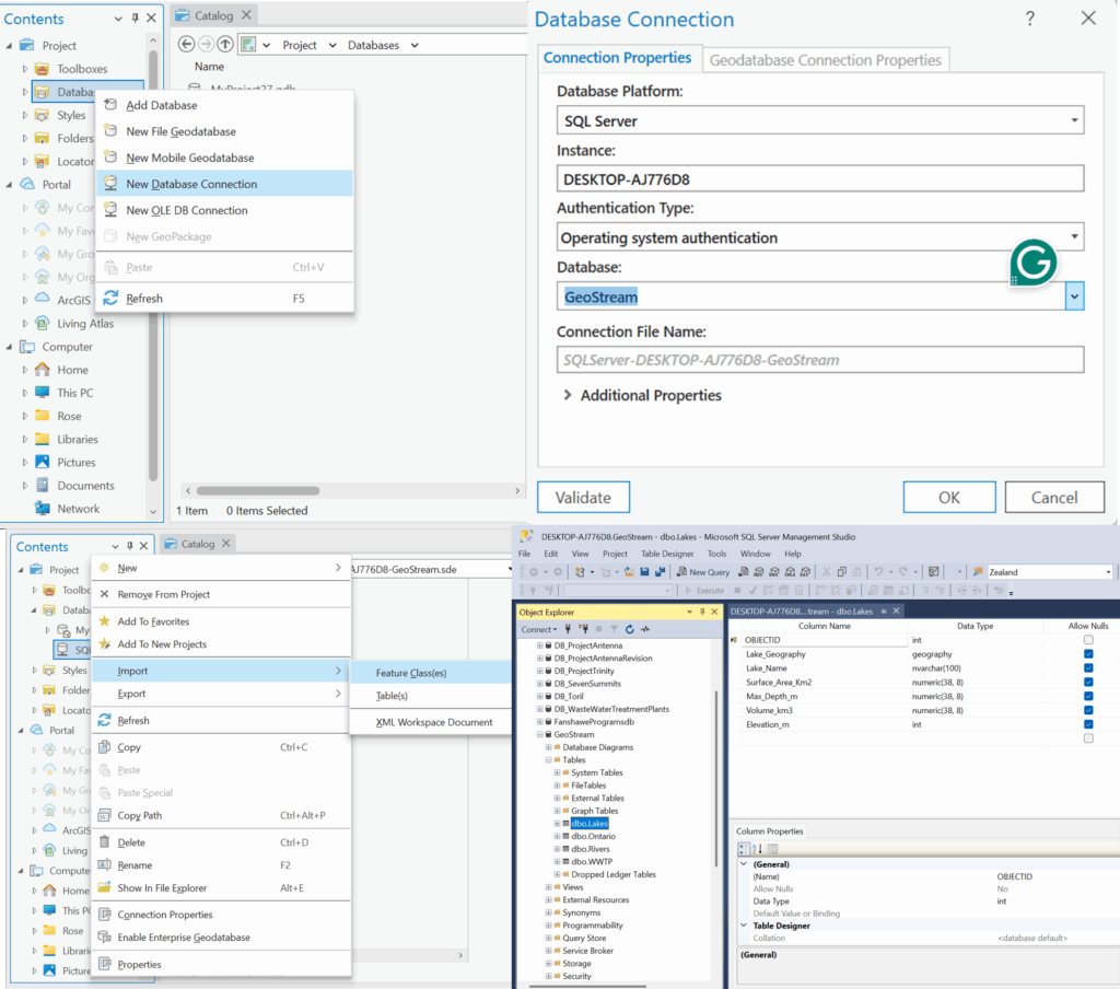
Part 1:Establish the Database Connection
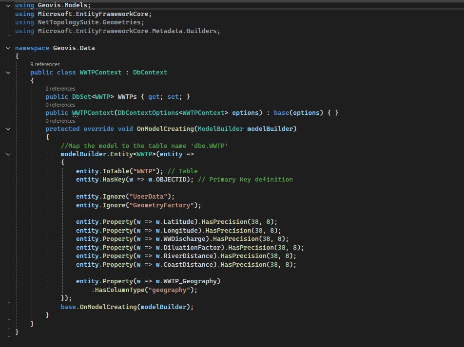
The foundation for this project is reliable data storage. For this project we use Microsoft SQL Server to host our key datasets; Wastewater plants, Lakes, Rivers as well as the Boundary on Ontario. In this initial step the database connection is established between the local desktop GIS environment (ArcGIS) and the Database through the ArcGIS Database Connection file (.sde).
The foundation for this project is reliable data storage. For this project we use Microsoft SQL Server to host our key datasets; Wastewater plants, Lakes, Rivers as well as the Boundary of Ontario. In this initial step the database connection is established between the local desktop GIS environment (ArcGIS) and the Database through the ArcGIS Database Connection file (.sde).
Once the connection is verified, ArcGIS tools are used to import the shapefile data directly into the SQL Server structure. This transforms the SQL database into an Enterprise Geodatabase, which is a spatial data model capable of storing and managing complex geometry.
The result is a highly structured repository where all attribute data and spatial features are stored, managed and indexed by the SQL engine.
Part 2: The Backend: Data Access & APIs
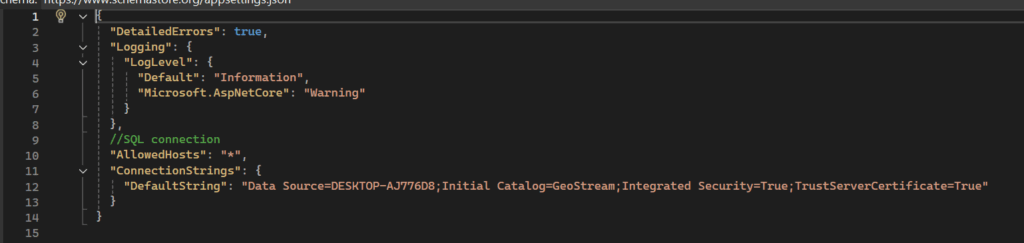
With the spatial data centralized in the SQL Database, the next part is creating the connection to serve this data to the web. The Backend is the intermediary between the database and the end-user display. The crucial first step is establishing the programmatic connection to the database using a secure Connection String. The key aspects here is the server name of the database and the name of the database itself as without the correct details here the data won’t be retrieved from the database.
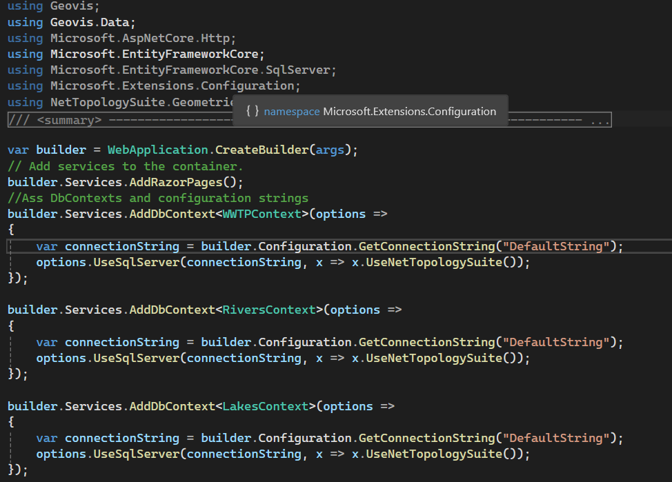
To translate the raw database connection into usable web services, ASP.NET Core and Entity Framework are used for data management. Setting this up, the API endpoints that the front-end application will call are set. This structure ensures that the web application interacts only with the secure, controlled services provided by the backend, maintaining both security and data integrity.
When a user loads the site, the entire system is triggered, and the user’s web browser sends a request to the server and the server using C# accesses the database, pulls the relevant spatial data and transforms it. The server packages the processed data into a web-ready format and sends it back to the browser. The browser instantly reads that package and draws the interactive map on your screen.
Part 3: Data Modelling: Mapping the Shapefiles to the Code
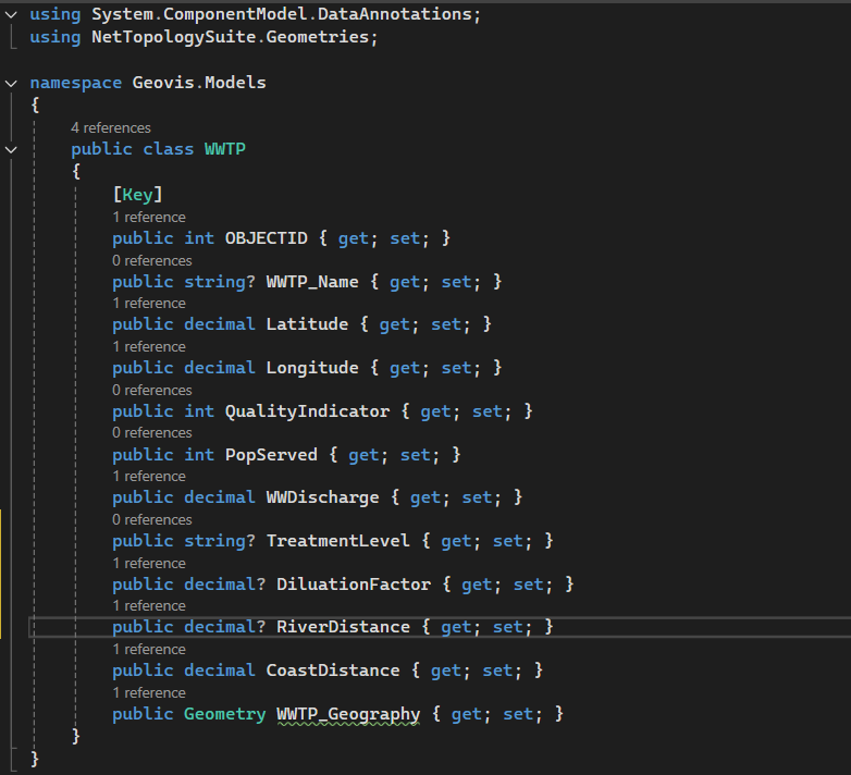
Before spatial data can be accessed by the backend services, the application must understand how the data is structured and how it corresponds to the tables created in the SQL Database. This is handled by the data model for each of the shapefiles, reflecting the individual columns in each of the shapefiles.
The data context is where the C# model is explicitly mapped to the database structure using Entity Framework Core, ensuring data synchronization and proper interpretation.
This robust modelling process ensures that the data pulled from the SQL Database is always treated as the original spatial data, ready to be processed by the backend and visualized on the frontend.
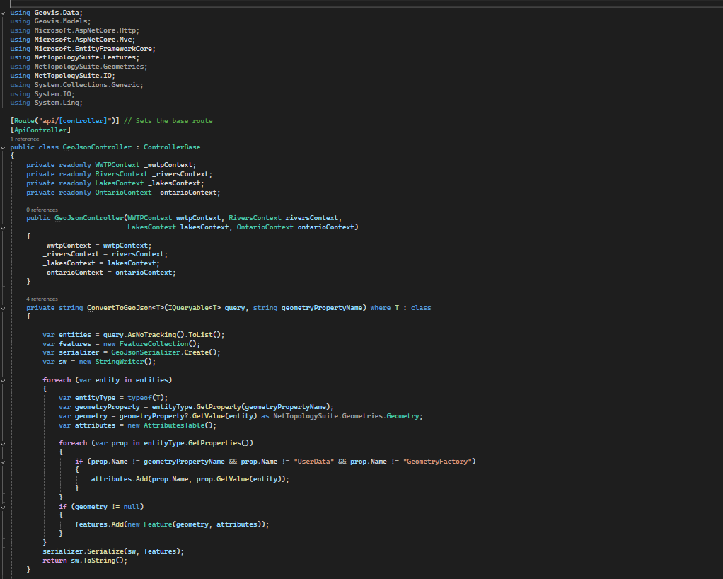
Part 4: Data Translation Engine (C# and GeoJSON)
The SQL Database stores location data using accurate, specific data types that are native to the server environment (e.g., geometry or geography). A web browser doesn’t understand these data types and it needs data delivered in a simpler, lighter, and universally readable format. This is where the translation engines come into work and it’s powered by C# back-end logic.
C# acts as the translator and it pulls the coordinate data from the SQL database. The data is then converted into GeoJSON which is a simple standardized, text-based format that all modern web mapping libraries understand. By converting everything to GeoJSON, the C# back-end creates a single, clean package that ensures data consistency and allows the map to load quickly and without errors, regardless of the user’s device or operating system.
Part 5: The Front-end: Interactive Visualization
The most visible piece of the puzzle is the Interactive Presentation. This is the key deliverable which entails embedding a powerful Geographic Information System (GIS) entirely within the user’s browser. The traditional desktop GIS software is bypassed, and users don’t need to install anything, purchase licenses or even use any complex interface but just open a web page.
The real power lies in the integration between the frontend and the backend services established. When a user loads the site, the entire system is triggered and the user’s web browser sends a request to the server and the server using C# API accesses the database, pulls the relevant spatial data and transforms it. The server packages the processed data into a web-ready format and sends it back to the browser. The browser instantly reads that package and draws the interactive map on the screen.
Once the GeoJSON data arrives, a JavaScript mapping library is used to render the interactive map. The presentation is a live tool designed for exploring data. Users can click on any WWTP icon or river line to instantly pull up its database attribute. The map is displayed alongside all supporting elements that provide further details on the browser without a user needing to leave the browser window.
Looking Ahead!
The Full-Stack architecture is not just for current visualization but it’s about establishing a powerful scalable platform for the future. As the server side is already robust and designed to process large geospatial datasets, it is perfectly created for integration of more advanced features. This structure allows for seamless addition of modules for complex analysis like using Python for predictive simulations or proximity modeling. The main benefit is that when these complex server-side analyses are complete, the results can be immediately packaged into GeoJSON and visualized on the existing map interface, turning static data into dynamic, predictive insights.
This Geovis project is designed to be the foundational geospatial data hub for Ontario’s water management, built for both current display needs and future analytical challenges.
SA8905 – Master of Spatial Analysis, Toronto Metropolitan University
A Geovizualization Project by Yulia Olexiuk.
Introduction
A common known fact is that all marathons are the same length, but are they created equal? Long distance running performance depends on more than just fitness and training. The physical environment plays a significant role in how runners exert effort. Whether it be terrain, slope, humidity, or temperature, marathons around the world present distinct geographic challenges. In this case, three races in three continents are compared. Boston’s rolling topography often masks the difficulty of its course such as its infamous Heartbreak Hill, and Singapore’s hot and humid climate has athletes start running before dawn to beat the sun.
Data
GPS data for the Boston, Berlin, and Singapore Marathons were sourced from publicly available Strava activities, limited to routes that runners had marked as public. The marathon data was ensured that it consisted of dense point resolution, clean timestamps, and minimal GPS noise and then downloaded as .GPX files.
Figure 1. Getting .GPX data from Strava.
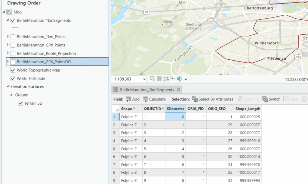
Using QGIS, the .GPX files were first inspected and cleaned and then converted to GeoPackage format and imported into ArcGIS Pro, where they were transformed into both point feature classes and polyline feature classes. The polyline class was then projected using appropriate city-specific coordinate systems (ETRS89 / UTM Zone 33N and NAD83 / Massachusetts Mainland, etc). The DEMs were sourced from the LivingAtlas database and are labeled as Terrain3D.
I used the Open-Meteo API to make queries for each marathon’s specific race day, narrowing the geographic coordinates, local timezone, and hourly variables including temperature (degC), humidity (%), wind speed (km/h), and precipitation(mm). It was integrated into ArcGIS Pro’s Add Surface Information and Extract Multi-Values to Points tools to derive slope, elevation range, and elevation gain per kilometre. The climate data was collected through an API which returned the data in JSON format. It was converted to .CSVs with Excel Power Query.
Software/Tools
ArcGISPro: Used to transform the data and make web layers, map routes, and calculate the field to get valuable runner information.
QGIS: Used to clean and overlook the .gpx files imported from Strava.
Experience Builder: Used to create an interactive dashboard for the geospatial data.
Methodology
The workflow for this project began with extensive preprocessing of GPS track data sourced from public Strava activities. Each GPX file was inspected, cleaned, and converted into usable spatial geometry and re-projecting all layers into city-appropriate projected coordinate reference systems. The fields were then calculated for pace per kilometre, elevation gain per kilometre, maximum slope, and mean slope, using a combination of the Generate Points Along Lines, Split Line at Measure, and Add Surface Information tools.
Figure 2. GPX point layer undergoing a spatial join.
The visualization design was the main cornerstone of the project’s approach. Thus, race maps employed accessible, easy-to-comprehend gradients to represent sequential variables such as pace, slope, and elevation gain, while the dashboard created through Experience Builder enabled dynamic comparison across the three cities.
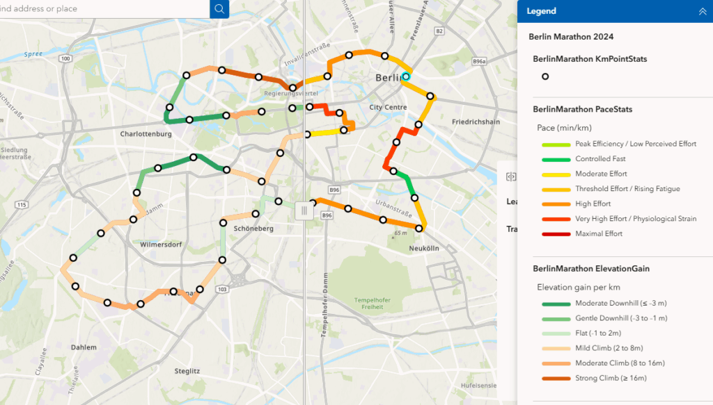
Figure 3. Slider showing the patterns and relationships between average pace and elevation of the Berlin marathon.
Results and Discussion
Relationship between Pace and Terrain
Berlin displays the most consistent and fastest pacing profile, with minimal variation in both slope and elevation gain of only 27 metres of elevation difference.
On the other hand Boston showed more variability by each consecutive marker due to its hilly terrain. The geovisualizations clearly highlight slowdowns associated with climb leading to Heartbreak Hill, followed by pace recoveries on downhill segments.
Surprisingly, the Singapore marathon route had a different performance dynamic but not in the way that was initially assumed. In addition to its exact elevation difference as Boston of 135 metres. Participants would also face more environmentally-centred constraints, not only terrain-based difficulty.
Pacing inconsistency can coincide with high humidity and hot overnight temperatures really showing viewers how tropical climate conditions can inflict a different form of endurance.
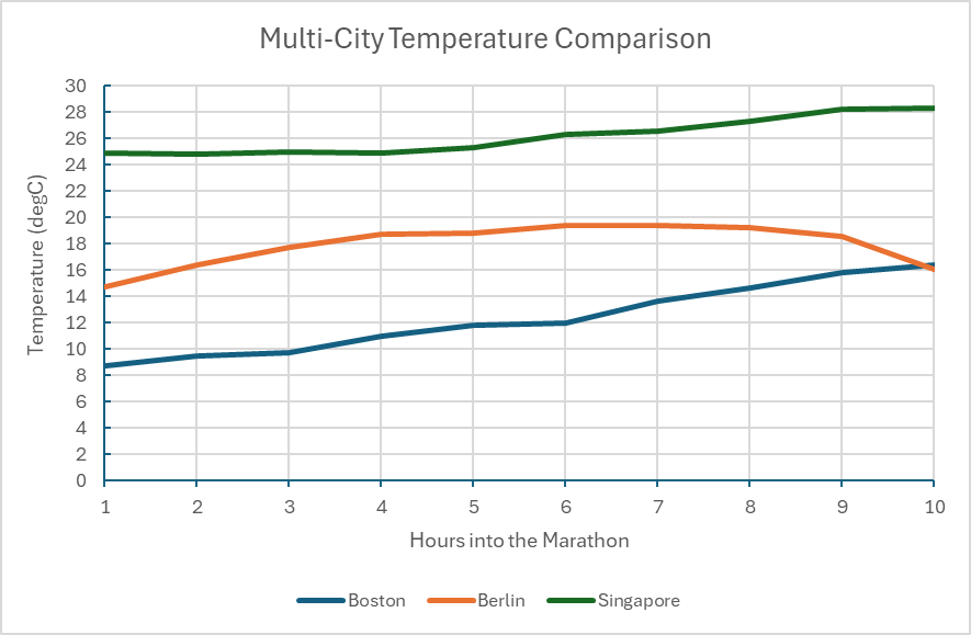
Figure 4. Chart demonstrating the recorded temperature in degrees Celsius at the time of each race day. Note that the date was omitted due to the differing years, days, and months of each marathon so the duration of the race is the primary focus.
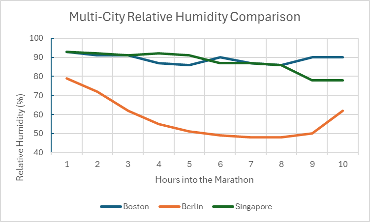
Figure 5. Chart comparing the relative humidity (%) between the marathon cities during race day.
Environmental Conditions and Weather During Race Day
It’s interesting to note that each city hosts their marathon at very different times throughout the year. For example, the Boston marathon used in the case study was held on April 17th, 2023. Berlin hosted their race on September 24th, 2023, and Singapore hosted their annual marathon on December 2nd, 2012. Boston usually started their race around 8:00 AM, Berlin usually starts an hour later at 9:00am local time. Lastly, Singapore begins the marathon at 4:30AM, assumingly to avoid the midday heat, which reaches high 30 degrees Celsius by noon.
This integration of hourly weather data highlights how climate interacts with geography to shape athletic effort. Berlin demonstrates ideal running conditions having cool and stable temperature along with stable wind speeds, which makes sense of the fast, consistent pacing. Boston shows slightly more variable weather, perhaps being on the New England Coast, Singapore saw the most influential weather impact with the humidity exceeding 80% for majority of the race (Figure 5) and persistent hot temperatures even throughout the night before.
Limitations
I experienced many limitations making this geovisualization including the fact that the project relies on public Strava .GPX data, which could vary in precision due to the accuracy of runner’s device whether it be phone or watch, or even satellite reception.
Also, though it was a good idea to use the data of some top performers of the marathon to get a good idea of where a well conditioned athlete naturally takes more time and slows their pace, I wished more average participant data was available to have a more averaged experience mapped.
Furthermore, I was unable to match the weather data directly to specific kilometres and instead had it serve as contextual aids rather than precise environmental measurements.
Conclusion
I think this geovisualization project does an effective job demonstrating how terrain, and climate distinctly shape marathon performance across Boston, Berlin, and Singapore and I believe that visuals like these can be super fascinating just to satisfy curiosity or plan strategically for a race in the future. Happy Mapping!
Hey everyone! For my Geovisualization project, I wanted to explore something familiar, cultural, and globally recognizable: the international expansion of Tim Hortons. Although the brand is iconic in Canada, fewer people know just how far it has spread across the world. My goal was to create an interactive, chronological StoryMap that guides viewers through the first Tim Hortons location in every country where the brand operates. To do this, I combined online research, geographic coordinates, and a storytelling platform that lets users “travel” from country to country using a next-slide navigation system. The result is an easy-to-follow visual timeline that maps the company’s journey from Hamilton to the Middle East, Asia, and beyond.
Step 1: I began by compiling a list of all countries where Tim Hortons has opened at least one store. Since there is no single authoritative dataset, I had to build this list manually.
I used official Tim Hortons country pages and local news sources (e.g., CBC News, Bahrain News, Malaysia Lifestyle Asia)
These articles helped me confirm: The country, the city and address of the first-ever location and when the year the branch opened.
Because accuracy matters in mapping, I double-checked every location to make sure my information was credible, date-verified, and sourced properly.
Step 2: Finding Coordinates for Each First Store
Once I confirmed each opening location, I searched for latitude and longitude using Google Maps
This ensured that the map zooms into the exact spot of each first store instead of a general city view. If a building no longer existed or the listing wasn’t clear, I used the most reliable archival address information available.
Step 3: Creating the StoryMapJS Project
After gathering all my data, I went to StoryMapJS (Knight Lab), signed in, and created a new project. I gave it a title that reflects the purpose of the visualization: showing Tim Hortons’ global growth through time.
StoryMapJS works slide-by-slide. Each slide represents a location on the map paired with text and an image. Because the platform automatically pans to your coordinates, it creates a smooth storytelling experience.
Step 4: Designing the Title Page
My first slide acts as a title/introduction page.
I left the location fields empty so that StoryMapJS wouldn’t zoom anywhere yet. Instead, I wrote a short explanation of the project meaning what it shows, why I chose the topic, and how to navigate the timeline.
This gives viewers context before they begin clicking through the countries.
Step 5: Adding Slides for Each Country
This is where the main work happens.
For every country, I clicked “Add Slide” on the left panel. Entered the country’s name, put in the latitude and longitude, added a title, wrote a short description with the in-text citation of the source. I inserted an image that visually represents the branch
StoryMapJS then automatically zooms into the exact coordinates and animates the movement from one country to the next
This creates a chronological touring experience, allowing viewers to follow Tim Hortons’ global expansion in the order it happened.
Step 6: Adding a Final References Slide
Because this project relies heavily on online sources, I added a final references slide listing all of the sources i used. I made sure to use APA citations.
Step 7: Publishing the StoryMap
When all slides were complete, I clicked:
“Save”, then “Publish Changes”
Then “Share” and finally “Copy Public Link”
This generated a shareable URL that can be posted online, embedded, or submitted for grading.
I hope this tutorial was helpful! Here is the link to check my geovis project yourself! Along with a QR code:
A Geovisualization Project by Rukiya Mohamed SA8905 – Master of Spatial Analysis, Toronto Metropolitan University
As Toronto pushes toward a cleaner, electrified future, electric vehicles (EVs) are steadily becoming part of the urban landscape. But adoption isn’t uniform, some neighbourhoods surge ahead, others lag behind, and the geography of the transition tells an important story.
For this project, I created a time-series animation in ArcGIS Pro that maps how EV ownership has grown year by year across Toronto’s Forward Sortation Areas (FSAs) from 2022 to 2025. Instead of four static maps, the animation brings the data to life, showing how adoption spreads, accelerates, and concentrates across the city.
Background: Why Map EV Adoption?
EVs are central to Toronto’s climate goals, but adoption reflects deeper social and economic patterns. Mapping where EVs are growing helps us understand:
Which neighbourhoods lead the transition
Which areas may require more investment in charging infrastructure
How adoption relates to broader demographic and mobility trends
Where planning and policy may be falling out of sync with real demand
This project focuses on how the transition is happening across Toronto—not as a single snapshot but as a dynamic temporal process.
Data Sources
1. Ontario Data Portal – Electric Vehicles by Forward Sortation Area
Battery Electric Vehicles (BEVs)
Plug-in Hybrid Electric Vehicles (PHEVs)
Total EVs
Quarterly counts (Q1 2022 → Q1 2025)
Aggregated by FSA (e.g., M4C, M6P)
2. Toronto Open Data Portal – FSA Boundary File
Used to isolate FSAs located within the City of Toronto
Provides the spatial geometry needed for mapping
Methodology
This workflow combines Excel preprocessing with ArcGIS Pro spatial joins and animation tools. Below is the full process with a clear tutorial so readers can replicate it.
Step 1: Cleaning EV Data in Excel
The raw EV file arrived as a single unformatted line. To prepare it:
Used TRIM() and TEXT-TO-COLUMNS to separate fields into:
FSA
BEVs
PHEVs
Total EVs
Year/Quarter
Created four separate datasets for:
2022
2023
2024
2025
Saved each file as a CSV for import into ArcGIS Pro.
Step 2: Bringing Data into ArcGIS Pro
Imported the Toronto FSA shapefile.
Imported each annual EV CSV.
Performed a Table → Spatial Join using the common FSA code.
Calculated EVs per 1000 persons using population from the Toronto boundary attributes.
Created four clean layers, one per year, ready for mapping.
Step 3: Building Choropleth Maps (2022–2025)
For each year layer:
Applied graduated colours to map total EVs (or EVs per 1000 people).
Used a consistent classification scheme to ensure comparability.
Selected a warm-to-cool colour ramp to highlight hotspots vs. low-adoption areas.
This produced four individually interpretable annual maps.
But the real magic comes next.
Step 4: Creating the EV Time-Series Animation in ArcGIS Pro
1. Enable Animation
Go to the View tab → Add Animation A timeline appears at the bottom of the screen.
2. Set Keyframes
For each year layer:
Turn ON only the layer for that year.
Set symbology and map extent exactly as desired.
Click Create Keyframe. Result:
Keyframe 1 = 2022
Keyframe 2 = 2023
Keyframe 3 = 2024
Keyframe 4 = 2025
3. Adjust Timing
Set transitions between keyframes to 2–3 seconds each.
Add fades if desired for smoother blending.
4. Export the Video
Go to Share → Export Animation
Output as MP4 at 1080p for clean blog-quality visuals
The final result is a smooth year-to-year playback of EV expansion across Toronto.
Results: What the Animation Reveals
The time-series visualization shows clear geographic patterns:
Downtown and midtown FSAs lead early adoption, reflecting higher incomes and better access to early charging infrastructure.
Inner suburbs show accelerating year-to-year growth, especially from 2023 onward.
By 2025, EV ownership forms a distinct corridor of high adoption stretching from the waterfront north through midtown and over to Etobicoke and North York.
Seeing these shifts unfold dynamically (rather than as four separate maps) reveals momentum, not just differences.
Menusan Anantharajah, Geovis Project Assignment, TMU Geography, SA8905, Fall 2025
Hello, this is my blog post!
My Geovis project will explore the realms of 3D mapping and printing through a multi-stage process that utilizes various tools. I have always had a small interest in 3D modelling and printing, so I selected this medium for the project. Although this is my first attempt, I was quite pleased with the process and the results.
I decided to map out a simplified Socioeconomic Status (SES) Index of Toronto’s neighbourhoods in 2021 using the following three variables:
Median household income
Percentage of population with a university degree
Employment rate
It should be noted that since these variables exist on different scales, they were standardized using z-scores and then scaled to a 0-100 range. The neighbourhoods will be extruded by the SES index value, meaning that neighbourhoods scoring high will be taller in height. I chose SES as my variable of choice since it would be interesting to physically visualize the disparities and differences between the neighbourhoods by height.
A variety of tools were used for this project, including:
Excel (calculating the SES index and formatting the table for spatial analysis)
ArcGIS Pro (spatially joining the neighbourhood shapefile with the SES table)
shp2stl* (takes the spatially joined shapefile and converts it to a 3D model)
Blender (used to add other elements such as title, north arrow, legend, etc.)
Microsoft 3D Builder** (cleaning and fixing the 3D model)
Ultimaker Cura (preparing the model for printing)
* shp2stl would require an older node.js installation ** Microsoft 3D Builder is discontinued, though you can sideload it
Process
Step 1: Calculate the SES index values from the Neighbourhood Profiles
The three SES variables (median household income, percentage of population with a university degree, employment rate) were extracted from the Neighbourhood Profiles table. Using Microsoft Excel, these variables were standardized using z-scores, then combined into a single average score, and finally rescaled to a 0-100 range. I then prepared the final table for use in ArcGIS Pro, which included the identifiers (neighbourhood names) with their corresponding SES values. After this was done, the table was exported as a .csv file and brought over to ArcGIS Pro.
Step 2: Create the Spatially Joined Shapefile using ArcGIS Pro
The neighbourhood boundary file and the newly created SES table were imported into ArcGIS Pro. Using the Add Join feature, the two data sets were combined into one unified shapefile, which was then exported as a .shp file.
The figure above shows what the SES map looks like in a two-dimensional view. The areas with lighter hues represent neighbourhoods with low SES values, while the ones in dark green represent neighbourhoods with high SES values.
Step 3: Convert the shapefile into a 3D model file using shp2stl
Before using shp2stl, make sure that you have an older version of node.js (v11.15.0) and npm (6.7.0) installed. I would also recommend placing your shapefile in a new directory, as it can later be utilized as a Node project folder. Once the shapefile is placed in a new folder, you can open the folder in Windows Terminal (or Command Prompt) and run the following:
npm install shp2stl
This will bring in all the necessary modules into the project folder. After that, the script can be written. I created the following script:
This script was ‘compiled’ using Visual Studio Code; however, you can use any compiler or processor (even Notepad works). This script was then saved to a .js file in the project folder. The script was then executed in Terminal using this:
node shapefile_convert.js
The result is a 3D model that looks like this:
Since we only have Toronto’s neighbourhoods, we have to import this into Blender and create the other elements.
Step 4: Add the Title, Legend, North Arrow and Scale Bar in Blender
The 3D model was brought into Blender, where the other map elements were created and added alongside the core model. To create the scale bar for the map, the 3D model was overlaid onto a 2D map that already contained a scale bar, as shown in the following image.
After creating the necessary elements, the model needs to be cleaned for printing.
Step 5: Cleaning the model using Microsoft 3D Builder
When importing the model into 3D Builder, you may encounter this:
Once you click to repair, the program should be able to fix various mesh errors like non-manifold edges, inverted faces or holes.
After running the repair tool, the model can be brought into Ultimaker Cura.
Step 6: Preparing the model for printing
The model was imported into Ultimaker Cura to determine the optimal printing settings. As I had to send this model to my local library to print, this step was crucial to see how the changes in the print settings (layer height, infill density, support structures) could impact the print time and quality. As the library had an 8-hour print limit, I had to ensure that the model was able to be printed out within that time limit.
With this tool, I was able to determine the best print settings (0.1 mm fine resolution, 10% infill density).
With everything finalized from my side, I sent the model over to be printed at the library; this was the result:
Overall, the print of the model was mostly successful. Most of the elements were printed out cleanly and as intended. However, the 3D text could not be printed with the same clarity, so I decided to print out the textual elements on paper and layer them on top of the 3D forms.
The following is the final resulting product:
Limitations
While I am still satisfied with the end result, there were some limitations to the model. The model still required further modifications and cleaning before printing; this was handled by the library staff at Burnhamthorpe and Central Library in Mississauga (huge shoutout to them). The text elements were also messy, which was expected given the size and width of the typeface used. One improvement to the model would be to print the elements separately and at a larger scale; this would ensure that each part is printed more clearly.
Closing Thoughts
This project was a great learning experience, especially for someone who had never tried 3D modelling and printing before. It was also interesting to see the 3D map highlighting the disparities between neighbourhoods; some neighbourhoods with high SES index values were literally towering over the disadvantaged bordering neighbourhoods. Although this project began as an experimental and exploratory endeavour, the process of 3D mapping revealed another dimension of data visualization.
References
City of Toronto. (2025). Neighbourhoods [Data set]. City of Toronto Open Data Portal. https://open.toronto.ca/dataset/neighbourhoods/
City of Toronto. (2023). Neighbourhood profiles [Data set]. City of Toronto Open Data Portal. https://open.toronto.ca/dataset/neighbourhood-profiles/