Interactive Earthquake Visualization Map

Hamid Zarringhalam

Geovis Project Assignment, TMU Geography, SA8905, Fall 2025

Welcome to Hamid Zarringhalam’s blog!
In this blog, I present a tutorial for the app that I developed to visualize near real time global earthquake data.


Introduction

In an increasingly data driven world, the ability to visualize complex spatial information in real time is essential for decision making, analysis, and public engagement. This application leverages the power of D3.js, a dynamic JavaScript library for data-driven documents, and Leaflet.js, a lightweight open-source mapping library, to create an interactive real-time visualization map.

By combining D3’s flexible data binding and animation capabilities with Leaflet’s intuitive map rendering and geospatial tools, the application enables users to explore live data streams activity and directly on a geographic interface.

The goal is to provide a responsive and visually compelling platform that not only displays data but also reveals patterns, trends, and anomalies as they unfold.

Data Sources

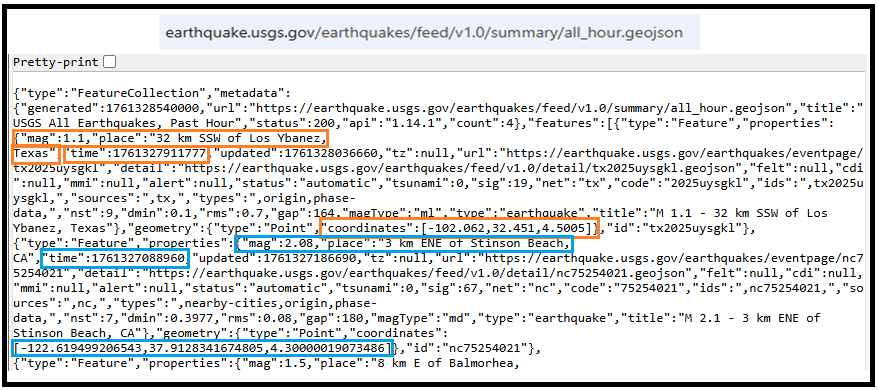
The USGS.gov provides scientific data about natural hazards, the health of our ecosystems and environment, and collects a massive amount of data from all over the world all the time. It provides earthquake data in several formats and updated every 5 minutes.

Here is the link to USGS GeoJSON Feeds: “http://earthquake.usgs.gov/earthquakes/feed/v1.0/geojson.php”

When you click on a data set, for example ‘All Earthquakes from the Past 7 Days’, you will be given a JSON representation of that data. You will be using the URL of this JSON to pull in the data for the visualization. Included popups that provide additional information about the earthquake when a marker is clicked.

For example: “https://earthquake.usgs.gov/earthquakes/feed/v1.0/summary/all_hour.geojson” contains different objects that show different earthquakes.

The Approach  

Real-time GeoJSon online earthquake data will be fetched from USGS. These Data will be processed through D3.js functions and will be displays as circle markers on different map using MapBox API, styled by magnitude and grouped by time intervals and create a map using Leaflet that plots all of the earthquakes from your data set based on their longitude and latitude.

There are three files that are created and used in this application

  1. HTML file that creates a web-based earthquake visualization tool. It loads a Leaflet map and uses JavaScript (via D3 and Leaflet) to fetch and display real-time earthquake data with interactive markers.
  2. Styles for style the map with CSS
  3. Java script which creates an interactive web map that visualizes real-time earthquake data from the USGS (United States Geological Survey) using Leaflet.js and D3.js.

Leaflet in the script is used to create an interactive, web-based map that visualizes earthquake data in a dynamic and user-friendly way. Leaflet provides the core functionality to render a map.

Leaflet is JavaScript library and great for displaying data, but it doesn’t include built-in tools for fetching or manipulating external data.

D3.js in this script is used to fetch and process external data specifically, the GeoJSON earthquake feeds from the USGS, and Popups, color and Circlemarker will be called in D3.js

Steps of creating interactive maps

Step 1. Creating the frame for the visualization using HTML

HTML File:

<html lang=”en”>

<head>

  <meta charset=”UTF-8″>

  <meta name=”viewport” content=”width=device-width, initial-scale=1.0″>

  <meta http-equiv=”X-UA-Compatible” content=”ie=edge”>

  <title>Leaflet Step-2</title>

  <!– Leaflet CSS –>

  <link rel=”stylesheet” href=”https://unpkg.com/leaflet@1.6.0/dist/leaflet.css”

    integrity=”sha512-xwE/ Az9zrjBIphAcBb3F6JVqxf46+CDLwfLMHloNu6KEQCAWi6HcDUbeOfBIptF7tcCzus KFjFw2yuvEpDL9wQ==”

    crossorigin=”” />

  <!– Our CSS –>

  <link rel=”stylesheet” type=”text/css” href=”static/css/style.css”>

</head>

<body>

  <!– The div that holds our map –>

  <div id=”map”></div>

  <!– Leaflet JS –>

  <script src=”https://unpkg.com/leaflet@1.6.0/dist/leaflet.js”

    integrity=”sha512-rVkLF/ 0Vi9U8D2Ntg4Ga5I5BZpVkVxlJWbSQtXPSiUTtC0TjtGOmxa1AJPuV0CPthew==”

    crossorigin=””></script>

  <!– D3 JavaScript –>

  <script type=”text/javascript” src=”https://cdnjs.cloudflare.com/ajax/libs/d3/4.2.3/d3.min.js”></script>

  <!– API key –>

  <script type=”text/javascript” src=”static/js/config.js”></script>

  <!– The JavaScript –>

  <script type=”text/javascript” src=”static/js/logic2.js”></script>

</body>

</html>

Step 2. Fetching Earthquake Data

This section of the App defines four URLs from USGS and assigns them to four variables:


Js codes for fetching the data from USGS:

var earthquake1_url = “https://earthquake.usgs.gov/earthquakes/feed/v1.0/summary/all_hour.geojson”

var earthquake2_url = “https://earthquake.usgs.gov/earthquakes/feed/v1.0/summary/all_day.geojson”

var earthquake3_url = “https://earthquake.usgs.gov/earthquakes/feed/v1.0/summary/all_week.geojson”

var earthquake4_url = “https://earthquake.usgs.gov/earthquakes/feed/v1.0/summary/all_month.geojson”

Step 3. Processing the data

D3.js is used for processing the data. Leaflet CircleMarker library and Color function will be called in this D3.js

Js codes for processing the data:

var earthquake3 = new L.LayerGroup();

//Here is the code for gathering the data when user chooses the 3rd option which is //all week earthquake information

d3.json(earthquake3_url, function (geoJson) {

    //Create Marker

    L.geoJSON(geoJson.features, {

        pointToLayer: function (geoJsonPoint, latlng) {

            return L.circleMarker(latlng, { radius: markerSize(geoJsonPoint.properties.mag) });

        },

        style: function (geoJsonFeature) {

            return {

                fillColor: Color(geoJsonFeature.properties.mag),

                fillOpacity: 0.7,

                weight: 0.1,

                color: ‘black’

            }

        },

        // Add pop-up with related information

        onEachFeature: function (feature, layer) {

            layer.bindPopup(

                “<h4 style=’text-align:center;’>” + new Date(feature.properties.time) +

                “</h4> <hr> <h5 style=’text-align:center;’>” + feature.properties.title + “</h5>”);

        }

    }).addTo(earthquake3);

    createMap(earthquake3);

});

Step 4. Creating proportional Circle Markers

The circle markers reflect the magnitude of the earthquake. Earthquakes with higher magnitudes appear larger and darker in color.

The circle marker Leaflet library is called in above D3.js code. Uses Color(magnitude) to assign color based on the magnitude:

Function Color(magnitude) { different color for different size of Magnitude}

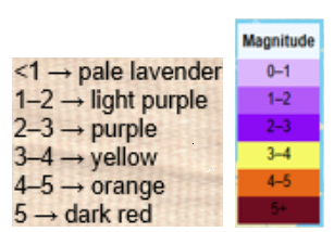
Function Color odes:

This function creates different colors for different magnitudes. This function will be called by D3.js and is highlighted in above code.

function Color(magnitude) {

        if (magnitude > 5) {

          return  “#6E0C21”;

        } else if (magnitude > 4) {

            return “#e76818”;

        } else if (magnitude > 3) {

            return “#F6F967”;

        } else if (magnitude > 2) {

            return “#8B0BF5”;

        } else if (magnitude > 1) {

            return “#B15AF8”;

        } else {

            return ‘#DCB6FC’

        }

      };

Step 5. Mapping the information using MapBox API

By choosing a different tile a different base map will be visualized, and it is through API to MapBox.

 var baseLayers = {

        “Tiles”: tiles,

        “Satellite”: satellite,

        “Terrain-RGB”: terrain_rgb,

        “Terrian”: Terrian

    };

Code for choosing the selected title through API to MapBox:

function createMap() {

   // Tile layer (initial map) whhich comes from map Box

    var tiles = L.tileLayer(“https://api.mapbox.com/styles/v1/{id}/tiles/{z}/{x}/{y}?access_token={accessToken}”, {

        attribution: “© <a href=’https://www.mapbox.com/about/maps/’>Mapbox</a> © <a href=’http://www.openstreetmap.org/copyright’>OpenStreetMap</a> <strong><a href=’https://www.mapbox.com/map-feedback/’ target=’_blank’>Improve this map</a></strong>”,

        tileSize: 512,

        maxZoom: 18,

        zoomOffset: -1,

        id: “mapbox/streets-v11”,

        accessToken: API_KEY

    });

    var satellite = L.tileLayer(‘https://api.tiles.mapbox.com/v4/{id}/{z}/{x}/{y}.png?access_token={accessToken}’, {

        attribution: ‘Map data &copy; <a href=\”https://www.openstreetmap.org/\”>OpenStreetMap</a> contributors, <a href=\”https://creativecommons.org/licenses/by-sa/2.0/\”>CC-BY-SA</a>, Imagery © <a href=\”https://www.mapbox.com/\”>Mapbox</a>’,

        maxZoom: 13,

        // Type of map box

        id: ‘mapbox.satellite’,

        accessToken: API_KEY

    });

    var terrain_rgb = L.tileLayer(‘https://api.mapbox.com/v4/mapbox.terrain-rgb/{z}/{x}/{y}.png?access_token={accessToken}’, {

        attribution: ‘Map data &copy; <a href=\”https://www.openstreetmap.org/\”>OpenStreetMap</a> contributors, <a href=\”https://creativecommons.org/licenses/by-sa/2.0/\”>CC-BY-SA</a>, Imagery © <a href=\”https://www.mapbox.com/\”>Mapbox</a>’,

        maxZoom: 13,

        // Type of map box

        id: ‘mapbox.outdoors’,

        accessToken: API_KEY

    });

     var Terrian = L.tileLayer(‘https://api.mapbox.com/v4/mapbox.mapbox-terrain-v2/{z}/{x}/{y}.png?access_token={accessToken}’, {

        attribution: ‘Map data &copy; <a href=\”https://www.openstreetmap.org/\”>OpenStreetMap</a> contributors, <a href=\”https://creativecommons.org/licenses/by-sa/2.0/\”>CC-BY-SA</a>, Imagery © <a href=\”https://www.mapbox.com/\”>Mapbox</a>’,

        maxZoom: 13,

        // Type of map box

        id: ‘mapbox.Terrian’,

        accessToken: API_KEY

    });

How to install and run the application

  • Request an API Key from MapBox at API Docs | Mapbox
  • Unzip the app.zip file
  • Add your API Key to the config.js file under “static/js” folder
  • Double-click on HTML file
  • Click on layer icon and choose the Tile and the period that earthquake happened
  • Click on any of the proportional circle to see more information about each earthquake

Overcoming Challenge(s)

Creating a D3.json() for real time interaction with USGS needed more work. I could make it work after reading more about D3 and finding about other examples.

Key Insights

  • Monitoring seismic activity in near real-time
  • Compare earthquake patterns across different timeframes
  • Understand magnitude distribution visually

Conclusion

The real time interactive map provides end users with timely, accurate information, making it both highly beneficial and informative. It also serves as a powerful tool for visualizing big data and supporting effective decision making.

Demographics of Chicago Neighbourhoods and Gang Boundaries in 2024

By: Ganesha Loree

Geovis Project Assignment, TMU Geography, SA8905, Fall 2025

INTRODUCTION

`Chicago is considered the most gang-occupied city in the United States, with 150,000 gang-affiliated residents, representing more than 100 gangs. In 2024, 46 gangs and their boundaries across Chicago were mapped by the City of Chicago. Factors about the formation of gangs have been of interest and a topic of research for many years all over the world (Assari et al., 2020), but for the purpose of this project, these factors are going to stem from demographics of Chicago. For instance, Chicago has deep roots within gang history and culture. Not only gangs but violent crimes are also dense. Demographics such as income, education, housing, race, etc., play factors within the neighbourhoods of Chicago and could be part of the cause of gang history.

METHODOLOGY

Step 1: Data Preparation

Chicago Neighbourhood Census Data (2025): Over 200 socioeconomic and demographic data for each neighbourhood was obtained from the Chicago Metropolitan Agency for Planning (CMAP) (Figure 1). In July 2025 their Community Data Snapshot portal released granular insights into population characteristics, income levels, housing, education, and employment metrics across Chicago’s neighbourhoods.

Figure 1: Census data for Chicago, 2024

Chicago Neighbourhood Boundary Files: official geographic boundaries for Chicago neighbourhoods were downloaded from the City of Chicago’s open data portal (Figure 2). These shapefiles were used to spatially join census data and support geospatial visualization.

Figure 2: Chicago Data Portal – Neighborhood Boundaries

Chicago Gang Territory Boundaries (2024): Gang territory data from 2024 was sourced from the Chicago Police Department’s GIS portal (Figure 3). These boundaries depict areas of known gang influence and were integrated into the spatial database to support comparative analysis with neighbourhood-level census indicators.

Step 2: Technology

Once the data was downloaded, they were applied to software to visualize the data. A combination of technologies was used, ArcGIS Pro and Sketchup (Web). ArcGIS Pro was used to import all boundary files, where neighbourhood census data was joined to Chicago boundary shapefile using unique identifier such as Neighbourhood Name (Figure 4).

Figure 4: ArcGIS Pro Data Join Table

Gang territory boundary polygons overlaid with neighborhood boundaries to enable spatial intersection and proximity analysis (Figure 5).

Figure 5: Shapefiles of Chicago’s Neighbourhoods and Gangs

Within ArcGIS Pro, the combined map of both boundaries allowed for analysis of the neighbourhoods with the most gang boundaries. Rough sketch of these neighbourhoods was made by circling the neighbourhoods of a clean map of Chicago, where the bigger circles show the areas with more gang areas and the stars indicate the neighborhoods with no gang boundaries (Figure 6). The CMAP was used to look at the demographics of the neighborhoods with the most area of gangs and compared to the areas with no gang areas (e.g. O’Hare).

Figure 6: Chicago neighborhood outlines with markers

SketchUp

SketchUp is 3D modeling tool that is used to generate and manipulate 3D models and is often used in architecture and interior design. Using this software for this project was a different purpose of the software; by importing Chicago neighborhoods outline as an image I was able to trace the neighborhoods.

Step 3: Visualization with 3D Extrusions (Sketch Up)

Determined the highest height of the 3D maps models, was based on the total number of neighborhoods (98) and total number of gangs records/areas (46). Determining which neighbourhoods had the most gang boundaries was based on the gang area number which was provided in the Gang Boundary file. The gang with the most area totaled to shape area of 587,893,900m2, where the smallest shape area is 217,949m2. Similar process was done with neighbourhood area measurements. Neighbourhoods were raised based on the number of gang areas that were present within that neighbourhood (as previously shown in Figure 5). 5’ (feet) is the highest neighbourhood, and 4” (inches) is the lowest neighbourhood where gangs are present, neighbourhoods that do not have gangs are not elevated.

A different approach was applied to the top 3 gangs map model, where the highest remains same in each gang, but are placed in the neighbourhoods that have that gang present. For instance, Gangster Disciples were set at approximately 5 feet (5′ 3/16″ or 1528.8 mm), Black P Stones at almost 4 feet (3′ 7/8″ or 936.6 mm), and Latin Kings at a little over 1 foot (1′ 8 1/4″ or 514.4 mm).

Map Design

Determined what demographic factors were going to be used to compare with gang areas, for example, income, race, and top 3 gangs (Gangster Disciples, Black P Stones, and Latin Kings). Two elements present with the two demographic maps (height and colour), where colour indicates the demographic factor and the height represents the gang presence (Figure 7).

Figure 7: 3D map models of Chicago gangs based on Race and Income

There was limited information available about the gang areas, which only consisted of gang name, shape area, and length measurements. In terms of SketchUp’s limitations, the free web version as some restrictions, had to manually draw the outline of Chicago neighbourhoods which was time consuming. In addition, SketchUp scale system was complex and was not consistent between maps. To address tis, each corner of the map was measured with the Tape Measure Tool to ensure uniformity. Lastly, when the final product was viewed in augmented reality (AR), the map quality was limited such as the neighbourhood outlines were gone, and the only parts that were visible were the colour parts of the models.

The most visual pattern shown from the race map is the areas with more gang activity have a large population of African Americans (Figure 7). For the income map, indicated in green, more gang areas have lower income whereas the areas with higher income do not have gangs in those neighborhoods. Based on the top three gangs, Gangster Disciples have the most gang boundaries across Chicago neighborhoods (Figure 8). Gangster Disciples takes up 33.6% of the area in km2, founded in 1964 in Englewood.

Figure 8: 3D map of the top 3 gangs in Chicago, 2024

FINAL PRODUCT

The final product, is user interactive through a QR code that allows viewers to look at the map models using augmented reality (AR) just by pointing your mobile device camera at the QR code below.

Being aware that the quality of the AR has its limits, the SketchUp map models can be viewed using the Geovis Map Models button below.

Reference

Assari, S., Boyce, S., Caldwell, C. H., Bazargan, M., & Mincy, R. (2020). Family income and gang presence in the neighborhood: Diminished returns of black families. Urban Science4(2), 29.

Parks and its association to Average Total Alcohol Expenditure (Alcohol in Parks Program in Toronto, ON)

Welcome to my Geovisualization Assignment!

Author: Gabyrel Calayan

Geovisualization Project Assignment

TMU Geography

SA8905 – FALL 2025

Today, we are going to be looking at Parks and Recreation Facilities and its possible association to average alcohol expenditure in census tracts (due to the Alcohol in Parks Program in the City of Toronto) using data acquired from the City of Toronto and Environics Analytics (City of Toronto, n.d.).

Context

Using R Studio’s expansive tool set for map creation and Quarto documentation, we are going to be creating a thematic and an interactive map for parks and its association with Average Total Alcohol Expenditure in Toronto. The idea behind topic was really out of the blue. I was just thinking of a fun, simple topic that I wanted to do that I haven’t done yet for my other assignments! And so I landed on this because of data availability while learning some new skills at R Studio and try out the Quarto documentation process.

Data

  • Environics Analytics – Average Alcohol Expenditure (Shapefile for census tracts and in CAD $) (Environics Analytics, 2025
  • City of Toronto – Parks and Recreation Facilities (Point data and filtered down to 40 parks that participate in the program) (City of Toronto, 2011).

Methodology

  • Using R Studio to map out my Average Alcohol Expenditure and the 55 Parks that are a part of the Alcohol in Parks Program by the City of Toronto
  • Utilize tmap functions to create both a static thematic and interactive maps
  • Utilize Quarto documentation to create a readme file of my assignment
  • Showcasing the mapping capabilities and potential of R Studio as a mapping tool

Example tmap code for viewing maps

This tmap code for initializing what kind of view you want (there are only two kinds of views)

  • Static thematic map

## This is for viewing as a static map

## tmap_mode("plot") + tm_shape(Alcohol_Expenditure)

  • Interactive map

## This for viewing as a interactive map

## tmap_mode("view") + tm_shape(Alcohol_Expenditure)

Visualization process

Step 1: Installing and loading the necessary packages so that R Studio can recognize our inputs

  • These inputs are kind of like puzzle pieces! Where you need the right puzzle piece (package) so that you can put the entire puzzle together.
  • So we would need a bunch of packages to visualize our project:
    • sf
    • tmap
    • dplyr
  • These two packages are important because “sf” lets us read the shapefiles into R Studio. While “tmap” lets us actually create the maps. And “dplyr” lets us filter our shapefiles and the data inside it.
  • Also, its very likely that the latest R Studio version has the necessary packages already. In that case, you can just do the library() function to call the packages that you would need. But, I like installing them again in case I forgot.

## Code for installing the packages

## install.packages("sf")

## install.packages("tmap")

## Loading the packages

## library(tmap)

## library(sf)

We can see in our console that it says “package ‘sf’ successfully unpacked and MD5 sums checked. That basically means its done installing.

  • In addition, these warning messages in this console output indicates that we have these packages already in the latest R Studio software.

After installing and loading these packages, then we can begin with loading and filtering the dataset so that we can move on to visualizing the data itself. The results of installing these packages can be seen in our “Console” section at the bottom left hand side of R Studio (it may depend on the user but I have seen people move the “Console” section to the top right hand side of R Studio interface.

Step 2: Loading and filtering our data

  • We must first set the working directory of where our data is and where our outputs are going to go

## Setting work directory

## setwd()

  • This code basically points to where your files are going to be outputted to in your computer
  • Now that we set our working directory, we can load in the data and filter it

## Code for naming our variables in R Studio and loading it in the software

## Alcohol_Parks <- read_sf("Parks and Recreation Facilities - 4326.shp")

## Alcohol_Expenditure <- read_sf("SimplyAnalytics_Shapefiles_5efb411128da3727b8755e5533129cb52f4a027fc441d8b031fbfc517c24b975.shp")

  • As we can see in the code snippets above, we are using one of the functions that belong to the sf package. The read_sf basically loads in the data that we have to be recognized as a shapefile.
  • It will appear on the right as part of the “Environment” section. This means it has read all the columns that are part of the dataset

Now we can see our data in the Environments Section. And there’s quite a lot. But no worries we only need to filter the Parks data!

Step 3: Filtering the data

  • Since we only need to filter the data for the parks in Toronto, we only need to grab the data that are a part of the 55 parks in the Alcohol in Parks Program
  • This follows a two – step approach:
    • Name your variable to match its filtered state
    • Then the actual filtering comes into play

## Code for running the filtering process

## Alcohol_Parks_Filtered <- filter(Alcohol_Parks, ASSET_NAME == "ASHTONBEE RESERVOIR PARK" | ASSET_NAME == "BERT ROBINSON PARK"| ASSET_NAME == "BOND PARK" | ASSET_NAME == "BOTANY HILL PARK" | ASSET_NAME == "BYNG PARK"

  • As we can see in the code above, before the filtering process we name the new variable to match its filtered state as “Alcohol_Parks_Filtered”
    • In addition, we are matching the column name that we type out in the code to the park names that are found in the Park data set!
    • For example: The filtering wouldn’t work if it was “Bond Park”. It must be all caps “BOND PARK”
  • Then we used the filter() function to filter the shapefile by ASSET_NAME to pick out the 40 parks
  • We can see in our filtered dataset that we have filtered it down to 53 parks with all the original columns attached. Most important being the geometry column so we can conduct visualizations!
  • Once we completed that, we can test out the tmap function to see how the data looks before we map it out.

Step 4: Do some testing visualizations to see if there is any issues

  • Now, we can actually use some tmap functions to see if our data work
  • tm_shape is the function for recognizing what shapefile we are using to visualize the variable
  • tm_polygons and tm_dots is for visualizing the variables as either a polygon or dot shapefile
  • For tm_polygons, fill and style is basically what columns are you visualizing the variable on and what data classification method you would like to use

## Code for testing our visualizations

## tm_shape(Alcohol_Expenditure) + tm_polygons(fill = "VALUE0", style = "jenks")

## tm_shape(Alcohol_Parks_Filtered) + tm_dots()

Now, we can see that it actually works! We can see that the map above is our shapefile and the one on the bottom is our parks!

Step 5: Using tmap and its extensive functions to build our map

  • We can now fully visualize our map and add all the cartographic elements necessary to flesh it out and make it as professional as possible

## Building our thematic map

##``tmap_mode("plot") + tm_shape(Alcohol_Expenditure) +

tm_polygons(fill = "VALUE0", fill.legend = tm_legend ("Average Alcohol Expenditure ($ CAD)"), fill.scale = tm_scale_intervals(style = "jenks", values = "Greens")) +

tm_shape(Alcohol_Parks_Filtered) + tm_bubbles(fill = "TYPE", fill.legend = tm_legend("The 40 Parks in Alcohol in Parks Program"), size = 0.5, fill.scale = tm_scale_categorical(values = "black")) +

tm_borders(lwd = 1.25, lty = "solid") +

tm_layout(frame = TRUE, frame.lwd = 2, text.fontfamily = "serif", text.fontface = "bold", color_saturation = 0.5, component.autoscale = FALSE) +

tm_title(text = "Greenspaces and its association with Alcohol Expenditure in Toronto, CA", fontfamily = "serif", fontface = "bold", size = 1.5) +

tm_legend(text.size = 1.5, title.size = 1.2, frame = TRUE, frame.lwd = 1) +

tm_compass(position = c ("top", "left"), size = 4) +

tm_scalebar(text.size = 1, frame = TRUE, frame.lwd = 1) +

tm_credits("Source: Environics Analytics\nProjection: NAD83", frame = TRUE, frame.lwd = 1, size = 0.75)

  • Quite a lot of code!
  • Now this is where the puzzle piece analogy comes into play as well
    • First, we add our tmap_plot function to specify that we want it as a static map first
    • We add both our variables together because we want to see our point data and how it lies on top of our alcohol expenditure shapefile
    • Utilizing tm_polygons, tm_shape, and tm_bubbles to draw both our variables as polygons and as point data
      • tm_bubbles is dots and tm_polygons draws the polygons of our alcohol expenditure shapefile
    • The code that is in our brackets for those functions are additional details that we would like to have in our map
    • For example: fill.legend = tm_legend ("Average Alcohol Expenditure ($ CAD)")
      • This code snippet makes it so that our legend title is “Average Alcohol Expenditure ($ CAD) for our polygon shapefile
      • The same applies for our point data for our parks
    • Basically, we can divide our code into two sections:
      • The tm_polygons all the way to tm_bubbles is essentially drawing our shapefiles
      • The tm_borders all the way to the tm_credits are what goes on outside our shapefiles
        • For example:
    • tm_title() and the code inside it is basically all the details that can be modified for our map. component.autoscale = FALSE is turning off the automatic rescaling of our map so that I can have more control over modifying the title part of the map to my liking

Now we have made our static thematic map! On to the next part which is the interactive visualization!

Since we built our puzzle parts for the thematic map, we just need to switch it over to the interactive map using tmap_mode(“view”)

This code chunk describes the process to create the interactive map

library(tmap)
library(sf)
library(dplyr)


##Loading in the data to check if it works
Alcohol_Parks <- read_sf("Parks and Recreation Facilities - 4326.shp")
Alcohol_Expenditure <- read_sf("SimplyAnalytics_Shapefiles_5efb411128da3727b8755e5533129cb52f4a027fc441d8b031fbfc517c24b975.shp")

#Filtering test_sf_point to show only parks where you can drink alcohol
Alcohol_Parks_Filtered <- 
  filter(Alcohol_Parks, ASSET_NAME == "ASHTONBEE RESERVOIR PARK" | ASSET_NAME == "BERT ROBINSON PARK"
                                 | ASSET_NAME == "BOND PARK" | ASSET_NAME == "BOTANY HILL PARK" | ASSET_NAME == "BYNG PARK"
                                 | ASSET_NAME == "CAMPBELL AVENUE PLAYGROUND AND PARK" | ASSET_NAME == "CEDARVALE PARK" 
                                 | ASSET_NAME == "CHRISTIE PITS PARK" | ASSET_NAME == "CLOVERDALE PARK" | ASSET_NAME == "CONFEDERATION PARK"
                                 | ASSET_NAME == "CORKTOWN COMMON" | ASSET_NAME == "DIEPPE PARK" | ASSET_NAME == "DOVERCOURT PARK"
                                 | ASSET_NAME == "DUFFERIN GROVE PARK" | ASSET_NAME == "EARLSCOURT PARK" | ASSET_NAME == "EAST LYNN PARK"
                                 | ASSET_NAME == "EAST TORONTO ATHLETIC FIELD" | ASSET_NAME == "EDWARDS GARDENS" | ASSET_NAME == "EGLINTON PARK"
                                 | ASSET_NAME == "ETOBICOKE VALLEY PARK" | ASSET_NAME == "FAIRFIELD PARK" | ASSET_NAME == "GRAND AVENUE PARK"
                                 | ASSET_NAME == "GORD AND IRENE RISK PARK" | ASSET_NAME == "GREENWOOD PARK" | ASSET_NAME == "G. ROSS LORD PARK"
                                 | ASSET_NAME == "HILLCREST PARK" | ASSET_NAME == "HOME SMITH PARK" | ASSET_NAME == "HUMBERLINE PARK" | ASSET_NAME == "JUNE ROWLANDS PARK"
                                 | ASSET_NAME == "LA ROSE PARK" | ASSET_NAME == "LEE LIFESON ART PARK" | ASSET_NAME == "MCCLEARY PARK" | ASSET_NAME == "MCCORMICK PARK" 
                                 | ASSET_NAME == "MILLIKEN PARK" | ASSET_NAME == "MONARCH PARK" | ASSET_NAME == "MORNINGSIDE PARK" | ASSET_NAME == "NEILSON PARK - SCARBOROUGH"
                                 | ASSET_NAME == "NORTH BENDALE PARK" | ASSET_NAME == "NORTH KEELESDALE PARK" | ASSET_NAME == "ORIOLE PARK - TORONTO" | ASSET_NAME == "QUEEN'S PARK"
                                 | ASSET_NAME == "RIVERDALE PARK EAST" | ASSET_NAME == "RIVERDALE PARK WEST" | ASSET_NAME == "ROUNDHOUSE PARK" | ASSET_NAME == "SCARBOROUGH VILLAGE PARK"
                                 | ASSET_NAME == "SCARDEN PARK" | ASSET_NAME == "SIR WINSTON CHURCHILL PARK" | ASSET_NAME == "SKYMARK PARK" | ASSET_NAME == "SORAREN AVENUE PARK"
                                 | ASSET_NAME == "STAN WADLOW PARK" | ASSET_NAME == "THOMSON MEMORIAL PARK" | ASSET_NAME == "TRINITY BELLWOODS PARK" | ASSET_NAME == "UNDERPASS PARK"
                                 | ASSET_NAME == "WALLACE EMERSON PARK" |  ASSET_NAME == "WITHROW PARK")  


##Now as a interactive map
tmap_mode("view") + tm_shape(Alcohol_Expenditure) + 
  
  tm_polygons(fill = "VALUE0", fill.legend = tm_legend ("Average Alcohol Expenditure ($ CAD)"), fill.scale = tm_scale_intervals(style = "jenks", values = "Greens")) +
  
  tm_shape(Alcohol_Parks_Filtered) + tm_bubbles(fill = "TYPE", fill.legend = tm_legend("The 55 Parks in Alcohol in Parks Program"), size = 0.5, fill.scale = tm_scale_categorical(values = "black")) + 
  
  tm_borders(lwd = 1.25, lty = "solid",) + 
  
  tm_layout(frame = TRUE, frame.lwd = 2, text.fontfamily = "serif", text.fontface = "bold", color_saturation = 0.5, component.autoscale = FALSE) +
 
   tm_title(text = "Greenspaces and its association with Alcohol Expenditure in Toronto, CA", fontfamily = "serif", fontface = "bold", size = 1.5) +
  tm_legend(text.size = 1.5, title.size = 1.2, frame = TRUE, frame.lwd = 1) +
  
  tm_compass(position = c("top", "right"), size = 2.5) + 
  
  tm_scalebar(text.size = 1, frame = TRUE, frame.lwd = 1, position = c("bottom", "left")) +
  
  tm_credits("Source: Environics Analytics\nProjection: NAD83", frame = TRUE, frame.lwd = 1, size = 0.75)

Link to viewing the interactive map: https://rpubs.com/Gab_Cal/Geovis_Project

  • The only differences that can be gleaned from this code chunk is that the tmap_mode() is not “plot” but instead set as “view”
    • For example: tmap_mode(“view”)

The map is now complete!

Results (Based on our interactive map)

  • Just based on the default settings for the interactive map, tmap includes a wide range of elements that make the map dynamic!
    • We have the zoom in and layer selection/basemap selection function on the top left
    • The compass that we created is shown in the top right
    • And the legend that we made is locked in at the bottom right
    • Our scalebar is also dynamic which changes scales when we zoom in and out
    • And our credits and projection section is also seen in the bottom right of our interactive map
    • We can also click on our layers to see the columns attached to the shapefiles
  • For example, we can click on the point data to see the id, LocationID, AssetID, Asset_Name, Type, Amenities, Address, Phone, and URL. While for our polygon shapefile we can see the spatial_id, name of the CT, and the alcohol spending value in that CT
  • As we can see in our interactive map, the areas that have the highest “Average Alcohol Expediture” lie near the upper part of the downtown core of Toronto
    • For example: The neighbourhoods that are dark green are Bridle Path-Sunnybrook-York Mills, Forest Hill North and South and Rosedale to name a few
  • However, only a few parks that are a park of the program reside in these high spending regions on alcohol
  • Most parks reside in census tracts where the alcohol expenditure is either the $500 to $3000 range
  • While there doesn’t seems to be much of an association, there is definitely more factors into play as to where people buy their alcohol or where they decide to consume it
  • Based on just visual findings:
    • For example: It’s possible that people simply do not drink in these parks even though its allowed. They probably find the comfort of their home a better place to consume alcohol
    • Or people don’t want to drink at a park when they could be doing more active group – like activities

References

Spatial Accessibility and Ridership Analysis of Toronto Bike Share Using QGIS & Kepler.gl

Teresa Kao

Geovis Project Assignment, TMU Geography, SA8905, Fall 2025

Hi everyone, in this project, I explore how cycling infrastructure influences Bike Share ridership across Toronto. Specifically, I examine whether stations located within 50 meters of protected cycling lanes exhibit higher ridership than those near unprotected lanes, and to see which areas protected cycling lanes could be improved.

This tutorial walks through the full workflow using QGIS for spatial analysis and Kepler.gl for interactive mapping, filtering, and data exploration. By the end, you’ll be able to visualize ridership patterns, measure proximity to cycling lanes, and identify where additional stations or infrastructure could improve accessibility.

Preparing the Data in QGIS

Importing Cycling Network and Station Data

Import the cycling network shapefiles using Layer -> Add Layer -> Add Vector Layer, and load the Bike Share station CSV by assigning X = longitude, Y = latitude, and setting the CRS to EPSG:4326 (WGS84).

Reproject to UTM 17N for Distance Calculations

Because Kepler.gl only supports GeoJSON in EPSG:4326, all layers are first reprojected in QGIS to EPSG:26917 (Right click -> Export -> Save Features As…), distance calculations are performed there, and the processed results are then exported back to GeoJSON (EPSG:4326) for use in Kepler.gl.

Calculating Distance to the Nearest Cycling Lane

Use the Join Attributes by Nearest tool ( Processing Toolbox-> Join Attributes by Nearest), setting the Input Layer to stations dataset, the Join Layer to the cycling lane dataset, and Maximum neighbours to 1. This will generate an output layer with a new field (distance_to_lane_m) representing the distance in meters from each station to its nearest cycling lane.

Creating Distance Categories

Use the Field Calculator (∑) to create distance classifications using the following expression :

<CASE
WHEN "dist_to_lane_m" <= 50 THEN '≤50m'
WHEN "dist_to_lane_m" <= 100 THEN '≤100m'
WHEN "dist_to_lane_m" <= 250 THEN '≤250m'
ELSE '>250m'
END>

Exporting to GeoJSON for Kepler.gl

Since Kepler.gl does not support shapefiles, export each layer as a GeoJSON (Right Click -> Export -> Save Features As -> Format: GeoJSON -> CRS: EPSG:4326). The distance values will remain correct because they were already calculated in UTM projection.

Building Interactive Visualizations in Kepler.gl

Import Data

Go to Layer -> Add Layer -> choose data

  1. For Bike Share Stations, use the point layer and symbolize it by the distance_to_lane_m field, selecting a colour scale and applying custom breaks to represent different distance ranges.
  2. For Protected Cycling Network, use the polygon layer and symbolize it by all the protected lane columns, applying a custom ordinal stroke colour scale such as light green.
  3. For Unprotected Cycling Network, use the polygon layer and symbolize it by all the unprotected columns, applying a custom ordinal stroke colour scale such as dark green.
  4. For Toronto Boundary, use the polygon layer and assign a simple stroke colour to outline the study area.

Add Filters

The filter slider is what makes this visualization powerful. Go to Add Filter -> Select a Dataset -> Choose the Field (for example ridership, distance_to_lane)

Add Tooltips

Go to Tooltip -> Toggle ON -> Select fields to display. Enable tooltips so users can hover a station to see details, such as station name, ridership, distance to lane, capacity.

Exporting Your Interactive Map

Export image, table(csv), and map (shareable link) -> uses Mapbox Api to create an interactive online map that other people can interact with your map.

How this interactive map help answer the research question

This interactive map helps answer the research question in two ways.
First, by applying a filter on distance_to_lane_m, users can isolate stations located within 50 meters of a cycling lane and visually compare their ridership to stations farther away. Toggling between layers for protected and unprotected cycling lanes allows users to see whether higher ridership stations tend to cluster near protected infrastructure.

Based on the map, the majority of higher ridership stations are concentrated near protected cycling lanes, suggesting a positive relationship between ridership and proximity to safer cycling infrastructure.

Second, by applying a ridership filter (>30,000 trips), the map highlights high demand stations that lack nearby protected cycling lanes. These appear as busy stations located next to unprotected lanes or more than 50 meters away from any cycling facility.

Together, these filters highlight where cycling infrastructure is lacking, especially in the Yonge Church area and the Downtown East / Yonge Dundas area, making it clear where protected lanes may be needed.

Final Interactive Map

Thank you for taking the time to explore my blog. I hope it was informative and that you were able to learn something from it!

Paint by Raster: Watercolour Cartography Illustrating Landform Expansion at Leslie Street Spit, Toronto (1972 – 2025)

Emma Hauser

Geovis Project Assignment, TMU Geography, SA8905, Fall 2025

Hi everyone, welcome to my final Geovisualization Project tutorial. With this project, I wanted to combine my love of watercolour painting with cartography. I used Catalyst Professional, ArcGIS Pro, and watercolours to transform Landsat imagery spanning the years 1972 to 2025 into blocks of colour representing periods of landform expansion at Leslie Street Spit. I also made an animated GIF to help illustrate the process.

Study Area

Just to give you a bit of background to the site, Leslie Spit is a manmade peninsula on the Toronto waterfront, made up of brick and concrete rubble from construction sites in Toronto starting in 1959. It was intended to be a port-related facility, but by the early 1970s, this use case was no longer relevant, and natural succession of vegetation had begun. The landform continued to expand through lakefilling, as did the vegetation and wildlife, and by 1995 the Toronto and Region Conservation Authority started enhancing natural habitats, founding Tommy Thompson Park.

Post Classification Change Detection

The Landsat program has been providing remotely sensed imagery since 1972, at which time the Baselands and “Spine Road” had been constructed. Pairs of Landsat images can be compared by classifying the pixels as land or water in Catalyst Professional using an unsupervised classification algorithm, and performing “delta” or post classification change detection in ArcGIS Pro using the Raster Calculator to determine areas that have undergone landform expansion in that time period. The tool literally subtracts the pixel values denoting land or water of a raster at an earlier date from a raster at a later date in order to compare them and detect change. If we perform this process seven times, up until 2025, we can get a near complete picture of the land base formation of the Spit and can visualize these changes.

Let’s begin!

Step 1: Data Collection from USGS EarthExplorer

The first step is to collect 9 images forming 7 image pairs from USGS EarthExplorer. I searched for images that had minimal cloud cover covering the extent of Toronto.

For the year 1985, we need to double up on images in order to transition from the Multispectral Scanner sensor with 60m resolution to the Thematic Mapper sensor with 30m resolution. 1980 MSS and 1985 MSS will form a pair, and 1985 TM and 1990 TM will form a pair.

Step 2: Data Processing in Catalyst Professional

Now we can begin processing our images. All images must be data merged either manually (using the Translate and Transfer Layers Utilities) or using the metadata MTL.txt files (using the Data Merge tool) to join each image band together and subset (using the Clipping/Subsetting tool) to the same extent. The geocoded extent is:

Upper left: 630217.500 P / 4836247.500 L
Lower right: 637717.500 P / 4828747.500 L

Using the 2025 image as an example, my window looked like this:

I started a new session of Unsupervised Classification and added two 8 bit channels.

I specified the K-Means algorithm with 20 maximum classes and 20 maximum iterations.

I used Post-Classification Analysis (Aggregation) to assign each of the 20 classes to an information class. These classes are Water and Land. I made sure all classes were assigned and I applied the result to the Output Channel.

I got this result:

I repeated this process for all images. For example, 1972 looked like this:

I saved all of the aggregation results as .pix files using the Clipping/Subsetting tool.

Step 3: Data Processing, Visualization, and GIF-making in ArcGIS Pro

We are ready to move onto our processing and visualization in ArcGIS Pro. Here, we will be performing the post classification or “delta” change detection.

I added the aggregation result .pix files to ArcGIS Pro. I exported the rasters to GRID format. The rasters now had values of 0 (No Data), 21 (Water), and 22 (Land). I used the Raster Calculator (Spatial Analyst) to subtract each earlier dated image from the next image in the sequence. So, 1974 minus 1972, 1976 minus 1974, and so on.

I got this result (with masking polygon included, explanation to follow):

The green (0) represents no change, the red (1) represents change from Water to Land (22 – 21), and the grey (-1) represents change from Land to Water (21 – 22).

I drew a polygon (shown in white) around the Spit so we can perform Extract by Mask (Spatial Analyst). This will clip the raster to a more specific extent.

I symbolized the extracted raster’s values of 0 and -1 with no colour and value 1 as red. We now have the first land area change raster for 1972 to 1974.

I repeated this for all time periods, symbolizing the portions of the raster with value 1 as orange, yellow, green, blue, indigo, and purple.

We can now begin our animation. I assigned each change raster its appropriate time period in the Layer Properties. A time slider appeared at the top of my map.

I added a keyframe for each time period to my animation by sliding to the correct time and pressing the green “+” button on the timeline. I used Fixed transitions of 1.5 seconds for each Key Length and extra time (3.0 seconds) at beginning and end to showcase the base raster and the finished product.

I added overlays (a legend and title) to my map. I ensured the Start Key was 1 (first) and the End Key was 9 (last) so that the overlays were visible throughout the entire 13.5 second animation.

I exported the animation as a GIF – voila!

Step 4: Watercolour Map Painting

To begin my watercolour painting, I used these materials:

  • Pencil and eraser
  • Drafting scale (or ruler)
  • Watercolour paper (Fabriano, cold press, 25% cotton, 12” x 15.75”)
  • Watercolour brushes (Cotman and Deserres)
  • Watercolour palettes (plastic and ceramic)
  • Watercolour drawing pad for test colour swatches
  • Water container
  • Lightbox (Artograph LightTracer)
  • Leslie Spit colour-printed reference image
  • Black India ink artist pen (Faber-Castell, not pictured)
  • Masking tape (not pictured)
  • Lots of natural light
  • JAZZ FM 91.1 playing on radio (optional)

I first sketched out in pencil some necessary map elements on the watercolour paper: title, subtitle, neatline, legend, etc. I then taped the reference image down onto the lightbox, and then taped the watercolour paper overtop.

I mixed colour and water until I achieved the desired hues and saturations.

From red to purple, I painted colours one by one, using the reference illuminated through the lightbox. When the last colour (purple) was complete, I added the Baselands and Spine Road in grey as well as all colours for the legend.

To achieve the final product, I added light grey paint for the surrounding land and used a black artist pen to go over my pencil lines and add a scale bar and north arrow.

The painting is complete – I hope you enjoyed this tutorial!