Pixels, rasters, GIFs, and beads — because who said remote sensing can’t be fun?
Oh, and I built a Google Earth Engine web app too.
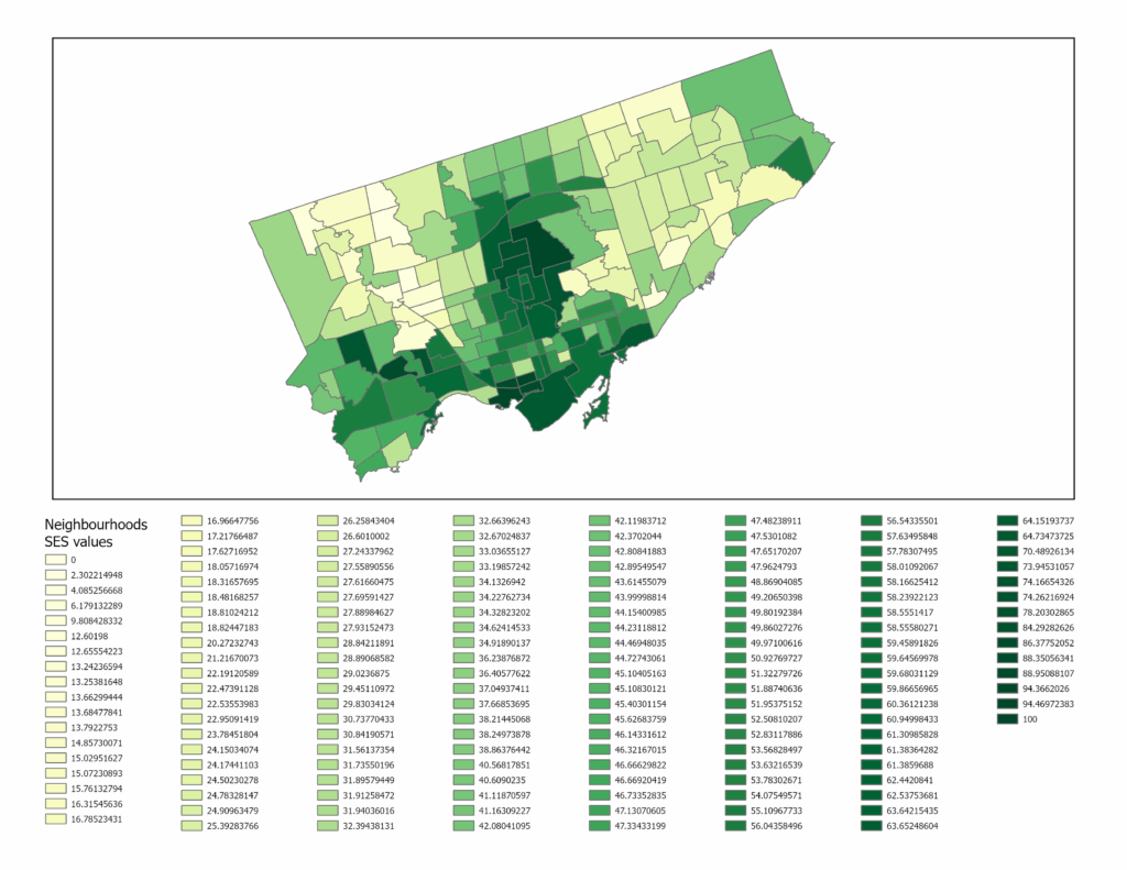
Geovis Project Assignment, TMU Geography, SA8905, Fall 2025
Author: Amina Derlic
Introduction
I’ve always been fascinated with things above the Earth. As a kid, I wanted to be an astronaut — drifting through space, staring back at the planet from far, far away. Life didn’t take me to the International Space Station, but it did bring me somewhere surprisingly close: remote sensing. Becoming a forest scientist turned out to be its own kind of space adventure — one where satellites become your eyes, algorithms become your instruments, and forests become your landscape.
For this project, I wanted to explore something that has always caught my curiosity: how forests and vegetation heal after fire. What actually happens in the years after a burn? How quickly does vegetation come back? Are there patterns of resilience, or scars that linger? And what changes become visible only when you zoom out and look across a whole decade of satellite data?
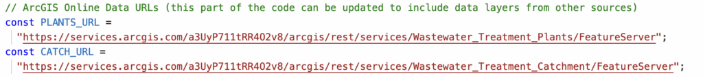
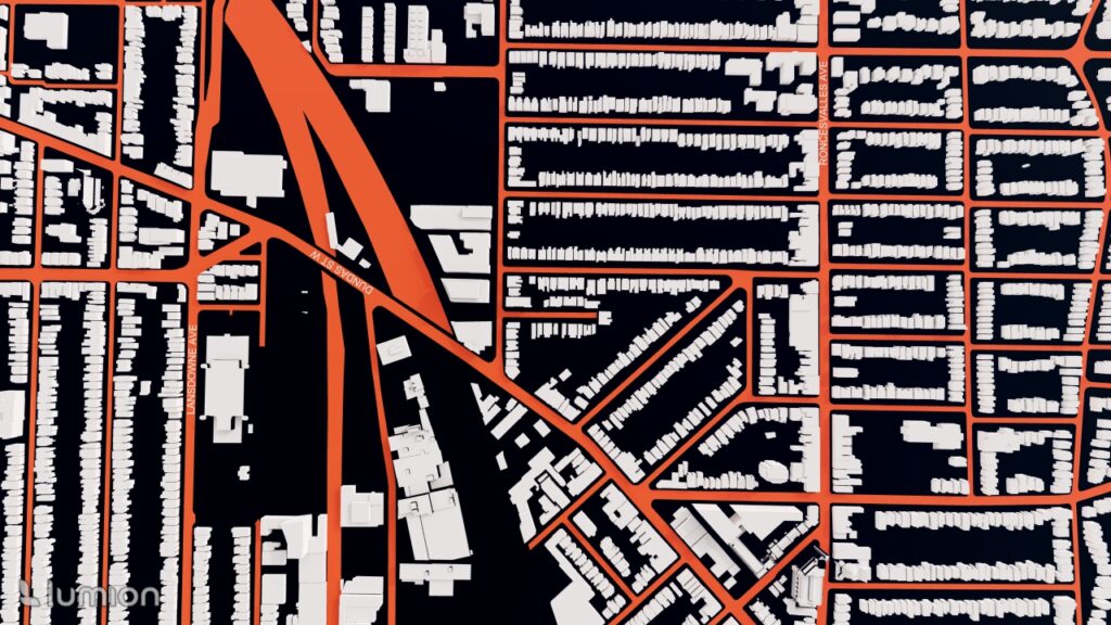
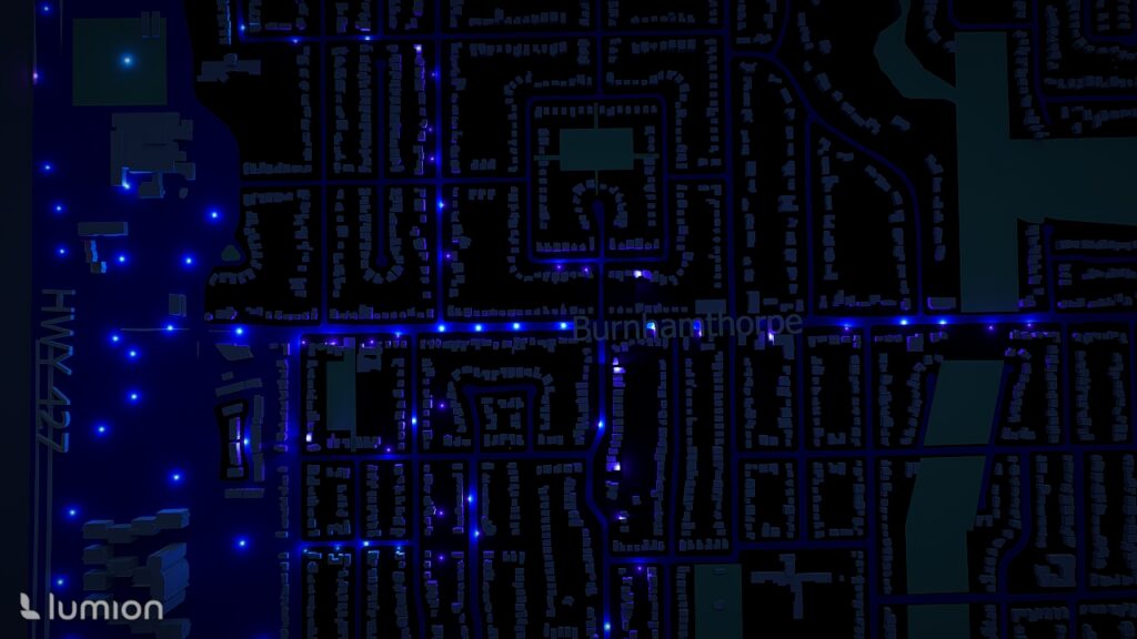
While digging through disturbance datasets, I came across the Kenora018 fire, a May 2016 wildfire right on the Ontario–Manitoba border near Kenora and Ingolf. It was perfect: great Landsat coverage, and a well-documented footprint. I even downloaded the official fire polygon from the Forest Disturbance Area dataset on Ontario’s GeoHub.
But instead of sticking strictly to that boundary, I decided to take a more playful cartographic approach. The broader border region burns often — almost rhythmically — so I expanded my area of interest. Looking at a larger extent allowed the landscape to tell a much bigger story than the official fire perimeter could.
From there, the project grew into a full workflow. My goals in Google Earth Engine (GEE) were to:
- build NDVI layers for 2015–2025 using Landsat composite imagery
- compute dNBR for key fire years (2016 and 2025) to quantify burn severity
- mask water and overlay Hansen tree loss for added ecological context
- create an interactive GEE web app with a smooth year slider
- animate everything into a GIF, visualizing a decade of change
- and finally, turn one raster into a piece of physical bead art — transforming pixels into something tactile and handmade
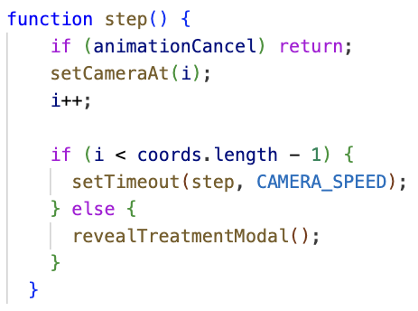
This was also my first substantial project using JavaScript — the language that Earth Engine speaks — which meant a learning curve full of trial, error, debugging, breakthroughs, and a surprising amount of satisfaction. Somewhere between the code editor, the map layers, the exports, and the bead tray, the project turned into a multi-stage creative and technical journey.
And from here, everything unfolded into the full workflow you’ll see below.
How I Built It: Data, Tools, and Workflow
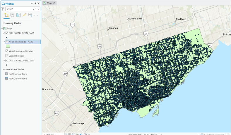
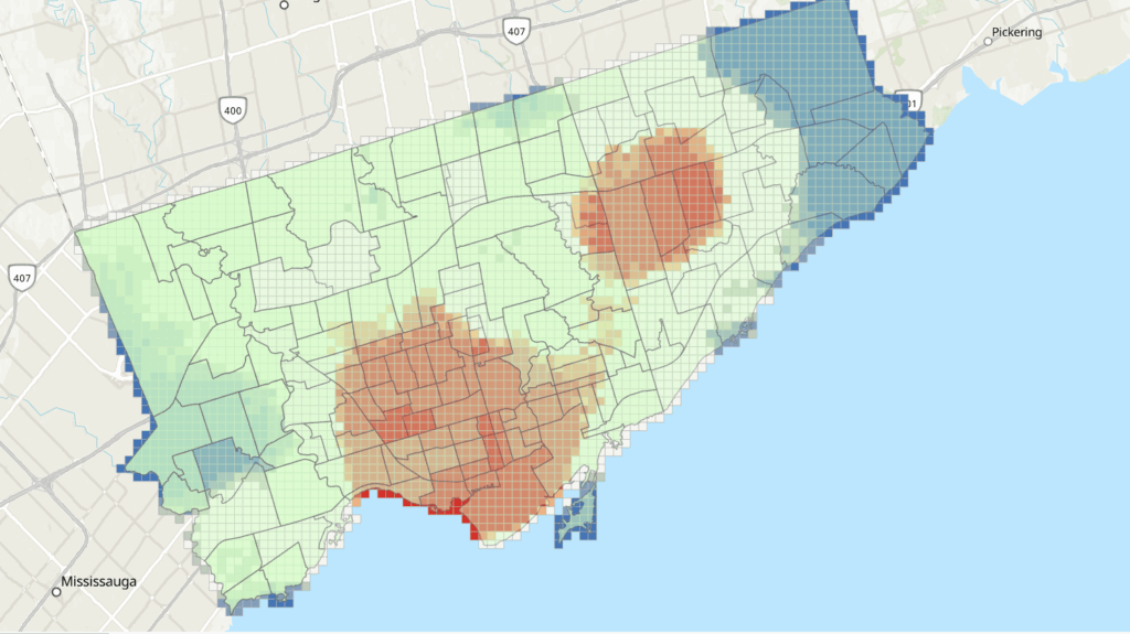
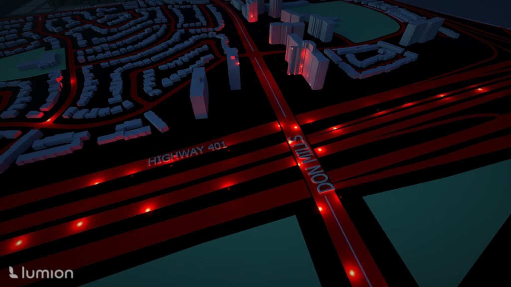
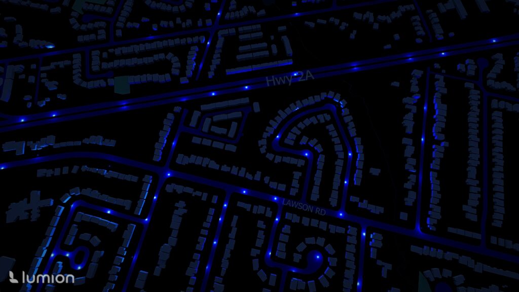
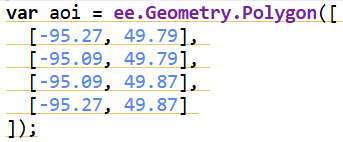
The study area for this project was chosen along the Kenora–Ingolf border, where the Kenora018 wildfire burned in May 2016. Instead of limiting the analysis strictly to the official fire boundary downloaded from the Ontario GeoHub, I expanded the area slightly to include surrounding forest stands, repeated burn patches, road networks, and nearby lakes. This broader geometry allowed the visualization to reflect not only the 2016 fire but also the recurring disturbance patterns that characterize this region.
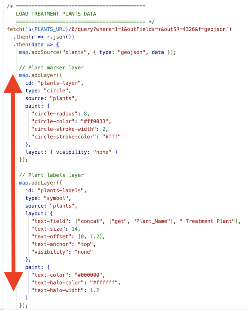
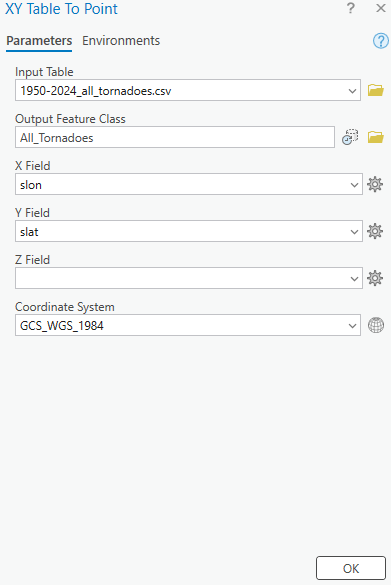
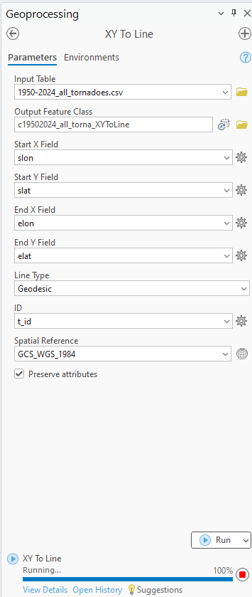
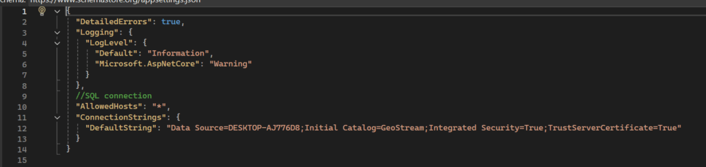
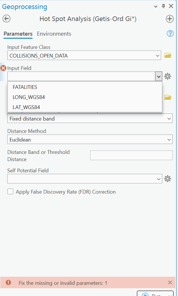
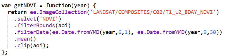
All data processing was carried out in Google Earth Engine, using a combination of Landsat imagery, global forest change data, and surface-water products. To track vegetation condition through time, I relied on the Landsat 8/9 NDVI 8-day composites from the LANDSAT/COMPOSITES/C02/T1_L2_8DAY_NDVI collection. I extracted summer-season imagery (June through September) for every year from 2015 to 2025, producing a decade-long series of clean, cloud-reduced NDVI layers. These composites provided a consistent view of vegetation health and were ideal for comparing regrowth before and after disturbance.
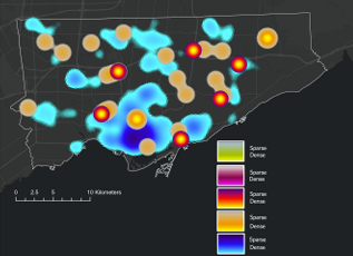
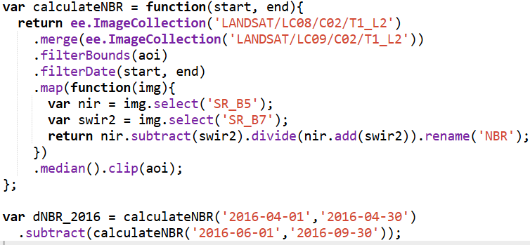
For burn-severity analysis, I used the Landsat 8 and 9 Level-2 Surface Reflectance collections (LANDSAT/LC08/C02/T1_L2 and LANDSAT/LC09/C02/T1_L2). These datasets include atmospherically corrected spectral bands, which are necessary for accurately computing the Normalized Burn Ratio (NBR). Using the NIR (SR_B5) and SWIR2 (SR_B7) bands, I calculated NBR for two time windows: a pre-fire period in April and a post-fire growing-season period from June through September. The difference between these two, dNBR, is a widely used indicator of burn severity. I produced dNBR images for 2016, the year of the Kenora018 fire, and for 2025, which showed another disturbance signal in the same region.
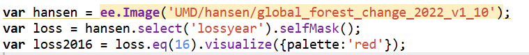
To contextualize the burn information, I incorporated the Hansen Global Forest Change dataset (UMD/hansen/global_forest_change_2022_v1_10). The lossyear layer identifies the precise year of canopy loss, and I used it to highlight where fire corresponded with actual forest removal. Importantly, dataset I used is only published up to 2022, so canopy loss could only be displayed through that year. The red pixels were blended into the 2016 dNBR map to show where burn severity aligned with structural forest change.
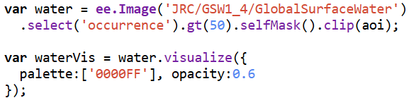
Because the region contains extensive lakes and small water bodies, I also used the JRC Global Surface Water dataset (JRC/GSW1_4/GlobalSurfaceWater) to create a water mask. However, in several places the JRC water polygons didn’t fully cover the lake edges, allowing some of the underlying Landsat pixels to show through — which made the water appear patchy and inconsistent on the map. To fix this, I converted the JRC water layer to vectors and applied a 3-metre buffer around each polygon. This small buffer filled in those gaps and produced smooth, continuous lake boundaries. After rasterizing the buffered shapes, I applied the mask across all imagery, which made the lakes look much cleaner in both the GIF animation and the interactive map.
Together, these datasets formed the backbone of the project, enabling a multi-layered visualization of fire, recovery, water, and forest change across eleven years of Landsat imagery.
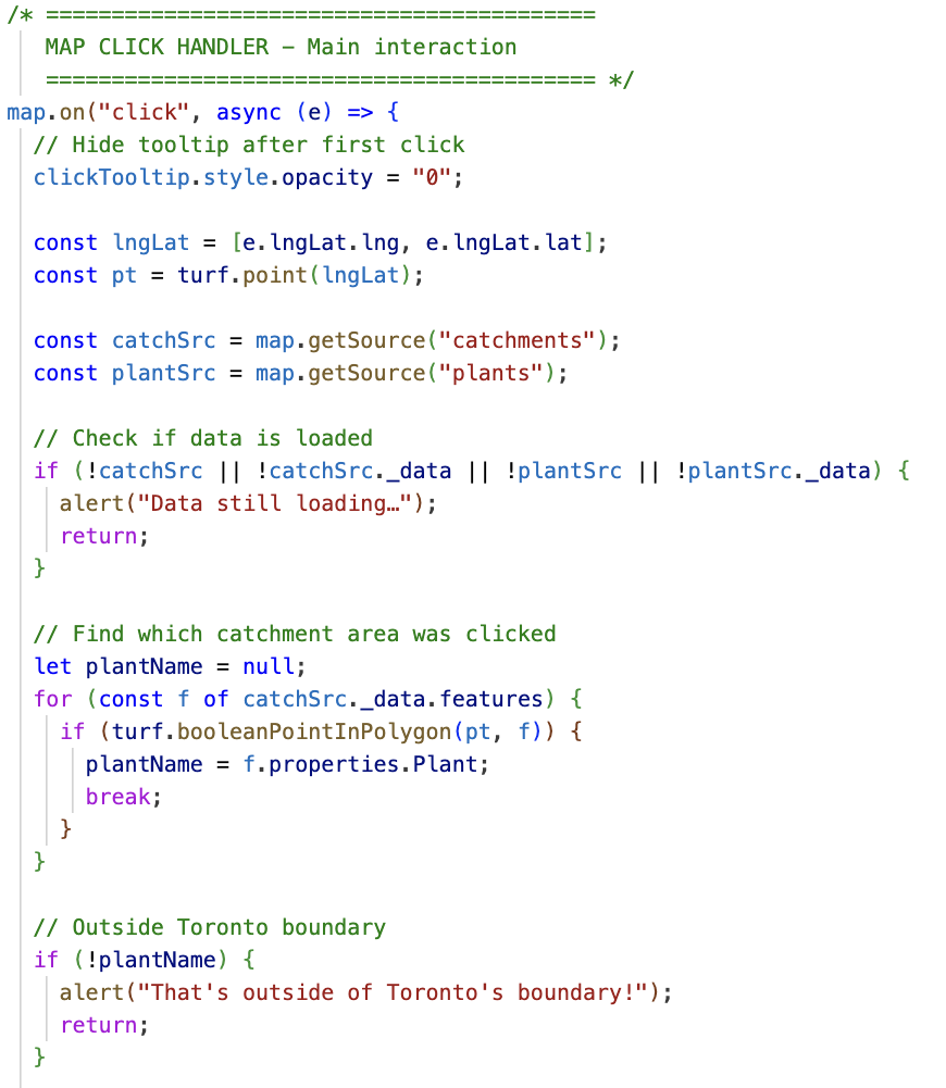
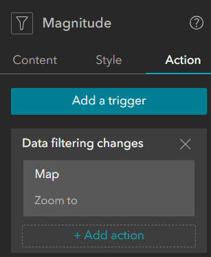
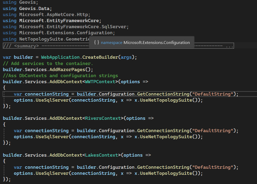
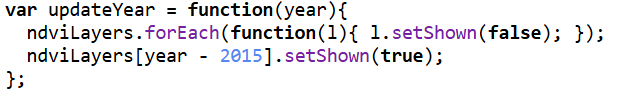
Once all annual NDVI and dNBR layers were created, I assembled them into an interactive web app using GEE’s UI toolkit. I built a year slider, layer toggles, and a map panel that automatically revealed the correct layers as the user scrolled through time. This allowed viewers to explore forest disturbance and regrowth dynamically rather than through static maps.
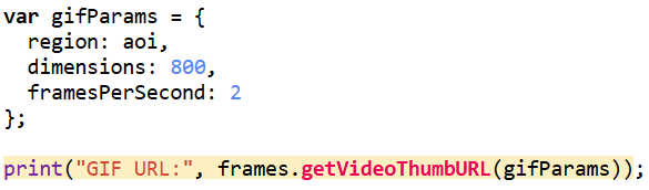
For the animation component, I generated visualized frames for each year, blended in the water mask and Hansen tree loss where needed, and assembled everything into a single ImageCollection for export as a GIF. While the interactive web app uses the full study area, I decided to crop the GIF to a smaller subregion that showed the most dramatic change. Much of the surrounding forest remained relatively stable over the decade, so focusing on the high-disturbance zone made the animation cleaner, more expressive, and easier to interpret. After exporting the GIF from Google Earth Engine, I added a simple title overlay in Canva to keep the aesthetic cohesive.
Results & What the Data Revealed
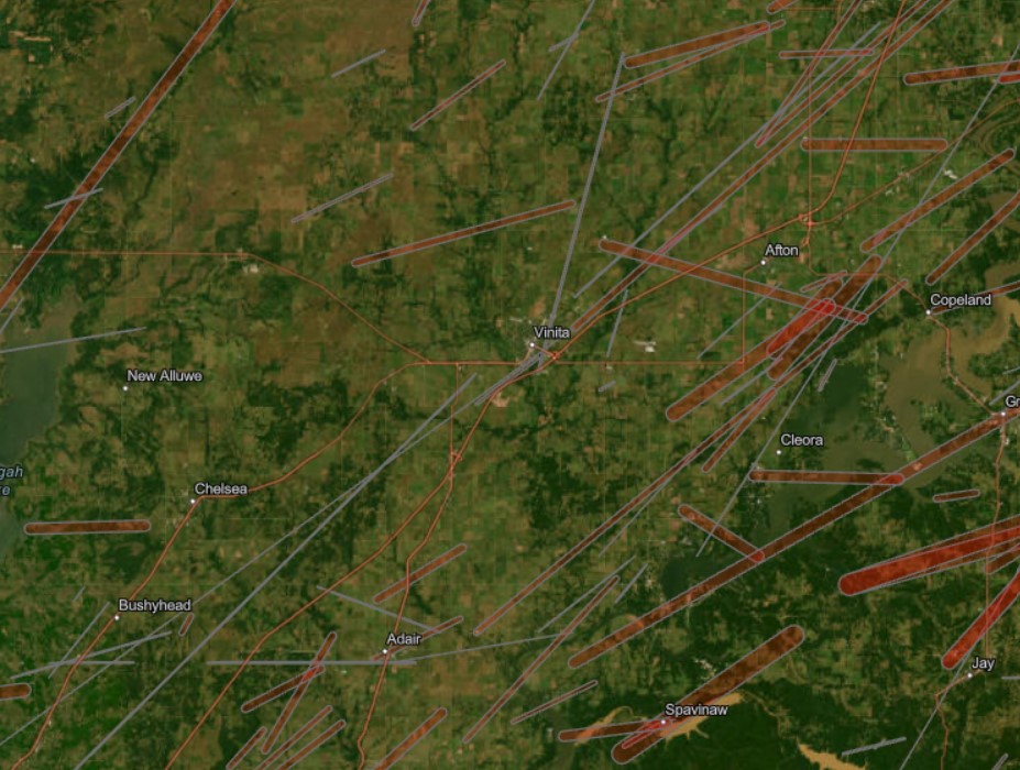
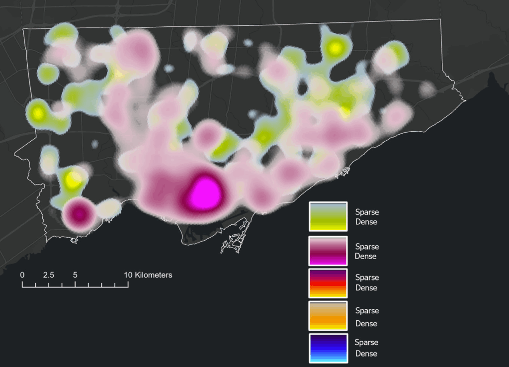
Once everything was assembled in the Google Earth Engine web app, the decade-long story of the Kenora–Ingolf forest began to unfold frame by frame. The 2015 NDVI layer offers a clean, healthy baseline — a landscape of mostly intact canopy, rich in mid-summer vegetation.
Check the App Here: Vegetation Cover Explorer
Before diving into the year-to-year patterns, it’s worth noting how the two key indicators behaved in this landscape. NDVI ranged roughly between 0.0 and 0.8, with the higher values representing dense, healthy canopy. This made it very effective for tracking vegetation recovery: strong greens in 2015, a sharp drop in 2016, and then a clear, steady resurgence in the years that followed. dNBR, on the other hand, showed burn severity in a way NDVI alone could not. In 2016, most values fell between –0.1 and 0.7, signalling low to moderate burn severity — not as intense as some fire reports suggested, but consistent with Landsat’s 30-metre pixel averaging. This also aligned with USGS MTBS. By 2025, dNBR peaks were higher on the eastern edge of the AOI, revealing a more severe burn pattern associated with the Kenora 20 and Kenora 14 fires. Together, NDVI and dNBR provided a complementary narrative: one charting the health of the vegetation, the other capturing the intensity and extent of disturbances shaping it.
The shift happens abruptly in 2016 with the Kenora018 wildfire. The dNBR layer reveals a clear patch of moderate burn severity. Interestingly, this contrasts with some local fire reports that described the event as severely burned. Landsat’s 30-metre pixel size helps explain the difference: each pixel blends many trees, softening the appearance of smaller, high-intensity burn pockets. The NDVI for 2016 fully supports this reading — vegetation drops sharply in the burn scar, transitioning toward yellows.
The Hansen forest-loss data for 2016 reinforces this interpretation. The red loss pixels align closely with the drop in NDVI and the moderate dNBR signature, confirming that actual tree mortality followed the same spatial pattern seen in the spectral indices. Even though dNBR suggested mostly low–moderate severity, the Hansen layer shows that canopy loss still occurred in the core of the burn scar, creating a consistent picture when all three datasets are viewed together.
By 2017, recovery is already visible. Small patches of green begin resurfacing across the scar. In 2018, the regrowth strengthens further, and the forest steadily rebuilds. That pattern breaks briefly in 2019, where NDVI shows a dip in vegetation unrelated to the 2016 burn. This aligns with fire reports describing several minor grass fires in the Kenora and Thunder Bay districts that year — small on the ground, but detectable at Landsat’s scale.
From 2020 to 2024, the forest rebounds spectacularly. NDVI values rise and stabilize, indicating a canopy that not only recovers but in many places reaches even higher productivity than the pre-2016 baseline. This decade-long greening makes the region appear surprisingly resilient.
Then 2025 changes the story again. Two separate fires — Kenora 20 and Kenora 14 — burned portions of the eastern side of my AOI. These events show up clearly in both NDVI and dNBR: sharp declines in vegetation, strong burn-severity signals, and fresh scar boundaries distinctly different from the 2016 burn. The contrast between long-term recovery and sudden new disturbance makes 2025 an especially dramatic year in the final visualization.
To showcase the temporal changes more clearly, I exported the processed frames as a GIF. Since the file was too large for standard embedding, I converted it into a short video and uploaded it to YouTube. This made the animation smoother, easier to share, and more accessible across devices. The video captures the most dynamic portion of the study area — including the 2016 Kenora018 burn and the later Kenora 20 and Kenora 14 fires in 2025 — and shows the forest shifting through cycles of disturbance and recovery.
Watch the Animation on YouTube: Vegetation and Burn Severity Time Series
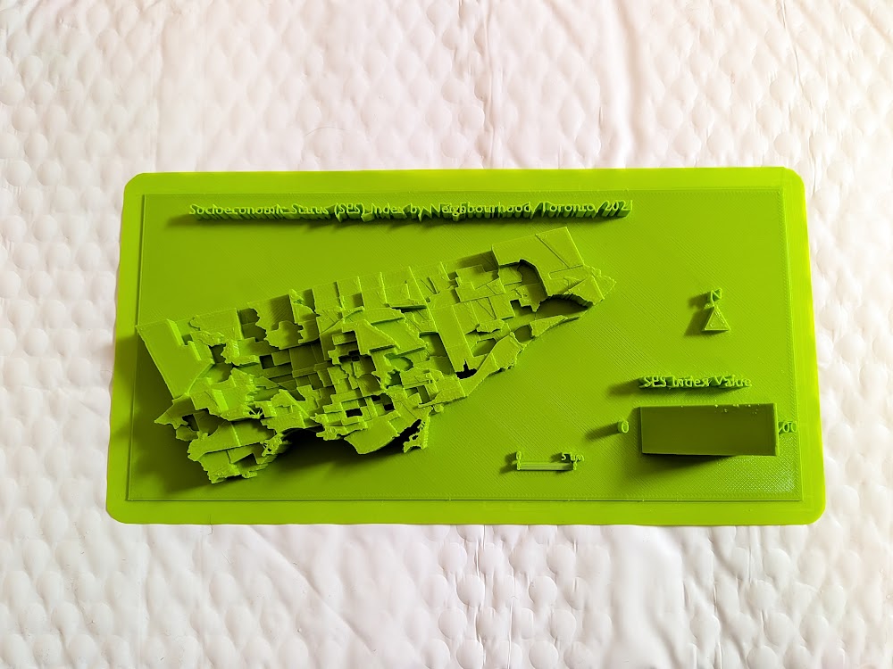
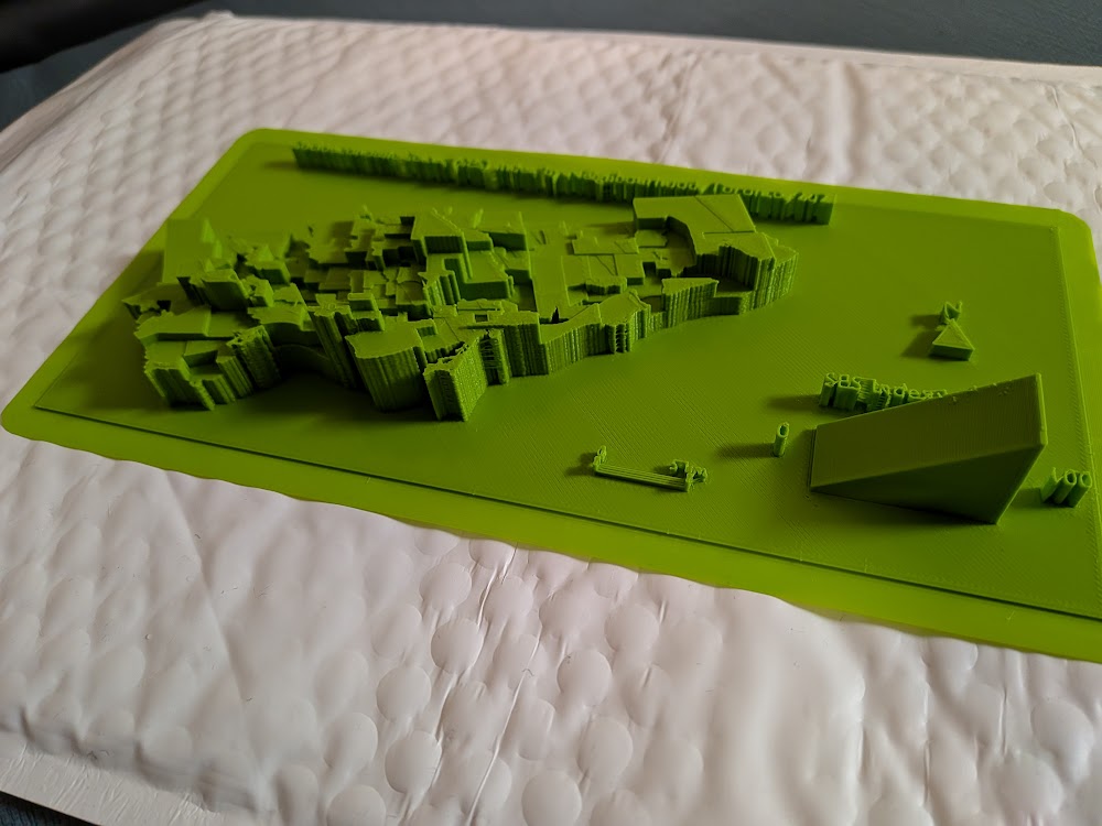
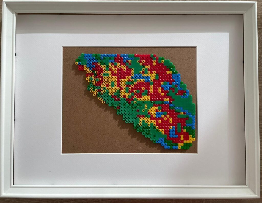
Physical Mapmaking With Beads
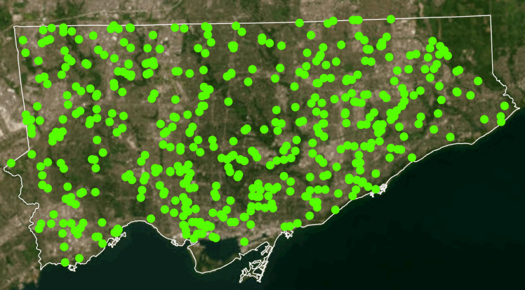
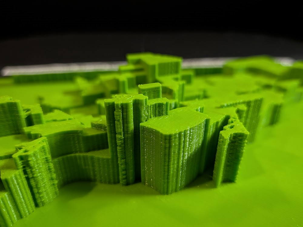
Finally, I wanted to take the project beyond the screen and turn part of the data into something tactile. I started by downloading the official Kenora 018 fire perimeter shapefile from the Ontario Ministry’s GeoHub, printed it, and used it as a physical template. Then I exported and printed my 2016 NDVI layer outlined with Hansen tree loss, trimmed it precisely to fit the perimeter, and used this as the base map for my physical build.
From there, I began assembling the bead map pixel by pixel using tweezers. Each bead colour corresponded to a class in the combined NDVI + tree loss dataset: blue for water, dark/healthy green for intact vegetation, yellow for stressed or low NDVI vegetation, and red for Hansen-confirmed 2016 tree loss. Because each printed pixel still contained sub-pixel variation, I used a simple decision rule: whichever class covered more than 50% of the pixel determined the bead placed on top.
The process was surprisingly challenging. Some beads were from different brands and sets, meaning they melted at different temperatures — a complication I didn’t anticipate. As a result, the final fused piece is a little uneven and imperfect. But that imperfection also feels true to the project. Converting satellite indices into something handcrafted forced me to slow down and engage with the landscape differently. It’s one thing to analyze disturbance with code; it’s another to physically place hundreds of tiny beads representing real burned trees. The end result may be a bit chaotic, but it’s meaningful, tactile, and oddly beautiful — a small, imperfect echo of a real forest recovering after fire.
Process of creating bead board:
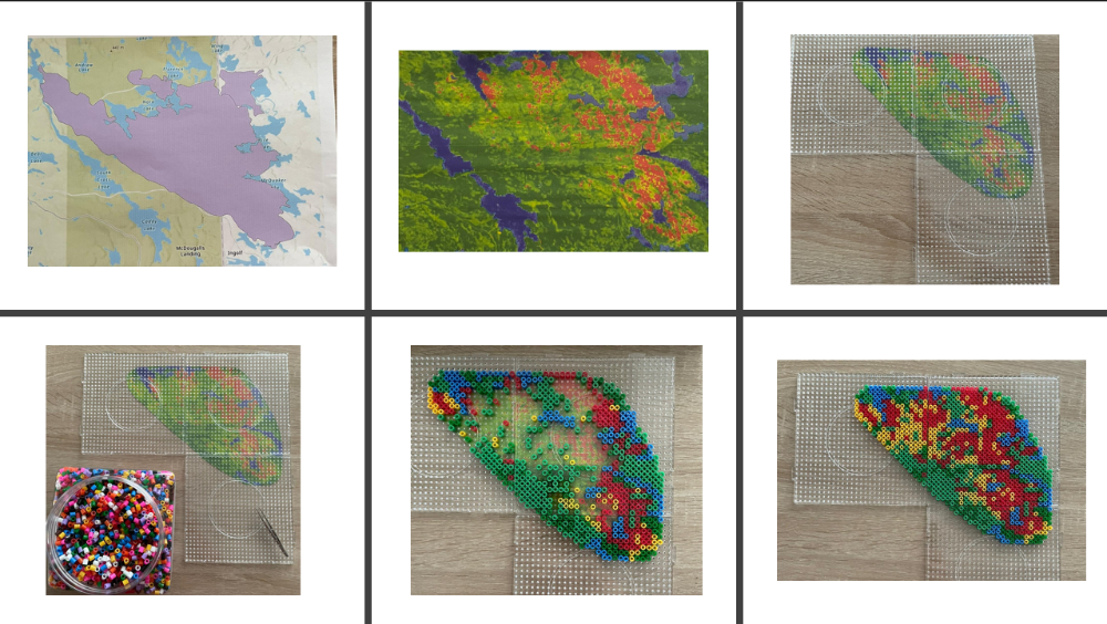
And final product on the table:
Limitations
As with any remote-sensing project, several limitations shape how the results should be interpreted. Landsat’s 30-metre resolution smooths out fine-scale fire effects, often making burns appear more moderate than ground reports suggest. Cloud masking varies year by year and can affect NDVI clarity. The Hansen dataset, used in this project, only extends to 2022, which means it cannot capture the 2025 tree loss associated with Kenora 20 and Kenora 14. And NDVI, while powerful, saturates in dense forest, making some structural changes invisible.
Even with these constraints, the decade-long patterns remain strong and revealing: the 2016 burn, the gradual regrowth, the 2019 dip, the robust recovery into the early 2020s, and finally the sharp return of fire in 2025.
Wrapping Up
What began as a small idea — “let’s check out what happened after that 2016 fire” — spiraled into a full time-travel adventure across a decade of Landsat data. I built sliders, animated rasters, chased burn scars across the Ontario–Manitoba border, and ended up turning satellite pixels into actual beads. Not bad for one project.
The forest’s story was both familiar and surprising: a big fire in 2016, recovery that starts immediately, a weird dip in 2019, years of strong regrowth… and then boom — the 2025 Kenora 20 and Kenora 14 fires lighting up the right side of my study area. You can almost feel the landscape breathing: exhale during fire, inhale during regrowth.
This was my first time writing JavaScript for real, my first time making a GIF in GEE, my first time turning data into a physical object — and definitely not my last. I’m leaving this project both tired and energized, full of new ideas and very aware of how fragile and resilient forests can be at the same time.
If you had told kid-me — the wannabe astronaut — that I’d one day be stitching together satellite imagery and making bead art out of forest fires… I think she would have approved.