Welcome to my Geovisualization Assignment!
Author: Gabyrel Calayan
Geovisualization Project Assignment
TMU Geography
SA8905 – FALL 2025
Today, we are going to be looking at Parks and Recreation Facilities and its possible association to average alcohol expenditure in census tracts (due to the Alcohol in Parks Program in the City of Toronto) using data acquired from the City of Toronto and Environics Analytics (City of Toronto, n.d.).
Context
Using R Studio’s expansive tool set for map creation and Quarto documentation, we are going to be creating a thematic and an interactive map for parks and its association with Average Total Alcohol Expenditure in Toronto. The idea behind topic was really out of the blue. I was just thinking of a fun, simple topic that I wanted to do that I haven’t done yet for my other assignments! And so I landed on this because of data availability while learning some new skills at R Studio and try out the Quarto documentation process.
Data
- Environics Analytics – Average Alcohol Expenditure (Shapefile for census tracts and in CAD $) (Environics Analytics, 2025
- City of Toronto – Parks and Recreation Facilities (Point data and filtered down to 40 parks that participate in the program) (City of Toronto, 2011).
Methodology
- Using R Studio to map out my Average Alcohol Expenditure and the 55 Parks that are a part of the Alcohol in Parks Program by the City of Toronto
- Utilize tmap functions to create both a static thematic and interactive maps
- Utilize Quarto documentation to create a readme file of my assignment
- Showcasing the mapping capabilities and potential of R Studio as a mapping tool
Example tmap code for viewing maps
This tmap code for initializing what kind of view you want (there are only two kinds of views)
- Static thematic map
## This is for viewing as a static map
## tmap_mode("plot") + tm_shape(Alcohol_Expenditure)
- Interactive map
## This for viewing as a interactive map
## tmap_mode("view") + tm_shape(Alcohol_Expenditure)
Visualization process
Step 1: Installing and loading the necessary packages so that R Studio can recognize our inputs
- These inputs are kind of like puzzle pieces! Where you need the right puzzle piece (package) so that you can put the entire puzzle together.
- So we would need a bunch of packages to visualize our project:
- sf
- tmap
- dplyr
- These two packages are important because “sf” lets us read the shapefiles into R Studio. While “tmap” lets us actually create the maps. And “dplyr” lets us filter our shapefiles and the data inside it.
- Also, its very likely that the latest R Studio version has the necessary packages already. In that case, you can just do the library() function to call the packages that you would need. But, I like installing them again in case I forgot.
## Code for installing the packages
## install.packages("sf")
## install.packages("tmap")
## Loading the packages
## library(tmap)
## library(sf)
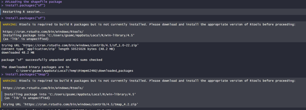
We can see in our console that it says “package ‘sf’ successfully unpacked and MD5 sums checked. That basically means its done installing.
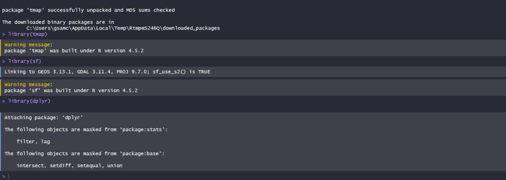
- In addition, these warning messages in this console output indicates that we have these packages already in the latest R Studio software.
After installing and loading these packages, then we can begin with loading and filtering the dataset so that we can move on to visualizing the data itself. The results of installing these packages can be seen in our “Console” section at the bottom left hand side of R Studio (it may depend on the user but I have seen people move the “Console” section to the top right hand side of R Studio interface.
Step 2: Loading and filtering our data
- We must first set the working directory of where our data is and where our outputs are going to go
## Setting work directory
## setwd()
- This code basically points to where your files are going to be outputted to in your computer
- Now that we set our working directory, we can load in the data and filter it
## Code for naming our variables in R Studio and loading it in the software
## Alcohol_Parks <- read_sf("Parks and Recreation Facilities - 4326.shp")
## Alcohol_Expenditure <- read_sf("SimplyAnalytics_Shapefiles_5efb411128da3727b8755e5533129cb52f4a027fc441d8b031fbfc517c24b975.shp")

- As we can see in the code snippets above, we are using one of the functions that belong to the sf package. The read_sf basically loads in the data that we have to be recognized as a shapefile.
- It will appear on the right as part of the “Environment” section. This means it has read all the columns that are part of the dataset
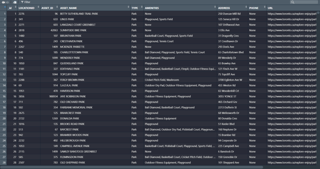
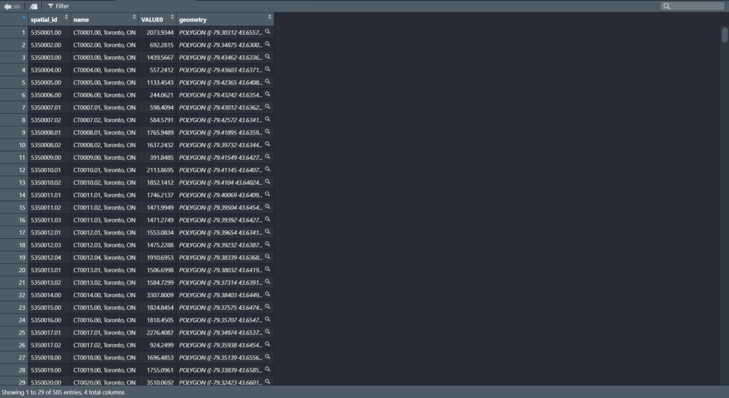
Now we can see our data in the Environments Section. And there’s quite a lot. But no worries we only need to filter the Parks data!
Step 3: Filtering the data
- Since we only need to filter the data for the parks in Toronto, we only need to grab the data that are a part of the 55 parks in the Alcohol in Parks Program
- This follows a two – step approach:
- Name your variable to match its filtered state
- Then the actual filtering comes into play
## Code for running the filtering process
## Alcohol_Parks_Filtered <- filter(Alcohol_Parks, ASSET_NAME == "ASHTONBEE RESERVOIR PARK" | ASSET_NAME == "BERT ROBINSON PARK"| ASSET_NAME == "BOND PARK" | ASSET_NAME == "BOTANY HILL PARK" | ASSET_NAME == "BYNG PARK"
- As we can see in the code above, before the filtering process we name the new variable to match its filtered state as “Alcohol_Parks_Filtered”
- In addition, we are matching the column name that we type out in the code to the park names that are found in the Park data set!
- For example: The filtering wouldn’t work if it was “Bond Park”. It must be all caps “BOND PARK”
- Then we used the filter() function to filter the shapefile by ASSET_NAME to pick out the 40 parks
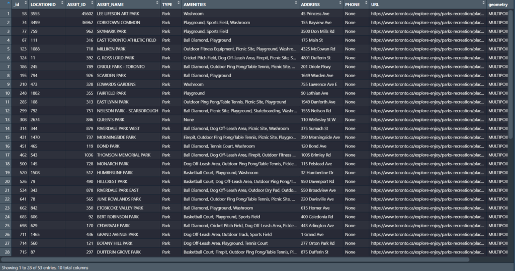
- We can see in our filtered dataset that we have filtered it down to 53 parks with all the original columns attached. Most important being the geometry column so we can conduct visualizations!
- Once we completed that, we can test out the tmap function to see how the data looks before we map it out.
Step 4: Do some testing visualizations to see if there is any issues
- Now, we can actually use some tmap functions to see if our data work
- tm_shape is the function for recognizing what shapefile we are using to visualize the variable
- tm_polygons and tm_dots is for visualizing the variables as either a polygon or dot shapefile
- For tm_polygons, fill and style is basically what columns are you visualizing the variable on and what data classification method you would like to use
## Code for testing our visualizations
## tm_shape(Alcohol_Expenditure) + tm_polygons(fill = "VALUE0", style = "jenks")
## tm_shape(Alcohol_Parks_Filtered) + tm_dots()


Now, we can see that it actually works! We can see that the map above is our shapefile and the one on the bottom is our parks!
Step 5: Using tmap and its extensive functions to build our map
- We can now fully visualize our map and add all the cartographic elements necessary to flesh it out and make it as professional as possible
## Building our thematic map
##``tmap_mode("plot") + tm_shape(Alcohol_Expenditure) +
tm_polygons(fill = "VALUE0", fill.legend = tm_legend ("Average Alcohol Expenditure ($ CAD)"), fill.scale = tm_scale_intervals(style = "jenks", values = "Greens")) +
tm_shape(Alcohol_Parks_Filtered) + tm_bubbles(fill = "TYPE", fill.legend = tm_legend("The 40 Parks in Alcohol in Parks Program"), size = 0.5, fill.scale = tm_scale_categorical(values = "black")) +
tm_borders(lwd = 1.25, lty = "solid") +
tm_layout(frame = TRUE, frame.lwd = 2, text.fontfamily = "serif", text.fontface = "bold", color_saturation = 0.5, component.autoscale = FALSE) +
tm_title(text = "Greenspaces and its association with Alcohol Expenditure in Toronto, CA", fontfamily = "serif", fontface = "bold", size = 1.5) +
tm_legend(text.size = 1.5, title.size = 1.2, frame = TRUE, frame.lwd = 1) +
tm_compass(position = c ("top", "left"), size = 4) +
tm_scalebar(text.size = 1, frame = TRUE, frame.lwd = 1) +
tm_credits("Source: Environics Analytics\nProjection: NAD83", frame = TRUE, frame.lwd = 1, size = 0.75)

- Quite a lot of code!
- Now this is where the puzzle piece analogy comes into play as well
- First, we add our tmap_plot function to specify that we want it as a static map first
- We add both our variables together because we want to see our point data and how it lies on top of our alcohol expenditure shapefile
- Utilizing tm_polygons, tm_shape, and tm_bubbles to draw both our variables as polygons and as point data
- tm_bubbles is dots and tm_polygons draws the polygons of our alcohol expenditure shapefile
- The code that is in our brackets for those functions are additional details that we would like to have in our map
- For example:
fill.legend = tm_legend ("Average Alcohol Expenditure ($ CAD)")- This code snippet makes it so that our legend title is “Average Alcohol Expenditure ($ CAD) for our polygon shapefile
- The same applies for our point data for our parks
- Basically, we can divide our code into two sections:
- The tm_polygons all the way to tm_bubbles is essentially drawing our shapefiles
- The tm_borders all the way to the tm_credits are what goes on outside our shapefiles
- For example:
- tm_title() and the code inside it is basically all the details that can be modified for our map. component.autoscale = FALSE is turning off the automatic rescaling of our map so that I can have more control over modifying the title part of the map to my liking

Now we have made our static thematic map! On to the next part which is the interactive visualization!
Since we built our puzzle parts for the thematic map, we just need to switch it over to the interactive map using tmap_mode(“view”)

This code chunk describes the process to create the interactive map
library(tmap)
library(sf)
library(dplyr)


##Loading in the data to check if it works
Alcohol_Parks <- read_sf("Parks and Recreation Facilities - 4326.shp")
Alcohol_Expenditure <- read_sf("SimplyAnalytics_Shapefiles_5efb411128da3727b8755e5533129cb52f4a027fc441d8b031fbfc517c24b975.shp")

#Filtering test_sf_point to show only parks where you can drink alcohol
Alcohol_Parks_Filtered <-
  filter(Alcohol_Parks, ASSET_NAME == "ASHTONBEE RESERVOIR PARK" | ASSET_NAME == "BERT ROBINSON PARK"
                                 | ASSET_NAME == "BOND PARK" | ASSET_NAME == "BOTANY HILL PARK" | ASSET_NAME == "BYNG PARK"
                                 | ASSET_NAME == "CAMPBELL AVENUE PLAYGROUND AND PARK" | ASSET_NAME == "CEDARVALE PARK"
                                 | ASSET_NAME == "CHRISTIE PITS PARK" | ASSET_NAME == "CLOVERDALE PARK" | ASSET_NAME == "CONFEDERATION PARK"
                                 | ASSET_NAME == "CORKTOWN COMMON" | ASSET_NAME == "DIEPPE PARK" | ASSET_NAME == "DOVERCOURT PARK"
                                 | ASSET_NAME == "DUFFERIN GROVE PARK" | ASSET_NAME == "EARLSCOURT PARK" | ASSET_NAME == "EAST LYNN PARK"
                                 | ASSET_NAME == "EAST TORONTO ATHLETIC FIELD" | ASSET_NAME == "EDWARDS GARDENS" | ASSET_NAME == "EGLINTON PARK"
                                 | ASSET_NAME == "ETOBICOKE VALLEY PARK" | ASSET_NAME == "FAIRFIELD PARK" | ASSET_NAME == "GRAND AVENUE PARK"
                                 | ASSET_NAME == "GORD AND IRENE RISK PARK" | ASSET_NAME == "GREENWOOD PARK" | ASSET_NAME == "G. ROSS LORD PARK"
                                 | ASSET_NAME == "HILLCREST PARK" | ASSET_NAME == "HOME SMITH PARK" | ASSET_NAME == "HUMBERLINE PARK" | ASSET_NAME == "JUNE ROWLANDS PARK"
                                 | ASSET_NAME == "LA ROSE PARK" | ASSET_NAME == "LEE LIFESON ART PARK" | ASSET_NAME == "MCCLEARY PARK" | ASSET_NAME == "MCCORMICK PARK"
                                 | ASSET_NAME == "MILLIKEN PARK" | ASSET_NAME == "MONARCH PARK" | ASSET_NAME == "MORNINGSIDE PARK" | ASSET_NAME == "NEILSON PARK - SCARBOROUGH"
                                 | ASSET_NAME == "NORTH BENDALE PARK" | ASSET_NAME == "NORTH KEELESDALE PARK" | ASSET_NAME == "ORIOLE PARK - TORONTO" | ASSET_NAME == "QUEEN'S PARK"
                                 | ASSET_NAME == "RIVERDALE PARK EAST" | ASSET_NAME == "RIVERDALE PARK WEST" | ASSET_NAME == "ROUNDHOUSE PARK" | ASSET_NAME == "SCARBOROUGH VILLAGE PARK"
                                 | ASSET_NAME == "SCARDEN PARK" | ASSET_NAME == "SIR WINSTON CHURCHILL PARK" | ASSET_NAME == "SKYMARK PARK" | ASSET_NAME == "SORAREN AVENUE PARK"
                                 | ASSET_NAME == "STAN WADLOW PARK" | ASSET_NAME == "THOMSON MEMORIAL PARK" | ASSET_NAME == "TRINITY BELLWOODS PARK" | ASSET_NAME == "UNDERPASS PARK"
                                 | ASSET_NAME == "WALLACE EMERSON PARK" |  ASSET_NAME == "WITHROW PARK")


##Now as a interactive map
tmap_mode("view") + tm_shape(Alcohol_Expenditure) +

  tm_polygons(fill = "VALUE0", fill.legend = tm_legend ("Average Alcohol Expenditure ($ CAD)"), fill.scale = tm_scale_intervals(style = "jenks", values = "Greens")) +

  tm_shape(Alcohol_Parks_Filtered) + tm_bubbles(fill = "TYPE", fill.legend = tm_legend("The 55 Parks in Alcohol in Parks Program"), size = 0.5, fill.scale = tm_scale_categorical(values = "black")) +

  tm_borders(lwd = 1.25, lty = "solid",) +

  tm_layout(frame = TRUE, frame.lwd = 2, text.fontfamily = "serif", text.fontface = "bold", color_saturation = 0.5, component.autoscale = FALSE) +

   tm_title(text = "Greenspaces and its association with Alcohol Expenditure in Toronto, CA", fontfamily = "serif", fontface = "bold", size = 1.5) +
  tm_legend(text.size = 1.5, title.size = 1.2, frame = TRUE, frame.lwd = 1) +

  tm_compass(position = c("top", "right"), size = 2.5) +

  tm_scalebar(text.size = 1, frame = TRUE, frame.lwd = 1, position = c("bottom", "left")) +

  tm_credits("Source: Environics Analytics\nProjection: NAD83", frame = TRUE, frame.lwd = 1, size = 0.75)
Link to viewing the interactive map: https://rpubs.com/Gab_Cal/Geovis_Project
- The only differences that can be gleaned from this code chunk is that the tmap_mode() is not “plot” but instead set as “view”
- For example: tmap_mode(“view”)
The map is now complete!
Results (Based on our interactive map)
- Just based on the default settings for the interactive map, tmap includes a wide range of elements that make the map dynamic!
- We have the zoom in and layer selection/basemap selection function on the top left
- The compass that we created is shown in the top right
- And the legend that we made is locked in at the bottom right
- Our scalebar is also dynamic which changes scales when we zoom in and out
- And our credits and projection section is also seen in the bottom right of our interactive map
- We can also click on our layers to see the columns attached to the shapefiles
- For example, we can click on the point data to see the id, LocationID, AssetID, Asset_Name, Type, Amenities, Address, Phone, and URL. While for our polygon shapefile we can see the spatial_id, name of the CT, and the alcohol spending value in that CT
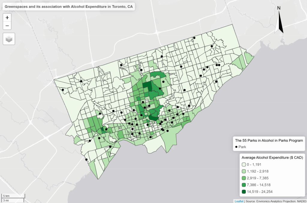
- As we can see in our interactive map, the areas that have the highest “Average Alcohol Expediture” lie near the upper part of the downtown core of Toronto
- For example: The neighbourhoods that are dark green are Bridle Path-Sunnybrook-York Mills, Forest Hill North and South and Rosedale to name a few
- However, only a few parks that are a park of the program reside in these high spending regions on alcohol
- Most parks reside in census tracts where the alcohol expenditure is either the $500 to $3000 range
- While there doesn’t seems to be much of an association, there is definitely more factors into play as to where people buy their alcohol or where they decide to consume it
- Based on just visual findings:
- For example: It’s possible that people simply do not drink in these parks even though its allowed. They probably find the comfort of their home a better place to consume alcohol
- Or people don’t want to drink at a park when they could be doing more active group – like activities
References
- Average Total Expenditure | Tobacco and alcohol | Alcoholic beverages | Alcoholic beverages purchased from stores, 2025. Toronto, ON: Environics Analytics: SimplyAnalytics (November 15, 2025)
- City of Toronto. (2011). Parks and Recreation Facilties [Shapefile]. https://open.toronto.ca/dataset/parks-and-recreation-facilities/
- City of Toronto. (n.d.). Alcohol in Parks Program. https://www.toronto.ca/city-government/planning-development/construction-new-facilities/parks-facility-plans-strategies/alcohol-in-parks-program/


