Geovis Project Assignment, TMU Geography, SA8905, Fall 2025
INTRODUCTION
`Chicago is considered the most gang-occupied city in the United States, with 150,000 gang-affiliated residents, representing more than 100 gangs. In 2024, 46 gangs and their boundaries across Chicago were mapped by the City of Chicago. Factors about the formation of gangs have been of interest and a topic of research for many years all over the world (Assari et al., 2020), but for the purpose of this project, these factors are going to stem from demographics of Chicago. For instance, Chicago has deep roots within gang history and culture. Not only gangs but violent crimes are also dense. Demographics such as income, education, housing, race, etc., play factors within the neighbourhoods of Chicago and could be part of the cause of gang history.
METHODOLOGY
Step 1: Data Preparation
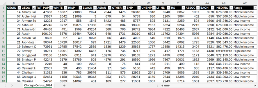
Chicago Neighbourhood Census Data (2025): Over 200 socioeconomic and demographic data for each neighbourhood was obtained from the Chicago Metropolitan Agency for Planning (CMAP) (Figure 1). In July 2025 their Community Data Snapshot portal released granular insights into population characteristics, income levels, housing, education, and employment metrics across Chicago’s neighbourhoods.
Figure 1: Census data for Chicago, 2024
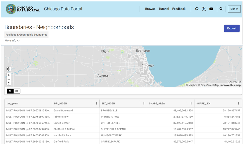
Chicago Neighbourhood Boundary Files: official geographic boundaries for Chicago neighbourhoods were downloaded from the City of Chicago’s open data portal (Figure 2). These shapefiles were used to spatially join census data and support geospatial visualization.
Figure 2: Chicago Data Portal – Neighborhood Boundaries
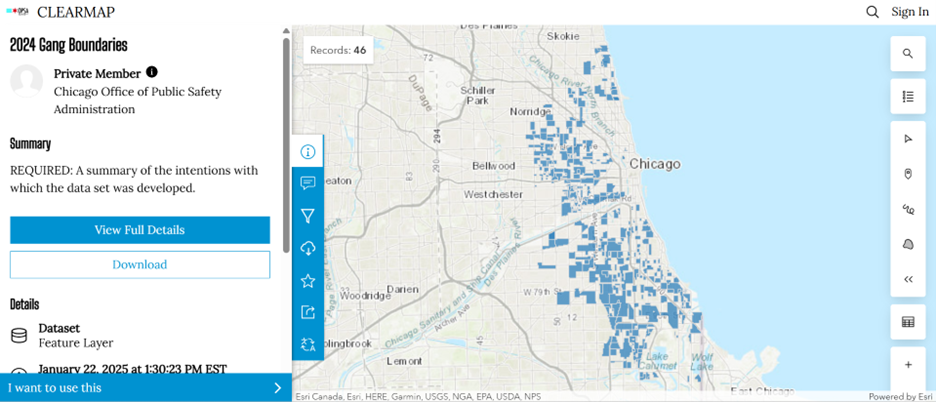
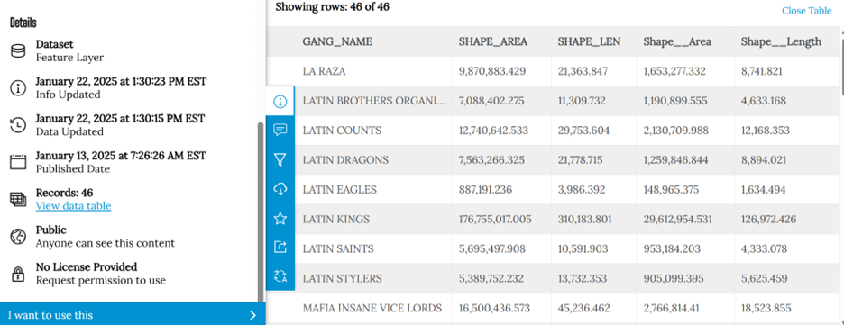
Chicago Gang Territory Boundaries (2024): Gang territory data from 2024 was sourced from the Chicago Police Department’s GIS portal (Figure 3). These boundaries depict areas of known gang influence and were integrated into the spatial database to support comparative analysis with neighbourhood-level census indicators.
Figure 3a: 2024 Gang Boundaries Data PortalFigure3b: 2024 Gang Boundaries Data Portal
Step 2: Technology
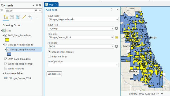
Once the data was downloaded, they were applied to software to visualize the data. A combination of technologies was used, ArcGIS Pro and Sketchup (Web). ArcGIS Pro was used to import all boundary files, where neighbourhood census data was joined to Chicago boundary shapefile using unique identifier such as Neighbourhood Name (Figure 4).
Figure 4:ArcGIS Pro Data Join Table
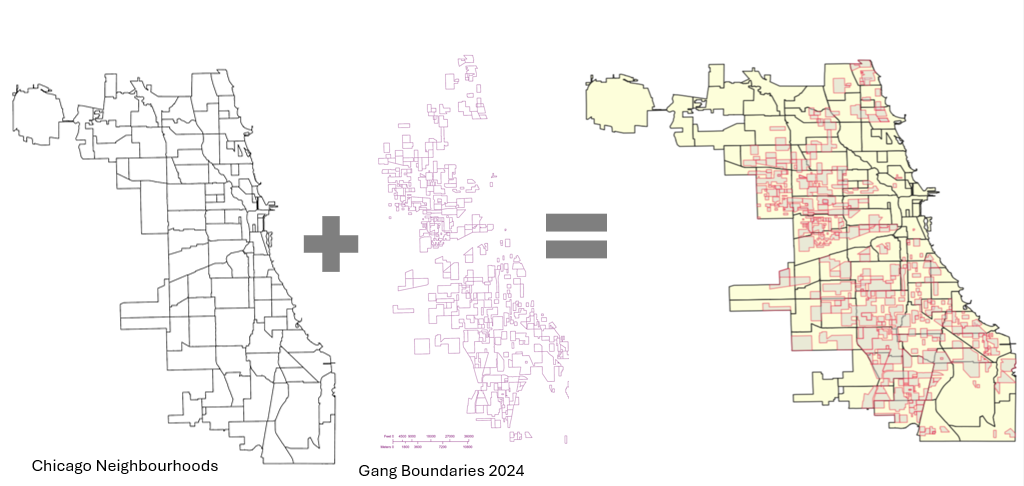
Gang territory boundary polygons overlaid with neighborhood boundaries to enable spatial intersection and proximity analysis (Figure 5).
Figure 5: Shapefiles of Chicago’s Neighbourhoods and Gangs
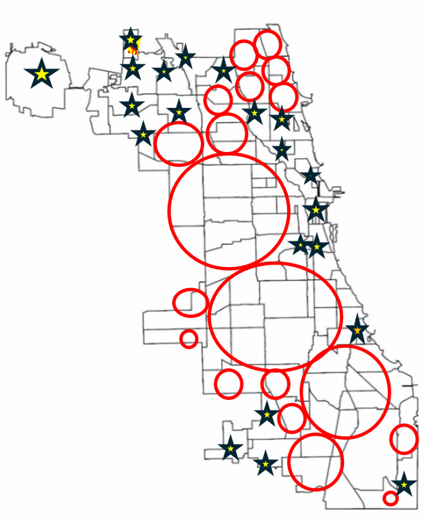
Within ArcGIS Pro, the combined map of both boundaries allowed for analysis of the neighbourhoods with the most gang boundaries. Rough sketch of these neighbourhoods was made by circling the neighbourhoods of a clean map of Chicago, where the bigger circles show the areas with more gang areas and the stars indicate the neighborhoods with no gang boundaries (Figure 6). The CMAP was used to look at the demographics of the neighborhoods with the most area of gangs and compared to the areas with no gang areas (e.g. O’Hare).
Figure 6: Chicago neighborhood outlines with markers
SketchUp
SketchUp is 3D modeling tool that is used to generate and manipulate 3D models and is often used in architecture and interior design. Using this software for this project was a different purpose of the software; by importing Chicago neighborhoods outline as an image I was able to trace the neighborhoods.
Step 3: Visualization with 3D Extrusions (Sketch Up)
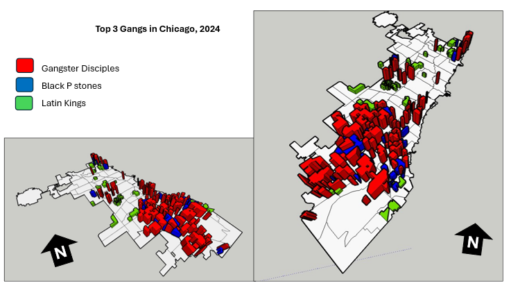
Determined the highest height of the 3D maps models, was based on the total number of neighborhoods (98) and total number of gangs records/areas (46). Determining which neighbourhoods had the most gang boundaries was based on the gang area number which was provided in the Gang Boundary file. The gang with the most area totaled to shape area of 587,893,900m2, where the smallest shape area is 217,949m2. Similar process was done with neighbourhood area measurements. Neighbourhoods were raised based on the number of gang areas that were present within that neighbourhood (as previously shown in Figure 5). 5’ (feet) is the highest neighbourhood, and 4” (inches) is the lowest neighbourhood where gangs are present, neighbourhoods that do not have gangs are not elevated.
A different approach was applied to the top 3 gangs map model, where the highest remains same in each gang, but are placed in the neighbourhoods that have that gang present. For instance, Gangster Disciples were set at approximately 5 feet (5′ 3/16″ or 1528.8 mm), Black P Stones at almost 4 feet (3′ 7/8″ or 936.6 mm), and Latin Kings at a little over 1 foot (1′ 8 1/4″ or 514.4 mm).
Map Design
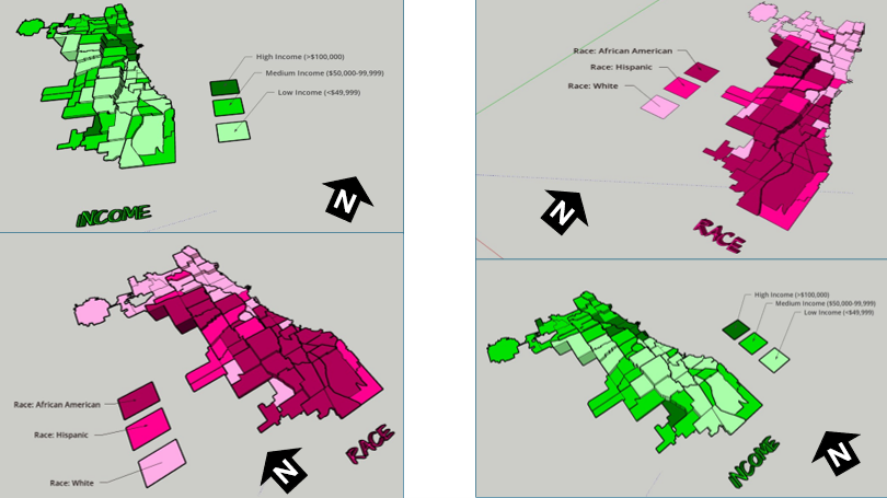
Determined what demographic factors were going to be used to compare with gang areas, for example, income, race, and top 3 gangs (Gangster Disciples, Black P Stones, and Latin Kings). Two elements present with the two demographic maps (height and colour), where colour indicates the demographic factor and the height represents the gang presence (Figure 7).
Figure 7: 3D map models of Chicago gangs based on Race and Income
LIMITATIONS
There was limited information available about the gang areas, which only consisted of gang name, shape area, and length measurements. In terms of SketchUp’s limitations, the free web version as some restrictions, had to manually draw the outline of Chicago neighbourhoods which was time consuming. In addition, SketchUp scale system was complex and was not consistent between maps. To address tis, each corner of the map was measured with the Tape Measure Tool to ensure uniformity. Lastly, when the final product was viewed in augmented reality (AR), the map quality was limited such as the neighbourhood outlines were gone, and the only parts that were visible were the colour parts of the models.
CONCLUSION (Key Insights)
The most visual pattern shown from the race map is the areas with more gang activity have a large population of African Americans (Figure 7). For the income map, indicated in green, more gang areas have lower income whereas the areas with higher income do not have gangs in those neighborhoods. Based on the top three gangs, Gangster Disciples have the most gang boundaries across Chicago neighborhoods (Figure 8). Gangster Disciples takes up 33.6% of the area in km2, founded in 1964 in Englewood.
Figure 8: 3D map of the top 3 gangs in Chicago, 2024
FINAL PRODUCT
The final product, is user interactive through a QR code that allows viewers to look at the map models using augmented reality (AR) just by pointing your mobile device camera at the QR code below.
Being aware that the quality of the AR has its limits, the SketchUp map models can be viewed using the Geovis Map Models button below.
Assari, S., Boyce, S., Caldwell, C. H., Bazargan, M., & Mincy, R. (2020). Family income and gang presence in the neighborhood: Diminished returns of black families. Urban Science, 4(2), 29.
Today, we are going to be looking at Parks and Recreation Facilities and its possible association to average alcohol expenditure in census tracts (due to the Alcohol in Parks Program in the City of Toronto) using data acquired from the City of Toronto and Environics Analytics (City of Toronto, n.d.).
Context
Using R Studio’s expansive tool set for map creation and Quarto documentation, we are going to be creating a thematic and an interactive map for parks and its association with Average Total Alcohol Expenditure in Toronto. The idea behind topic was really out of the blue. I was just thinking of a fun, simple topic that I wanted to do that I haven’t done yet for my other assignments! And so I landed on this because of data availability while learning some new skills at R Studio and try out the Quarto documentation process.
Data
Environics Analytics – Average Alcohol Expenditure (Shapefile for census tracts and in CAD $) (Environics Analytics, 2025
City of Toronto – Parks and Recreation Facilities (Point data and filtered down to 40 parks that participate in the program) (City of Toronto, 2011).
Methodology
Using R Studio to map out my Average Alcohol Expenditure and the 55 Parks that are a part of the Alcohol in Parks Program by the City of Toronto
Utilize tmap functions to create both a static thematic and interactive maps
Utilize Quarto documentation to create a readme file of my assignment
Showcasing the mapping capabilities and potential of R Studio as a mapping tool
Example tmap code for viewing maps
This tmap code for initializing what kind of view you want (there are only two kinds of views)
Step 1: Installing and loading the necessary packages so that R Studio can recognize our inputs
These inputs are kind of like puzzle pieces! Where you need the right puzzle piece (package) so that you can put the entire puzzle together.
So we would need a bunch of packages to visualize our project:
sf
tmap
dplyr
These two packages are important because “sf” lets us read the shapefiles into R Studio. While “tmap” lets us actually create the maps. And “dplyr” lets us filter our shapefiles and the data inside it.
Also, its very likely that the latest R Studio version has the necessary packages already. In that case, you can just do the library() function to call the packages that you would need. But, I like installing them again in case I forgot.
## Code for installing the packages
## install.packages("sf")
## install.packages("tmap")
## Loading the packages
## library(tmap)
## library(sf)
We can see in our console that it says “package ‘sf’ successfully unpacked and MD5 sums checked. That basically means its done installing.
In addition, these warning messages in this console output indicates that we have these packages already in the latest R Studio software.
After installing and loading these packages, then we can begin with loading and filtering the dataset so that we can move on to visualizing the data itself. The results of installing these packages can be seen in our “Console” section at the bottom left hand side of R Studio (it may depend on the user but I have seen people move the “Console” section to the top right hand side of R Studio interface.
Step 2: Loading and filtering our data
We must first set the working directory of where our data is and where our outputs are going to go
## Setting work directory
## setwd()
This code basically points to where your files are going to be outputted to in your computer
Now that we set our working directory, we can load in the data and filter it
## Code for naming our variables in R Studio and loading it in the software
## Alcohol_Parks <- read_sf("Parks and Recreation Facilities - 4326.shp")
As we can see in the code snippets above, we are using one of the functions that belong to the sf package. The read_sf basically loads in the data that we have to be recognized as a shapefile.
It will appear on the right as part of the “Environment” section. This means it has read all the columns that are part of the dataset
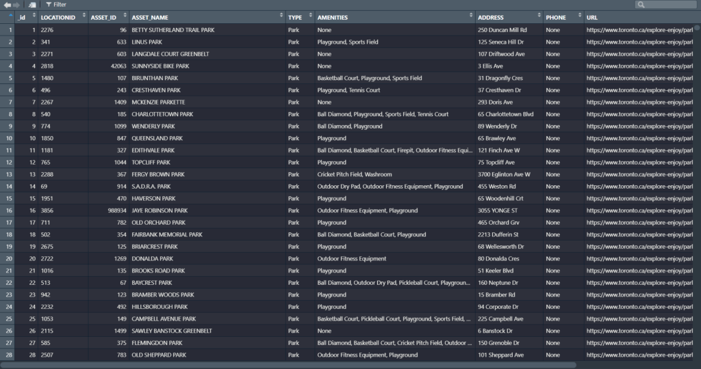
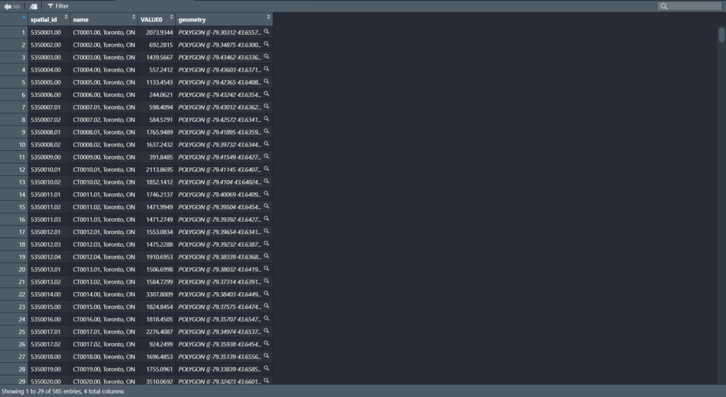
Now we can see our data in the Environments Section. And there’s quite a lot. But no worries we only need to filter the Parks data!
Step 3: Filtering the data
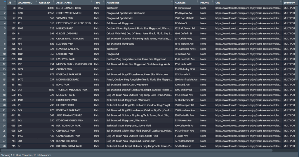
Since we only need to filter the data for the parks in Toronto, we only need to grab the data that are a part of the 55 parks in the Alcohol in Parks Program
As we can see in the code above, before the filtering process we name the new variable to match its filtered state as “Alcohol_Parks_Filtered”
In addition, we are matching the column name that we type out in the code to the park names that are found in the Park data set!
For example: The filtering wouldn’t work if it was “Bond Park”. It must be all caps “BOND PARK”
Then we used the filter() function to filter the shapefile by ASSET_NAME to pick out the 40 parks
We can see in our filtered dataset that we have filtered it down to 53 parks with all the original columns attached. Most important being the geometry column so we can conduct visualizations!
Once we completed that, we can test out the tmap function to see how the data looks before we map it out.
Step 4: Do some testing visualizations to see if there is any issues
Now, we can actually use some tmap functions to see if our data work
tm_shape is the function for recognizing what shapefile we are using to visualize the variable
tm_polygons and tm_dots is for visualizing the variables as either a polygon or dot shapefile
For tm_polygons, fill and style is basically what columns are you visualizing the variable on and what data classification method you would like to use
Now this is where the puzzle piece analogy comes into play as well
First, we add our tmap_plot function to specify that we want it as a static map first
We add both our variables together because we want to see our point data and how it lies on top of our alcohol expenditure shapefile
Utilizing tm_polygons, tm_shape, and tm_bubbles to draw both our variables as polygons and as point data
tm_bubbles is dots and tm_polygons draws the polygons of our alcohol expenditure shapefile
The code that is in our brackets for those functions are additional details that we would like to have in our map
For example: fill.legend = tm_legend ("Average Alcohol Expenditure ($ CAD)")
This code snippet makes it so that our legend title is “Average Alcohol Expenditure ($ CAD) for our polygon shapefile
The same applies for our point data for our parks
Basically, we can divide our code into two sections:
The tm_polygons all the way to tm_bubbles is essentially drawing our shapefiles
The tm_borders all the way to the tm_credits are what goes on outside our shapefiles
For example:
tm_title() and the code inside it is basically all the details that can be modified for our map. component.autoscale = FALSE is turning off the automatic rescaling of our map so that I can have more control over modifying the title part of the map to my liking
Now we have made our static thematic map! On to the next part which is the interactive visualization!
Since we built our puzzle parts for the thematic map, we just need to switch it over to the interactive map using tmap_mode(“view”)
This code chunk describes the process to create the interactive map
The only differences that can be gleaned from this code chunk is that the tmap_mode() is not “plot” but instead set as “view”
For example: tmap_mode(“view”)
The map is now complete!
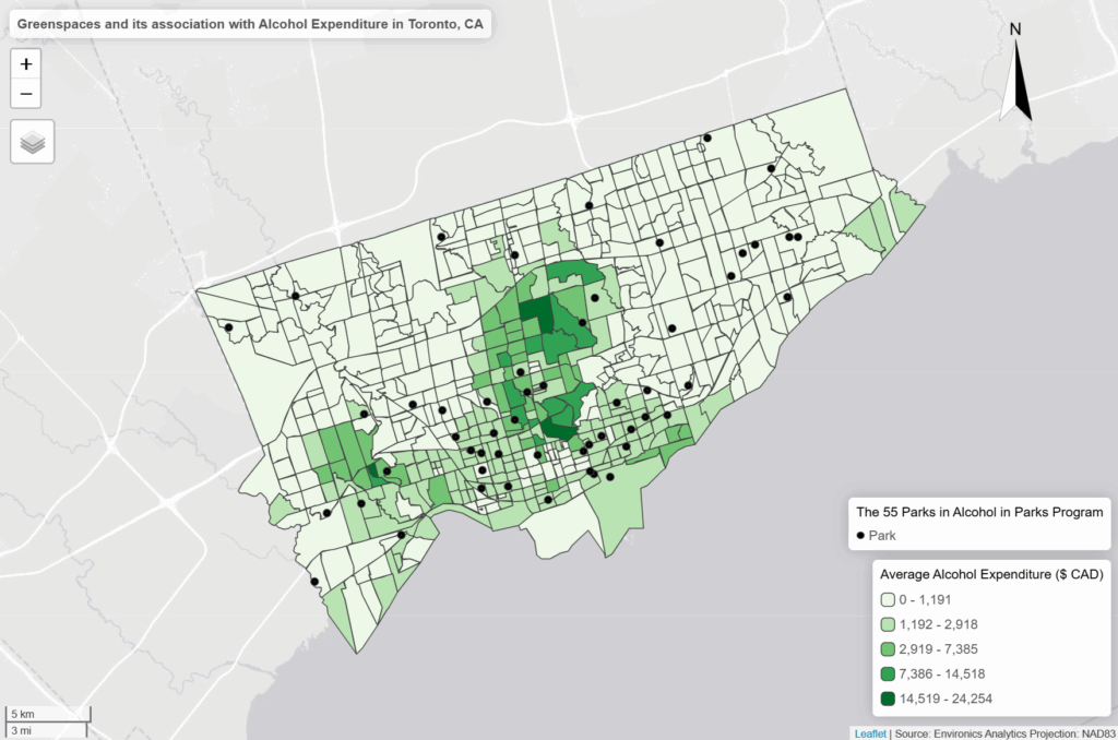
Results (Based on our interactive map)
Just based on the default settings for the interactive map, tmap includes a wide range of elements that make the map dynamic!
We have the zoom in and layer selection/basemap selection function on the top left
The compass that we created is shown in the top right
And the legend that we made is locked in at the bottom right
Our scalebar is also dynamic which changes scales when we zoom in and out
And our credits and projection section is also seen in the bottom right of our interactive map
We can also click on our layers to see the columns attached to the shapefiles
For example, we can click on the point data to see the id, LocationID, AssetID, Asset_Name, Type, Amenities, Address, Phone, and URL. While for our polygon shapefile we can see the spatial_id, name of the CT, and the alcohol spending value in that CT
As we can see in our interactive map, the areas that have the highest “Average Alcohol Expediture” lie near the upper part of the downtown core of Toronto
For example: The neighbourhoods that are dark green are Bridle Path-Sunnybrook-York Mills, Forest Hill North and South and Rosedale to name a few
However, only a few parks that are a park of the program reside in these high spending regions on alcohol
Most parks reside in census tracts where the alcohol expenditure is either the $500 to $3000 range
While there doesn’t seems to be much of an association, there is definitely more factors into play as to where people buy their alcohol or where they decide to consume it
Based on just visual findings:
For example: It’s possible that people simply do not drink in these parks even though its allowed. They probably find the comfort of their home a better place to consume alcohol
Or people don’t want to drink at a park when they could be doing more active group – like activities
References
Average Total Expenditure | Tobacco and alcohol | Alcoholic beverages | Alcoholic beverages purchased from stores, 2025. Toronto, ON: Environics Analytics: SimplyAnalytics (November 15, 2025)