Demographics of Chicago Neighbourhoods and Gang Boundaries in 2024

By: Ganesha Loree

Geovis Project Assignment, TMU Geography, SA8905, Fall 2025

INTRODUCTION

`Chicago is considered the most gang-occupied city in the United States, with 150,000 gang-affiliated residents, representing more than 100 gangs. In 2024, 46 gangs and their boundaries across Chicago were mapped by the City of Chicago. Factors about the formation of gangs have been of interest and a topic of research for many years all over the world (Assari et al., 2020), but for the purpose of this project, these factors are going to stem from demographics of Chicago. For instance, Chicago has deep roots within gang history and culture. Not only gangs but violent crimes are also dense. Demographics such as income, education, housing, race, etc., play factors within the neighbourhoods of Chicago and could be part of the cause of gang history.

METHODOLOGY

Step 1: Data Preparation

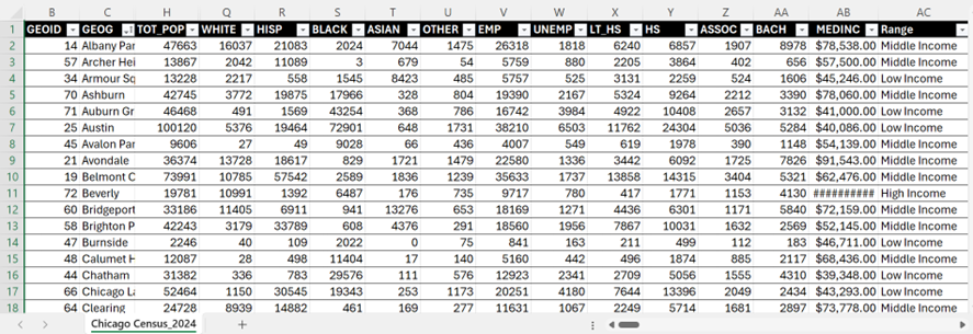
Chicago Neighbourhood Census Data (2025): Over 200 socioeconomic and demographic data for each neighbourhood was obtained from the Chicago Metropolitan Agency for Planning (CMAP) (Figure 1). In July 2025 their Community Data Snapshot portal released granular insights into population characteristics, income levels, housing, education, and employment metrics across Chicago’s neighbourhoods.

Figure 1: Census data for Chicago, 2024

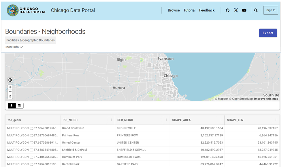
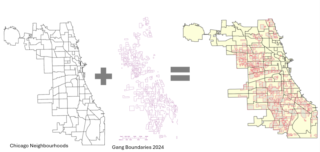
Chicago Neighbourhood Boundary Files: official geographic boundaries for Chicago neighbourhoods were downloaded from the City of Chicago’s open data portal (Figure 2). These shapefiles were used to spatially join census data and support geospatial visualization.

Figure 2: Chicago Data Portal – Neighborhood Boundaries

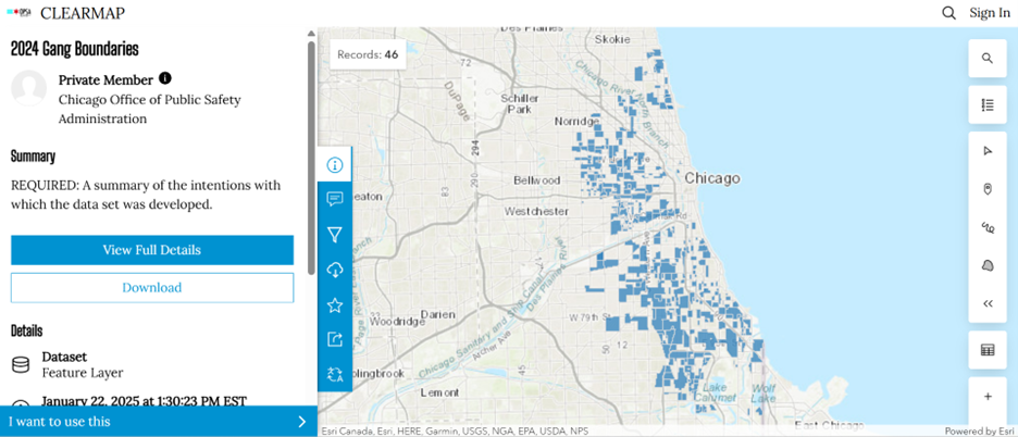
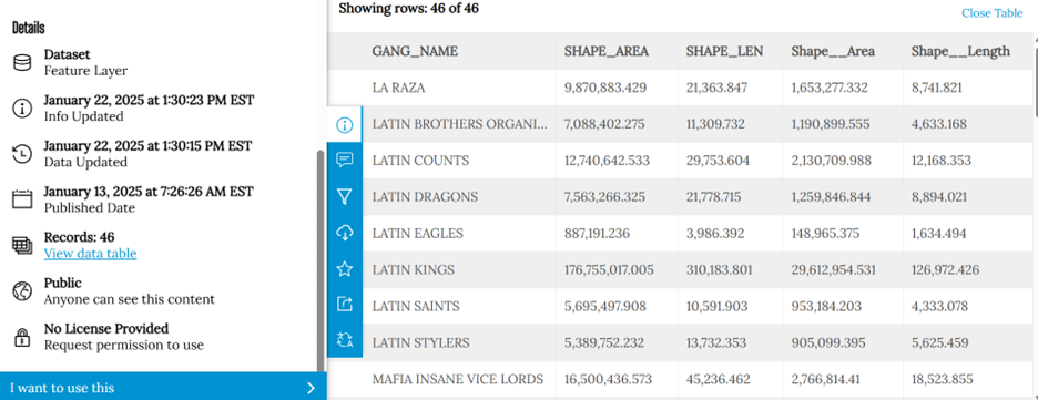
Chicago Gang Territory Boundaries (2024): Gang territory data from 2024 was sourced from the Chicago Police Department’s GIS portal (Figure 3). These boundaries depict areas of known gang influence and were integrated into the spatial database to support comparative analysis with neighbourhood-level census indicators.

Step 2: Technology

Once the data was downloaded, they were applied to software to visualize the data. A combination of technologies was used, ArcGIS Pro and Sketchup (Web). ArcGIS Pro was used to import all boundary files, where neighbourhood census data was joined to Chicago boundary shapefile using unique identifier such as Neighbourhood Name (Figure 4).

Figure 4: ArcGIS Pro Data Join Table

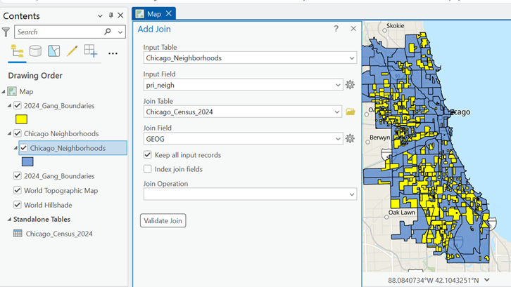
Gang territory boundary polygons overlaid with neighborhood boundaries to enable spatial intersection and proximity analysis (Figure 5).

Figure 5: Shapefiles of Chicago’s Neighbourhoods and Gangs

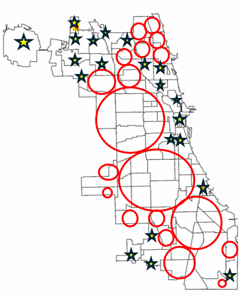
Within ArcGIS Pro, the combined map of both boundaries allowed for analysis of the neighbourhoods with the most gang boundaries. Rough sketch of these neighbourhoods was made by circling the neighbourhoods of a clean map of Chicago, where the bigger circles show the areas with more gang areas and the stars indicate the neighborhoods with no gang boundaries (Figure 6). The CMAP was used to look at the demographics of the neighborhoods with the most area of gangs and compared to the areas with no gang areas (e.g. O’Hare).

Figure 6: Chicago neighborhood outlines with markers

SketchUp

SketchUp is 3D modeling tool that is used to generate and manipulate 3D models and is often used in architecture and interior design. Using this software for this project was a different purpose of the software; by importing Chicago neighborhoods outline as an image I was able to trace the neighborhoods.

Step 3: Visualization with 3D Extrusions (Sketch Up)

Determined the highest height of the 3D maps models, was based on the total number of neighborhoods (98) and total number of gangs records/areas (46). Determining which neighbourhoods had the most gang boundaries was based on the gang area number which was provided in the Gang Boundary file. The gang with the most area totaled to shape area of 587,893,900m2, where the smallest shape area is 217,949m2. Similar process was done with neighbourhood area measurements. Neighbourhoods were raised based on the number of gang areas that were present within that neighbourhood (as previously shown in Figure 5). 5’ (feet) is the highest neighbourhood, and 4” (inches) is the lowest neighbourhood where gangs are present, neighbourhoods that do not have gangs are not elevated.

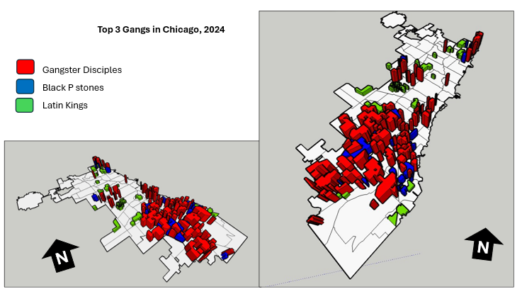
A different approach was applied to the top 3 gangs map model, where the highest remains same in each gang, but are placed in the neighbourhoods that have that gang present. For instance, Gangster Disciples were set at approximately 5 feet (5′ 3/16″ or 1528.8 mm), Black P Stones at almost 4 feet (3′ 7/8″ or 936.6 mm), and Latin Kings at a little over 1 foot (1′ 8 1/4″ or 514.4 mm).

Map Design

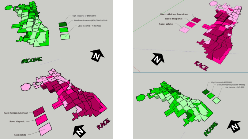
Determined what demographic factors were going to be used to compare with gang areas, for example, income, race, and top 3 gangs (Gangster Disciples, Black P Stones, and Latin Kings). Two elements present with the two demographic maps (height and colour), where colour indicates the demographic factor and the height represents the gang presence (Figure 7).

Figure 7: 3D map models of Chicago gangs based on Race and Income

There was limited information available about the gang areas, which only consisted of gang name, shape area, and length measurements. In terms of SketchUp’s limitations, the free web version as some restrictions, had to manually draw the outline of Chicago neighbourhoods which was time consuming. In addition, SketchUp scale system was complex and was not consistent between maps. To address tis, each corner of the map was measured with the Tape Measure Tool to ensure uniformity. Lastly, when the final product was viewed in augmented reality (AR), the map quality was limited such as the neighbourhood outlines were gone, and the only parts that were visible were the colour parts of the models.

The most visual pattern shown from the race map is the areas with more gang activity have a large population of African Americans (Figure 7). For the income map, indicated in green, more gang areas have lower income whereas the areas with higher income do not have gangs in those neighborhoods. Based on the top three gangs, Gangster Disciples have the most gang boundaries across Chicago neighborhoods (Figure 8). Gangster Disciples takes up 33.6% of the area in km2, founded in 1964 in Englewood.

Figure 8: 3D map of the top 3 gangs in Chicago, 2024

FINAL PRODUCT

The final product, is user interactive through a QR code that allows viewers to look at the map models using augmented reality (AR) just by pointing your mobile device camera at the QR code below.

Being aware that the quality of the AR has its limits, the SketchUp map models can be viewed using the Geovis Map Models button below.

Reference

Assari, S., Boyce, S., Caldwell, C. H., Bazargan, M., & Mincy, R. (2020). Family income and gang presence in the neighborhood: Diminished returns of black families. Urban Science4(2), 29.

The History Of Chicago’s Homicides For The Last Two Decades

By: Charan Batth

Geovis Project Assignment @RyersonGeo, SA8905, Fall 2021

Introduction

The crime rate for the city of Chicago is significantly higher than the US average. In 2016, Chicago was responsible for nearly half of the homicides increase in the US.

A time series interactive dashboard will be used to visualize and analyze the distribution of homicides across Chicago for the last two decades. We will create this dashboard using Tableau Desktop, which is an interactive data visualization and analytical tool. In addition to the dashboard, we will create two visualizations: treemap and line chart. Treemap will be used to visualize aggregated homicides across police districts. The line chart will visualize the number of homicides per month.

Data

The data used to produce the Interactive Dashboard was obtained from the Chicago Data Portal. The dataset consists of 7,424,694 crimes between 2001 to 2021. However, since our crime is focused on homicides, the data was filtered by setting the field Prime Type to be equal to HOMICIDE and then the data was downloaded as a CSV file.

I will go through the step-by-step process of creating the time-series interactive dashboard, the dashboard can be viewed here for reference.

Creating the Interactive Dashboard

To get started on creating the interactive dashboard and the visualizations. We will first import the data, since our dataset is in a CSV format we will select the Text File under the To a File Option. After opening the data, you will see a screen showing all the fields in the CSV file and on the bottom left beside Data Source, you will see a tab called Sheet 1 (highlighted in orange), we will click on it to begin the process of creating the dashboard. The Worksheet tabs will be used to create the map and visualizations and the Dashboard tab will be used to create the dashboard.

In order to create a dot density map showing homicides across Chicago, we need to plot the latitude and longitude coordinates for each homicide. We do this by dragging the Longitude field into the Columns tab and the Latitude field into the Rows tab. We then set both fields to Dimension, by right-clicking on the fields. A map will automatically be created however, there are two minor issues with the map, shown below.

Our map shows 1 null point (displayed on the bottom right of the map) and there is a random point in Missouri.

In order to fix these issues, we will first remove the null point by clicking on 1 null and selecting the Filter Data. To remove the random point located in Missouri, we will right-click on the point and select Exclude. This will remove the point from the map, and our map extent will automatically zoom to the Chicago area.

Creating Time-series Map

To create the time-series map, we will drag the Year field into the Pages card. This will create a time slider that will allow you to view the dot density map for any chosen year. The time slider also allows the user to animate the map, by clicking on the loop button and the animation can be paused at any time.

For our dot density map, we will show specific attributes for each homicide location on the map. This can be accomplished by dragging the fields into the Marks card. For our map, we will show the following fields: Block, Description, District, Location Description, and Date.

To make our map look aesthetic, we will change the theme of our map to Dark. This can be done by going to the header Map, hovering over to Background Map, and selecting Dark. To better visualize the locations of the data points, we will add zip code boundaries to the map. To do this, we will go to the header Map and from there we will choose Map Layers and then select the Zip Code Boundaries under the Map Layers pane (this will appear on the left side of the sheet). Lastly, we are going to change the colour and size of the data points. This can be done by going to the Marks card and selecting the Color and Size option.

Visualizations

Treemap

We will now create the visualizations to better understand the distribution of homicides in Chicago. To begin the process, we will create a new Worksheet and we will name it Treemap. To create a treemap, we will first drag the Year field into the Page card, as we are creating a time-series interactive map. Since we want to see how homicides vary across police districts, we will drag the District field into the Marks card. To show the homicides, we will drag the Primary Type field onto both the Color and Size options in the Marks card. We will then set the Primary Type field to Measure and choose Count, as we want to show aggregated homicides. The final step is to make our worksheet transparent, so we could add it to our interactive map. This is done by going to the header Format and selecting Shading. In the Formatting pane, we will set the Worksheet and Pane background colour to None.

Line Chart

We will create a new Worksheet and name it chart. Our data does not contain the month the incident occurred, but we have the Date when the incident occurred. So, in order to extract just the month, we will need to create a new field. This can be done by going to the Analysis header and choosing Create Calculated Field. We will give the field an appropriate name, change the name Calculation1 to MonthOfIncident. To extract the month we first need to truncate the Date field, as it contains both the date and time. We will use the LEFT function which allows us to truncate a string type specified by the length. The date consists of 10 characters (dd/mm/yyyy), so our query would be LEFT([Date], 10). Next, we need to extract the month from the truncated string, so we will use the built-in function, called MONTH, which returns a number representing the month. However, the MONTH function requires its parameter data type to be a date. So we need to convert our truncated string date to date, we can do this by applying the DATE function on the LEFT function and finally applying the MONTH function on the entire expression. Thus our expression for finding the month is:

Now, we can finally begin the process of creating the line chart. As we are making a time-series interactive map, we will also need to make a time-series line chart. So, we will drag the Year field into the Pages card, as this will be part of our time-series interactive map. Next, we will drag the MonthOfIncident field into the Columns tab and Primary Type into the Rows tab. Since we want to show the total number of homicides, we will set the Primary Type field to Measure and select Count. We will make this worksheet transparent as well, so we will go to the header Format and select Shading. In the Formatting pane, we will set the Worksheet and Pane background colour to None.

Creating the Dashboard

To create our dashboard, we will click on the Dashboard tab, right beside the Worksheet tab. In the dashboard, we can add all the worksheets we have created. We will first add the interactive map followed by the visualizations. To display the visualizations on top of the map, we need to make them float. So, we will select one of the visualizations and hover over to More Options (shown as a downward arrow) and click on Floating, repeat this process for the other visualization. You can also change the size of the dashboard by going to the Size pane, the default size is Desktop Browser (1000 x 800), we will change it to Generic Desktop (1366 x 788). Last but not least, we will publish this dashboard, by going to the Server -> Tableau Public -> Save to Tableau Public As. Tableau Public allows anyone to view the dashboard and allow anyone to download it and specific permissions for the dashboard can be applied.

Limitations and Future Goals

One of the main limitations that occurred during the process of creating the dashboard was gathering the data. First, I had downloaded the entire CSV file containing all different types of crimes. However, when I filtered the Primary Type to HOMICIDE in the Filters card, a huge amount of data for homicides was missing. So, I then decided to directly connect the dataset to Tableau using ODATA Server. It took me a couple hours to connect to the server, just to run into the same issue. I then tried exporting the data through SODA API from the portal, I was able to find raw data for homicides however, it contained partial data. After a while, I figured out I had to directly filter the table in the Chicago Data Portal in order to download the entire data for Chicago homicides.

Another limitation I faced with the data was creating the visualizations. Originally I intended on creating a highlight table to show how homicides varied across police districts and community areas. However, due to the data having null values for community areas, the visualization couldn’t be created. Furthermore, I was only able to create basic visualizations, as the data did not have any interesting variables to help analyze the homicide distribution. For instance, if each homicide incident included a Zip Code, it could have been used to explain the spatial pattern much better rather than using police districts to show how homicides vary across it.

If I was to expand on this project, I would try to incorporate all different crime incidents from 2001-2021 to see Chicago’s overall crime history. In addition to this, I would find demographic data for Chicago such as population, education, and average family income to help understand the spatial pattern for the distribution of crimes.