Mapping Toronto’s Post-War Urban Sprawl & Infill Growth (1945-2021)

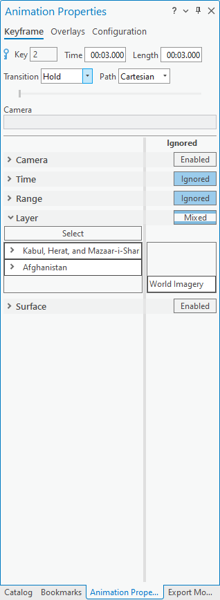
A Geovizualization Project by Mandeep Rainal.

SA8905 – Master of Spatial Analysis, Toronto Metropolitan University.

For this project, I explore how Toronto has grown and intensified over time, by creating a 3D animated geovisualization using Kepler.gl. I will be using 3D building massing data from the City of Toronto and construction period information from the 2021 Census data (CHASS).

Instead of showing a static before and after map, I decided to build a 3D animated geovizualization that reveals how the city “fills in” over time showing the early suburban expansion, mid-era infill, and rapid post-2000 intensification.

To do this, I combined the following:

  • Toronto’s 3D Massing Building Footprints
  • Age-Class construction era categories
  • A Custom “Built-Year” proxy
  • A timeline animation created in Kepler. gl and Microsoft Windows.

The result is a dynamic sequence showing how Toronto physically grew upward and outward.

BACKGROUND

Toronto is Canada’s largest and fastest growing city. Understanding where and when the built environment expanded helps explain patterns of suburbanization, identify older and newer development areas and see infill and intensification. This also helps contextualize shifts in density and planning priorities for future development.

Although building-level construction years are not publicly available, the City of Toronto provides detailed 3D massing geometry, and Statistics Canada provides construction periods at the census tract level for private dwellings.

By combining these sources into a single animated geovizualization, we can vizualize Toronto’s physical growth pattern over 75 years.

DATA

  • City of Toronto – 3D Building Massing (Polygon Data)
    1. Height attributes (average height)
    2. Building Footprints
    3. Used for 3D extrusions
  • City of Toronto – Muncipal Boundary (Polygon Data)
    1. Used to isolate from the Census metropolitan area to the Toronto city core.
  • 2021 Census Tract Boundary
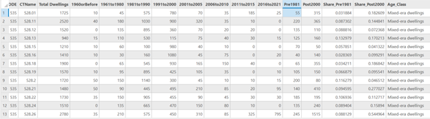
  • CHASS (2021 Census) – Construction Periods for Dwellings
    1. Total dwellings
    2. 1960 and before
    3. 1961-1980
    4. 1981-1990
    5. 1991-2010
    6. 2011-2015
    7. 2016-2021
    8. Used to assign Age classes and a generalized “BuiltYear” for each building.

METHODOLOGY

Step 1: Cleaning and Preparing the Data in ArcGIS Pro

  • I first imported the collected data into ArcGIS. I clipped the census tract layers to the City of Toronto boundary to get census tracts for Toronto only.
  • Next, I joined the census tract polygon layer we created to the construction period data that was imported. This gives us census tracts with construction period counts.
  • Because Toronto does not have building-year data, I assigned construction era categories from the census as proxies for building age, and created an age classification system using proportions. Adding periods and dividing / total dwellings to get proportions, and assigned them into three classes:
    • Mostly Pre-1981 dwellings
    • Mixed-era dwellings
    • Mostly 2000+dwellings
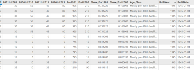
  • Next, I needed a numeric date field for Kepler to activate the time field. I assigned a representative year to each tract using the Age classes.
    • if age = Mostly Pre-1981 dwellings = 1945
    • if age = Mixed-era dwellings = 1990
    • if age = Mostly 2000+dwellings = 2010
  • And to make the built year Kepler-compatible a new date field was created to format as 1945-01-01.
  • The data was then exported as GeoJSON files to import into Kepler.gl. The built year data was also exported as a CSV because Kepler doesn’t pick up on the time field in geoJSON easily.

Stage 2: Visualizing the Growth in Kepler

  • Once the layers are loaded into Kepler the tool allows you manipulate and vizualize different attributes quickly.
  • First the 3D Massing GeoJSON was set to show height extrusion based on the average height field. The colour of the layer was muted and set to be based on the age classes and dwelling eras of the buildings.
  • Second layer, was a point layer also based on the age-classes. This would fill in the 3D massings as the time slider progressed, and was based on brighter colours.
  • The Built Date CSV was added as a time-based filter for the build date field.

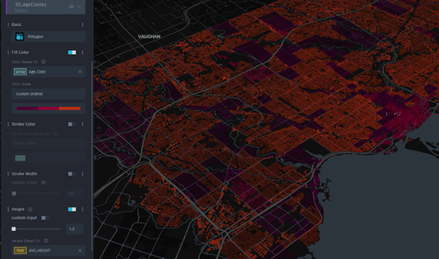
The final visualization was screen recorded and shows an animation of Toronto being built from 1945 to 2021.

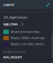
  • Teal = Mixed-era dwellings
  • Amber = Mostly 2000+ dwellings
  • Dark purple = Mostly Pre-1981 dwellings

RESULTS

The animation reveals key patterns on development in the city.

  • Pre-1981 areas dominate older neighbourhoods, the purple shaded areas show Old Toronto, Riverdale, Highpark, North York.
  • Mixed-era dwellings appear in more transitional suburbs, filling in teal, and showing subdividisions with infill.
  • Mostly 2000+ dwellings are filling in amber and highlight the rapid intensification in areas like downtown with high-rise booms, North York centre, Scarborough Town Centre.

The animation shows suburban sprawl expanding outward, before the vertical intensification era begins around the year 2000.

Because Kepler.gl cannot export 3D time-slider animations as standalone HTML files, I captured the final visualization using Microsoft Windows screen recording instead.

LIMITATIONS

This visualization used census tract–level construction-period data as a proxy for building age, which means the timing of development is generalized rather than precise. I had to collapse the CHASS construction ranges into age classes because the census periods span multiple decades and cannot be animated in Kepler.gl’s time slider, which only accepts a single built-year value per feature. Because all buildings within a tract inherit the same age class, fine-grained variation is lost and the results are affected by aggregation. Census construction categories are broad, and assigning a single representative “built year” further simplifies patterns. The Kepler animation therefore illustrates symbolic patterns of sprawl, infill, and intensification, not exact chronological construction patterns.

CONCLUSION

This project demonstrates how multiple datasets can be combined to produce a compelling 3D time-based visualization of a city’s growth. By integrating ArcGIS Pro preprocessing with Kepler’s dynamic visualization tools, I was able to:

  • Simplify census construction-era data
  • Generate meaningful urban age classes
  • Create temporal building representations
  • Visualize 75+ years of urban development in a single interactive tool

Kepler’s time slider adds an intuitive, animated story of how Toronto grew, revealing patterns of change that static maps cannot communicate.

Visualizing the Influence of Afghanistan’s Geography on Its History and Culture Using 3D Animation in ArcGIS Pro

Hello everyone! I’m excited to share my tutorial on how to use the animation capabilities in ArcGIS Pro to visualize 3D data and create an animated video.

My inspiration for this project was learning more about my ancestral homeland, Afghanistan, whose history and culture are known to have been heavily influenced by its location and topography.

Since I also wanted to gain experience working with the 3D layers and animation tools available in ArcGIS Pro, I decided to create a 3D animation of how geography has influenced Afghanistan’s history and culture.

My end product was an educational video that I narrated and posted on Youtube.

The GIS software I used in this project was ArcGIS Pro 3.3.1. I also used the Voice Memos app to record my narration, and iMovie to compile the audio recordings and the exported ArcGIS Pro movie into one video.

For my data sources, I derived the historical information presented in the animation from a textbook by Jalali (2021), the political administrative boundary of Afghanistan from geoBoundaries (Runfola et al., 2020), and the World Elevation 3D/Terrain 3D and World Imagery basemap layers from ArcGIS Pro (Esri et al., 2024; Maxar et al., 2024).

For this tutorial, I will only be providing a broad overview of the steps I took to create my end product. For additional details on how to use the animation capabilities in ArcGIS Pro, please refer to Esri’s free online Help documentation.

Now, without further ado, let’s get started!

To design and create a geographic-based animation involving 3D data using ArcGIS Pro.

The following convention was used to represent the process of navigating the ArcGIS Pro ribbon: Tab (Group) > Command

Since I wanted to create a narrated video as my end product, I first had to research my topic and decide what kind of story I wanted to tell by writing the script that would go along with each keyframe.

The next step was to record the narration using the script I wrote so that I could have a reference point for my keyframe transitions.

This process was as simple as hitting record on Voice Memos, then uploading each audio file to a new iMovie project.

The audio files were trimmed and aligned until a seamless transition between each clip was achieved.

To create the animation, the following steps were taken:

In my case, the Terrain 3D layer was automatically loaded as the elevation surface. To load the World Imagery layer, I had to navigate to Map (Layer) > Basemap and select “Imagery”.

I then added and symbolized the political administrative boundary shapefile I downloaded for Afghanistan.

To mark the locations of the three cities I included in some of the keyframes, I also created my own point geometry using the graphical notation layer available through Insert (Layer Templates) > Point Map Notes. The Create tool under Edit (Features) was used to digitize the points.

Finally, I downloaded two PNG images to insert into the animation at a later time (Anonymous, 2014; Khan, 2010).

GeoVis

Although an animation can be created regardless, bookmarking the view you intend to use for each keyframe is a good way of planning out your animation. The Scene’s view can be adjusted and updated at a later time, but this allows you to have an initial framework to start with.

ArcGIS Pro also allows you to import your bookmarks to automatically create keyframes using preconfigured playback styles.

Creating a Bookmark

To open the Bookmarks pane, click on “Manage Bookmarks” under Map (Navigate) > Bookmarks. Zoom to your desired keyframe location and create a bookmark using the New Bookmark subcommand.

The Locate command under Map (Inquiry) can be used to quickly search for and zoom to any geocoded location on the Earth’s surface.

Adjusting the View

To change the camera angle of your current view, use the on-screen navigator in the lower left corner of the Scene window. Click on the chevron to access full control.

By clicking and holding down on the bottom of the arrow on the outer ring of the on-screen navigator, you can rotate the view around the current target by 360o.

Clicking and holding down on the outer ring only will allow you to pan the Scene towards the selected heading.

To change the pitch of the camera angle or rotate the view around the current target, click and hold down on the inner ring around the globe, then drag your mouse in the desired direction.

Finally, clicking and holding down on the globe allows you to change your current target.

If your current Scene has never been initialized for an animation, the Animation tab can be activated through View (Animation) > Add.

To ensure you design the animation to fit the resolution you intend to export to, click on Animation (Export) > Movie.

In the Export Movie pane, under “Advanced Movie Export Settings”, select your desired “Resolution”. You could also use one of the “Movie Export Presets”  if desired. I chose “1080p HD Letterbox (1920 x 1080)” to produce a good quality video.

This step is very important, as the view of your keyframes and the placement of any overlays you add are directly affected by the aspect ratio of your export, which is directly tied to your selected resolution.

GeoVis

Start off by opening the Animation Timeline pane through Animation (Playback) > Timeline.

In the Bookmarks pane, click on your first bookmark. With your view set, click “Create first keyframe” in the Animation Timeline pane to add a keyframe.

Repeat this process until all of your keyframes are added.

Alternatively, as mentioned before, the Import command in Animation (Create) can be used to automatically load all of the bookmarks in your project as keyframes using a preconfigured playback style.

GeoVis

If you need to adjust the view of a keyframe, adjust your current view in the Scene window, then select the keyframe in the Animation Timeline pane and hit Update in Animation (Edit).

To configure the transition, time, and layer visibility of each keyframe, open the Animation Properties pane through Animation (Edit) > Properties and click on the Keyframe tab in this pane.

Choose one of the five transition types to animate the camera path: “Fixed”, “Adjustable”, “Linear”, “Hop”, or “Stepped”.

To create a tour animation that pans between geographic locations, a combination of “Hold” and “Hop” can be used. “Fixed” can be used to create a fly-through that navigates along a topographic feature.

Hit the play button in the Animation Timeline pane to view your animation and adjust accordingly.

Although the Terrain 3D and World Imagery layers may not draw well in ArcGIS Pro due to their sheer size, they should appear fine in the exported video.

Text, images, and other graphics can be added using the commands available in Animation (Overlay). Acceptable image file formats are JPG, TIFF, PNG, and BMP.

The position and timing of an overlay can be adjusted in the Overlays tab in the Animation Properties pane.

GeoVis

Once you’re satisfied with your animation, you can export by clicking on Animation (Export) > Movie again.

Name the file and select your desired “Media Format” and “Frames Per Second” settings.

Your resolution should already be set, but you can adjust the “Quality” to determine the size of your file.

Hit “Export” once you’re ready. Depending on the size of your animation, it can take several hours for the video to export. Mine took over 10 hours.

You can also export a subsection of your animation by specifying a “Start Time” and “End Time”. This can be useful to preview the end result of your animation bit by bit without having to export the entire video, which can take a lot of time.

With my animation exported, I added the video to my project in iMovie. Since I timed the animation according to my narration, the two files aligned perfectly at the zero mark and no further editing had to be done.

To export the final video, I used File > Share > Youtube & Facebook and made sure to match the resolution to the one I selected in ArcGIS Pro (1920 x 1080). iMovie will notify you once the .mov file is exported.

The final step was uploading the video on Youtube.

Create and/or log in to your Youtube account. On the Youtube homepage, click on You > Your videos > Content > Create > Upload videos to add the .mov file. A wizard will pop up.

Under the Details tab, fill out the “Title” and provide a “Description” for your video. Timestamps marking different chapters in the video can also be added here.

Select a thumbnail and fill out the remaining fields, including those under “Show more”, such as “Video language”. Selecting a “Video language” is necessary to add subtitles, which can be done through the Video elements tab.

Once your video is set up, hit “Publish”. Youtube will supply you with the link to your published video.

You just visualized 3D data and created a geographic-based animation using ArcGIS Pro!

Anonymous. (2014, September 18). Ahmad Shah Durrani [Artwork]. https://history-of-pashtuns.blogspot.com/2014/09/ahmed-shah-durrani.html

Esri, Maxar, Earthstar Geographics, & GIS User Community. (2024, November 19). World Imagery (November 26, 2024) [Tile layer]. Esri. https://services.arcgisonline.com/ArcGIS/rest/services/World_Imagery/MapServer

Jalali, A. A. (2021). Afghanistan: A Military History From the Ancient Empires to the Great Game. University Press of Kansas.

Khan, M. (2010, December 11). Horse [Artwork]. https://www.foundmyself.com/Momin+khan/art/horse/66007

Maxar, Airbus DS, USGS, NGA, NASA, CGIAR, GEBCO, N Robinson, NCEAS, NLS, OS, NMA, Geodatastyrelsen, & GIS User Community. (2024, June 12). World Elevation 3D/Terrain 3D (November 26, 2024) [Image service layer]. Esri. https://services.arcgisonline.com/arcgis/rest/services/WorldElevation3D/Terrain3D/ImageServer

Runfola, D., Anderson, A., Baier, H., Crittenden, M., Dowker, E., Fuhrig, S., Goodman, S., Grimsley, G., Layko, R., Melville, G., Mulder, M., Oberman, R., Panganiban, J., Peck, A., Seitz, L., Shea, S., Slevin, H., Youngerman, R., & Hobbs, L. (2020). GeoBoundaries: A Global Database of Political Administrative Boundaries (September 21, 2024) [Shapefile]. GeoBoundaries. https://www.geoboundaries.org