Marzieh Darabi, Geovis Project Assignment, TMU Geography, SA8905, Fall 2024
https://experience.arcgis.com/experience/638bb61c62b3450ab3133ff21f3826f2
This project is designed to help transportation planners understand how families travel to school and identify the most commonly used walking routes. The insights gained enable the City of Mississauga to make targeted improvements, such as adding new signage where it will have the greatest impact.
Project Workflow
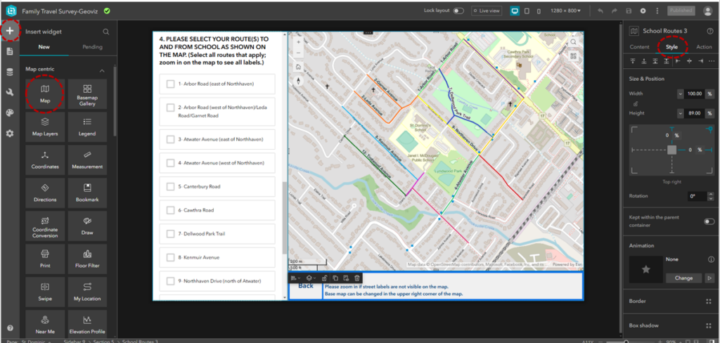
Each school has its own dedicated page within the app, displaying both a map and a survey. The maps were prepared in ArcGIS Pro and then shared to ArcGIS Online. In the Map Viewer, I defined the symbology and set the desired zoom level for the final map. To identify key routes for the study, I used the Buffer tool in ArcGIS Pro to analyze routes in close proximity to schools. Next, I applied the Select by Location tool to identify routes located within a 400-meter radius of each school. These selected routes were then exported as a new street dataset. I further refined this dataset by customizing the streets to include only the most relevant options, reducing the number of choices presented in the survey.
Each route segment was labeled to correspond directly with the survey questions, making it easy for families to understand which options in the survey matched the map. To make these labels, new field was added to street dataset that would correspond to options in the survey. These maps were then integrated into ArcGIS Experience Builder using the Map Widget, which allows further customization of map content and styling via the application’s settings panel.
Why Experience Builder?
When designing the application, I chose ArcGIS Experience Builder because of its flexibility, modern interface, and wide range of features tailored to building interactive applications. Here are some of the specifications and advantages of using Experience Builder for this project:
- Widget-Based Design:
Experience Builder operates on a widget-based framework, allowing users to drag and drop functional components onto the canvas. This flexibility made it easy to integrate maps, surveys, buttons, and text boxes into a cohesive application. - Customizable Layouts:
The platform offers tools for designing responsive layouts that adapt to different screen sizes. For this project, I configured desktop layout to ensure that the application is accessible to families. - Map Integration:
The Map Widget provided options to display the walking routes and key streets interactively. I set specific map extents to align with the study’s goals. End-users could zoom in or out and interact with the map to see routes more clearly. - Survey Integration:
By embedding the survey using the Survey Widget, I was able to link survey questions directly to map visuals. The widget also allowed real-time updates, meaning survey responses are automatically stored and can be accessed or analyzed in ArcGIS Online. - Dynamic User Navigation:
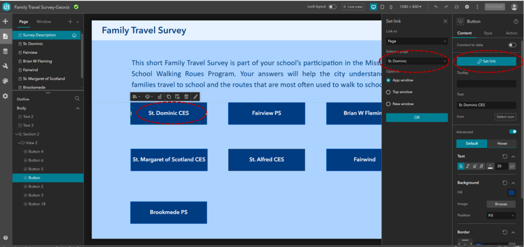
The Button Widget enabled intuitive navigation between pages. Each button is configured to link directly to a school’s map and survey page, while a Back Button on each page ensures users can easily return to the introduction screen. - Styling Options:
Experience Builder offers extensive styling options to customize the look and feel of the application. I used the Style Panel to select fonts, colors, and layouts that are visually appealing and accessible.
App Design Features
The app is designed to accommodate surveys for seven schools. To ensure ease of navigation, I created an introductory page listing all the schools alongside a brief overview of the survey. From this page, users can navigate to individual school maps using a Button Widget, which links directly to the corresponding school pages. A Back Button on each map page allows users to return to the school list easily.
The survey is embedded within each page using the Survey Widget, allowing users to submit their responses directly. The submitted data is stored as survey records and can be accessed via ArcGIS Online.
Customizing Surveys
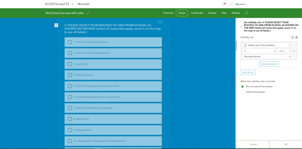
The survey was created using the Survey123 app, which offers various question types to suit different needs. For my survey, I utilized multiple-choice and single-line text question types. Since some questions are specific to individual schools, I customized their visibility using visibility rules based on the school selected in Question 1. For example, Question 4, which asks families about the routes they use to reach school, only becomes visible once a school is selected in Question 1.
If the survey data varies significantly across different maps, separate surveys can be created for each school to ensure accuracy and relevance.
Final Thoughts
Using ArcGIS Experience Builder provided the ideal platform for this project by combining powerful map visualizations with an intuitive interface for survey integration. Its customization options allowed me to create a user-centric app that meets the needs of both families and transportation planners.


