3D Visualization of Traffic Collision Hotspots in Toronto (2022)

Geovis Project Assignment, TMU Geography, SA8905, Fall 2025
By: Haneen Banat

Introduction

Traffic collisions are a major urban safety concern in large cities like Toronto, where dense road networks, high population, and multimodal movement create complex interactions between drivers, pedestrians, cyclists, and transit. Traditional 2D maps and tables can represent collision statistics, but they often fail to communicate spatial intensity or the “feel” of risk across neighbourhoods. For this project, I explore how GIS, 3D modeling, and architectural rendering tools can work together to reimagine collision data as a three-dimensional, design-driven geovisualization.

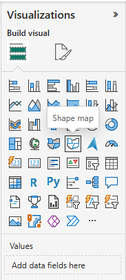
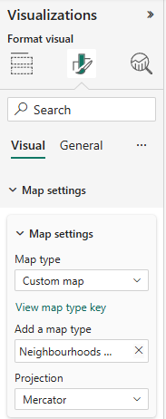
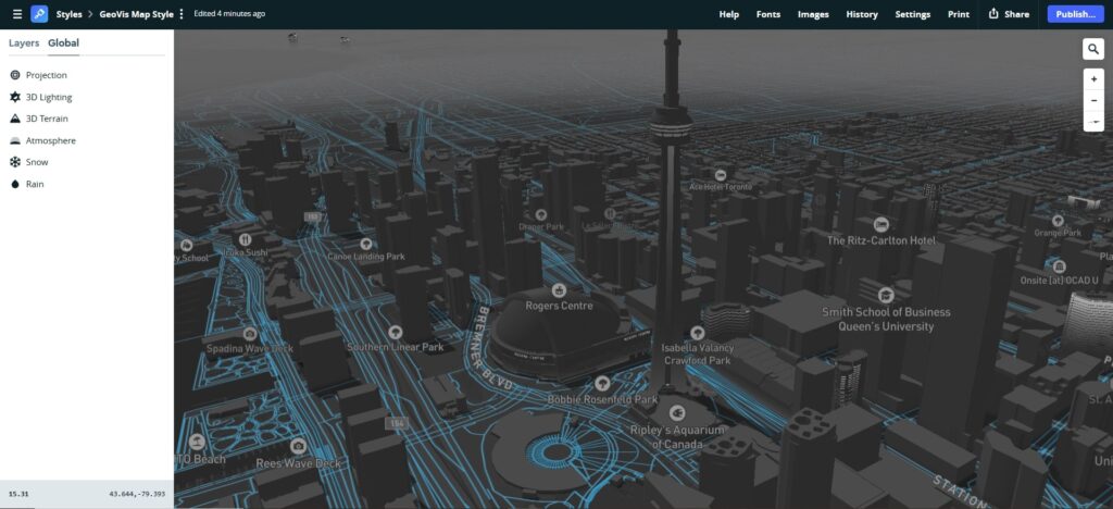
My project, 3D Visualization of Traffic Collision Hotspots in Toronto, transforms Toronto Police Service collision data into an immersive 3D map. The goal is to visualize where collisions are concentrated, how spatial patterns differ across neighbourhoods, and how 3D storytelling techniques can make urban safety data more intuitive and visually compelling for planners, designers, and the public. I use a multi-software workflow that spans ArcGIS Pro, the City of Toronto’s 3D massing data, SketchUp, and Lumion. This project demonstrates how cartographic tools can support modern spatial storytelling, blending urban analytics with design. 

Data Sources

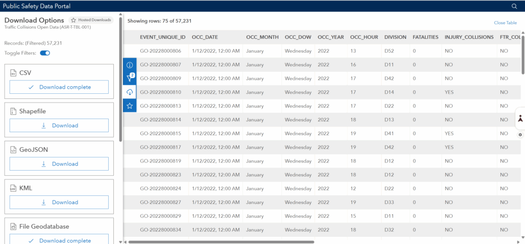
Toronto Police Open Data Portal

Dataset: Traffic Collisions (ASR-T-TBL-001)
Link: https://data.torontopolice.on.ca

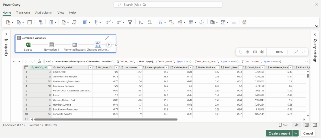
This dataset includes over 770,000 collision records across many years. Each record includes: Location, Date, time, collision type, mode invloved and different attributes. Because the full dataset is extremely large and includes COVID-period anomalies, I filtered the dataset to only the year 2022. This produced roughly 50,000-60,000 collision records. For this project, only automobile collisions were used. I downloaded the geodatabase file as a CVS.

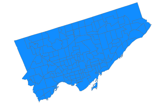
The second piece of data that was needed was City of Toronto – Neighbourhood Boundaries: Link: https://open.toronto.ca/dataset/neighbourhoods/

The third piece of data is City of Toronto Planning, 3D Massing Model. Link: https://cot-planning.maps.arcgis.com/apps/webappviewer/index.html?id=161511b3fd7943e39465f3d857389aab

This dataset includes 3D building footprints and massing geometry. I downloaded individual massing tiles in SketchUp format (.skp) for the neighbourhoods with the highest hotspot scores. Because each tile is extremely heavy, I imported them piece by piece.

Software Used:

  • ArcGIS Pr: filtering, spatial join, hotspot analysis
  • SketchUp: extrusion modeling and colour classification
  • Lumion: 3D rendering, lighting, and final visuals

Methodology

This project required a multi-stage workflow spanning GIS analysis, CAD conversion, 3D modeling, and rendering. The workflow is divided into four main stages.

Step 1: Data Cleaning & Hotspot Analysis using ArcGIS Pro

Filtering Collision Data:

The Police dataset originally contained 772,000 records.

  1. Applied a filter for OCC_DATE = 2022
  2. Removed non-automobile collisions
  3. Ensured that only records with valid geometry were included
  4. Downloaded as File Geodatabase (shapefile download was corrupt)

After filtering, the dataset was reduced to a manageable 50,000 records

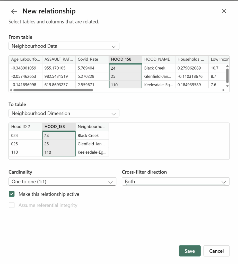
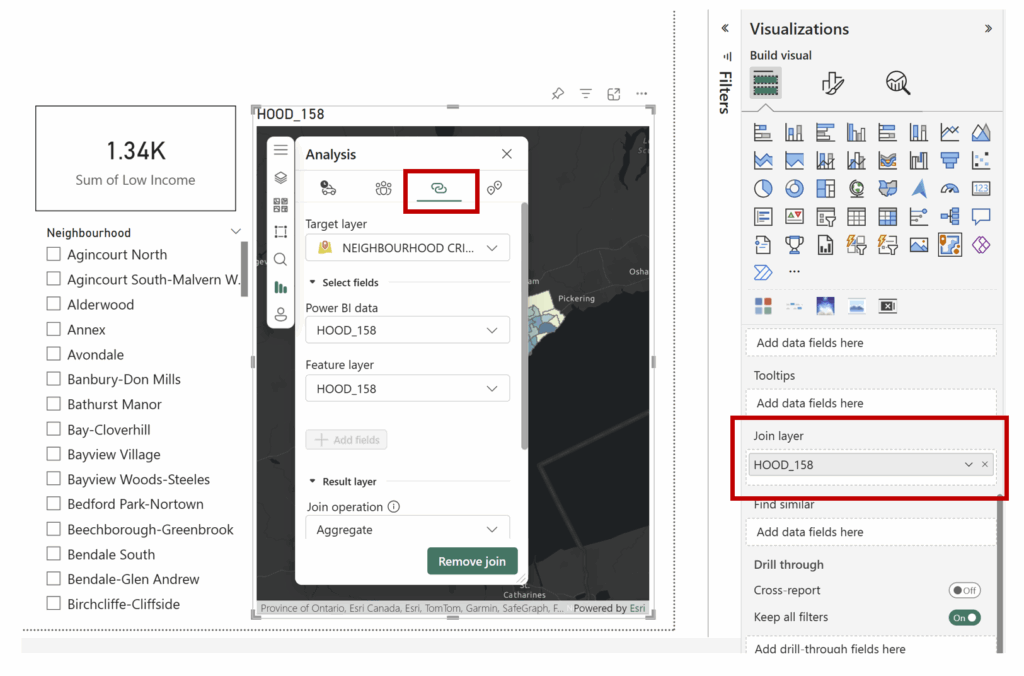
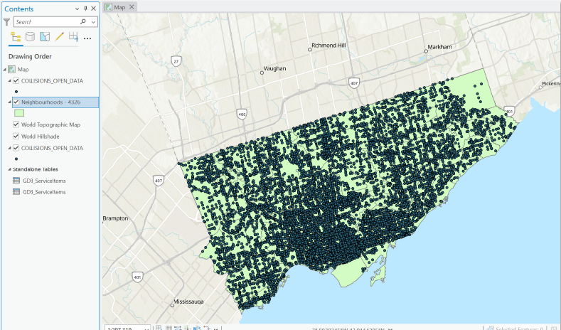
Step 2: Spatial Join (Join collisions to neighbourhoods)

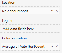
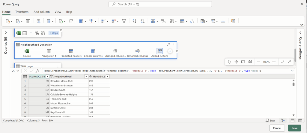
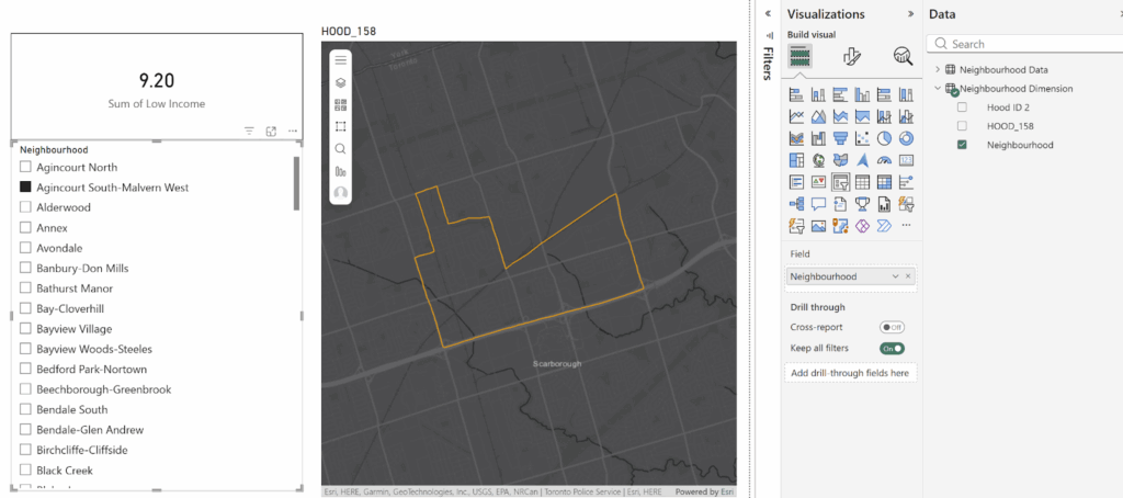
To understand spatial distribution, I joined the collision points to Toronto’s 158 neighbourhood polygons

Tool: Spatial Join

  • Target features: Neighbourhoods
  • Join features: Collisions
  • Join operation: JOIN_ONE_TO_ONE
  • Match option: INTERSECT

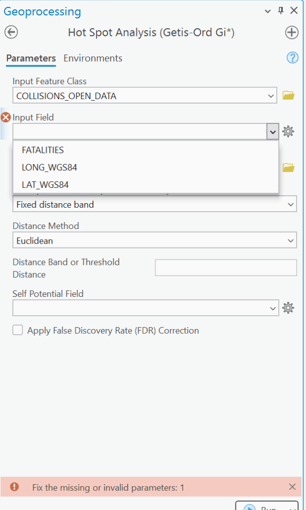
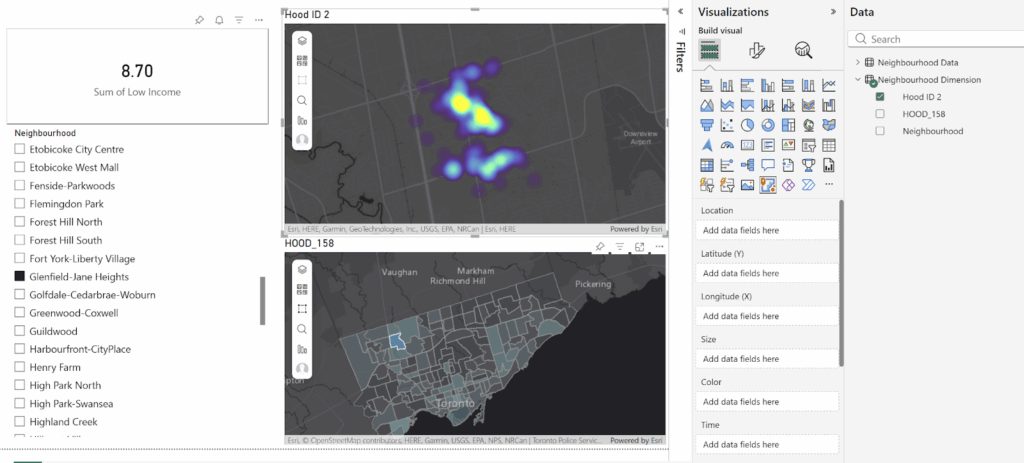
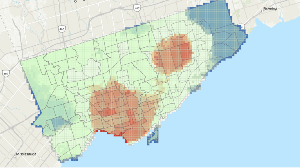
Step 3: Hotspot Analysis (Optimized Hot Spot Analysis)

Tool: Optimized Hot Spot Analysis
Input: All collision points
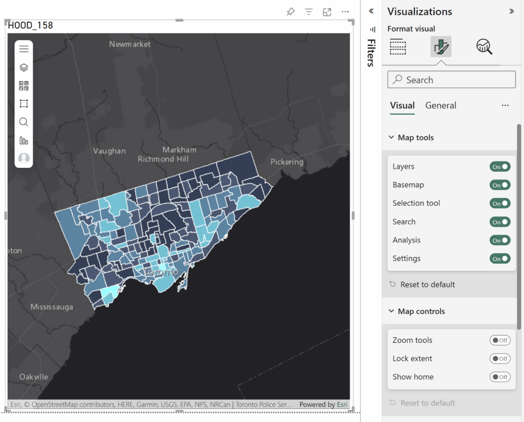
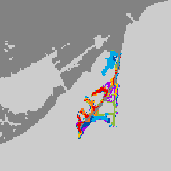
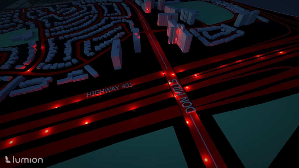
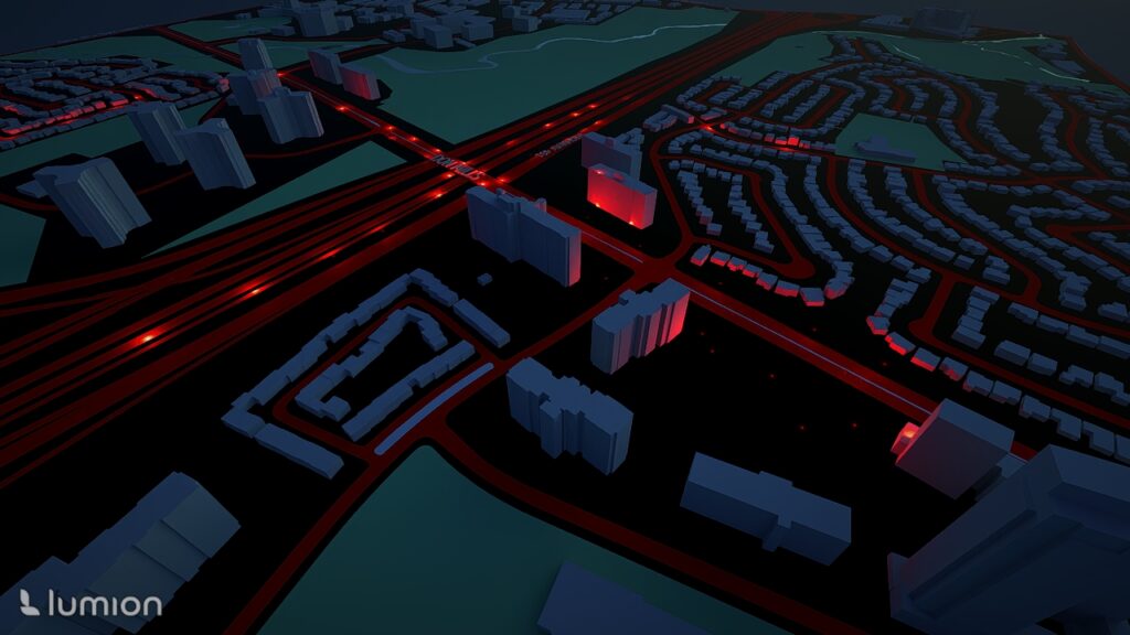
This produced a statistically significant hotspot/coldspot map: White = not significant Red = High-risk clusters Blue = Low-risk clusters

Step 4: 3D Map in Sketchup

Importing DWG into SketchUp

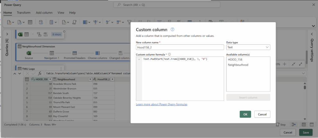
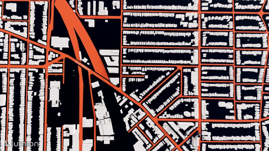
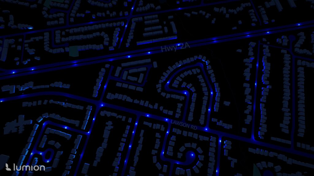
To import into SketchUp, the downloaded SketchUp files of Toronto neighborhood boundaries that were downloaded earlier were used in this stage. Each file must be downloaded separately. Identifying each section was done through the labels that were automatically applied.

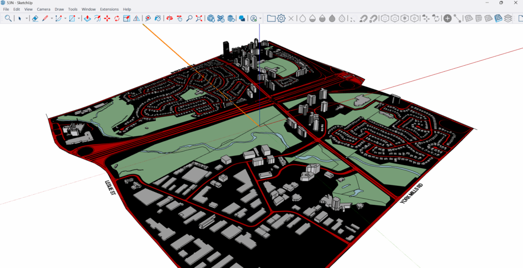
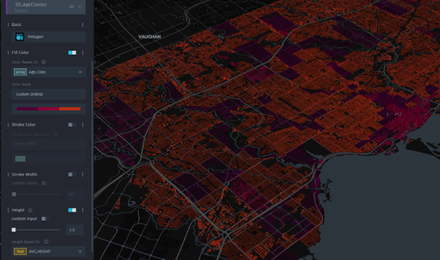
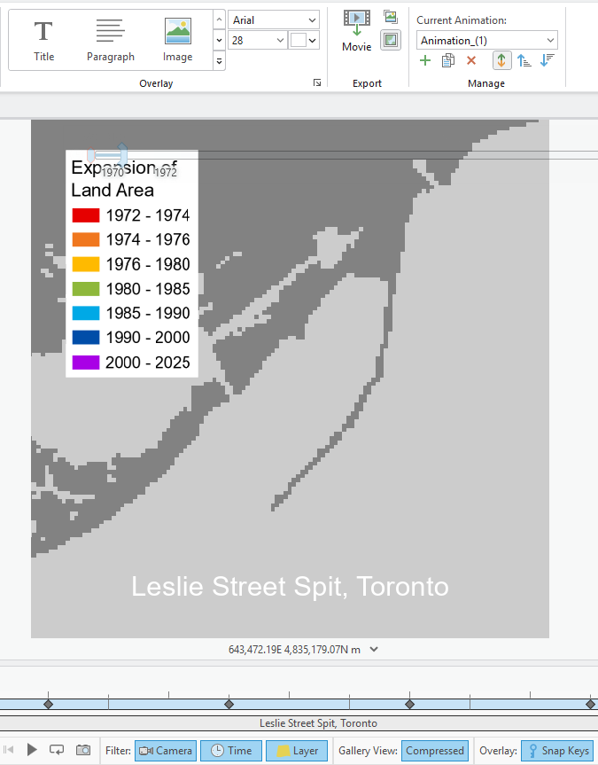
Applying Colour Classification: To create a visually intuitive gradient:

Very high hotspots: red, Low collisions: blue

Step 5: Rendering & Visualization in Lumion

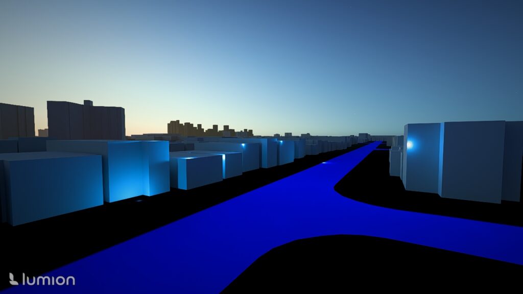
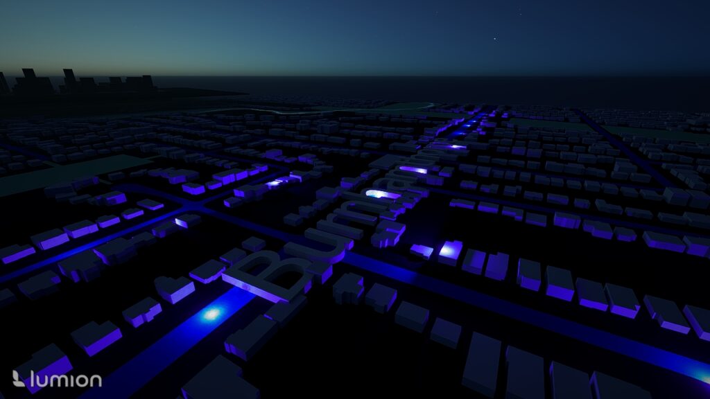
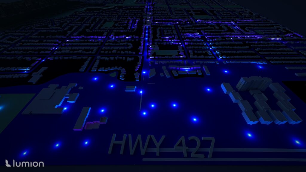
Importing the SketchUp Model: The extruded model was imported into Lumion for realistic visualization.

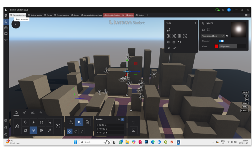
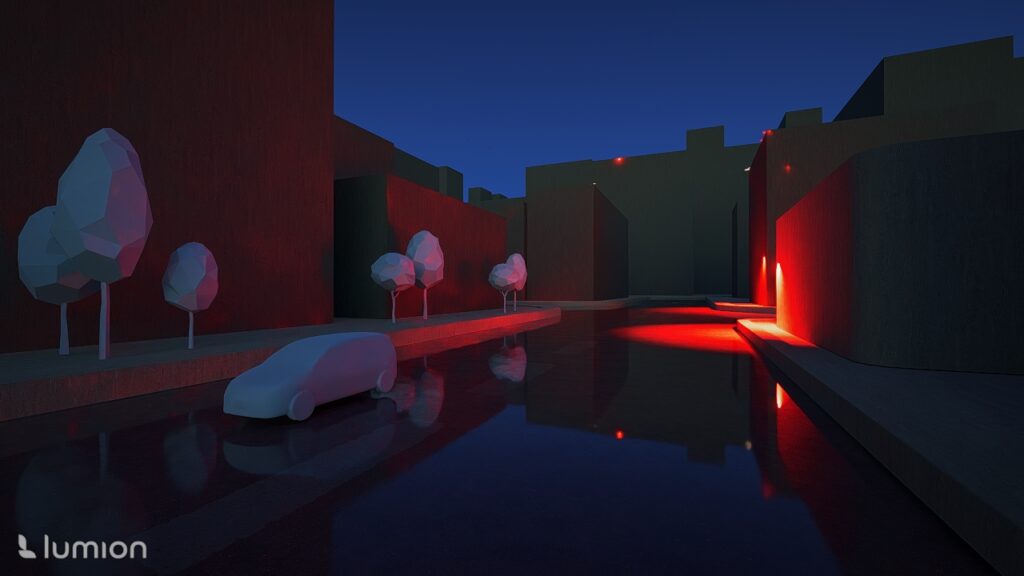
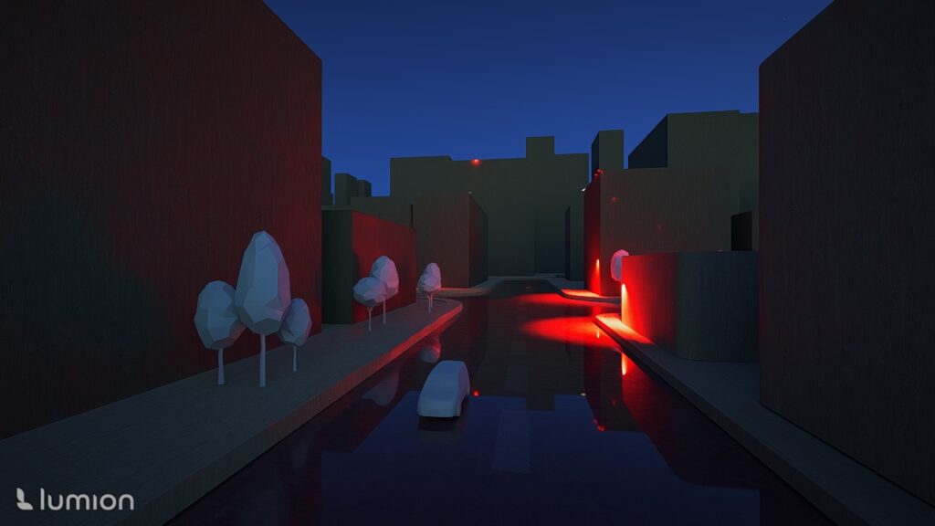
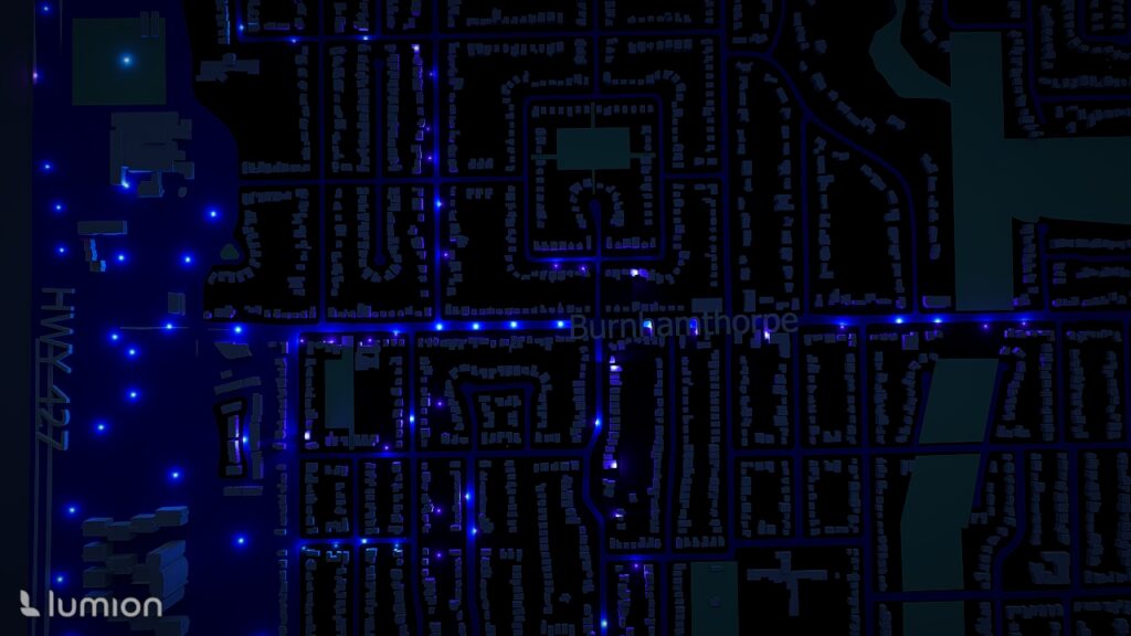
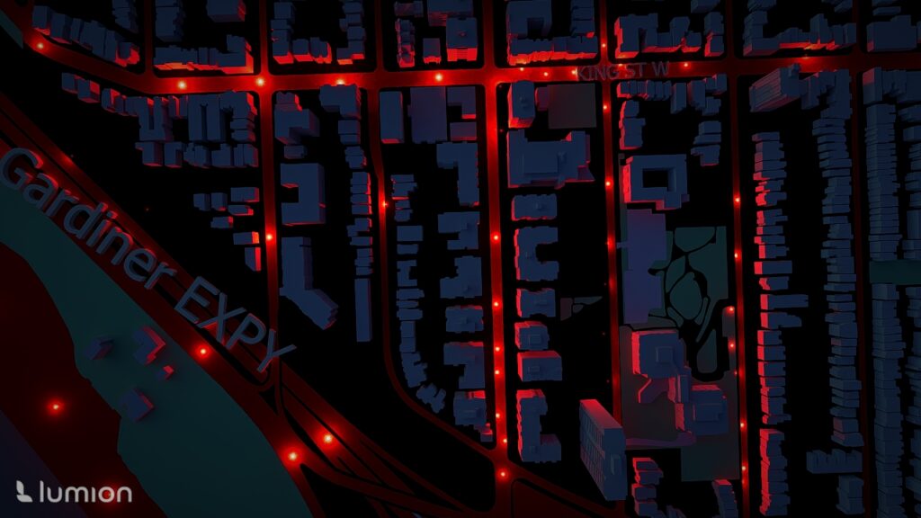
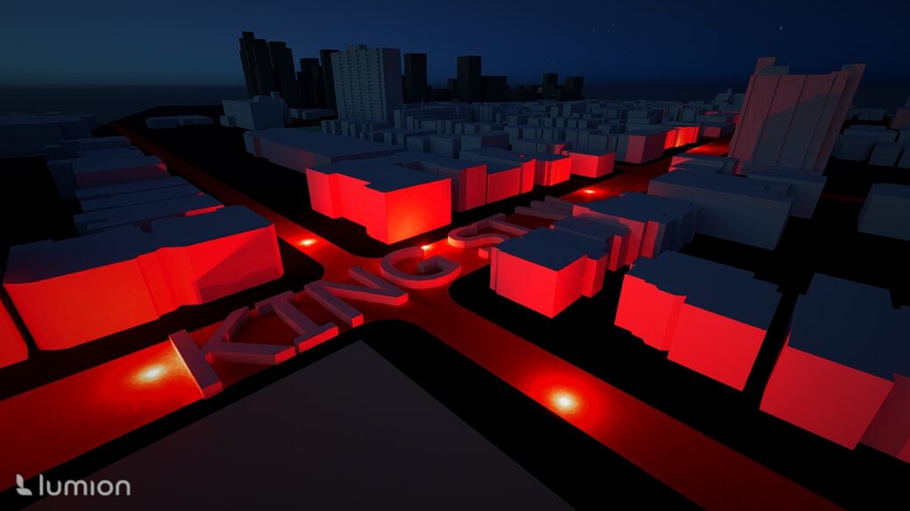
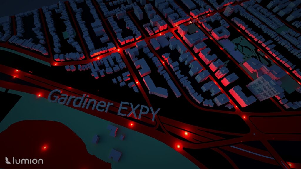
Adding Atmospheric Lighting: Because this visualization focuses on highlighting hotspot intensities, I chose a night time scene: which then i reduced sunlight intensity. Added Spotlights added at various heights Colours represented collision intensity: Blue = lower-risk area, Red = high collision zones

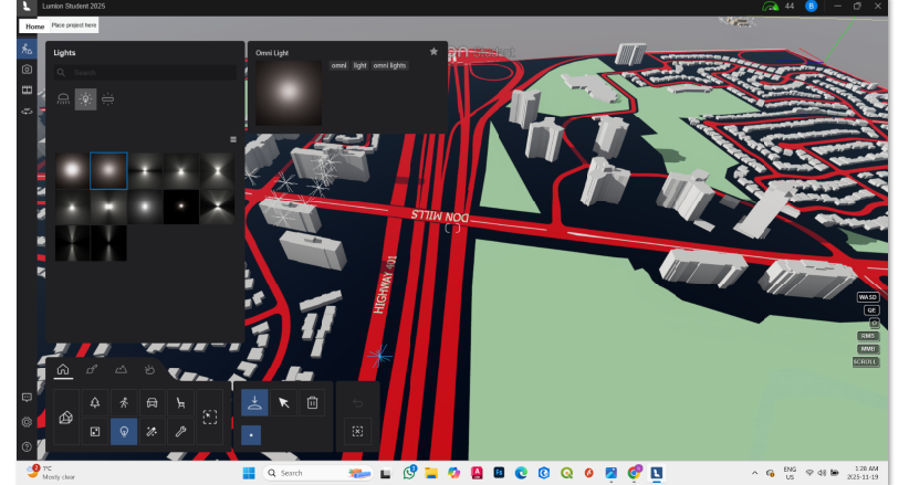
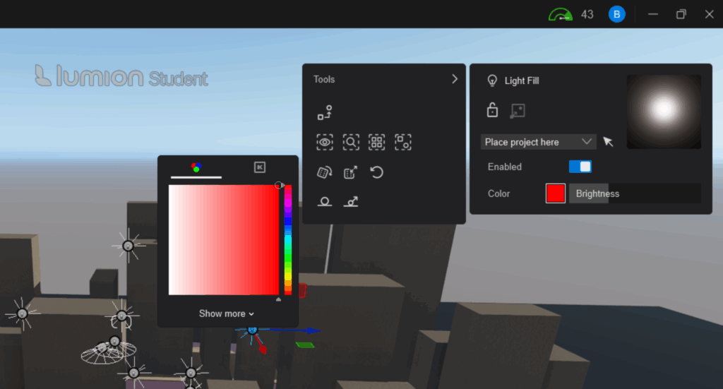
Add lighting and change color to to match the collision type

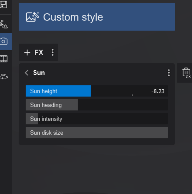
Decrease the Sun intensity to set a night time setting

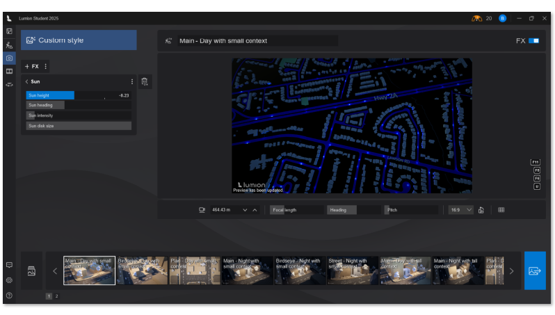
Camera Movement & Composition: I created multiple camera angles to show: Nighttime lighting reflecting collision intensity, Panoramic views of the 3D collision landscape, Close-ups of high-risk clusters

Step 6: Exporting the Final Renders

Each neighborhood would need to be rendered at the chosen angle and exported. 

Results

1. Downtown and Waterfront

Areas such as St. Lawrence–East Bayfront–Islands, Harbourfront–CityPlace, Fort York–Liberty Village, and West Queen West showed extremely high collision densities

2. Inner Suburban Belt

Neighbourhoods like South Riverdale, Annex, Dufferin Grove, and Trinity-Bellwoods exhibited moderate-to-high collision intensity, correlating with high pedestrian and cyclist activity.

3. Lower-risk Zones

Coldspots appeared mainly in low-density residential neighbourhoods with fewer arterial roads.

3D Advantages

The extruded height and nighttime lighting made it easy to instantly see:

  • Which areas had the most collisions
  • How intensity changes across neighbourhoods
  • Where the city might focus safety interventions

Limitations

  • Massing data is extremely large: Importing all of Toronto was impossible due to memory and file size constraints.
    Only selected hotspot tiles were used.
  • Temporal variation ignored: This project analyzed only 2022 and not multi-year trends.
  • Hotspot analysis generalizes clustering
    While statistically robust, it does not differentiate between collisions caused by traffic volume, infrastructure, or behavioural factors.
  • Rendering is interpretive
    Height and colour were designed for visual storytelling rather than strict quantitative precision.
  • Limited Interactive: The 3D render isnt interactive unless you have acess to the softwares used, which would either need to be Sketchup or Lumion.

Conclusion

This project demonstrates how collision data can be transformed from static points into an immersive 3D visualization that highlights urban road safety patterns. By integrating ArcGIS analysis with architectural modeling tools like SketchUp and Lumion, I created a geographically accurate, data-driven 3D landscape of Toronto’s collision hotspots.

The final visualization shows where collisions cluster most intensely, provides intuitive spatial cues for understanding road safety risks, and showcases the potential of hybrid cartographic-design workflows. This form of neo-cartography offers a compelling way to communicate urban safety information to planners, designers, policymakers, and the public.

Geospatial Assessment of Solar Glare Hazard Potential on Urban Road Network (Mississauga, ON)

1. Introduction and Objectives
This report documents the methodology and execution of a geospatial analysis aimed at identifying specific segments of the road network with a high potential for dangerous solar glare during critical commute times.
The analysis focuses on the high-risk window for solar glare in the Greater Toronto Area (GTA), typically the winter months (January) around the afternoon commute (4:00 PM EST), when the sun is low on the horizon and positioned in the southwest.
The primary objectives were to:
1. Calculate the average solar position (Azimuth and Elevation) for the defined high-risk period.
2. Determine the orientation (Azimuth) of all road segments in the StreetCentreline layer.
3. Calculate the acute angle between the road and the sun (R_S_ANGLE).
4. Filter the results to identify segments where the road is both highly aligned with the sun and the driver is traveling into the solar direction, marking them as High Glare Hazard Potential.
2. Phase I: ArcPy Scripting for Data Calculation
The first phase involved developing an ArcPy script to calculate the necessary astronomical and geometric values and append them to the input feature class. Due to database constraints (specifically the 10-character field name limit in certain geodatabase formats), field names were abbreviated.
2.1. Script Parameters and Solar Calculation
The script uses the approximate latitude and longitude of Mississauga, ON (43.59, -79.64), and calculates the average solar position for the first week of January 2025 at 4:00 PM EST.
2.2. Final ArcPy Script
The following Python code was executed in the ArcGIS Pro Python environment:
import arcpy
import datetime
import math
import calendar

# — User Inputs (ADJUST THESE VALUES AS NEEDED) —
input_fc = “StreetCentreline”
MISSISSAUGA_LAT = 43.59
MISSISSAUGA_LON = -79.64
TARGET_TIME_HOUR = 16
YEAR = 2025

# — Field Names for Output (MAX 10 CHARACTERS FOR COMPLIANCE) —
ROAD_AZIMUTH_FIELD = “R_AZIMUTH” # Road segment’s direction (Calculated)
SOLAR_AZIMUTH_FIELD = “S_AZIMUTH” # Average Sun direction
SOLAR_ELEVATION_FIELD = “S_ELEV” # Average Sun altitude
ROAD_SOLAR_ANGLE_FIELD = “R_S_ANGLE” # Angle difference (Glare Indicator: 0=Worst Glare)

# — Helper Functions (Solar Geometry and Segment Azimuth) —

def calculate_solar_position(lat, lon, dt_local):
“””Calculates Solar Azimuth and Elevation (Simplified NOAA Standard).”””
TIMEZONE = -5
day_of_year = dt_local.timetuple().tm_yday
gamma = (2 * math.pi / 365) * (day_of_year – 1 + (dt_local.hour – 12) / 24)

eqtime = 229.18 * (0.000075 + 0.001868 * math.cos(gamma) – 0.032077 * math.sin(gamma)
– 0.014615 * math.cos(2 * gamma) – 0.040849 * math.sin(2 * gamma))
decl = math.radians(0.006918 – 0.399912 * math.cos(gamma) + 0.070257 * math.sin(gamma)
– 0.006758 * math.cos(2 * gamma) + 0.000907 * math.sin(2 * gamma)
– 0.002697 * math.cos(3 * gamma) + 0.00148 * math.sin(3 * gamma))

time_offset = eqtime + 4 * lon – 60 * TIMEZONE
tst = dt_local.hour * 60 + dt_local.minute + dt_local.second / 60 + time_offset
ha_deg = (tst / 4) – 180
ha_rad = math.radians(ha_deg)
lat_rad = math.radians(lat)

cos_zenith = (math.sin(lat_rad) * math.sin(decl) +
math.cos(lat_rad) * math.cos(decl) * math.cos(ha_rad))
zenith_rad = math.acos(min(max(cos_zenith, -1.0), 1.0))
solar_elevation = 90 – math.degrees(zenith_rad)

azimuth_num = -math.sin(ha_rad)
azimuth_den = math.tan(decl) * math.cos(lat_rad) – math.sin(lat_rad) * math.cos(ha_rad)

if azimuth_den == 0:
solar_azimuth_deg = 180 if ha_deg > 0 else 0
else:
solar_azimuth_rad = math.atan2(azimuth_num, azimuth_den)
solar_azimuth_deg = math.degrees(solar_azimuth_rad)

solar_azimuth = (solar_azimuth_deg + 360) % 360

return solar_azimuth, solar_elevation


def calculate_segment_azimuth(first_pt, last_pt):
“””Calculates the azimuth/bearing of a line segment.”””
dx = last_pt.X – first_pt.X
dy = last_pt.Y – first_pt.Y
bearing_rad = math.atan2(dx, dy)
bearing_deg = math.degrees(bearing_rad)
azimuth = (bearing_deg + 360) % 360
return azimuth

# — Main Script Execution —
arcpy.env.overwriteOutput = True

try:
# 1. Calculate Average Solar Position
start_date = datetime.date(YEAR, 1, 1)
end_date = datetime.date(YEAR, 1, 7)
total_azimuth, total_elevation, day_count = 0, 0, 0
current_date = start_date

while current_date <= end_date:
local_dt = datetime.datetime(current_date.year, current_date.month, current_date.day, TARGET_TIME_HOUR, 0, 0)
az, el = calculate_solar_position(MISSISSAUGA_LAT, MISSISSAUGA_LON, local_dt)
if el > 0:
total_azimuth += az
total_elevation += el
day_count += 1
current_date += datetime.timedelta(days=1)

if day_count == 0:
raise ValueError(“The sun is below the horizon for all calculated dates/times.”)

avg_solar_azimuth = total_azimuth / day_count
avg_solar_elevation = total_elevation / day_count

# 2. Add required fields
for field_name in [ROAD_AZIMUTH_FIELD, SOLAR_AZIMUTH_FIELD, SOLAR_ELEVATION_FIELD, ROAD_SOLAR_ANGLE_FIELD]:
if not arcpy.ListFields(input_fc, field_name):
arcpy.AddField_management(input_fc, field_name, “DOUBLE”)

# 3. Use an UpdateCursor to calculate and populate fields
fields = [“SHAPE@”, ROAD_AZIMUTH_FIELD, SOLAR_AZIMUTH_FIELD, SOLAR_ELEVATION_FIELD, ROAD_SOLAR_ANGLE_FIELD]

with arcpy.da.UpdateCursor(input_fc, fields) as cursor:
for row in cursor:
geometry = row[0]
segment_azimuth = None
if geometry and geometry.partCount > 0 and geometry.getPart(0).count > 1:
segment_azimuth = calculate_segment_azimuth(geometry.firstPoint, geometry.lastPoint)

road_solar_angle = None
if segment_azimuth is not None:
angle_diff = abs(segment_azimuth – avg_solar_azimuth)
road_solar_angle = min(angle_diff, 360 – angle_diff) # Acute angle (0-90)

row[1] = segment_azimuth
row[2] = avg_solar_azimuth
row[3] = avg_solar_elevation
row[4] = road_solar_angle

cursor.updateRow(row)

except arcpy.ExecuteError:
arcpy.AddError(arcpy.GetMessages(2))
except Exception as e:
print(f”An unexpected error occurred: {e}”)
3. Phase II: Classification of True Hazard Potential (Arcade)
Calculating the R_S_ANGLE ($0^\circ$ to $90^\circ$) identifies road segments that are geometrically aligned with the sun. However, it does not distinguish between a driver traveling into the sun (High Hazard) versus traveling away from the sun (No Hazard).
To isolate the segments with a true hazard potential, a new field (HAZARD_DIR) was created and calculated using an Arcade Expression in ArcGIS Pro’s Calculate Field tool.
3.1. Classification Criteria
A segment is classified as having High Hazard Potential (HAZARD_DIR = 1) if both conditions are met:
1. Angle Alignment: The calculated R_S_ANGLE is $15^\circ$ or less (indicating maximum glare).
2. Directional Alignment: The segment’s azimuth (R_AZIMUTH) is oriented within $\pm 90^\circ$ of the sun’s azimuth (S_AZIMUTH), meaning the driver is facing the sun.
3.2. Final Arcade Expression for Field Calculation
The following Arcade script was used to populate the HAZARD_DIR field (Short Integer type):
// HAZARD_DIR Field Calculation (Language: Arcade)

// Define required input fields
var solarAz = $feature.S_AZIMUTH; // Average Sun Azimuth (e.g., 245 degrees)
var roadAz = $feature.R_AZIMUTH; // Road Segment Azimuth (0-360)
var angleDiff = $feature.R_S_ANGLE; // Acute Angle between Road and Sun (0-90)

// 1. Check for High Glare Angle (< 15 degrees)
if (angleDiff <= 15) {

// 2. Check if the road direction is facing INTO the solar direction
// Calculate the acute difference between roadAz and solarAz (0-180 degrees)
var directionDiff = Abs(roadAz – solarAz);
var acuteDirDiff = Min(directionDiff, 360 – directionDiff);

// If the difference is <= 90 degrees, the driver is generally facing the sun
if (acuteDirDiff <= 90) {
return 1; // TRUE: HIGH Glare Hazard Potential
}
}

return 0; // FALSE: NO Glare Hazard Potential (Angle too high or driving away from sun)
4. Results and Mapping of Hazard Potential
The final classification based on the HAZARD_DIR field (where 1 indicates a High Glare Hazard Potential) was used to generate a thematic map of the Mississauga road network. The map isolates the segments that will experience direct, high-intensity sun glare during the 4:00 PM EST winter commute.
4.1. Map Output Description
The map, titled “Solar Glare Hazard Map of City of Mississauga for the First Week of The Year,” clearly differentiates between segments with no glare hazard (yellow) and those with a high solar glare hazard (red).
• Yellow Segments (Street with no Solar Glare Hazard in first week of the year): These represent the vast majority of the network. They include roads running generally north-south (where the sun is primarily hitting the side of the vehicle) or segments where the driver is traveling away from the low sun angle (i.e., eastbound/northeast-bound traffic).
• Red Segments (Street with High Solar Glare Hazard in first week of the year): These are the critical segments for this analysis. They represent roads that are:
1. Oriented in the southwest-to-west direction (similar to the sun’s average azimuth).
2. Where a driver traveling along that segment would be facing directly into the low sun angle.
4.2. Analysis of Identified Hazard Corridors
The high-hazard (red) segments are predominantly clustered along major arterial roads as shown in the following map that follow a strong East-West or Northeast-Southwest orientation.


• Major Corridors: A highly concentrated linear feature of red segments is visible running across the northern/central part of the city, strongly suggesting a major East-West highway or arterial road where the vast majority of segments are oriented to the west. This confirms that these major commuter corridors are the highest-risk areas for this specific time and season.
• Localized Hazards: Several smaller, isolated red segments are scattered throughout the map. These likely represent the East-West portions of minor residential streets or short segments of angled intersections where the road azimuth briefly aligns with the sun.
• Mitigation Focus: The results provide specific, actionable intelligence. Instead of deploying wide-scale mitigation efforts, the city can focus on the delineated red corridors for strategies such as:
o Targeted message boards warning drivers during the specific 3:30 PM–5:00 PM time window in January.
o Evaluating tree planting or physical barriers only along these identified segments to block the low western sun.
5. Conclusion and Next Steps
The integration of solar geometry (Python/ArcPy) and directional filtering (Arcade) successfully generated a definitive dataset of high-risk road segments. The final map, generated based on the HAZARD_DIR field, clearly highlights specific routes that pose a safety risk to westbound or southwest-bound drivers during the target time window.
Future steps for this analysis include:
• Expanding the calculation to include the morning commute period (e.g., 7:00 AM EST) when the sun is low in the East/Southeast.
• Integrating the analysis with collision data to validate the modeled hazard areas.
• Developing mitigation strategies, such as targeted placement of tree cover or glare-reducing signage, based on the identified high-hazard segments.

Unifying the “Megacity”A Historical Interactive Animation of The Amalgamation of Toronto Using Canva and ArcGIS Pro

By Aria Brown

Geovis Project Assignment | TMU Geography | SA8905 | Fall 2025

Hello everyone! Welcome to my geovis blog post :)

Introduction & Context

As someone who has an immense passion for geography, I have come across many opportunities where I can implement such a passion in relation to my other interests. Although geography is paramount in my interests, I am also quite an avid history buff. Thus, I wanted to see if I could capture both my passions and merge them into one project.

Contentedly, I was able to produce a project that combines 3 very important and personal aspects that provide insight into myself and my interests; my passion for geography and history, as well as my appreciation for the City of Toronto, where myself and my family’s roots in Canada first began. Therefore, I decided that I wanted to visualize the history of this great city, taking viewers through time to show how Toronto was able to get to what it is today by utilizing the free-to-use new gen. website Canva with its animation and interactive features.

Therefore, I present to you Unifying the “Megacity,” A Historical Interactive Animation of the Amalgamation of Toronto. My project takes us back to 1834 when the City of Toronto was first created and progressively follows a timeline to bring viewers to the present.

Figure 1

Timeline that the project will follow

Data & Rationale

Recently, incorporating animation into the world of GIS has been a quite popular trend that many individuals, organizations, and companies have decided to implement in their work. However, animation tools may be hard to come by and most would require a fee upon usage. Therefore, I knew I wanted to see if I could implement a way that GIS could be visualized using an easy-to-use tool that supports interactive features and animation. For those that may be aware, ArcGIS Pro itself does feature an animation tool that uses a timeline (key frames) that the software then compiles and presents in a rather static animation. 


So you might be wondering, why not just use ArcGISPro? ArcGISPro animation and interactive features I found to be quite limiting. Users are limited to key frames to present their animation and may not include extensive interactive features that can be played with or toggled on. I wanted to create a fun interactive animation that was almost seamless and easy to follow without being tied to the constraining ArcGISPro capabilities, and without the fees that other animation tools and softwares may require. Also, Canva is widely used by many to create presentations, reports, etc, and I thought why not showcase how this website that many know and love is capable of so much more.

Tools Used:

Canva- Free Graphic Design Tool

ArcGIS Pro- Desktop GIS Software

Data Used:

City of Toronto Historical Annexation Boundaries (1834-1967)- University of Toronto Dataverse

City of Toronto Community Council Boundaries- Toronto Open Data Portal

Municipal Boundaries as of 1996- Government of Canada

Methodology

Step 1: Upload Data into ArcGISPro and Examine the Data and its Attributes
First, I created a new map project in ArcGIS Pro and uploaded my data. I then right clicked my layers in the ‘Contents’ pane and selected ‘Attributes,’ here you can investigate your data and look for key information such as time frames or date fields. With this particular dataset, the attributes table featured key fields such as the Name of the annexed community (Name) and the year it was annexed (DtAnxd).

Figure 2

Opened attribute table in ArcGIS Pro highlighting the Name and DtAnxd fields

Step 2: Separate the Data into Key Time Frames

In order to ensure that my animation was concise, I separated the data into key time frames instead of showing the progression of city boundaries one-by-one, as there are a total of 51 records. I then laid out a framework as to how I was going to group my data using Microsoft Excel and grouped the data by their decades or significant time frames. I exported the attributes table to Excel using the ‘Table to Excel’ geoprocessing tool. I colour-coded my excel document to keep my records organized and so I could easily visualize the beginning and end of each time frame.

Figure 3

Table to Excel geoprocessing tool

Figure 4

Microsoft Excel spreadsheet of my data and key information sorted by the order it will be presented in

Step 3: Use the ‘Export Features’ Tool to Export Selected Attributes

Once my data and time frames were organized, I selected the date-specific polygons using the ‘Select By Attributes’ tool and ran the expression:

Where YrAnxd (text field that has just the year of annexation) includes the value(s) 1883, 1884 (years)

Figure 5

Select By Attributes tool in ArcGIS Pro and the attribute table view after selecting specific attributes


After running this tool for each time frame, I exported the selected attributes by selecting the layer on the Contents pane, right-clicking and selecting Data→Export Features, where I exported selected features based on the time frame. Each time frame was exported into separate shape-files, and the picture below shows the export of the 1883-1884 time frame into a shape-file entitled ‘1883_1884” which was the titling format I maintained for each shape-file.


Step 4: Customize the Map and Layout

After exporting each time frame into separate shape-files, I edited the look of my map by changing the basemap to depict a more historical-looking one that I felt fit the theme of my project and symbolized the boundary lines, scale bar, and north arrow to match the theme as well. I made sure to bookmark the location of the map in order to ensure each time frame would have a seamless transition without any movement from the map itself. 

In order to show a progression of Toronto’s boundaries that gradually increased over time, I made sure to toggle on the shape-files of the previous years to showcase this. For example, for the 1883-1884 time frame, I kept the previous 1834 shape-file to show this boundary progression.

Figure 6

Map in ArcGIS Pro with the layers of 1834 and 1883_1884 turned on

Step 5: Export Maps

I then exported each map to a PNG file by selecting the Share tab and selecting Export Layout.

Step 6: Upload to Canva

Each map was uploaded to Canva using the ‘Uploads’ tool on the left menu bar to a presentation-style template 

Figure 7

Uploads icon that is used to upload imagery files

Step 7: Use Presentation Template to Layout Maps and Customize

I customized each slide of my presentation by adding my maps, borders, images and icons.

Step 8: Enable Various Animation Tools Between Slides and Text

To create a rather seamless transition between time frames, I selected the ‘Dissolve’ animation tool by hovering my mouse over the space between each slide and selecting the ‘Add Transition’ option. Here, Canva presents a variety of different animation transitions to choose from, however I selected ‘Dissolve’ as I felt it was the most seamless transition due to its fading animation type. I also used different animation types for the display of different text components within the slides.

Figure 8

Selecting the ‘Dissolve’ animation under the Transitions tab, after selecting the transition style, the icon will the be present between slides (in this case the ‘Dissolve’ tool is represented by an infinity symbol

Step 9: Add Selectable Icons

I also wanted to make my animation more interactive and came up with the idea of allowing viewers to see a historic map of Toronto at the particular time frame that the slide was presenting. I got this idea by seeing the use of historic maps being used as basemaps to showcase the evolution of the city and its boundaries. I then found historical maps from the City of Toronto’s Historical Maps and Atlases website and saved them. I then uploaded them to Canva, duplicated my slide with a blank map and added the historic map to it. I then georeferenced the historic maps by lining up the borders between them and my map. I temporarily made the historic maps a bit transparent so I could line up the borders accurately.

I added a ‘plus’ icon from Canva on the slide I wanted and configured the icon so that if it was selected, viewers would be able to see the historic map of Toronto at around the same time. This was done by selecting the plus icon and selecting the ellipsis and navigating to ‘Add Link.’ Then, I selected the particular slide I wanted in the ‘Enter a link or Search’ section. This configured the plus icon to allow viewers to select it, prompting Canva to present the map with the historic imagery overlaid on top. An additional selectable icon (back button) was created on the historic map slides to allow users to go back to the original slide they were viewing.

Figure 9

Under the ‘Elements’ tool on the left menu bar, here I search for ‘plus button’ and selected one that I liked

Figure 10

Adding a link to the plus icon and linking the desired slide

*Note: I kept all my historic map slides at the end of my presentation, as they are are optional aspect that can be viewed

Results

Link to Canva Presentation:

https://www.canva.com/design/DAG4ck_PXLQ/S60h1kAtqPjzCwqFgmYAVA/edit?utm_content=DAG4ck_PXLQ&utm_campaign=designshare&utm_medium=link2&utm_source=sharebutton

Presentation:

After the completion of the previous steps, the final product features an animated and interactive presentation of maps! The final product now has:

  • Select capabilities
  • Animated transitions between slides and text
  • Selectable pop up icons to present new information (historic map imagery)
  • Zoom in and out capabilities

I hope you may be inspired by this and try to make your own interactive animation

Thank you!

References

City of Toronto. (2018). Toronto Community Council Boundaries Options Paper. City of Toronto. https://www.toronto.ca/legdocs/mmis/2018/ex/bgrd/backgroundfile-116256.pdf

City of Toronto. (2025). Community Council Area Profiles. City of Toronto. https://www.toronto.ca/city-government/data-research-maps/neighbourhoods-communities/community-council-area-profiles/

City of Toronto. (2025). Historical Maps and Atlases. City of Toronto. https://www.toronto.ca/city-government/accountability-operations-customer-service/access-city-information-or-records/city-of-toronto-archives/whats-online/maps/historical-maps-and-atlases/

Government of Canada. (2005). Municipal boundaries as of 1996. Government of Canada. https://open.canada.ca/data/en/dataset/a3e19e02-36f0-4244-87ab-8f029c6846e2

Fortin, M. (2023). City of Toronto Historical Annexation Boundaries (1834 – 1967). University of Toronto. https://borealisdata.ca/dataset.xhtml?persistentId=doi:10.5683/SP3/XN2NRW
MacNamara, J. (2005). Toronto Chronology. Ontario Genealogical Society.https://web.archive.org/web/20070929044646/http://www.torontofamilyhistory.org/chronology.html

Auto Theft Trends in Toronto: Interactive Geospatial Dashboard Using Power BI

SA8905 – Cartography and Geovisualization
Geovisualization Project Assignment

By: Nishaan Grewal

I am sure that many of us have experienced or have heard about the ever-growing issue, which is auto theft. This project, utilizing PowerBI, will not only help analyze but also provide a visualization of Toronto auto theft patterns (2020-2024). Using the spatial insights together with the business intelligence tools provided by PowerBI, it has allowed me to compare trends across the years, and overall create an interactive dashboard that is usable by users.

You may be asking why not just use ArcGIS and PowerBI, but as informative and advanced the mapping is on ArcGIS it still lacks the story telling and understanding for the everyday user. I believe GIS should be used to help educate and inform individuals in a user-friendly and easy-to-access manner. Using Power BI for the first time myself, I can truly say it has helped me understand how GIS can be used in many other ways, rather than in my comfort zone, which is just using ArcGIS Pro. My goal was to create an easy-to-follow to follow dashboard that allows the user to explore Toronto’s neighbourhood-level auto theft trends in an intuitive and meaningful way, without being confused.

So let’s get started and give an overview of the project. Please remember if your TorontoMU account does not work for PowerBI, you must obtain licencing from the TMU. I had to get help from the TMU help desk.

Datasets:

2. Neighbourhoods Boundary (JSON file) – City of Toronto Open Data (https://open.toronto.ca/dataset/neighbourhoods/)


STEP 1: Add and Clean Data

I started by importing the CSV file of the Auto Theft dataset into PowerBI.

Click: Home → Get Data → Text/CSV → Transform Data

With that, I cleaned the data as I was only interested in the Auto Theft crime from the years 2020 to 2024. I manually just removed unnecessary columns (e.g, other crime types). I also verified column types (Year = whole number, Neighbourhood = text)

With the cleaning done, my dataset looked a bit like this.

(Keep in mind, this cleaned dataset is 790 rows of data)

STEP 2: Add Map

As mentioned earlier, although there is a ArcGIS feature on PowerBI, I wanted to only use features that PowerBI offers, eliminating the need for furthur licensing (for everyday users). So for this project, I used Shape Map, which is under the Visualizations pane.

With that added to the Format panel, I had to expand the Map settings, turn on Custom map, and upload the Neighbourhoods Boundary (JSON file).

With that you will see a neighbourhood boundary of Toronto


After Dragging the Neighbourhoods and AutoTheftCount columns from the cleaned dataset (in the Data pane) and dragging them to the Location and Colour saturation as follows:

You get a map choropleth map like the following:

Feel free to choose a colour scheme of your liking and make sure to add your title.

STEP 3: Add Interactive Year Slicer

As a map is now present, it is time for us to make the interactive feature of the dashboard. I did this by adding a Slicer (Year Slicer), and adding the Year column from the dataset. The slicer can be located in the Visualization panel.

After playing around with the format settings, I had finalized a Slicer that allows a user to click a year (2020 – 2024), which changes the map appearance with the Auto Theft counts within that specific year.


Step 4: Create Measures for KPIs

With the slicer working, it was now time to create the KPIs to provide viewers with key indicators that not only updated with the click of a button, but also gave insightful and readable information. This allowed the viewer to understand the map with better context.

I did this by creating new measures (Go to the top ribbon → Modeling → New measure). As the formula bar popped up, I wrote some code that helped analyze different insights.

The insight measures created were:

1. Total Auto Thefts

2. Neighbourhood With Most Auto Theft

3. Neighbourhood With Least Auto Theft

4. Highest Auto Theft in Neighbourhood

5. Lowest Auto Theft in Neighbourhood

6. Change in Auto Theft Based on Previous Year (%)

With the help of ChatGPT, I was able to validate my code.

Step 5: Turn Every Measure into a KPI Card

Now that the measures were all made, it is time for the easier step, which is to add KPI Cards.

In the Visualization pane, there is a feature called “Card”; make sure you use the dynamic version as seen below.

With 6 Cards now on the Dashboard, I then dragged each measurement into each card from the Data pane.

This is what was created from steps 1 to 5.

Step 6: Add Graphs

With graphs missing, I had decided to add a Line Chart that showed “Total Auto Thefts in Years”, and a Stacked Bar Chart that showed “Top 5 Neighbourhoods With Most Total Auto Theft”.

These graphs can be added by using the same Visualization Panel.

LINE CHART:

Make sure to drag the data to the respective X and Y axes.

STACKED BAR CHART:

Make sure to drag the data to the respective X and Y axes, and make sure to add a filter that takes only the top 5 neighbourhoods instead of all neighbourhoods.

After this step was done, I had a rough dashboard, which, although it wasn’t aesthetically finished, it now at least had an interactive map that changed based on a viewer’s click on a selected year, which also updated the KPIs and graphs data.

Step 7: Make it Finalized

After playing around with each feature’s formatting (to change colour and look), I had now developed a finished product that I was very pleased with.


This is now an interactive dashboard that displays information on the Auto Theft trends in Toronto based on the years 2020 to 2024.

In Memoriam: A 3D Interactive Web Map of Toronto’s Decommissioned Speed Cameras (2020-2025)

By Matthew Cygan

GeoVis Project Assignment, TMU Geography, SA8905, Fall 2025

Introduction: Gone But Never Forgotten

Five days ago, on November 14, 2025, Ontario’s automated speed enforcement program ended¹. At midnight, all 150 of Toronto’s speed cameras stopped issuing tickets, closing a controversial five-year chapter in the city’s traffic safety infrastructure. Between January and August 2025 alone, these cameras issued 550,997 tickets and collected over $30 million². Since July 2020, they generated millions in revenue while reducing speeding in school zones by 45%³.

This memorial blog will aim to preserve the good memories. The result is a digital memorial: a 3D interactive web map documenting 198 speed camera locations across Toronto’s 25 wards, built with Mapbox GL JS and custom JavaScript. This map highlights geographic and temporal features along with the volume of tickets issued to drivers!

Users can scroll to zoom and hold Ctrl/Cmd and drag to rotate and tilt for 3D view

Preview

Context: The Automated Speed Camera Program and Its Ban

The automated speed enforcement program began in July 2020 after the provincial government enabled municipalities to deploy cameras⁴. By November 2022, Toronto had issued 560,000 tickets and collected $34 million⁵. The city expanded from 75 to 150 cameras in March 2025, using data-driven placement to target areas with speeding and collision histories⁷.

Despite some data indicating effectiveness (45% reduction in school zone speeding³, 87% reduction in vehicles exceeding limits by 20+ km/h⁹), Premier Doug Ford announced a provincial ban in September 2025, calling the cameras a “cash grab”⁸. The ban took effect November 14, 2025¹.

Consequences:

  • Potential layoff of 1,000 Toronto workers¹⁰
  • Loss of $30+ million in annual revenue¹⁰
  • Removal of all active 150 cameras and infrastructure
  • Provincial funding of $42 million deemed insufficient by city leaders¹⁰

Data Sources and Data Management

The project combines datasets from the City of Toronto’s Open Data Portal¹¹:

  • Speed Camera Locations (GeoJSON)
  • Monthly Charge Data (July 2020 to November 2025)

The Data Management Problem:

The biggest challenge was joining the location and charge datasets by my only linking variable: address. Unfortunately, both had a plethora of inconsistencies in address formats:

  • Random double spaces: “Kipling Ave.” vs “Kipling Ave.”
  • Period inconsistencies: “St.” vs “St”
  • Abbreviation differences: “W” vs “West”, “Dr” vs “Drive”
  • Directional contradictions: Same location described as “south of X” in one dataset, “north of Y” in another

The final dataset contains 198 documented locations, though some have incomplete enforcement data.

This experience showed me that real-world public datasets are messy. Data cleaning is often the most time-consuming part of any GIS project.

Building the Memorial Map

Step 1: GeoJSON Structure

All Speed Camera XY coordinates were exported to GeoJSON format to make the locations readable by JavaScript:

Step 2: Custom Basemap

I designed a custom basemap in Mapbox Studio that displayed a visually appealing and cartographically sound map:

  • Grayscale base colors creating a neutral and smooth background
  • Blue roads for road infrastructure clarity and visual harmony
  • Minimal labels with clean typography creating a modern aesthetic

Step 3: Adding 3D Terrain

Late in development, I added Mapbox’s 3D terrain feature using the Terrain-DEM v1 tileset¹². This transformed the user experience:

  • Users can hold Ctrl/Cmd and drag to rotate and tilt the view
  • 3D visualization reveals how cameras are positioned in space and provides more real world context

Step 4: Bringing the Interactive Map to Life

Getting the interactive web map functional required three main files working together: the GeoJSON data, the HTML file, and the CSS styling.

The toronto_speed_cameras.geojson file, as seen in the image in Step 1, contains the coordinates and details for all 198 camera locations. Each camera is a Point feature with properties like ward, location name, site code, and enforcement dates. The JavaScript reads this file to position markers and populate the interactive popups.

The index.html file is the backbone. It sets up the page structure, loads the Mapbox GL JS library, and links everything together. JavaScript embedded in the HTML initializes the map and handles the interactive features.

The style.css file handles visual styling including map default extent and placement, marker appearance including hover effects and drop shadows, and responsive design for different screen sizes.

All three parts need each other. Without the HTML, there’s no web canvas. Without the GeoJSON, there are no locations to display. Without CSS, everything looks unpolished. Making sure each was properly linked and loaded was essential to creating a functional, interactive, and professional-looking final product.

Step 5: Interactive Markers

Using JavaScript, I implemented custom markers with the official speed camera icon:

Step 6: Deployment

I deployed the final map to Netlify’s free hosting service, making it publicly accessible at toronto-speed-camera-locations.netlify.app. Netlify’s continuous deployment means any updates automatically publish.

Technical Challenges and Solutions

Building the interactive map involved several practical technical challenges that shaped the final design. The raw dataset required rigorous cleaning and restructuring as mentioned earlier which lead to a large problem cleaning and thus a few locations could not be obtained.

Additionally, browsers block pages from loading local files for security reasons, meaning the map wouldn’t work when opened directly from the file system; it had to be run through a live server and eventually deployed online to load the GeoJSON data correctly.

The popups also displayed incorrectly at first. Text would overflow outside the popup container, which required removing conflicting styles and adding proper wrapping and layout rules. Although these limitations introduced roadblocks, the final result is a smooth, fully functioning interactive 3D map.

References

¹ CP24. (November 14, 2025). “Speed enforcement camera ban is now in effect in Ontario.” YouTube. https://www.youtube.com/watch?v=zvDqLrSjoos

² The Globe and Mail. (October 2, 2025). “Speed cameras work, but do generate revenue. Is the solution investing more?” https://www.theglobeandmail.com/drive/culture/article-speed-cameras-work-but-do-generate-revenue-is-the-solution-investing/

³ Toronto Metropolitan University & The Hospital for Sick Children. (July 24, 2025). “Automated cameras cut speeding by 45 per cent in Toronto school zones, study finds.” https://www.torontomu.ca/news-events/news/2025/07/cameras-cut-speeding-by-45-per-cent-in-toronto-school-zones/

⁴ CBC News. (November 29, 2022). “Toronto drivers paying $34M in fines thanks to speed cameras.” https://www.cbc.ca/news/canada/toronto/toronto-speed-cameras-millions-in-fines-1.6668443

⁵ CBC News. (November 29, 2022). “Toronto drivers paying $34M in fines thanks to speed cameras.” https://www.cbc.ca/news/canada/toronto/toronto-speed-cameras-millions-in-fines-1.6668443

⁶ CityNews Toronto. (March 13, 2025). “Toronto doubling the number of speed cameras on city streets.” https://toronto.citynews.ca/2025/03/13/toronto-doubling-the-amount-of-speed-cameras-on-city-streets/

⁷ Narcity. (April 15, 2025). “Toronto just got 75 new speed cameras and they’re already active in ‘problematic’ areas.” https://www.narcity.com/toronto/toronto-new-speed-cameras-2025

⁸ Ontario Ministry of Transportation. (September 24, 2025). “Ontario Protecting Taxpayers by Banning Municipal Speed Cameras.” https://news.ontario.ca/en/release/1006534/

⁹ Toronto Metropolitan University. (July 2025). “Study on Automated Speed Enforcement Effectiveness.” (Referenced in multiple sources as demonstrating 87% reduction in vehicles exceeding speed limit by 20+ km/h)

¹⁰ ST Lawyers. (November 14, 2025). “Toronto Layoffs After Speed Camera Ban: Severance Pay for 1,000 Workers.” https://stlawyers.ca/blog-news/toronto-layoffs-speed-camera-ban-severance/

¹¹ City of Toronto. (2025). “Automated Speed Enforcement & Open Data Portal.” https://www.toronto.ca/services-payments/streets-parking-transportation/road-safety/vision-zero/safety-initiatives/automated-speed-enforcement/

¹² Mapbox. (2025). “Add 3D terrain to a map.” Mapbox GL JS Documentation. https://docs.mapbox.com/mapbox-gl-js/example/add-terrain/

¹³ Halliday, L. (April 15, 2019). “Mapbox – Interactive maps in React.” YouTube. https://youtu.be/JJatzkPcmoI?si=HMYAtzRkYQ-nbR4y

A One Stop Shop for Bitcoin Legality and Central Bank Digital Currency Development Statuses Across the World (Web Map Application)

You’ve heard about blockchain and Bitcoin about a million times by now, and may even own some, but did you know that many governments around the world are actually planning to intertwine blockchain technology in a different way, by combining it with their own countries official currency?

Governments plan to do this by implementing what’s known as a “Central Bank Digital Currency”, or CBDC for short. This solution allows governments to utilize the benefits of blockchain technology, without inhibiting the “risk” of decentralization. In fact, countries like Nigeria have already fully launched a fully operational CBDC for their citizens to use. Check out the maps I created below by clicking on the image, and try to spot some other countries that fully launched a CBDC! (Hint: Think islands!)

In case maps are not opening from image, try this link: https://torontomu.maps.arcgis.com/apps/instant/compare/index.html?appid=42c8571764d344949f7d80bd62e0be6b

CBDCs are important because they bring the benefits of blockchain technologies, such as transaction traceability (which can reduce fraud, scams, and other financial crimes), reduced friction, and improved transaction speeds with the benefit (or disadvantage, depending on who you ask) of a centralized government authority to monitor the network, meaning blockchain efficiency but without anonymous wallets. During Bitcoin’s inception, some early adopters called for the replacement of the US dollar with Bitcoin instead, making bold predictions that the world would transition to a decentralized financial system. Unfortunately for them, some governments around the world have banned Bitcoin by law.

What is interesting however, is that despite some countries being pro-CBDC, they may be-anti Bitcoin and crypto. For example; China, who outright banned the dealing and trading of Bitcoin by financial institutions, yet piloted the “eCNY” CBDC. (Try finding some other interesting patterns like this in the maps!) Some countries like the USA have researched a CBDC, but have the “CBDC Anti-Surveillance State Act” in place, preventing the Federal Reserve from issuing a CBDC. (Notes like this can be observed for a few countries in my maps, either under the field “CBDC Notes” or “Bitcoin Notes”).

I wanted to highlight some of these patterns, by creating a global map of Bitcoin legality across different countries, with a second displayable layer which includes CBDC development statuses across different countries. On top of that, I also found that existing Bitcoin legality maps online tend to be static, and do not allow for the convenient viewing of smaller countries, despite having relevant Bitcoin legality data, or CBDC development status data. It is worth mentioning that atlanticcouncil.org has already created an interactive “CBDC Tracker” map, however it does not contain any data regarding Bitcoin, preventing the instant viewing of a countries views on both topics (which my maps allow for by clicking on a country!).

Initially, I planned to create a different map, with layers not just displaying Bitcoin legal status across different countries, but also the legal status of altcoins and stablecoins. However, many countries do not have laws regarding altcoins and stablecoins (many don’t even have laws on Bitcoin, as seen in the grey areas of my map), so I decided to switch my projects trajectory a bit to instead focus on Bitcoin and CBDCs, as there clearly is a lot of data on CBDCs, and it is an even newer and more novel concept compared to traditional decentralized cryptocurrencies.

Map Creation Process:

The creation of my maps took a few steps. Firstly, I had to gather data. This proved relatively simple, as there was a convenient Wikipedia article (I know, I know, but its data was referenced!) that already listed Bitcoin legality across countries that had laws regarding it. I grouped legality into three categories: 1) Permitted By Law, 2) Partially Restricted by Law, and 3) Prohibited by Law. The next step, was to find a shapefile that contained the world’s countries. This was found on ArcGIS Hub, and was as follows:

I noticed it could not be edited, so I had to save it as a new feature layer in ArcGIS Online in order to do the necessary joins.

Next, creation of the .CSV file for joining. First, I copied the “Countries” column from the countries shapefile, then pasted it into a new .CSV. The rest was pretty simple, but tedious, as I manually went back and forth inputting the Bitcoin legality data for each country that contained it. This was done by inputting a 0 for prohibited, a 1 for permitted, and a 2 for partially restricted. I then used an IF statement to create the text column with “Permitted by Law”, “Prohibited by Law” and “Partially Restricted by Law”.

Next, I had to find data on CBDC development statuses around the world, and conveniently enough, atlanticcouncil.org has already created an interactive map that does just this, as mentioned earlier. I did however, find their map’s use of colours to be quite confusing (why is “launched” in pink!?). To add the data, I manually looked at each countries CBDC status, and included it into my .CSV into a new column. I also combined “Inactive” and “Cancelled” into the same category as “Inactive or Cancelled” to reduce the number of legend items, and for simplistic reading. Lastly, notes columns were added for any countries that may include, well, notable details regarding their CBDC status or Bitcoin legality status. In the end, my .CSV looked something like this:

Once the data was ready, it was time to map! I simply joined the countries shapefile to my data file, once for the “Bitcoin_Legal_Status” and once for the “CBDC_Development_Status”.

The resulting map layers were created:

Global Bitcoin Legal Status.

Global Central Bank Digital Currency Development Status.

Next, I had to publish each layer as individual web maps. This would allow me to get to my next step of creating the web app.

ArcGIS Online allows for the creation of web apps, known as “Instant Apps”. I created a “Compare” app, allowing for the side by side comparison of multiple web maps. I simply selected my maps, toggled a few settings, and my app was ready to go!

The world is changing fast, I think these maps highlight interesting dichotomies in some government’s views on blockchain technologies, the difference may simply just be if they can track who’s spending their CBDC’s and on what, as tracking anonymous Bitcoin transactions can be challenging. Invasion of privacy and government overreach or public safety and the future of finance? What do you think?

This blog post and map application was created for the SA8905 course at Toronto Metropolitan University taught by Dr. Claus Rinner.

Mapping Toronto’s Post-War Urban Sprawl & Infill Growth (1945-2021)

A Geovizualization Project by Mandeep Rainal.

SA8905 – Master of Spatial Analysis, Toronto Metropolitan University.

For this project, I explore how Toronto has grown and intensified over time, by creating a 3D animated geovisualization using Kepler.gl. I will be using 3D building massing data from the City of Toronto and construction period information from the 2021 Census data (CHASS).

Instead of showing a static before and after map, I decided to build a 3D animated geovizualization that reveals how the city “fills in” over time showing the early suburban expansion, mid-era infill, and rapid post-2000 intensification.

To do this, I combined the following:

  • Toronto’s 3D Massing Building Footprints
  • Age-Class construction era categories
  • A Custom “Built-Year” proxy
  • A timeline animation created in Kepler. gl and Microsoft Windows.

The result is a dynamic sequence showing how Toronto physically grew upward and outward.

BACKGROUND

Toronto is Canada’s largest and fastest growing city. Understanding where and when the built environment expanded helps explain patterns of suburbanization, identify older and newer development areas and see infill and intensification. This also helps contextualize shifts in density and planning priorities for future development.

Although building-level construction years are not publicly available, the City of Toronto provides detailed 3D massing geometry, and Statistics Canada provides construction periods at the census tract level for private dwellings.

By combining these sources into a single animated geovizualization, we can vizualize Toronto’s physical growth pattern over 75 years.

DATA

  • City of Toronto – 3D Building Massing (Polygon Data)
    1. Height attributes (average height)
    2. Building Footprints
    3. Used for 3D extrusions
  • City of Toronto – Muncipal Boundary (Polygon Data)
    1. Used to isolate from the Census metropolitan area to the Toronto city core.
  • 2021 Census Tract Boundary
  • CHASS (2021 Census) – Construction Periods for Dwellings
    1. Total dwellings
    2. 1960 and before
    3. 1961-1980
    4. 1981-1990
    5. 1991-2010
    6. 2011-2015
    7. 2016-2021
    8. Used to assign Age classes and a generalized “BuiltYear” for each building.

METHODOLOGY

Step 1: Cleaning and Preparing the Data in ArcGIS Pro

  • I first imported the collected data into ArcGIS. I clipped the census tract layers to the City of Toronto boundary to get census tracts for Toronto only.
  • Next, I joined the census tract polygon layer we created to the construction period data that was imported. This gives us census tracts with construction period counts.
  • Because Toronto does not have building-year data, I assigned construction era categories from the census as proxies for building age, and created an age classification system using proportions. Adding periods and dividing / total dwellings to get proportions, and assigned them into three classes:
    • Mostly Pre-1981 dwellings
    • Mixed-era dwellings
    • Mostly 2000+dwellings
  • Next, I needed a numeric date field for Kepler to activate the time field. I assigned a representative year to each tract using the Age classes.
    • if age = Mostly Pre-1981 dwellings = 1945
    • if age = Mixed-era dwellings = 1990
    • if age = Mostly 2000+dwellings = 2010
  • And to make the built year Kepler-compatible a new date field was created to format as 1945-01-01.
  • The data was then exported as GeoJSON files to import into Kepler.gl. The built year data was also exported as a CSV because Kepler doesn’t pick up on the time field in geoJSON easily.

Stage 2: Visualizing the Growth in Kepler

  • Once the layers are loaded into Kepler the tool allows you manipulate and vizualize different attributes quickly.
  • First the 3D Massing GeoJSON was set to show height extrusion based on the average height field. The colour of the layer was muted and set to be based on the age classes and dwelling eras of the buildings.
  • Second layer, was a point layer also based on the age-classes. This would fill in the 3D massings as the time slider progressed, and was based on brighter colours.
  • The Built Date CSV was added as a time-based filter for the build date field.

The final visualization was screen recorded and shows an animation of Toronto being built from 1945 to 2021.

  • Teal = Mixed-era dwellings
  • Amber = Mostly 2000+ dwellings
  • Dark purple = Mostly Pre-1981 dwellings

RESULTS

The animation reveals key patterns on development in the city.

  • Pre-1981 areas dominate older neighbourhoods, the purple shaded areas show Old Toronto, Riverdale, Highpark, North York.
  • Mixed-era dwellings appear in more transitional suburbs, filling in teal, and showing subdividisions with infill.
  • Mostly 2000+ dwellings are filling in amber and highlight the rapid intensification in areas like downtown with high-rise booms, North York centre, Scarborough Town Centre.

The animation shows suburban sprawl expanding outward, before the vertical intensification era begins around the year 2000.

Because Kepler.gl cannot export 3D time-slider animations as standalone HTML files, I captured the final visualization using Microsoft Windows screen recording instead.

LIMITATIONS

This visualization used census tract–level construction-period data as a proxy for building age, which means the timing of development is generalized rather than precise. I had to collapse the CHASS construction ranges into age classes because the census periods span multiple decades and cannot be animated in Kepler.gl’s time slider, which only accepts a single built-year value per feature. Because all buildings within a tract inherit the same age class, fine-grained variation is lost and the results are affected by aggregation. Census construction categories are broad, and assigning a single representative “built year” further simplifies patterns. The Kepler animation therefore illustrates symbolic patterns of sprawl, infill, and intensification, not exact chronological construction patterns.

CONCLUSION

This project demonstrates how multiple datasets can be combined to produce a compelling 3D time-based visualization of a city’s growth. By integrating ArcGIS Pro preprocessing with Kepler’s dynamic visualization tools, I was able to:

  • Simplify census construction-era data
  • Generate meaningful urban age classes
  • Create temporal building representations
  • Visualize 75+ years of urban development in a single interactive tool

Kepler’s time slider adds an intuitive, animated story of how Toronto grew, revealing patterns of change that static maps cannot communicate.

Spatial Intelligence Dashboard for Community Safety Using ArcGIS for Power BI

Geovis Project Assignment, TMU Geography, SA8905, Fall 2025

By Debbie Verduga

Welcome to my Geo Viz Tutorial! 

I love ArcGIS and I love Power BI. Each shines in their own way, which is why I was excited to discover the new ArcGIS integration within Microsoft Power BI. Let’s dive in and explore what it can do! 

First off, traditional business intelligence (BI) technologies offer powerful analytical insights but often fall short in providing geospatial context. Conversely, geospatial technologies offer map centric capabilities and advanced geoprocessing, but often lack insights integration.  

ArcGIS for Power BI directly integrates spatial analytics with business intelligence without the need of geoprocessing tools or advanced level expertise. This integration has the potential to empower everyday analysts to explore and leverage spatial data without needing to be highly experts in GIS. 

This tutorial will demonstrate how to use ArcGIS for Power BI to: 

  • Integrate multiple data sources – using City of Toronto neighbourhood socio-demographics, crime statistics, and gun violence data.
  • Perform data joins within Power BI – by linking datasets effortlessly without needing complex GIS tools.
  • Create interactive spatial dashboards – by blending BI insights with mapping capabilities, including thematic maps and hotspot analysis. 

You will need TMU Credentials for: 

  • Power BI Online 
  • ArcGIS Online
  • Data
DatasetFile TypeSource
Neighbourhood Socio-demographic DataExcel Simply Analytics (Pre-Aggregated Census Data) 
Neighbourhood Crime RatesSHP File (Boundary)ArcGIS Online Published by Toronto Police Service
Shooting & Firearm DischargeSHP File (Point/Location)ArcGIS Online Published by Toronto Police Service

Power BI Online

Log into https://app.powerbi.com/ using your TMU credentials. To help you out, watch this tutorial to get started with Power BI Online.

ArcGIS Online 

Log Into https://www.arcgis.com/ using your TMU credentials. Make sure you explore data available for your analysis. For this tutorial we will be using Toronto Police Service Open data including neighbourhood crime rates and shootings and firearms discharges

Loading Data 

To create a new report in Power BI, you need a set of data to start. For this analysis, we will use neighbourhood level socio-demographic data in an excel format. This data includes total population and variables that are often associated with marginalized communities including low income, unemployment rates, no education and visible minorities rates. This data does not have spatial reference, however, the neighbourhood name and unique identifier is available in the data. 

Add Data > Click on New Report > Get Data > Choose Data Source > Upload File > Browse to your file location > Click Next > Select Excel Tab you wish to Import > Select Transform Data 

Semantic Model

This will take you to the report’s Semantic Model. Think of a semantic model as the way you transform raw data into a business-ready format for analysis and reporting. The opportunities for manipulating data here are endless!

Using the semantic model you can define relationships with other data, incorporate business logic, perform calculations, summarize, pivot and manipulate data in many ways.

 What I love about semantic models is that it remembers every transformation you have made to the data. If you made a mistake, don’t sweat it, come back to the semantic model and undo. It’s that simple. 

Once you load data you have two options. You can create a report or create a semantic model. Let’s create a report for now. 

Create Report > Name Semantic Model 

Report Layout 

The report layout functions as a canvas. This is where you add all your visualizations. On the right panel you have Filters, Visualizations and Data. 

Visuals are added by clicking on the icons. If you hover over the icon, you can see what they are called. There are default visuals, but you can add more visuals from the microsoft store. 

The section below the visual icons helps guide how to populate the visual with your data. 

Each visual is configured differently. For example, a chart/graph requires a y-axis and y-axis. To populate these visuals, drag and drop the column from your data table into these fields/values. 

Add a Visual 

Lets add an interactive visualization that displays the low income rate based on the neighbourhood selected from a list. 

From the visualization panel > Add the Card Visual 

From the data panel > Drag the variable column into the Fields 

By default, Power BI summarizes the statistics in your entire data. Lets create an interactive filter to interact with this statistic based on a selected neighborhood. 

From the Visualizations Panel > Add the Slicer Visual > Drag and drop the column that has the neighbourhood name > Filter from the slicer any given neighbourhood. 

The slicer now interacts with the Card visual to filter out its respective statistic. 

Congrats! We have created our very first interactive visualization! Well done :) 

Pro Tip: To validate that calculations and visualizations are correct in Power BI, use excel to manipulate data in the same format and validate that visualizations are correct. 

Load Data from ArcGIS Online

To demonstrate the full integration of Power BI and geospatial data, let’s bring data from ESRI’s ArcGIS Online. Authoritative open data is available in this portal and can be directly accessed through Power BI. 

Linking Data 

When you think about integrating non-spatial data with spatial/location data, you will need to keep in mind that at the very least, you will need common identifiers to be able to link data together. For example, the neighbourhood data has a neighbourhood name and identifier which are also available in the data published by the Toronto Police Service including neighbourhood crime rates and shootings and firearms discharges

Add ArcGIS for Power BI Visual 

Add the ArcGIS for Power BI visual > Log in using your TMU Credentials. 

Add Layers

Click on Layers Icon > Switch to ArcGIS Online > Search for Layers by Name > Select Layer > Done 

This will add the layer to your map. You can go back and add more layers. You can also add layers from your own ArcGIS Online account. 

ArcGIS Navigation Menu 

The navigation menu on the left panel of this window allows you to perform the following geospatial functions 

  • Change and style symbology
  • Change the Base Map
  • Change Layer Properties 
  • Analysis tab allows you to
    • Conduct Drive Time and Buffer
    • Add demographic data 
    • Link/Join Data
    • Find Similar Data

For the purposes of this analysis, we will: 

  • Establish a join between our neighbourhood socio-demographic data and the spatial data including crime rates and shootings and firearms discharges 
  • Develop a thematic map of one crime type
  • Develop a shootings hot spot analysis 

Data Cleansing

When linking data, the common neighbourhood IDs from all these different data sources are not in the same format. For example, in my data, the ID is an integer format. However, in the Shooting and Firearms Data, this field is in a text format padded with zeros. 

In Power BI, we can create a clean table with neighbourhood information that acts as a neighbourhood dimension table to link data together and manipulate the columns to facilitate data linkages. Let’s create a neighbourhood dimension table.

Create a clean Neighbourhood Table 

Open the Semantic Model > Change to Editing Mode > Transform Data > Right Click on Table > Duplicate Neighbourhood Table > Right Click on new table to Rename  >  Choose Column > Remove all Unwanted Columns > Click on Hood ID Column > Click Transform > Change to Whole Number > Right Click on Column to Rename > Add Custom Column (Formula Below) > Save

Formula = Text.PadStart(Text.From([HOOD_158]), 3, “0”)

The custom column and formula takes the HOOD ID, changes it into a text field and adds padding of zeros. This will match the neighbourhood ID format in the shootings and firearm discharge data. Keep in mind, the only data you can manipulate is the data within your semantic model. You cannot change or manipulate the data sourced from ArcGIS Online. 

Relationships 

The newly created table in the semantic model needs to be related to the neighbourhood socio-demographic data to make sure that all tables are related to each other. 

Establish a Relationship

In the semantic model view > Click Manage Relationships > Add New Relationship > Select From Table and Identifier > Select To Table and Identifier > Establish Cardinality and Cross-Filter Direction to Both > Save > Close 

Congrats! We created a clean table that will function as a neighbourhood dimension table to facilitate data joins. We also learned how to establish a relationship with other tables in your semantic model. This comes handy as you can integrate multiple sources of data. 

Let’s return to the report and continue building visualizations. 

Joining Non-Spatial Data with Spatial Data 

Neighbourhood Crime 

Now we will join our non-spatial data from our semantic model with our spatial data in ArcGIS Online.

Join Non-Spatial Data with ArcGIS Online Data

Click on the ArcGIS Visual > Analysis Tab > Join Layer > Target Layer > Power BI Data (Drag & Drop Hood ID into the Join Layer Field in the Visualization Pane > Additional Options will now Appear on the Map> Select Join Field > Join Operation Aggregate > Interaction Filter > Create Join > Close

Congrats! We have created a join between the non-spatial data in Power BI and the spatial data in ArcGIS Online. 

Change the neighbourhood filter to see this map filter and zoom into the selected neighbourhood. 

Thematic Map 

Now, let’s create a thematic map with one of the crime rates variables in this dataset. 

On the left hand panel of the map: 

Click on Layers > Click on Symbology > Active Layer > Select Field Assault Rate 2024 > Change to Colour > Click on Style Options Tab > Change Colour Ramp to another Colour > Change Classification > Close Window. 

Congrats! We created a thematic map in Power BI using ArcGIS Online boundary file. 

Change the neighbourhood filter to see how the map interacts with the data. Since this is a thematic map, we may not want to filter all the data, instead, we just want to highlight the area of interest. 

Click on Analysis > Join Layer > Change the Interaction Behaviour to Highlight instead of Filter> Update Join

Check this again by changing the neighbourhood filter. Now, the map just highlights the neighbourhood instead of filtering it. 

Customizing Map Controls 

When you have the ArcGIS visual selected, you have the ability to customize your settings using the visualization panel. This controls the map tools available in the report. This can come in handy when setting up a default extent in your map for this report or allowing users to have control over the map. 

Shootings and Firearm Discharges 

Let’s visualize location data and create a hot spot analysis. To save time, copy and paste the map you created in the step before. 

In the new map, add the Shootings and Firearms Data. 

Challenge: Practice what you have learned thus far! 

  • Change the base layer to a dark theme. 
  • Add the Shootings and Firearm Discharge Data from ArcGIS Online. 
  • Create a join with this layer and the data in Power BI. 
  • Play around with changing the colour and shape of the symbology. 

Hotspot Analysis 

Now create a heat map from the Shooting and Firearm Discharges location data.

Click on Layers > Symbology > Change Symbol Type from Location to Heat Map > Style Options > Change Colour Ramp > Change Blur Radius > Close 

Congrats! We have created a heat map in Power BI! 

This map is dynamic, when you filter the neighbourhood from the list, the hot spot map filters as well. 

Customizing your report

It’s time to customize the rest of the report by adding visualizations, incorporating additional maps, adjusting titles and text, changing the canvas background, and bringing in more data to enrich the overall analysis.

I hope you’re just as excited as I am to start using Power BI alongside ArcGIS. By blending these two powerful tools, you can easily bring different data sources together and unlock a blend of BI insights and spatial intelligence—all in one place. 

References

Neighbourhood Crime Rates – Toronto Police Service Open Data

Shooting and Firearm Discharges – Toronto Police Service Open Data

Environics Analytics – Simply Analytics

The Carolinian Zone: Traditional Ecological Knowledge (TEK) Plant Species Common in the Carolinian Zone

Geovis Project Assignment, TMU Geography, SA8905, Fall 2025

By: Danielle Lacka

INTRODUCTION:

Hello readers!

For my geo-visualization project, I wanted to weave together stories of land, knowledge, and technology through a Métis lens. My project, “Mapping Métis Traditional Ecological Knowledge (TEK): Where TEK Plant Species Are Found in the Carolinian Zone,” became a way to visualize how cultural knowledge and ecology intersect across southern Ontario’s most biodiverse landscape.

Inspired by the storytelling traditions that shape how knowledge is shared, I used ArcGIS StoryMaps to build an interactive narrative that brings TEK plant species to life on the map.

This project is more than just a map—it’s a story about connection, care, and the living relationships between people and the environment. Through digital tools and mapping in ArcGIS Pro, I aimed to highlight how Métis TEK continues to grow and adapt in today’s technological world.

See the finished story map here:

Join me as I walk through how I created this project where data meets story, and where land, plants, and knowledge come together on the screen.

PROJECT BACKGROUND:

In 2010, the Métis Nation of Ontario (MNO) released the Southern Ontario Métis Traditional Plant Use Study, the first of its kind to document Métis traditional ecological knowledge (TEK) related to plant and vegetation use in southern Ontario (Métis Nation of Ontario, 2010). The study, supported by Ontario Power Generation (OPG), was developed through collaboration with Métis Elders, traditional resource users, and community councils in the Northumberland, Oshawa, and Durham regions. It highlights Métis-specific traditional and medicinal practices that differ from those of neighbouring First Nations, while also recording environmental changes in southern Ontario and their effects on Métis relationships with plant life.

Since there are already extensive records documenting the plant species found across the Carolinian Zone, this project focuses on connecting those existing data sources with Métis Traditional Ecological Knowledge, revealing where cultural and ecological landscapes overlap and how they continue to shape our understanding of place. Not all species mentioned in the study are included in this storymap as some species mentioned were not found in the Carolinian Zone List of Vascular Plants by Michael J. Oldham. The video found at the end of this story is shared by the Métis Nation of Ontario as part of the Southern Ontario Métis Traditional Plant Use Study (2010). It is included to support the geovisualization of plant knowledge and landscapes in southern Ontario. The teachings and knowledge remain the intellectual and cultural property of the Métis Nation of Ontario and are presented with respect for community protocols, including acknowledging the Métis Nation of Ontario as the knowledge holders, not reproducing or claiming the teachings, and using them solely for the purposes of geovisualization and awareness in this project.

This foundational research of the MNO represents an important step in recognizing and protecting Métis ecological knowledge and cultural practices, ensuring they are considered in environmental assessments and future land-use decisions. Visualizing this knowledge on a map helps bring these relationships to life and helps in connecting traditional teachings to place, showing how Métis plant use patterns are tied to specific landscapes, and making this knowledge accessible in a meaningful, spatial way.

Let’s get started on how this project was built.

THE GEOVISUALIZATION PRODUCT:

The data that was used to build this StoryMap is as follows:

The software that was used to create this StoryMap is as follows:

  • ArcGIS StoryMaps to put the story together
  • ArcGIS Pro to build the map for the story
  • Microsoft Excel to build the dataset

Now that we have all the tools and data we need we can get started on building the project.

STEPS:

  1. Make your dataset: we have 2 sets of data and it is easier when everything is in one place. This requires some manual labour of reading and searching the data to find out what plants mentioned in the MNO’s study are found within the Carolinian zone and what census divisions they could *commonly be found in. 

*NOTE: I made this project based on the definition of status common to be found in the Carolinian zone and CDs as there were many different status definitions in Oldham’s data, but I wanted to connect these datasets based on the definition of being commonly found instead of other definitions (rare, uncommon, no status, etc.) (Oldham, 2017).

In order to make this new dataset I used Excel to hold the columns: Plant Name, Scientific Name, Comments, and Métis use of description from the MNO’s study, as well as a column called “Common Status” to hold the CDs these species were commonly found in. 

  1. Fill your dataset: Now that the dataset is set up, data can be put into it. I brought the list of species as well as the rest of the columns mentioned from the MNO’s plant use study into their respective columns: 

I included the comments column as this is important context to include to ensure that using this data was in its whole and told the whole story of this dataset rather than bits and pieces.

Once the base data is in the sheet we can start locating their common status within the Carolinian zone using Oldham’s data records.

What I did was search each species mentioned in the MNO plant use study within Oldham’s dataset. Then if the species matched records in the dataset I would include the CD’s name in the Common Status column.

Once the entire species list has been searched the data collection step is complete and we can move onto the next step.

  1. Bring in your map layers: Open ArcGIS Pro and create a new project. I changed my basemap layer to better match the theme of this to Imagery Hybrid. Add in the Ontario Geohub Shapefile (the red outline). Rename this if you want as it is pretty well named already. Next bring in the Stats Canada CD shapefile. 
  1. Refine your map layers: First I selected only 7E (The Carolinian Zone), using the select by attribute option: 

Then you filter based on this ecoregion: 

Then once you run the selection you can export as a new layer with only the Carolinian Zone.

Next I applied the CD layer and clipped it to the exported Carolinian zone layer using the clip feature:

This will only show the CDs that lie within the Carolinian Zone. Now you will add the pdf layer. We need to use this pdf to draw the boundary line for 7E4 which is an eco-district that includes several CDs. With the pdf layer selected, click Imagery and Georeference:

Next, you can right click on the layer and click zoom to layer. 

Then in the georeferencing tab, click move and the pdf should show up to move around the map.

Now, you can use the three options (in the figure above) to as best you can overlay the pdf to align with the map to look something like this:

Once it is fit you can draw the boundary line on the clipped CD layer with create layer 

If it is too tricky to see beyond the pdf you can change the transparency to make it easier:

Now you can draw the boundary. Once that is complete click save, then export the layer drawn as a new layer. Now you can change the symbology for colour to show the distinctive divisions in the Ecozone. 

For the labels, I added a new column in the Eco-divisions layer called Short for the abbreviations of the districts for a better look. I manually entered in the abbreviations for the CDs similar to how Oldham did it in his map.

Now you should have something like this:

Now that the map is completed, we can start on making the storymap.

  1. Make the storymap

I started by writing up the text for how I wanted the story map to flow in google docs, making an introduction and providing some background context: such as the data I used, why the work done by the MNO is important for Indigenous people and the environment, and what I hope the project achieves. I wrote up where I wanted to put the maps, and what images and plant knowledge tables.

I applied this plan to the story map and had to turn the map I made in ArcGIS into a web map in order to access it in story map. (You can choose to make the map in ArcGIS Online to avoid this).

I also found some awesome 3-D models of some of the species mentioned from a site called Sketch fab which I thought was super cool to be able to visualize!

Then you have created a story map learning about the Carolinian Zone and what Métis TEK plant species are commonly found and used from here!

CONCLUSIONS/LIMITATIONS:

One of the key limitations of this project is that some zones lacked common status plant species as described in the MNO Plant Use Study, resulting in no species being listed for those areas. This absence may reflect gaps in documentation rather than a true lack of plant use, pointing to the need for more comprehensive and localized research.

The uneven distribution of documented plant species across zones underscores both the complexity of Métis plant relationships and the urgency of further study. By embracing these limitations as a call to action, we affirm the value of Indigenous knowledge systems and encourage broader learning about the interdependence between people and place.

REFERENCES

Carolinian Canada Coalition. (2007). Caring for nature in Brant: Landowner action in Carolinian Canada [Fact sheet]. https://caroliniancanada.ca/sites/default/files/File%20Depository/Library/factsheets/Brant_Factsheet_Final.pdf 

Carolinian Canada Coalition. (2007). Caring for nature in Elgin: Landowner action in Carolinian Canada [Fact sheet]. https://caroliniancanada.ca/sites/default/files/File%20Depository/Library/factsheets/Elgin_Factsheet_Final.pdf 

Carolinian Canada Coalition. (2007). Caring for nature in Essex: Landowner action in Carolinian Canada [Fact sheet]. https://caroliniancanada.ca/sites/default/files/File%20Depository/Library/factsheets/Essex_Factsheet_Final.pdf 

Carolinian Canada Coalition. (2007). Caring for nature in Haldimand: Landowner action in Carolinian Canada [Fact sheet]. https://caroliniancanada.ca/sites/default/files/File%20Depository/Library/factsheets/Haldimand_Factsheet_Final.pdf 

Carolinian Canada Coalition. (2007). Caring for nature in Hamilton: Landowner action in Carolinian Canada [Fact sheet]. https://caroliniancanada.ca/sites/default/files/File%20Depository/Library/factsheets/Hamilton_Factsheet_Final.pdf 

Carolinian Canada Coalition. (2007). Caring for nature in Lambton: Landowner action in Carolinian Canada [Fact sheet]. https://caroliniancanada.ca/sites/default/files/File%20Depository/Library/factsheets/Lambton_Factsheet_Final.pdf 

Carolinian Canada Coalition. (2007). Caring for nature in Middlesex: Landowner action in Carolinian Canada [Fact sheet]. https://caroliniancanada.ca/sites/default/files/File%20Depository/Library/factsheets/Middlesex_Factsheet_Final.pdf 

Carolinian Canada Coalition. (2007). Caring for nature in Niagara: Landowner action in Carolinian Canada [Fact sheet]. https://caroliniancanada.ca/sites/default/files/File%20Depository/Library/factsheets/Niagara_Factsheet_Final.pdf 

Carolinian Canada Coalition. (2007). Caring for nature in Oxford: Landowner action in Carolinian Canada [Fact sheet]. https://caroliniancanada.ca/sites/default/files/File%20Depository/Library/factsheets/Oxford_Factsheet_Final.pdf 

Chatham-Kent Home. (2024, November 28). Agriculture & Agri-Food. https://www.chatham-kent.ca/EconomicDevelopment/invest/invest/Pages/Agriculture.aspx 

Métis Nation of Ontario. (2010). Traditional ecological knowledge study: Southern Ontario Métis traditional plant use [PDF]. Métis Nation of Ontario. https://www.metisnation.org/wp-content/uploads/2011/03/so_on_tek_darlington_report.pdf 

Oldham, Michael. (2017). List of the Vascular Plants of Ontario’s Carolinian Zone (Ecoregion 7E). Carolinian Canada. 10.13140/RG.2.2.34637.33764.

Paint by Raster: Watercolour Cartography Illustrating Landform Expansion at Leslie Street Spit, Toronto (1972 – 2025)

Emma Hauser

Geovis Project Assignment, TMU Geography, SA8905, Fall 2025

Hi everyone, welcome to my final Geovisualization Project tutorial. With this project, I wanted to combine my love of watercolour painting with cartography. I used Catalyst Professional, ArcGIS Pro, and watercolours to transform Landsat imagery spanning the years 1972 to 2025 into blocks of colour representing periods of landform expansion at Leslie Street Spit. I also made an animated GIF to help illustrate the process.

Study Area

Just to give you a bit of background to the site, Leslie Spit is a manmade peninsula on the Toronto waterfront, made up of brick and concrete rubble from construction sites in Toronto starting in 1959. It was intended to be a port-related facility, but by the early 1970s, this use case was no longer relevant, and natural succession of vegetation had begun. The landform continued to expand through lakefilling, as did the vegetation and wildlife, and by 1995 the Toronto and Region Conservation Authority started enhancing natural habitats, founding Tommy Thompson Park.

Post Classification Change Detection

The Landsat program has been providing remotely sensed imagery since 1972, at which time the Baselands and “Spine Road” had been constructed. Pairs of Landsat images can be compared by classifying the pixels as land or water in Catalyst Professional using an unsupervised classification algorithm, and performing “delta” or post classification change detection in ArcGIS Pro using the Raster Calculator to determine areas that have undergone landform expansion in that time period. The tool literally subtracts the pixel values denoting land or water of a raster at an earlier date from a raster at a later date in order to compare them and detect change. If we perform this process seven times, up until 2025, we can get a near complete picture of the land base formation of the Spit and can visualize these changes.

Let’s begin!

Step 1: Data Collection from USGS EarthExplorer

The first step is to collect 9 images forming 7 image pairs from USGS EarthExplorer. I searched for images that had minimal cloud cover covering the extent of Toronto.

For the year 1985, we need to double up on images in order to transition from the Multispectral Scanner sensor with 60m resolution to the Thematic Mapper sensor with 30m resolution. 1980 MSS and 1985 MSS will form a pair, and 1985 TM and 1990 TM will form a pair.

Step 2: Data Processing in Catalyst Professional

Now we can begin processing our images. All images must be data merged either manually (using the Translate and Transfer Layers Utilities) or using the metadata MTL.txt files (using the Data Merge tool) to join each image band together and subset (using the Clipping/Subsetting tool) to the same extent. The geocoded extent is:

Upper left: 630217.500 P / 4836247.500 L
Lower right: 637717.500 P / 4828747.500 L

Using the 2025 image as an example, my window looked like this:

I started a new session of Unsupervised Classification and added two 8 bit channels.

I specified the K-Means algorithm with 20 maximum classes and 20 maximum iterations.

I used Post-Classification Analysis (Aggregation) to assign each of the 20 classes to an information class. These classes are Water and Land. I made sure all classes were assigned and I applied the result to the Output Channel.

I got this result:

I repeated this process for all images. For example, 1972 looked like this:

I saved all of the aggregation results as .pix files using the Clipping/Subsetting tool.

Step 3: Data Processing, Visualization, and GIF-making in ArcGIS Pro

We are ready to move onto our processing and visualization in ArcGIS Pro. Here, we will be performing the post classification or “delta” change detection.

I added the aggregation result .pix files to ArcGIS Pro. I exported the rasters to GRID format. The rasters now had values of 0 (No Data), 21 (Water), and 22 (Land). I used the Raster Calculator (Spatial Analyst) to subtract each earlier dated image from the next image in the sequence. So, 1974 minus 1972, 1976 minus 1974, and so on.

I got this result (with masking polygon included, explanation to follow):

The green (0) represents no change, the red (1) represents change from Water to Land (22 – 21), and the grey (-1) represents change from Land to Water (21 – 22).

I drew a polygon (shown in white) around the Spit so we can perform Extract by Mask (Spatial Analyst). This will clip the raster to a more specific extent.

I symbolized the extracted raster’s values of 0 and -1 with no colour and value 1 as red. We now have the first land area change raster for 1972 to 1974.

I repeated this for all time periods, symbolizing the portions of the raster with value 1 as orange, yellow, green, blue, indigo, and purple.

We can now begin our animation. I assigned each change raster its appropriate time period in the Layer Properties. A time slider appeared at the top of my map.

I added a keyframe for each time period to my animation by sliding to the correct time and pressing the green “+” button on the timeline. I used Fixed transitions of 1.5 seconds for each Key Length and extra time (3.0 seconds) at beginning and end to showcase the base raster and the finished product.

I added overlays (a legend and title) to my map. I ensured the Start Key was 1 (first) and the End Key was 9 (last) so that the overlays were visible throughout the entire 13.5 second animation.

I exported the animation as a GIF – voila!

Step 4: Watercolour Map Painting

To begin my watercolour painting, I used these materials:

  • Pencil and eraser
  • Drafting scale (or ruler)
  • Watercolour paper (Fabriano, cold press, 25% cotton, 12” x 15.75”)
  • Watercolour brushes (Cotman and Deserres)
  • Watercolour palettes (plastic and ceramic)
  • Watercolour drawing pad for test colour swatches
  • Water container
  • Lightbox (Artograph LightTracer)
  • Leslie Spit colour-printed reference image
  • Black India ink artist pen (Faber-Castell, not pictured)
  • Masking tape (not pictured)
  • Lots of natural light
  • JAZZ FM 91.1 playing on radio (optional)

I first sketched out in pencil some necessary map elements on the watercolour paper: title, subtitle, neatline, legend, etc. I then taped the reference image down onto the lightbox, and then taped the watercolour paper overtop.

I mixed colour and water until I achieved the desired hues and saturations.

From red to purple, I painted colours one by one, using the reference illuminated through the lightbox. When the last colour (purple) was complete, I added the Baselands and Spine Road in grey as well as all colours for the legend.

To achieve the final product, I added light grey paint for the surrounding land and used a black artist pen to go over my pencil lines and add a scale bar and north arrow.

The painting is complete – I hope you enjoyed this tutorial!