LiDAR point clouds are a challenging form of data to navigate. With perplexing noise, volume and distribution, point clouds require rigorous manipulation of both parameters and computational power. This blog post introduces a series of tools for the future biomass estimator, with a focus on detecting errors, and finding solutions through the process of visualization.
Programs you will need: RStudio, MATLAB, CloudCompare
Packages you will need: LidR, TreeQSM
Tree Delineation – R (lidR Package)
Beginning with an unclassified point cloud. Point clouds are generated from LiDAR sensors, strapped to aerial or terrestrial sources. Point clouds provide a precise measurement of areas, mapping three dimensional information about target objects. This blog post focuses on individual trees, however, entire forest stands, construction zones, and even cities may be mapped using LiDAR technology. This project aims to tackle a smaller object for simplicity, replicability, and potential for future scaling.
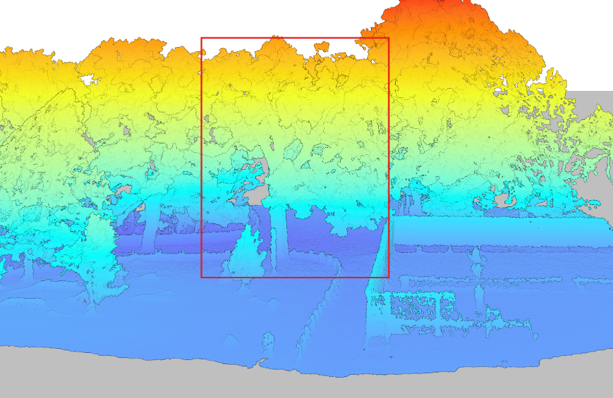
Visualized point cloud in DJI Terra. Target tree outlined in red.
The canopy of these trees overlap. The tree is almost indistinguishable without colour values (RGB), hidden between all the other trees. No problem. Before we quantify this tree, we will delineate it (separate it from the others).
library(lidR) # Load packages
library(rgl)
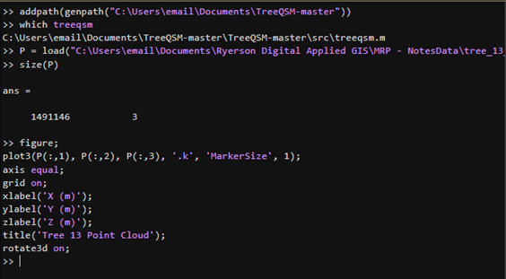
las <- readLAS("Path to las file")Before we can separate the trees, we must classify and normalize them to determine what part of the point cloud consists of tree, and what part does not. Normalizing the points helps adjust Z values to represent above ground height rather than absolute elevation.
las <- classify_ground(las, csf())

las <- normalize_height(las, tin())

plot(las, color = "Z")
Now that the point cloud has been appropriately classified and normalized, we can begin to separate the trees. Firstly, we will detect the tree heights. The tree tops will define the perimeter of each individual tree.
hist(ttops$Z, breaks = 20, main = "Detected Tree Heights", xlab = "Height (m)")

plot(las, color = "Z")

plot(sf::st_geometry(ttops), add = TRUE, pch = 3, col = "red", cex = 2)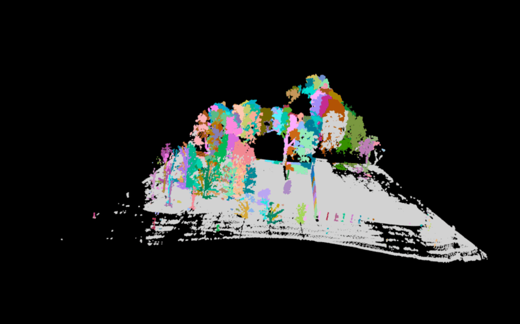
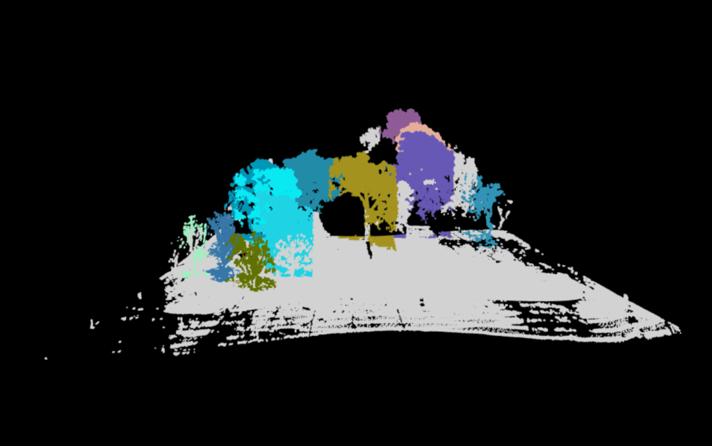
The first iteration will not be the last. 158 trees were detected this first round. An urban park does not have more than 15 in a small, open region such as this. Adjusting window size and height will help isolate trees more accurately. These parameters will depend on factors such as the density of your trees, density of your point cloud, tree shape, tree size, tree height and tree canopy cover. Even factors such as terrestrial versus aerial lasers will effect which parts of the tree will be better detected. In this way, no two models will be perfect with the same parameters. Make sure to play around to accommodate for this.
ttops <- locate_trees(las, lmf(ws = 8, hmin = 10))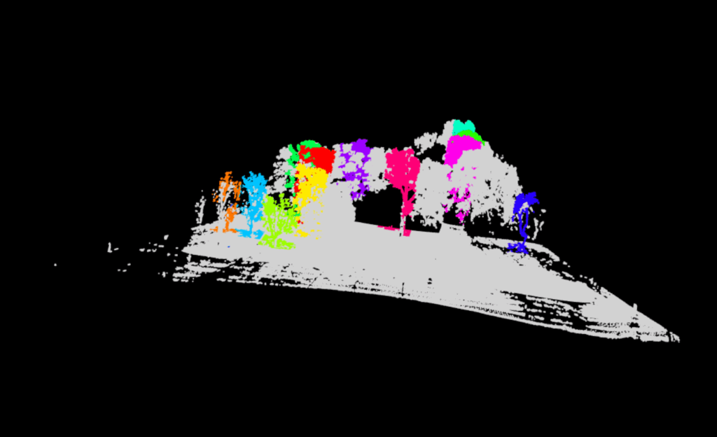
A new issue arises. Instead of too many trees, there are now no individual, fully delineated trees visible within the output. All trees consist of chopped up pieces, impossible for accurate quantification. We must continue to adjust our parameters.
This occurred due to the overlapping canopies between our trees. The algorithm was unable to grow each detected tree model into its full form. Luckily, the lidR package offers multiple methods for tree segmenting. We may move on to the dalponte2016 algorithm for segmenting trees.
chm <- rasterize_canopy(las, res = 0.5, p2r())

las <- segment_trees(las, dalponte2016(chm, ttops, th_tree = 1, th_seed = 0.3, th_cr = 0.5, max_cr = 20))

table(las$treeID, useNA = "always") # Check assignment

plot(las, color = "treeID")
A Canopy Height Model is produced to delineate the next set of trees. This canopy model…
…is turned into…
While this is much improved, the tree of choice (mustard yellow) has a significant portion of its limbs cut off. This is due to its irregular shape. This requires a much more aggressive application of the dalponte2016 parameters. We adjust parameters so that the minimum height (th_tree) is closer to the ground, the minimum height of the treetop seeds (th_seed) are inclusive of the smallest irregularities, the crown ratio (th_cr) is extremely relaxed so that the tree crowns can spread further, and the crown radius (max_cr) is allowed to expand further. Here is the code:
las <- segment_trees(las, dalponte2016(chm, ttops, th_tree = 0.2, th_seed = 0.1, th_cr = 0.2, max_cr = 30)) 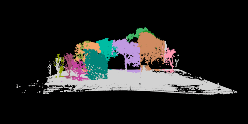
Finally, the trees are whole. Our tree (purple) is now distinct from all other trees. It is time to remove our favorite tree. You can decide which tree is your favourite by using the rgl package. It will allow you to visualize in 3D, even while in RStudio.
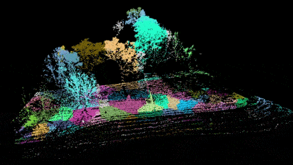
GIF created using Snipping Tool (Video Option) and Microsoft Clip Champ.
tree <- filter_poi(las, treeID == 13)
plot(tree, color = "Z")
coords <- data.frame(X = tree$X, Y = tree$Y, Z = tree$Z)
coords$X <- coords$X - min(coords$X)
coords$Y <- coords$Y - min(coords$Y)
coords$Z <- coords$Z - min(coords$Z)
write.table(coords, file = "tree_13_for_treeqsm.txt", row.names = FALSE, col.names = FALSE, sep = " ")
While the interactive file itself is too large to insert into this blog post. You can click on the exported visualization here. This will give you a good idea of the output. Unfortunately, Sketchfab is unable to accommodate the point data’s attribute table, but it does have the option for annotation if you wish to share a 3D model with simplified information. It even has the option to create virtual reality options.
Now if you have taken the chance to click on the link, try and think of the new challenge we now encounter after having delineated the single tree. There is one more task to be done before we will be able to derive accurate tree metrics.
Segmentation – CloudCompare
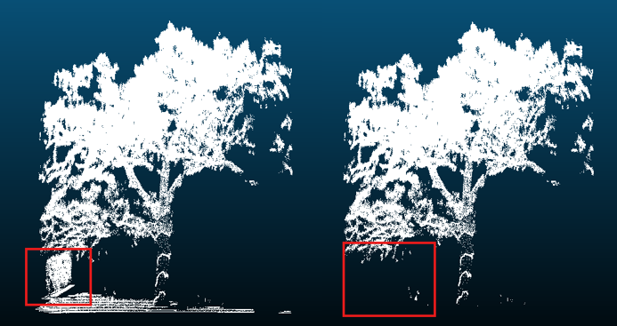
If you didn’t notice from the final output, the fence was included in our most aggressive segmentation. If this occurs, fear not, we can trim the point cloud further, with cloud compare.
Download cloud compare, drag and drop your freshly exported file, and utilize the segmentation tool.
Click on your file name under DB Tree so a cube appears, framing your tree.
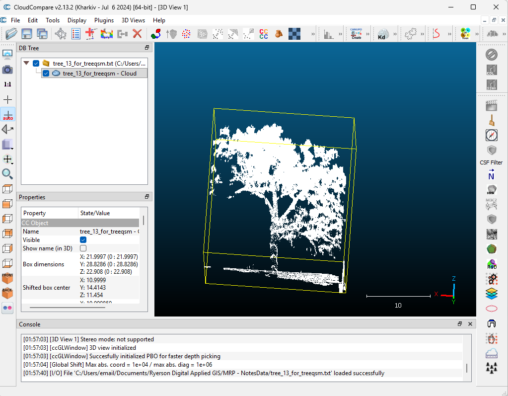
Then click Tools –> Segmentation –> Cross Section.
Utilize the box to frame out the excess, and use the “Export Section as New Entity” function under the Slices section to obtain a fresh, fence (and ground) free layer.
Our tree can now be processed in Matlab!
Quantitative Structural Modeling – MATLAB (TreeQSM)
Allows visualization of your individual tree. A new window named “Figures” will pop up to show your progress.
The following parameters can be played around with. These are the initial parameters that worked for me. Further information about these parameters can be found here, in the official documentation of TreeQSM. Please ensure you have the Statistics and Machine Learning Toolbox installed if any errors occur.
inputs.PatchDiam1 = 0.10;
inputs.PatchDiam2Min = 0.02;
inputs.PatchDiam2Max = 0.05;
inputs.BallRad1 = 0.12;
inputs.BallRad2 = 0.10;
inputs.nmin1 = 3;
inputs.nmin2 = 1;
inputs.lcyl = 3;
inputs.FilRad = 3.5;
inputs.OnlyTree = 1;
inputs.Taper = 1;
inputs.ParentCor = 1;
inputs.TaperCor = 1;
inputs.GrowthVolCor = 1;
inputs.TreeHeight = 1;
inputs.Robust = 1;
inputs.name = 'tree_13';
inputs.disp = 1;
inputs.save = 0;
inputs.plot = 1;
inputs.tree = 1;
inputs.model = 1;
inputs.MinCylRad = 0;
inputs.Dist = 1;

QSM_clean = treeqsm(P, inputs);

fprintf('\n=== TREE 13 - NO FENCE ===\n');
fprintf('Total Volume: %.4f m³ (%.1f liters)\n',

QSM_clean.treedata.TotalVolume/1000, QSM_clean.treedata.TotalVolume);

fprintf('Tree Height: %.2f m\n', QSM_clean.treedata.TreeHeight);
fprintf('DBH: %.1f cm\n', QSM_clean.treedata.DBHqsm * 100);
fprintf('Number of Branches: %d\n', QSM_clean.treedata.NumberBranches);
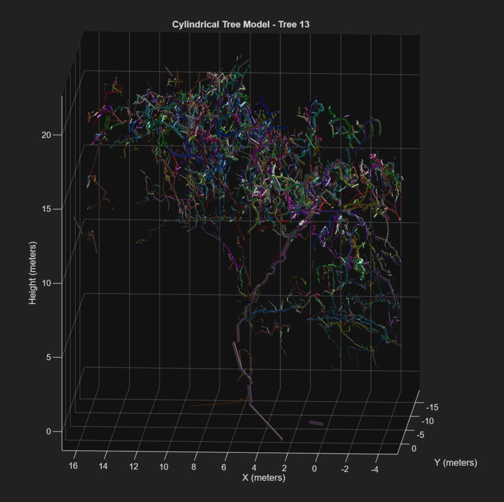
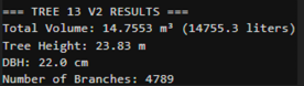
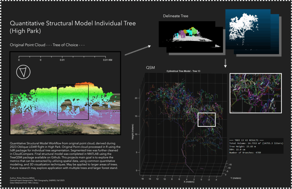
If this is your output, you have successfully created a Quantitative Structural Model of your tree of choice. This consists of a series of cylinders enveloping every branch, twig and trunk part of your tree. This cylindrical tree model can quantify every part of the tree and produce a spatial understanding of tree biomass distribution.
For now, we have structural indicators, such as total volume, number of branches, and height, which may be used as proxy for physical measurements. The summary of this process has been posted below in the form of a visualized workflow.
This project provides a foundational learning curve that encourages the reader to explore the tools available for visualizing and manipulating point clouds, by classification, segmentation and volumetric modeling. This has potential for studies in carbon sequestration, where canopy height and volume can be linked to broaden the understanding of above-ground biomass, and the spatial-temporal factors that affect our national resources. There is potential for vegetation growth monitoring, where smaller plantations can be consistently, and accurately monitored for structural changes (growth, rot, death etc.). While a single tree is not the most exhilarating project, it lays the groundwork for defining ecological accounting systems for expansive 3D spatial analysts.
Limitations
This project was unable to obtain ground truth for accurate comparison of the point cloud. With ground truth, the parameters could have been more accurately defined. This workflow relied heavily on visual indicators to segment and quantify this tree. This project requires further expansion, with a focus on verifying the extent of accuracy. The next step in this process consists of comparison to allometric modelling, as well as more expansive forest stands.
For now, we end with one tree, in hopes of one day tackling a forest.
Resources
Moral Support
Professor Cheryl Rogers – For the brilliant ideas and positivity.
Data
Roussel, J., & Auty, D. (2022). lidRbook: R for airborne LiDAR data analysis. Retrieved from https://r-lidar.github.io/lidRbook/
Åkerblom, M., Raumonen, P., Kaasalainen, M., & Casella, E. (2017). TreeQSM documentation (Version 2.3) [PDF manual]. Inverse Tampere. https://github.com/InverseTampere/TreeQSM/blob/master/Manual/TreeQSM_documentation.pdf
Toronto Metropolitan University Library Collaboratory. (2023). Oblique LiDAR flight conducted in High Park, Toronto, Ontario [Dataset]. Flown by A. Millward, D. Djakubek, & J. Tran.