SA8905 – Cartography and Geovisualization
Geovisualization Project Assignment
By: Nishaan Grewal
I am sure that many of us have experienced or have heard about the ever-growing issue, which is auto theft. This project, utilizing PowerBI, will not only help analyze but also provide a visualization of Toronto auto theft patterns (2020-2024). Using the spatial insights together with the business intelligence tools provided by PowerBI, it has allowed me to compare trends across the years, and overall create an interactive dashboard that is usable by users.
You may be asking why not just use ArcGIS and PowerBI, but as informative and advanced the mapping is on ArcGIS it still lacks the story telling and understanding for the everyday user. I believe GIS should be used to help educate and inform individuals in a user-friendly and easy-to-access manner. Using Power BI for the first time myself, I can truly say it has helped me understand how GIS can be used in many other ways, rather than in my comfort zone, which is just using ArcGIS Pro. My goal was to create an easy-to-follow to follow dashboard that allows the user to explore Toronto’s neighbourhood-level auto theft trends in an intuitive and meaningful way, without being confused.
So let’s get started and give an overview of the project. Please remember if your TorontoMU account does not work for PowerBI, you must obtain licencing from the TMU. I had to get help from the TMU help desk.
Datasets:
1. Neighbourhood Crime Rates Open Data (CSV file) – Toronto Police Service (https://data.torontopolice.on.ca/datasets/TorontoPS::neighbourhood-crime-rates-open-data/explore?location=43.717192%2C-79.376060%2C9.90)
2. Neighbourhoods Boundary (JSON file) – City of Toronto Open Data (https://open.toronto.ca/dataset/neighbourhoods/)
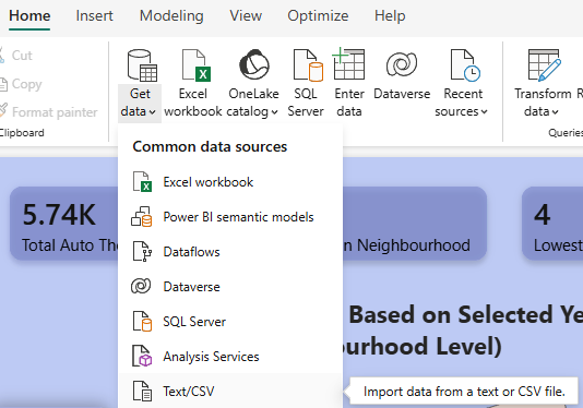
STEP 1: Add and Clean Data
I started by importing the CSV file of the Auto Theft dataset into PowerBI.
Click: Home → Get Data → Text/CSV → Transform Data
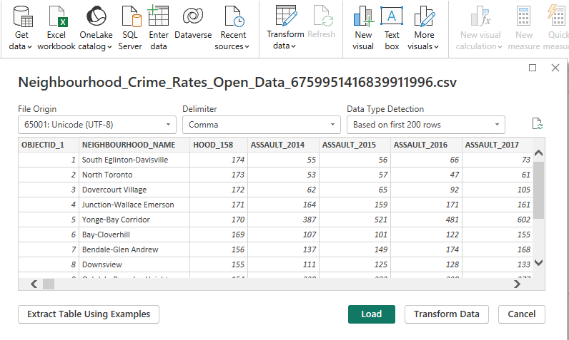
With that, I cleaned the data as I was only interested in the Auto Theft crime from the years 2020 to 2024. I manually just removed unnecessary columns (e.g, other crime types). I also verified column types (Year = whole number, Neighbourhood = text)
With the cleaning done, my dataset looked a bit like this.
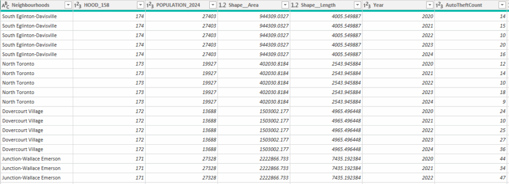
(Keep in mind, this cleaned dataset is 790 rows of data)
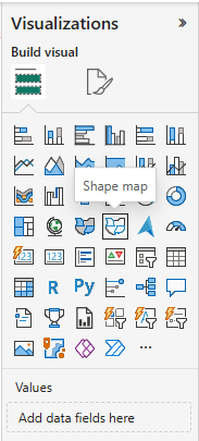
STEP 2: Add Map
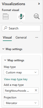
As mentioned earlier, although there is a ArcGIS feature on PowerBI, I wanted to only use features that PowerBI offers, eliminating the need for furthur licensing (for everyday users). So for this project, I used Shape Map, which is under the Visualizations pane.
With that added to the Format panel, I had to expand the Map settings, turn on Custom map, and upload the Neighbourhoods Boundary (JSON file).
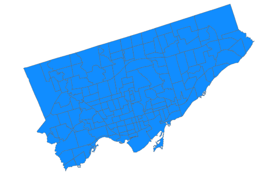
With that you will see a neighbourhood boundary of Toronto
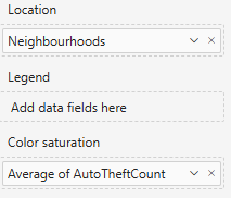
After Dragging the Neighbourhoods and AutoTheftCount columns from the cleaned dataset (in the Data pane) and dragging them to the Location and Colour saturation as follows:
You get a map choropleth map like the following:
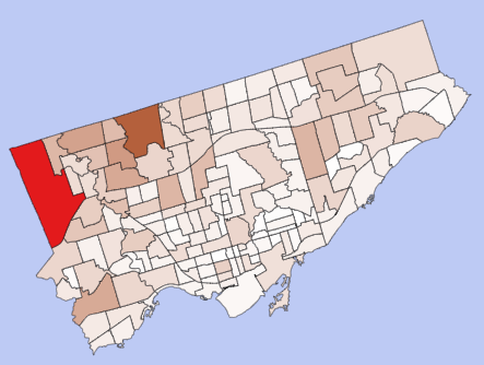
Feel free to choose a colour scheme of your liking and make sure to add your title.
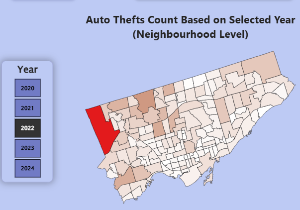
STEP 3: Add Interactive Year Slicer
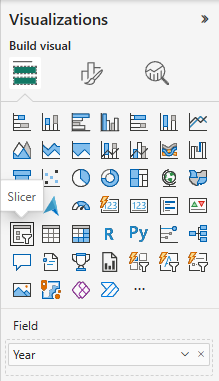
As a map is now present, it is time for us to make the interactive feature of the dashboard. I did this by adding a Slicer (Year Slicer), and adding the Year column from the dataset. The slicer can be located in the Visualization panel.
After playing around with the format settings, I had finalized a Slicer that allows a user to click a year (2020 – 2024), which changes the map appearance with the Auto Theft counts within that specific year.
Step 4: Create Measures for KPIs
With the slicer working, it was now time to create the KPIs to provide viewers with key indicators that not only updated with the click of a button, but also gave insightful and readable information. This allowed the viewer to understand the map with better context.
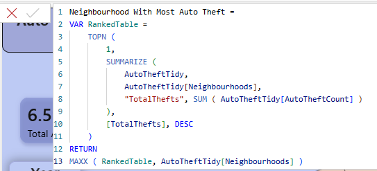
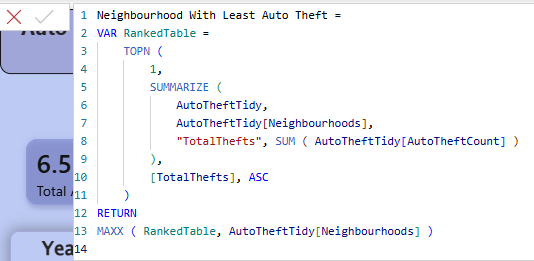
I did this by creating new measures (Go to the top ribbon → Modeling → New measure). As the formula bar popped up, I wrote some code that helped analyze different insights.
The insight measures created were:
1. Total Auto Thefts

2. Neighbourhood With Most Auto Theft
3. Neighbourhood With Least Auto Theft
4. Highest Auto Theft in Neighbourhood

5. Lowest Auto Theft in Neighbourhood

6. Change in Auto Theft Based on Previous Year (%)
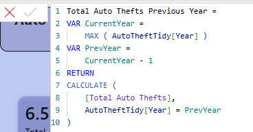
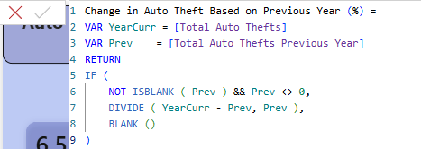
With the help of ChatGPT, I was able to validate my code.
Step 5: Turn Every Measure into a KPI Card
Now that the measures were all made, it is time for the easier step, which is to add KPI Cards.
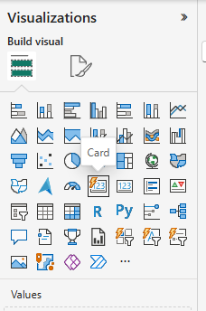
In the Visualization pane, there is a feature called “Card”; make sure you use the dynamic version as seen below.
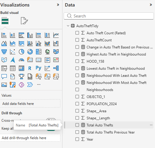
With 6 Cards now on the Dashboard, I then dragged each measurement into each card from the Data pane.
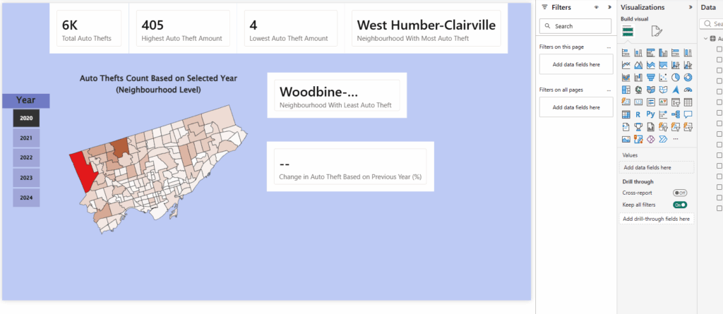
This is what was created from steps 1 to 5.
Step 6: Add Graphs
With graphs missing, I had decided to add a Line Chart that showed “Total Auto Thefts in Years”, and a Stacked Bar Chart that showed “Top 5 Neighbourhoods With Most Total Auto Theft”.
These graphs can be added by using the same Visualization Panel.
LINE CHART:
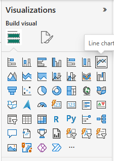
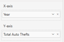
Make sure to drag the data to the respective X and Y axes.
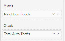
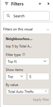
STACKED BAR CHART:
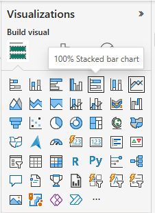
Make sure to drag the data to the respective X and Y axes, and make sure to add a filter that takes only the top 5 neighbourhoods instead of all neighbourhoods.
After this step was done, I had a rough dashboard, which, although it wasn’t aesthetically finished, it now at least had an interactive map that changed based on a viewer’s click on a selected year, which also updated the KPIs and graphs data.
Step 7: Make it Finalized
After playing around with each feature’s formatting (to change colour and look), I had now developed a finished product that I was very pleased with.
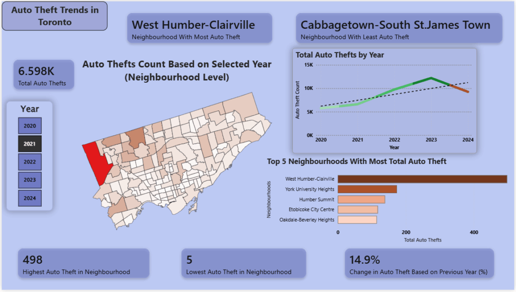
This is now an interactive dashboard that displays information on the Auto Theft trends in Toronto based on the years 2020 to 2024.