By Aria Brown
Geovis Project Assignment | TMU Geography | SA8905 | Fall 2025
Hello everyone! Welcome to my geovis blog post :)
Introduction & Context
As someone who has an immense passion for geography, I have come across many opportunities where I can implement such a passion in relation to my other interests. Although geography is paramount in my interests, I am also quite an avid history buff. Thus, I wanted to see if I could capture both my passions and merge them into one project.
Contentedly, I was able to produce a project that combines 3 very important and personal aspects that provide insight into myself and my interests; my passion for geography and history, as well as my appreciation for the City of Toronto, where myself and my family’s roots in Canada first began. Therefore, I decided that I wanted to visualize the history of this great city, taking viewers through time to show how Toronto was able to get to what it is today by utilizing the free-to-use new gen. website Canva with its animation and interactive features.
Therefore, I present to you Unifying the “Megacity,” A Historical Interactive Animation of the Amalgamation of Toronto. My project takes us back to 1834 when the City of Toronto was first created and progressively follows a timeline to bring viewers to the present.
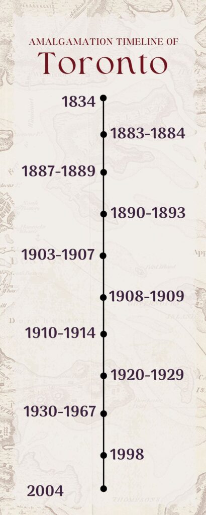
Figure 1
Timeline that the project will follow
Data & Rationale
Recently, incorporating animation into the world of GIS has been a quite popular trend that many individuals, organizations, and companies have decided to implement in their work. However, animation tools may be hard to come by and most would require a fee upon usage. Therefore, I knew I wanted to see if I could implement a way that GIS could be visualized using an easy-to-use tool that supports interactive features and animation. For those that may be aware, ArcGIS Pro itself does feature an animation tool that uses a timeline (key frames) that the software then compiles and presents in a rather static animation.
So you might be wondering, why not just use ArcGISPro? ArcGISPro animation and interactive features I found to be quite limiting. Users are limited to key frames to present their animation and may not include extensive interactive features that can be played with or toggled on. I wanted to create a fun interactive animation that was almost seamless and easy to follow without being tied to the constraining ArcGISPro capabilities, and without the fees that other animation tools and softwares may require. Also, Canva is widely used by many to create presentations, reports, etc, and I thought why not showcase how this website that many know and love is capable of so much more.
Tools Used:
Canva- Free Graphic Design Tool
ArcGIS Pro- Desktop GIS Software
Data Used:
City of Toronto Historical Annexation Boundaries (1834-1967)- University of Toronto Dataverse
City of Toronto Community Council Boundaries- Toronto Open Data Portal
Municipal Boundaries as of 1996- Government of Canada
Methodology
Step 1: Upload Data into ArcGISPro and Examine the Data and its Attributes
First, I created a new map project in ArcGIS Pro and uploaded my data. I then right clicked my layers in the ‘Contents’ pane and selected ‘Attributes,’ here you can investigate your data and look for key information such as time frames or date fields. With this particular dataset, the attributes table featured key fields such as the Name of the annexed community (Name) and the year it was annexed (DtAnxd).
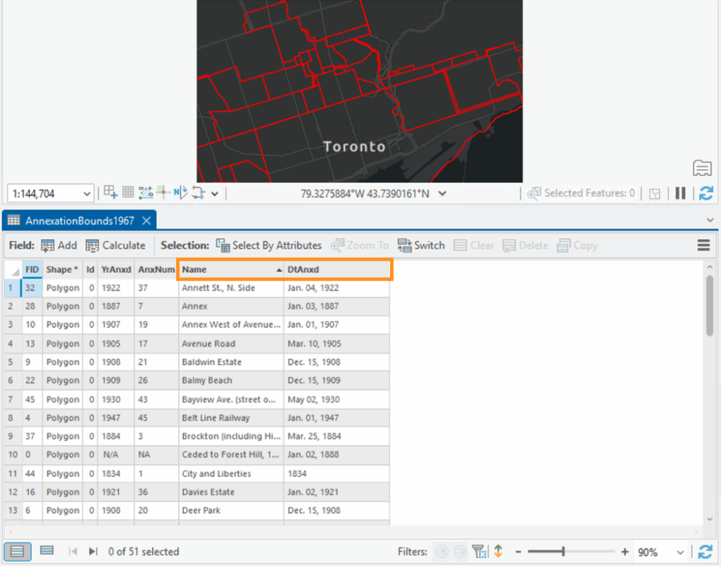
Figure 2
Opened attribute table in ArcGIS Pro highlighting the Name and DtAnxd fields
Step 2: Separate the Data into Key Time Frames
In order to ensure that my animation was concise, I separated the data into key time frames instead of showing the progression of city boundaries one-by-one, as there are a total of 51 records. I then laid out a framework as to how I was going to group my data using Microsoft Excel and grouped the data by their decades or significant time frames. I exported the attributes table to Excel using the ‘Table to Excel’ geoprocessing tool. I colour-coded my excel document to keep my records organized and so I could easily visualize the beginning and end of each time frame.
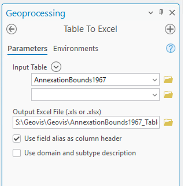
Figure 3
Table to Excel geoprocessing tool
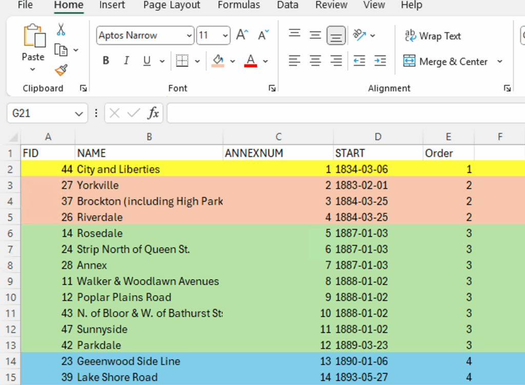
Figure 4
Microsoft Excel spreadsheet of my data and key information sorted by the order it will be presented in
Step 3: Use the ‘Export Features’ Tool to Export Selected Attributes
Once my data and time frames were organized, I selected the date-specific polygons using the ‘Select By Attributes’ tool and ran the expression:
Where YrAnxd (text field that has just the year of annexation) includes the value(s) 1883, 1884 (years)
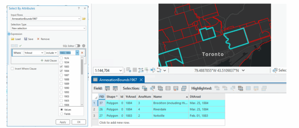
Figure 5
Select By Attributes tool in ArcGIS Pro and the attribute table view after selecting specific attributes
After running this tool for each time frame, I exported the selected attributes by selecting the layer on the Contents pane, right-clicking and selecting Data→Export Features, where I exported selected features based on the time frame. Each time frame was exported into separate shape-files, and the picture below shows the export of the 1883-1884 time frame into a shape-file entitled ‘1883_1884” which was the titling format I maintained for each shape-file.
Step 4: Customize the Map and Layout
After exporting each time frame into separate shape-files, I edited the look of my map by changing the basemap to depict a more historical-looking one that I felt fit the theme of my project and symbolized the boundary lines, scale bar, and north arrow to match the theme as well. I made sure to bookmark the location of the map in order to ensure each time frame would have a seamless transition without any movement from the map itself.
In order to show a progression of Toronto’s boundaries that gradually increased over time, I made sure to toggle on the shape-files of the previous years to showcase this. For example, for the 1883-1884 time frame, I kept the previous 1834 shape-file to show this boundary progression.
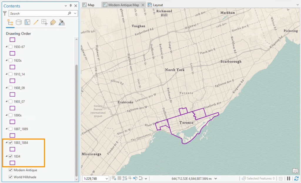
Figure 6
Map in ArcGIS Pro with the layers of 1834 and 1883_1884 turned on
Step 5: Export Maps
I then exported each map to a PNG file by selecting the Share tab and selecting Export Layout.
Step 6: Upload to Canva
Each map was uploaded to Canva using the ‘Uploads’ tool on the left menu bar to a presentation-style template
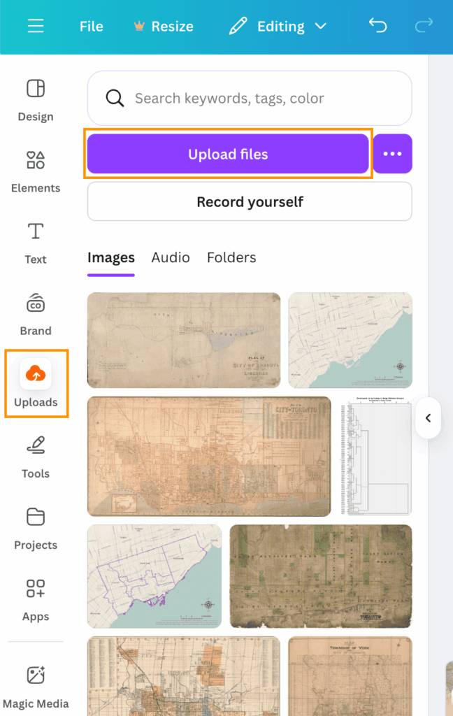
Figure 7
Uploads icon that is used to upload imagery files
Step 7: Use Presentation Template to Layout Maps and Customize
I customized each slide of my presentation by adding my maps, borders, images and icons.
Step 8: Enable Various Animation Tools Between Slides and Text
To create a rather seamless transition between time frames, I selected the ‘Dissolve’ animation tool by hovering my mouse over the space between each slide and selecting the ‘Add Transition’ option. Here, Canva presents a variety of different animation transitions to choose from, however I selected ‘Dissolve’ as I felt it was the most seamless transition due to its fading animation type. I also used different animation types for the display of different text components within the slides.
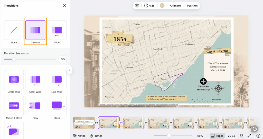
Figure 8
Selecting the ‘Dissolve’ animation under the Transitions tab, after selecting the transition style, the icon will the be present between slides (in this case the ‘Dissolve’ tool is represented by an infinity symbol
Step 9: Add Selectable Icons
I also wanted to make my animation more interactive and came up with the idea of allowing viewers to see a historic map of Toronto at the particular time frame that the slide was presenting. I got this idea by seeing the use of historic maps being used as basemaps to showcase the evolution of the city and its boundaries. I then found historical maps from the City of Toronto’s Historical Maps and Atlases website and saved them. I then uploaded them to Canva, duplicated my slide with a blank map and added the historic map to it. I then georeferenced the historic maps by lining up the borders between them and my map. I temporarily made the historic maps a bit transparent so I could line up the borders accurately.
I added a ‘plus’ icon from Canva on the slide I wanted and configured the icon so that if it was selected, viewers would be able to see the historic map of Toronto at around the same time. This was done by selecting the plus icon and selecting the ellipsis and navigating to ‘Add Link.’ Then, I selected the particular slide I wanted in the ‘Enter a link or Search’ section. This configured the plus icon to allow viewers to select it, prompting Canva to present the map with the historic imagery overlaid on top. An additional selectable icon (back button) was created on the historic map slides to allow users to go back to the original slide they were viewing.
Figure 9
Under the ‘Elements’ tool on the left menu bar, here I search for ‘plus button’ and selected one that I liked
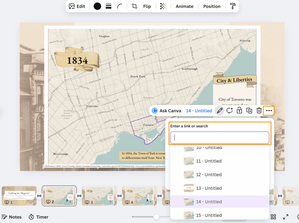
Figure 10
Adding a link to the plus icon and linking the desired slide
*Note: I kept all my historic map slides at the end of my presentation, as they are are optional aspect that can be viewed
Results
Link to Canva Presentation:
Presentation:
After the completion of the previous steps, the final product features an animated and interactive presentation of maps! The final product now has:
- Select capabilities
- Animated transitions between slides and text
- Selectable pop up icons to present new information (historic map imagery)
- Zoom in and out capabilities
I hope you may be inspired by this and try to make your own interactive animation
Thank you!
References
City of Toronto. (2018). Toronto Community Council Boundaries Options Paper. City of Toronto. https://www.toronto.ca/legdocs/mmis/2018/ex/bgrd/backgroundfile-116256.pdf
City of Toronto. (2025). Community Council Area Profiles. City of Toronto. https://www.toronto.ca/city-government/data-research-maps/neighbourhoods-communities/community-council-area-profiles/
City of Toronto. (2025). Historical Maps and Atlases. City of Toronto. https://www.toronto.ca/city-government/accountability-operations-customer-service/access-city-information-or-records/city-of-toronto-archives/whats-online/maps/historical-maps-and-atlases/
Government of Canada. (2005). Municipal boundaries as of 1996. Government of Canada. https://open.canada.ca/data/en/dataset/a3e19e02-36f0-4244-87ab-8f029c6846e2
Fortin, M. (2023). City of Toronto Historical Annexation Boundaries (1834 – 1967). University of Toronto. https://borealisdata.ca/dataset.xhtml?persistentId=doi:10.5683/SP3/XN2NRW
MacNamara, J. (2005). Toronto Chronology. Ontario Genealogical Society.https://web.archive.org/web/20070929044646/http://www.torontofamilyhistory.org/chronology.html