Geovis Project Assignment, TMU Geography, SA8905, Fall 2025
Author: Pravar Joshi
Introduction
This tutorial walks through how I created Follow Your Flush, an educational web app that shows where wastewater travels in Toronto after someone flushes a toilet or drains a sink. The goal of the project is to help the public understand a complex urban system in a simple, visual way. Toronto has nearly 3,800 km of sanitary sewers and more than 523,000 property connections. Most of this infrastructure is underground and difficult to picture. This project uses interactive mapping, routing, and animation to turn a hidden system into an intuitive experience.
It invites the user to click anywhere in the city. The app then:
- Identifies which wastewater treatment plant serves that location.
- Computes a walking route (as a stand-in for sewer pipes) from the chosen point to the plant.
- Animates a smooth camera flythrough along the path.
- Extends the journey along an outfall pipe to Lake Ontario or the Don River.
- Presents a treatment stages summary with a simple looping wastewater animation.
- Shows the total travel distance.
The app brings together Mapbox GL JS, ArcGIS Online (AGOL) feature services, Mapbox Directions, and Turf.js for spatial calculations. It also uses the Mapbox Free Camera API, along with terrain and sky layers, to turn a simple map click into a fully animated 3D experience. In this tutorial, I will walk through how to combine these tools to build your own interactive story maps that draw on AGOL data, incorporate animations, use 3D map views, and perform open source geospatial analysis.
Why create an interactive story map?
This project shows how web mapping can turn a hidden system into something easy to understand. Most people never think about how wastewater makes its way to a treatment plant. A story-driven, animated map helps people understand distance, direction, and the treatment process.
The same approach can be used for other topics:
- Drinking water treatment story
- Fish migration patterns (eg salmon)
- A bike or transit route animation
- A delivery vehicle or garbage collection story
- A heatwave moving across a city
- A “walk the proposed development site” planning tool for developers
The storytelling approach stays the same. Only the datasets change.
Integrating Mapbox with ArcGIS Online (AGOL) Data
One of the most important pieces of this project is the ability to bring AGOL data directly into a Mapbox application. AGOL hosts feature services that can be queried through a simple REST API. These services can return data as GeoJSON, which Mapbox can load immediately as a source. This creates a flexible workflow where authoritative data is stored in AGOL (eg municipalities often post data on AGOL and it can be accessed for free) and rendered interactively through Mapbox in a custom web application.
This integration enables you to access the plentiful feature services in AGOL while leveraging Mapbox’s industry-leading graphics layers and APIs that allow for interactive web apps to be created with ease.
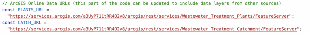
In this project, two AGOL layers were used:
- Wastewater Treatment Plants (points)
- Wastewater Catchments (polygons)
These were loaded through REST queries. First, I stored the URL for each of them separately:
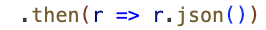
Then, I fetched the URL for each of them independently; for example:

Once the request is sent to AGOL to retrieve the feature service, then it needs to be converted into a JavaScript object that contains the GeoJSON features:
The next step is to register the data inside Mapbox as a source, so it can draw this data, filter it, transform, and animate:

Lastly, I created a circle layer for the plant locations since this is point data and added labels above the plant. I kept the visibility as ‘none’ or hidden as this data is only shown on the map once the user triggers the entire workflow:
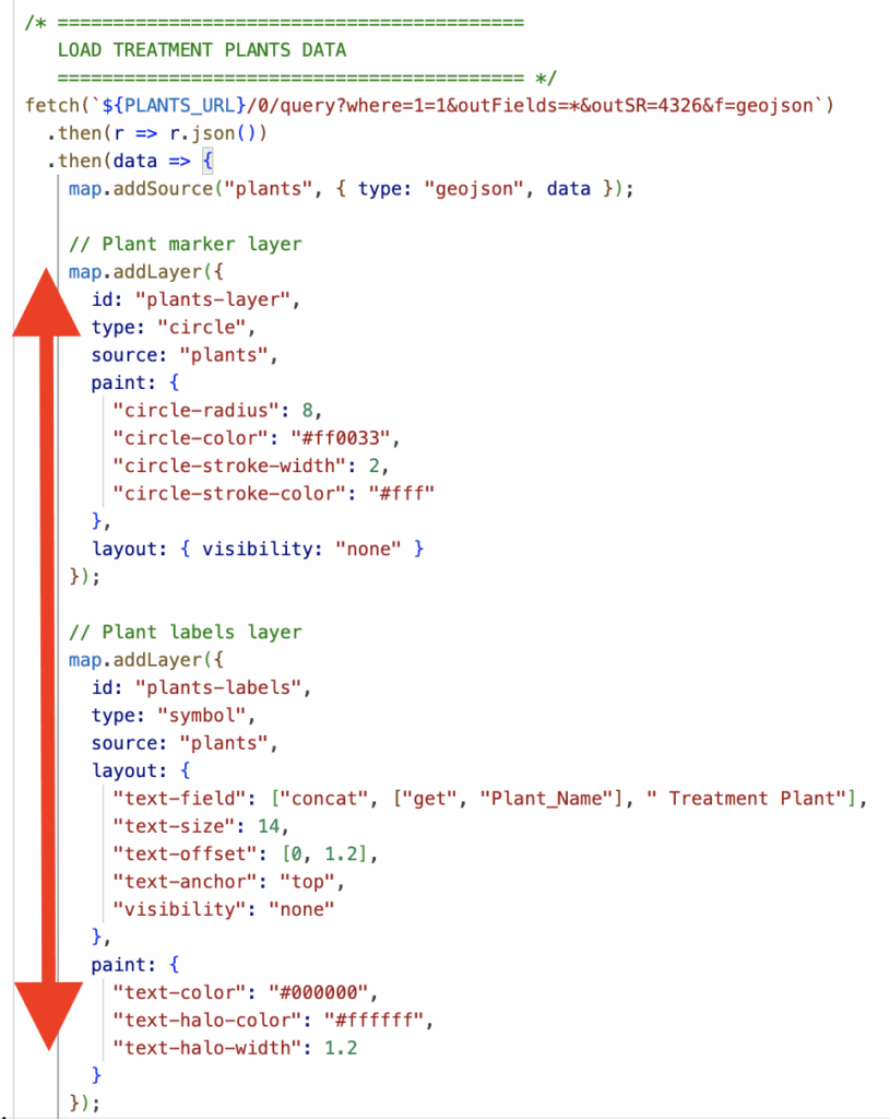
To summarize, this part of the tutorial walks through how to download an AGOL feature layer as GeoJSON such that it can be used in Mapbox. In this example, a point layer from AGOL was transformed in a circle layer for wastewater treatment plant locations and a symbol layer was also created in Mapbox for readable labels. Please refer to more detailed documentation here: https://developers.arcgis.com/rest/services-reference/enterprise/query-feature-service-layer/
Using Turf.js for Open-Source Spatial Analysis
Turf.js is a lightweight, open-source geospatial analysis library for JavaScript. It fills an important gap if you want to do geospatial operations, without depending on commercial APIs or paying credits for repeated calls via ESRI’s APIs.
In this project, Turf.js is used to support:
- Finding the nearest address to a click
- Creating line geometries
- Point-to-Point distance calculations
- Computing final journey lengths
- Handling geometry operations that Mapbox does not perform
Finding the nearest address to a click
When the user clicks the map, the app looks for the closest address point. This gives the user context: “You clicked near 123 Sample Street.”
This pattern can also be used for a variety of use-cases. Instead of the closest address point, you can program the app to find the nearest park, nearest fire station, nearest trailhead, nearest bus stop, etc..
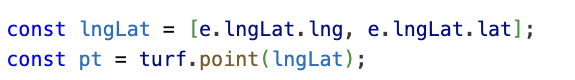
While the reverse-geocoding itself is done through the Mapbox Geocoding API, Turf provides the geographic structure needed to represent the clicked location correctly. The codeblock below is converting the raw coordinate pair into a proper GeoJSON Point. Then, the location can be passed cleanly into downstream spatial logic, distance functions, and API calls. Turf ensures the click is formatted as a true spatial feature rather than just a number pair.
Creating Line Geometries
A major part of the app involves drawing routes and pipe paths on the map. Turf.js makes this possible by converting plain arrays of coordinates into valid GeoJSON LineStrings. These LineStrings are then used for routing, animation, and distance calculations.
Walking Route (user click → treatment plant)
When the Mapbox Directions API returns a walking route, it provides the geometry as a raw array of coordinate pairs. Turf turns that list into a real spatial feature:

This gives the route a formal geometric structure. That structure is what allowed me to smooth the route, fit the map to the route’s bounding box, computre the route’s geodesic length, and animate the camera along the path. Without converting the coordinates to a LineString, none of those operations would work reliably.
Point-to-Distance Calculations
Turf allows the app to treat the walking route and the outfall pipe as real geographic lines instead of screen-based pixels. Using turf.length(), the distance between route coordinates is computed with proper geographic units. This converts hundreds of small coordinate segments into a single cumulative distance.

Conclusion
Mapbox is good at rendering beautiful map outputs for web apps, but it does not run geospatial operations. Turf fills this gap and can be leveraged for your interactive story-based web app!
Handling User Input and Spatial Logic
User interaction drives the entire application. The workflow always begins with a map click that triggers the logic for selecting the correct spatial boundary, calculating a route, and starting the animation.
This process applies can apply for many different use-cases:
- Identify which watershed a user clicked
- Identify or assign a bike route or transit line based on where a user clicked
- Detect which fire station or service zone covers an area
In my example, the code performs two essential operations:
- Detect which AGOL polygon contains the user clicked point.
- Use that polygon’s attributes to guide the rest of the story
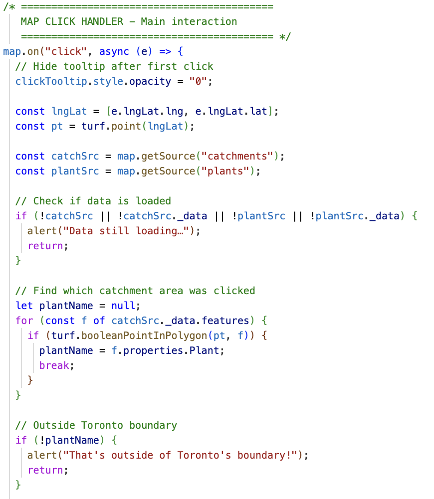
This codeblock below is the main map click handler for my application. Some of the key features:
- Listening for a Click
The handler begins withmap.on("click", …), which waits for the user to click the map. This is the trigger for all interaction. - Cleaning Up the Interface
The tooltip that guides first-time users is hidden as soon as they click. This keeps the interface clean for the rest of the workflow. - Capturing the Click Location
The clicked longitude and latitude are extracted from the event (e.lngLat). These coordinates are wrapped into a Turf.js point object (turf.point(lngLat)), which allows the point to be used in spatial operations. - Checking That the Data Is Loaded
Before running any spatial queries, the code checks whether the catchment polygons and plant data have actually finished loading. If either dataset is missing, the user sees an alert and the function stops. - Executing Point-in-Polygon Logic Before running any spatial queries, the code checks whether the catchment polygons and plant data have actually finished loading. If either dataset is missing, the user sees an alert and the function stops.
- Handling Clicks Outside the Study Area If the loop finishes without finding a catchment, the system alerts the user that the click was outside the valid boundary and ends the function.
Enhancing the Map with Terrain and Sky Layers
To make the map feel more immersive, the project uses Mapbox’s terrain and sky layers. These layers add visual depth by emphasizing elevation and atmospheric light, giving users the sense that they are traveling through a landscape rather than sliding across a flat 2D map.
Adding a Digital Elevation Model (DEM)
Mapbox provides a global DEM that can be used to give the map a 3D effect. The DEM can be added as a raster source:
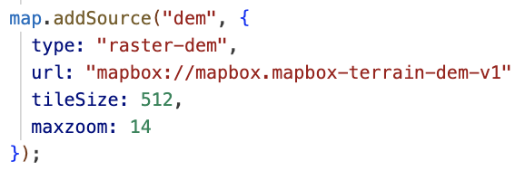
Once the DEM is loaded, you can apply it as the map’s terrain:

The exaggeration value controls how “vertical” the terrain appears. A little exaggeration helps users see the landscape without making the scenery look unnatural.
Adding a Sky Layer
The sky layer gives the map a realistic horizon when the camera tilts which is especially important in a project with dramatic camera movements such as this one as there is a camera that follows the path.
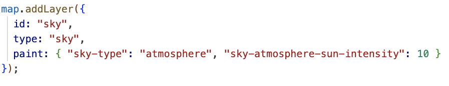
This sky layer the camera animation feel more cinematic. When the camera swoops down behind the walking path or flies across Lake Ontario during the outfall animation, the sky contributes to a sense of motion and depth.
Using the Mapbox Free Camera API for Animation
The free camera API allows the map’s viewpoint to move smoothly along a path. This is similar to mimicking a drone or guided flythrough and transforms the map from a static reference into a narrated journey.
Setting up the camera
You start by grabbing the current free camera options from the map:

This camera can be repositioned and rotated independently.
placing the camera at a coordinate
For each coordinate in the route, you update the camera’s position and orientation:
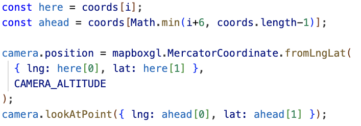
The .position function controls where the camera is located. The .lookAtPoint function controls what the camera is pointed at and CAMERA_ALTITUDE adjusts how high above the path the animation flies. In my application, I enable the user to adjust the altitude via a slider.
Animating the flight
You can create a recursive step() function that updates the camera a little at a time to create an animation:
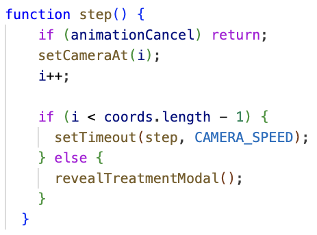
The result is a smooth glide along the walking route and the outfall pipe, in my application. This creates the core storytelling moment of the application, letting users “follow their flush” as if traveling along the sewer network themselves.
Educational Modals and Storytelling Structure
The Follow Your Flush web app uses a sequence of modals to turn geographic data into a guided, educational story. This approach ensures users learn something at every step rather than just looking at moving lines on a map.
Intro Modal (Setting the Stage)
This modal set the introductory concept and disappears when the user is ready to begin:
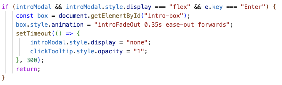
This helps new users understand what the app represents and what they should do next (press enter!).
Click Info Modal (SHOWING KEY DATA ATTRIBUTES BACK TO THE USER)
Once the app determines which treatment plant services the area the user clicked, it displays an informational modal. This modal is the bridge between the spatial logic and the educational experience. To build it, the app uses DOM manipulation methods that let JavaScript read and update HTML elements on the page:
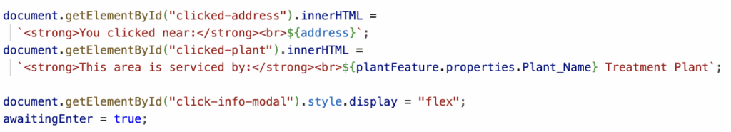
The key DOM methods used here are:
getElementById()finds the exact element to update.innerHTMLwrites dynamic HTML content into the modal.style.displaycontrols when modals appear- state flags like
awaitingEnterhelp manage user flow
Overall, the use of modals throughout an interactive web app help create a narrative for the user.
Conclusion
This project brings together ArcGIS Online Data Integration, Mapbox graphics, Turf.js, camera animations, and interactive modals to create a guided, educational experience on top of real spatial data. While there is no need to re-create these exact steps, the techniques demonstrated here can be leveraged for any interactive web app. Thank you for reading this post!