A Geovisualization Project by Rukiya Mohamed
SA8905 – Master of Spatial Analysis, Toronto Metropolitan University
As Toronto pushes toward a cleaner, electrified future, electric vehicles (EVs) are steadily becoming part of the urban landscape. But adoption isn’t uniform, some neighbourhoods surge ahead, others lag behind, and the geography of the transition tells an important story.
For this project, I created a time-series animation in ArcGIS Pro that maps how EV ownership has grown year by year across Toronto’s Forward Sortation Areas (FSAs) from 2022 to 2025. Instead of four static maps, the animation brings the data to life, showing how adoption spreads, accelerates, and concentrates across the city.
Background: Why Map EV Adoption?
EVs are central to Toronto’s climate goals, but adoption reflects deeper social and economic patterns. Mapping where EVs are growing helps us understand:
- Which neighbourhoods lead the transition
- Which areas may require more investment in charging infrastructure
- How adoption relates to broader demographic and mobility trends
- Where planning and policy may be falling out of sync with real demand
This project focuses on how the transition is happening across Toronto—not as a single snapshot but as a dynamic temporal process.
Data Sources
1. Ontario Data Portal – Electric Vehicles by Forward Sortation Area
- Battery Electric Vehicles (BEVs)
- Plug-in Hybrid Electric Vehicles (PHEVs)
- Total EVs
- Quarterly counts (Q1 2022 → Q1 2025)
- Aggregated by FSA (e.g., M4C, M6P)
2. Toronto Open Data Portal – FSA Boundary File
- Used to isolate FSAs located within the City of Toronto
- Provides the spatial geometry needed for mapping
Methodology
This workflow combines Excel preprocessing with ArcGIS Pro spatial joins and animation tools. Below is the full process with a clear tutorial so readers can replicate it.
Step 1: Cleaning EV Data in Excel
The raw EV file arrived as a single unformatted line. To prepare it:
- Used TRIM() and TEXT-TO-COLUMNS to separate fields into:
- FSA
- BEVs
- PHEVs
- Total EVs
- Year/Quarter
- FSA
- Created four separate datasets for:
- 2022
- 2023
- 2024
- 2025
- 2022
- Saved each file as a CSV for import into ArcGIS Pro.
Step 2: Bringing Data into ArcGIS Pro
- Imported the Toronto FSA shapefile.
- Imported each annual EV CSV.
- Performed a Table → Spatial Join using the common FSA code.
- Calculated EVs per 1000 persons using population from the Toronto boundary attributes.
- Created four clean layers, one per year, ready for mapping.
Step 3: Building Choropleth Maps (2022–2025)
For each year layer:
- Applied graduated colours to map total EVs (or EVs per 1000 people).
- Used a consistent classification scheme to ensure comparability.
- Selected a warm-to-cool colour ramp to highlight hotspots vs. low-adoption areas.
This produced four individually interpretable annual maps.
But the real magic comes next.
Step 4: Creating the EV Time-Series Animation in ArcGIS Pro
1. Enable Animation
- Go to the View tab → Add Animation
A timeline appears at the bottom of the screen.
2. Set Keyframes
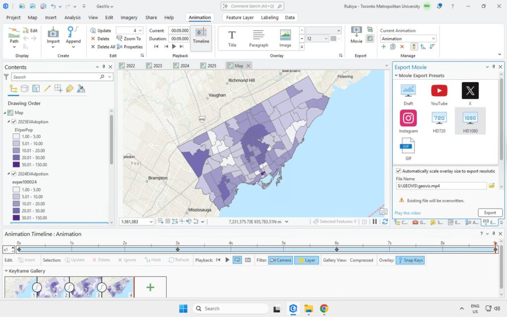
For each year layer:
- Turn ON only the layer for that year.
- Set symbology and map extent exactly as desired.
- Click Create Keyframe.
Result:
- Keyframe 1 = 2022
- Keyframe 2 = 2023
- Keyframe 3 = 2024
- Keyframe 4 = 2025
3. Adjust Timing
- Set transitions between keyframes to 2–3 seconds each.
- Add fades if desired for smoother blending.
4. Export the Video
- Go to Share → Export Animation
- Output as MP4 at 1080p for clean blog-quality visuals
- The final result is a smooth year-to-year playback of EV expansion across Toronto.
Results: What the Animation Reveals
The time-series visualization shows clear geographic patterns:
- Downtown and midtown FSAs lead early adoption, reflecting higher incomes and better access to early charging infrastructure.
- Inner suburbs show accelerating year-to-year growth, especially from 2023 onward.
- By 2025, EV ownership forms a distinct corridor of high adoption stretching from the waterfront north through midtown and over to Etobicoke and North York.
Seeing these shifts unfold dynamically (rather than as four separate maps) reveals momentum, not just differences.