SA8905 – Master of Spatial Analysis, Toronto Metropolitan University
A Geovizualization Project by Yulia Olexiuk.
Introduction
A common known fact is that all marathons are the same length, but are they created equal? Long distance running performance depends on more than just fitness and training. The physical environment plays a significant role in how runners exert effort. Whether it be terrain, slope, humidity, or temperature, marathons around the world present distinct geographic challenges. In this case, three races in three continents are compared. Boston’s rolling topography often masks the difficulty of its course such as its infamous Heartbreak Hill, and Singapore’s hot and humid climate has athletes start running before dawn to beat the sun.
Data
- GPS data for the Boston, Berlin, and Singapore Marathons were sourced from publicly available Strava activities, limited to routes that runners had marked as public. The marathon data was ensured that it consisted of dense point resolution, clean timestamps, and minimal GPS noise and then downloaded as .GPX files.
Figure 1. Getting .GPX data from Strava.
- Using QGIS, the .GPX files were first inspected and cleaned and then converted to GeoPackage format and imported into ArcGIS Pro, where they were transformed into both point feature classes and polyline feature classes. The polyline class was then projected using appropriate city-specific coordinate systems (ETRS89 / UTM Zone 33N and NAD83 / Massachusetts Mainland, etc). The DEMs were sourced from the LivingAtlas database and are labeled as Terrain3D.
- I used the Open-Meteo API to make queries for each marathon’s specific race day, narrowing the geographic coordinates, local timezone, and hourly variables including temperature (degC), humidity (%), wind speed (km/h), and precipitation(mm). It was integrated into ArcGIS Pro’s Add Surface Information and Extract Multi-Values to Points tools to derive slope, elevation range, and elevation gain per kilometre. The climate data was collected through an API which returned the data in JSON format. It was converted to .CSVs with Excel Power Query.
Software/Tools
- ArcGISPro: Used to transform the data and make web layers, map routes, and calculate the field to get valuable runner information.
- QGIS: Used to clean and overlook the .gpx files imported from Strava.
- Experience Builder: Used to create an interactive dashboard for the geospatial data.
Methodology
- The workflow for this project began with extensive preprocessing of GPS track data sourced from public Strava activities. Each GPX file was inspected, cleaned, and converted into usable spatial geometry and re-projecting all layers into city-appropriate projected coordinate reference systems. The fields were then calculated for pace per kilometre, elevation gain per kilometre, maximum slope, and mean slope, using a combination of the Generate Points Along Lines, Split Line at Measure, and Add Surface Information tools.
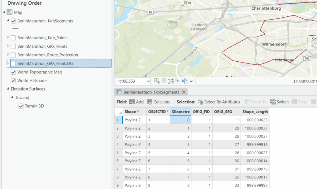
Figure 2. GPX point layer undergoing a spatial join.
- The visualization design was the main cornerstone of the project’s approach. Thus, race maps employed accessible, easy-to-comprehend gradients to represent sequential variables such as pace, slope, and elevation gain, while the dashboard created through Experience Builder enabled dynamic comparison across the three cities.
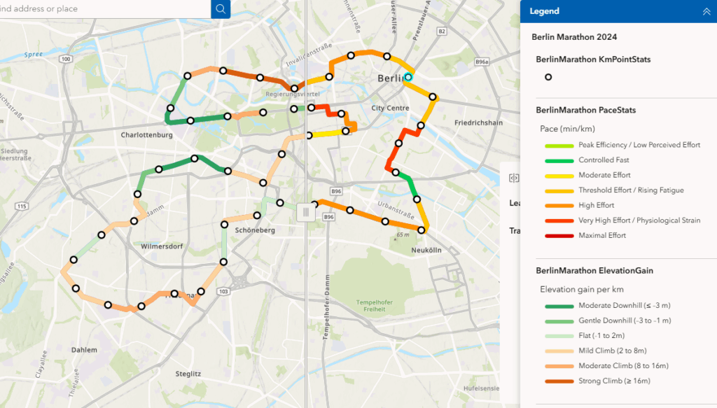
Figure 3. Slider showing the patterns and relationships between average pace and elevation of the Berlin marathon.
Results and Discussion
Relationship between Pace and Terrain
- Berlin displays the most consistent and fastest pacing profile, with minimal variation in both slope and elevation gain of only 27 metres of elevation difference.
- On the other hand Boston showed more variability by each consecutive marker due to its hilly terrain. The geovisualizations clearly highlight slowdowns associated with climb leading to Heartbreak Hill, followed by pace recoveries on downhill segments.
- Surprisingly, the Singapore marathon route had a different performance dynamic but not in the way that was initially assumed. In addition to its exact elevation difference as Boston of 135 metres. Participants would also face more environmentally-centred constraints, not only terrain-based difficulty.
- Pacing inconsistency can coincide with high humidity and hot overnight temperatures really showing viewers how tropical climate conditions can inflict a different form of endurance.
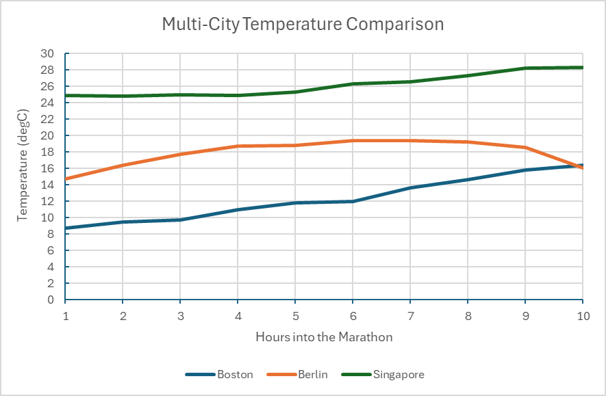
Figure 4. Chart demonstrating the recorded temperature in degrees Celsius at the time of each race day. Note that the date was omitted due to the differing years, days, and months of each marathon so the duration of the race is the primary focus.
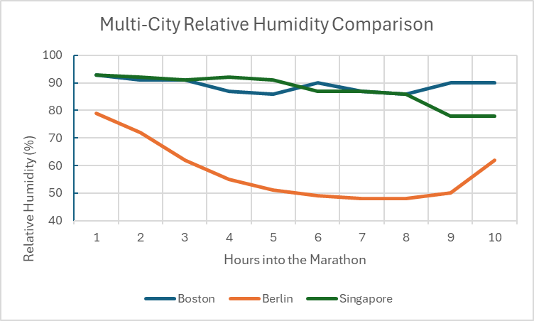
Figure 5. Chart comparing the relative humidity (%) between the marathon cities during race day.
Environmental Conditions and Weather During Race Day
- It’s interesting to note that each city hosts their marathon at very different times throughout the year. For example, the Boston marathon used in the case study was held on April 17th, 2023. Berlin hosted their race on September 24th, 2023, and Singapore hosted their annual marathon on December 2nd, 2012. Boston usually started their race around 8:00 AM, Berlin usually starts an hour later at 9:00am local time. Lastly, Singapore begins the marathon at 4:30AM, assumingly to avoid the midday heat, which reaches high 30 degrees Celsius by noon.
- This integration of hourly weather data highlights how climate interacts with geography to shape athletic effort. Berlin demonstrates ideal running conditions having cool and stable temperature along with stable wind speeds, which makes sense of the fast, consistent pacing. Boston shows slightly more variable weather, perhaps being on the New England Coast, Singapore saw the most influential weather impact with the humidity exceeding 80% for majority of the race (Figure 5) and persistent hot temperatures even throughout the night before.
Limitations
- I experienced many limitations making this geovisualization including the fact that the project relies on public Strava .GPX data, which could vary in precision due to the accuracy of runner’s device whether it be phone or watch, or even satellite reception.
- Also, though it was a good idea to use the data of some top performers of the marathon to get a good idea of where a well conditioned athlete naturally takes more time and slows their pace, I wished more average participant data was available to have a more averaged experience mapped.
- Furthermore, I was unable to match the weather data directly to specific kilometres and instead had it serve as contextual aids rather than precise environmental measurements.
Conclusion
I think this geovisualization project does an effective job demonstrating how terrain, and climate distinctly shape marathon performance across Boston, Berlin, and Singapore and I believe that visuals like these can be super fascinating just to satisfy curiosity or plan strategically for a race in the future. Happy Mapping!