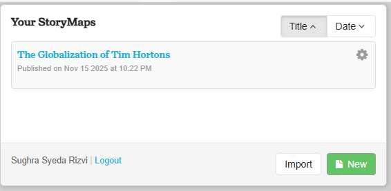
Sughra Syeda Rizvi, Geovis Project Assignment, TMU Geography, SA8905, Fall 2025
Hey everyone! For my Geovisualization project, I wanted to explore something familiar, cultural, and globally recognizable: the international expansion of Tim Hortons. Although the brand is iconic in Canada, fewer people know just how far it has spread across the world. My goal was to create an interactive, chronological StoryMap that guides viewers through the first Tim Hortons location in every country where the brand operates.
To do this, I combined online research, geographic coordinates, and a storytelling platform that lets users “travel” from country to country using a next-slide navigation system. The result is an easy-to-follow visual timeline that maps the company’s journey from Hamilton to the Middle East, Asia, and beyond.
Step 1:
I began by compiling a list of all countries where Tim Hortons has opened at least one store. Since there is no single authoritative dataset, I had to build this list manually.
I used official Tim Hortons country pages and local news sources (e.g., CBC News, Bahrain News, Malaysia Lifestyle Asia)
These articles helped me confirm: The country, the city and address of the first-ever location and when the year the branch opened.
Because accuracy matters in mapping, I double-checked every location to make sure my information was credible, date-verified, and sourced properly.
Step 2: Finding Coordinates for Each First Store
Once I confirmed each opening location, I searched for latitude and longitude using Google Maps
This ensured that the map zooms into the exact spot of each first store instead of a general city view. If a building no longer existed or the listing wasn’t clear, I used the most reliable archival address information available.
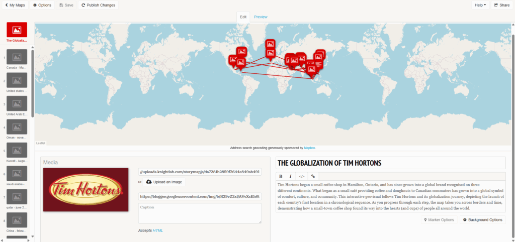
Step 3: Creating the StoryMapJS Project
After gathering all my data, I went to StoryMapJS (Knight Lab), signed in, and created a new project. I gave it a title that reflects the purpose of the visualization: showing Tim Hortons’ global growth through time.
StoryMapJS works slide-by-slide. Each slide represents a location on the map paired with text and an image. Because the platform automatically pans to your coordinates, it creates a smooth storytelling experience.
Step 4: Designing the Title Page
My first slide acts as a title/introduction page.
I left the location fields empty so that StoryMapJS wouldn’t zoom anywhere yet. Instead, I wrote a short explanation of the project meaning what it shows, why I chose the topic, and how to navigate the timeline.
This gives viewers context before they begin clicking through the countries.
Step 5: Adding Slides for Each Country
This is where the main work happens.
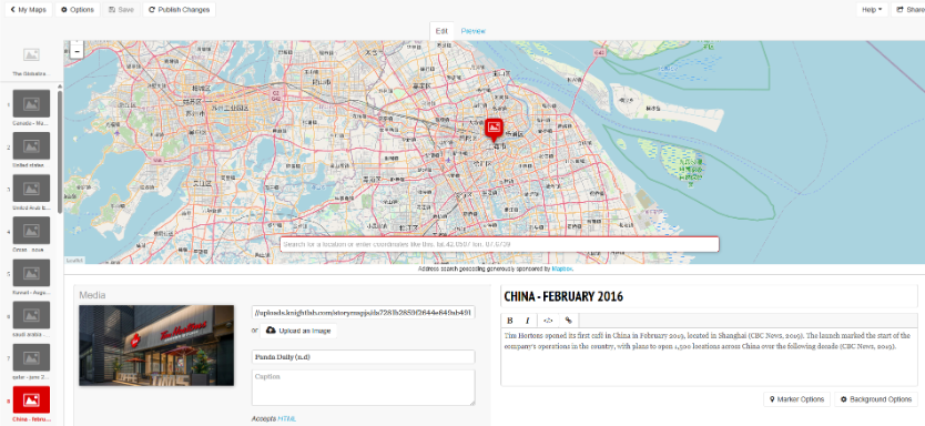
For every country, I clicked “Add Slide” on the left panel. Entered the country’s name, put in the latitude and longitude, added a title, wrote a short description with the in-text citation of the source. I inserted an image that visually represents the branch
StoryMapJS then automatically zooms into the exact coordinates and animates the movement from one country to the next
This creates a chronological touring experience, allowing viewers to follow Tim Hortons’ global expansion in the order it happened.
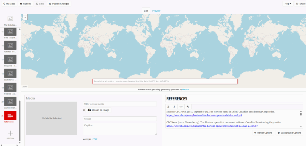
Step 6: Adding a Final References Slide
Because this project relies heavily on online sources, I added a final references slide listing all of the sources i used. I made sure to use APA citations.
Step 7: Publishing the StoryMap
When all slides were complete, I clicked:
“Save”, then “Publish Changes”

Then “Share” and finally “Copy Public Link”

This generated a shareable URL that can be posted online, embedded, or submitted for grading.
I hope this tutorial was helpful! Here is the link to check my geovis project yourself! Along with a QR code: