Evolution of Residential Real Estate in Toronto – 2014 to 2022

Shashank Prabhu, Geovis Project Assignment, TMU Geography, SA8905, Fall 2024 

Introduction
Toronto’s residential real estate market has experienced one of the most rapid price increases among major global cities. This surge has led to a significant affordability crisis, impacting the quality of life for residents. My goal with this project was to explore the key factors behind this rapid increase, while also analyzing the monetary and fiscal policies implemented to address housing affordability.
The Approach: Mapping Median House Prices
To ensure a more accurate depiction of the market, I used the median house price rather than the average. The median better accounts for outliers and provides a clearer view of housing trends. This analysis focused on all home types (detached, semi-detached, townhouses, and condos) between 2014 and 2022.

Although data for all years were analyzed, only pivotal years (2014, 2017, 2020, and 2022) were mapped to emphasize the factors driving significant changes during the period.

Data Source
The Toronto Regional Real Estate Board (TRREB) was the primary data source, offering comprehensive market watch reports. These reports provided median price data for Central Toronto, East Toronto, and West Toronto—TRREB’s three primary regions. These regions are distinct from the municipal wards used by the city.

Creating the Maps

Step 1: Data Preparation
The Year-to-Date (YTD) December figures were used to capture an accurate snapshot of annual performance. The median price data for each of the years across the different regions was organized in an Excel sheet, joined with TRREB’s boundary file (obtained through consultation with the Library’s GIS department), and imported into ArcGIS Pro. WGS 1984 Web Mercator projection was used for the maps.

Step 2: Visualization with 3D Extrusions
3D extrusions were used to represent price increases, with the height of each bar corresponding to the median price. A green gradient was selected for visual clarity, symbolizing growth and price.

Step 3: Overcoming Challenges

After creating the 3D extrusion maps for the respective years (2014, 2017, 2020, 2022), the next step was to export those maps to ArcOnline and then to Story Maps, the easiest way of doing so was to export it as a Web Scene, from which it would show up under the Content section on ArcOnline.

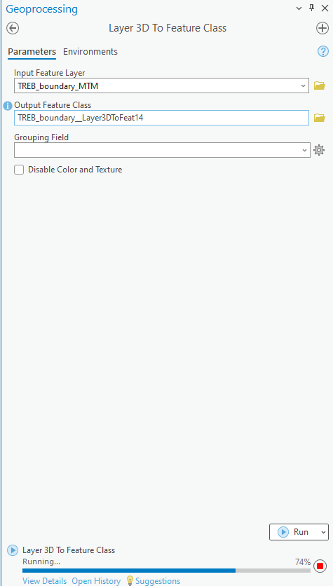
  • Flattened 3D Shapes: Exporting directly as a Web Scene to add onto Story Maps caused extrusions to lose their 3D properties. This was resolved using the “Layer 3D to Feature Class” tool.

  • Lost Legends: However, after using the aforementioned tool, the Legends were erased during export. To address this, static images of the legends were added below each map in Story Maps.

Step 4: Finalizing the Story Map
After resolving these issues, the maps were successfully exported using the Export Web Scene option. They were then embedded into Story Maps alongside text to provide context and analysis for each year.

Key Insights
The project explored housing market dynamics primarily through an economic lens.

  • Interest Rates: The Bank of Canada’s overnight lending rate played a pivotal role, with historic lows (0.25%) during the COVID-19 pandemic fueling a housing boom, and sharp increases (up to 5% by 2023) leading to market cooling.
  • Immigration: Record-breaking immigration inflows also contributed to increased demand, exacerbating the affordability crisis.

While earlier periods like 2008 were critical in shaping the market, boundary changes in TRREB’s data made them difficult to include.

Conclusion
Analyzing real estate trends over nearly a decade and visualizing them through 3D extrusions offers a profound insight into the rapid rise of residential real estate prices in Toronto. This approach underscores the magnitude of the housing surge and highlights how policy measures, while impactful, have not fully addressed the affordability crisis.

The persistent rise in prices, even amidst various interventions, emphasizes the critical need for increased housing supply. Initiatives aimed at boosting the number of housing units in the city remain essential to alleviate the pressures of affordability and meet the demands of a growing population.

Link to Story Map (You will need to sign in through your TMU account to view it): https://arcg.is/WCSXG

Family Travel Survey

Marzieh Darabi, Geovis Project Assignment, TMU Geography, SA8905, Fall 2024

https://experience.arcgis.com/experience/638bb61c62b3450ab3133ff21f3826f2

This project is designed to help transportation planners understand how families travel to school and identify the most commonly used walking routes. The insights gained enable the City of Mississauga to make targeted improvements, such as adding new signage where it will have the greatest impact.

Project Workflow

Each school has its own dedicated page within the app, displaying both a map and a survey. The maps were prepared in ArcGIS Pro and then shared to ArcGIS Online. In the Map Viewer, I defined the symbology and set the desired zoom level for the final map. To identify key routes for the study, I used the Buffer tool in ArcGIS Pro to analyze routes in close proximity to schools. Next, I applied the Select by Location tool to identify routes located within a 400-meter radius of each school. These selected routes were then exported as a new street dataset. I further refined this dataset by customizing the streets to include only the most relevant options, reducing the number of choices presented in the survey.

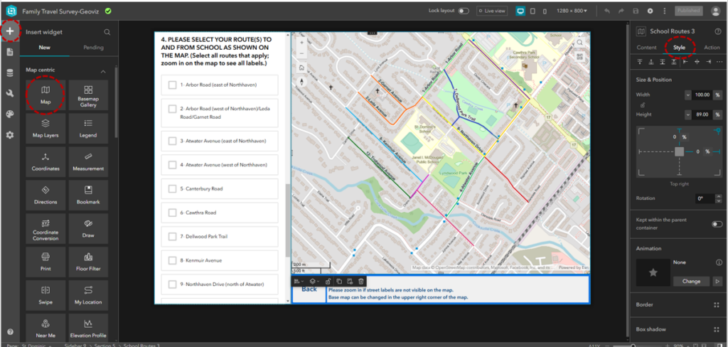
Each route segment was labeled to correspond directly with the survey questions, making it easy for families to understand which options in the survey matched the map. To make these labels, new field was added to street dataset that would correspond to options in the survey. These maps were then integrated into ArcGIS Experience Builder using the Map Widget, which allows further customization of map content and styling via the application’s settings panel.

ArcGIS Experience Builder interface showing the process of adding a Map Widget and customizing the app layout

Why Experience Builder?

When designing the application, I chose ArcGIS Experience Builder because of its flexibility, modern interface, and wide range of features tailored to building interactive applications. Here are some of the specifications and advantages of using Experience Builder for this project:

  1. Widget-Based Design:
    Experience Builder operates on a widget-based framework, allowing users to drag and drop functional components onto the canvas. This flexibility made it easy to integrate maps, surveys, buttons, and text boxes into a cohesive application.
  2. Customizable Layouts:
    The platform offers tools for designing responsive layouts that adapt to different screen sizes. For this project, I configured desktop layout to ensure that the application is accessible to families.
  3. Map Integration:
    The Map Widget provided options to display the walking routes and key streets interactively. I set specific map extents to align with the study’s goals. End-users could zoom in or out and interact with the map to see routes more clearly.
  4. Survey Integration:
    By embedding the survey using the Survey Widget, I was able to link survey questions directly to map visuals. The widget also allowed real-time updates, meaning survey responses are automatically stored and can be accessed or analyzed in ArcGIS Online.
  5. Dynamic User Navigation:
    The Button Widget enabled intuitive navigation between pages. Each button is configured to link directly to a school’s map and survey page, while a Back Button on each page ensures users can easily return to the introduction screen.
  6. Styling Options:
    Experience Builder offers extensive styling options to customize the look and feel of the application. I used the Style Panel to select fonts, colors, and layouts that are visually appealing and accessible.

App Design Features

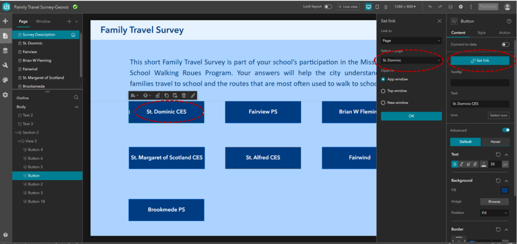
The app is designed to accommodate surveys for seven schools. To ensure ease of navigation, I created an introductory page listing all the schools alongside a brief overview of the survey. From this page, users can navigate to individual school maps using a Button Widget, which links directly to the corresponding school pages. A Back Button on each map page allows users to return to the school list easily.

The survey is embedded within each page using the Survey Widget, allowing users to submit their responses directly. The submitted data is stored as survey records and can be accessed via ArcGIS Online.

Setting links between buttons and pages in ArcGIS Experience Builder

Customizing Surveys

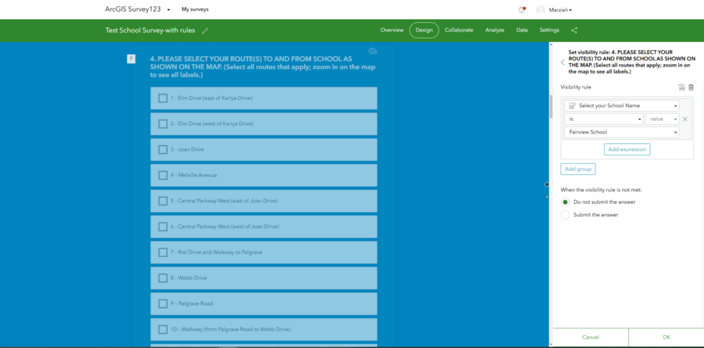
The survey was created using the Survey123 app, which offers various question types to suit different needs. For my survey, I utilized multiple-choice and single-line text question types. Since some questions are specific to individual schools, I customized their visibility using visibility rules based on the school selected in Question 1. For example, Question 4, which asks families about the routes they use to reach school, only becomes visible once a school is selected in Question 1.

If the survey data varies significantly across different maps, separate surveys can be created for each school to ensure accuracy and relevance.

setting visibility rules for survey questions based on user responses

Final Thoughts

Using ArcGIS Experience Builder provided the ideal platform for this project by combining powerful map visualizations with an intuitive interface for survey integration. Its customization options allowed me to create a user-centric app that meets the needs of both families and transportation planners.

Natural Disasters around the world from 1950-2018

By: Zahra H. Mohamed for SA8905 @RyersonGeo

You can download the code here!

Introduction

Natural disasters are major events that result from natural processes of the planet. With global warming and the changing of our climate, it’s rare to go through a week without mention of a flood, earthquake, or a bad storm happening somewhere in the world. I chose to make my web map on natural disasters, because it is at the front of lot of people’s minds lately, as well as there is reliable and historical public data available on disasters around the world. My main goal is to make an informational and easy to use web page, that is accessible to anyone from any educational level or background. The web page will display all of the recorded natural disasters around the world over the past 68 years, and will allow you to see what parts of the world are more prone to certain types of disasters in a clear and understandable format.

Figure 1. Map displaying natural disaster data points, zoomed into Africa.

In order to make my web map I used:

  • Javascript – programming language
  • HTML/CSS – front-end programming language and stylesheets
  • Leaflet – a javascript library or interactive maps
  • JQuery – a javascript framework
  • JSCharting – a javascript charting library that creates charts using SVG (Scalable Vector Graphics)

Data & Map Creation

The data for this web map was taken from: Geocoded Disasters (GDIS) Dataset, v1 (1960-2018) from NASA’s Socioeconomic Data and Applications Centre (SEDAC). The data was originally downloaded as a Comma-separated values (CSV) file. CSV files are simple text files that allow for you to easily share data, and generally take up less space.

A major hurdle in preparing this map was adding the data file onto the map. Because the CSV file was so large (30, 000+). I originally added the csv file onto mapbox studio as a dataset, and then as tiles, but I ended up switching to Leaflet, and locally accessing the csv file instead. Because the file was so large, I decided to use QGIS to sort the data by disaster type, and then uploaded them in my javascript file, using JQuery.

Data can come in different data types and formats, so it is important to convert data into format that is useful for whatever it is you hope to extract or use it for. In order to display this data, first the markers data is read from the csv file, and then I used Papa Parse to convert the string file, to an array of objects. Papa Parse is a csv library for javascript, that allows you to parse through large files on the local system or download them from the internet. Data in an array and/or object, allows you to loop through the data, making it easier to access particular information. For example, when including text in the popup for the markers (Figure 2), I had to access to particular information from the disaster data, which was very easy to do as it was an object.

Code snippet for extracting csv and creating marker and popup (I bolded the comments. Comments are just notes, they are not actually part of the code):

// Read markers data from extreme_temp.csv
$.get('./extreme_temp.csv', function (csvString) {

  // Use PapaParse to convert string to array of objects
  var data = Papa.parse(csvString, { header: true, dynamicTyping: true }).data;

  // For each row in data, create a marker and add it to the map
  for (var i in data) {
    var row = data[i];

        // create popup contents
        var customPopup = "<h1>" + row.year + " " + row.location + "<b> Extreme Temperature Event<b></h1><h2><br>Disaster Level: " + row.level + "<br>Country: " + row.country + ".</h2>"

        // specify popup options 
        var customOptions =
        {
          'maxWidth': '500',
          'className': 'custom'
        }

    var marker = L.circleMarker([row.latitude, row.longitude], {
      opacity: 50
    }).bindPopup(customPopup, customOptions);

// show popup on hover
    marker.on('mouseover', function (e) {
      this.openPopup();
    });
    marker.on('mouseout', function (e) {
      this.closePopup();
    });

// style marker and add to map
    marker.setStyle({ fillColor: 'transparent', color: 'red' }).addTo(map);
  }

});
Figure 2. Marker Popup

I used L.Circlemarker ( a leaflet vector layer) to assign a standard circular marker to each point. As you can see in Figure 1 and 3, the markers appear all over the map, and are very clustered in certain areas. However, when you zoom in as seen in Figure 3, the size of the markers adjusts, and they become easier to see, as you zoom into the more clustered areas. The top left corner of the map contains a zoom component, as well these 4 empty square buttons vertically aligned, which are each assigned a continent (just 4 continents for now), and will navigate over to that continent when clicked.

Figure 3. Map zoomed in to display, marker size

The bottom left corner of the map contains the legend and toggle buttons to change between the theme of the map, from light to dark. Changing the theme of the map doesn’t alter any of the data on the map, it just changes the style of the basemap. Nowadays almost every browser and web page seems to have a dark mode option, so I thought it would be neat include. The title, legend and the theme toggles, are all static and their positions on the web page remain the same.

Another component on the web page is the ‘Disaster Fact’ box on the bottom right corner of the page. This textbook is meant display random facts about natural disaster over a specified time interval. Ideally, i have variable that contains an array of facts in a list, in string form. Then use the setInterval(); function, and a function that generates a random number, that is the length of the array – 1, and use that as an index to select one of the list items from the array. However, for the moment the map will display the first fact after the specific time interval, when the page loads, but then it remains on the page. But refreshing the page, will cause for the function to generate another random fact.

Figure 4. Pie Chart displaying Distribution of Natural Disasters

One of the component of my web map page, that I will expand on, is the chart. For now I added a simple pie chart using JSCharts to display the total number of disasters per disaster type, for the last 68 years. Using JSCharts as fairly simple, as you can see if you take a look at the code for it in my GitHub. I calculated the total number of disasters for each disaster type by looking at the number of lines in each of my already divided csv files, and manually entered them as the y values. However, normally in order to calculate this data, especially if it was in one large csv file, I would use RStudio.

Something to keep in mind:

People view websites on different platform nowadays, from laptops, to tables and iPhones. A problem with creating web pages is to keep in mind that different platform for viewing web pages, have different screen sizes. So webpages need to be optimized to look good in differ screen sizes, and this is largely done using CSS.

Looking Ahead

Overall my web map is still in progress, and there are many components I need to improve upon, and would like to add to. I would also like to add a bar chart that shows the total number of disasters for each year, for each disaster type , along the bottom of the map, with options to toggle between each disaster type. Also I would like to add a swipe bar that allows you to see the markers on the map based on the year. A component of the map I had trouble adding was an option to hide/view marker layers on the map. I was able to get it to work for just one marker for each disaster type, but it wouldn’t work for the entire layer, so looking ahead I will figure out how to fix that as well.

There was no major research question in making this web page, my goal was to simply make a web map that was appealing, interesting, and easy to use. I hope to expand on this map and add the components that I’ve mentioned, and fix the issues I wasn’t able to figure out. Overall, making a web page can be frustrating, and there is a lot of googling and watching youtube videos involved, but making a dynamic web app is a useful skill to learn as it can allow you to convey information as specifically and creatively as you want.

Interactive Map and Border Travels

Given the chance to look at making geovisualisation, a pursuit began to bring in data on a scope which would need adjustments and interaction for understanding geography further and further, while still being able to begin the journey with an overview and general understanding of the topic at hand.

Introduction to the geovisualisation

This blog post doesn’t unveil a hidden gem theme of border crossing, but demonstrates how an interactive map can share the insights which the user might seek, not being limited to the publisher’s extents or by printed information. Border crossing is selected as topic of interest to observe the navigation that may get chosen with borders, applying this user to a point of view that is similar to those crossing at these points themselves, by allowing them to look at the crossing options, and consider preferences.

To give the user this perspective, this meant beginning to locate and provide the crossing points. The border crossing selected was the US border between Canada and between Mexico, being a scope which could be engaged with the viewer and provide detail, instead of having to limit this data of surface transportation to a single specified scale and extent determined by the creator rather than the user.

Border crossings are a matter largely determined by geography, and are best understood in map rather than any other data representation, unlike attributes like sales data which may still be suitable in an aspatial sense, such as projected sales levels by line graph.

To get specific, the data came from the U.S. Bureau of Transportation Statistics, and was cleaned to be results from the beginning of January 2010 til the end of September 2020. The data was geocoded with multiple providers and selected upon consistency, however some locations were provided but their location could not be identified.

Seal of the U.S. Bureau of Transportation Statistics

To start allowing any insights for you, the viewer, the first data set to be appended to the map is of the border locations. These are points, and started to identify the distribution of crossing opportunities between the north American countries. If a point could not be appended to the location of the particular office that processed the border entries, then the record was assigned to the city which the office was located in. An appropriate base layer was imported from Mapbox to best display the background map information.

The changes in the range of border crossings were represented by shifts in colour gradient and symbol size. With all the points and their proportions plotted, patterns could begin to be provided as per the attached border attributes. These can illustrate the increases and decreases in entries, such as the crossings in California points being larger compared to entries in Montana.

Mapped Data

But is there a measure as to how visited the state itself is, rather than at each entry point? Yes! Indeed there is. In addition to the crossing points themselves, the states which they belong to have also been given measurement. Each state with a crossing is represented on the map displaying a gradient for the value of average crossing which the state had experienced. We knew that California had entry points with more crossings than the points shown in Montana, but now we compare these states themselves, and see that California altogether still experienced more crossings at the border than Montana had, despite having fewer border entry points.
Could there be a way to milk just a bit more of this basic information? Yes. This is where the map begins to benefit from being interactive.
Each point and each state can be hovered over to show the calculated values they had, clarifying how much more or less one case had when compared to another. A state may have a similar gradient, an entry point may appear the same size, but to hover over them you can see which place the locations belong to, as well as the specific crossing value it has. Montana is a state with one of the most numerous crossing points, and experiencing similar crossing frequencies across these entries. To hover over the points we can discover that Sweetgrass, Montana is the most popular point along the Montana border.

Similar values along the Montana border

In fact, this is how we discover another dimension which belongs to the data. Hovering over these cases we can see a list of transport modes that make up the total crossings, and that the sum was made up of transport by trucks, trains, automotives, busses, and pedestrians.

To discover more data available should simply mean more available to learn, and to only state the transport numbers without their visuals would not be the way to share an engaging spatial understanding. With these 5 extra aspects of the border crossings available, the map can be made to display the distributions of each particular mode.

Despite the points in Alaska typically being one of the least entered among the total border crossings, selecting the entries by train draws attention to Skagway, Alaska, being one of the most used border points for crossing into the US, even though it is not connected to the mainland. Of course, this mapped display paints a strong understanding from the visuals, as though this large entry experienced at Skagway, Alaska is related to the border crossings at Blaine, Washington, likely being the train connection between Alaska and Continental USA.

Mapping truck crossing levels (above), crossings are made going east and past the small city of Calexico. The Calexico East is seen having a road connection between the two boundaries facing a single direction, suggesting little interaction intended along the way

When mapping pedestrian crossings (above), these are much more popular in Calexico, the area which is likely big dense to support the operation of the airport shown in its region, and is displaying an interweaving connection of roads associated with an everyday usage

Overall, this is where the interactive mapping applies. The borders and their entry points have relations largely influenced by geography. The total pedestrian or personal vehicle crossings do well to describe how attractive the region may be on one side rather than another. Searching to discover where these locations become attractive, and even the underlying causes for the crossing to be selected, can be discovered in the map that is interactive for the user, looking at the grounds which the user chooses.

While this theme data layered on top highlights the topic, the base map can help explain the reasons behind it, and both are better understood when interactive. It isn’t necessary to answer one particular thought here as a static map may do, but instead to help address a number of speculative thoughts, enabling your exploration.

Desperate Journeys

By Ibrahim T. Ghanem

Geovis Project Assignment @RyersonGeo, SA8905, Fall 2019

Background:

Over the past 20 years, Asylum Seekers have invented many travel routes between Africa, Europe and Middle East in order be able to reach a country of Asylum. Many governmental and non-governmental provided information about those irregular travel routes used by Asylum Seekers. In this context, this geovisualization project aims at compiling and presenting two dimensions of this topic: (1) a comprehensive animated spider map presenting some of the travel routes between the above mentioned three geographic areas; (2) develop a dashboard that connects those routes to other statistics about refugees in a user-friendly interface. In that sense, the best software to fit the project is Tableau.

Data and Technology

Creation of Spider maps at Tableau is perfect for connecting hubs to surrounding point as it allows paths between many origins and destinations. Besides, it can comprehend multiple layers. Below is a description of the major steps for the creation of the animated map and dashboard.

Also, Dashboards are now very useful in combining different themes of data (i.e. pie-charts, graphs, and maps), and accordingly, they are used extensively in non-profit world to present data about a certain cause. The Geovisualiztion Project applied geocoding approach to come up with the animated map and the dashboard.

The Data used to create the project included the following:

-Origins and Destinations of Refugees

-Number of Refugees hosted by each country

-Count of Refugees arriving by Sea (2010-2015)

-Demographics of Refugees arriving by Sea – 2015

Below is a brief description of the steps followed to create the project

Step 1: Data Sources:

The data was collected from the below sources.

United Nations High Commissioner for Refugees, Human Rights Watch, Vox, InfoMigrants, The Geographical Association of UK, RefWorld, Broder Free Association for Human Rights, and Frontex Europa.

However, most of the data are not geocoded. Accordingly, Google Sheets was used in Geocoding 21 routes, and thereafter each Route was given a distinguishing ID and a short description of the route.

Step 2: Utilizing the Main Dataset:

Data is imported from an excel sheet. In order to compute a route, Tableau requires data about origins,and destination with latitude and longitude. In that aspect, the data contains different categories:

A-Route I.D. It is a unique path I.D. for each route of the 21 routes;

B-Order of Points: It is the order of stations travelled by refugees from their country of origin to country of Asylum;

C-Year: the year in which the route was invented;

D-Latitude/Longitude: it is the coordinates of the each station;

F-Country: It is the country hosting Refugees;

E- Population: Number of refugees hosted in each country.

Step 3: Building the Map View:

The map view was built by putting longitude in columns, latitude in rows, Route I.D. at details, and selecting the mark type as line. In order to enhance the layout, Oder of Points was added to Marks’ Path, and changing it to dimensions instead of SUM.  Finally, to bring stations of travel, another layer was added to by putting another longitude to columns, and changing it to Dual Axis. To create filtration by Route, and timeline by year, route was added Filter while year was added to page.

Step 4: Identifying Routes:

To differentiate routes from each other by distinct colours, the route column was added to colours, and the default setting was changed to Tableau 20. And Layer format wash changed to dark to have a contrast between the colours of the routes and the background.

Step 5: Editing the Map:

After finishing up with the map formation. A video was captured by QuickStart and edited by iMovie to be cropped and merged.

Step 6: Creating the Choropleth map and Symbology:

In another sheet, a set of excel data (obtained from UNHCR) was uploaded to create a Choropoleth map that would display number of refugees hosted by each country by year 2018. Count of refugees was added to columns while Country was added to rows. The Marks’ colour ramp of orange-gold, with 4 classes was added to indicate whether or not the country is hosting a significant number of refugees. Hovering over each country would display the name of the country and number of refugees it hosts.

Step 7: Statistical Graphs:

A pie-chart and a graph were added to display some other statistics related to count of Refugees arriving by Sea from Africa to Europe, and the demographics of those refugees arriving by sea. Demographics was added to label to display them on the charts.

Step 8: Creation of the Dashboard:

All four sheets were added in the dashboard section through dragging them into the layer view. To comprehend that amount of data explanation, size was selected as legal landscape. Title was given to the Dashboard as Desperate Journeys.

Limitations

A- Tableau does not allow the map creator to change the projection of the maps; thus, presentation of maps is limited. Below is a picture showing the final format of the dashboard:

B-Tableau has an online server that can host dashboard; nevertheless, it cannot publish animated maps. Thus, the animated maps is uploaded here a video. The below link can lead the viewer to the dashboard:

https://prod-useast-a.online.tableau.com/t/desperatejourneysgeovis/views/DesperateJourneys_IbrahimGhanem_Geoviz/DesperateJourneys/ibrahim.ghanem@ryerson.ca/23c4337a-dd99-4a1b-af2e-c9f683eab62a?:display_count=n&:showVizHome=n&:origin=viz_share_link

C-Due to unavailability of geocoded data, geocoding the routes of refugees’ migration consumed time to fine out the exact routes taken be refugees. These locations were based on the reports and maps released by the sources mentioned at the very beginning of the post.

A Shot in the Dark: Analyzing Mass Shootings in the United States, 2014-2019

By: Miranda Ramnarayan

Geovis Project Assignment @RyersonGeo, SA8905, Fall 2019

The data gathered for this project was downloaded from the Gun Violence Archive (https://www.gunviolencearchive.org/), which is a non-for Profit Corporation. The other dataset is the political affiliation per state, gathered by scrapping this information from (https://www.usa.gov/election-results). Since both of these datasets contain a “State Name” column, an inner join will be conducted to allow the two datasets to “talk” to each other.

The first step is importing your excel files, and setting up that inner join.

There are four main components this dashboard is made of: States with Mass Shootings, States with Highest Death Count, Total Individuals Injured from Mass Shootings and a scattergram displaying the amount of individuals injured and killed. All of these components were created in Tableau Worksheets and then combined on a Dashboard upon completion. The following are steps on how to re-create each Worksheet. 

1. States with Mass Shootings

In order to create a map in Tableau, very basic geographic information is needed. In this case, drag and drop the “State” attribute under the “Dimensions” column into the empty frame. This will be the result:

In order to change the symbology from dots to polygons, select “Map” under the Marks section.

To assign the states with their correct political affiliation, simply drag and drop the associated year you want into the “Colour” box under Marks.

This map is displaying the states that have had mass shootings within them, from 2014 to 2019. In order to automatic this, simply drag and drop the “Incident Date” attribute under Pages. The custom date page has been selected as “Month / Year” since the data set is so large.

This map is now complete and when you press the play button displayed in the right side of this window, the map will change as it only displays states that have mass shootings within them for that month and year.

2. States with Highest Death Count

This is an automated chart that shows the Democratic and Republican state that has the highest amount of individuals killed from mass shootings, as the map with mass shootings above it runs through its time series. Dragging and dropping “State” into the Text box under Marks will display all the states within the data set. Dragging and dropping the desired year into Colour under Marks will assign each state with its political party.

 In order for this worksheet to display the state with the highest kill count, the following calculations have to be made once you drag and drop the “# Killed” from Measures into Marks.

To link this count to each state, filter “State” to only display the one that has the maximum count for those killed.

This will automatically place “State” under Filters.

Drag and drop “Incident Date” into Pages and set the filter to Month / Year, matching the format from section 1.

Format your title and font size. The result will look like:

3. Total Individuals Injured from Mass Shootings

In terms of behind the scenes editing, this graph is the easiest to replicate.

Making sure that “State Name” is above “2016” in this frame is very important, since this is telling Tableau to display each state individually in the bar graph, per year.

4. Scattergram

This graph displays the amount of individuals killed and injured per month / year. This graph is linked to section 1 and section 2, since the “Incident Date” under Pages is set to the same format. Dragging and dropping “SUM (#Killed)” into Rows and SUM (#Injured) into Columns will set the structure for the graph.

In order for the dot to display the sum of individuals killed and injured, drag and drop “# Killed” into Filter and the following prompt will appear. Select “Sum” and repeat this process for “# Injured”.

Drag and drop “Incident Date” and format the date to match Section 1 and 2. This will be your output.

Dashboard Assembly

This is where Tableau allows you to be as customizable as you want. Launching a new Dashboard frame will allow you to drag and drop your worksheets into the frame. Borders, images and text boxes can be added at this point. From here, you can re-arrange/resize and adjust your inserted workbooks to make sure formatting is to your desire.  

Right clicking on the map on the dashboard and selecting “Highlight” will enable an interactive feature on the dashboard. In this case, users will be able to select a state of interest, and it will highlight that state across all workbooks on your dashboard. This will also highlight the selected state on the map, “muting” other states and only displaying that state when it fits the requirements based on the calculations set up prior.

Since all the Pages were all set to “Month/Year”, once you press “play” on the States with Mass Shootings map, the rest of the dashboard will adjust to display the filtered information.

It should be noted that Tableau does not allow the user to change the projection of any maps produced, resulting in a lack of projection customization. The final dashboard looks like this:

GeoVis: Mapdeck Package in R

Gregory Huang
Geovisualization Project, @RyersonGeo, Fall 2019

Introduction

This project is a demonstration of the abilities of the mapdeck package in R, including its shiny interactive app compatibility.

Mapdeck is an R package created by David Cooley. Essentially, it integrates some of mapbox’s functionality into the R environment. Mapbox is a popular web-based mapping service that is community-driven and provides some great geovisualization functionalities. Strava’s global heat map is one example.

I am interested in looking at flight routes across global hubs and see if there are destination overlaps for these routes. Since the arc layer provided by mapdeck has impressive visualization capabilities of the flight routes, I’ve chosen to use mapdeck to visualize some flight route data around the world.

Example of a map generated by mapdeck: arcs, text, lines, and scatterplots are all available. Perspective changes can be done by pressing down Ctrl and clicking. The base maps are customizable with a massive selection of both mapbox and user-generated maps. This map is one of the results from longest_flights.R, which uses the “decimal” basemap.
The Map has some level of built-in interactivity: Here is an example of using a “tooltip” where if a user hovers over an arc, the arc highlights and shows information about that particular route. Note that mapdeck doesn’t want to draw flight routes across the Pacific – so if accuracy is key, do keep this in mind.

Software Requirements

To replicate this project, you’ll need your own mapbox access token. It is free as long as you have a valid email address. Since the code is written in R, you’ll also need R and R Studio downloaded on your machine to run the code.

Tl;dr…

Here’s the Shiny App

The code I created and the data I used can also be found on my GitHub repository, Geovis. To run them on your personal machine, simply download the folder and follow the instructions on the README document at the bottom of the repository page.

Screenshot of the shiny app: The slide bar will tell the map which flights to show, based on the longitudes of the destinations. All flights depart out of YYZ/KEF/AMS/FRA/DXB.

Details: Code to Generate a Map

The code I’ve written contained 2 major parts, both utilizing flight route data. The first part is done with longest_flights.R, demonstrating the capabilities of the mapdeck package using data I curated for the longest flights in the world. The second part is done with yyz_fra.R and shinyApp.R to demonstrate the shiny app compatibility and show how the package handles larger datasets (hint – very well). The shinyApp uses flight route data from 5 airports: Toronto, Iceland-Keflavik, Amsterdam, Frankfurt, and Dubai, pulled from openflights.org.

For the flight route data for the 5 airports, in particular, the data needed cleaning to make the data frame useable to mapdeck. This involved removing empty rows, selecting only the relevant data, and merging the tables.

Code snippet for cleaning the data. After the for loop completes, the flight route data downloaded from openflights.org becomes available to be used for mapdeck.

Once the data were cleaned, I began using the mapdeck functions to map out the routes. The basic parts of the mapdeck() function are to first declare your key, give it a style, and assign it a pitch if needed. There are many more parameters you can customize, but I just changed the style and pitch. Once the mapdeck map is created, use the “pipe” notion (%>%) to add any sort of layers to your map. For example, add_arc() to add the arcs seen in this post. Of course, there are many parameters that you can set, but the most important are the first three: Where your data come from, and where the origin/destination x-y coordinates are.

An example creating an arc on a map. In addition to the previously mentioned parameters, tooltip generates the little chat boxes when you hover over a layer entry, and layer_id is important when there are multiple layers on the same map.

Additional details on creating all different types of layers, including heatmaps, can be found on the documentation page HERE.

Details: Code to make a “Shiny” app

On top of the regular interactive functionalities of mapdeck, incorporating a mapdeck map into shiny can add more layers of interactivity to the map. In this particular instance, I added a slider bar in Shiny where the user can indicate the longitudes of the destinations they want to see. For example, I can filter to see just the flights going to East Asia by using that slider bar. Additional functions of shiny include using drop-menus to select specific map layers, and checkboxes as well.

The shiny code can roughly be broken down into three parts: ui, server, and shinyApp(ui, server). The ui handles the user interface and receives data from the server, while the server decides what map to produce by the input given by the user in ui. shinyApp(ui,server) combines the two to generate a shiny app.

Mapdeck integrates into the shiny app environment by mapdeckOutput() in ui to specify the map to display, and by renderMapdeck() and mapdeck_update() in server to generate the map (rendeerMapdeck) and appropriate layers to display (mapdeck_update).

Below is the code used to run the shiny app demonstrated in this blog post. Note the ui and server portions of the code bode. To run the shiny app after that, simply run shinyApp(ui,server) to generate the app.

Creating the UI
Snippet of the Server creation section. Note that the code listens to what the UI says with reactive() and observeEvent().

This concludes my geovis blog post. If you have any questions, please feel free to email me at gregory.huang@ryerson.ca.

Here is the link to my GitHub repository again: https://github.com/greghuang8/Geovis

Visualizing Station Delays on the TTC

By: Alexander Shatrov

Geovis Project Assignment @RyersonGeo, SA8905, Fall 2018.

Intro:

The topic of this geovisualization project is the TTC. More specifically, the Toronto subway system and its many, many, MANY delays. As someone who frequently has to suffer through them, I decided to turn this misfortune into something productive and informative, as well as something that would give a person not from Toronto an accurate image of what using the TTC on a daily basis is like. A time-series map showing every single delay the TTC went through over a specified time period.  The software chosen for this task was Carto, due to its reputation as being good at creating time-series maps.

Obtaining the data:

First, an excel file of TTC subway delays was obtained from Toronto Open Data, where it is organised by month, with this project specifically using August 2018 data. Unfortunately, this data did not include XY coordinates or specific addresses, which made geocoding it difficult. Next, a shapefile of subway lines and stations was obtained from a website called the “Unofficial TTC Geospatial Data”. Unfortunately, this data was incomplete as it had last been updated in 2012 and therefore did not include the recent 2017 expansion to the Yonge-University-Spadina line. A partial shapefile of it was obtained from DMTI, but it was not complete. To get around this, the csv file of the stations shapefile was opened up, the new stations added, the latitude-longitude coordinates for all of the stations manually entered in, and the csv file then geocoded in ArcGIS using its “Display XY Data” function to make sure the points were correctly geocoded. Once the XY data was confirmed to be working, the delay excel file was saved as a csv file, and had the station data joined with it. Now, it had a list of both the delays and XY coordinates to go with those delays. Unfortunately, not all of the delays were usable, as about a quarter of them had not been logged with a specific station name but rather the overall line on which the delay happened. These delays were discarded as there was no way to know where exactly on the line they happened. Once this was done, a time-stamp column was created using the day and timeinday columns in the csv file.

Finally, the CSV file was uploaded to Carto, where its locations were geocoded using Carto’s geocode tool, seen below.

It should be noted that the csv file was uploaded instead of the already geocoded shapefile because exporting the shapefile would cause an issue with the timestamp, specifically it would delete the hours and minutes from the time stamp, leaving only the month and day. No solution to this was found so the csv file was used instead. The subway lines were then added as well, although the part of the recent extension that was still missing had to be manually drawn. Technically speaking the delays were already arranged in chronological order, but creating a time series map just based on the order made it difficult to determine what day of the month or time of day the delay occurred at. This is where the timestamp column came in. While Carto at first did not recognize the created timestamp, due to it being saved as a string, another column was created and the string timestamp data used to create the actual timestamp.

Creating the map:

Now, the data was fully ready to be turned into a time-series map. Carto has greatly simplified the process of map creation since their early days. Simply clicking on the layer that needs to be mapped provides a collection of tabs such as data and analysis. In order to create the map, the style tab was clicked on, and the animation aggregation method was selected.

The color of the points was chosen based on value, with the value being set to the code column, which indicates what the reason for each delay was. The actual column used was the timestamp column, and options like duration (how long the animation runs for, in this case the maximum time limit of 60 seconds) and trails (how long each event remains on the map, in this case set to just 2 to keep the animation fast-paced). In order to properly separate the animation into specific days, the time-series widget was added in the widget tab, located next to to the layer tab.

In the widget, the timestamp column was selected as the data source, the correct time zone was set, and the day bucket was chosen. Everything else was left as default.

The buckets option is there to select what time unit will be used for your time series. In theory, it is supposed to range from minutes to decades, but at the time of this project being completed, for some reason the smallest time unit available is day. This was part of the reason why the timestamp column is useful, as without it the limitations of the bucket in the time-series widget would have resulted in the map being nothing more then a giant pulse of every delay that happened that day once a day. With the time-stamp column, the animation feature in the style tab was able to create a chronological animation of all of the delays which, when paired with the widget was able to say what day a delay occurred, although the lack of an hour bucket meant that figuring out which part of the day a delay occurred requires a degree of guesswork based on where the indicator is, as seen below

Finally, a legend needed to be created so that a viewer can see what each color is supposed to mean. Since the different colors of the points are based on the incident code, this was put into a custom legend, which was created in the legend tab found in the same toolbar as style. Unfortunately this proved impossible as the TTC has close to 200 different codes for various situations, so the legend only included the top 10 most common types and an “other” category encompassing all others.

And that is all it took to create an interesting and informative time-series map. As you can see, there was no coding involved. A few years ago, doing this map would have likely required a degree of coding, but Carto has been making an effort to make its software easy to learn and easy to use. The result of the actions described here can be seen below.

https://alexandershatrov.carto.com/builder/8574ffc2-9751-49ad-bd98-e2ab5c8396bb/embed

Global Impacts of Earthquakes and Natural Disasters

Geovis Project Assignment @RyersonGeo, SA8905, Fall 2018

Author: Katrina Mavrou

Date: Tuesday November 13th 2018

Topic: Global Impacts of Earthquakes and Natural Disasters

Link: Natural Disasters: Earthquake

Purpose:

To educate an audience with a wide variety of educational backgrounds on natural disaster impacts and side effects through visualization of spatial data using Esri’s Story Map Applications. As well, to gain a personal understanding  and experience using ArcGIS online and available tools.

Data Source: USGS Earthquake Database, 2018; Global International Displacement Database, 2018.

Software: ArcGIS Pro, ArcGIS Online

Outline:

The topic of this project is Natural Disaster impacts, in specific Earthquakes, and analyzes the global displacement and infrastructure loss. The platform used is ArcGIS Online, using hosted feature layers, web maps and mapping applications, such as a variety of Esri’s story map applications. The data is provided from USGS Earthquake database and Global International Displacement Database. The purpose of this exercise is to utilize multiple Esri story map functions, and other online plat forms into one map.

The first step was to clean up the datasets. The CSV files were imported into Microsoft SQL Server Management Studio to preform spatial queries and extract data needed from each dataset for the displacement dataset data was extracted by year and imported into a new table. The subset data was imported into ArcGIS Pro, where is was joined to the global shapefile and exported as new layers. Each year created a new layer so that the animation tool could be used on the time enabled field to create a time lapse of displacement. Each new layer was exported as a shapefile zipped folder so that it could be imported into ArcGIS Online as a hosted feature layer.

The first section, monthly earthquake report, of the story map is created by using a live link to publish data. To do this a web map is created using the live updating CSV from USGS. The data is collected and published every 5 minutes, therefore each time the story map is opened or refreshed the map will look different from the previous time. The data is displayed using the magnitude and depth of the earthquake (Image 1). This process was repeated for the second section, the weekly earthquake report. Another feature that was used for this map is pop-ups. Each instance displayed on the map when clicked will introduce a pop-up window that gives the user more information on that specific earth quake.

Live data of Monthly Earthquakes

Image 1: Live data of Monthly Earthquakes

The next section introduces the user to fault lines, specifically San Andreas Fault located in California, USA (Image 2). Using KML and KMZ files LiDAR layers of the fault lines are displayed on a satellite image map. Data of the most tragic earthquakes are also displayed on the map. This is historic data of earthquakes with magnitude greater than 5. By clicking on each earthquake location a pop-up is enabled and gives historical facts about each instance.

San Andreas Fault and Earthquakes

Image 2: San Andreas Fault and Earthquakes

The following section of the story map regards displacement caused by earthquakes. The main screen includes a heat map of displaced people from 1980-2018. The side panel includes a story map slide show. This was created from a simple web map with time enabled layers. The presentation function was then used to create a time lapse of global displacement for each year from 2010 to 2017 (Image 3). The presentation was then embedded into the side panel of the displacement section of the story map.

Presentation of Timelapse

Image 3: Presentation timelapse

The slide displacement VS population includes a swipe and slide story map embedded into the main story map. This is a global map that swipes two layers global displacement due to natural disasters for 2017 and world population for 2017 (Image 4). The swipe and slide map allows the user to easily compare the two layers side-by-side.

Swipe and Slide Map

Image 4: Swipe and Slide Map

The last section uses a story map shortlist to display images of earthquake impacts. This uses geocoded images to place images on a map (Image 5). The main panel holds with map with pointers indicating the coordinates of the geocoded images. The side panel displays the images. When an image is clicked on it pops up with the map and information regarding the image and earthquake can be found.

Geocoded image and reference map

Image 5: Geocoded image and reference map

The purpose of this technology is to easily display spatial data for individuals who are unfamiliar with utilizing other Esri products. Story maps are an easy and interactive way for users will all backgrounds of knowledge to interact with spatial maps and learn new information on a topic.

Limitations and Summary:

The final project is a story map journal with easy navigation and educational purpose. In the future I would like to incorporate even more of Esri’s online functions and applications, to expand my understanding. As well, a limitation to the project is the amount of space allotted to each student at Ryerson with ArcGIS online. Some processing functions were unavailable or used too much space, therefore these procedures had to be processed using ArcPro and then import the final product into ArcGIS online. Overall, the project reached its purpose of providing contextual information on spatial impacts of earthquakes.

Invasive Species in Ontario: An Animated-Interactive Map Using CARTO

By Samantha Perry
Geovis Project Assignment @RyersonGeo, SA8905, Fall 2018

My goal was to create an animated time-series map using CARTO to visualize the spread of invasive species across Ontario. In Ontario there are dozens of invasive species posing a threat to the health of our lakes, rivers, and forests. These intruding species can spread quickly due to the absence of natural predators, often damaging native species and ecosystems, and resulting in negative effects on the economy and human health. Mapping the spread of these invasive species is beneficial for showing the extent of the affected areas which can potentially be used for research and remediation purposes, as well as awareness for the ongoing issue. For this project, five of the most problematic or wide-spread invasive species were included in an animated-interactive map to show their spatial and temporal distribution.

The final animated-interactive map can be found at: https://perrys14.carto.com/builder/7785166c-d0cf-41ac-8441-602f224b1ae8/embed

Data

  1. The first dataset used was collected from the Ontario Ministry of Natural Resources and Forestry and contained information on invasive species observed in the province from 1982 to 2012. The data was provided as a shapefile, with polygons representing the affected areas.
  2. The second dataset was downloaded from the Early Detection & Distribution Mapping System (EDDMapS) Ontario website. The dataset included information about invasive species identified between 2010 and 2018. I obtained this dataset to supplement the Ontario Ministry dataset in order to provide a more up-to-date distribution of the species.

Software
CARTO is a location-intelligence based website that offers easy to use mapping and analysis software, allowing you to create visually appealing maps and discover key insights from location data. Using CARTO, I was able to create an animated-interactive map displaying the invasive species data. CARTO’s Time-Series Widget can be used to display large numbers of points over time. This feature requires a map layer containing point geometries with a timestamp (date), which is included in the data collected for the invasive species.

CARTO also offers an interactive feature to their maps, allowing users control some aspects of how they want to view the data. The Time-Series Widget includes animation controls such as play, stop, and pause to view a selected range of time. In addition, a Layer Selector can be added to the map so the user is able to select which layer(s) they wish to view.

Limitations
In order to create the map, I created a free student account with CARTO. Limitations associated with a free student account include a limit on the amount of data that can be stored, as well as a maximum of 8 layers per map. This limits the amount of invasive species that can be mapped.

Additionally, only one Time-Series Widget can be included per map, meaning that I could not include a time-series animation for each species individually, as I originally intended to. Instead, I had to create one time-series animation layer that included all five of the species. Because this layer included thousands of points, the map looks dark and cluttered when zoomed out to the full extent of the province (Figure 1). However, when zoomed in to specific areas of the province, the points do not overlap as much and the overall animation looks cleaner.

Another limitation to consider is that not all the species’ ranges start at the same time. As can be seen in Figure 1 below, the time slider on the map shows that there is a large increase in species observations around 2004. While it is possible that this could simply be due to an increase in observations around that time, it is likely because some of the species’ ranges begin at that time.

Figure 1. Layer showing all five invasive species’ ranges.

Tutorial

Step 1: Downloading and reviewing the data
The Ontario Ministry of Natural Resources and Forestry data was downloaded as a polygon shapefile using Scholars GeoPortal, while the EDDMapS Ontario dataset was downloaded as a CSV file from their website.

Step 2: Selection of species to map
Since the datasets included dozens of different invasive species in the datasets, it was necessary to select a smaller number of species to map. Determining which species to include involved some brief research on the topic, identifying which species are most prevalent and problematic in the province. The five species selected were the Eurasian Water-Milfoil, Purple Loosestrife, Round Goby, Spiny Water Flea, and Zebra Mussel.

Step 3: Preparing the data for upload to CARTO
Since the time-series animation in CARTO is only available for point data, I had to convert the Ontario Ministry polygon data to points. To do this I used ArcMap’s “Feature to Point” tool which created a new point layer from the polygon centroids. I then used the “Add XY Coordinates” tool to get the latitude and longitude of each point. Finally, I used the “Table to Excel” conversion tool to export the layer’s attribute table as an excel file. This provided me with a table with all invasive species point data collected by the Ontario Ministry that could be uploaded to CARTO.

Next, I created a table that included the information for the five selected species from both sources. I selected only the necessary columns to include in the new table, including; Species Name, Observation Date, Year, Latitude, Longitude, and Observation Source. This combined table was then saved as an excel file to be uploaded to CARTO.

Finally, I created 5 additional tables for each of the species separately. These were later used to create map layers that show each species’ individual distribution.

Step 4: Uploading the datasets to CARTO
After creating a free student account with CARTO, I uploaded the six datasets as excel files. Once uploaded, I had to change the “Observation Date” column from a “string” to “date” data type for each dataset. A “date” data type is required for the time-series animation to run.

Step 5: Geocoding datasets
Each dataset added to the map as a layer had to be geocoded. Using the latitude and longitude columns previously added to the Excel file, I geocoded each of the five species’ layers.

Step 6: Create time-series widget to display temporal distribution of all species
After creating a blank map, I added the Excel file that included all the invasive species data as a layer. I then added a Time-Series Widget to allow for the temporal animation. I then selected Observation Date as the column to be displayed, meaning that the point data will be organized by observation date. I chose to organize the buckets, or groupings, for the corresponding time-slider by year.

Since “cumulative” was not an option for the Time-Series layer, I had to use CARTCSS to edit the code for the aggregation style. Changing the style from “linear” to “cumulative” allowed the points to remain on the screen for the duration of the animation, letting the user see the entire species’ range in the province. The updated CSS code can be seen in the screenshots below.

Step 7: Creating five additional layers for each species’ range
Since I could only add one Time-Series Widget per map, and the layer with the animation looks cluttered at some extents, I decided to create five additional layers that show each of the species’ individual observation data and range.

Step 8: Customizing layer styles
After adding all of the layers, a colour scheme was selected where each of the species’ was represented by a different colour to clearly differentiate between them. Colours that are generally associated with the species were selected. For example, the colour purple was selected to represent Purple Loosestrife, which is a purple flowering plant. The “multiply” style option was selected, meaning that areas with more or overlapping occurrences of invasive species are a darker shade of the selected colour.

A layer selector was included in the legend so that users can turn layers on or off. This allows them to clearly see one species’ distribution at a time.

Step 9: Publish map
Once all of the layers were configured correctly, the map was published so it could be seen by the public.