The Carolinian Zone: Traditional Ecological Knowledge (TEK) Plant Species Common in the Carolinian Zone

Geovis Project Assignment, TMU Geography, SA8905, Fall 2025

By: Danielle Lacka

INTRODUCTION:

Hello readers!

For my geo-visualization project, I wanted to weave together stories of land, knowledge, and technology through a Métis lens. My project, “Mapping Métis Traditional Ecological Knowledge (TEK): Where TEK Plant Species Are Found in the Carolinian Zone,” became a way to visualize how cultural knowledge and ecology intersect across southern Ontario’s most biodiverse landscape.

Inspired by the storytelling traditions that shape how knowledge is shared, I used ArcGIS StoryMaps to build an interactive narrative that brings TEK plant species to life on the map.

This project is more than just a map—it’s a story about connection, care, and the living relationships between people and the environment. Through digital tools and mapping in ArcGIS Pro, I aimed to highlight how Métis TEK continues to grow and adapt in today’s technological world.

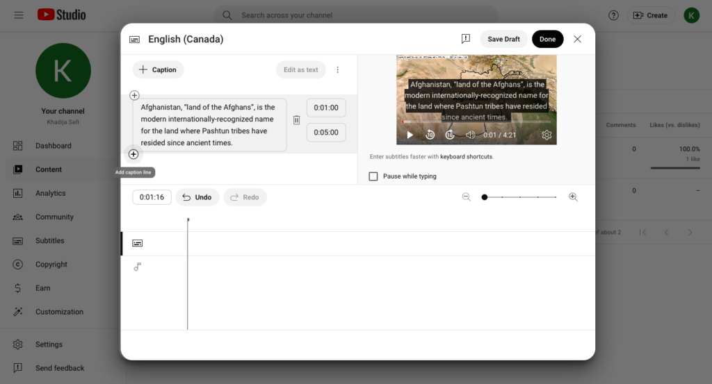
See the finished story map here:

Join me as I walk through how I created this project where data meets story, and where land, plants, and knowledge come together on the screen.

PROJECT BACKGROUND:

In 2010, the Métis Nation of Ontario (MNO) released the Southern Ontario Métis Traditional Plant Use Study, the first of its kind to document Métis traditional ecological knowledge (TEK) related to plant and vegetation use in southern Ontario (Métis Nation of Ontario, 2010). The study, supported by Ontario Power Generation (OPG), was developed through collaboration with Métis Elders, traditional resource users, and community councils in the Northumberland, Oshawa, and Durham regions. It highlights Métis-specific traditional and medicinal practices that differ from those of neighbouring First Nations, while also recording environmental changes in southern Ontario and their effects on Métis relationships with plant life.

Since there are already extensive records documenting the plant species found across the Carolinian Zone, this project focuses on connecting those existing data sources with Métis Traditional Ecological Knowledge, revealing where cultural and ecological landscapes overlap and how they continue to shape our understanding of place. Not all species mentioned in the study are included in this storymap as some species mentioned were not found in the Carolinian Zone List of Vascular Plants by Michael J. Oldham. The video found at the end of this story is shared by the Métis Nation of Ontario as part of the Southern Ontario Métis Traditional Plant Use Study (2010). It is included to support the geovisualization of plant knowledge and landscapes in southern Ontario. The teachings and knowledge remain the intellectual and cultural property of the Métis Nation of Ontario and are presented with respect for community protocols, including acknowledging the Métis Nation of Ontario as the knowledge holders, not reproducing or claiming the teachings, and using them solely for the purposes of geovisualization and awareness in this project.

This foundational research of the MNO represents an important step in recognizing and protecting Métis ecological knowledge and cultural practices, ensuring they are considered in environmental assessments and future land-use decisions. Visualizing this knowledge on a map helps bring these relationships to life and helps in connecting traditional teachings to place, showing how Métis plant use patterns are tied to specific landscapes, and making this knowledge accessible in a meaningful, spatial way.

Let’s get started on how this project was built.

THE GEOVISUALIZATION PRODUCT:

The data that was used to build this StoryMap is as follows:

The software that was used to create this StoryMap is as follows:

  • ArcGIS StoryMaps to put the story together
  • ArcGIS Pro to build the map for the story
  • Microsoft Excel to build the dataset

Now that we have all the tools and data we need we can get started on building the project.

STEPS:

  1. Make your dataset: we have 2 sets of data and it is easier when everything is in one place. This requires some manual labour of reading and searching the data to find out what plants mentioned in the MNO’s study are found within the Carolinian zone and what census divisions they could *commonly be found in. 

*NOTE: I made this project based on the definition of status common to be found in the Carolinian zone and CDs as there were many different status definitions in Oldham’s data, but I wanted to connect these datasets based on the definition of being commonly found instead of other definitions (rare, uncommon, no status, etc.) (Oldham, 2017).

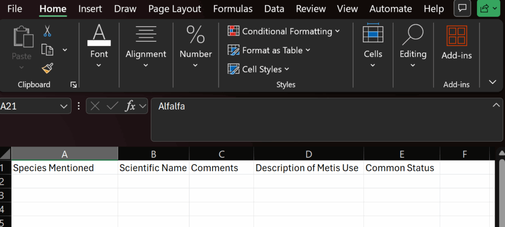
In order to make this new dataset I used Excel to hold the columns: Plant Name, Scientific Name, Comments, and Métis use of description from the MNO’s study, as well as a column called “Common Status” to hold the CDs these species were commonly found in. 

  1. Fill your dataset: Now that the dataset is set up, data can be put into it. I brought the list of species as well as the rest of the columns mentioned from the MNO’s plant use study into their respective columns: 

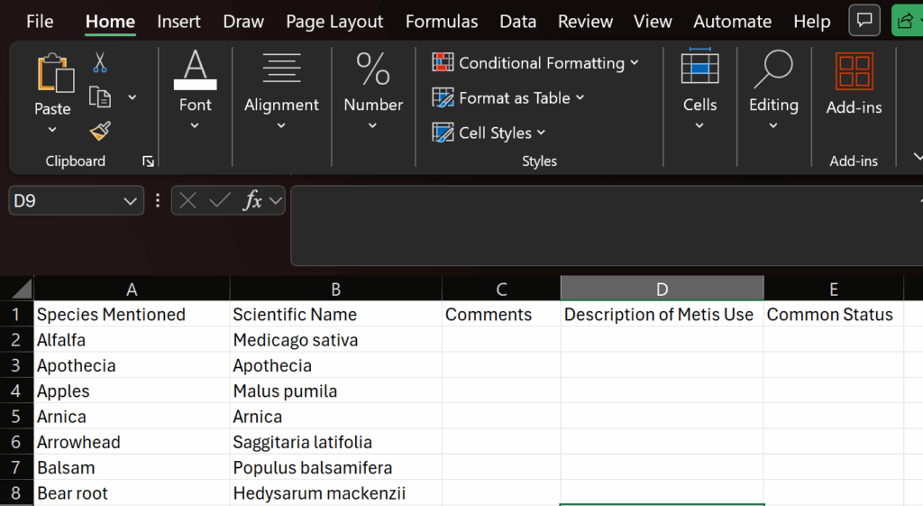
I included the comments column as this is important context to include to ensure that using this data was in its whole and told the whole story of this dataset rather than bits and pieces.

Once the base data is in the sheet we can start locating their common status within the Carolinian zone using Oldham’s data records.

What I did was search each species mentioned in the MNO plant use study within Oldham’s dataset. Then if the species matched records in the dataset I would include the CD’s name in the Common Status column.

Once the entire species list has been searched the data collection step is complete and we can move onto the next step.

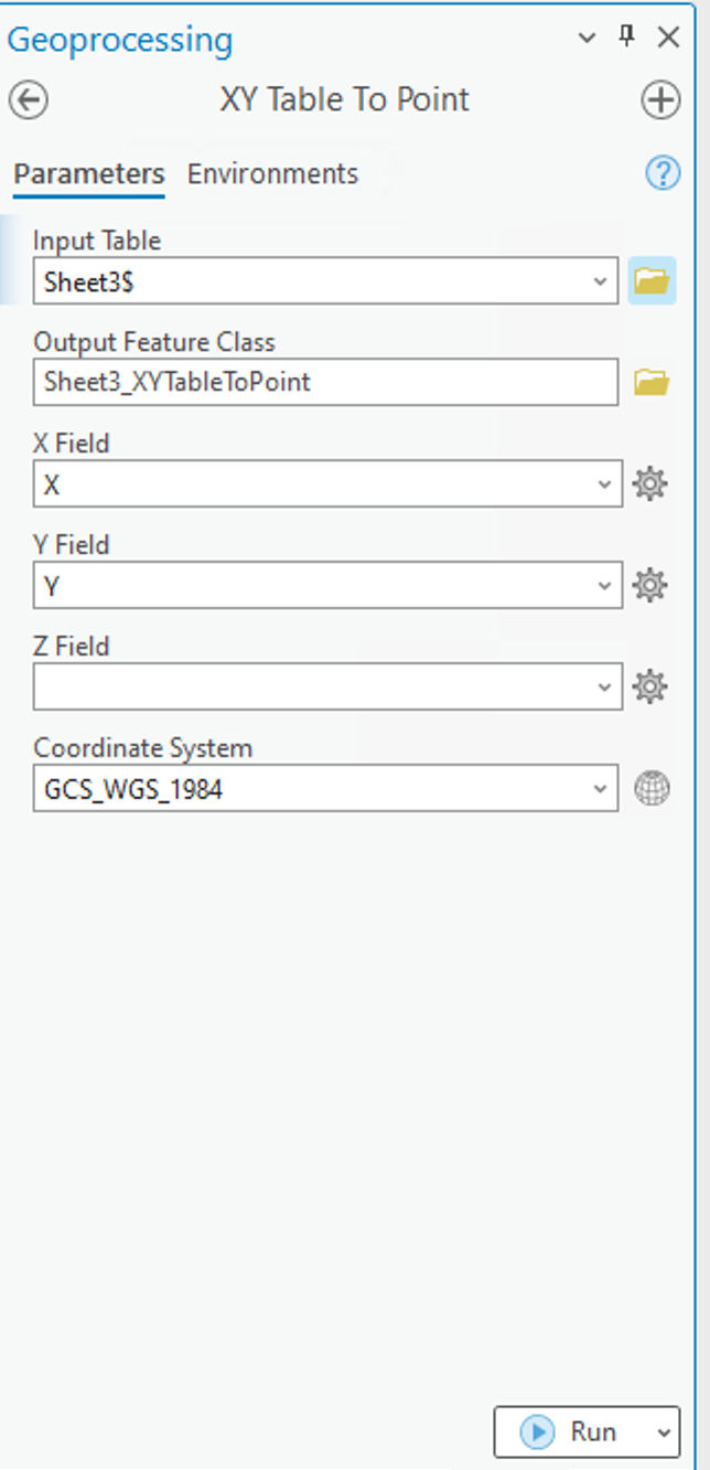
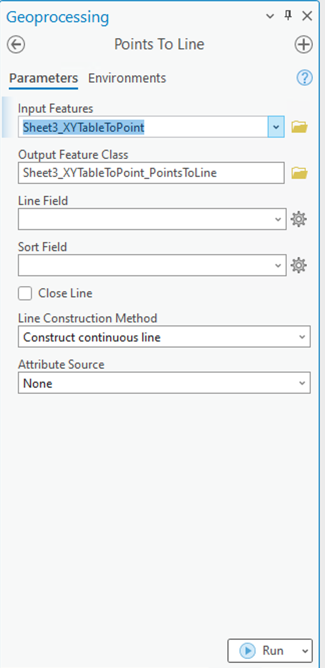
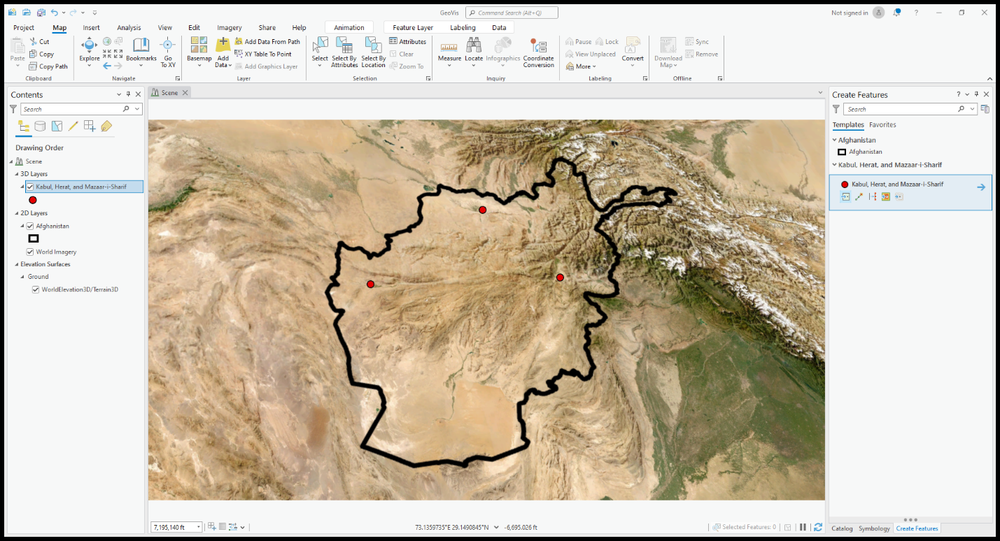
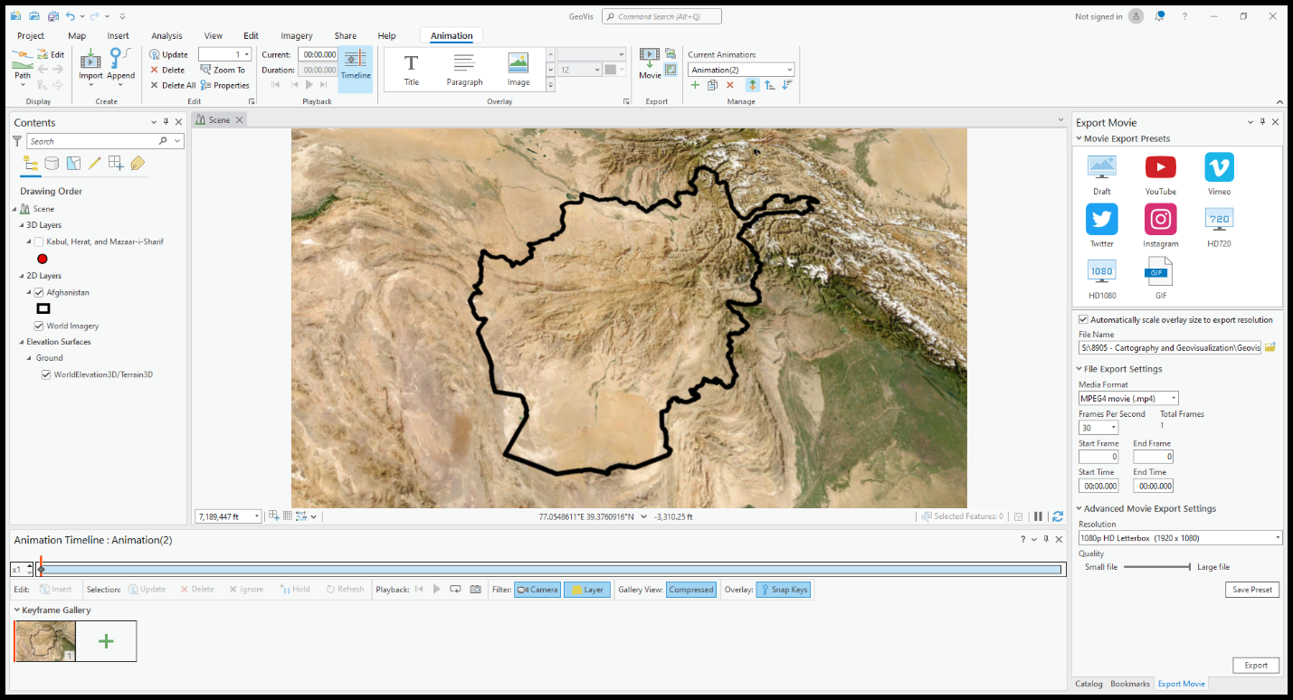
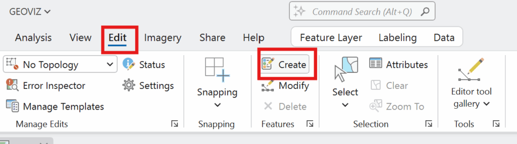
  1. Bring in your map layers: Open ArcGIS Pro and create a new project. I changed my basemap layer to better match the theme of this to Imagery Hybrid. Add in the Ontario Geohub Shapefile (the red outline). Rename this if you want as it is pretty well named already. Next bring in the Stats Canada CD shapefile. 
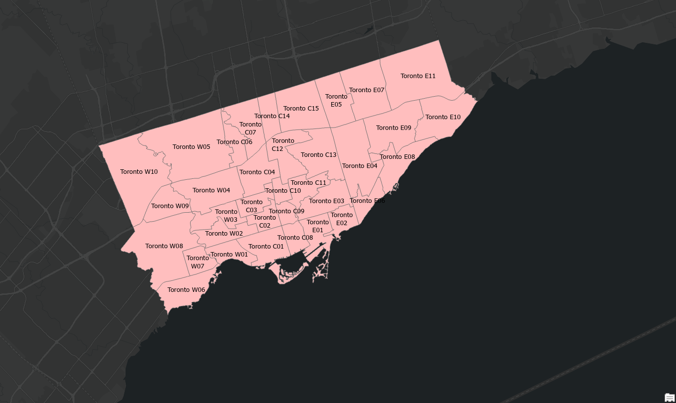
  1. Refine your map layers: First I selected only 7E (The Carolinian Zone), using the select by attribute option: 

Then you filter based on this ecoregion: 

Then once you run the selection you can export as a new layer with only the Carolinian Zone.

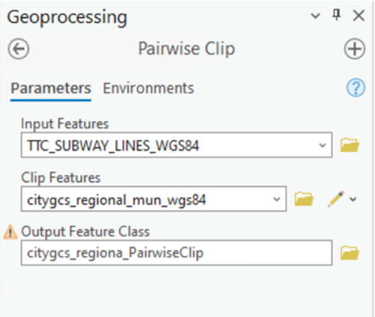
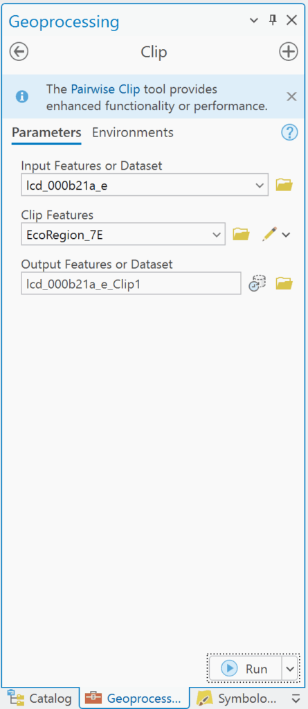
Next I applied the CD layer and clipped it to the exported Carolinian zone layer using the clip feature:

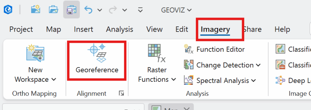
This will only show the CDs that lie within the Carolinian Zone. Now you will add the pdf layer. We need to use this pdf to draw the boundary line for 7E4 which is an eco-district that includes several CDs. With the pdf layer selected, click Imagery and Georeference:

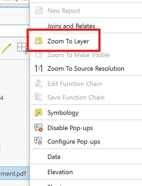
Next, you can right click on the layer and click zoom to layer. 

Then in the georeferencing tab, click move and the pdf should show up to move around the map.

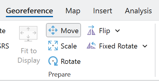
Now, you can use the three options (in the figure above) to as best you can overlay the pdf to align with the map to look something like this:

Once it is fit you can draw the boundary line on the clipped CD layer with create layer 

If it is too tricky to see beyond the pdf you can change the transparency to make it easier:

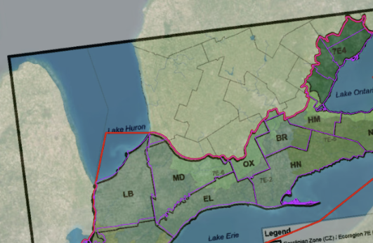
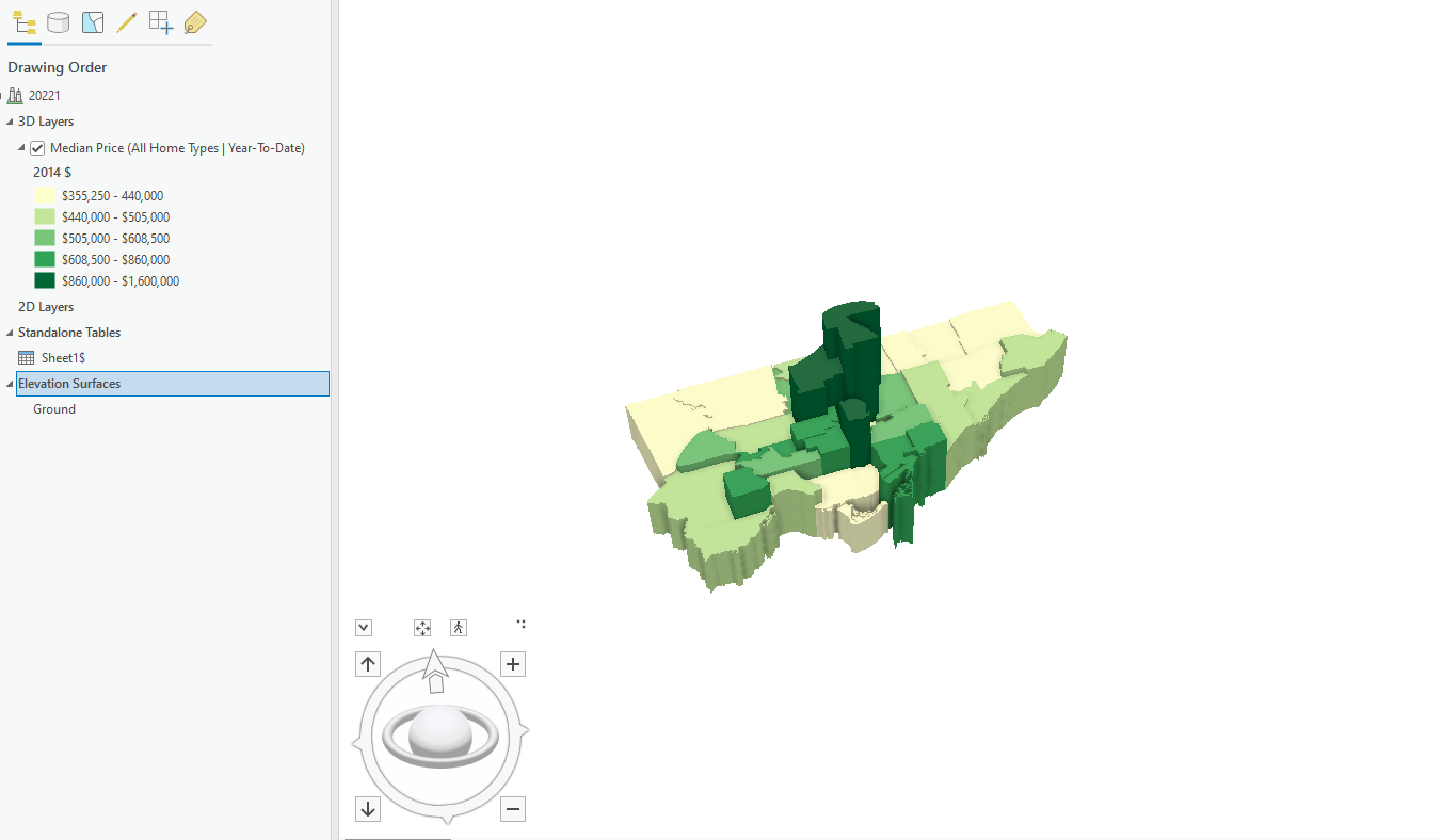
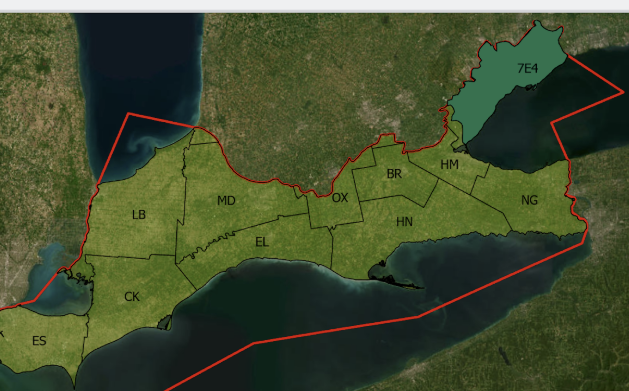
Now you can draw the boundary. Once that is complete click save, then export the layer drawn as a new layer. Now you can change the symbology for colour to show the distinctive divisions in the Ecozone. 

For the labels, I added a new column in the Eco-divisions layer called Short for the abbreviations of the districts for a better look. I manually entered in the abbreviations for the CDs similar to how Oldham did it in his map.

Now you should have something like this:

Now that the map is completed, we can start on making the storymap.

  1. Make the storymap

I started by writing up the text for how I wanted the story map to flow in google docs, making an introduction and providing some background context: such as the data I used, why the work done by the MNO is important for Indigenous people and the environment, and what I hope the project achieves. I wrote up where I wanted to put the maps, and what images and plant knowledge tables.

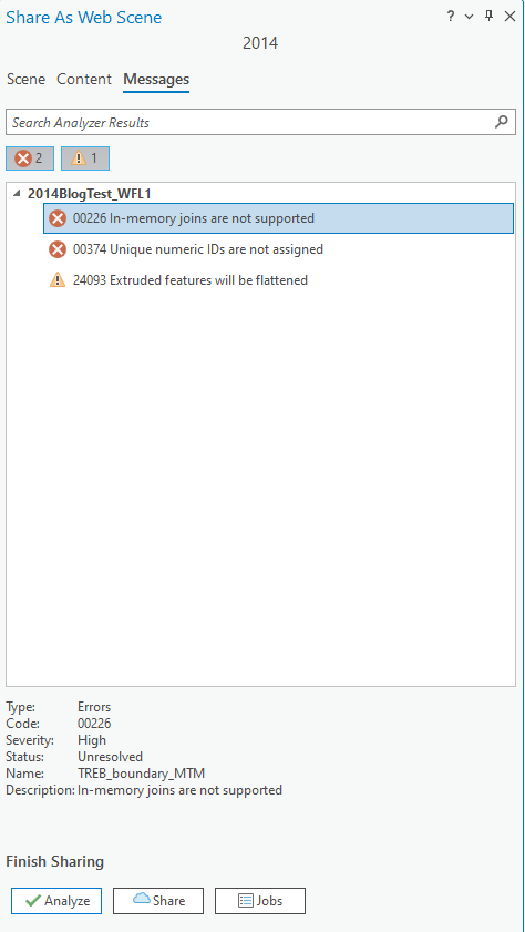
I applied this plan to the story map and had to turn the map I made in ArcGIS into a web map in order to access it in story map. (You can choose to make the map in ArcGIS Online to avoid this).

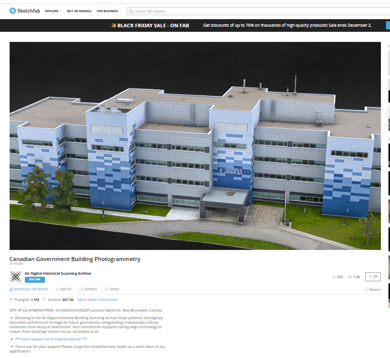
I also found some awesome 3-D models of some of the species mentioned from a site called Sketch fab which I thought was super cool to be able to visualize!

Then you have created a story map learning about the Carolinian Zone and what Métis TEK plant species are commonly found and used from here!

CONCLUSIONS/LIMITATIONS:

One of the key limitations of this project is that some zones lacked common status plant species as described in the MNO Plant Use Study, resulting in no species being listed for those areas. This absence may reflect gaps in documentation rather than a true lack of plant use, pointing to the need for more comprehensive and localized research.

The uneven distribution of documented plant species across zones underscores both the complexity of Métis plant relationships and the urgency of further study. By embracing these limitations as a call to action, we affirm the value of Indigenous knowledge systems and encourage broader learning about the interdependence between people and place.

REFERENCES

Carolinian Canada Coalition. (2007). Caring for nature in Brant: Landowner action in Carolinian Canada [Fact sheet]. https://caroliniancanada.ca/sites/default/files/File%20Depository/Library/factsheets/Brant_Factsheet_Final.pdf 

Carolinian Canada Coalition. (2007). Caring for nature in Elgin: Landowner action in Carolinian Canada [Fact sheet]. https://caroliniancanada.ca/sites/default/files/File%20Depository/Library/factsheets/Elgin_Factsheet_Final.pdf 

Carolinian Canada Coalition. (2007). Caring for nature in Essex: Landowner action in Carolinian Canada [Fact sheet]. https://caroliniancanada.ca/sites/default/files/File%20Depository/Library/factsheets/Essex_Factsheet_Final.pdf 

Carolinian Canada Coalition. (2007). Caring for nature in Haldimand: Landowner action in Carolinian Canada [Fact sheet]. https://caroliniancanada.ca/sites/default/files/File%20Depository/Library/factsheets/Haldimand_Factsheet_Final.pdf 

Carolinian Canada Coalition. (2007). Caring for nature in Hamilton: Landowner action in Carolinian Canada [Fact sheet]. https://caroliniancanada.ca/sites/default/files/File%20Depository/Library/factsheets/Hamilton_Factsheet_Final.pdf 

Carolinian Canada Coalition. (2007). Caring for nature in Lambton: Landowner action in Carolinian Canada [Fact sheet]. https://caroliniancanada.ca/sites/default/files/File%20Depository/Library/factsheets/Lambton_Factsheet_Final.pdf 

Carolinian Canada Coalition. (2007). Caring for nature in Middlesex: Landowner action in Carolinian Canada [Fact sheet]. https://caroliniancanada.ca/sites/default/files/File%20Depository/Library/factsheets/Middlesex_Factsheet_Final.pdf 

Carolinian Canada Coalition. (2007). Caring for nature in Niagara: Landowner action in Carolinian Canada [Fact sheet]. https://caroliniancanada.ca/sites/default/files/File%20Depository/Library/factsheets/Niagara_Factsheet_Final.pdf 

Carolinian Canada Coalition. (2007). Caring for nature in Oxford: Landowner action in Carolinian Canada [Fact sheet]. https://caroliniancanada.ca/sites/default/files/File%20Depository/Library/factsheets/Oxford_Factsheet_Final.pdf 

Chatham-Kent Home. (2024, November 28). Agriculture & Agri-Food. https://www.chatham-kent.ca/EconomicDevelopment/invest/invest/Pages/Agriculture.aspx 

Métis Nation of Ontario. (2010). Traditional ecological knowledge study: Southern Ontario Métis traditional plant use [PDF]. Métis Nation of Ontario. https://www.metisnation.org/wp-content/uploads/2011/03/so_on_tek_darlington_report.pdf 

Oldham, Michael. (2017). List of the Vascular Plants of Ontario’s Carolinian Zone (Ecoregion 7E). Carolinian Canada. 10.13140/RG.2.2.34637.33764.

Interactive Earthquake Visualization Map

Hamid Zarringhalam

Geovis Project Assignment, TMU Geography, SA8905, Fall 2025

Welcome to Hamid Zarringhalam’s blog!
In this blog, I present a tutorial for the app that I developed to visualize near real time global earthquake data.


Introduction

In an increasingly data driven world, the ability to visualize complex spatial information in real time is essential for decision making, analysis, and public engagement. This application leverages the power of D3.js, a dynamic JavaScript library for data-driven documents, and Leaflet.js, a lightweight open-source mapping library, to create an interactive real-time visualization map.

By combining D3’s flexible data binding and animation capabilities with Leaflet’s intuitive map rendering and geospatial tools, the application enables users to explore live data streams activity and directly on a geographic interface.

The goal is to provide a responsive and visually compelling platform that not only displays data but also reveals patterns, trends, and anomalies as they unfold.

Data Sources

The USGS.gov provides scientific data about natural hazards, the health of our ecosystems and environment, and collects a massive amount of data from all over the world all the time. It provides earthquake data in several formats and updated every 5 minutes.

Here is the link to USGS GeoJSON Feeds: “http://earthquake.usgs.gov/earthquakes/feed/v1.0/geojson.php”

When you click on a data set, for example ‘All Earthquakes from the Past 7 Days’, you will be given a JSON representation of that data. You will be using the URL of this JSON to pull in the data for the visualization. Included popups that provide additional information about the earthquake when a marker is clicked.

For example: “https://earthquake.usgs.gov/earthquakes/feed/v1.0/summary/all_hour.geojson” contains different objects that show different earthquakes.

The Approach  

Real-time GeoJSon online earthquake data will be fetched from USGS. These Data will be processed through D3.js functions and will be displays as circle markers on different map using MapBox API, styled by magnitude and grouped by time intervals and create a map using Leaflet that plots all of the earthquakes from your data set based on their longitude and latitude.

There are three files that are created and used in this application

  1. HTML file that creates a web-based earthquake visualization tool. It loads a Leaflet map and uses JavaScript (via D3 and Leaflet) to fetch and display real-time earthquake data with interactive markers.
  2. Styles for style the map with CSS
  3. Java script which creates an interactive web map that visualizes real-time earthquake data from the USGS (United States Geological Survey) using Leaflet.js and D3.js.

Leaflet in the script is used to create an interactive, web-based map that visualizes earthquake data in a dynamic and user-friendly way. Leaflet provides the core functionality to render a map.

Leaflet is JavaScript library and great for displaying data, but it doesn’t include built-in tools for fetching or manipulating external data.

D3.js in this script is used to fetch and process external data specifically, the GeoJSON earthquake feeds from the USGS, and Popups, color and Circlemarker will be called in D3.js

Steps of creating interactive maps

Step 1. Creating the frame for the visualization using HTML

HTML File:

<html lang=”en”>

<head>

  <meta charset=”UTF-8″>

  <meta name=”viewport” content=”width=device-width, initial-scale=1.0″>

  <meta http-equiv=”X-UA-Compatible” content=”ie=edge”>

  <title>Leaflet Step-2</title>

  <!– Leaflet CSS –>

  <link rel=”stylesheet” href=”https://unpkg.com/leaflet@1.6.0/dist/leaflet.css”

    integrity=”sha512-xwE/ Az9zrjBIphAcBb3F6JVqxf46+CDLwfLMHloNu6KEQCAWi6HcDUbeOfBIptF7tcCzus KFjFw2yuvEpDL9wQ==”

    crossorigin=”” />

  <!– Our CSS –>

  <link rel=”stylesheet” type=”text/css” href=”static/css/style.css”>

</head>

<body>

  <!– The div that holds our map –>

  <div id=”map”></div>

  <!– Leaflet JS –>

  <script src=”https://unpkg.com/leaflet@1.6.0/dist/leaflet.js”

    integrity=”sha512-rVkLF/ 0Vi9U8D2Ntg4Ga5I5BZpVkVxlJWbSQtXPSiUTtC0TjtGOmxa1AJPuV0CPthew==”

    crossorigin=””></script>

  <!– D3 JavaScript –>

  <script type=”text/javascript” src=”https://cdnjs.cloudflare.com/ajax/libs/d3/4.2.3/d3.min.js”></script>

  <!– API key –>

  <script type=”text/javascript” src=”static/js/config.js”></script>

  <!– The JavaScript –>

  <script type=”text/javascript” src=”static/js/logic2.js”></script>

</body>

</html>

Step 2. Fetching Earthquake Data

This section of the App defines four URLs from USGS and assigns them to four variables:


Js codes for fetching the data from USGS:

var earthquake1_url = “https://earthquake.usgs.gov/earthquakes/feed/v1.0/summary/all_hour.geojson”

var earthquake2_url = “https://earthquake.usgs.gov/earthquakes/feed/v1.0/summary/all_day.geojson”

var earthquake3_url = “https://earthquake.usgs.gov/earthquakes/feed/v1.0/summary/all_week.geojson”

var earthquake4_url = “https://earthquake.usgs.gov/earthquakes/feed/v1.0/summary/all_month.geojson”

Step 3. Processing the data

D3.js is used for processing the data. Leaflet CircleMarker library and Color function will be called in this D3.js

Js codes for processing the data:

var earthquake3 = new L.LayerGroup();

//Here is the code for gathering the data when user chooses the 3rd option which is //all week earthquake information

d3.json(earthquake3_url, function (geoJson) {

    //Create Marker

    L.geoJSON(geoJson.features, {

        pointToLayer: function (geoJsonPoint, latlng) {

            return L.circleMarker(latlng, { radius: markerSize(geoJsonPoint.properties.mag) });

        },

        style: function (geoJsonFeature) {

            return {

                fillColor: Color(geoJsonFeature.properties.mag),

                fillOpacity: 0.7,

                weight: 0.1,

                color: ‘black’

            }

        },

        // Add pop-up with related information

        onEachFeature: function (feature, layer) {

            layer.bindPopup(

                “<h4 style=’text-align:center;’>” + new Date(feature.properties.time) +

                “</h4> <hr> <h5 style=’text-align:center;’>” + feature.properties.title + “</h5>”);

        }

    }).addTo(earthquake3);

    createMap(earthquake3);

});

Step 4. Creating proportional Circle Markers

The circle markers reflect the magnitude of the earthquake. Earthquakes with higher magnitudes appear larger and darker in color.

The circle marker Leaflet library is called in above D3.js code. Uses Color(magnitude) to assign color based on the magnitude:

Function Color(magnitude) { different color for different size of Magnitude}

Function Color odes:

This function creates different colors for different magnitudes. This function will be called by D3.js and is highlighted in above code.

function Color(magnitude) {

        if (magnitude > 5) {

          return  “#6E0C21”;

        } else if (magnitude > 4) {

            return “#e76818”;

        } else if (magnitude > 3) {

            return “#F6F967”;

        } else if (magnitude > 2) {

            return “#8B0BF5”;

        } else if (magnitude > 1) {

            return “#B15AF8”;

        } else {

            return ‘#DCB6FC’

        }

      };

Step 5. Mapping the information using MapBox API

By choosing a different tile a different base map will be visualized, and it is through API to MapBox.

 var baseLayers = {

        “Tiles”: tiles,

        “Satellite”: satellite,

        “Terrain-RGB”: terrain_rgb,

        “Terrian”: Terrian

    };

Code for choosing the selected title through API to MapBox:

function createMap() {

   // Tile layer (initial map) whhich comes from map Box

    var tiles = L.tileLayer(“https://api.mapbox.com/styles/v1/{id}/tiles/{z}/{x}/{y}?access_token={accessToken}”, {

        attribution: “© <a href=’https://www.mapbox.com/about/maps/’>Mapbox</a> © <a href=’http://www.openstreetmap.org/copyright’>OpenStreetMap</a> <strong><a href=’https://www.mapbox.com/map-feedback/’ target=’_blank’>Improve this map</a></strong>”,

        tileSize: 512,

        maxZoom: 18,

        zoomOffset: -1,

        id: “mapbox/streets-v11”,

        accessToken: API_KEY

    });

    var satellite = L.tileLayer(‘https://api.tiles.mapbox.com/v4/{id}/{z}/{x}/{y}.png?access_token={accessToken}’, {

        attribution: ‘Map data &copy; <a href=\”https://www.openstreetmap.org/\”>OpenStreetMap</a> contributors, <a href=\”https://creativecommons.org/licenses/by-sa/2.0/\”>CC-BY-SA</a>, Imagery © <a href=\”https://www.mapbox.com/\”>Mapbox</a>’,

        maxZoom: 13,

        // Type of map box

        id: ‘mapbox.satellite’,

        accessToken: API_KEY

    });

    var terrain_rgb = L.tileLayer(‘https://api.mapbox.com/v4/mapbox.terrain-rgb/{z}/{x}/{y}.png?access_token={accessToken}’, {

        attribution: ‘Map data &copy; <a href=\”https://www.openstreetmap.org/\”>OpenStreetMap</a> contributors, <a href=\”https://creativecommons.org/licenses/by-sa/2.0/\”>CC-BY-SA</a>, Imagery © <a href=\”https://www.mapbox.com/\”>Mapbox</a>’,

        maxZoom: 13,

        // Type of map box

        id: ‘mapbox.outdoors’,

        accessToken: API_KEY

    });

     var Terrian = L.tileLayer(‘https://api.mapbox.com/v4/mapbox.mapbox-terrain-v2/{z}/{x}/{y}.png?access_token={accessToken}’, {

        attribution: ‘Map data &copy; <a href=\”https://www.openstreetmap.org/\”>OpenStreetMap</a> contributors, <a href=\”https://creativecommons.org/licenses/by-sa/2.0/\”>CC-BY-SA</a>, Imagery © <a href=\”https://www.mapbox.com/\”>Mapbox</a>’,

        maxZoom: 13,

        // Type of map box

        id: ‘mapbox.Terrian’,

        accessToken: API_KEY

    });

How to install and run the application

  • Request an API Key from MapBox at API Docs | Mapbox
  • Unzip the app.zip file
  • Add your API Key to the config.js file under “static/js” folder
  • Double-click on HTML file
  • Click on layer icon and choose the Tile and the period that earthquake happened
  • Click on any of the proportional circle to see more information about each earthquake

Overcoming Challenge(s)

Creating a D3.json() for real time interaction with USGS needed more work. I could make it work after reading more about D3 and finding about other examples.

Key Insights

  • Monitoring seismic activity in near real-time
  • Compare earthquake patterns across different timeframes
  • Understand magnitude distribution visually

Conclusion

The real time interactive map provides end users with timely, accurate information, making it both highly beneficial and informative. It also serves as a powerful tool for visualizing big data and supporting effective decision making.

Demographics of Chicago Neighbourhoods and Gang Boundaries in 2024

By: Ganesha Loree

Geovis Project Assignment, TMU Geography, SA8905, Fall 2025

INTRODUCTION

`Chicago is considered the most gang-occupied city in the United States, with 150,000 gang-affiliated residents, representing more than 100 gangs. In 2024, 46 gangs and their boundaries across Chicago were mapped by the City of Chicago. Factors about the formation of gangs have been of interest and a topic of research for many years all over the world (Assari et al., 2020), but for the purpose of this project, these factors are going to stem from demographics of Chicago. For instance, Chicago has deep roots within gang history and culture. Not only gangs but violent crimes are also dense. Demographics such as income, education, housing, race, etc., play factors within the neighbourhoods of Chicago and could be part of the cause of gang history.

METHODOLOGY

Step 1: Data Preparation

Chicago Neighbourhood Census Data (2025): Over 200 socioeconomic and demographic data for each neighbourhood was obtained from the Chicago Metropolitan Agency for Planning (CMAP) (Figure 1). In July 2025 their Community Data Snapshot portal released granular insights into population characteristics, income levels, housing, education, and employment metrics across Chicago’s neighbourhoods.

Figure 1: Census data for Chicago, 2024

Chicago Neighbourhood Boundary Files: official geographic boundaries for Chicago neighbourhoods were downloaded from the City of Chicago’s open data portal (Figure 2). These shapefiles were used to spatially join census data and support geospatial visualization.

Figure 2: Chicago Data Portal – Neighborhood Boundaries

Chicago Gang Territory Boundaries (2024): Gang territory data from 2024 was sourced from the Chicago Police Department’s GIS portal (Figure 3). These boundaries depict areas of known gang influence and were integrated into the spatial database to support comparative analysis with neighbourhood-level census indicators.

Step 2: Technology

Once the data was downloaded, they were applied to software to visualize the data. A combination of technologies was used, ArcGIS Pro and Sketchup (Web). ArcGIS Pro was used to import all boundary files, where neighbourhood census data was joined to Chicago boundary shapefile using unique identifier such as Neighbourhood Name (Figure 4).

Figure 4: ArcGIS Pro Data Join Table

Gang territory boundary polygons overlaid with neighborhood boundaries to enable spatial intersection and proximity analysis (Figure 5).

Figure 5: Shapefiles of Chicago’s Neighbourhoods and Gangs

Within ArcGIS Pro, the combined map of both boundaries allowed for analysis of the neighbourhoods with the most gang boundaries. Rough sketch of these neighbourhoods was made by circling the neighbourhoods of a clean map of Chicago, where the bigger circles show the areas with more gang areas and the stars indicate the neighborhoods with no gang boundaries (Figure 6). The CMAP was used to look at the demographics of the neighborhoods with the most area of gangs and compared to the areas with no gang areas (e.g. O’Hare).

Figure 6: Chicago neighborhood outlines with markers

SketchUp

SketchUp is 3D modeling tool that is used to generate and manipulate 3D models and is often used in architecture and interior design. Using this software for this project was a different purpose of the software; by importing Chicago neighborhoods outline as an image I was able to trace the neighborhoods.

Step 3: Visualization with 3D Extrusions (Sketch Up)

Determined the highest height of the 3D maps models, was based on the total number of neighborhoods (98) and total number of gangs records/areas (46). Determining which neighbourhoods had the most gang boundaries was based on the gang area number which was provided in the Gang Boundary file. The gang with the most area totaled to shape area of 587,893,900m2, where the smallest shape area is 217,949m2. Similar process was done with neighbourhood area measurements. Neighbourhoods were raised based on the number of gang areas that were present within that neighbourhood (as previously shown in Figure 5). 5’ (feet) is the highest neighbourhood, and 4” (inches) is the lowest neighbourhood where gangs are present, neighbourhoods that do not have gangs are not elevated.

A different approach was applied to the top 3 gangs map model, where the highest remains same in each gang, but are placed in the neighbourhoods that have that gang present. For instance, Gangster Disciples were set at approximately 5 feet (5′ 3/16″ or 1528.8 mm), Black P Stones at almost 4 feet (3′ 7/8″ or 936.6 mm), and Latin Kings at a little over 1 foot (1′ 8 1/4″ or 514.4 mm).

Map Design

Determined what demographic factors were going to be used to compare with gang areas, for example, income, race, and top 3 gangs (Gangster Disciples, Black P Stones, and Latin Kings). Two elements present with the two demographic maps (height and colour), where colour indicates the demographic factor and the height represents the gang presence (Figure 7).

Figure 7: 3D map models of Chicago gangs based on Race and Income

There was limited information available about the gang areas, which only consisted of gang name, shape area, and length measurements. In terms of SketchUp’s limitations, the free web version as some restrictions, had to manually draw the outline of Chicago neighbourhoods which was time consuming. In addition, SketchUp scale system was complex and was not consistent between maps. To address tis, each corner of the map was measured with the Tape Measure Tool to ensure uniformity. Lastly, when the final product was viewed in augmented reality (AR), the map quality was limited such as the neighbourhood outlines were gone, and the only parts that were visible were the colour parts of the models.

The most visual pattern shown from the race map is the areas with more gang activity have a large population of African Americans (Figure 7). For the income map, indicated in green, more gang areas have lower income whereas the areas with higher income do not have gangs in those neighborhoods. Based on the top three gangs, Gangster Disciples have the most gang boundaries across Chicago neighborhoods (Figure 8). Gangster Disciples takes up 33.6% of the area in km2, founded in 1964 in Englewood.

Figure 8: 3D map of the top 3 gangs in Chicago, 2024

FINAL PRODUCT

The final product, is user interactive through a QR code that allows viewers to look at the map models using augmented reality (AR) just by pointing your mobile device camera at the QR code below.

Being aware that the quality of the AR has its limits, the SketchUp map models can be viewed using the Geovis Map Models button below.

Reference

Assari, S., Boyce, S., Caldwell, C. H., Bazargan, M., & Mincy, R. (2020). Family income and gang presence in the neighborhood: Diminished returns of black families. Urban Science4(2), 29.

Parks and its association to Average Total Alcohol Expenditure (Alcohol in Parks Program in Toronto, ON)

Welcome to my Geovisualization Assignment!

Author: Gabyrel Calayan

Geovisualization Project Assignment

TMU Geography

SA8905 – FALL 2025

Today, we are going to be looking at Parks and Recreation Facilities and its possible association to average alcohol expenditure in census tracts (due to the Alcohol in Parks Program in the City of Toronto) using data acquired from the City of Toronto and Environics Analytics (City of Toronto, n.d.).

Context

Using R Studio’s expansive tool set for map creation and Quarto documentation, we are going to be creating a thematic and an interactive map for parks and its association with Average Total Alcohol Expenditure in Toronto. The idea behind topic was really out of the blue. I was just thinking of a fun, simple topic that I wanted to do that I haven’t done yet for my other assignments! And so I landed on this because of data availability while learning some new skills at R Studio and try out the Quarto documentation process.

Data

  • Environics Analytics – Average Alcohol Expenditure (Shapefile for census tracts and in CAD $) (Environics Analytics, 2025
  • City of Toronto – Parks and Recreation Facilities (Point data and filtered down to 40 parks that participate in the program) (City of Toronto, 2011).

Methodology

  • Using R Studio to map out my Average Alcohol Expenditure and the 55 Parks that are a part of the Alcohol in Parks Program by the City of Toronto
  • Utilize tmap functions to create both a static thematic and interactive maps
  • Utilize Quarto documentation to create a readme file of my assignment
  • Showcasing the mapping capabilities and potential of R Studio as a mapping tool

Example tmap code for viewing maps

This tmap code for initializing what kind of view you want (there are only two kinds of views)

  • Static thematic map

## This is for viewing as a static map

## tmap_mode("plot") + tm_shape(Alcohol_Expenditure)

  • Interactive map

## This for viewing as a interactive map

## tmap_mode("view") + tm_shape(Alcohol_Expenditure)

Visualization process

Step 1: Installing and loading the necessary packages so that R Studio can recognize our inputs

  • These inputs are kind of like puzzle pieces! Where you need the right puzzle piece (package) so that you can put the entire puzzle together.
  • So we would need a bunch of packages to visualize our project:
    • sf
    • tmap
    • dplyr
  • These two packages are important because “sf” lets us read the shapefiles into R Studio. While “tmap” lets us actually create the maps. And “dplyr” lets us filter our shapefiles and the data inside it.
  • Also, its very likely that the latest R Studio version has the necessary packages already. In that case, you can just do the library() function to call the packages that you would need. But, I like installing them again in case I forgot.

## Code for installing the packages

## install.packages("sf")

## install.packages("tmap")

## Loading the packages

## library(tmap)

## library(sf)

We can see in our console that it says “package ‘sf’ successfully unpacked and MD5 sums checked. That basically means its done installing.

  • In addition, these warning messages in this console output indicates that we have these packages already in the latest R Studio software.

After installing and loading these packages, then we can begin with loading and filtering the dataset so that we can move on to visualizing the data itself. The results of installing these packages can be seen in our “Console” section at the bottom left hand side of R Studio (it may depend on the user but I have seen people move the “Console” section to the top right hand side of R Studio interface.

Step 2: Loading and filtering our data

  • We must first set the working directory of where our data is and where our outputs are going to go

## Setting work directory

## setwd()

  • This code basically points to where your files are going to be outputted to in your computer
  • Now that we set our working directory, we can load in the data and filter it

## Code for naming our variables in R Studio and loading it in the software

## Alcohol_Parks <- read_sf("Parks and Recreation Facilities - 4326.shp")

## Alcohol_Expenditure <- read_sf("SimplyAnalytics_Shapefiles_5efb411128da3727b8755e5533129cb52f4a027fc441d8b031fbfc517c24b975.shp")

  • As we can see in the code snippets above, we are using one of the functions that belong to the sf package. The read_sf basically loads in the data that we have to be recognized as a shapefile.
  • It will appear on the right as part of the “Environment” section. This means it has read all the columns that are part of the dataset

Now we can see our data in the Environments Section. And there’s quite a lot. But no worries we only need to filter the Parks data!

Step 3: Filtering the data

  • Since we only need to filter the data for the parks in Toronto, we only need to grab the data that are a part of the 55 parks in the Alcohol in Parks Program
  • This follows a two – step approach:
    • Name your variable to match its filtered state
    • Then the actual filtering comes into play

## Code for running the filtering process

## Alcohol_Parks_Filtered <- filter(Alcohol_Parks, ASSET_NAME == "ASHTONBEE RESERVOIR PARK" | ASSET_NAME == "BERT ROBINSON PARK"| ASSET_NAME == "BOND PARK" | ASSET_NAME == "BOTANY HILL PARK" | ASSET_NAME == "BYNG PARK"

  • As we can see in the code above, before the filtering process we name the new variable to match its filtered state as “Alcohol_Parks_Filtered”
    • In addition, we are matching the column name that we type out in the code to the park names that are found in the Park data set!
    • For example: The filtering wouldn’t work if it was “Bond Park”. It must be all caps “BOND PARK”
  • Then we used the filter() function to filter the shapefile by ASSET_NAME to pick out the 40 parks
  • We can see in our filtered dataset that we have filtered it down to 53 parks with all the original columns attached. Most important being the geometry column so we can conduct visualizations!
  • Once we completed that, we can test out the tmap function to see how the data looks before we map it out.

Step 4: Do some testing visualizations to see if there is any issues

  • Now, we can actually use some tmap functions to see if our data work
  • tm_shape is the function for recognizing what shapefile we are using to visualize the variable
  • tm_polygons and tm_dots is for visualizing the variables as either a polygon or dot shapefile
  • For tm_polygons, fill and style is basically what columns are you visualizing the variable on and what data classification method you would like to use

## Code for testing our visualizations

## tm_shape(Alcohol_Expenditure) + tm_polygons(fill = "VALUE0", style = "jenks")

## tm_shape(Alcohol_Parks_Filtered) + tm_dots()

Now, we can see that it actually works! We can see that the map above is our shapefile and the one on the bottom is our parks!

Step 5: Using tmap and its extensive functions to build our map

  • We can now fully visualize our map and add all the cartographic elements necessary to flesh it out and make it as professional as possible

## Building our thematic map

##``tmap_mode("plot") + tm_shape(Alcohol_Expenditure) +

tm_polygons(fill = "VALUE0", fill.legend = tm_legend ("Average Alcohol Expenditure ($ CAD)"), fill.scale = tm_scale_intervals(style = "jenks", values = "Greens")) +

tm_shape(Alcohol_Parks_Filtered) + tm_bubbles(fill = "TYPE", fill.legend = tm_legend("The 40 Parks in Alcohol in Parks Program"), size = 0.5, fill.scale = tm_scale_categorical(values = "black")) +

tm_borders(lwd = 1.25, lty = "solid") +

tm_layout(frame = TRUE, frame.lwd = 2, text.fontfamily = "serif", text.fontface = "bold", color_saturation = 0.5, component.autoscale = FALSE) +

tm_title(text = "Greenspaces and its association with Alcohol Expenditure in Toronto, CA", fontfamily = "serif", fontface = "bold", size = 1.5) +

tm_legend(text.size = 1.5, title.size = 1.2, frame = TRUE, frame.lwd = 1) +

tm_compass(position = c ("top", "left"), size = 4) +

tm_scalebar(text.size = 1, frame = TRUE, frame.lwd = 1) +

tm_credits("Source: Environics Analytics\nProjection: NAD83", frame = TRUE, frame.lwd = 1, size = 0.75)

  • Quite a lot of code!
  • Now this is where the puzzle piece analogy comes into play as well
    • First, we add our tmap_plot function to specify that we want it as a static map first
    • We add both our variables together because we want to see our point data and how it lies on top of our alcohol expenditure shapefile
    • Utilizing tm_polygons, tm_shape, and tm_bubbles to draw both our variables as polygons and as point data
      • tm_bubbles is dots and tm_polygons draws the polygons of our alcohol expenditure shapefile
    • The code that is in our brackets for those functions are additional details that we would like to have in our map
    • For example: fill.legend = tm_legend ("Average Alcohol Expenditure ($ CAD)")
      • This code snippet makes it so that our legend title is “Average Alcohol Expenditure ($ CAD) for our polygon shapefile
      • The same applies for our point data for our parks
    • Basically, we can divide our code into two sections:
      • The tm_polygons all the way to tm_bubbles is essentially drawing our shapefiles
      • The tm_borders all the way to the tm_credits are what goes on outside our shapefiles
        • For example:
    • tm_title() and the code inside it is basically all the details that can be modified for our map. component.autoscale = FALSE is turning off the automatic rescaling of our map so that I can have more control over modifying the title part of the map to my liking

Now we have made our static thematic map! On to the next part which is the interactive visualization!

Since we built our puzzle parts for the thematic map, we just need to switch it over to the interactive map using tmap_mode(“view”)

This code chunk describes the process to create the interactive map

library(tmap)
library(sf)
library(dplyr)


##Loading in the data to check if it works
Alcohol_Parks <- read_sf("Parks and Recreation Facilities - 4326.shp")
Alcohol_Expenditure <- read_sf("SimplyAnalytics_Shapefiles_5efb411128da3727b8755e5533129cb52f4a027fc441d8b031fbfc517c24b975.shp")

#Filtering test_sf_point to show only parks where you can drink alcohol
Alcohol_Parks_Filtered <- 
  filter(Alcohol_Parks, ASSET_NAME == "ASHTONBEE RESERVOIR PARK" | ASSET_NAME == "BERT ROBINSON PARK"
                                 | ASSET_NAME == "BOND PARK" | ASSET_NAME == "BOTANY HILL PARK" | ASSET_NAME == "BYNG PARK"
                                 | ASSET_NAME == "CAMPBELL AVENUE PLAYGROUND AND PARK" | ASSET_NAME == "CEDARVALE PARK" 
                                 | ASSET_NAME == "CHRISTIE PITS PARK" | ASSET_NAME == "CLOVERDALE PARK" | ASSET_NAME == "CONFEDERATION PARK"
                                 | ASSET_NAME == "CORKTOWN COMMON" | ASSET_NAME == "DIEPPE PARK" | ASSET_NAME == "DOVERCOURT PARK"
                                 | ASSET_NAME == "DUFFERIN GROVE PARK" | ASSET_NAME == "EARLSCOURT PARK" | ASSET_NAME == "EAST LYNN PARK"
                                 | ASSET_NAME == "EAST TORONTO ATHLETIC FIELD" | ASSET_NAME == "EDWARDS GARDENS" | ASSET_NAME == "EGLINTON PARK"
                                 | ASSET_NAME == "ETOBICOKE VALLEY PARK" | ASSET_NAME == "FAIRFIELD PARK" | ASSET_NAME == "GRAND AVENUE PARK"
                                 | ASSET_NAME == "GORD AND IRENE RISK PARK" | ASSET_NAME == "GREENWOOD PARK" | ASSET_NAME == "G. ROSS LORD PARK"
                                 | ASSET_NAME == "HILLCREST PARK" | ASSET_NAME == "HOME SMITH PARK" | ASSET_NAME == "HUMBERLINE PARK" | ASSET_NAME == "JUNE ROWLANDS PARK"
                                 | ASSET_NAME == "LA ROSE PARK" | ASSET_NAME == "LEE LIFESON ART PARK" | ASSET_NAME == "MCCLEARY PARK" | ASSET_NAME == "MCCORMICK PARK" 
                                 | ASSET_NAME == "MILLIKEN PARK" | ASSET_NAME == "MONARCH PARK" | ASSET_NAME == "MORNINGSIDE PARK" | ASSET_NAME == "NEILSON PARK - SCARBOROUGH"
                                 | ASSET_NAME == "NORTH BENDALE PARK" | ASSET_NAME == "NORTH KEELESDALE PARK" | ASSET_NAME == "ORIOLE PARK - TORONTO" | ASSET_NAME == "QUEEN'S PARK"
                                 | ASSET_NAME == "RIVERDALE PARK EAST" | ASSET_NAME == "RIVERDALE PARK WEST" | ASSET_NAME == "ROUNDHOUSE PARK" | ASSET_NAME == "SCARBOROUGH VILLAGE PARK"
                                 | ASSET_NAME == "SCARDEN PARK" | ASSET_NAME == "SIR WINSTON CHURCHILL PARK" | ASSET_NAME == "SKYMARK PARK" | ASSET_NAME == "SORAREN AVENUE PARK"
                                 | ASSET_NAME == "STAN WADLOW PARK" | ASSET_NAME == "THOMSON MEMORIAL PARK" | ASSET_NAME == "TRINITY BELLWOODS PARK" | ASSET_NAME == "UNDERPASS PARK"
                                 | ASSET_NAME == "WALLACE EMERSON PARK" |  ASSET_NAME == "WITHROW PARK")  


##Now as a interactive map
tmap_mode("view") + tm_shape(Alcohol_Expenditure) + 
  
  tm_polygons(fill = "VALUE0", fill.legend = tm_legend ("Average Alcohol Expenditure ($ CAD)"), fill.scale = tm_scale_intervals(style = "jenks", values = "Greens")) +
  
  tm_shape(Alcohol_Parks_Filtered) + tm_bubbles(fill = "TYPE", fill.legend = tm_legend("The 55 Parks in Alcohol in Parks Program"), size = 0.5, fill.scale = tm_scale_categorical(values = "black")) + 
  
  tm_borders(lwd = 1.25, lty = "solid",) + 
  
  tm_layout(frame = TRUE, frame.lwd = 2, text.fontfamily = "serif", text.fontface = "bold", color_saturation = 0.5, component.autoscale = FALSE) +
 
   tm_title(text = "Greenspaces and its association with Alcohol Expenditure in Toronto, CA", fontfamily = "serif", fontface = "bold", size = 1.5) +
  tm_legend(text.size = 1.5, title.size = 1.2, frame = TRUE, frame.lwd = 1) +
  
  tm_compass(position = c("top", "right"), size = 2.5) + 
  
  tm_scalebar(text.size = 1, frame = TRUE, frame.lwd = 1, position = c("bottom", "left")) +
  
  tm_credits("Source: Environics Analytics\nProjection: NAD83", frame = TRUE, frame.lwd = 1, size = 0.75)

Link to viewing the interactive map: https://rpubs.com/Gab_Cal/Geovis_Project

  • The only differences that can be gleaned from this code chunk is that the tmap_mode() is not “plot” but instead set as “view”
    • For example: tmap_mode(“view”)

The map is now complete!

Results (Based on our interactive map)

  • Just based on the default settings for the interactive map, tmap includes a wide range of elements that make the map dynamic!
    • We have the zoom in and layer selection/basemap selection function on the top left
    • The compass that we created is shown in the top right
    • And the legend that we made is locked in at the bottom right
    • Our scalebar is also dynamic which changes scales when we zoom in and out
    • And our credits and projection section is also seen in the bottom right of our interactive map
    • We can also click on our layers to see the columns attached to the shapefiles
  • For example, we can click on the point data to see the id, LocationID, AssetID, Asset_Name, Type, Amenities, Address, Phone, and URL. While for our polygon shapefile we can see the spatial_id, name of the CT, and the alcohol spending value in that CT
  • As we can see in our interactive map, the areas that have the highest “Average Alcohol Expediture” lie near the upper part of the downtown core of Toronto
    • For example: The neighbourhoods that are dark green are Bridle Path-Sunnybrook-York Mills, Forest Hill North and South and Rosedale to name a few
  • However, only a few parks that are a park of the program reside in these high spending regions on alcohol
  • Most parks reside in census tracts where the alcohol expenditure is either the $500 to $3000 range
  • While there doesn’t seems to be much of an association, there is definitely more factors into play as to where people buy their alcohol or where they decide to consume it
  • Based on just visual findings:
    • For example: It’s possible that people simply do not drink in these parks even though its allowed. They probably find the comfort of their home a better place to consume alcohol
    • Or people don’t want to drink at a park when they could be doing more active group – like activities

References

Spatial Accessibility and Ridership Analysis of Toronto Bike Share Using QGIS & Kepler.gl

Teresa Kao

Geovis Project Assignment, TMU Geography, SA8905, Fall 2025

Hi everyone, in this project, I explore how cycling infrastructure influences Bike Share ridership across Toronto. Specifically, I examine whether stations located within 50 meters of protected cycling lanes exhibit higher ridership than those near unprotected lanes, and to see which areas protected cycling lanes could be improved.

This tutorial walks through the full workflow using QGIS for spatial analysis and Kepler.gl for interactive mapping, filtering, and data exploration. By the end, you’ll be able to visualize ridership patterns, measure proximity to cycling lanes, and identify where additional stations or infrastructure could improve accessibility.

Preparing the Data in QGIS

Importing Cycling Network and Station Data

Import the cycling network shapefiles using Layer -> Add Layer -> Add Vector Layer, and load the Bike Share station CSV by assigning X = longitude, Y = latitude, and setting the CRS to EPSG:4326 (WGS84).

Reproject to UTM 17N for Distance Calculations

Because Kepler.gl only supports GeoJSON in EPSG:4326, all layers are first reprojected in QGIS to EPSG:26917 (Right click -> Export -> Save Features As…), distance calculations are performed there, and the processed results are then exported back to GeoJSON (EPSG:4326) for use in Kepler.gl.

Calculating Distance to the Nearest Cycling Lane

Use the Join Attributes by Nearest tool ( Processing Toolbox-> Join Attributes by Nearest), setting the Input Layer to stations dataset, the Join Layer to the cycling lane dataset, and Maximum neighbours to 1. This will generate an output layer with a new field (distance_to_lane_m) representing the distance in meters from each station to its nearest cycling lane.

Creating Distance Categories

Use the Field Calculator (∑) to create distance classifications using the following expression :

<CASE
WHEN "dist_to_lane_m" <= 50 THEN '≤50m'
WHEN "dist_to_lane_m" <= 100 THEN '≤100m'
WHEN "dist_to_lane_m" <= 250 THEN '≤250m'
ELSE '>250m'
END>

Exporting to GeoJSON for Kepler.gl

Since Kepler.gl does not support shapefiles, export each layer as a GeoJSON (Right Click -> Export -> Save Features As -> Format: GeoJSON -> CRS: EPSG:4326). The distance values will remain correct because they were already calculated in UTM projection.

Building Interactive Visualizations in Kepler.gl

Import Data

Go to Layer -> Add Layer -> choose data

  1. For Bike Share Stations, use the point layer and symbolize it by the distance_to_lane_m field, selecting a colour scale and applying custom breaks to represent different distance ranges.
  2. For Protected Cycling Network, use the polygon layer and symbolize it by all the protected lane columns, applying a custom ordinal stroke colour scale such as light green.
  3. For Unprotected Cycling Network, use the polygon layer and symbolize it by all the unprotected columns, applying a custom ordinal stroke colour scale such as dark green.
  4. For Toronto Boundary, use the polygon layer and assign a simple stroke colour to outline the study area.

Add Filters

The filter slider is what makes this visualization powerful. Go to Add Filter -> Select a Dataset -> Choose the Field (for example ridership, distance_to_lane)

Add Tooltips

Go to Tooltip -> Toggle ON -> Select fields to display. Enable tooltips so users can hover a station to see details, such as station name, ridership, distance to lane, capacity.

Exporting Your Interactive Map

Export image, table(csv), and map (shareable link) -> uses Mapbox Api to create an interactive online map that other people can interact with your map.

How this interactive map help answer the research question

This interactive map helps answer the research question in two ways.
First, by applying a filter on distance_to_lane_m, users can isolate stations located within 50 meters of a cycling lane and visually compare their ridership to stations farther away. Toggling between layers for protected and unprotected cycling lanes allows users to see whether higher ridership stations tend to cluster near protected infrastructure.

Based on the map, the majority of higher ridership stations are concentrated near protected cycling lanes, suggesting a positive relationship between ridership and proximity to safer cycling infrastructure.

Second, by applying a ridership filter (>30,000 trips), the map highlights high demand stations that lack nearby protected cycling lanes. These appear as busy stations located next to unprotected lanes or more than 50 meters away from any cycling facility.

Together, these filters highlight where cycling infrastructure is lacking, especially in the Yonge Church area and the Downtown East / Yonge Dundas area, making it clear where protected lanes may be needed.

Final Interactive Map

Thank you for taking the time to explore my blog. I hope it was informative and that you were able to learn something from it!

Paint by Raster: Watercolour Cartography Illustrating Landform Expansion at Leslie Street Spit, Toronto (1972 – 2025)

Emma Hauser

Geovis Project Assignment, TMU Geography, SA8905, Fall 2025

Hi everyone, welcome to my final Geovisualization Project tutorial. With this project, I wanted to combine my love of watercolour painting with cartography. I used Catalyst Professional, ArcGIS Pro, and watercolours to transform Landsat imagery spanning the years 1972 to 2025 into blocks of colour representing periods of landform expansion at Leslie Street Spit. I also made an animated GIF to help illustrate the process.

Study Area

Just to give you a bit of background to the site, Leslie Spit is a manmade peninsula on the Toronto waterfront, made up of brick and concrete rubble from construction sites in Toronto starting in 1959. It was intended to be a port-related facility, but by the early 1970s, this use case was no longer relevant, and natural succession of vegetation had begun. The landform continued to expand through lakefilling, as did the vegetation and wildlife, and by 1995 the Toronto and Region Conservation Authority started enhancing natural habitats, founding Tommy Thompson Park.

Post Classification Change Detection

The Landsat program has been providing remotely sensed imagery since 1972, at which time the Baselands and “Spine Road” had been constructed. Pairs of Landsat images can be compared by classifying the pixels as land or water in Catalyst Professional using an unsupervised classification algorithm, and performing “delta” or post classification change detection in ArcGIS Pro using the Raster Calculator to determine areas that have undergone landform expansion in that time period. The tool literally subtracts the pixel values denoting land or water of a raster at an earlier date from a raster at a later date in order to compare them and detect change. If we perform this process seven times, up until 2025, we can get a near complete picture of the land base formation of the Spit and can visualize these changes.

Let’s begin!

Step 1: Data Collection from USGS EarthExplorer

The first step is to collect 9 images forming 7 image pairs from USGS EarthExplorer. I searched for images that had minimal cloud cover covering the extent of Toronto.

For the year 1985, we need to double up on images in order to transition from the Multispectral Scanner sensor with 60m resolution to the Thematic Mapper sensor with 30m resolution. 1980 MSS and 1985 MSS will form a pair, and 1985 TM and 1990 TM will form a pair.

Step 2: Data Processing in Catalyst Professional

Now we can begin processing our images. All images must be data merged either manually (using the Translate and Transfer Layers Utilities) or using the metadata MTL.txt files (using the Data Merge tool) to join each image band together and subset (using the Clipping/Subsetting tool) to the same extent. The geocoded extent is:

Upper left: 630217.500 P / 4836247.500 L
Lower right: 637717.500 P / 4828747.500 L

Using the 2025 image as an example, my window looked like this:

I started a new session of Unsupervised Classification and added two 8 bit channels.

I specified the K-Means algorithm with 20 maximum classes and 20 maximum iterations.

I used Post-Classification Analysis (Aggregation) to assign each of the 20 classes to an information class. These classes are Water and Land. I made sure all classes were assigned and I applied the result to the Output Channel.

I got this result:

I repeated this process for all images. For example, 1972 looked like this:

I saved all of the aggregation results as .pix files using the Clipping/Subsetting tool.

Step 3: Data Processing, Visualization, and GIF-making in ArcGIS Pro

We are ready to move onto our processing and visualization in ArcGIS Pro. Here, we will be performing the post classification or “delta” change detection.

I added the aggregation result .pix files to ArcGIS Pro. I exported the rasters to GRID format. The rasters now had values of 0 (No Data), 21 (Water), and 22 (Land). I used the Raster Calculator (Spatial Analyst) to subtract each earlier dated image from the next image in the sequence. So, 1974 minus 1972, 1976 minus 1974, and so on.

I got this result (with masking polygon included, explanation to follow):

The green (0) represents no change, the red (1) represents change from Water to Land (22 – 21), and the grey (-1) represents change from Land to Water (21 – 22).

I drew a polygon (shown in white) around the Spit so we can perform Extract by Mask (Spatial Analyst). This will clip the raster to a more specific extent.

I symbolized the extracted raster’s values of 0 and -1 with no colour and value 1 as red. We now have the first land area change raster for 1972 to 1974.

I repeated this for all time periods, symbolizing the portions of the raster with value 1 as orange, yellow, green, blue, indigo, and purple.

We can now begin our animation. I assigned each change raster its appropriate time period in the Layer Properties. A time slider appeared at the top of my map.

I added a keyframe for each time period to my animation by sliding to the correct time and pressing the green “+” button on the timeline. I used Fixed transitions of 1.5 seconds for each Key Length and extra time (3.0 seconds) at beginning and end to showcase the base raster and the finished product.

I added overlays (a legend and title) to my map. I ensured the Start Key was 1 (first) and the End Key was 9 (last) so that the overlays were visible throughout the entire 13.5 second animation.

I exported the animation as a GIF – voila!

Step 4: Watercolour Map Painting

To begin my watercolour painting, I used these materials:

  • Pencil and eraser
  • Drafting scale (or ruler)
  • Watercolour paper (Fabriano, cold press, 25% cotton, 12” x 15.75”)
  • Watercolour brushes (Cotman and Deserres)
  • Watercolour palettes (plastic and ceramic)
  • Watercolour drawing pad for test colour swatches
  • Water container
  • Lightbox (Artograph LightTracer)
  • Leslie Spit colour-printed reference image
  • Black India ink artist pen (Faber-Castell, not pictured)
  • Masking tape (not pictured)
  • Lots of natural light
  • JAZZ FM 91.1 playing on radio (optional)

I first sketched out in pencil some necessary map elements on the watercolour paper: title, subtitle, neatline, legend, etc. I then taped the reference image down onto the lightbox, and then taped the watercolour paper overtop.

I mixed colour and water until I achieved the desired hues and saturations.

From red to purple, I painted colours one by one, using the reference illuminated through the lightbox. When the last colour (purple) was complete, I added the Baselands and Spine Road in grey as well as all colours for the legend.

To achieve the final product, I added light grey paint for the surrounding land and used a black artist pen to go over my pencil lines and add a scale bar and north arrow.

The painting is complete – I hope you enjoyed this tutorial!

Evolution of Residential Real Estate in Toronto – 2014 to 2022

Shashank Prabhu, Geovis Project Assignment, TMU Geography, SA8905, Fall 2024 

Introduction
Toronto’s residential real estate market has experienced one of the most rapid price increases among major global cities. This surge has led to a significant affordability crisis, impacting the quality of life for residents. My goal with this project was to explore the key factors behind this rapid increase, while also analyzing the monetary and fiscal policies implemented to address housing affordability.

The Approach: Mapping Median House Prices
To ensure a more accurate depiction of the market, I used the median house price rather than the average. The median better accounts for outliers and provides a clearer view of housing trends. This analysis focused on all home types (detached, semi-detached, townhouses, and condos) between 2014 and 2022.

Although data for all years were analyzed, only pivotal years (2014, 2017, 2020, and 2022) were mapped to emphasize the factors driving significant changes during the period.

Data Source
The Toronto Regional Real Estate Board (TRREB) was the primary data source, offering comprehensive market watch reports. These reports provided median price data for Central Toronto, East Toronto, and West Toronto—TRREB’s three primary regions. These regions are distinct from the municipal wards used by the city.

Creating the Maps

Step 1: Data Preparation
The Year-to-Date (YTD) December figures were used to capture an accurate snapshot of annual performance. The median price data for each of the years across the different regions was organized in an Excel sheet, joined with TRREB’s boundary file (obtained through consultation with the Library’s GIS department), and imported into ArcGIS Pro. WGS 1984 Web Mercator projection was used for the maps.

Step 2: Visualization with 3D Extrusions
3D extrusions were used to represent price increases, with the height of each bar corresponding to the median price. A green gradient was selected for visual clarity, symbolizing growth and price.

Step 3: Overcoming Challenges

After creating the 3D extrusion maps for the respective years (2014, 2017, 2020, 2022), the next step was to export those maps to ArcOnline and then to Story Maps, the easiest way of doing so was to export it as a Web Scene, from which it would show up under the Content section on ArcOnline.

  • Flattened 3D Shapes: Exporting directly as a Web Scene to add onto Story Maps caused extrusions to lose their 3D properties. This was resolved using the “Layer 3D to Feature Class” tool.

  • Lost Legends: However, after using the aforementioned tool, the Legends were erased during export. To address this, static images of the legends were added below each map in Story Maps.

Step 4: Finalizing the Story Map
After resolving these issues, the maps were successfully exported using the Export Web Scene option. They were then embedded into Story Maps alongside text to provide context and analysis for each year.

Key Insights
The project explored housing market dynamics primarily through an economic lens.

  • Interest Rates: The Bank of Canada’s overnight lending rate played a pivotal role, with historic lows (0.25%) during the COVID-19 pandemic fueling a housing boom, and sharp increases (up to 5% by 2023) leading to market cooling.
  • Immigration: Record-breaking immigration inflows also contributed to increased demand, exacerbating the affordability crisis.

While earlier periods like 2008 were critical in shaping the market, boundary changes in TRREB’s data made them difficult to include.

Conclusion
Analyzing real estate trends over nearly a decade and visualizing them through 3D extrusions offers a profound insight into the rapid rise of residential real estate prices in Toronto. This approach underscores the magnitude of the housing surge and highlights how policy measures, while impactful, have not fully addressed the affordability crisis.

The persistent rise in prices, even amidst various interventions, emphasizes the critical need for increased housing supply. Initiatives aimed at boosting the number of housing units in the city remain essential to alleviate the pressures of affordability and meet the demands of a growing population.

Link to Story Map (You will need to sign in through your TMU account to view it): https://arcg.is/WCSXG

3D String Mapping and Textured Animation: An Exploration of Subway Networks in Toronto and Athens

BY: SARAH DELIMA

SA8905 – Geovis Project, MSA Fall 2024

INTRODUCTION:

Greetings everyone! For my geo-visualization project, I wanted to combine my creative skills of Do It Yourself (DIY) crafting with the technological applications utilized today. This project was an opportunity to be creative using resources I had from home as well as utilizing the awesome applications and features of Microsoft Excel, ArcGIS Online, ArcGIS Pro, and Clipchamp.

In this blog, I’ll be sharing my process for creating a 3D physical string map model. To mirror my physical model, I’ll be creating a textured animated series of maps. My models display the subway networks of two cities. The first being the City of Toronto, followed by the metropolitan area of Athens, Greece.

Follow along this tutorial to learn how I completed this project!

PROJECT BACKGROUND:

For some background, I am more familiar with Toronto’s subway network. Fortunately enough, I was able to visit Athens and explore the city by relying on their subway network. As of now, both of these cities have three subway lines, and are both undergoing construction of additional lines. My physical model displays the present subway networks to date for both cities, as the anticipated subway lines won’t be opening until 2030. Despite the hands-on creativity of the physical model, it cannot be modified or updated as easily as a virtual map. This is where I was inspired to add to my concept through a video animated map, as it visualizes the anticipated changes to both subway networks!

PHYSICAL MODEL:

Materials Used:

  • Paper (used for map tracing)
  • Pine wood slab
  • Hellman ½ inch nails
  • Small hammer
  • Assorted colour cotton string
  • Tweezers
  • Krazy glue

Methods and Process:

For the physical model, I wanted to rely on materials I had at home. I also required a blank piece of paper for a tracing the boundary and subway network for both cities. This was done by acquiring open data and inputting it into ArcGIS Pro. The precise data sets used are discussed further in my virtual model making. Once the tracings were created, I taped it to a wooden base. Fortunately, I had a perfect base which was pine wood. I opted for hellman 1/2 inch nails as the wood was not too thick and these nails wouldn’t split the wood. Using a hammer, each nail was carefully placed onto the the tracing outline of the cities and subway networks .

I did have to purchase thread so that I could display each subway line to their corresponding colour. The process of placing the thread around the nails did require some patience. I cut the thread into smaller pieces to avoid knots. I then used tweezers to hold the thread to wrap around the nails. When a new thread was added, I knotted it tightly around a nail and applied krazy glue to ensure it was tightly secured. This same method was applied when securing the end of a string.

Images of threading process:

City of Toronto Map Boundary with Tracing

After threading the city boundary and subway network, the paper tracing was removed. I could then begin filling in the space of the boundary. I opted to use black thread for the boundary and fill, to contrast both the base and colours of the subway lines. The City of Toronto thread map was completed prior to the Athens thread map. The same steps were followed. Each city is on opposite sides of the wood base for convenience and to minimize the use of an additional wood base.

Of course, every map needs a title , legend, north star, projection, and scale. Once both of the 3D string maps were complete, the required titles and text were printed and laminated and added to the wood base for both 3D string maps. I once again used the nails and hammer with the threads to create both legends. Below is an image of the final physical products of my maps!

FINAL PHYSICAL MODELS:

City of Toronto Subway Network Model:

Athens Metropolitan Area Metro Network Model:

VIRTUAL MODEL:

To create the virtual model, I used ArcGIS Pro software to create my two maps and apply picture fill symbology to create a thread like texture. I’ll begin by discussing the open data acquired for the City of Toronto, followed by the Census Metropolitan Area of Athens to achieve these models.

The City of Toronto:

Data Acquisition:

For Toronto, I relied on the City of Toronto open data portal to retrieve the Toronto Municipal Boundary as well as TTC Subway Network dataset. The most recent dataset still includes Line 3, but was kept for the purpose of the time series map. As for the anticipated Eglinton line and Ontario line, I could not find open data for these networks. However, Metrolinx created interactive maps displaying the Ontario Line and Eglinton Crosstown (Line 5) stations and names. To note, the Eglinton Crosstown is identified as a light rail transit line, but is considered as part of the TTC subway network. 

To compile the coordinates for each station for both subway routes, I utilized Microsoft Excel to create 2 sheets, one for the Eglinton line and one for the Ontario line. To determine the location of each subway station, I used google maps to drop a pin in the correct location by referencing the map visual published by Metrolinx. 

Ontario Line Excel Table :

Using ArcGIS Pro, I used the XY Table to Point tool to insert the coordinates from each separate excel sheet, to establish points on the map. After successfully completing this, I had to connect each point to create a continuous line. For this, I used the Point to Line tool also in ArcGIS Pro.

XY Table to Point tool and Points to Line tool used to add coordinates to map as points and connect points into a continuous line to represent the subway route:

After achieving this, I did have to adjust the subway routes to be clipped within the boundary for The City of Toronto as well as Athens Metropolitan Area. I used the Pairwise Clip in the Geoprocessing pane to achieve this.

Geoprocessing pairwise clip tool parameters used. Note: The input features were the subway lines withe the city boundary as the clip features.

Athens Metropolitan Area:

Data Acquisition:

For retrieving data for Athens, I was able to access open data from Athens GeoNode I imported the following layers to ArcGIS Online; Athens Metropolitan Area, Athens Subway Network, and proposed Athens Line 4 Network which I added as accessible layers to ArcGIS online. I did have to make minor adjustments to the data, as the Athens metropolitan area data displays the neighbourhood boundaries as well. For the purpose of this project, only the outer boundaries were necessary. To overcome this, I used the merge modify feature to merge all the individual polygons within the metropolitan area boundary into one. I also had to use the pairwise clipping tool once again as the line 4 network exceeds the metropolitan boundary, thus being beyond the area of study for this project.

Adding Texture Symbology:

ArcGIS has a variety of tools and features that can enhance a map’s creativity and visualization. For this project , I was inspired by an Esri Yarn Map Tutorial. Given the physical model used thread, I wanted to create a textured map with thread. To achieve this, I utilized the public folder provided with the tutorial. This included portable network graphics (.png) cutouts of several fabrics as well as pen and pencil textures. To best mirror my physical model, I utilized a thread .png.

ESRI yarn map tutorial public folder:

I added the thread .png images by replacing the solid fill of the boundaries and subway networks with a picture fill. This symbology works best with a .png image for lines as it seamlessly blends with the base and surrounding features of the map. The thread .png image uploaded as a white colour, which I was able to modify its colour according to the boundary or particular subway line without distorting the texture it provides. 

For both the Toronto and Athens maps, the picture fill for each subway line and boundary was set to a thread .png with its corresponding colour. The boundaries for both maps were set to black as in the physical model, where the subway lines also mirror the physical model which is inspired by the existing/future colours used for subway routes. Below displays the picture symbology with the thread .png selected and tint applied for the subway lines.

City of Toronto subway Networks with picture fill of thread symbology applied:

The base map for the map was also altered, as the physical model is placed on a wood base. To mirror that, I extracted a Global Background layer from ArcGIS online, which I modified using the picture fill to upload a high resolution image of pine wood to be the base map for this model. For the city boundaries for both maps, the thread .png imagery was also applied with a black tint.

PUTTING IT ALL TOGETHER:

After creating both maps for Toronto and Athens, it was time to put it into an animation! The goal of the animation was to display each route, and their opening year(s) to visually display the evolution of the subway system, as my physical model merely captures the current subway networks. 

I did have to play around with the layers to individually capture each subway line. The current subway network data for both Toronto and Athens contain all 3 of their routes in one layer, in which I had to isolate each for the purpose of the time lapse in which each route had to be added in accordance to their initial opening date and year of most recent expansion. To achieve this, I set a Definition Query for each current subway route I was mapping whilst creating the animation.

Definition query tool accessed under layer properties:

Once I added each keyframe in order of the evolution of each subway route, I created a map layout for each map to add in the required text and titles as I did with the physical model. The layouts were then exported into Microsoft Clipchamp to create the video animation. I imported each map layout in .png format. From there, I added transitions between my maps, as well as sound effects !

CITY OF TORONTO SUBWAY NETWORK TIMELNE:

Geovis Project, TMU Geography, SA8905 Sarah Delima

(@s1delima.bsky.social) 2024-11-19T15:05:37.007Z

ATHENS METROPOLITAN AREA METRO TIMELINE:

Geovis Project, TMU Geography, SA8905 Sarah Delima

(@s1delima.bsky.social) 2024-11-19T15:12:18.523Z

LIMITATIONS: 

While this project allowed me to be creative both with my physical and virtual models, it did present certain limitations. A notable limitation to this geovisualization for the physical model is that it is meant to be a mere visual representation of the subway networks.

As for the virtual map, although open data was accessible for some of the subway routes, I did have to manually enter XY coordinates for future subway networks. I did reference reputable maps of the anticipated future subway routes to ensure accuracy.  Furthermore, given my limited timeline, I was unable to map the proposed extensions of current subway routes. Rather, I focused on routes currently under construction with an anticipated completion date. 

CONCLUSION: 

Although I grew up applying my creativity through creating homemade crafts, technology and applications such as ArcGIS allow for creativity to be expressed on a virtual level. Overall, the concept behind this project is an ode to the evolution of mapping, from physical carvings to the virtual cartographic and geo-visualization applications utilized today.

Visualizing Aerial Photogrammetry to Minecraft Java Edition 1.21.1

Andrea Santoso-Pardi
SA8905 Geovis project, Fall 2024

Introduction

Using aerial photogrammetry into Minecraft builds is an interesting way to combine real-world data with a video game that many people play. Adding aerial photogrammetry of a building and city is a way to get people interested in GIS technology and can be used for accessibility reasons to understand where different buildings are in the world. This workflow will introduce the process finding aerial building photogrammetry, using the .obj file to process it with Blender plugins (BlockBlender 1.41 and BlockBlender to Minecraft .Schem 1.42), exporting it as a .schem file for use in single player Minecraft Java Edition 1.21.1 by using the Litematica to paste the schematic, converting the model from latitude and longitude coordinates to Minecraft coordinates and editing the schematic

List of things you will need for this

  • Photogrammetry – preferably one that is watertight with no holes. If holes are present, one will have to manually close the holes.
  • Blender 3.6.2 – a free 3D modelling software. This does not work with the latest realease of 4.3 as of when I am writing this
    • Addons to use:
      • BlockBlender 1.41 ($20 Version) – Paid by the TMU Library Collaboratory, used to convert the photogrammetry into minecraft block textures
      • BlockBlender to Minecraft .Schem 1.42 – used to export the file into .schem file, a file which minecraft can read
  • Minecraft Java Edition ($29.99) – a video game played on a computer. This is different to Minecraft Bedrock Edition

Gathering Data: What is Aerial Photogrammetry & What is the best model to use?

Aerial photogrammetry is a technique that uses overlapping photographs captured from above and various angles to create accurate, measurable 3D model or maps of real-world landscapes, structures, or objects. However, photogrammetry is becoming a lot more accessible, it is now able to be created by just using a phone camera. The dataprocessing for drone imagery of a building includes:
Point Clouds which are a dense collection of points representing the object or terrain in 3D space. And also 3D Meshes which are surfaces created by connecting points into a polygonal network. The polygonal network of Aerial photogrammetry of a building is usually many triangles.

If you are going to search up a photogrammetry model to use, here is what made me choose this one of a government building and also know that it was photogrammetry.

  1. Large number of triangles and vertices. The model had 1.5 Million Triangles and 807.4k Vertices. 3D models made using 3D modeling Software will have lower counts of both of in the tens of thousands. This is how I knew it was photogrammetry.
  2. Minimal clean up. There was little to no clean-up required on the model for it to be able to be put into minecraft. Of course if you do not care that a lot of clean-up needs to happen before being able to convert the photogrammetry into blocks then you can do so. But know it will take hours depending on how many holes the model has.
    • I spent too many hours trying to clean-up Kerr Hall photogrammetry and it still had all the holes associated with it. If you want to do Kerr Hall please contact the Facilities for Campus Data for floor plans and walls for what it is supposed to look like outside to ensure the trees aren’t in the photogrammetry. Then use Blender Architecture and BlenderGIS plugins to scale the building accordingly
  3. States the Location/Coordinates. If you want the elevation of the model, you will need to know where it is geolocated in the world. Having the coordinates makes this processes easier in BlenderGIS
  4. Minimal/Zero Objects around the wall of the building. When getting photogrammetry, objects too close to the wall can merge with the building wall. Things like trees make it very hard to get clear viewing of the wall to the point that there might not even be a wall in the photogrammetry.
    • The topology of trees makes it so many tiny holes may happen instead. Making sure no objects are around the buildings ensures that I know that the walls are and will be visible in the final product. Do a quick 360 of the photogrammetry to ensure this is the case for the one you want
  5. Ensure to be able to download as a .OBJ file. For Blockblender to work the building textures need to have photos for blockblender to assign a block to the photo pixel
  6. Consistent Lighting all around. If different areas of the building have different lighting it does not make for a consistent model as I don’t want to change the brightness of the photo.

When exporting the model I chose an OBJ format as I knew that it was compatiable with the Blockblender addon to work.

When exporting, ensure you know where it downloads to. Extra steps like unzipping the file may occur depending on how it is formatted.

Blender

Blender is a free 3D modeling software that was chosen due to its high customizable editing options. If you haven’t used blender before, I suggest learning the basic controls this is a playlist to help understand each function.

Installing Addons

Download all the files you need as .zip files
Go to Edit > Preferences > Install From Disk and import the .zip files of the add-ons. Make sure you save your preferences. Just as a reminder, the ones needed for this tutorial are: BlockBlender 1.41 ($20 Version) and Minecraft .Schem 1.42

Import & Cleaning Up the .obj Model

To import the model go to File > Import > Wavefront OBJ .
The file does not have to be an .obj to work. But it does have to textures that are separate from the 3D Model if you want to use the Blockblender add-on.

Import the same model twice. One to make into Minecraft blocks and the other to use as a reference. Put them into different collections. You can name them “Reference” and “Editing” . Press M to Create two separate collections for each model.

To clean up the model to have it ready for use in blockblender, the model has to have a solid , watertight, mesh. In short, what this means is that the mesh of the model needs to have closed edges. It’s a bit hard to explain. Its not necessary to learn if your 3D model requires minimal clean up. But if you want to understand more of what I mean this resource might be helpful. https://davidstutz.de/a-formal-definition-of-watertight-meshes/

Go into Edit Mode. Click on the model (it should have an orange outline) and go into edit mode (see top left corner). Alternatively you can hit Tab to switch between Edit and Object Mode

Press A to Select All

Go Above into Select > Select Loops > Select Boundary Loop

It should look like this afterwards, with only the boundary loops selcted

Press Alt + F to fill in the faces
If you look underneath the model, you can see how it makes the mesh watertight

Before Pressing Alt+ F, Model viewed from below, with boundary loops selected in Blender 3.6.2
After Pressing Alt + F, Model viewed from below, with boundary loops selected in Blender 3.6.2

You can now exit edit mode. You can see in Object mode how the hole in the model is now enclosed. This has created a watertight solid mesh.

Model Before Edits, viewed from below in Blender 3.6.2

Model Before Edits, viewed from below in Blender 3.6.2


You can also clean up models with holes the same way. For complex models however, select the area around where the hole in the model is instead of select all.

If you would like an only visual explanation here is a video. Don’t switch over to sculpt mode and don’t enable Dyntopo and go into the sculpting mode as you will lose textures. The textures are needed for blockblender. If you do accidentally do dynotopo, Ctrl + Z can be used to undo or you can copy and paste your reference and do this section over again.

BlockBlender

Blockblender is an add-on for blender created by Joey Carolino, if you want to know how to visually see how blockblender is used better, below is a youtube video of how to use more functions in BlockBlender. There is a free version and a paid version of blockblender so if you cannot contact the Library Collaboratory to use the computer with the paid Blockblender then you can use the free version

Using Blockblender

Before doing this step, save your work to ensure that nothing goes away
Select the model and press Turn Selected Into Blocks. This will take a while to fully load. When it does, the model will look like glass. If blender becomes too laggy, exit blender and dont save. You can reduce the size of your model before doing this section to ensure you can add all the textures needed

To find out the image ID and what order to use them, go to the Material Properties It should look like a Red circle.

The names of the photo are shown and to ensure the model looks like the picture you must put it in that order or else it will not look like the reference model.

Here is what the Blockblender Model looks like

From here, Blockblender has different tools to choose the block selection. Each block is categorized into these areas in the Collections Area. However You can select individual blocks and move them into the unused collection by dragging and dropping. Alternatively press CTRL to select multiple to drag and drop

I also felt that the scale of 1 Block = 1m did not give enough detail so the block size was changed to 0.5m

The final model I ended up going with is below. Although it is not perfect, I can manual edit, use Litematica or Minecraft commands afterwards. It is hard to show how the workflow with just pictures so highly suggest the video above to see more of the functionality.

Government building when converted into Minecraft blocks using Blockblender 1.4.2. The N-Panel of blockblender is to the right of the screen

Blockblender to .Schem

This add-on was created by EpicSpartanRyan#8948 on Discord. Special thanks to him. They are also available for hire if someone wanted to put buildings into minecraft to make a campus server with a 30 minute free consultation and aims to respond in 12 hours.

Putting this into a .schem file allows it to be read in a format that minecraft understands.

To quickly see how it would work to export and put into Minecraft but using World Edit and in multiplayer server, please see his video below. It also compares what the textures in blender look like to what it looks like inside of minecraft

Using Blockblender to .Schem

To prepare the file to export,
Uncheckmark “Make Instances Real”

Click the model. Press Convert to Mesh in the N-panel to make the mesh look more like minecraft blocks rather than triangles. You can see if the mesh has changed by selecting the object and going into Edit Mode or by looking at the viewport wireframe

Click the model. Press Ctrl + A and apply All Transforms This will ensure all the textures will be there

The model with the viewport wire frame and the menu to press

Next, you want to go into File > Export > Minecraft (.schem) or press Export as schem on the N-panel Blockblender options. The N-panel can be seen in the previous section

Save the file whatever name you want but to ensure the .schem file is saved to your schematics folder. This is to save time trying to find where you put the model later. This can be found by searching %appdata% on your file pathway area. The file path should be
C:\Users\[YourComputerProfileName]\AppData\Roaming\.minecraft\schematics

If a schematics folder is not present, make one inside the .minecraft folder

Minecraft

Installing Minecraft, Fabric Loader and Mods

If you need help downloading Minecraft look at this article. https://www.minecraft.net/en-us/updates/instructions . I bought Minecraft in 2013 so I’m unsure of the process of what buying and downloading Minecraft is like now as I refuse to buy something that I already have. This video here may also be helpful but I have not followed along but I did watch it to ensure the video makes sense.

Fabric Loader

Fabric Loader is used as a way to change the minecraft experience from vanilla (default minecraft) to whatever experience you want by downloading other mods. It acts as bridge between the game and the mods you want to use.

To download, Choose the download that works best for the device you are on. For me that was Download for Windows x64, the latest version of Fabric Loader which is named fabric-installer-1.0.1 but it may change in the future.
Press to run the installer until it opens up to here. Since I am not running fabric on a server but on a client (single player usually), I downloaded it to Minecraft 1.21.1 and the Latest Loader Version.

Mods: Litematica and MaLiLib

Before entering Minecraft download the mods and add them to your mods folder. You do not need to do anything to the mod after it is downloaded except to move them into the Minecraft mod folder.

The general pathway would be C:\Users[YourComputerProfileName]\AppData\Roaming.minecraft\mods
It should all keep as the WinRAR archive

  • Litematica (litematica-fabric-1.21.1-0.19.50)
  • MaLiLib (malilib-fabric-1.21.1-0.21.0)
View of My Mods Folder

Launching Minecraft Java

Minecraft Launcher should show the fabric loader like this

Ensure to change the loader to be fabric-loader-1.21.1 so the mods will be attached. Once it is changed, press the big green button that says Play

Create a New World

This is just to import the model into Minecraft Java 1.21.1 SinglePlayer so I went into Singleplayer > Create New World and Here are the options chosen
Game Tab
Game mode : Creative
Difficulty: Peaceful
Allow Commands On
World Tab
World Type : Superflat
Generate Structures : Off
Bonus Chest : Off

Once having the options you like, you can create a New World.

Using Litematica

The building can be placed down in any world using the Litematica Mod. If you have any troubles using it, for the basic commands How To Use Litematica by @ryanthescion helped a lot in learning how to use the different commands

The minecraft stick is used in Litematica to toggle between modes. To get a minecraft stick, press E to open up the inventory / creative menu and search up Stick (which it opens to the search automatically) or find it under the Ingredients Tab

Left Click and Drag the stick into your hotbar (the area where one can see the multiple wooden sticks) and exit out of the inventory pressing E
Note that one stick is enough for the mod to work as it has to be held in your hand to use. The multiple sticks there are to show where the hotbar is.

With the Stick in your hand, one can toggle between the different modes by pressing CTRL + Scroll Wheel to go between 9 different modes.

Adding The Model

What I did in short was open the Litematica menu by pressing M , went to the Configuration menu

Hotkeys is a place to create custom keyboard and/or mouse shortcuts for different commands. Create a shortcut that is has no existing shortcut for it already. The tutorial used J + K for “executefunction” to paste the building so I followed the tutorial and use those also so now I will have to press J and K to execute a command. If there is a problem with the hotkeys used, it would turn a yellow/orange colour instead of white.


Next I went back to the Litematica menu went to Load Schematics added the folder pathway were I keep the schematics. Pressed the schematic build file I wanted to Load then pressed Load Schematic at the bottom of the page. Thus the government building was pasted into minecraft.

Converting Latitude and Longitude to Minecraft Coordinates

In the Litematica menu press the Loaded Schematics button then go to Schematic Placements > Configure > Schematic placement and you can change the building to be the same coordinates as in real life. Y is 18 because using the “What is My Elevation” website at the coordinates states 9m. Since 1 block is equal to 0.5m in our model, 9m divded by 0.5 is 18m.

The X and Z coordinates are if the geographic coordinate system of Earth converted with what the minecraft coordinate system is (Cartesian Coordinates). The conversion between the geographic coordinate system uses the WGS84 coordinate system (World Geodetic System 1984) and Cartesian Coordinates assumes both origins start at 0,0,0 and 1 block = 0.5 metres. If 1 degree of latitude and 1 degree of longitude both are 111,320 metres (for this projection)2:
Latitude in blocks per degree = 222,640 blocks per degree
Metres per degree of longitude = [111,320 × cos(latitude in radians) ] / 0.5

To align this with real-world geographic coordinates (latitude and longitude), one needs to define a reference point. Since the the real-world origin (0° latitude and 0°, longitude) is set to correspond to X = 0 and Z = 0 in minecraft. The formulas below is used to calculate the difference in Latitude and Longitude based off of this

The Formulas to Convert to Minecraft are:
Minecraft Z Coordinates = [ΔLatitude × 111,320] / [Scale (meters per block)]
Minecraft X Coordinates = [ΔLatitude × ( 111,320 × cos(Origin Latitude in radians))] / [Scale (meters per block)]
Minecraft Y Coordinates = Elevation in metres / Scale (metres per block)

Where:
ΔLatitude = Target Latitude − Origin Latitude
ΔLongitude = Target Longitude − Origin Longitude
Target Latitude is 47.621474856679534°
Target Longitude is −65.65655551636287°
If Origin is 0° latitude and 0°, longitude
Scale (metres per block) = 0.5 metres

Using cosine has it so the conversion better reflects real-world distances as Earth is a spheroid an minecraft is flat

Therefore the Minecraft coordinates are

Minecraft X Coordinates = −9,858,611
Minecraft Y Coordinates = 18
Minecraft Z Coordinates = 10,606,309


Note: You will have to Teleport to where the model is put do /tp <playername> x y z to where the building is loaded

Fixing The Model

There were many edits that needed to happen. I fixed the trees to actually have trunks as the textures did not load them in properly. I used what generated as a guide for what the shapes for the trees should look like

I also tried to change the pattern on the wall to more accurately reflect what it looks like in the photogrammetry

Blender Render of the 3D Model (before using Blockblender) compared with what I changed it to in Minecraft
Helpful Tips

/time set day
/effect give <targets> <effect> infinite [<amplifier>] [<hideParticles>]

To edit the schematic Minecraft Litematica schematic editing by @waynestir on Youtube was the most helpful this allowed me to replace blocks and have them as the schematic.


Limitations

Using this approach of taking aerial building photogrammetry, using blender to make it minecraft blocks and then trying to convert the latitude and longitude coordinates to minecraft to put the building in the exact right spot is that Minecraft is a fixed grid cubic Block representation which will lack the detail of the 3D aerial building photogrammetry model on any given day. To try to make a scale that allows for the geolocation correctness and building height but transferred over to minecraft is a fine detail task that has to try to balance the artistry with reality.

In Blockblender, fine details like the antennae at the top of the building don’t come through as it only uses blocks for the representation. so railings, window frames and more could be lost or require block subsitutes.

The Photogrammetry can be very complex and very noisy with shadows that may make blockblender interpret the data wrong. Blockblender as an add-on is limited to the minecraft default colours which may not accurately reflect what real-world surfaces look like or are made out of.

The Minecraft height limit can be an issue depending on how tall the building is you want to convert.

Geolocating the building from latitude and longitude to minecraft coordinates will not work on a much larger scale (i.e keeping the scale at 0.5m is 1 block) as the minecraft world is 30 million by 30 million.

Litematica also has limited functionality until one has to do a lot more manually or use another plug in.

Conclusion

This workflow is an excellent way to bring real-world data into Minecraft, but it requires balancing the complexity of photogrammetry models with Minecraft’s block-based limitations. Understanding and addressing these challenges produce detailed, manageable builds that work well in Minecraft’s unique environment.

Footnotes

  1. “Canadian Government Building Photogrammetry” (https://skfb.ly/oLZyt) by Air Digital Historical Scanning Archive is licensed under Creative Commons Attribution (http://creativecommons.org/licenses/by/4.0/) ↩︎
  2. https://www.esri.com/arcgis-blog/products/arcgis-desktop/defense/determining-a-z-factor-for-scaling-linear-elevation-units-to-match-geographic-coordinate-values/ ↩︎

Visualizing the Influence of Afghanistan’s Geography on Its History and Culture Using 3D Animation in ArcGIS Pro

Hello everyone! I’m excited to share my tutorial on how to use the animation capabilities in ArcGIS Pro to visualize 3D data and create an animated video.

My inspiration for this project was learning more about my ancestral homeland, Afghanistan, whose history and culture are known to have been heavily influenced by its location and topography.

Since I also wanted to gain experience working with the 3D layers and animation tools available in ArcGIS Pro, I decided to create a 3D animation of how geography has influenced Afghanistan’s history and culture.

My end product was an educational video that I narrated and posted on Youtube.

The GIS software I used in this project was ArcGIS Pro 3.3.1. I also used the Voice Memos app to record my narration, and iMovie to compile the audio recordings and the exported ArcGIS Pro movie into one video.

For my data sources, I derived the historical information presented in the animation from a textbook by Jalali (2021), the political administrative boundary of Afghanistan from geoBoundaries (Runfola et al., 2020), and the World Elevation 3D/Terrain 3D and World Imagery basemap layers from ArcGIS Pro (Esri et al., 2024; Maxar et al., 2024).

For this tutorial, I will only be providing a broad overview of the steps I took to create my end product. For additional details on how to use the animation capabilities in ArcGIS Pro, please refer to Esri’s free online Help documentation.

Now, without further ado, let’s get started!

To design and create a geographic-based animation involving 3D data using ArcGIS Pro.

The following convention was used to represent the process of navigating the ArcGIS Pro ribbon: Tab (Group) > Command

Since I wanted to create a narrated video as my end product, I first had to research my topic and decide what kind of story I wanted to tell by writing the script that would go along with each keyframe.

The next step was to record the narration using the script I wrote so that I could have a reference point for my keyframe transitions.

This process was as simple as hitting record on Voice Memos, then uploading each audio file to a new iMovie project.

The audio files were trimmed and aligned until a seamless transition between each clip was achieved.

To create the animation, the following steps were taken:

In my case, the Terrain 3D layer was automatically loaded as the elevation surface. To load the World Imagery layer, I had to navigate to Map (Layer) > Basemap and select “Imagery”.

I then added and symbolized the political administrative boundary shapefile I downloaded for Afghanistan.

To mark the locations of the three cities I included in some of the keyframes, I also created my own point geometry using the graphical notation layer available through Insert (Layer Templates) > Point Map Notes. The Create tool under Edit (Features) was used to digitize the points.

Finally, I downloaded two PNG images to insert into the animation at a later time (Anonymous, 2014; Khan, 2010).

GeoVis

Although an animation can be created regardless, bookmarking the view you intend to use for each keyframe is a good way of planning out your animation. The Scene’s view can be adjusted and updated at a later time, but this allows you to have an initial framework to start with.

ArcGIS Pro also allows you to import your bookmarks to automatically create keyframes using preconfigured playback styles.

Creating a Bookmark

To open the Bookmarks pane, click on “Manage Bookmarks” under Map (Navigate) > Bookmarks. Zoom to your desired keyframe location and create a bookmark using the New Bookmark subcommand.

The Locate command under Map (Inquiry) can be used to quickly search for and zoom to any geocoded location on the Earth’s surface.

Adjusting the View

To change the camera angle of your current view, use the on-screen navigator in the lower left corner of the Scene window. Click on the chevron to access full control.

By clicking and holding down on the bottom of the arrow on the outer ring of the on-screen navigator, you can rotate the view around the current target by 360o.

Clicking and holding down on the outer ring only will allow you to pan the Scene towards the selected heading.

To change the pitch of the camera angle or rotate the view around the current target, click and hold down on the inner ring around the globe, then drag your mouse in the desired direction.

Finally, clicking and holding down on the globe allows you to change your current target.

If your current Scene has never been initialized for an animation, the Animation tab can be activated through View (Animation) > Add.

To ensure you design the animation to fit the resolution you intend to export to, click on Animation (Export) > Movie.

In the Export Movie pane, under “Advanced Movie Export Settings”, select your desired “Resolution”. You could also use one of the “Movie Export Presets”  if desired. I chose “1080p HD Letterbox (1920 x 1080)” to produce a good quality video.

This step is very important, as the view of your keyframes and the placement of any overlays you add are directly affected by the aspect ratio of your export, which is directly tied to your selected resolution.

GeoVis

Start off by opening the Animation Timeline pane through Animation (Playback) > Timeline.

In the Bookmarks pane, click on your first bookmark. With your view set, click “Create first keyframe” in the Animation Timeline pane to add a keyframe.

Repeat this process until all of your keyframes are added.

Alternatively, as mentioned before, the Import command in Animation (Create) can be used to automatically load all of the bookmarks in your project as keyframes using a preconfigured playback style.

GeoVis

If you need to adjust the view of a keyframe, adjust your current view in the Scene window, then select the keyframe in the Animation Timeline pane and hit Update in Animation (Edit).

To configure the transition, time, and layer visibility of each keyframe, open the Animation Properties pane through Animation (Edit) > Properties and click on the Keyframe tab in this pane.

Choose one of the five transition types to animate the camera path: “Fixed”, “Adjustable”, “Linear”, “Hop”, or “Stepped”.

To create a tour animation that pans between geographic locations, a combination of “Hold” and “Hop” can be used. “Fixed” can be used to create a fly-through that navigates along a topographic feature.

Hit the play button in the Animation Timeline pane to view your animation and adjust accordingly.

Although the Terrain 3D and World Imagery layers may not draw well in ArcGIS Pro due to their sheer size, they should appear fine in the exported video.

Text, images, and other graphics can be added using the commands available in Animation (Overlay). Acceptable image file formats are JPG, TIFF, PNG, and BMP.

The position and timing of an overlay can be adjusted in the Overlays tab in the Animation Properties pane.

GeoVis

Once you’re satisfied with your animation, you can export by clicking on Animation (Export) > Movie again.

Name the file and select your desired “Media Format” and “Frames Per Second” settings.

Your resolution should already be set, but you can adjust the “Quality” to determine the size of your file.

Hit “Export” once you’re ready. Depending on the size of your animation, it can take several hours for the video to export. Mine took over 10 hours.

You can also export a subsection of your animation by specifying a “Start Time” and “End Time”. This can be useful to preview the end result of your animation bit by bit without having to export the entire video, which can take a lot of time.

With my animation exported, I added the video to my project in iMovie. Since I timed the animation according to my narration, the two files aligned perfectly at the zero mark and no further editing had to be done.

To export the final video, I used File > Share > Youtube & Facebook and made sure to match the resolution to the one I selected in ArcGIS Pro (1920 x 1080). iMovie will notify you once the .mov file is exported.

The final step was uploading the video on Youtube.

Create and/or log in to your Youtube account. On the Youtube homepage, click on You > Your videos > Content > Create > Upload videos to add the .mov file. A wizard will pop up.

Under the Details tab, fill out the “Title” and provide a “Description” for your video. Timestamps marking different chapters in the video can also be added here.

Select a thumbnail and fill out the remaining fields, including those under “Show more”, such as “Video language”. Selecting a “Video language” is necessary to add subtitles, which can be done through the Video elements tab.

Once your video is set up, hit “Publish”. Youtube will supply you with the link to your published video.

You just visualized 3D data and created a geographic-based animation using ArcGIS Pro!

Anonymous. (2014, September 18). Ahmad Shah Durrani [Artwork]. https://history-of-pashtuns.blogspot.com/2014/09/ahmed-shah-durrani.html

Esri, Maxar, Earthstar Geographics, & GIS User Community. (2024, November 19). World Imagery (November 26, 2024) [Tile layer]. Esri. https://services.arcgisonline.com/ArcGIS/rest/services/World_Imagery/MapServer

Jalali, A. A. (2021). Afghanistan: A Military History From the Ancient Empires to the Great Game. University Press of Kansas.

Khan, M. (2010, December 11). Horse [Artwork]. https://www.foundmyself.com/Momin+khan/art/horse/66007

Maxar, Airbus DS, USGS, NGA, NASA, CGIAR, GEBCO, N Robinson, NCEAS, NLS, OS, NMA, Geodatastyrelsen, & GIS User Community. (2024, June 12). World Elevation 3D/Terrain 3D (November 26, 2024) [Image service layer]. Esri. https://services.arcgisonline.com/arcgis/rest/services/WorldElevation3D/Terrain3D/ImageServer

Runfola, D., Anderson, A., Baier, H., Crittenden, M., Dowker, E., Fuhrig, S., Goodman, S., Grimsley, G., Layko, R., Melville, G., Mulder, M., Oberman, R., Panganiban, J., Peck, A., Seitz, L., Shea, S., Slevin, H., Youngerman, R., & Hobbs, L. (2020). GeoBoundaries: A Global Database of Political Administrative Boundaries (September 21, 2024) [Shapefile]. GeoBoundaries. https://www.geoboundaries.org