Creating Effective Landsat Timelapses

When asked to describe a satellite time-lapse, it is extremely likely that one would extrapolate some sort of time-series creation that shows gradual change with the use of natural colour images. It is however in this method of displaying satellite imagery, that a great deal of information is lost. To elaborate, individuals viewing such time-series creations cannot interpret quantifiable descriptors that may aid in conveying a message. Take for example the time-lapse provided below.

For what it is, a simple visual attempt at identifying change, the time-lapse above does an effective job at conveying change. Having said this however it does not provide the viewer with quantifiable observations, like the area developed per year, or even the ratio of land to water, as an example. Such statistics would be extremely useful in not only further illustrating a point, but also further encapsulating a viewer in the creation made. With this being said there are methods in which information can be derived from satellite imagery to provide viewers with a greater level of detail.

Within the realm of remote sensing, or the field in which data are collected without having a physical presence, there are a number of methods that allow individuals to interpret quantifiable data from the images one may capture. The most significant method being, a change detection. As a brief summary of what a change detection is, it is a temporal analysis between two, or more, periods of time, where either multi-spectral, or hyper-spectral images, and subsequent band combinations, are used to identify quantifiable areas of change between temporal foci. A change detection is of significant importance as it imparts the viewer with a definitive measure of change, far from the interpreted observation of change found within a regular timelapse. Taking a step back, one could quite easily identify, and even argue that in order to create a more effective timelapse, one could combine aspects of a change detection, creating an enhanced, and ever effective geo-visualization. Such a creation would bridge the gap between the lay, and the academic.

But such a thought begs the question; how could this be accomplished? Better yet, how could a timelapse, comprised of hundreds of composite spectral images, that displays a quantifiable characteristic, be created in an timely, and effective manor?

Put simply, programming is the answer to such questions. 

By creating a number of programs, an effective timelapse can be created that can be an effective evolution, from what was previously used. In an attempt to elaborate such a plan, such an attempt follows three steps:

  1. Create a program, a web-driver, that downloads an entire dataset, in this case all Landsat 4 – 5, imagery for a specific row, and path, in the absence of an API, or database. For an effective geo-visualization to be created, a great deal of data are needed.
  2. Instantiate a program, that opens each file, in this case Landsat image, and pulls three bands to be used to create a composite image that will better show a specific type of geographic change..
  3. Develop a program, that classifies imagery based on a predefined signature class, a file containing information on predetermined training classifications, that will then find, and append, the total area of a classification to a CSV file.

Put simply, the series of programs that will be created will create the intended geo-visualization, as well as do so in an efficient manor.

Attached are two links to a Dropbox folder, both links are direct connections to both programs needed to, download, and compose the images in focus.

Image Downloader:

https://www.dropbox.com/s/63ig83vd30ydk0a/Composite_Composer.py?dl=0

Image Composer:

https://www.dropbox.com/s/63ig83vd30ydk0a/Composite_Composer.py?dl=0

*Note, that in-depth comments have been provided for each stage, within each program. A general idea, as well as flow of each program should be quite easy to interpret.

It should be noted however, in the process of creating such a geo-visualization, a significant error arose. To elaborate, in the process of creating the final program, the GIS software, in this case ArcGIS, through the manipulation of ArcPY, failed on multiple attempts to read a signature file, and create a classification for each image. After much research it was concluded that an internal, however still unresolved issue was the main cause. As such, the final, and most important program could not be created.

The images created, were then edited in Adobe Lightroom, a image manipulation software, to remove any significant errors, and stitched together using Adobe Premiere Pro. Additional peices of information, such as titles, summaries, as well as dates were added within Adobe After Effects. The final geo-visualization can be seen below.

In summary, the Landsat timelapse created is extremely unique, it can safely be argued that there are no other geo-visualization methods like it currently present. In regards to what was attempted to be solved, it however did not accomplish all the tasks set out. From the perspective of the viewer, it is an easier method of data interpretation, however, it still lacks the quantifiable data aspect.

With all of this being said however, it is hoped that in the future, when previously mentioned bugs in software are fixed, another, more successful attempt at this geo-visualization can be made.

Actually Snapchat Follows You…

by Lindsay Ginou
Geovis Class Project @RyersonGeo, SA8905, Fall 2017

Introduction

This Story Map is part of a lesson plan developed for Grade 9 Issues in Canadian Geography in the Department of Geography and Environmental Studies at Ryerson University.

This screen shot is the introduction of Snap Maps and background on Snap Inc.

Story Map is a template for publishing text, interactive maps, and other media as a package. It is provided by ESRI and is only available on ArcGIS Online. You can apply for limited ArcGIS Online account for free, or, if you are apart of a larger organisation that can afford it, a full account at a cost.

This lesson is intended to teach students about how major social media platforms (specifically Snapchat) can geo-code their uploaded photos allowing others to follow the student’s location and learn details about a student’s life that maybe they didn’t indent the viewer to know.

This Story Map

This style of Story Map is called “Short List.” As you can see, it shows places of interest organized into a set of tabs. It would be particularly useful for travel diaries or trip guides. It is very easy to create. Just upload the pictures you want to use and either type in an address that you want them associated with, or click and drag the marker to the appropriate location on the map. A description can be added to every picture. Viewers can either select the picture under the tab they are interested in and its marker will be highlighted, or select the marker and the picture will be highlighted.

What It Looks Like
The first tab is a warm up section providing basic information on Snapchat, Instagram, Facebook, Twitter, and Niantic (Pokemon Go) and it allows the students to make some spacial observations about the locations of these companies headquarters.
This screenshot is of the first tab where students learn about different social media platforms that make use of geo-coding.
The second tab shows a Snapmap-like account for a fake student named, Lily. Using the worksheets provided with the lesson plan, students piece together details about Lily’s life and whereabouts, and reflect on what they are telling people with their own social media accounts.
Locations in Toronto that Lily has Snap-mapped and unintentionally given valuable information about herself.


This picture indirectly tells people where Lily lives and where you can find her almost every evening.

Check It Out!

Check out my Story Map here!

Lessons & Questions

However, this blog is missing an important component of this project, the lesson plan. It is really only applicable for teachers, but I will include some of the questions that that students would be required to answer while investigating these maps.

You (and the students) may feel uncomfortable at the idea of asking some of these questions about Lily’s life, but it is be a good opportunity for a teachable moment discussion. Many people hearing about this lesson plan felt it was important, but ‘creepy”. Here we want to encourage students to express their feelings and reflect on the idea that people could be doing the same thing to them through their social media accounts. This type of spatial analysis can be used for unsavory goals and it’s important that this reality be acknowledged.

1. What school does Lily go to?

2. How do you think Lily gets to school each day?

3. What year is she in?

4.What programme is she in?

5. Name two of Lily’s friends. Do they go to same school as her?

6. Where does Lily live?

7. Do you think Lily has a lot of money? Why or why not? Bonus: What bank does      she use?

8. Imagine that after looking at Lily’s Snap Map that you would like to become friends with her. Create a plan for how you would befriend her. Be sure to include where and when you can find her during the week and what you would talk to her about to get her interested in hanging out with you. Be sure to give evidence of why your ideas will work. (8)

9. Do you use Snap Map, or post pictures on any Social Media platform even if it’s not on a map? Discuss what you have learned in this activity about at least 3 drawbacks of posting information about yourself on the internet and how GIS can be used against you. (6)

I hope this post gave you some helpful and interesting ideas. Thanks for reading!

Creating a Flight Simulator and Virtual Landscape Using LiDAR Data and Unity 3D

by Brian Mackay
Geovis Class Project @RyersonGeo, SA8905, Fall 2017

The concept for this project stems from the popularity of phone apps and computer gaming. It attempts to merge game creation software, graphic art and open source geographic data. A flight simulator was created using Unity 3D to virtually explore a natural landscape model created from Light Detection and Ranging (LiDAR) data collected from the US Geological Survey (USGS). 

The first step is to define the study area, which is a square mile section of Santa Cruz Island off the coast of California. This area was selected for the dramatic elevation changes, naturalness and rich cultural history. Once the study area is defined, the LiDAR data can be collected from the USGS Earth Explorer in an .LAS file format.

After data is collected, ArcMap is used to create a raster image before use in Unity 3D. The .LAS file was imported into ArcMap in order to create the elevation classes. This was done by using the statistics tab in the property manager of the .LAS file in ArcCatalog and clicking the calculate statistics button. Once generated an elevation map is displayed using several elevation classes. The next step is to convert the image to a raster using the .LAS dataset to raster conversion tool in ArcToolbox. This creates a raster image that must then be turned into a .RAW file format using Photoshop before it is compatible with Unity.

The data is now ready for use in Unity. Unity 3D Personal (free version) was used to create the remainder of the project. The first step is to import the .RAW file after opening Unity 3D. Click the GameObject tab → 3D Object → Terrain, then click on the settings button in the inspector window, scroll down, click import raw and select your file. 

Next, define the area and height parameters to scale the terrain. The USGS data was in imperial units so this had to be converted to meters, which is used by Unity. The Length and width after conversion were set as 1609m (1 sq mile) and the height was set as 276m (906ft), which was taken from ArcMap and the .LAS file elevation classes (seen right and below). Once these parameters are set you can use your graphic art skills to edit the terrain.


Editing the terrain starts with the inspector window (seen below). The terrain was first smoothed to give it a more natural appearance rather than harsh, raw edges. Different textures and brushes were used to edit the terrain to create the most accurate representation of the natural landscape. In order to replicate the natural landscape, the satellite map from Google was used as a reference for colours, textures and brush/tree cover.

This is a tedious process and you can spend hours editing the terrain using these tools. The landscape is almost finished, but it needs a sky. This is added by activating the Main Camera in the hierarchy window then going to the inspector window and clicking Add Component → Rendering → Skybox. The landscape is complete and it is time to build the flight simulator.

To build the plane you must create each of its parts individually by GameObject → 3D Object → Cube. Arrange and scale each of the planes parts using the inspector window. The final step is to drag and drop the individual airplane parts into a parent object by first clicking GameObject → Create Empty. This is necessary so the C# coding applies to the whole airplane and not just an individual part. Finally, a chase camera has to be attached to the plane in order for the movement to be followed. You can use the inspector window to set the coordinates of the camera identical to the plane and then offsetting the camera back and above the plane to a viewing angle you prefer.

C# coding was the final step of this project and it was used to code the airplane controls as well as the reset game button. To add a C# script to an object, click on the asset in the hierarchy you want to code and select Add Component → New Script. The C# script code below was used to control the airplane.

Parameters for speed and functionality of the airplane were set as well as the operations for the chase camera. Finally, a reset button was programmed using another C# script as seen below. 

The flight simulator prototype is almost complete. The last thing is inserting music and game testing. To insert a music file go to GameObject → Create Empty, then in the inspector window click Add Component → Audio → Audio Source and select the file. Now it’s time to test the flight simulator by clicking the game tab at the top of the viewer and pressing play.

Once testing is complete, it’s ready for export/publishing. Click File → Build Settings then select the type of game you want to create (in this case WebGL), then click Build and Run and upload the files to the suitable web host. The game is now complete.. Try it here!

There are a few limitations to using Unity 3D with geographic data. The first is the scaling of objects, such as the airplane and trees. This was problematic because the airplane was only about 5m long and 5m wide, which makes the scale of other objects appear overly large. The second limitation is the terrain editor and visual art component. Without previous experience using Unity 3D or having any graphic arts background it was extremely time consuming to replicate a natural landscape virtually. The selection of materials available for the terrain were limited to a few grasses, rocks, sand and trees in the Personal version. Other limitations include the user’s skills related to programming, particularly the unsuccessfully programmed colliders, which create invisible barriers to limit the airplane from flying off the landscape. Despite these limitations Unity 3D appears to provide the user with an endless creative canvas for game creation, landscape modeling, alteration and conceptual design, which are often very limited when using other GIS related software.

NHL Travel Web App

by Luke Johnson
Geovis Project Assignment @RyersonGeo, SA8905, Fall 2017

Context

I’ve been a Toronto Maple Leaf and enthusiastic hockey fan my whole life, and I’ve never been able to intersect my passion for the sport with my love of geography. As a geographer, I’ve been looking for ways to blend the two together for a few years now, and this geovis project finally provided me the opportunity! I’ve always been interested in the debate about how teams located on the west cost travel more than teams located centrally or on the east coast, and that they had a way tougher schedule because of the increased travel time. For this project, I decided to put that argument to rest, and allow anybody to compare two teams for the 2016/2017 NHL season, and visualize all the flights that they take throughout the year, as well as view the accumulated number of kilometres traveled at any point during the season and display the final tally. I thought this would be a neat way to show hockey fans the grueling schedule the players endure throughout the year, without the fan having to look at a boring table!

It all started with the mockup above. I had brainstormed and created a few different interfaces, but this is what I came up with to best illustrate travel routes and cumulative kilometres traveled throughout the year. The next step was deciding on the what data to use and which technology  would work best to put it all together!

Data

First of all, all NHL teams were compiled along with the name of their arena and the arena location (lat/long). Next, a pre-compiled csv of the NHL schedule was downloaded from left wing lock, which saved me a lot of time not having the scrape the NHL website, and compile the schedule myself. Believe it or not, that’s all the data I needed to figure out the travel route and kilometres traveled for each team! 

Methods

All of this data mentioned above was put into a SQLite database with 3 tables – a Team table, Arena table, and a Schedule table. The Arena table could be joined with the Team table, to get information on which team played at what arena, and where that arena is located. The Team table can also be joined with the Schedule table, to get information regarding which teams play on what day, and the location of the arena that they are playing. 

Because I wanted to allow the user to select any unique combination of teams, it would have been very difficult to pre-process all of the unique combinations (435 unique combinations to be exact). For this reason, I decided to build a very lightweight Application Programming Interface (API) that would act as a mediator between the database and the web application. API’s are a great resource for controlling how the data from the database is delivered, and simplifies the combination process. This API was programmed in Python using the Flask framework.  The following screenshot shows a small exert from the Flask python code, where a resource is set up to allow the web application to query all of the arenas, and will get back a geojson which can be displayed on the map.

After the Flask python API was configured, it was time to build the front end code of the application! Mapbox was chosen as the web mapping tool in the front end, mainly because of its ease of use and vast sample code available online. For a smaller number of users, it’s completely free! To create the chart, I decided to use an open source charting library called Chart.js. It is 100% free, and again has lots of examples online. Both the mapbox map and Chart.js chart were created using javascript, and wrapped within HTML and CSS,  to create one main webpage.

To create the animation, the web application sends a request to the API to query the database for each team chosen to compare. The web application then loops through the schedule for each team, refreshing the page rapidly to make a seamless animation of the 2 airplane’s moving. At the same time the distance between two NHL arenas is calculated, and a running total is appended to the chart, and refreshed after each game in the schedule. The following snippet of code shows how the team 1 drop down menu is created.

Results

After everything was compiled, it was time to demo the web app! The video below shows a demo of the capability of the web application, comparing the Toronto Maple Leafs to the Edmonton Oilers, and visualizing their flights throughout the year, as well as their total kilometres traveled.

To get a more in depth understanding of how the web application was put together, please visit my Github page where you can download the code and build the application yourself!


Geovisualizing “Informality” – Using OpenStreetMap & Story Maps to tell the story of infrastructure in Kibera (Nairobi, Kenya)

by Melanie C. MacDonald
Geovis Project Assignment @RyersonGeo, SA8905, Fall 2017

From November 8th to 16th, 2017, I ran a small mapping campaign to generate building data in Kibera (Nairobi, Kenya) using OpenStreetMap (OSM). OSM is a collaborative online project whose aim is to create a free, editable ‘world map’ for anyone to use. The foundation(s) of OSM are rooted in both participation and partnership (i.e. the open-source movement) and restriction (i.e. the growing complexity of data and copyright constraints in many fields of work); collaboration was OSMs direct response to these notable growing restrictions and, as a results, I felt the best – and most interesting – technology suited for my geovisualization project. Overall, my personal campaign resulted in the contribution of 6770 buildings generated from known sources – mostly myself – and 1101 from ‘unknown’ sources (to me).

Importance:

Building data in informal settlements (or “slums”) is difficult to generate and/or find. While my research efforts, which included an informal interview/discussion with colleagues in Kenya, uncovered that building data for Kibera does in fact exist, it is prohibitively expensive and inaccessible to most people, including myself. (Note: Despite being a student and a former researcher in Nairobi, this was the case.) To further this, copyright law protects any data extracted in the private sector, making it more complicated to use this data to create a map for the public. Because I wanted to use this geovisualization project to create such a map – accessible to anyone (using the technology available through Esri’s Story Maps) and educational, the case for OSM became even stronger.

Steps taken: how and where to start?

The first step of my project was to learn how OpenStreetMap (OSM) works. Because OSM is intuitive, the steps I took were simple: (1) visit the website, www.openstreetmap.org; (2) create an account (“Sign Up”); (3) Log In; (4) type in “Kibera, Nairobi, Kenya” into the search field; (3) click “edit”; (4) follow the tutorial that OSM offers before you make your first edit; (5) select “Area” and zoom all the way into the rooftops of the buildings to create polygons that mark the geolocation of each structure (double-click to close the polygon); (6) select “Building” from the options in the left-bar (Note: if this process was done with people who live in these neighbourhoods, the names of what each building could be included in the data extraction, which would create more possibility for analysis in the future); (7) click the “check-mark” (perhaps the most important step to saving the data, and then “Save” on the top banner.

These steps were repeated until a chosen portion of Kibera was completed. The above instructions were emailed to a few willing participants and a “call” for participation via Twitter, too, was done periodically over the course of 6 days. My building extraction started from the beginning of an “access road” at the furthest South-Eastern point of Kibera in a village called Soweto-East, where I had conducted research about a contentious “slum-upgrading” programme 4 years ago.

Over the course of 6 days, I made 31,691 edits to OSM over all, which included all actions (deleting incorrect buildings, creating nodes, moving things, etc.). In total, I created 5471 buildings and 1299 were created by friends and family, resulting in 6770 buildings in total. However, when I extracted this building data, first loading it into QGIS and then exporting that shapefile into ArcGIS, 7871 buildings were counted (extracted/cleaned) in this area South of the railway (which runs along the northern part of the outside boundary). I cannot account for who created 1101 buildings (perhaps success attributed to social media efforts?), but 86% of the area was ‘mapped’ over a 6-day period.

It’s often said, for perspective purposes, that Kibera is “two-thirds the size of Central Park in New York”, but the precise calculation of area it covered is less-often (if ever) expressed. I wasn’t able to contribute to an absolutely calculation, either, but: not accounting for elevation or other things, at its longest and widest, the area of Kibera covered in this 6-day period was approximately 2000m x 1500m. It’s imprecise, but: imagine someone running around a 400m track 5 times and you have the length of the area in focus – thousands of buildings that are homes, businesses, schools, medical clinics, and so on the equivalent of maybe 10 football fields (12 or 13 acres).

 Accuracy, Precision & Impact

It was often difficult to determine where the lines began and ended. Because of the corrugated metal material that’s used to build homes, schools, businesses (and more), the light flares from the sun, captured from the satellite imagery, made for guesswork in some instances. The question then became: why bother? Is there a point, or purpose, to capturing these structures at all if it’s impossible to be precise?

Much of the work to date with open-source data in this particular community in this particular part of the world is deeply rooted in protecting people; keeping people safe. Reading about the origins of mapping efforts by an organization called Map Kibera can reveal a lot about the impact(s) and challenges of creating geodata in informal settlements (or “slums”). The process of drawing thousands of polygons to represent buildings that are most often considered to be precarious or impermanent housing was enlightening. One of the main take-away ‘lessons’ was that data production and availability is critical – without data, we don’t have much to work with as spatial analysts.

Practical Implications: the “Story Map”

While new data production was one of the goals of this geovisualization project, the second challenge goal was to find a way of communicating the results. As a technology, Esri’s Story Maps technology was the most useful because it allowed me to link the OSM map as a basemap, which helped maintain the open-source ‘look’ to the map. Without much effort, the 7871 new buildings, covering 7 of the 13 villages in Kibera, were automatically available using this basemap. Because I took stop-motion videos of the OSM building extraction process, I was able to create point data on my Story Map to link to these videos. With “education” as one of the goals of the project – both of the infrastructure in Kibera itself, and of how to use OSM, in general – people unfamiliar with OSM tools and how they can be used/useful in the context of missing data in informal settlements (or “slums”) could familiarize themselves with both. In addition, I included interesting, personal photos from prior-research/work in this area, further adding to the “story” of infrastructure in the community. The Story Map is available here.

Print: Formalizing the Informal

The initial goal of this geovisualization project was to demonstrate that there is beauty and art in the creation of data, particularly when it is collaborative and made to be openly-accessible, unrestricted, and for anyone to use. After I proposed to create and extract building data from Kibera, I wanted to use a special printing technology to have the building data etched into an aluminum composite material called dibond. The idea was to have this piece of collaborative work (about a place commonly labeled a “slum”) gallery-ready and ultimately “legitimized” simply by being etched into something permanent (this idea of “legitimate” is tongue-in-cheek, to be clear). The technology available to etch into dibond is limited in the city, however, and when time-limitations made the etching-goal prohibitive, I decided to have the final product printed and mounted onto dibond as a compromise. In the end, the result of having the mounting material hidden was conceptually true to the goal of the project – to draw attention to the reality that real people with rich lives maintain these homes, businesses, schools, community centres, etc., regardless of the assumptions what that corrugated metal material may indicate. Paired with the Esri Story Map, this print was useful at drawing the attention of people into the digital story, which was loaded onto a computer for the day of the formal project presentation. Now, however, the 24×36 print hands on my wall, generating conversation about the entire process of this project and the potential impacts of open-source data. Having spent 3 years of my life examining the impacts of public participation when designing infrastructure changes (which hopefully lead to improvements in quality of life), this print – and process – could not have a better ‘home’.

Movies and Television shows filmed in Toronto but based elsewhere…

by Alexander Pardy
Geovis Class Project @RyersonGeo, SA8905, Fall 2017

Data and Data Cleaning:

To obtain my data I used https://moviemaps.org/ and selected Toronto  the website displays a map that shows locations in the Greater Toronto Area  where movies and television shows were filmed. The point locations are overlaid on top of Google Maps imagery.

If you use the inspect element tool in internet explorer, you can find a single line of JavaScript code within the map section of the webpage that contains the latitude and longitude of every single point.

The data is in a similar format to python code. The entire line of JavaScript code was inputted into a Python script.  The python script writes the data into a CSV file that can then easily be opened in Microsoft Excel. Once the file was opened in Excel, Google was used to search for the setting of each and every single movie or television show, using the results of various different websites such as fan websites, IMDB, or Wikipedia. Some locations take place in fictional towns and cities, in this case locations were approximated using best judgement to find a similar location to the setting. All the information was than saved into a CSV file. Python was then used to delete out any duplicates in the CSV file and was used to give a count of each unique location value. This gives the total number of movies and television shows filmed at each different geographical location. The file was than saved out of python back into a CSV file. The latitude and longitude coordinates for each location was than obtained from Google and inputted into the CSV file.  An example is shown below.

Geospatial Work:

The CSV file was inputted into QGIS as a delimited text layer with the coordinate system WGS 84. The points were than symbolized using a graduated class method based on a classified count of the number of movies or television shows filmed in Toronto. A world country administrative shape file was obtained from the Database of Global Administrative Areas (GADM). There was a slight issue with this shapefile,  the shapefile had too much data and every little island on the planet was represented in this shapefile. Since we are working at a global scale the shapefile contained too much detail for the scope of this project.

Using WGS 84 the coordinate system positions the middle of the map at the prime meridian and the equator. Since a majority of the films and television shows are based in North America,  a custom world projection was created. This was accomplished in QGIS by going into Settings, Custom CRS, and selecting World Robinson projection. The parameters of this projection was then changed to change the longitude instead of being the prime meridian at 0 degrees, it was changed to -75 degrees to better center North America in the middle of the map. An issue came up after completing this is that a shapefile cannot be wrapped around a projection in QGIS.


After researching how to fix this, it was found that it can be accomplished by deleting out the area where the wrap around occurs. This can be accomplished by deleting the endpoints of where the occurrence happens. This is done by creating a text file that says:

This text box defines the corners of a polygon we wish to create in QGIS.  A layer  can now be created from the delimited text file, using custom delimiters set to semi colon and well-known text. It creates a polygon on our map, which is a very small polygon that looks like a line. Then by going into Vector, Geoprocessing Tools, Difference and selecting the input layer as the countries layer and the difference layer as the polygon that was created. Once done it gives a new country layer with a very thin part of the map deleted out (this is where the wrap around occurred). Now the map wraps around fine and is not stretched out. There is still a slight problem in Antarctica so it was selected and taken out of the map.

Styling:

The shapefile background was made grey with white hairlines to separate the countries. The count and size of the locations was kept the same. The locations were made 60% transparent. Since there was not a lot of  different cities the  symbols were classified to be in 62 classes, therefore each time the number increased, the size of the point would increase.  The map is now complete. A second map was added in the print composer section to show a zoomed in section of North America. Labels and lines were then added into the map using Illustrator.

Story Map:

I felt that after the map was made a visualization should also be created to help covey the map that was created by being able to tell a story of the different settings of films and television shows that were filmed in Toronto.  I created a ESRI story map that can be found Here .

The Story Map shows 45 points on a world map, these are all based on the setting of television shows and movies that were filmed in the City of Toronto. The points on the map are colour coded. Red point locations had 4-63 movie and television shows set around the points. Blue point locations had 2-3 movie and television shows set around the points. Green point locations had 1 movie or television show set around the point. When you click on a point it brings you to a closer view of the city the point is located in. It also brings up a description that tells you the name of the place you are viewing and the number of movies and television shows whose settings takes place in that location. You also have the option to play a selected movie or television show trailer from YouTube in the story map to give you an idea of what was filmed in Toronto but is conveyed by the media industry to be somewhere else.

Vancouver Minecraft Project

by Christopher Gouett-Hanna
Geovis Class Project @RyersonGeo, SA8905, Fall 2017

The general idea for my geo-visualization project was to utilize GIS files to create a Minecraft world.  What is Minecraft you may be asking?  Minecraft is a computer game, similar to Lego, where you can create environments with 1×1 blocks.  This makes it an ideal candidate for working with GIS data as it provides a reference scale to build upon.  To facilitate the transformation of GIS data to Minecraft, FME by Safe Software was used.  FME is an ETL software that can read and write to numerous file types. It also has countless transformers that can alter the imported data.  For the sake of this project, LiDAR data and vector shapefiles were used to populate the new world.

DEM

To create the base for the Vancouver Minecraft, we had to create a digital elevation model (DEM).  A LiDAR data set was used to create the DEM within FME.  This step was important because it forms the ground that everything would be placed upon.  In hindsight, a traditional raster DEM may have been better, since the LiDAR had classified things like cars as ground.  The following is a picture of the LiDar file used to create the DEM and buildings in the Vancouver Minecraft. All areas below sea level were separated to be attributed water blocks. Below is a screenshot of the LiDAR used to make the Vancouver Minecraft.

3D Buildings

The buildings in the Minecraft world were created using the LiDAR data and building footprint shape files.  The shapefiles were needed to ensure the Buildings were created at the right elevation.  The z values from the lidar data were used to define the extent of the buildings and the footprints were used to clip the data so there was no overlap. This data was all put into the 3D Forcer and Extruder tools in FME.   This produced 3D models of all buildings in the study area.  Below is an image of some of the buildings in the minecraft world and the same area in real life.

Vector Data

To add some more features to the Minecraft world, two shapefile vectors were added.  One was a road vector, and the other was a street tree shapefile.  FME was able to clip this data to the extents of the DEM.  Below is an image of each feature in the game.  The vector layers were given the condition to be placed 1 unit above the elevation of the DEM at the X-Y coordinate.  This would ensure that the vector layers were on top of the ground.  No other online case that I could find used both LiDAR and vector shapefiles, so this was a successful trial of the technique.  Below is a picture of the roads in the minecraft world and a picture of the street trees on Georgia street.  The trees were planted as saplings in the game, so it took 30-45 minutes for most of the trees to grow.  The bumps in the road are either to do with a rise in elevation, or cars that got coded as ground features in the LiDAR data.


Final Step

Once the ground, water, buildings, roads and tree files were all selected, they were all transformed into point cloud data in FME.  The point cloud calculator was also used to append each data type with a Minecraft block ID.  This will allow Minecraft to build the world with the proper coloured blocks.  These individual point clouds were then combined with the PointCloudCombiner tool.  Some were also given elevation parameters to ensure they rested above the ground.  Finally, the world was scaled down 50% to ensure it all fit within the Minecraft box.  Then the point cloud was exported with the Minecraft writer, with each point being assigned a Minecraft result.  Here are some more pictures of the world and the FME work-space used to construct it.


Raspberry Pi Controlled LED Map

by Arsh Grewal
Geovis Class Project @RyersonGeo, SA8905, Fall 2017

The original idea for this project came from a map that Torontonians see all the time. The subway map uses lights to convey information, I wanted to use the same concept and apply it for this project. I decided to use this technique on cities.

LED Map for TTC Line 1.

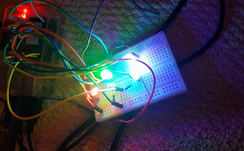
By displaying the cities as LED’s, I can use light to display information. To do this I used Python with Raspberry Pi. Raspberry Pi is unique because it has GPIO pins which can be controlled via code. Raspberry Pi works like a low spec computer but it is much more flexible. Python can be used with Raspberry Pi to control current flowing out of the GPIO pins. I decided to use this current to power LED’s.

Raspberry Pi Controlling RGB LEDs

The image below shows the schematic of how the project would have originally worked. The theme of the project is sustainability in cities. Each entry for the legend is associated with the top 3 cities for that category. Each colour would correspond with a ranking. Green would equal one, Blue equals 2 and Red equals 3. I initially wanted to use Red, Blue and Green to differentiate the ranks. For example, The cities with the highest Livability are Vancouver, Toronto and Calgary in that order. When the LED for Livability (represented with an I) turns on, the LED for Vancouver would turn green, the LED for Toronto would turn blue and the LED for Calgary would turn Red. This would happen for each category. The LED’s would stay on for 4 seconds for each category. The positive end of the LED would connect to a GPIO pin, while the negative end connects to a Ground pin.

The Diagram shows the original layout of the LED map.

There was a cartographic issue with this idea. The use of red indicates the lowest value, which is not what it means in my case. Red is the third best value (not the worst) and should be represented with the appropriate colour. The issue was that I was unable to find something similar to RGB LED’s, which displayed multiple colours. I could combine the RGB values to create new colours, but the pi can only supply a limited amount of current (~50 mha). Using RGB LED’s to create new colours requires a lot of current. Each LED takes about 20 mha. I could limit the energy consumption by using resistors (I did eventually end up using them) but that would reduce the brightness of the LED’s. I would not have been able to do this with the number of LED’s I planned on using. Instead, I decided to use brightness. I realized I could use (Pulse Width Modulation) PWM to control the brightness of the bulbs. Below is the video of me testing the RGB LED’s.

PWM essentially turns the LED’s on and off at a rapid rate to control brightness (faster than the eye can detect). The longer a bulb is on, the brighter it seems. The video below is me testing the PWM function on the Raspberry Pi.

After deciding to include PWM, I had to change the code I created. Below is the code I used to program the Raspberry Pi.

import RPi.GPIO as GPIO #Imports GPIO functions in the library

import time

GPIO.setmode(GPIO.BCM)

GPIO.setwarnings(False)

GPIO.setup(18,GPIO.OUT) #Sets pin 18 as active

v=GPIO.PWM(18,100) #Sets pin 18 to 100hz frequency for PWM, aliased to ‘v’

v.start(100) #Pin 18 is on for a 100% of the time

print “Vancouver on” #Displays ‘Vancouver on’ on the command screen

GPIO.setup(23,GPIO.OUT)

print “Toronto on”

t=GPIO.PWM(23,100)

t.start(10) #Pin 23 is on for 10% of the time.

GPIO.setup(4,GPIO.OUT)

print “Calgary on”

c=GPIO.PWM(4,100)

c.start(1) #Pin 4 is on for 1% of the time

GPIO.setup(12,GPIO.OUT)

print “Indicator 1 on”

GPIO.output(12,GPIO.HIGH) # Turns on Pin 12 (Maximum brightness)

time.sleep(4) #Pauses code for 4 seconds

print “Vancouver off”

v.stop() #Stops PWM for pin 18

print “Toronto off”

t.stop()

print “Calgary off”

c.stop()

print “Indicator 1 off”

GPIO.output(12,GPIO.LOW) #Turns off pin 12

#A similar code would be run for the next category.

After the coding was complete I tested the connections using the Breadboard, which allows the user to test connections without soldering. After a few trials, the code worked! The next step was to connect the cables with the LED’s via soldering. Soldering is used to make connections more permanent. A solder is a combination of highly conductive metals. The solder is heated until it melts, and the liquid metal is then applied to the ‘connection’. The liquid solder then cools and hardens. I soldered the resistors to the positive end of the LED and then soldered the copper wires to each end of the LED.

After all the LED’s were soldered, the next step was to build the actual physical model. A map of Canada with the appropriate cities was glued onto a piece of cardboard. Holes were made for the required cities, after which the LED’s were installed. I used Styrofoam from old boxes to make the base for the project. After about 8 hours of building the model, I was ready to test the final product.

The LED map finally worked! I ran into one problem. I did not have a monitor as a display for the Raspberry Pi. I was using my TV as the display, but I could not bring that with me to campus. Instead I downloaded PuTTy. PuTTy allowed me to connect my laptop to the command module of the pi using an ethernet cable. All I had to do was type ‘sudo python LED.py’ in the command module to make it work. I made it so the project would work with a simple right click of the mouse. The image below shows some of the wiring required to make the map work.

The Underbelly of the final product.

#AddressingTheSurface Translucent Maps inspired by GIS and Open Data

by Edgar Baculi #themapmaker
Geovisualization Project @RyersonGeo, SA8905, Fall 2017

#AddressingTheSurface was a collaborative geovisualization project with recent OCAD University graduate, Graphic Designer and Fine Artist Jay Ginsherman, with ideas and direction from Ryerson University, Master of Spatial Analysis candidate Edgar Baculi. This project was inspired by the previous work of Ginsherman entitled ‘Liquid Shadows’ using translucent images or maps as well as a lighting device nicknamed the ‘Lightbox’. This piece along with Ginsherman’s previous and on-going work can be found here http://jginsherman.format.com/. While attending OCAD University’s 102nd GradEx, Baculi encountered the work of Ginsherman and the GIS like experience of the attendees. From this the idea of using open data and actual GIS to produce a piece had begun.

After consulting with Ginsherman a piece based on the lived experience of Baculi, open data and GIS was established. Having previous research work in open data, Baculi was familiar with exploring and downloading open data. The Toronto Open Data Catalogue provided all the data relevant to the project. The key focus of the data collection were datasets related to Toronto Community Housing and services of interest for these residents and other locations.

The following datasets were downloaded and manipulated from the catalogue:
1. Toronto Community Housing Corporation Residences (with high, mid and low rise buildings selected and divided into three map layers)
2. The boundary of the city of Toronto (dissolved former municipality shape file)
3. City of Toronto Neighbourhoods
4. Street file
5. Fire Stations
6. Police Stations
7. Park Land
8. TTC Subway lines
9. Three heat/ kernel density maps on services of interest for TCHC residents (based on Rent Bank Centres, Community Cooling Centres and Shelters.

A key aspect of this project was the use of subtractive colours (Magenta, Yellow and Cyan) for the heat maps to show interesting overlap, resulting in new colours. The overlap of colours were designed intentionally to be open to interpretation to the map readers.

Using ArcGIS the previously mentioned datasets were adjusted by Baculi with ideal symbology before being sent to Ginsherman. The discussions between Baculi and Ginsherman involved understanding how GIS works and cartographic ideals for the look of the maps, with great design to appeal to the audience. Baculi wanted to create a hands on GIS experience, with a legend that built itself up and remained legible to the map reader. Ginsherman incorporated these ideals into the final look under Baculi’s direction.

Once Baculi completed the GIS portion of the layers, they were sent off to Ginsherman to improve design, layout and to print. Ginsherman used PDF’s of the layers in adobe illustrator, and ensured map alignment by limiting the work to the same illustrator file and giving each map its own layer. Printing involved using a laser printer, specifically at the OCAD University Digital Print Centre. Previous draft layers were also created to test the colour combinations and the best level of transparency for the maps.

A key component of the piece was the Lightbox from Ginsherman’s previous work which was designed and built by Ginsherman and his father. The Lightbox is made of wood, acrylic glass, and LED lights which were screwed together. The Toronto boundary layer was the only layer not printed on a translucent sheet, but on the glass. The boundary along with the north arrow acted as guides to align the layering of the maps. The LED lights improved the clarity of the layering maps as well as directed attention to the piece.

The end result was presented on Ryerson’s 2017 GIS Day and consisted of a Lightbox with the Toronto boundary printed on top and a total of 12 translucent maps. A variety of combinations were possible for interaction and discussion for the attendees. Please see the YouTube video below!

Using Laser-Cutting to Visualize the 1953 North Sea Flood in the Netherlands

by Carmen Huber
Geovis Class Project @RyersonGeo, SA8905, Fall 2017

Context

The 1953 flood was one of the worst in the history of the Netherlands (Deltawerken, 2017) – a country in which 1/3 of its land area lies below sea level (Netherlands Tourism, 2017). The flood had devastating impacts on the country, including:

  • 1,835 deaths
  • 200,000 cattle drowned
  • 200,000 hectares of soil flooded
  • 3,000 houses and 300 farms destroyed
  • 40,000 houses and 3,000 farms damaged
  • 72,000 people evacuated

This flood has additional significance, because the devastating impacts led to multiple changes in policy and infrastructure related to water management in the Netherlands. On February the 21st, 1953, the Deltacommission was founded to devise a plan to guide these changes (Deltawerken, 2017).

Creating the Model

To help in visualizing the extent of the flood itself, laser-cutting was used to create two physical models of the landscape in which the flood occurred:

  1. Displaying the landscape “pre-flood”
  2. Displaying the landscape “post-flood” (or during the flood)

Both models were created to represent only the areas surrounding the flood extent – which was centred in the province of Zeeland (appropriately translates to English as “Sealand”).

Data

Two spatial datasets were used to create the models: elevation and land cover. Elevation is extremely relevant to the 1953 flood due to the increased vulnerability of low-lying areas – it is much easier for these areas to flood that those with higher elevations. The MODIS (2015) elevation raster was used to represent elevation.

A land cover raster (Landscan, 2015) was used to determine the “normal” extent of the North Sea – used in the pre-flood model. While the extent of the North Sea was likely slightly different in 1953 than in 2015, spatial data was difficult to come by for this time period – due to the fact that the flood took place over 50 years ago along with difficulty navigating open data portals written completely in Dutch! Therefore, the 2015 dataset was used to provide a general representation of the North Sea extent.

Additionally, one non-spatial image was georeferenced to define the flood extent. The historical time period that the flood took place also made it difficult to obtain spatially-enabled data of the flood extent itself. I contacted an employee at the Dutch Open Data Portal, and was pointed to multiple PDFs outlining the flood extent in great detail – and again, written in Dutch. Because these images were so hard to decipher, I opted to use a basic JPG image of the flood extent that was made available on the Deltawerks website (http://www.deltawerken.com/Devastating-Powers/484.html). This image was used to define the flood extent.

Methods

These datasets needed to be processed, and then exported into a format which could be used as an input for the laser-cutting machines.

The first step in this process was to transform the JPG flood extent image into a spatially referenced polygon. To do this, provinces in the Netherlands were selected by eyeballing the approximate extent of the flood. From this selection, the ‘minimum bounding area’ tool was used to output a rectangular polygon which would encompass all of the selected area. In order to “cut” the flood extent from this rectangular polygon, the JPG image showing the flood extent first needed to be geocoded. The image was imported into ArGIS Pro – and initially appeared to be “floating in space” because it had no spatial information associated with it. To resolve this, multiple georeferencing points were added to match identifiable points on the JPG image to the same points on the exiting base map. Approximately twenty georeferencing points were added before the JPG image appeared to line up with the base map underneath. Finally, the geocoded image was made transparent, and used as a guide to edit the rectangular polygon to form the shape of the flood extent (using the “cut” editing tool). The flood extent data for the “post-flood” model was complete!

The second step in this process was to define the “normal” extent of the North Sea in the study area. To do this, the elevation raster was used. The raster was first clipped to the same rectangular study area polygon previously used to create the flood extent. After the raster was clipped, all pixels identified as being water were extracted. Then, the raster extraction of water pixels were converted to polygon. Because the polygon was created from individual pixels, the resulting edges are very jagged. The “smoothing” tool was run on the sea extent polygon, which resulted in something that would be much more visually appealing in the model. The result represented the North Sea extent “pre-flood”.

The third step in the process was to manipulate the elevation data. Like the land cover raster, the elevation raster was clipped to the rectangular study area polygon. Then, elevation values needed to be reclassed. Reclassing the raster simplified the data in a way, so that it would be possible to construct using laser-cutting. The raster was reclassed into five classes: -6 – 0 m, 0 – 10 m, 10 – 20 m, 20 – 30 m, and 30 – 40 m. This reclassed raster was then converted to a polygon, with the ‘simplify’ option elected.  Graduated colours was selected for symbology of the resulting layer, so that you could intuitively tell which layer had the lowest to highest elevation. A copy of the polygon elevation layer was made, so that one existed for the “pre-flood” model and for the “post-flood” model. For the “pre-flood” model the erase tool was used, inputting the normal North Sea extent as the erase feature and one of the elevation polygon layers as the target feature. This was repeated for “post-flood” model, but instead the flood extent polygon was inputted as the erase feature. Now, both elevation datasets were complete!

The result of processing was four layers, for two models:

  • “Pre-flood” model
    • Normal North Sea extent
    • Elevation (with North Sea extent erased)
  • “Post-flood model
    • 1953 flood extent
    • Elevation (with North Sea extent erased)

These layers were shown on the layout view of Arc individually, and exported as PDFs (seen below). PDFs were requested by the company that I had contacted about running the laser cutting process.

“Pre-flood” sea extent and elevation (top left and right, and “post-flood” flood extent and elevation (bottom left and right)

After reviewing my project with the external company, I sent them my PDF files and discussed potential materials. We decided that using 3 mm wood would be a good choice in material for the elevation component – it would show the difference in elevation by layering but also would not be too expensive. For each increase in elevation class, and additional layer of wood would be cut to stack onto the one below. This would make the result 3D in nature, and make differences in elevation really stand out (especially since the Netherlands is so flat!). We also decided that using a blue Plexiglas would make the sea and flood extent be visually appealing and really stand out. I received the laser cut materials in a package, as shown in the image below.

Laser-cut wood and Plexiglas picked up!

When the cutting was complete, I stained the wood using a decreasing number of coats as the elevation layer increased. Then, I assembled the pieces on a wooden base using wood glue and double sided tape. I added a legend indicating the elevation range for each level.

Final Product

The finial product is as seen here:

Final product: “Pre-flood” model on left, “post-flood” model on right

Multiple layers used to show differences in elevation

Looking back, there were a few things I would have done differently to improve this project. First, the model would have been more interesting if I had found historically accurate data sources for 1953. Additionally, the models would have been more accurate if I had somehow incorporated the locations of the storm barriers and/or dykes that failed during the flood.  Second, the final product might have been more visually appealing if I had used a greater number class breaks to represent elevation. This would have provided more detail on the elevation of the study area, and would have made the models look better in general. Third, I could have improved minor details (such as the title) to make the final product look more polished. Despite these potential improvements, I was happy with the result! I discovered that laser-cutting is an effective technique to create visually appealing spatial models.


Sources:

Deltawerken. (2017). The Flood of 1953. Retrieved from: http://www.deltawerken.com/the-flood-of-1953/89.html

Netherlands Tourism. (2017). Is the Netherlands Below Sea Level? Retrieved from: http://www.netherlands-tourism.com/netherlands-sea-level/