By Gabriel Dunk-Gifford
November 27th, 2024
SA 8905

Background
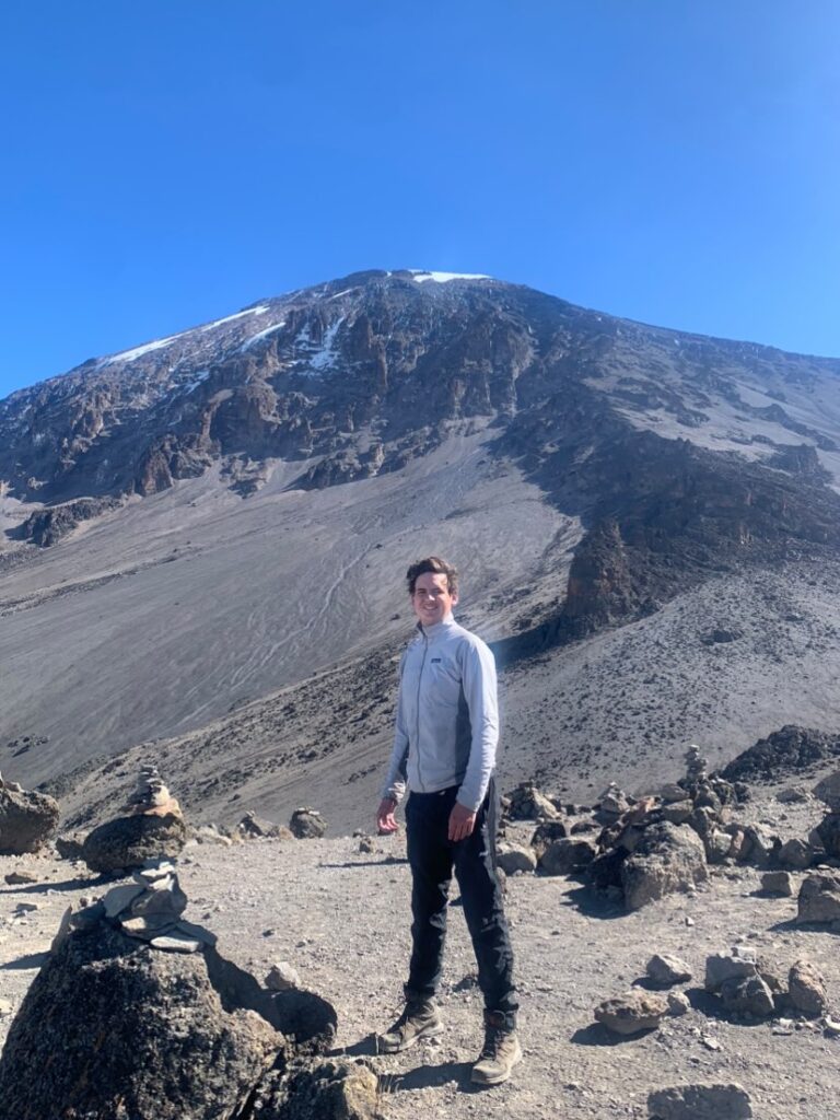
In 2023, I climbed Mount Kilimanjaro. Mount Kilimanjaro, is located in the northern region of Tanzania, straddling the border with Kenya, and at 5,895 metres, is the tallest mountain in Africa. My sister was doing a work term in Tanzania, so I thought it was a great opportunity to complete a physical and mental challenge that has been a bucket list item for me. The other major driver for me to climb this mountain, is that it is one of the tallest mountains in the world that does not require a large amount of technical climbing and can be done mostly by walking. Despite this however, the freezing temperatures, the altitude and the long distances being covered meant that it was still an immensely difficult challenge for me to complete. We chose to climb the 7 day Machame Route, which was recommended for people that wanted a long enough route to have a relatively high chance of reaching the summit, but did not want to spend an excessive amount for the longest routes. This was just one of many routes that climbing companies use when leading trips to the summit, which have a lot of variation in terms of length of time. The shortest route, Marangu, which takes place over 5 days is the least expensive, due to not having to pay the 10-20 people required to lead a group of climbers (Guides, Assistant Guides, Porters, and Cooks). However, the flip side of this is that 5 days does not provide very much time to acclimatize to the altitude, which means that over 50% of climbers on this route do not reach the summit due to prevalent altitude sickness. The 7 day Machame Route is much more manageable with the extra days, giving the climbers more time to make sorties into the higher elevation zones and back down to acclimatize more comfortably. The third route, which is called the Northern Circuit as it traverses all the way around the north side of the mountain, takes place over 10 days. It is the most scenic, giving time for climbers to see all the different types of vegetation zones that the mountain has to offer, and also causes the least amount of altitude-related stress, as it ascends into the high elevation much more slowly, and gives more time to acclimatize once the climbers have reached that zone. Altitude sickness has a large amount of variation between people, in terms of the level of severity and symptoms. For instance, one person in my group, who was an experienced triathlete, began experiencing symptoms of altitude sickness on the 2nd day of the climb, and was ultimately unable to reach the summit, whereas my symptoms were less severe. Despite this, by the time we reached the summit in the early hours of the morning on Day 6, I had begun to feel the effects of the altitude, with persistent headaches, exhaustion and vertigo. These symptoms are all consequences of the reduced amount of oxygen that is available at such a high elevation, and were also compounded by the extremely low temperatures at night (between -15 and -25 degrees), which made it very difficult to sleep. Despite these setbacks however, reaching the summit was a very interesting and rewarding experience that I wanted to share with this project.
Scope of the project
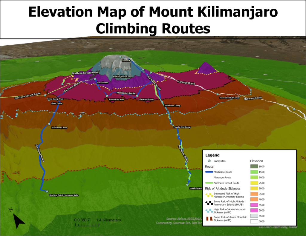
For the purposes of this geovisualization project, I chose to create a 3d scene in ArcGIS Pro, which displayed the elevation of the different parts of the mountain, and how 3 different route lengths (5 days, 7 days and 10 days) differ in terms of how they traverse through the different elevation zones. I also drew dashed lines on my 3d model which mark the elevation at which different levels of altitude sickness typically occur. Because of my own personal experience and that of other people, I thought that it was important to analyze altitude sickness and how it can be prevalent in a climb as common as Mount Kilimanjaro
Generally there are two levels of altitude sickness that can occur on a climb such as this one. The first one, Acute Mountain Sickness or AMS, is extremely common. The symptoms are not particularly severe, usually showing in most people as fatigue, shortness of breath, headaches, and sometimes nausea. The risk of this illness occurs usually in the 2000 to 2,500 metre range, becoming extremely common by the time a person ascends to around 4000 metres. The second, much more severe form of altitude sickness, comes in two forms, High Altitude Pulmonary Edema and High Altitude Cerebral Edema. As is probably evident from the names of these illnesses, HAPE primarily affects the lungs, while HACE mostly affects the brain, though most people that contract this, experience symptoms of both. HAPE/HACE begins to occur in people at the 4500m range (with a 2-6% risk at that elevation), but becomes much more prevalent at elevations above 5000m. The risk of this illness continues to increase as the elevation increases, which is why it is so difficult to reach the summit of the 8000m + mountains like Everest or K2. To counteract the effects of these illnesses, acclimatization to the elevation is extremely important. This is why mountain guides are constantly stressing the need to keep a very slow pace of climbing, and longer routes have a much higher success rate, as it allows for more time for the body to acclimatize to the altitude.
Format of the Project
To complete this project, I began by downloading an elevation raster dataset from NASA Earthdata to display the elevation on the mountain. I then added that to an ArcGIS project and drew a boundary around the mountain to use as my study area. From there, I clipped the raster to only show the elevation in that area, and also limit the size of the file. The dataset was classified at 1 metre intervals, which meant that the differences in elevation between classes was extremely difficult to see, so I used the Reclassify Analysis tool to classify the raster at 500 metre intervals. I then assigned colours to each class with green representing the lowest elevations, then yellow, orange, red and finally blue and white for the very high elevations around the summit. I then started a project in Google Earth to draw out the different climbing routes. While Google Earth has limited functionality in terms of mapping, I find that its 3d terrain is detailed and easy to see, so it provided a more accurate depiction of the routes than if I used ArcGIS Pro. I used point placemarks to mark the different campsites on each of the routes and connected them with line features. For knowledge of the routes and campsites, I used the itineraries on popular Kilimanjaro guide companies’ websites, for each of the different routes. Once I had finished drawing out the routes and campsites in Google Earth, I exported the map as a KML file and converted it to ArcGIS layer files using an analysis tool. Finally, I drew polygons around the elevation borders that corresponded with the risks of altitude sickness that I outlined above. I used dashed lines as my symbology for that layer in order to differentiate it from the solid line routes layer.

The next step for the project was converting the map to a 3d scene, in order to display the elevation more accurately. I increased the vertical exaggeration of my ground terrain base layer, in order to differentiate the elevation zones more. From there, I explored the scene and added labels to make sure that all the different map elements could be seen. I created an animation that flew around the mountain to display all angles at the beginning of my Story Maps Project. I then created still maps that covered the different areas of the mountain that are traversed by the different routes. Since the 5 day route basically ascends and descends on the same path, it only needed one map to show its elevation changes, and different campsites. However, the 7 day map needed two different maps to capture all the different parts of the route, and the 10 day one needed 4 as it travels all the way around the less commonly climbed, north side of the mountain. Finally, I created an ArcGIS Story Maps project to display the different maps that I created. I think that Story Maps is an excellent tool for displaying the results of projects such as this one. Its interactive and engaging interface allows the user to understand what can be a complicated project, in a simple and intriguing manner. I added pictures of my own climb to the project to add context to the topic, along with text explaining the different maps. The project can be viewed here: https://arcg.is/1Sinnf0
Conclusions
This project is very beneficial, as it both provides people who have climbed the mountain the opportunity to see the different elevation zones that they traversed and thus maybe connect that with some of their own experiences, but also the chance for prospective climbers to see the progression through the levels of elevation that each route takes, and be informed their choice of route based on that.
